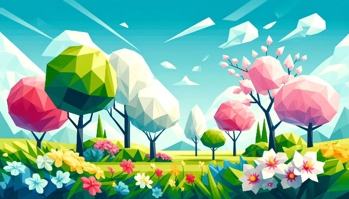
Spring hits different when you’ve got the right colors. Whether you’re designing a brand refresh, planning a wedding, or just want your space to feel less like winter happened, spring color palettes give you that renewal energy without the guesswork.
Most designers grab pastels and call it done. But spring’s bigger than soft pink and mint green.
This guide breaks down 15 tested palettes with hex codes, psychology insights, and pairing tips. You’ll learn which combinations work for different projects, how to apply color theory principles, and when to break the pastel rules entirely.
From soft pastels to tropical brights, each palette includes practical applications and color psychology context you can actually use.
Spring Color Palettes
Spring palettes capture renewal and growth through soft pastels and vibrant florals. These combinations work across fashion, interiors, branding, and digital design.
The season’s color palette options range from delicate pastels to bold tropical hues. Understanding color theory helps you pick combinations that resonate with your audience.
Soft Pastel Dream
| #FDB4A6 | #A9BB80 | #CDB7F7 | #BECED7 | #FDF3C0 |
Color Breakdown
Blush pink (#FDB4A6) brings warmth without aggression. Mint green (#A9BB80) adds botanical freshness.
Lavender (#CDB7F7) provides calming depth. Baby blue (#BECED7) and pale yellow (#FDF3C0) complete the airy feel.
Best Used For
Wellness brands, nurseries, beauty packaging, spring fashion campaigns. Works for minimalist websites needing approachable softness.
Color Codes
- Blush Pink: #FDB4A6 (RGB 253, 180, 166)
- Mint Green: #A9BB80 (RGB 169, 187, 128)
- Lavender: #CDB7F7 (RGB 205, 183, 247)
- Baby Blue: #BECED7 (RGB 190, 206, 215)
- Pale Yellow: #FDF3C0 (RGB 253, 243, 192)
Mood & Psychology
Creates tranquility and gentle optimism. Color psychology shows pastels reduce stress and promote openness.
This pastel color palette feels approachable without being childish.
Pairing Tips
Use cream or soft gray as neutrals. Avoid pairing with neon or heavily saturated colors that break the delicate balance.
Works beautifully with sans-serif fonts and generous white space in layouts.
Fresh Garden
| #9AB59A | #F2F4ED | #D7E0D4 | #B0B08D | #D6B293 |
Color Breakdown
Sage green (#9AB59A) dominates with earthy sophistication. Warm white (#F2F4ED) creates clean breathing room.
Soft gray (#D7E0D4), moss (#B0B08D), and sandy beige (#D6B293) add natural depth. This monochrome approach stays grounded.
Best Used For
Organic products, sustainable fashion, home decor, spa branding. Perfect for nature color palettes that need sophistication.
Color Codes
- Sage Green: #9AB59A (RGB 154, 181, 154)
- Warm White: #F2F4ED (RGB 242, 244, 237)
- Soft Gray: #D7E0D4 (RGB 215, 224, 212)
- Moss: #B0B08D (RGB 176, 176, 141)
- Sandy Beige: #D6B293 (RGB 214, 178, 147)
Mood & Psychology
Evokes stability, growth, natural wellness. Green’s calming properties combine with neutral color palettes for timeless appeal.
Pairing Tips
Combine with terracotta or brown accents for earth color palettes. Use serif fonts for traditional feel or clean sans-serifs for modern layouts.
Maintain strong contrast ratios for accessibility, especially with lighter tones.
Cherry Blossom
| #FFB7C2 | #5EA4B6 | #FDC5C6 | #BECED7 | #FFA6C2 |
Color Breakdown
Sakura pink (#FFB7C2) captures delicate spring blooms. Turquoise (#5EA4B6) provides cool counterbalance.
Coral (#FDC5C6), pale aqua (#BECED7), and soft peach (#FFA6C2) create romantic harmony. Classic analogous colors with temperature variation.
Best Used For
Wedding color palettes, feminine branding, spring events, romantic stationery. Works for Japanese-inspired designs and floral photography.
Color Codes
- Sakura Pink: #FFB7C2 (RGB 255, 183, 194)
- Turquoise: #5EA4B6 (RGB 94, 164, 182)
- Coral: #FDC5C6 (RGB 253, 197, 198)
- Pale Aqua: #BECED7 (RGB 190, 206, 215)
- Soft Peach: #FFA6C2 (RGB 255, 166, 194)
Mood & Psychology
Creates romance, freshness, gentle joy. Pink nurtures while turquoise adds clarity and breath.
Pairing Tips
Use white or ivory backgrounds to prevent overwhelming sweetness. Pair with script fonts for elegance or modern sans-serifs for contemporary feel.
Add gold accents for luxury, charcoal for sophistication.
Bright Bloom
| #DC4A93 | #FEE30C | #5EA7CC | #FF8701 | #E1115A |
Color Breakdown
Fuchsia (#DC4A93) and lemon yellow (#FEE30C) burst with energy. Electric blue (#5EA7CC) adds modern punch.
Tangerine (#FF8701) and raspberry (#E1115A) complete the vibrant bright color palette. This is a triadic color scheme on steroids.
Best Used For
Youth brands, festivals, creative agencies, energetic campaigns. Perfect for fun color palettes targeting Gen Z and millennials.
Color Codes
- Fuchsia: #DC4A93 (RGB 220, 74, 147)
- Lemon Yellow: #FEE30C (RGB 254, 227, 12)
- Electric Blue: #5EA7CC (RGB 94, 167, 204)
- Tangerine: #FF8701 (RGB 255, 135, 1)
- Raspberry: #E1115A (RGB 225, 17, 90)
Mood & Psychology
Creates excitement, playfulness, bold confidence. High saturation demands attention and communicates innovation.
Pairing Tips
Requires careful visual hierarchy to avoid chaos. Use one color as dominant, others as accents.
Ground with black, white, or deep navy blue. Reserve for projects where energy outweighs sophistication.
Easter Egg
| #A6D8F1 | #FFCBC3 | #BDEEED | #FDF3C0 | #A696CC |
Color Breakdown
Powder blue (#A6D8F1) and soft pink (#FFCBC3) evoke classic spring traditions. Mint (#BDEEED) adds freshness.
Butter yellow (#FDF3C0) and lilac (#A696CC) complete the cheerful, nostalgic mix. Perfect pastel color palettes balance.
Best Used For
Children’s products, spring retail, bakery branding, educational materials. Works for kids color palettes that stay sophisticated.
Color Codes
- Powder Blue: #A6D8F1 (RGB 166, 216, 241)
- Soft Pink: #FFCBC3 (RGB 255, 203, 195)
- Mint: #BDEEED (RGB 189, 238, 237)
- Butter Yellow: #FDF3C0 (RGB 253, 243, 192)
- Lilac: #A696CC (RGB 166, 150, 204)
Mood & Psychology
Creates nostalgia, innocence, playful warmth. These muted pastels feel safe and approachable across demographics.
Pairing Tips
Works with display fonts for playful headers. Combine with light color palettes for maximum airiness.
Avoid dark or heavy elements that disrupt the delicate mood.
Meadow Morning
| #81C309 | #A2D3E2 | #FFD850 | #E4F1ED | #FED0DF |
Color Breakdown
Grass green (#81C309) brings vibrant life. Sky blue (#A2D3E2) adds open-air freshness.
Buttercup (#FFD850), cloud white (#E4F1ED), and rose (#FED0DF) create cheerful meadow vibes. Strong hue variation maintains interest.
Best Used For
Outdoor brands, children’s apps, garden centers, cheerful packaging. Ideal for projects needing optimistic energy without neon intensity.
Color Codes
- Grass Green: #81C309 (RGB 129, 195, 9)
- Sky Blue: #A2D3E2 (RGB 162, 211, 226)
- Buttercup: #FFD850 (RGB 255, 216, 80)
- Cloud White: #E4F1ED (RGB 228, 241, 237)
- Rose: #FED0DF (RGB 254, 208, 223)
Mood & Psychology
Creates joy, playfulness, outdoor energy. Yellow and green together signal growth and happiness across cultures.
Pairing Tips
Use the green sparingly as focal point. Balance saturated tones with plenty of white space for readability.
Pairs well with happy color palettes in editorial and social media design.
Tropical Spring
| #F2664A | #C6E4E8 | #CDD370 | #F3F7E9 | #EFC1BC |
Color Breakdown
Bright coral (#F2664A) brings tropical warmth. Cool aqua (#C6E4E8) balances with refreshing contrast.
Lime (#CDD370), cream (#F3F7E9), and salmon (#EFC1BC) complete the beach-inspired mix. This split-complementary color scheme stays balanced.
Best Used For
Travel brands, resort marketing, tropical products, vacation campaigns. Works for summer color palettes starting in spring.
Color Codes
- Bright Coral: #F2664A (RGB 242, 102, 74)
- Cool Aqua: #C6E4E8 (RGB 198, 228, 232)
- Lime: #CDD370 (RGB 205, 211, 112)
- Cream: #F3F7E9 (RGB 243, 247, 233)
- Salmon: #EFC1BC (RGB 239, 193, 188)
Mood & Psychology
Creates vacation mindset, relaxation, adventure. Coral’s warmth paired with aqua’s coolness signals escape and renewal.
Pairing Tips
Requires strong emphasis on one temperature (warm or cool) as dominant. Use grid systems to organize the varied tones.
Combine with movement and rhythm through repeated color blocks.
Purple Haze
| #65495A | #CDB7F7 | #EFDAAD | #69976E | #A382A3 |
Color Breakdown
Eggplant (#65495A) grounds the palette with depth. Mauve (#CDB7F7) softens with pastel sophistication.
Wheat (#EFDAAD), asparagus green (#69976E), and dusty rose (#A382A3) create unexpected harmony. Muted purple tones dominate.
Best Used For
Botanical brands, artisan products, vintage-inspired designs, sophisticated spring campaigns. Perfect for muted color palettes with character.
Color Codes
- Eggplant: #65495A (RGB 101, 73, 90)
- Mauve: #CDB7F7 (RGB 205, 183, 247)
- Wheat: #EFDAAD (RGB 239, 218, 173)
- Asparagus Green: #69976E (RGB 105, 151, 110)
- Dusty Rose: #A382A3 (RGB 163, 130, 163)
Mood & Psychology
Creates mystery, creativity, natural elegance. Purple’s spiritual qualities blend with earthy tones for grounded sophistication.
Pairing Tips
Works beautifully in print design and packaging design. Use slab serif fonts for vintage appeal.
Maintain clear typographic hierarchy since muted tones can blur together without structure.
Citrus Burst
| #FFC857 | #FF6B6B | #E54C5A | #6B92A7 | #43637B |
Color Breakdown
Carnival yellow (#FFC857) delivers sunny warmth. Cherry red (#FF6B6B) and bright berry (#E54C5A) add playful punch.
Sky blue (#6B92A7) and deep ocean (#43637B) cool the palette without killing energy. Strong complementary color scheme creates vibration.
Best Used For
Food brands, entertainment, children’s products, energetic campaigns. Works for vivid color palettes needing summer crossover appeal.
Color Codes
- Carnival Yellow: #FFC857 (RGB 255, 200, 87)
- Cherry Red: #FF6B6B (RGB 255, 107, 107)
- Bright Berry: #E54C5A (RGB 229, 76, 90)
- Sky Blue: #6B92A7 (RGB 107, 146, 167)
- Deep Ocean: #43637B (RGB 67, 99, 123)
Mood & Psychology
Creates excitement, appetite, playful joy. Red and yellow together trigger hunger and attention.
Pairing Tips
Use blue tones to prevent overwhelming warmth. Apply repetition strategically to create visual rhythm without chaos.
Works with bold typography and geometric shapes. Combine with orange color palettes for warmth.
Spring Sunset
| #FFDFA6 | #FFCBC3 | #A6D8F1 | #7DA2CF | #567CA0 |
Color Breakdown
Apricot (#FFDFA6) and peach glow (#FFCBC3) create warm softness. Clear sky (#A6D8F1) transitions to calm blue (#7DA2CF).
Horizon (#567CA0) adds depth. This gradient color palette mimics natural light progression.
Best Used For
Lifestyle brands, meditation apps, calming products, spring evenings theme. Perfect for sunset color palettes adapted for spring.
Color Codes
- Apricot: #FFDFA6 (RGB 255, 223, 166)
- Peach Glow: #FFCBC3 (RGB 255, 203, 195)
- Clear Sky: #A6D8F1 (RGB 166, 216, 241)
- Calm Blue: #7DA2CF (RGB 125, 162, 207)
- Horizon: #567CA0 (RGB 86, 124, 160)
Mood & Psychology
Creates serenity, warmth, gentle transition. Mimics natural color shifts people find inherently calming.
Pairing Tips
Use gradient techniques to blend colors smoothly. Works beautifully in web design hero sections.
Pair with fonts that have soft terminals. Combine with sky color palettes for cohesion.
Floral Romance
| #EE62B3 | #FFD966 | #467339 | #F6E6D9 | #C72D5C |
Color Breakdown
Pink tulip (#EE62B3) brings bold floral energy. Golden yellow (#FFD966) adds sunshine warmth.
Olive green (#467339), cream (#F6E6D9), and burgundy (#C72D5C) balance sweetness with sophistication. Tetradic color scheme variation.
Best Used For
Floral businesses, event planning, romantic branding, upscale spring products. Works for pink color palettes needing depth.
Color Codes
- Pink Tulip: #EE62B3 (RGB 238, 98, 179)
- Golden Yellow: #FFD966 (RGB 255, 217, 102)
- Olive Green: #467339 (RGB 70, 115, 57)
- Cream: #F6E6D9 (RGB 246, 230, 217)
- Burgundy: #C72D5C (RGB 199, 45, 92)
Mood & Psychology
Creates romance with grounded elegance. Pink’s softness tempered by deep green and burgundy prevents excessive sweetness.
Pairing Tips
Use cream as dominant background. Apply pink and burgundy with careful proximity for cohesion.
Pairs well with typefaces that balance elegance and readability. Consider yellow color palettes for brighter alternatives.
Candy Spring
| #FF6B6B | #FFD966 | #EBFFE9 | #F6EDFF | #FFFDE6 |
Color Breakdown
Strawberry (#FF6B6B) and daffodil (#FFD966) provide saturated pops. Mint cream (#EBFFE9) brings fresh coolness.
Lavender mist (#F6EDFF) and lemon chiffon (#FFFDE6) soften the intensity. Mix of saturated and pale tones.
Best Used For
Confectionery, children’s entertainment, playful apps, spring candy campaigns. Perfect for food color palettes with energy.
Color Codes
- Strawberry: #FF6B6B (RGB 255, 107, 107)
- Daffodil: #FFD966 (RGB 255, 217, 102)
- Mint Cream: #EBFFE9 (RGB 235, 255, 233)
- Lavender Mist: #F6EDFF (RGB 246, 237, 255)
- Lemon Chiffon: #FFFDE6 (RGB 255, 253, 230)
Mood & Psychology
Creates playfulness, sweetness, childlike joy. Light pastels prevent candy colors from becoming overwhelming.
Pairing Tips
Use saturated colors sparingly as accents. Maintain generous spacing between bright elements for unity.
Works with rounded shapes and friendly font pairings. Combine with variety in scale.
Earth Awakening
| #FF8701 | #589102 | #FEBD16 | #467339 | #3B2C28 |
Color Breakdown
Terracotta (#FF8701) brings warm earth tones. Avocado (#589102) and fern green (#467339) add botanical richness.
Amber (#FEBD16) and clay brown (#3B2C28) ground the palette. Strong connection to earth color palettes.
Best Used For
Organic products, sustainable brands, outdoor gear, artisan goods. Works for warm color palettes with natural appeal.
Color Codes
- Terracotta: #FF8701 (RGB 255, 135, 1)
- Avocado: #589102 (RGB 88, 145, 2)
- Amber: #FEBD16 (RGB 254, 189, 22)
- Fern Green: #467339 (RGB 70, 115, 57)
- Clay Brown: #3B2C28 (RGB 59, 44, 40)
Mood & Psychology
Creates grounding, authenticity, natural confidence. Earthy tones signal reliability and organic quality.
Pairing Tips
Use brown as anchor, brighter tones as accents. Apply alignment principles for structure.
Works with textured backgrounds and rustic design elements. Combine with brown color palettes for cohesion.
Azure Dream
| #5EA7CC | #F4A8CF | #FDFD96 | #B6E7B9 | #B19CD9 |
Color Breakdown
Cerulean (#5EA7CC) delivers clear sky brightness. Powder pink (#F4A8CF) softens with gentle femininity.
Butter (#FDFD96), mint (#B6E7B9), and soft lavender (#B19CD9) complete the dreamy mix. Balanced hue distribution.
Best Used For
Dream journals, wellness apps, spring fashion, creative projects. Works for blue color palettes needing whimsy.
Color Codes
- Cerulean: #5EA7CC (RGB 94, 167, 204)
- Powder Pink: #F4A8CF (RGB 244, 168, 207)
- Butter: #FDFD96 (RGB 253, 253, 150)
- Mint: #B6E7B9 (RGB 182, 231, 185)
- Soft Lavender: #B19CD9 (RGB 177, 156, 217)
Mood & Psychology
Creates dreaminess, imagination, gentle optimism. Cool and warm tones balance for universal appeal.
Pairing Tips
Use cerulean as dominant color. Apply pastels with strategic font spacing for readability.
Works with soft shadows and rounded corners. Consider purple color palettes for variations.
Spring Bouquet
| #A96CB1 | #FFD850 | #69976E | #EFDAAD | #A382A3 |
Color Breakdown
Violet (#A96CB1) leads with artistic sophistication. Daffodil yellow (#FFD850) brings cheerful brightness.
Moss green (#69976E), pale cream (#EFDAAD), and dusty mauve (#A382A3) create vintage charm. Muted but memorable.
Best Used For
Artisan brands, vintage markets, botanical products, sophisticated spring events. Perfect for vintage color palettes with spring freshness.
Color Codes
- Violet: #A96CB1 (RGB 169, 108, 177)
- Daffodil Yellow: #FFD850 (RGB 255, 216, 80)
- Moss Green: #69976E (RGB 105, 151, 110)
- Pale Cream: #EFDAAD (RGB 239, 218, 173)
- Dusty Mauve: #A382A3 (RGB 163, 130, 163)
Mood & Psychology
Creates nostalgia, artistic sensitivity, refined taste. Purple and yellow offer interesting color mixing potential.
Pairing Tips
Use cream as buffer between saturated tones. Apply baseline grids for organized layouts.
Works with retro color palettes and hand-drawn illustrations. Pair with thoughtful typography elements.
FAQ on Spring Color Palettes
What colors are best for spring palettes?
Pastels like blush pink, lavender, and mint green dominate spring. Bright options include coral, yellow, and turquoise.
Earthy tones like sage green and terracotta work for grounded spring looks. Your choice depends on project mood and audience.
How do I choose spring colors for branding?
Match colors to your brand personality and target demographic. Soft pastels suit wellness and beauty brands, while bright palettes work for youth-focused products.
Test color combinations using color palette tools. Consider color psychology and ensure accessibility with proper contrast ratios.
What’s the difference between spring and summer color palettes?
Spring palettes feature softer, fresher tones with botanical greens and delicate florals. Summer color palettes use more saturated, warmer hues like deep blues and vibrant corals.
Spring feels renewal-focused while summer leans toward heat and energy. Both share brightness but differ in intensity and temperature.
Can I mix pastel and bright colors in spring palettes?
Absolutely. Combining pastels with one or two bright accents creates dynamic design balance. Use saturated colors sparingly as focal points.
This approach maintains spring’s freshness while adding visual interest. Apply visual hierarchy principles to prevent chaos.
What are the best spring color combinations for websites?
Soft green with cream, powder blue with peach, or lilac with pale yellow work well. Ensure sufficient contrast for text readability and accessibility compliance.
Test combinations in web design context before finalizing. Consider how colors render across different screens.
How do I convert spring palette colors to CMYK for print?
Use design software like Adobe Illustrator to convert RGB values to CMYK. Colors may shift slightly, so request printed proofs before final production.
Work with Pantone colors for consistent print design results. Adjust saturation if pastels appear washed out.
What spring colors work best for interior design?
Sage green, blush pink, sky blue, and soft gray create calming spaces. Pair with white or beige neutrals for sophisticated looks.
Add terracotta or mustard yellow accents for warmth. Consider natural light when selecting final shades.
Are spring color palettes suitable for dark mode designs?
Yes, but adjust saturation and brightness. Use deeper versions of spring colors like forest green or navy blue for backgrounds with lighter accents.
Maintain proper contrast ratios for accessibility. Test dark mode palettes separately from light mode versions for optimal readability.
How do analogous colors work in spring palettes?
Analogous colors sit next to each other on the color wheel. Spring examples include yellow-green-blue or pink-purple-blue combinations that create harmonious, flowing designs.
This approach feels natural and cohesive. Use one color as dominant, others as supporting elements for better balance.
What’s the best way to test spring color palettes before committing?
Create mood boards with your chosen colors applied to actual design elements. Test on different devices and lighting conditions for accurate representation.
Get feedback from target audience members. Use A/B testing for digital projects to measure engagement and conversion impacts before full implementation.
Conclusion
These 15 spring color palettes give you tested combinations that work across digital, print, and physical spaces. From soft pastels to vibrant tropical hues, each palette serves specific moods and audiences.
Understanding color theory basics helps you customize these combinations for your projects. Apply analogous, complementary, or triadic schemes based on your goals.
Don’t limit yourself to pastels just because it’s spring. Bold combinations with proper balance and contrast often perform better.
Test your chosen palette across different contexts before committing. Colors behave differently in web design versus print, and seasonal color trends evolve quickly.
Start with one palette that matches your project needs, then adapt the hex codes to fit your specific brand or vision.

Renowned for his expertise in logo design and visual branding, Bogdan has developed a multitude of logos for various clients.
His skills extend to creating posters, vector illustrations, business cards, and brochures. Additionally, Bogdan's UI kits were featured on marketplaces like Visual Hierarchy and UI8.
He also wrote in the past years on sites like Design Your Way, WebDesignerDepot, WPDean, Designmodo, Speckyboy, Slider Revolution, and more.
- The Windsurf Logo History, Colors, Font, And Meaning - 10 October 2026
- How to Remove Background From Product Photos (No Photoshop) - 10 October 2026
- How Designers can Build a Stronger Online Creative Identity - 9 October 2026

Bogdan Sandu is a seasoned designer who has been designing websites since 2008. Renowned for his expertise in logo design and visual branding, Bogdan has developed a multitude of logos for various clients. His skills extend to creating posters, vector illustrations, business cards, and brochures. Additionally, Bogdan's UI kits were featured on marketplaces like Visual Hierarchy and UI8. He also wrote in the past years on sites like Design Your Way, WebDesignerDepot, WPDean, Designmodo, Speckyboy, Slider Revolution, and more.
You Might Also Like