With the growing number of products and services, the market is too competitive, so businesses do their best to acquire and retain new customers. Digital marketing channels make it easy for businesses to reach out to target audiences and deliver brand messages.
Today, email marketing continues to stand out. The number of 4.8 billion email users proves that people still use emails for communication as one of the most popular channels, so it’s the most effective digital marketing channel for building brand awareness, increasing sales, and fostering long-term customer relationships.
That’s why it’s no wonder that businesses aim at gaining more and more email subscribers.
The best way to grow your email list? Focus on a well-designed page to guide visitors, drive conversations, and win customers. In this article, we’re going to walk through the reasons why a landing page design results in conversions and actionable ways on how to do it right.
The Role of a Well-Designed Landing Page for Email Collection
Most people are visual learners which makes a design an important factor in the decision-making process. Creating an eye-catching landing page design makes visitors decide whether they want to subscribe to your email list or leave the page.
Here are three more reasons why a well-designed landing page matters.
- Grab the visitors’ attention. An average attention span is 8 seconds, so having an eye-catching landing page design is a great way to make visitors want to stay longer and learn more instead of quitting quickly.
- Create a strong first impression. Modern customers value and trust businesses that invest time and budget into brand image and a landing page design can tell a lot about your company before visitors become your customers.
- Improve email subscription experience. A good design highlights the benefits of joining an email list and makes it easy for visitors to understand which steps to take in order to complete the desired action which results in more email subscribers.
Whether you hire designers, use landing page builders, or outsource landing page design, you still need to know elements that make a high-converting landing page. Here are seven approaches on how to design landing pages that convert visitors into email subscribers.
1. Keep a Focus on the Value
Users are bombarded with dozens of emails daily, so they are picky when it comes to sharing their personal email addresses. Research by Clutch, surveying 628 regular AI assistant users in September 2026, found that 98% had at least one concern about advertising in AI assistants, with 56% specifically concerned about privacy and data use. This highlights the importance of transparency when collecting personal information. Landing pages designed to capture email addresses should clearly explain why an email address is required, how it will be used, and what users can expect in return.
More often than not, a person subscribes to the email list when sees the value of doing it. From getting a lead magnet to receiving an additional discount or being involved into the community, there are different reasons that convert visitors into email subscribers.
When it comes to a landing page design, it’s important to be straight to the point and keep a focus on the value your subscribers get.
Let’s take a look at this example from Hubspot. The company starts the message with the value for a potential subscriber
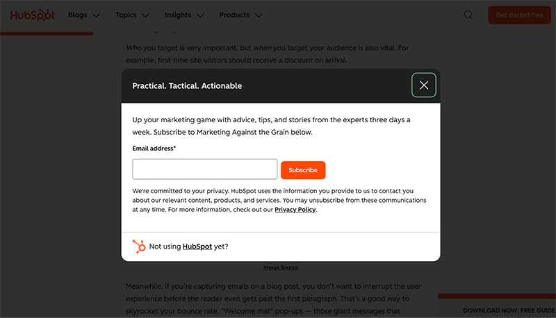
First and foremost, your copy should solve real customer problems and show the benefits of joining an email list. And here are several elements of a landing page that deliver the value proposition:
- Persuasive headline
- Supportive subheadline
- Benefit-driven copy with bullet points
2. Offer a Valuable Lead Magnet
It is in humans’ nature to love getting something valuable for free. That’s why the idea of using lead magnets, aka free digital items, drives so much traffic and works so well when it comes to offering them in exchange for sharing contact information like email addresses.
Case in point:
When Ciler Demiralp launched the Newsletter Circle, the company chose an industry report as a lead magnet to attract more email subscribers and it was an effective choice as it resulted in an email list growth of 22%.
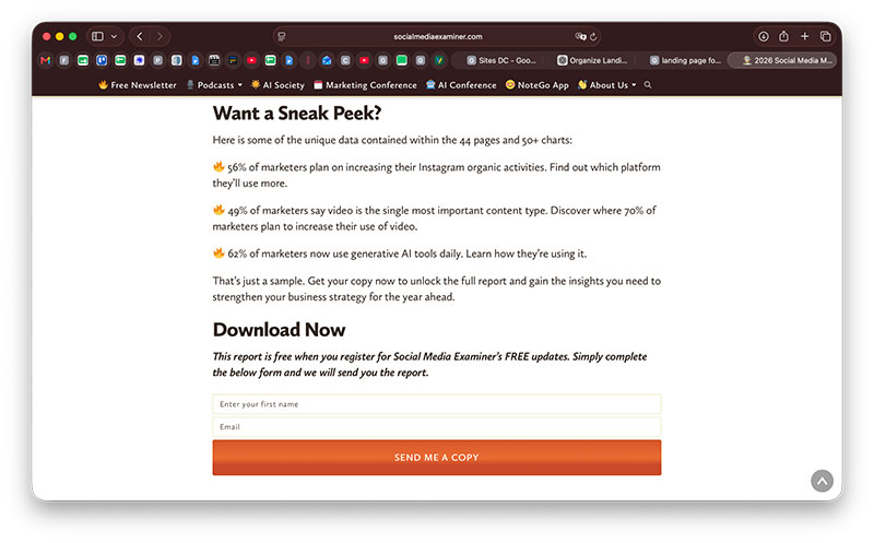
Yes, industry reports often work as lead magnets. Another proof needed? As a market leader in the social media marketing field, SocialMediaExaminer constantly conducts industry-specific surveys and turns them into research reports. Then, interested visitors can access to the findings in exchange for their contact information:
Beyond industry research reports, other valuable lead magnet ideas include:
- Ebooks
- Guides
- Templates
- Free trials
- Webinars
- Video tutorials
- Welcome discounts
- Free shipping
- Loyalty rewards
- Early access
- Case studies
3. Make the Sign Up Form Easy and Short
When people land on your landing page, more often than not, they are new potential customers who haven’t interacted with your brand before. Therefore, they may have little or no trust in your brand yet. At this stage of the customer journey, it’s important not to scare them away. That’s why it’s important to make the sign-up process as simple and short as possible. Moreover, people get overwhelmed when they need to spend much time filling out data, so always require the bare minimum information initially.
Several practical advice for you to follow:
- Avoid unnecessary fields, complicated questions, and confusing instructions
- Include a compelling CTA button
- Ask for email addresses only
4. Build a Seasonal Landing Page
The holiday season is a great opportunity to refresh your landing page and make it more relevant to what your audience is currently interested in. It’s no secret that seasonal campaigns naturally create a sense of urgency. Plus, festive visuals and holiday-themed messaging evoke positive emotions, nostalgia, and a sense of excitement. All in all it creates an emotional connection and therefore makes your brand more appealing for visitors to complete the desired action and share their email addresses.
A good example comes from Printify, a print-on-demand platform. Running the campaign before the Xmas period, the company doesn’t simply add festive decorations to the page but it encourages its target audience to pay attention to the advantage of the holiday season for their businesses and set up their online store, expand their product lines by creating custom holiday merchandise or personalized gifts.
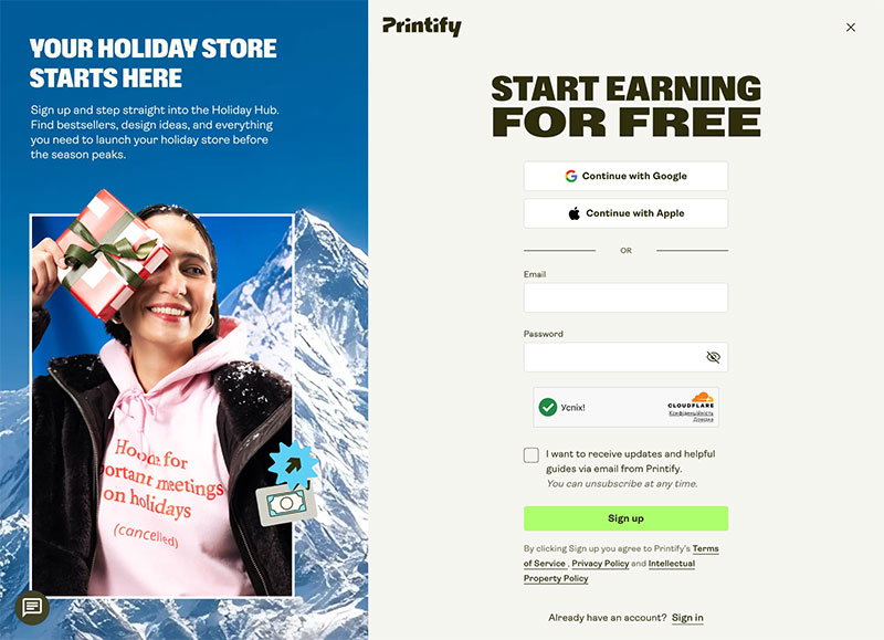
Printify focuses on these timely opportunities and helps visitors solve their pain points to boost sales during the peak season. The offer sounds more relevant and gives visitors a compelling reason to engage with the brand and potentially subscribe to its email list.
5. Put the Call to Action Button in the Right Place
A call to action button is a crucial element of a landing page design that guides visitors on where to go and what to do next. It’s aimed at achieving the primary goal of your landing page and when you plan to convert visitors into email subscribers, it should be something like “Subscribe now”, “Join other X email subscribers”, or “Share your email address”.
However, it’s not enough to create a compelling and result-oriented CTA button, but it’s also important to know where to put it so that more visitors could spot it easily. As specified in one article by GetResponse, “your CTA should appear right below your headline text, in the center of the page.”
What is more, you need to make the most out of the design to help your CTA stand out – choose contrast colors, readable fonts, and enough white space around the button to make it visually distinct from the rest of the page.
6. Use the Power of Brand Credibility with Social Proof
In an oversaturated market where customers are bombarded with similar offers from different companies, peer recommendations and social proof are what makes your company stand out. Leveraging the power of social proof helps to build trust while creating a sense of belonging. Whether you choose to add reviews, subscriber number or testimonials, you give visitors a signal that your business is worth trusting and your potential subscribers can join a community of like-minded people who share their interests.
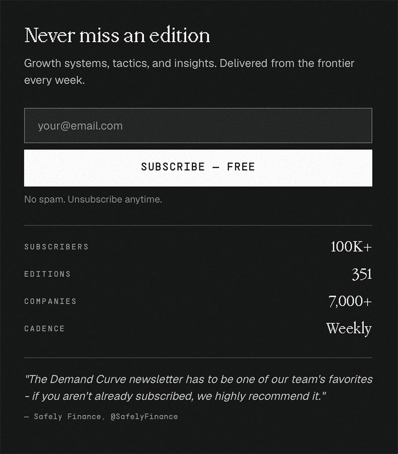
There are various ways on how to incorporate social proof as a part of a landing page design. Let’s take a look at how Demand Curve did it. Not only did the company put the number of subscribers and companies they had on the list, but they also added a quote from a satisfied subscriber:
7. Test and Optimize Your Landing Page
If you believe that you have an outstanding landing page but it doesn’t convert, think about conducting an A/B test and using heatmaps and scroll maps. Your visitors and their behavior are the biggest hint whether a landing page requires changes in a design or copy.
Plus, your email list doesn’t help to grow your business unless you have active and engaged subscribers. That’s better to aim at a small email list with a higher open rate than a large database with a high rate of unsubscribes. That’s why it’s important to check whether new subscribers are genuine and have valid email addresses.
Use an email verification and contact database tool like SignalHire that makes it fast and easy to scan your subscribers. Moreover, the tool helps companies get additional valuable information about subscribers with its bulk enrichment feature that finds your subscribers’ names, surnames, companies, phone numbers, and social media profiles.
In a Word
A proper landing page design is still a significant element that grabs the attention of the target audience and makes the visitors want to stay longer on the page in order to find out more about the company, its products, and its benefits. When you know how to organize your landing page right with design elements, it’s easier to highlight the message and convert visitors into email subscribers. Thus, we recommend you unleash your creativity and test what works best for your audience as there’s no one-size-fits-all solution that can bring results over and over again. And, don’t forget to draw inspiration from other businesses in your field!

Renowned for his expertise in logo design and visual branding, Bogdan has developed a multitude of logos for various clients.
His skills extend to creating posters, vector illustrations, business cards, and brochures. Additionally, Bogdan's UI kits were featured on marketplaces like Visual Hierarchy and UI8.
He also wrote in the past years on sites like Design Your Way, WebDesignerDepot, WPDean, Designmodo, Speckyboy, Slider Revolution, and more.
- The LinkedIn Logo History, Colors, Font, and Meaning - 20 November 2026
- How to Design Landing Pages That Convert Visitors into Email Subscribers - 20 November 2026
- Why Quality Assurance is the Backbone of Seamless UI/UX and Web Design - 20 November 2026

Bogdan Sandu is a seasoned designer who has been designing websites since 2008. Renowned for his expertise in logo design and visual branding, Bogdan has developed a multitude of logos for various clients. His skills extend to creating posters, vector illustrations, business cards, and brochures. Additionally, Bogdan's UI kits were featured on marketplaces like Visual Hierarchy and UI8. He also wrote in the past years on sites like Design Your Way, WebDesignerDepot, WPDean, Designmodo, Speckyboy, Slider Revolution, and more.
You Might Also Like