Oswald’s condensed proportions and clean geometry dominate countless websites, but using the same typeface as everyone else kills brand differentiation. You need alternatives that capture…
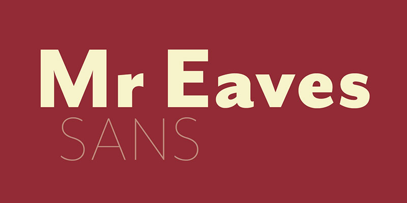
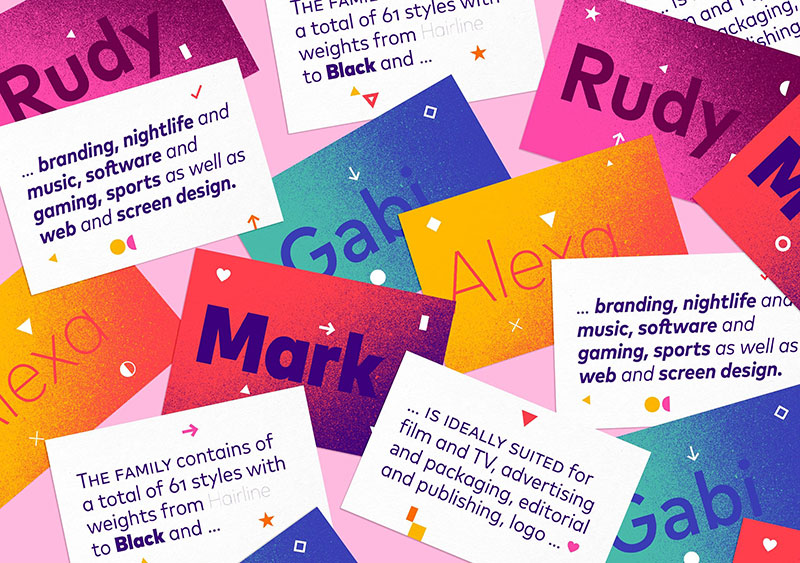
Gill Sans defined British typography for nearly a century, but licensing costs and overuse pushed designers toward alternatives. Finding fonts similar to Gill Sans means…
Brandon Grotesque dominates modern branding, but its popularity creates a problem. Your designs start looking like everyone else’s. Finding fonts similar to Brandon Grotesque gives…
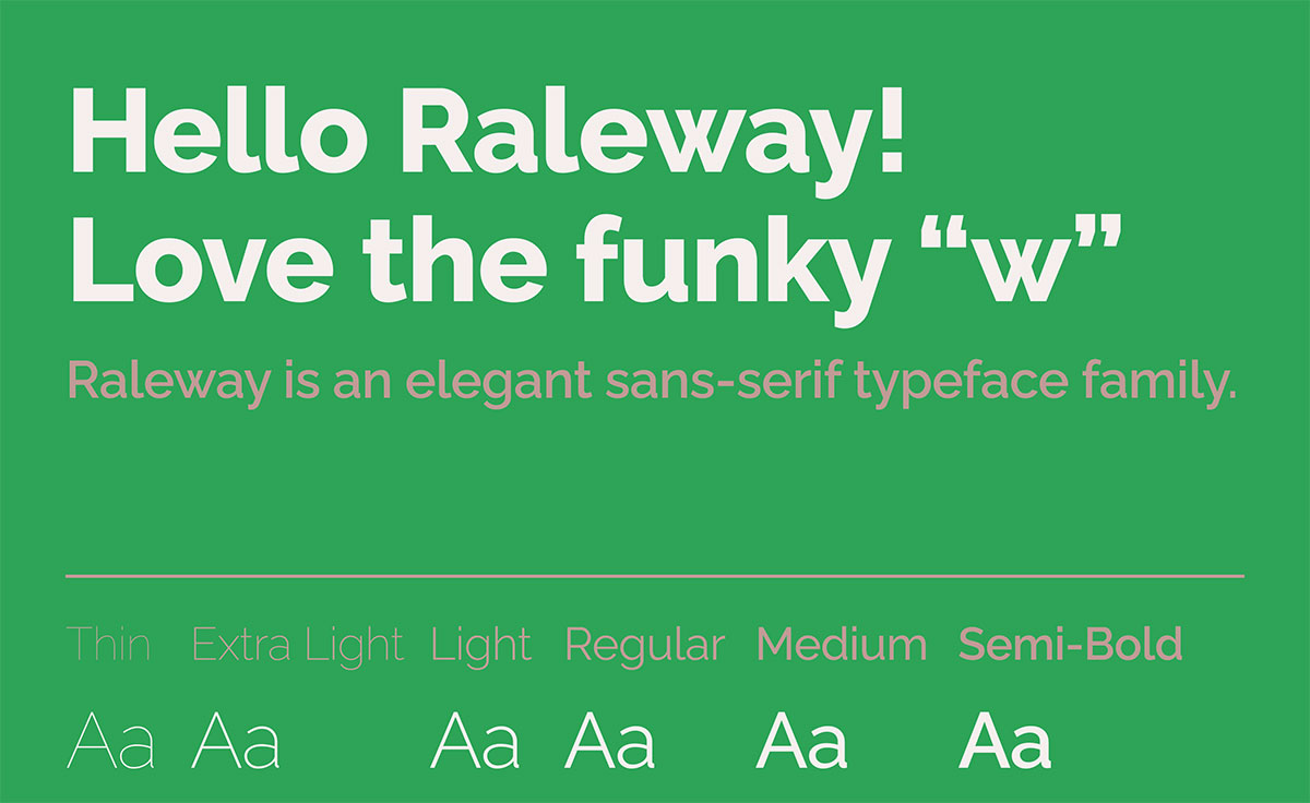
Raleway’s clean geometric elegance has made it a web design staple, but relying on a single typeface limits your creative toolkit. Whether you need a…
Papyrus divides the design world like few other typefaces. Love it or hate it, you’ve probably overused it at some point. The good news? Plenty…
Baskerville’s elegant serifs have graced everything from wedding invitations to literary magazines for over 250 years. But what happens when you need that same refined…
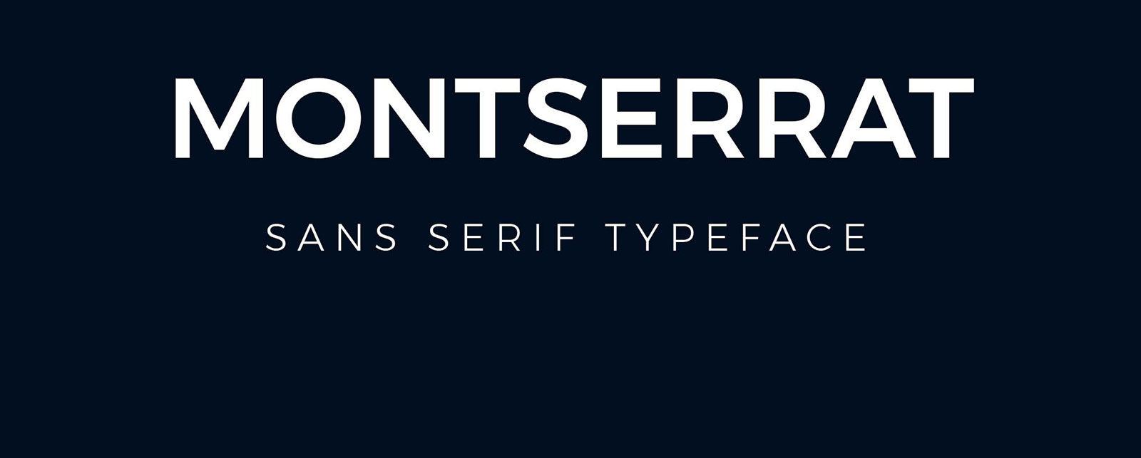
Montserrat’s clean geometric lines made it a web design staple, but overuse dulls its impact. Fonts similar to Montserrat offer fresh alternatives without sacrificing the…
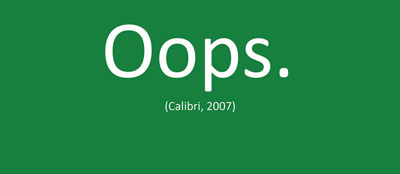
Calibri’s reign as Microsoft Office’s default ended in 2023, leaving millions scrambling for alternatives. Whether you’re switching by choice or necessity, finding fonts similar to…
Hermann Zapf’s Optima remains one of the most elegant humanist sans-serif typefaces ever created, but its licensing costs and ubiquity sometimes demand alternatives. Whether you’re…
Roboto sits on millions of Android screens and thousands of websites, but it’s not always the right choice. Maybe you need better font licensing terms.…
Bodoni’s razor-thin hairlines crack under digital pressure. That’s the brutal truth about using this 18th-century icon for modern projects. But you’re not stuck with mediocre…
That ornate, medieval lettering on diplomas and wedding invitations catches your eye every time. But tracking down the right blackletter typeface when you need it?…
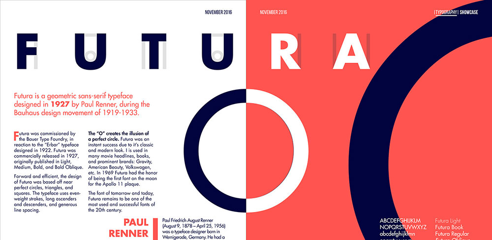
Futura defined geometric sans serif design in 1927, but licensing costs and limited web availability push designers toward alternatives. Finding fonts similar to Futura means understanding what…
Century Gothic stopped being just another geometric sans-serif the moment you realized its licensing costs were eating your budget. Or maybe the font just feels…
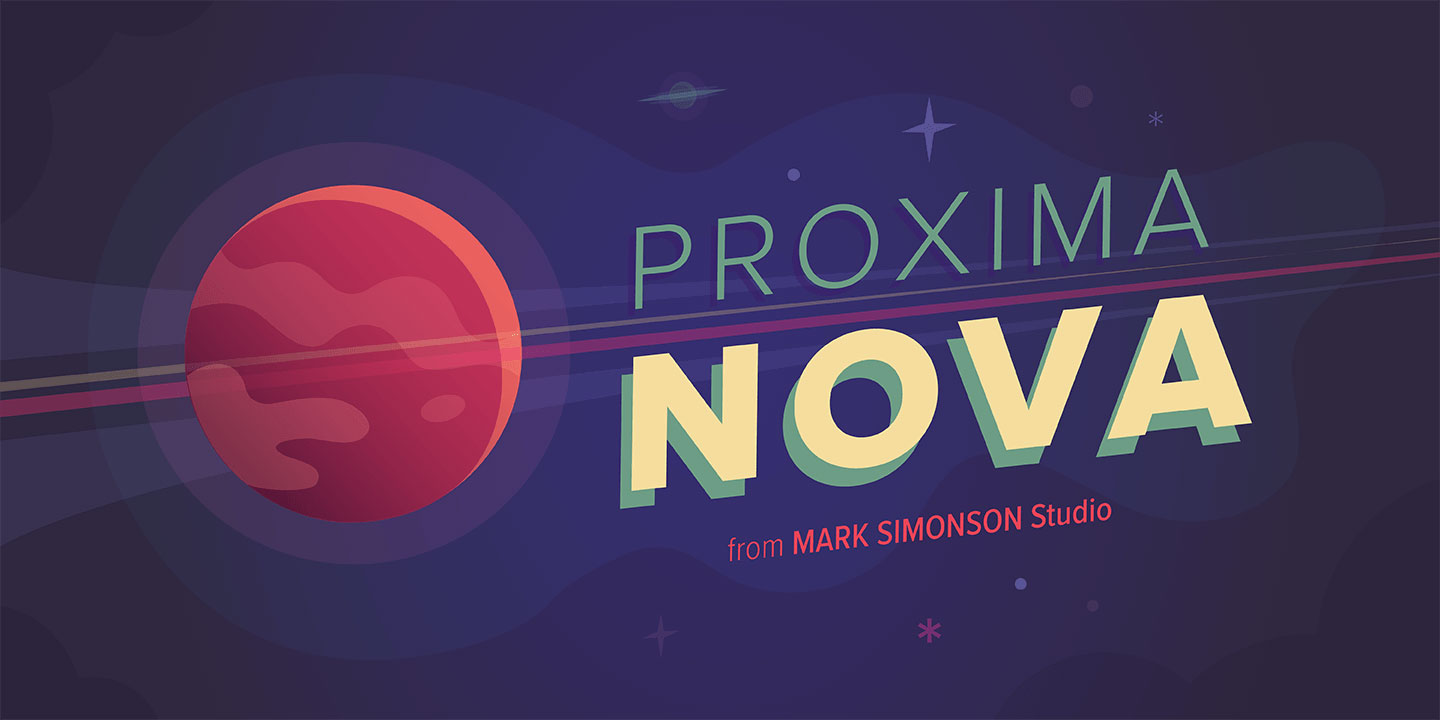
Proxima Nova costs money. That’s the problem. You need a clean, professional sans-serif typeface for your project, but licensing fees don’t fit the budget. Or…
Minion Pro disappeared from your design toolkit the moment your Adobe subscription lapsed. Now you’re staring at a layout that suddenly looks wrong with Times…
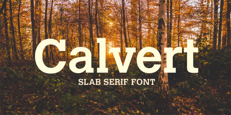
Rockwell’s geometric slab serif structure has dominated headlines and branding for decades, but licensing costs and overuse push designers toward fresh alternatives. Finding fonts similar…
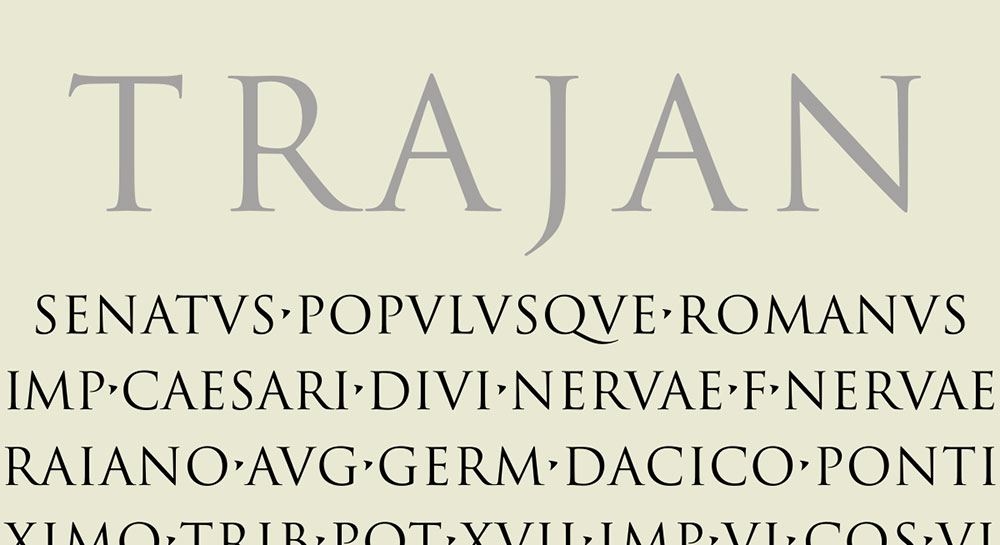
Trajan dominates movie posters and luxury branding, but overuse has dulled its impact. Designers need fresh alternatives that capture the same classical authority without triggering…
Times New Roman dominated office documents and academic papers for decades, but it’s far from your only option. If you need fonts similar to Times…
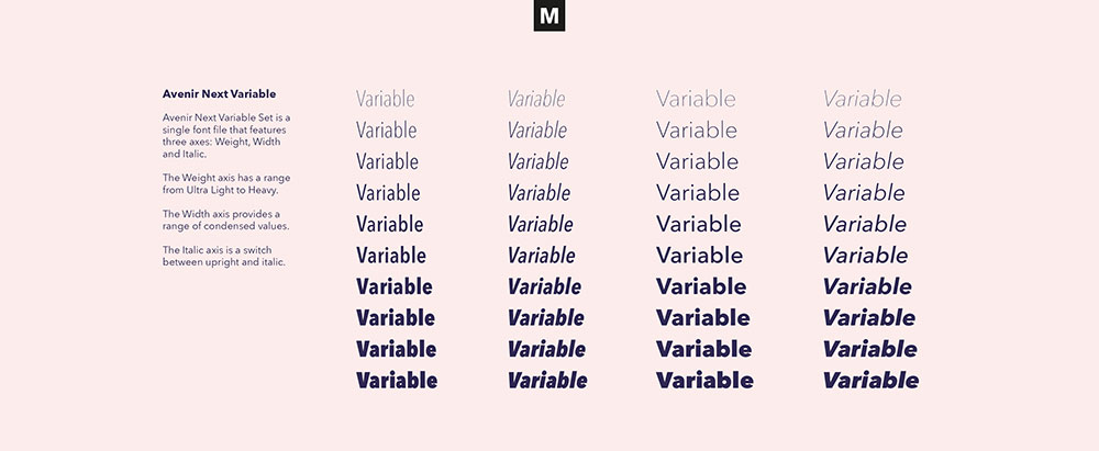
You’ve been staring at that Avenir license price for five minutes. The fonts similar to Avenir you need exist, and some cost nothing. Avenir’s clean…
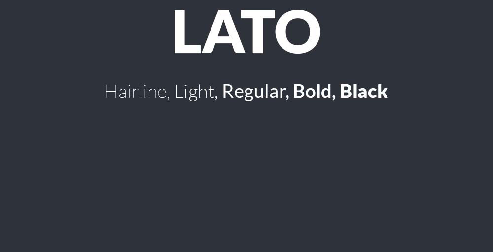
Lato’s clean lines and warm personality have made it a web design staple, but relying on a single typeface limits your creative options. Whether you’re…
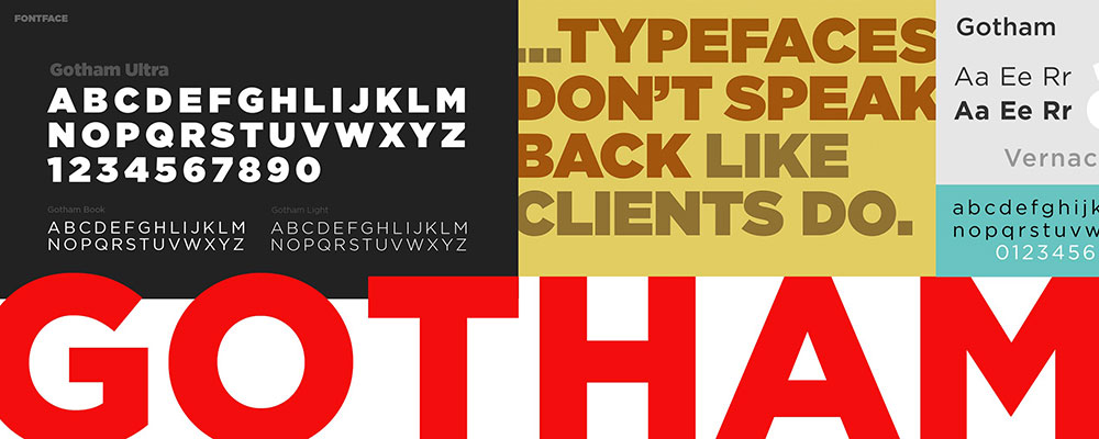
Gotham’s licensing costs push many designers toward alternatives that deliver similar geometric precision without the premium price tag. Whether you need a free option for…
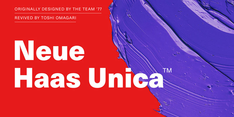
Helvetica costs money, and sometimes you need something different anyway. Whether you’re designing a website, building a brand identity, or just tired of seeing the…
Eurostile’s squared letterforms and retro-futuristic aesthetic have dominated tech branding and gaming interfaces since 1962. But licensing costs, overuse, and limited weight options send designers…
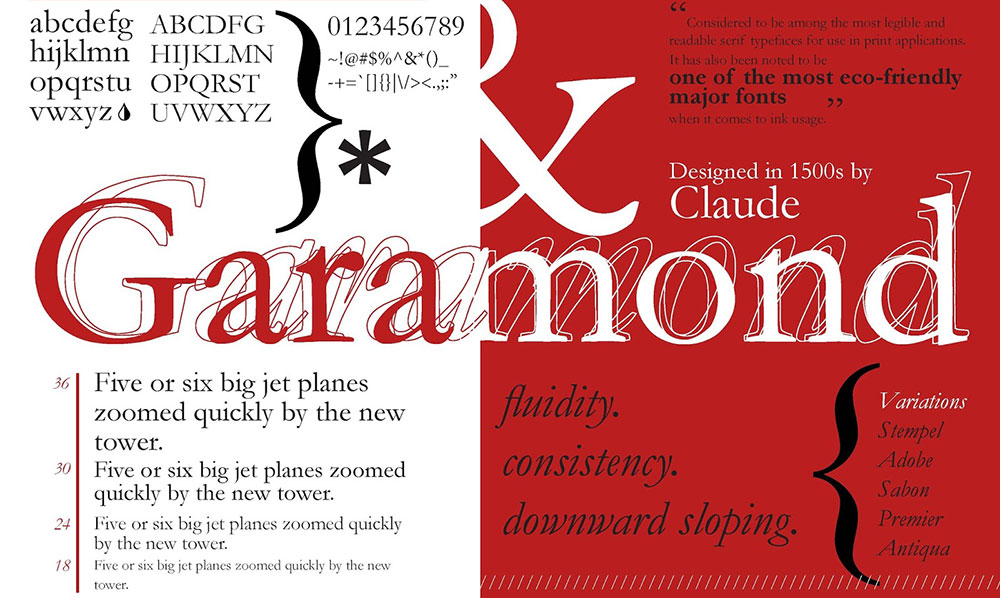
Garamond’s timeless elegance has dominated book design and editorial layouts for centuries, but relying on a single typeface limits creative possibilities. Modern designers need versatile…
Comic Sans gets a bad rap, but sometimes you need that casual, approachable vibe without the stigma. Whether you’re designing educational materials, creating child-friendly content,…