That ornate, medieval lettering on diplomas and wedding invitations catches your eye every time. But tracking down the right blackletter typeface when you need it? That’s where things get tricky.
Old English Text MT dominates formal documents, yet dozens of equally striking alternatives exist. Some offer better readability. Others bring authentic historical character or modern refinements that Old English lacks.
This guide examines fonts similar to Old English across multiple categories, from authentic medieval revivals like Cloister Black and Fette Fraktur to contemporary interpretations designed for digital applications.
You’ll discover which blackletter fonts work best for certificates, which excel in branding, and how to pair these dramatic typefaces with modern design elements. Whether you’re creating wedding invitations, designing a logo, or setting historical documents, you’ll find practical alternatives that match Old English’s Gothic gravitas without its limitations.
Fonts Similar To Old English
| Font Name | Primary Characteristics | Best Use Case | Availability |
|---|---|---|---|
| Cloister Black | Traditional blackletter with dense strokes, moderate readability | Formal certificates, historical documents | Commercial |
| Fette Fraktur | Bold German blackletter with angular terminals, high contrast | Headlines, posters, beer labels | Widely available |
| Wilhelm Klingspor Gotisch | Refined Gothic with calligraphic details, elegant proportions | Book covers, wedding invitations | Commercial |
| Wedding Text | Ornamental blackletter with decorative capitals, romantic style | Wedding stationery, formal invitations | Commercial |
| Linotext | Sharp blackletter with clean lines, moderate weight | Display text, title designs | Limited availability |
| Schwabacher | Rounded German blackletter, more legible than Fraktur | Historical texts, medieval themes | Free alternatives exist |
| Textura | Extremely dense Gothic with vertical emphasis, low readability | Decorative headers, medieval reproductions | Multiple versions |
| Canterbury | Traditional English blackletter with moderate ornaments | Church bulletins, classic literature | Commercial |
| Goudy Text | Refined blackletter by Frederic Goudy, balanced proportions | Religious texts, diplomas | Widely available |
| Lucida Blackletter | Modern interpretation with improved legibility, uniform strokes | Digital displays, contemporary designs | Commercial (Bigelow & Holmes) |
| Kingthings Petrock | Quirky Gothic with irregular features, playful character | Fantasy themes, creative projects | Free (Kevin King) |
| UnifrakturMaguntia | Digital Fraktur revival with complete Unicode support | German texts, multilingual projects | Free (Open Font License) |
| Enchant | Mystical blackletter with ornate decorations, fantasy aesthetic | Gaming, fantasy literature | Limited availability |
| BeneScriptine | Calligraphic blackletter with flowing strokes, handwritten feel | Religious manuscripts, historical documents | Free |
| Harbour | Contemporary blackletter with simplified forms, better readability | Modern branding, logo design | Commercial |
| Bogus Jack | Rough blackletter with distressed texture, grunge aesthetic | Rock posters, edgy designs | Limited availability |
| Eskapade | Elegant Fraktur with refined details, professional appearance | Premium branding, luxury packaging | Commercial |
| Cambridge | Academic blackletter with traditional proportions | University materials, scholarly publications | Limited availability |
| Berman Bold | Heavy blackletter with strong presence, high impact | Headlines, attention-grabbing text | Limited availability |
| Karson | Stylized Gothic with modern touches, balanced design | Contemporary applications, branding | Limited availability |
| Inumocca | Ornamental blackletter with exotic flair, distinctive style | Artistic projects, unique branding | Limited availability |
| Portico Diablo | Gothic font with dramatic angles, dark aesthetic | Horror themes, Halloween materials | Limited availability |
| The White Knight | Chivalric blackletter with noble character, medieval feel | Fantasy games, medieval events | Limited availability |
| Kingston Williams | Classic English blackletter with formal structure | Traditional documents, certificates | Limited availability |
| Hellios Gothic | Bold Gothic with aggressive styling, strong presence | Metal bands, edgy branding | Limited availability |
| Ambrosia | Decorative blackletter with flowing elements, romantic style | Feminine designs, elegant stationery | Limited availability |
| Angel Wish | Whimsical blackletter with soft curves, ethereal quality | Fantasy art, magical themes | Limited availability |
| Wilson Wells | Refined blackletter with professional finish, moderate ornaments | Business cards, formal correspondence | Limited availability |
| Hewina | Traditional German blackletter with authentic character | Historical reproductions, cultural projects | Limited availability |
Cloister Black

Cloister Black adapts 1870s Priory Text (itself from Caslon Text) into a modernized blackletter released by American Type Founders in 1904.
Key Characteristics
Dense vertical strokes create a woven texture across the page. Ornate capitals feature elaborate decorative flourishes and swirls.
Angular letterforms maintain sharp, pointed edges throughout.
Two alternate forms exist for V and W.
Missing spurs on b, h, k distinguish it from other blackletter variations.
Historical Context
Joseph W. Phinney and Morris Fuller Benton designed this typeface in the early 1900s. Digitized versions came from Bitstream, Tilde, and CastleType.
Monotype’s Old English variation differs in specific glyph details.
Best Use Cases
Certificates and diplomas benefit from its formal authority.
Works well for newspaper mastheads requiring traditional gravitas.
Religious documents and church materials leverage its ecclesiastical associations.
Formal invitations and announcements where historical weight matters.
Similarity to Old English
Both typefaces stem from Caslon’s 19th-century blackletter tradition. The textura structure mirrors Old English’s dense, vertical patterning.
Ornamental capitals share similar decorative vocabulary.
Heavy stroke weight and Gothic influences appear in both designs.
Pairing Recommendations
Combine with Goudy Text for hierarchical contrast.
Use modern sans-serif fonts for body text after decorative headers.
Serif fonts like Garamond work for supporting text blocks.
Readability Considerations
Optimal at 12pt or larger for display purposes only.
Not suitable for extended reading or body text applications.
Individual character recognition suffers at small sizes due to dense patterning.
Fette Fraktur

Johann Christian Bauer designed this heavy fraktur around 1850 specifically for advertising headlines rather than traditional text setting.
Key Characteristics
Bold weight defines every stroke and counter space. Lowercase letters blend gothic structure with rounded forms.
Capitals display characteristic broken letter ornamentation.
Forked ascenders appear on most lowercase letters.
Mix of rounded and angular elements creates visual tension.
Historical Context
The Bauer brothers (Alexander and Conrad) refined the design in the 1870s at their Frankfurt punchcuttery.
Multiple German foundries sold matrices, spreading it widely across Europe.
Nazis used it extensively until 1941 when they discontinued blackletter faces.
Popular today for conveying traditional German or Bavarian atmosphere.
Best Use Cases
Beer advertising and brewery branding across German-speaking markets.
Restaurant signage emphasizing hearty, traditional cuisine.
Event posters requiring rustic or old-fashioned aesthetic.
Package design for products claiming heritage authenticity.
Similarity to Old English
Both feature heavy blackletter structure with decorative capitals.
Fraktur’s broken forms echo Old English’s angular aesthetic.
Similar formal weight makes both suitable for ceremonial purposes.
Gothic influences pervade both typeface designs.
Pairing Recommendations
Pair with clean geometric sans-serif fonts for modern contrast.
Use slab serif fonts for approachable hierarchy.
Avoid combining with other ornate or script typefaces.
Readability Considerations
Limited legibility outside German-speaking regions where fraktur familiarity exists.
Best reserved for headlines above 18pt.
Lowercase offers better readability than elaborate capitals.
Not appropriate for extended reading passages.
Wilhelm Klingspor Gotisch

Rudolf Koch designed this textura between 1919 and 1925 for the Klingspor Foundry, initially calling it Missal Schrift.
Key Characteristics
Sharp, spiky forms define the overall character.
Delicate hairline endings terminate each stroke in capitals and lowercase.
Thin parallel or bridging lines add decorative elements to capitals.
Two capital sets exist: normal and condensed forms.
Tension in transitional curves creates elegant sophistication.
Historical Context
Originally conceived as Missal Schrift, later renamed after founder Wilhelm Klingspor who died shortly after release.
The only blackletter design included in FontShop’s 100 Best Typefaces.
Koch included 35 ligatures and multiple alternates in the original metal design.
Digital versions from Alter Littera provide the most faithful revival.
Best Use Cases
Wine labels seeking refined traditional European aesthetic.
Premium product packaging requiring elegant historical references.
Art exhibition materials and cultural event promotion.
Book titles and chapter headers for literary works.
Similarity to Old English
Both belong to textura classification with vertical emphasis.
Angular construction and Gothic architecture influences align.
Formal application contexts overlap significantly.
Decorative capitals share similar elaborate approach.
Pairing Recommendations
Works exceptionally well with Renaissance-era serif fonts.
Combine with humanist sans-serifs for contemporary applications.
Pair with Goudy Text for varied blackletter hierarchy.
Readability Considerations
Requires 12pt minimum for acceptable legibility.
Not suitable for body text due to ornamental complexity.
Best used for headlines and short text passages.
Modern eyes unfamiliar with textura may struggle initially.
Wedding Text
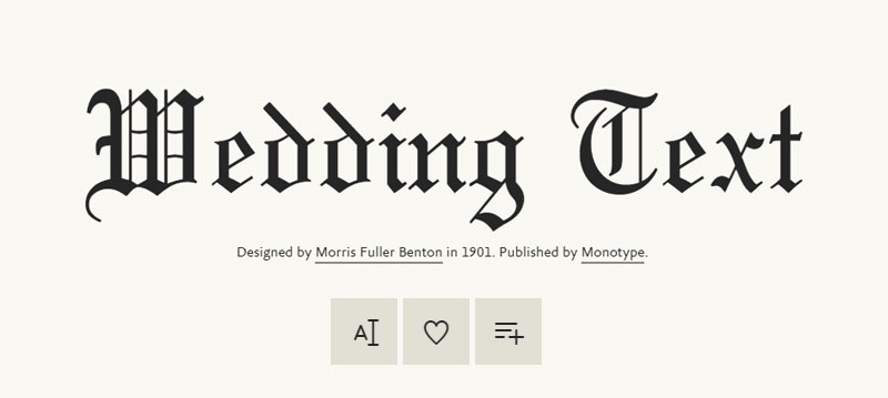
Designed specifically for formal invitations and ceremonial documents, this blackletter emphasizes decorative elegance over utilitarian readability.
Key Characteristics
Extremely ornate capitals dominate the design vocabulary.
Lowercase maintains gothic structure with restrained flourishes.
Wide letter spacing accommodates decorative elements.
Vertical stress mirrors traditional textura patterning.
Historical Context
Developed during the Victorian era’s peak fascination with medieval revival.
American type foundries promoted it for social stationery.
Popular throughout the 20th century for wedding-related printing.
Best Use Cases
Wedding invitations remain the primary application.
Anniversary announcements and formal event cards.
Certificate borders and decorative headers.
Boutique branding requiring romantic, traditional associations.
Similarity to Old English
Both typefaces target ceremonial and formal documentation.
Decorative capital construction follows similar principles.
Gothic medieval references appear throughout both designs.
Heavy vertical emphasis creates comparable texture.
Pairing Recommendations
Combine with script fonts for complementary formality.
Use elegant serif body text like Garamond or Baskerville.
Avoid modern geometric sans-serifs that clash stylistically.
Readability Considerations
Capitals work best at large display sizes (18pt+).
Use sparingly for maximum decorative impact.
Not intended for extended text passages.
Linotext
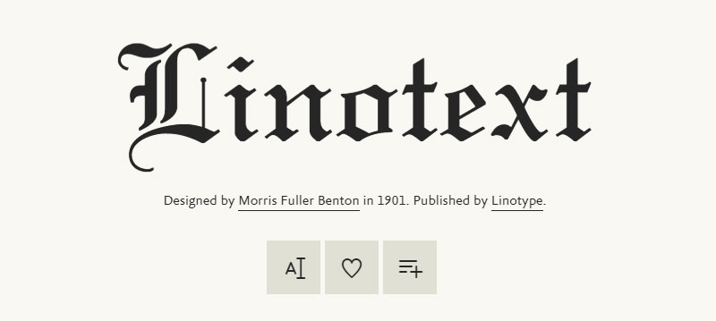
Morris Fuller Benton designed this blackletter for Monotype specifically for certificates and formal documentation.
Key Characteristics
Traditional blackletter structure with sharp angular lines.
Ornate decorative flourishes appear on key characters.
Formal elegance balanced with reasonable legibility.
Dense vertical patterning creates classic Gothic texture.
Historical Context
Developed in the early 20th century during American Type Founders’ blackletter expansion.
Designed specifically for Linotype composition systems.
Popular choice for academic and professional certificates throughout mid-century.
Best Use Cases
Academic diplomas and university certificates.
Professional certifications and achievement awards.
Formal documents requiring traditional authority.
Historical publication headers and title pages.
Similarity to Old English
Both prioritize formal documentation applications.
Traditional blackletter structure appears in both designs.
Gothic influences and vertical emphasis align.
Ceremonial weight and presence match closely.
Pairing Recommendations
Works with traditional serif fonts for body text.
Pair with other Monotype classic faces for cohesive documents.
Combine with simple sans-serifs for modern certificate designs.
Readability Considerations
Suitable at 14pt and above for primary text.
Better legibility than more ornate blackletter alternatives.
Still not appropriate for extended body copy.
Schwabacher

This blackletter style dominated German printing from the late 15th century until Fraktur’s emergence in the mid-16th century.
Key Characteristics
Pronounced round shapes create handwritten appearance.
Less angular than textura with more flowing letterforms.
Distinctive forms that combine gothic and cursive elements.
Open counters improve legibility compared to denser blackletters.
Historical Context
Derived from Textura script around 1480.
Most common German typeface before Fraktur’s introduction.
Used for text emphasis even after Fraktur gained dominance.
Featured prominently in the Nuremberg Chronicle (1493).
Best Use Cases
Historical reproductions of 15th-16th century German texts.
Medieval festival materials and event branding.
Fantasy game typography and worldbuilding elements.
Period-appropriate theatrical and cinematic design.
Similarity to Old English
Both represent distinct blackletter traditions from different regions.
Gothic medieval associations appear in both styles.
Formal ceremonial applications overlap.
Dense, decorative letterforms characterize both typefaces.
Pairing Recommendations
Combine with rotunda styles for varied blackletter hierarchy.
Use with simple book faces for historical documents.
Avoid pairing with other heavily decorative typefaces.
Readability Considerations
More readable than textura due to rounder forms.
Best used at 12pt or larger for primary text.
Moderate legibility allows for short text blocks.
Textura
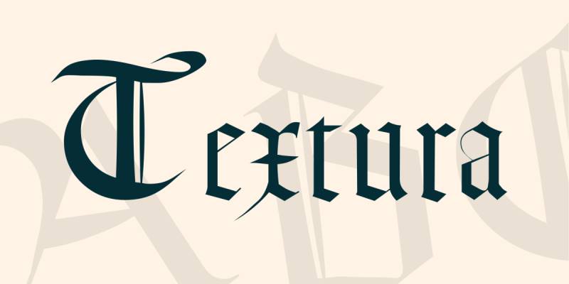
The most formal and calligraphic blackletter style, characterized by tall, narrow letters with sharp, angular forms.
Key Characteristics
Tall, angular letters with hexagonal “o” shapes.
Dense vertical strokes create fabric-like texture.
Minimal curves with sharp, broken angles throughout.
Diamond-shaped terminals on ascenders and descenders.
Historical Context
Developed in Western Europe during the 12th century.
Used in Johannes Gutenberg’s 42-line Bible (1450s).
Most common blackletter form in Germany, France, and Italy during medieval period.
Also called Gothic Bookhand or textualis.
Best Use Cases
Religious texts and ecclesiastical materials.
Historical manuscripts and period reproduction work.
Medieval-themed branding and event materials.
Formal certificates requiring maximum traditional weight.
Similarity to Old English
Old English derives directly from textura tradition.
Both share angular construction and vertical emphasis.
Dense, woven patterning appears in both styles.
Formal, ceremonial applications align perfectly.
Pairing Recommendations
Works with uncial letterforms for hierarchical contrast.
Pair with transitional serif text faces like Baskerville.
Use simple sans-serifs to provide visual breathing room.
Readability Considerations
Extremely poor legibility for modern readers.
Suitable only for display use at large sizes (18pt+).
Individual character recognition requires deliberate study.
Avoid for any functional text communication.
Canterbury

Released as part of the gothic revival movement, Canterbury provides moderately ornate blackletter suitable for display purposes.
Key Characteristics
Balanced between decoration and functionality.
Gothic letterforms with controlled ornamentation.
Vertical emphasis with moderate stroke contrast.
Readable capitals that avoid excessive flourishes.
Historical Context
Designed during the Victorian gothic revival period.
Named after Canterbury Cathedral, referencing English medieval tradition.
Popular for ecclesiastical printing and church materials.
Best Use Cases
Church bulletins and religious organization materials.
Historical society publications and heritage documentation.
British-themed design work emphasizing medieval connections.
Restaurant menus for establishments with English or Celtic themes.
Similarity to Old English
Both reference English medieval manuscript traditions.
Gothic cathedral associations appear in both names and aesthetics.
Formal weight suitable for ceremonial applications.
Traditional blackletter structure underlies both designs.
Pairing Recommendations
Combines well with Celtic-inspired decorative elements.
Use with Caslon or other British typography traditions.
Pair with simple book faces for readable contrast.
Readability Considerations
More readable than extremely ornate alternatives.
Suitable for short text blocks at 14pt+.
Capitals provide better legibility than lowercase in small sizes.
Goudy Text
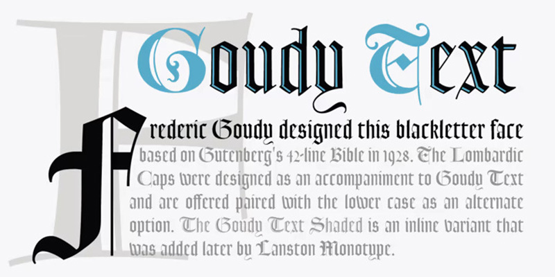
Frederic Goudy designed this textura-style blackletter in 1928 after studying Gutenberg’s 42-line Bible typography.
Key Characteristics
Medieval authenticity in lowercase construction.
Lombardic capitals feature spectacular ornamental design.
Strong vertical emphasis creates shaft-of-light effect.
Victorian eccentricities appear in standard capital set.
Dense patterning maintains proper blackletter texture.
Historical Context
Created in 1928 for Lanston Monotype by American designer Frederic Goudy.
Based on careful study of Gutenberg’s Bible printing.
Considered one of the most authentic American blackletter revivals.
Alternative capital sets provide Lombardic and standard options.
Best Use Cases
Christmas cards and holiday greeting materials.
Music-related collateral and concert programs.
Advertising requiring traditional, authoritative presence.
Wedding invitations and formal announcements.
Similarity to Old English
Both draw from medieval manuscript traditions.
Textura classification unites both typefaces.
Formal ceremonial applications overlap extensively.
Dense Gothic patterning appears in both designs.
Pairing Recommendations
Lombardic capitals pair beautifully with simple lowercase.
Combine with Renaissance-era text faces.
Use with modern sans-serifs for contemporary contrast.
Works well with other Goudy designs for cohesive layouts.
Readability Considerations
Minimum 14pt recommended for legibility.
Lowercase offers decent readability for blackletter.
Capitals work best as decorative initials rather than all-caps text.
Not appropriate for body copy or extended reading.
Lucida Blackletter
Designed by Charles Bigelow and Kris Holmes in 1992 as a modern interpretation of cursive blackletter styles from the 15th and 16th centuries.
Key Characteristics
Modern refinement of historical blackletter forms.
Cursive influences create flowing connections.
More contrasted strokes than standard Lucida Serif.
Technical precision maintains digital rendering quality.
Historical Context
Part of the extensive Lucida type family released in 1992.
Designed with digital rendering and screen legibility in mind.
Benefits from Lucida’s systematic design approach.
Less historically rigid than pure medieval revivals.
Best Use Cases
Restaurant menus seeking traditional atmosphere.
Signage requiring antique character with modern clarity.
Poster design balancing historical reference with functionality.
Digital applications where rendering quality matters.
Similarity to Old English
Both provide blackletter aesthetics for contemporary applications.
Gothic influences appear throughout both designs.
Formal weight suitable for ceremonial purposes.
Traditional manuscript connections unite both typefaces.
Pairing Recommendations
Combines naturally with other Lucida family members.
Works with humanist sans-serifs for modern layouts.
Pair with Lucida Serif for hierarchical systems.
Readability Considerations
Better legibility than most historical blackletter revivals.
Suitable at text sizes down to 10pt in some applications.
Still best reserved for display and headline use.
Tighten spacing at large display sizes.
Kingthings Petrock
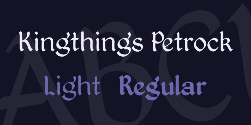
Kevin King designed this font based on labeling letterforms found in St. Petrock’s Church in Exeter, England.
Key Characteristics
Simple labeling hand adapted from church display case.
Medieval character with practical functionality.
Bold, angular edges with decorative details.
Light weight variant increases usability range.
Historical Context
Based on bell-ringing display lettering from Exeter church.
Created by independent designer Kevin King (Kingthings).
Free font widely adopted for fantasy and medieval-themed projects.
Light version developed to improve practical applications.
Best Use Cases
Fantasy game interfaces and worldbuilding materials.
Medieval-themed entertainment and event design.
Book covers for fantasy and historical fiction.
Vintage or heritage branding requiring authentic character.
Similarity to Old English
Both draw inspiration from English medieval sources.
Gothic structural elements appear throughout.
Suitable for overlapping ceremonial applications.
Historical authenticity drives both designs.
Pairing Recommendations
Works with other Kingthings medieval-themed fonts.
Pair with simple sans-serifs for game UI clarity.
Combine with complementary decorative borders and elements.
Readability Considerations
More functional than purely decorative alternatives.
Light weight improves legibility significantly.
Best at 12pt or larger for comfortable reading.
Short text applications work better than extended passages.
UnifrakturMaguntia
J. ‘mach’ Wust designed this font in 2010, drawing from Peter Wiegel’s Berthold Mainzer Fraktur, itself based on Carl Albert Fahrenwaldt’s 1901 typeface.
Key Characteristics
Large, sharp stroke contrast defines the design.
Slightly rounded uppercase letters soften the overall effect.
Traditional blackletter design with modern smart font technologies.
Extensive ligature support enables authentic typesetting.
Historical Context
Based on 1901 Carl Albert Fahrenwaldt design from Mainz.
Peter Wiegel’s Berthold Mainzer Fraktur served as intermediate source.
Released in 2010 with OpenType features for ligatures.
Available under SIL Open Font License for free use.
Best Use Cases
German language historical documents and reproductions.
Logo design requiring fraktur authenticity with historical connotations.
Display typography for traditional or heritage brands.
Cultural materials referencing German printing traditions.
Similarity to Old English
Both represent major blackletter traditions (fraktur vs. textura).
Gothic medieval associations unite both styles.
Formal ceremonial weight matches across typefaces.
Historical manuscript connections appear in both.
Pairing Recommendations
Combines with grotesque sans-serifs for German modernist contrast.
Use with traditional book faces for academic materials.
Works well with other fraktur variants for hierarchy.
Readability Considerations
Large stroke contrast affects character differentiation.
Best suited for display purposes at 14pt+.
Not recommended for body text or extended reading.
Rounded capitals improve legibility slightly over pure fraktur.
Enchant
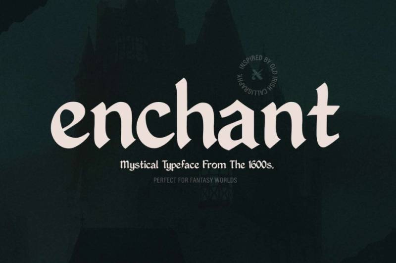
A decorative blackletter-inspired display font with mystical and magical design associations.
Key Characteristics
Heavily ornamented letterforms with fantasy influences.
Decorative flourishes and elaborate terminals.
Mix of gothic and whimsical elements.
Display-only construction prioritizes visual impact.
Historical Context
Modern design inspired by medieval manuscripts and fantasy aesthetics.
Created for contemporary decorative applications rather than historical accuracy.
Popular in fantasy and mystical design contexts.
Best Use Cases
Fantasy book covers and magical-themed design.
Game titles and entertainment branding.
Event materials for renaissance fairs and fantasy conventions.
Mystical or esoteric product packaging.
Similarity to Old English
Both feature elaborate decorative capitals.
Gothic medieval influences appear throughout.
Ceremonial weight suitable for special occasions.
Traditional manuscript associations link both typefaces.
Pairing Recommendations
Combine with simpler display faces for hierarchy.
Use with Celtic or fantasy-themed decorative elements.
Pair with readable text faces for functional content.
Readability Considerations
Extremely limited legibility due to heavy ornamentation.
Use only for large display applications (24pt+).
Best reserved for single words or very short phrases.
Not functional for any practical text communication.
BeneScriptine
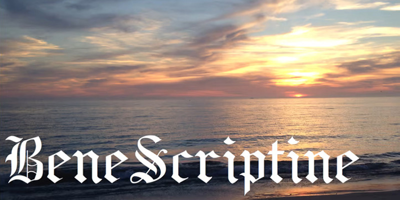
A decorative script with blackletter influences designed for ecclesiastical and formal applications.
Key Characteristics
Calligraphic construction with blackletter weight.
Flowing connections between letterforms.
Religious and monastic aesthetic associations.
Formal ceremonial character throughout.
Historical Context
Inspired by medieval monastic scriptoria and manuscript production.
References Benedictine manuscript traditions.
Modern design interpreting historical religious writing.
Best Use Cases
Religious ceremony materials and church documentation.
Monastic-themed design and Catholic organization materials.
Historical reproduction work for religious texts.
Formal invitations with spiritual or ecclesiastical themes.
Similarity to Old English
Both reference medieval religious manuscript traditions.
Gothic weight and formal presence align.
Ceremonial applications overlap significantly.
Traditional European ecclesiastical associations connect both.
Pairing Recommendations
Works with traditional religious typography.
Combine with simple book faces for readability.
Pair with liturgical design elements and borders.
Readability Considerations
Script nature limits legibility compared to pure blackletter.
Best used for decorative headers and special elements.
Minimum 14pt recommended for any functional use.
Harbour
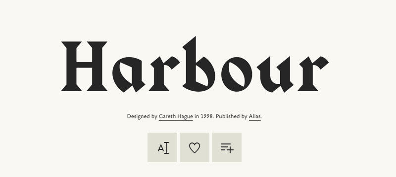
A nautical-themed blackletter with maritime associations and sturdy construction.
Key Characteristics
Robust letterforms suggesting maritime durability.
Blackletter structure adapted for nautical contexts.
Heavy weight conveys strength and tradition.
Moderate ornamentation balances functionality and character.
Historical Context
Modern design referencing port city and maritime traditions.
Evokes historical shipping and harbor signage.
Combines blackletter heritage with nautical themes.
Best Use Cases
Maritime businesses and harbor-related branding.
Seafood restaurants and nautical-themed establishments.
Coastal tourism materials and port city identity.
Brewing and distillery labels with maritime associations.
Similarity to Old English
Both feature heavy Gothic weight and presence.
Traditional associations with heritage and history.
Formal ceremonial applications work for both.
Blackletter structural foundations unite designs.
Pairing Recommendations
Combines with vintage nautical graphics and elements.
Use with slab serifs for maritime industrial feel.
Pair with rope, anchor, and maritime decorative elements.
Readability Considerations
Functional at medium display sizes (16pt+).
Better legibility than purely ornamental alternatives.
Still best reserved for headlines and short text.
Bogus Jack

An unconventional blackletter with irregular, hand-drawn character and rough edges.
Key Characteristics
Deliberately imperfect letterforms create organic feel.
Gothic structure with intentional irregularities.
Hand-drawn quality distinguishes from refined alternatives.
Vintage, distressed aesthetic throughout.
Historical Context
Modern design emphasizing authenticity through imperfection.
References hand-painted signs and vernacular lettering.
Popular in craft brewing and artisanal product branding.
Best Use Cases
Craft brewery branding and artisanal product labels.
Vintage-style posters and event materials.
Designs requiring authentic, handmade character.
Tattoo-inspired graphics and alternative culture materials.
Similarity to Old English
Both provide Gothic weight and medieval associations.
Traditional blackletter influences appear in both.
Formal ceremonial potential exists despite different aesthetics.
Heavy structural presence unites designs.
Pairing Recommendations
Works with other distressed and vintage elements.
Combine with hand-drawn illustrations and textures.
Use with simple sans-serifs for functional text.
Readability Considerations
Irregular construction limits legibility.
Best at large display sizes (20pt+) only.
Use sparingly for maximum impact.
Not suitable for extended text passages.
Eskapade
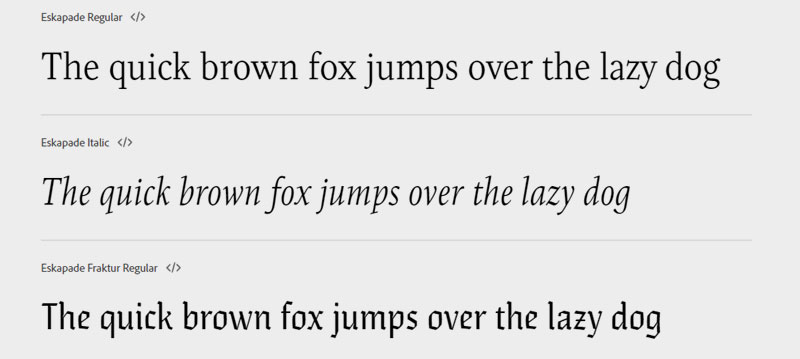
A refined blackletter with Scandinavian design influences and contemporary sensibility.
Key Characteristics
Clean, modernized blackletter construction.
Scandinavian design restraint tempers traditional ornamentation.
Multiple weights provide typographic flexibility.
Contemporary refinement of historical forms.
Historical Context
Modern design synthesizing blackletter heritage with Nordic minimalism.
Released in digital era with contemporary applications in mind.
Balances historical reference with modern functionality.
Best Use Cases
Contemporary branding seeking historical gravitas with modern clarity.
Editorial design requiring sophisticated blackletter references.
Packaging design balancing tradition and contemporary aesthetics.
Cultural institution identity and promotional materials.
Similarity to Old English
Both draw from blackletter manuscript traditions.
Gothic influences appear throughout letterforms.
Formal weight suitable for ceremonial contexts.
Traditional European heritage connects both designs.
Pairing Recommendations
Combines with modern sans-serifs for sophisticated contrast.
Works with minimalist design approaches.
Pair with contemporary serif faces for editorial use.
Readability Considerations
Better legibility than historical blackletter revivals.
Multiple weights enable hierarchical systems.
Functional at smaller sizes than traditional alternatives.
Still best reserved for display and headline applications.
Cambridge
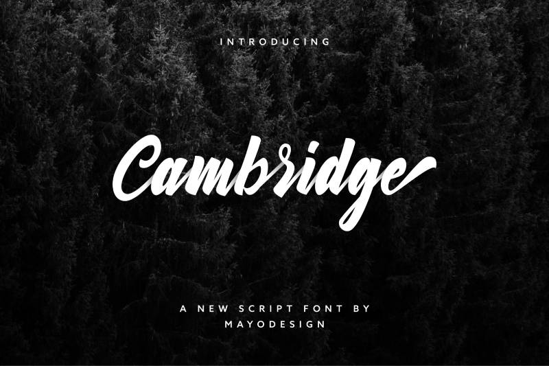
Named after the English university city, this blackletter references British academic and ecclesiastical traditions.
Key Characteristics
Scholarly associations through name and aesthetic.
Moderate ornamentation balances tradition and function.
English blackletter characteristics rather than German fraktur.
Academic formality pervades design decisions.
Historical Context
References Cambridge University’s long publishing history.
Evokes British educational and ecclesiastical institutions.
Modern interpretation of English manuscript traditions.
Best Use Cases
Academic materials and university publications.
British heritage tourism and cultural institution design.
Traditional publishing and scholarly communication.
Educational certificates and achievement recognition.
Similarity to Old English
Both reference English medieval manuscript traditions.
Academic and ecclesiastical associations align perfectly.
Traditional British heritage connects both typefaces.
Gothic structural foundations unite designs.
Pairing Recommendations
Works naturally with British typography traditions like Caslon.
Combine with traditional university design elements.
Pair with book faces for academic publishing.
Readability Considerations
Moderate legibility for blackletter category.
Suitable for short academic titles and headers.
Best at 14pt or larger for comfortable reading.
Berman Bold
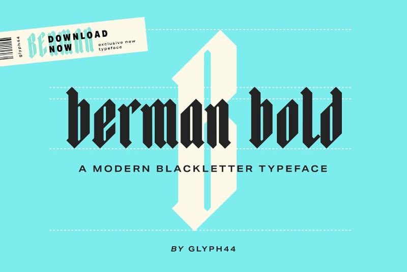
A heavily weighted blackletter with strong visual presence and commanding authority.
Key Characteristics
Extreme bold weight dominates every stroke.
Gothic structure amplified through heavy construction.
Maximum visual impact for display purposes.
Reduced counters from heavy stroke weight.
Historical Context
Modern display design prioritizing impact over historical accuracy.
Developed for advertising and headline applications.
References early 20th century display typography trends.
Best Use Cases
Concert posters and entertainment event promotion.
Bold branding requiring maximum attention.
Sports and competitive event materials.
Advertising headlines demanding visual dominance.
Similarity to Old English
Both feature heavy Gothic weight and presence.
Traditional blackletter structure underlies both designs.
Formal ceremonial potential exists in both.
Medieval manuscript influences appear throughout.
Pairing Recommendations
Requires simple, lightweight supporting typography.
Use with minimal sans-serifs to avoid visual competition.
Combine with open white space for breathing room.
Readability Considerations
Heavy weight significantly limits legibility.
Best used for single words or very short phrases.
Minimum 24pt recommended for any functional use.
Counters close at smaller sizes making characters indistinguishable.
Karson
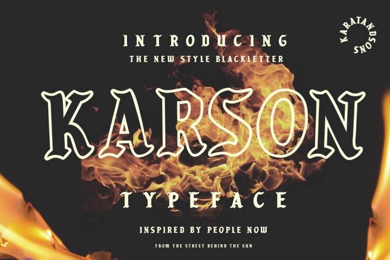
A contemporary blackletter with streamlined forms and modern proportions.
Key Characteristics
Simplified blackletter structure for contemporary applications.
Gothic influences tempered by modern design sensibility.
Cleaner letterforms improve functionality.
Balanced ornamentation level.
Historical Context
Modern design adapting blackletter for 21st-century contexts.
Developed with digital media and screen rendering in mind.
References tradition while prioritizing contemporary usability.
Best Use Cases
Modern branding requiring historical depth.
Digital applications needing blackletter character.
Contemporary packaging with heritage associations.
Design work balancing tradition and innovation.
Similarity to Old English
Both draw from Gothic blackletter traditions.
Medieval manuscript influences connect designs.
Formal weight suitable for ceremonial purposes.
Traditional European heritage unites typefaces.
Pairing Recommendations
Works with contemporary sans-serifs and geometric faces.
Combines effectively with modern design systems.
Pair with minimalist approaches for sophisticated contrast.
Readability Considerations
Improved legibility over historical alternatives.
Functional at moderate text sizes (12pt+).
Still best reserved for display applications.
Cleaner forms enable better character recognition.
Inumocca
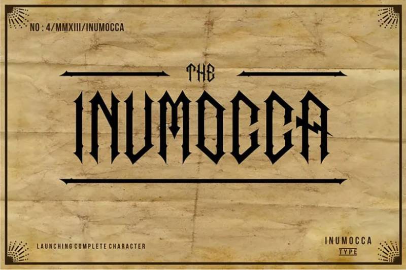
A decorative blackletter with organic, flowing characteristics and elaborate ornamentation.
Key Characteristics
Flowing, organic letterforms with natural movement.
Heavy ornamentation throughout character set.
Gothic structure with Art Nouveau influences.
Display-focused design prioritizing visual interest.
Historical Context
Modern design synthesizing blackletter with Art Nouveau aesthetics.
Created for contemporary decorative applications.
References turn-of-century ornamental typography.
Best Use Cases
Luxury product packaging and premium branding.
Decorative materials requiring elaborate character.
Art Nouveau-themed design work.
Special occasion materials and celebration items.
Similarity to Old English
Both feature elaborate decorative capitals.
Gothic medieval weight appears in both.
Traditional ceremonial applications overlap.
Manuscript-inspired ornamentation connects designs.
Pairing Recommendations
Combines with Art Nouveau decorative elements.
Use with elegant script faces for complementary ornamentation.
Pair with simple text faces for readable contrast.
Readability Considerations
Heavy ornamentation severely limits legibility.
Use only for large display purposes (24pt+).
Best reserved for decorative initials and special elements.
Not functional for any practical text communication.
Portico Diablo
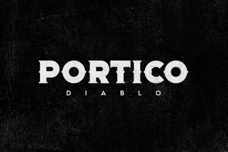
An aggressive blackletter with sharp, angular features and dark, dramatic presence.
Key Characteristics
Extremely angular construction with sharp terminals.
Dramatic stroke contrast creates intense visual character.
Gothic structure pushed toward aggressive expression.
Heavy, dark weight throughout.
Historical Context
Modern design emphasizing blackletter’s dramatic potential.
Created for contemporary alternative culture applications.
References metal music and underground aesthetics.
Best Use Cases
Metal band logos and music industry branding.
Alternative culture materials and underground events.
Horror-themed design and dark aesthetic applications.
Aggressive branding requiring visual intensity.
Similarity to Old English
Both feature sharp Gothic angularity.
Heavy blackletter weight appears in both designs.
Medieval manuscript influences connect typefaces.
Traditional formal structure underlies both.
Pairing Recommendations
Works with distressed textures and dark imagery.
Combine with bold sans-serifs for supporting text.
Use with minimal additional ornamentation to avoid visual chaos.
Readability Considerations
Aggressive styling limits practical legibility.
Best used for logos and very short display text.
Minimum 20pt recommended for any recognition.
Sharp angles and extreme contrast challenge readability.
The White Knight
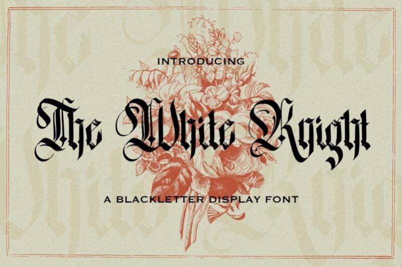
An elegant blackletter with refined ornamentation and aristocratic bearing.
Key Characteristics
Refined elegance throughout character construction.
Aristocratic bearing in decorative elements.
Gothic structure with sophisticated execution.
Balanced contrast between weight and delicacy.
Historical Context
Modern design referencing chivalric and aristocratic traditions.
Created for elegant, formal contemporary applications.
Synthesizes medieval manuscript heritage with refined execution.
Best Use Cases
Luxury wedding invitations and high-end social stationery.
Premium brand identity for traditional luxury goods.
Formal event materials requiring sophisticated elegance.
Fine dining restaurant menus and upscale hospitality.
Similarity to Old English
Both target formal, ceremonial applications.
Gothic medieval heritage connects designs.
Elaborate decorative capitals appear in both.
Traditional manuscript influences unite typefaces.
Pairing Recommendations
Combines with elegant script faces for formal hierarchy.
Works with refined serif text faces.
Pair with gold foil and premium finishing techniques.
Readability Considerations
Refined execution improves legibility over heavier alternatives.
Best at 14pt or larger for comfortable recognition.
Still display-focused rather than text-appropriate.
Elegant proportions aid character differentiation.
Kingston Williams
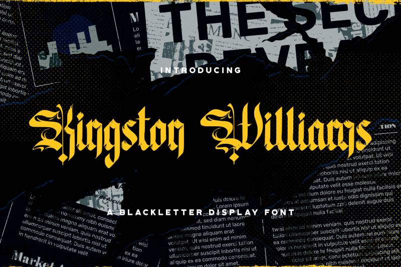
A contemporary blackletter with American Colonial influences and historical references.
Key Characteristics
Colonial American design sensibility.
Gothic structure adapted for American context.
Moderate ornamentation level.
Traditional weight with contemporary refinement.
Historical Context
References American Colonial printing and signage traditions.
Synthesizes European blackletter with American aesthetics.
Modern design evoking historical American craftsmanship.
Best Use Cases
American heritage branding and historical site materials.
Colonial-themed restaurants and hospitality venues.
Historical society publications and heritage tourism.
Traditional American product branding.
Similarity to Old English
Both reference English-language blackletter traditions.
Gothic manuscript influences connect designs.
Formal ceremonial weight appears in both.
Traditional European heritage adapted for specific contexts.
Pairing Recommendations
Works with other Colonial-era design elements.
Combines with American traditional serif faces.
Pair with historical American decorative motifs.
Readability Considerations
Moderate legibility for blackletter category.
Functional at 14pt or larger.
Better suited for display than extended text.
Hellios Gothic
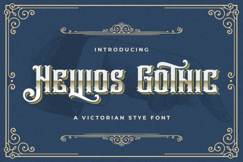
A dramatic blackletter with intense visual presence and bold character.
Key Characteristics
Intense visual presence throughout design.
Bold Gothic structure with strong vertical emphasis.
Dramatic ornamentation and elaborate details.
Heavy weight creates commanding appearance.
Historical Context
Modern design maximizing blackletter’s dramatic potential.
Created for contemporary entertainment and branding applications.
References theatrical and cinematic title design traditions.
Best Use Cases
Movie titles and entertainment branding.
Theatrical production materials and performing arts.
Bold logo design requiring dramatic presence.
Event promotion with high visual impact needs.
Similarity to Old English
Both feature heavy Gothic weight and dramatic presence.
Traditional blackletter structure underlies designs.
Elaborate decorative capitals connect typefaces.
Medieval manuscript influences appear throughout.
Pairing Recommendations
Requires simple supporting typography to avoid competition.
Works with bold sans-serifs for hierarchy.
Combine with dramatic imagery and high contrast layouts.
Readability Considerations
Dramatic styling limits practical legibility.
Best at large display sizes (20pt+).
Use for headlines and title applications only.
Heavy ornamentation challenges character recognition.
Ambrosia
An elegant, flowing blackletter with graceful curves and sophisticated ornamentation.
Key Characteristics
Graceful, flowing letterforms throughout.
Sophisticated ornamentation with refined execution.
Gothic structure softened by elegant curves.
Feminine aesthetic compared to heavier alternatives.
Historical Context
Modern design emphasizing blackletter’s elegant potential.
Created for contemporary luxury and lifestyle applications.
References Art Nouveau and refined manuscript traditions.
Best Use Cases
Luxury beauty products and feminine branding.
High-end fashion and lifestyle design.
Elegant wedding materials and social stationery.
Premium hospitality and boutique hotel identity.
Similarity to Old English
Both feature elaborate decorative elements.
Gothic manuscript heritage connects designs.
Formal ceremonial applications overlap.
Traditional European influences appear throughout.
Pairing Recommendations
Combines beautifully with script faces.
Works with elegant serif text fonts.
Pair with sophisticated color palettes and refined imagery.
Readability Considerations
Flowing curves improve legibility slightly over angular alternatives.
Best at 14pt or larger for comfortable reading.
Display-focused design not suitable for body text.
Elegant proportions aid character recognition.
Angel Wish
A whimsical blackletter with fairytale associations and magical character.
Key Characteristics
Whimsical interpretation of Gothic forms.
Fairytale and magical aesthetic throughout.
Decorative elements suggest enchantment.
Lighter weight than traditional blackletter.
Historical Context
Modern design emphasizing fantasy and magical themes.
Created for contemporary entertainment and children’s markets.
References storybook illustration traditions.
Best Use Cases
Children’s book titles and fairytale-themed materials.
Fantasy event branding and magical entertainment.
Whimsical product packaging and toy branding.
Celebration materials for children’s parties.
Similarity to Old English
Both feature Gothic structural influences.
Medieval storybook associations connect designs.
Decorative capitals appear in both typefaces.
Traditional European fairytale heritage links both.
Pairing Recommendations
Works with other whimsical and decorative elements.
Combines with playful script faces.
Pair with fantasy illustrations and magical imagery.
Readability Considerations
Lighter weight improves legibility over heavier alternatives.
Best at 12pt or larger for recognition.
Whimsical styling still limits functional applications.
More approachable than aggressive blackletter alternatives.
Wilson Wells
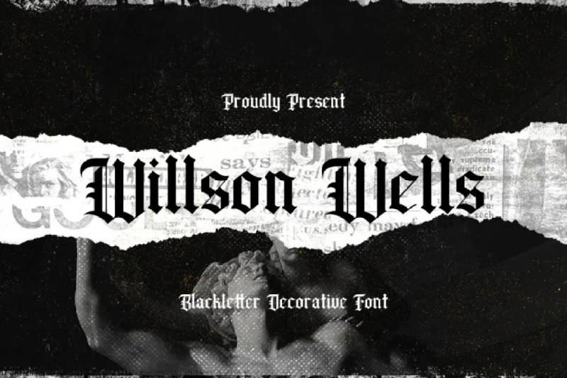
A sturdy blackletter with craftsman-like quality and handmade character.
Key Characteristics
Craftsman aesthetic throughout construction.
Handmade quality in letterform execution.
Gothic structure with artisanal character.
Moderate weight balances presence and functionality.
Historical Context
Modern design emphasizing handcrafted traditions.
References Arts and Crafts movement and artisanal making.
Created for contemporary craft-focused branding.
Best Use Cases
Craft brewery and artisanal product branding.
Handmade goods packaging and maker culture materials.
Traditional craftsmanship business identity.
Heritage brand development and positioning.
Similarity to Old English
Both reference traditional craftsmanship.
Gothic manuscript heritage connects designs.
Formal weight suitable for ceremonial purposes.
European artisanal traditions unite typefaces.
Pairing Recommendations
Works with other craft-focused design elements.
Combines with vintage and heritage aesthetics.
Pair with handmade textures and artisanal imagery.
Readability Considerations
Moderate legibility for blackletter category.
Functional at 14pt or larger.
Better suited for display than extended reading.
Artisanal character aids in approachability.
Hewina
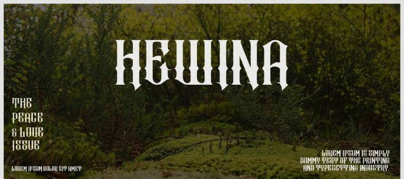
A contemporary blackletter with clean lines and modernist simplification.
Key Characteristics
Simplified blackletter structure for modern applications.
Clean lines and reduced ornamentation.
Gothic influences expressed through minimalist lens.
Contemporary proportions and spacing.
Historical Context
Modern design adapting blackletter for 21st-century contexts.
References modernist design principles and minimalism.
Created for contemporary digital and print applications.
Best Use Cases
Modern editorial design requiring historical depth.
Contemporary branding with heritage associations.
Digital applications needing blackletter reference.
Minimalist design systems incorporating traditional elements.
Similarity to Old English
Both draw from Gothic blackletter traditions.
Medieval manuscript influences connect designs.
Formal structural weight appears in both.
Traditional European heritage unites typefaces.
Pairing Recommendations
Works naturally with modernist sans-serifs.
Combines with minimalist design approaches.
Pair with contemporary geometric faces for contrast.
Readability Considerations
Simplified forms significantly improve legibility.
Functional at text sizes (10pt+) in some contexts.
Best clarity among contemporary blackletter alternatives.
Reduced ornamentation enables better character recognition.
FAQ on Fonts Similar To Old English
What is the closest free alternative to Old English Text MT?
Cloister Black offers the most similar structure and weight. Both stem from 19th-century blackletter revivals with dense vertical patterning and ornate capitals. Available from multiple foundries, Cloister Black maintains Old English’s ceremonial presence without licensing costs.
Can blackletter fonts be used for body text?
No. Textura and fraktur styles severely limit legibility for extended reading. Their dense, angular construction makes character recognition difficult. Reserve blackletter typefaces for headlines, certificates, logos, and decorative applications at 14pt or larger for optimal functionality.
What’s the difference between Fraktur and Old English fonts?
Fraktur features rounded lowercase forms with broken capitals, originating in 16th-century Germany. Old English derives from textura with sharper angularity throughout. Both belong to the blackletter family but represent distinct regional and historical traditions with different character construction.
Which blackletter font is most readable?
Goudy Text provides superior legibility among traditional blackletter designs. Frederic Goudy studied Gutenberg’s Bible to create authentic medieval character with improved spacing. Modern alternatives like Lucida Blackletter offer even better readability through refined stroke contrast and digital optimization.
Are Old English fonts appropriate for modern branding?
Yes, when used strategically. Craft breweries, heritage brands, and cultural institutions successfully employ blackletter typography. Pair with clean sans-serif fonts for contrast. Use for logos and headers only, never body text, maintaining readability while conveying tradition and authenticity.
What fonts pair well with blackletter typefaces?
Simple serif fonts like Garamond or Baskerville provide elegant contrast. Modern geometric sans-serifs create contemporary tension. Avoid pairing multiple ornate typefaces together. White space becomes crucial when incorporating heavy blackletter designs to prevent visual overwhelm and maintain hierarchy.
Why do newspapers still use blackletter mastheads?
Blackletter conveys authority, tradition, and historical continuity. The New York Times and similar publications maintain Gothic typography to signal journalistic heritage and institutional gravitas. The formal weight communicates seriousness and established credibility that lighter typefaces cannot achieve.
Can I use blackletter fonts for wedding invitations?
Absolutely. Wedding Text, Goudy Text, and Wilhelm Klingspor Gotisch excel for formal invitations. Their ornamental capitals and ceremonial weight suit romantic occasions perfectly. Pair with elegant script fonts for complementary hierarchy. Ensure 14pt minimum size for comfortable reading.
What’s the historical significance of blackletter typography?
Blackletter typeface emerged in 12th-century Western Europe from Carolingian manuscript traditions. Johannes Gutenberg used textura for his revolutionary Bible. These fonts dominated German printing until 1941, representing centuries of European cultural and religious documentation before modern alternatives gained prominence.
How do I choose between different blackletter styles?
Consider regional context and application. Fraktur suits German themes; textura works for religious materials; schwabacher fits medieval contexts. Evaluate readability needs, decorative level desired, and historical authenticity required. Test multiple alternatives at intended size before final selection for optimal results.
Conclusion
Exploring fonts similar to Old English reveals a rich landscape of blackletter typography beyond the familiar default. From Cloister Black’s Victorian authenticity to Wilhelm Klingspor Gotisch’s refined elegance, each alternative brings distinct character to your design work.
The key lies in matching typeface characteristics to your specific application. Fette Fraktur dominates advertising. Goudy Text excels for certificates. Modern interpretations like Lucida Blackletter solve digital rendering challenges that historical revivals can’t address.
Remember that Gothic script demands restraint. Use these dramatic typefaces at 14pt minimum, pair them with simple supporting fonts, and reserve them for headlines and decorative elements.
Whether designing wedding invitations, craft brewery logos, or medieval-themed materials, you now have practical alternatives that deliver Old English’s ceremonial weight without its limitations.
If you enjoyed reading this article on fonts similar to Old English, you should check out these articles with fonts similar to Proxima Nova, Avenir, Lato, Papyrus, Comic Sans, Century Gothic, Minion Pro, Gill Sans, and Eurostile.
Renowned for his expertise in logo design and visual branding, Bogdan has developed a multitude of logos for various clients.
His skills extend to creating posters, vector illustrations, business cards, and brochures. Additionally, Bogdan's UI kits were featured on marketplaces like Visual Hierarchy and UI8.
He also wrote in the past years on sites like Design Your Way, WebDesignerDepot, WPDean, Designmodo, Speckyboy, Slider Revolution, and more.
- The Airtable Logo History, Colors, Font, And Meaning - 12 July 2026
- How to Blur Background in Canva: A Quick Tutorial - 11 July 2026
- Typography Trends - 10 July 2026
Bogdan Sandu is a seasoned designer who has been designing websites since 2008. Renowned for his expertise in logo design and visual branding, Bogdan has developed a multitude of logos for various clients. His skills extend to creating posters, vector illustrations, business cards, and brochures. Additionally, Bogdan's UI kits were featured on marketplaces like Visual Hierarchy and UI8. He also wrote in the past years on sites like Design Your Way, WebDesignerDepot, WPDean, Designmodo, Speckyboy, Slider Revolution, and more.
You Might Also Like