
Sky Color Palettes for Fresh Designs: 40 Examples

As dawn crests the horizon, the sky’s canvas blooms into a symphony of colors, a daily masterpiece that whispers inspiration into the soul of every design. It’s nature’s very own color palette—vast, ever-changing, and breathtakingly beautiful.
In the world of web design, unlocking the secrets of these sky color palettes can be transformative, elevating a project from the mundane to the sublime.
Delve into the heart of the atmosphere’s ephemeral artistry, where twilight transitions and daylight tones guide the eye, and the subtle sunset hues stir emotion.
This article is a journey through the ethereal shades of the azure sky range, exploring how the spectral colors of the atmosphere can shape a visual narrative.
By the final lines, anticipate a newfound appreciation for the dynamic sky coloring and its application in digital creativity.
Learn to harness atmospheric colors in ways that resonate with viewers, establish an atmosphere, and communicate a message as clearly as the sky on a crisp morning.
Discover tools like the color wheel and color theory principles that bridge the gap between the natural world and pixel-perfect designs.
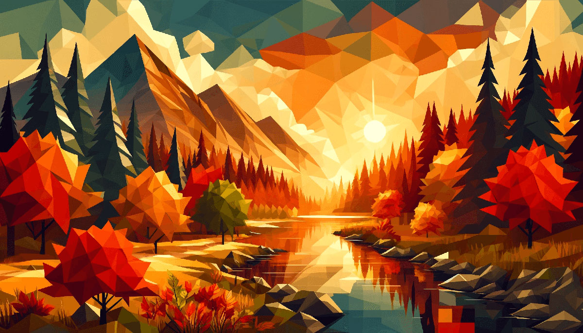
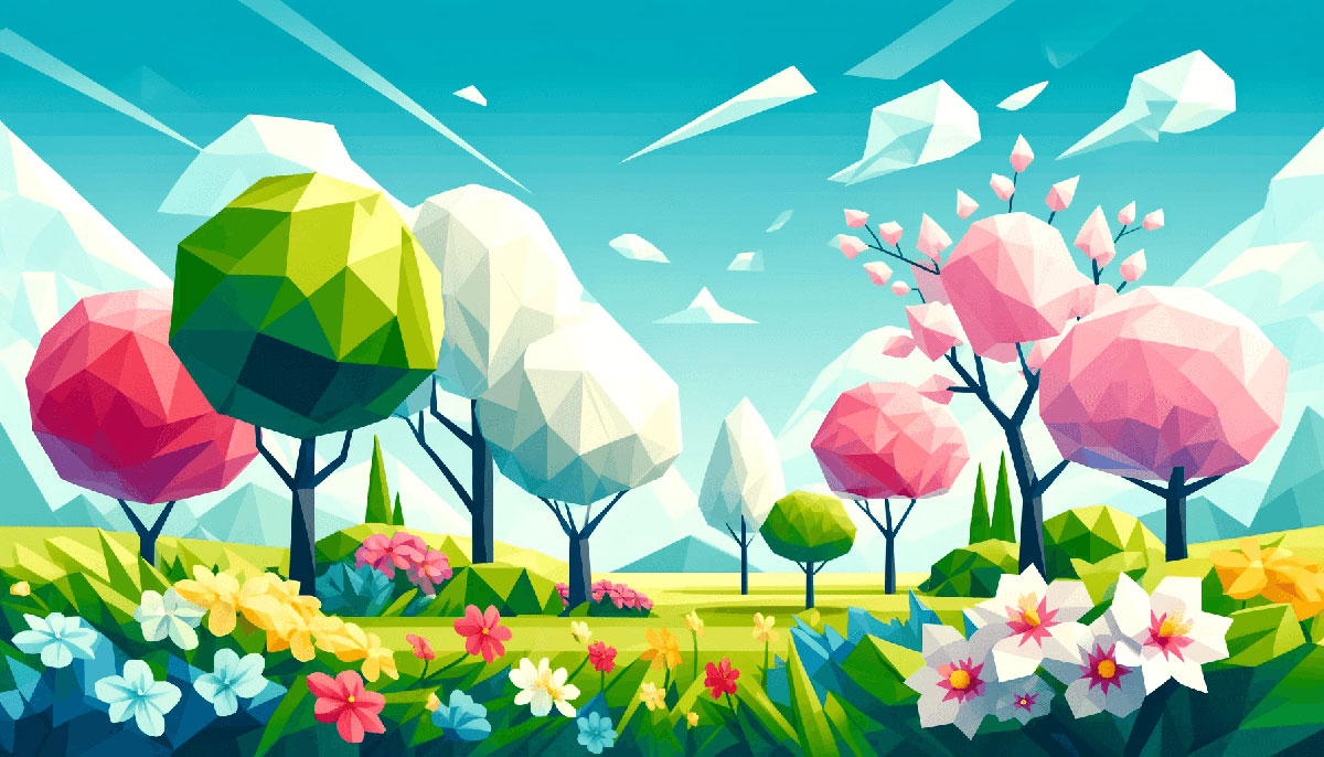
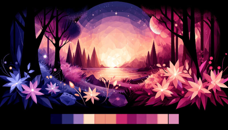
Examples of Sky Color Palettes
| #CDF5FD | #A0E9FF | #89CFF3 | #00A9FF |
| #176B87 | #86B6F6 | #B4D4FF | #EEF5FF |
| #F7EEDD | #ACE2E1 | #41C9E2 | #008DDA |
| #7AA2E3 | #6AD4DD | #97E7E1 | #F8F6E3 |
| #687EFF | #80B3FF | #98E4FF | #B6FFFA |
| #FFE5E5 | #E0AED0 | #AC87C5 | #756AB6 |
| #0D9276 | #BBE2EC | #FFF6E9 | #40A2E3 |
| #BEFFF7 | #A6F6FF | #9EDDFF | #6499E9 |
| #E5E1DA | #FBF9F1 | #AAD7D9 | #92C7CF |
| #7B66FF | #5FBDFF | #96EFFF | #C5FFF8 |
| #146C94 | #19A7CE | #AFD3E2 | #F6F1F1 |
| #FBEEAC | #F4D160 | #75C2F6 | #1D5D9B |
| #F2F7A1 | #35A29F | #088395 | #071952 |
| #F8FDCF | #E2F6CA | #9BE8D8 | #78C1F3 |
| #146C94 | #19A7CE | #B0DAFF | #FEFF86 |
| #4682A9 | #749BC2 | #91C8E4 | #F6F4EB |
| #FFEEBB | #A7ECEE | #99DBF5 | #9AC5F4 |
| #FFEAD2 | #DBDFEA | #ACB1D6 | #8294C4 |
| #DAF5FF | #B9E9FC | #B0DAFF | #FEFF86 |
| #E6FFFD | #AEE2FF | #ACBCFF | #B799FF |
| #205E61 | #3F979B | #8BF5FA | #F9F54B |
| #0D4C92 | #59C1BD | #A0E4CB | #CFF5E7 |
| #EAFDFC | #BFEAF5 | #91D8E4 | #82AAE3 |
| #F2F7A1 | #46C2CB | #6D67E4 | #453C67 |
| #FFF2F2 | #E5E0FF | #8EA7E9 | #7286D3 |
| #E3DFFD | #ECF2FF | #E5D1FA | #FFF4D2 |
| #FFEBAD | #FFF6BF | #7FE9DE | #A5F1E9 |
| #FEDEFF | #93C6E7 | #AEE2FF | #B9F3FC |
| #FFADBC | #D989B5 | #975C8D | #863A6F |
| #8EC3B0 | #9ED5C5 | #BCEAD5 | #DEF5E5 |
| #645CAA | #B1B2FF | #BFACE0 | #25316D |
| #FFC18E | #5DA7DB | #EEF1FF | #FFEBAD |
| #7A4069 | #5837D0 | #ABD9FF | #F8F9D7 |
| #C689C6 | #7DE5ED | #FAF7F0 | #FFF6BF |
| #A5F1E9 | #BCCEF8 | #C3F8FF | #D2DAFF |
| #C4D7E0 | #B2C8DF | #CDFCF6 | #EBC7E8 |
| #98A8F8 | #E1FFEE | #937DC2 | #81C6E8 |
| #FEF5AC | #AAC4FF | #FCC5C0 | #513252 |
| #97D2EC | #6E85B7 | #CA4E79 | #A084CA |
| #5F6F94 | #FFEEAF | #E8A0BF | #7FBCD2 |
FAQ on Sky Color Palettes
Why does the sky show different colors at sunrise and sunset?
The spectacle begins and ends with light. As the sun curves the horizon, its rays pass through more atmosphere, scattering short-wavelength hues and leaving behind the splendor of sunset hues.
Conversely, dawn greets us with softer, cooler colors due to the angle of the sun and less atmospheric scattering.
What determines the shades of blue we see in the sky?
Atmospheric optics come into play here. When sunlight enters our atmosphere, it collides with molecules causing Rayleigh scattering—a phenomenon favoring shorter blue wavelengths.
The result? A kaleidoscope ranging from light dawn blue to deep afternoon azure, with factors like humidity amplifying the effect.
How can I replicate sky colors in my digital designs?
Start by sampling RGB sky values from photographs. Employ tools like Photoshop’s eyedropper for precision. Then, translate these spectral colors of the atmosphere into your digital palette.
Consider atmospheric colors for gradients and overlays to convey a time of day or mood in your designs.
Are there any colors that are rarely seen in the sky?
Indeed, some colors play hard to get. Greens, for example, are fleeting guests in the sky’s vast mural.
Usually, they flash during certain weather-themed palettes like the aurora or in rare atmospheric phenomena, where the scattering of light through ice crystals or dust paints the improbable.
What emotion can sky color palettes evoke in viewers?
Each palette whispers its own story. Tranquil blue sky gradients can soothe, while the fierce dusk color patterns might invigorate.
The ephemeral twilight shades often evoke contemplation. Sensitive integration of these chromatic sky art elements can deeply resonate with the emotional fabric of an audience.
How do seasonal changes affect sky color palettes?
Seasons orchestrate a grand ballet of light and shadow. With the earth’s tilt, sun paths alter, inviting a wider range of sky-inspired hues.
Winter skies may wear a softer, desaturated coat, while summer skylines can parade more saturated blues, accentuating the season’s robust energy.
What are the challenges of printing sky colors accurately?
Recreating sky color palettes in print demands finesse, due to the transition from RGB to CMYK color models. Some atmospheric subtleties may be lost in this process.
Understanding ink and paper interactions can help, as well as consulting with a talented printer experienced in translating sky hues to paper.
Can sky color palettes impact the psychological appeal of a website?
Absolutely. A website draped in dawn color scheme can energize and welcome. Alternatively, a digital space that dons the night sky colors can induce a sense of mystery or sophistication.
The sky’s tapestry offers a psychological palette that, when wielded with intent, deeply affects visitor perception.
How can I stay true to natural sky colors in my artwork?
Begin with reverence for nature’s natural lighting shades. Observe, photograph, and study the sky at various times.
Crafting color harmony in skies requires patience, a keen eye, and practice to appreciate the subtle nuances. Being true to the source is as much about artistry as it is about accuracy.
What tools do designers use to select and apply sky color palettes?
Designers often use graphic design software like Adobe Illustrator and color match tools to translate the chroma and saturation seen in the sky into their work.
Additionally, color swatches and digital color wheels can guide in creating complementary and analogous sky-inspired designs that reflect our atmosphere’s dynamic range.
Conclusion
In the dance of light and shadow, the sky color palettes wield a power both sublime and evocative. Harnessing these ethereal tones in design transcends mere aesthetics; it’s about crafting experiences and stirring souls. The twilight shades and dawn color schemes beckon with whispers of creativity, urging a fusion of nature’s majesty into the digital realm.
- Reflecting on sunset hues or the quietude of a clear sky spectrum, it’s clear why these motifs resonate so deeply within us, within our work.
The sky, after all, is a shared canvas, its hues a language understood across horizons and cultures. As designers, tapping into this universal palette imbues our projects with the essence of life itself—a connection steeped in the beauty of daybreak, the tranquility of daytime blues, the drama of dusk.
Let this exploration of sky-inspired chromatics be a beacon. May the weather-themed palettes and night sky colors captured here inspire a journey of visible emotion and untethered imagination, for the sky truly is the limit.
Bogdan Sandu, a seasoned designer with 15 years of diverse experience, has been designing websites since 2008.
Renowned for his expertise in logo design and visual branding, Bogdan has developed a multitude of logos for various clients.
His skills extend to creating posters, vector illustrations, business cards, and brochures. Additionally, Bogdan's UI kits were featured on marketplaces like Visual Hierarchy and UI8.
Latest posts by Bogdan Sandu (see all)
- Purple Color Palettes Fit for Royalty - 16 May 2024
- How To Find A Font: Top Font Finders To Use - 16 May 2024
- The Guinness Logo History, Colors, Font, And Meaning - 15 May 2024