The Miller Lite logo is one of the most recognized marks in American beer. It first appeared in 1973 when Miller Brewing Company launched its light beer nationally, and it has gone through at least eight distinct versions since then. The current design, reintroduced in 2014, is actually a revised take on the original 1974 crest. It features navy blue, gold, red, and white elements with hops, barley, and the word “Lite” in a blackletter-style typeface.
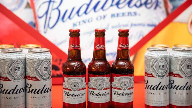
Within the beer industry, this logo sits alongside marks from Budweiser, Coors Light, and Heineken as part of a broader visual language that defines how Americans think about beer. The Miller Lite mark helped create the light beer category itself, which now accounts for a huge share of U.S. beer sales.
The brand is owned by Molson Coors Beverage Company. Frederick Miller founded the original brewery in Milwaukee, Wisconsin back in 1855. The Lite version appeared over a century later, and the logo has gone through roughly eight major redesigns between 1973 and today.
What Is the Miller Lite Logo?

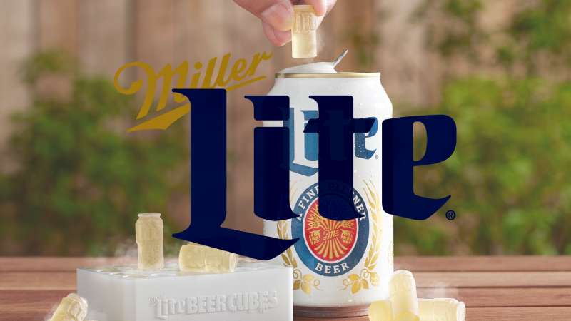
The Miller Lite logo is a combination mark featuring the word “Lite” in a large blackletter-inspired font, a red oval shield with “A Fine Pilsner Beer” text, and illustrations of hops and barley bound together. It was first introduced in 1973, with the current version being a 2014 revision of that original. The navy blue and gold color palette signals tradition and quality.
Here are the key attributes of the Miller Lite logo:
- Design Type: Combination mark (wordmark plus crest elements)
- Primary Elements: “Lite” wordmark in blackletter typography, hops and barley illustrations, red oval badge, Miller “M” monogram
- Official Introduction Date: 1973 (original), 2014 (current revision)
- Designer/Agency: Miller Brewing Company in-house team (the Draft Beer typeface used as a reference was created by Michael Hagemann for FontMesa)
- Trademark Status: Registered with the United States Patent and Trademark Office under Molson Coors Beverage Company USA LLC (Serial Number 88132081, filed September 26, 2018). Gold and blue (Pantone 289) are claimed as color features of the mark.
- Color Palette: Navy Blue (#000F3D), Gold (#C59232), Red (#D0202E), White (#FFFFFF)
- Usage Context: Beer cans, bottles, tap handles, promotional merchandise, digital advertising, sponsorship materials, bar signage, and packaging design across all product formats
How Has the Miller Lite Logo Evolved Over Time?

The Miller Lite logo has changed at least eight times since 1973. It started as a hops-and-barley crest, shifted to eagle-based designs in the 1990s, went through a decade-long blue can era in the 2000s, and then looped all the way back to its retro roots in 2014.
That last move, the return to a 1970s-style can, actually boosted sales immediately. People said the beer tasted better. The recipe hadn’t changed at all.
Original Lite Beer Logo (1973-1992)
- Years Active: 1973-1992
- Design Description: A crest-style logo on a white can. The word “Lite” appeared in a large, slanted blackletter typeface in blue. Below it sat a red oval containing “A Fine Pilsner Beer” in white text. Hops and barley flanked the oval, tied with rope knots. The whole thing had an old-world brewing feel to it.
- Color Scheme: Navy blue, gold, red, white
- Designer: Miller Brewing Company in-house
- Context: This was the logo that launched the light beer revolution. Miller had acquired the formula from Meister Brau and needed a mark that communicated “real beer” while marketing a lower-calorie product. The white can with blue and red lettering matched what other major brewers like Pabst Blue Ribbon were doing at the time.
- Cultural Significance: This logo ran alongside the famous “Tastes Great, Less Filling” ad campaign featuring athletes like John Madden, Dick Butkus, and Bob Uecker. It became the face of a whole new beer category. The original can design stayed mostly unchanged for about 20 years, which is pretty wild when you think about how often brands refresh these days.
Eagle Crest Era (1992-1998)
- Years Active: 1992-1998
- Design Description: Miller added a bald eagle to the logo and placed the word “Miller” prominently on the can. The eagle crest was borrowed from the Miller High Life and Miller Genuine Draft branding, giving Lite a more unified look across the Miller family.
- Color Scheme: Gold, navy, white, red accents
- Context: Competition from Bud Light and Coors Light forced a rebrand. When customers would say “I want a light beer,” bartenders didn’t always reach for Miller. Adding “Miller” to the can was a direct response to that confusion. The eagle gave it an American, patriotic feel.
- Key Changes from Previous: The original crest was replaced by the Miller eagle. The blackletter “Lite” text became secondary. The whole design felt more corporate, more structured.
- Cultural Significance: This was Miller fighting for shelf space. The 1990s beer wars were brutal, and this logo was part of the brand’s attempt to unify its image across all Miller products.
Simplified Gold Circle (1998-2001)
- Years Active: 1998-2001
- Design Description: The beer was officially renamed from “Lite” to “Miller Lite” in 1998. The logo shifted to a yellow/gold circle with the beer’s name inside. Cleaner. More noticeable on shelves. The spikelets remained on the sides but the overall look was stripped back.
- Color Scheme: Gold, dark blue, white
- Key Changes from Previous: Gone was the eagle crest. The design prioritized the brand name in a simpler layout. Think less “heraldic” and more “modern consumer product.”
- Context: The late 1990s were rough for Miller Lite. The infamous “Dick” ad campaign flopped. Sales suffered. The simplified logo was part of an attempt to reset the brand’s image.
Blue Can Period (2001-2014)
- Years Active: 2001-2014
- Design Description: Miller Lite went blue. The entire can shifted to a blue background with silver and white accents. A double ring appeared in 2001. By 2008, the design got sleeker with less gold. In 2010, they added a beer image to the background to differentiate from Bud Light, which had also gone blue around the same time.
- Color Scheme: Blue, silver, white, minimal gold
- Context: Here’s the thing. MillerCoors execs later admitted the blue can was a mistake. Internal research showed consumers thought it looked like a soda, not a beer. The brand kept tweaking the blue look for over a decade, trying to make it work. It never really did. Sales dropped year after year.
- Key Changes from Previous: A complete departure from every previous Miller Lite design. The traditional brewing imagery was gone. The visual hierarchy shifted entirely toward a modern, “energetic” look that, looking back, was marketing hype.
- Cultural Significance: This period represents what happens when a brand chases trends instead of leaning into what makes it unique. The blue can era is now used as a case study in beer branding. Revenue dropped 7% in 2013 alone.
Retro Revival (2014-Present)
- Years Active: 2014-present
- Design Description: A revised version of the 1973 original. The hops and barley were redrawn. The drop shadow on “Lite” was removed. The rope ties holding the barley were replaced with the Miller “M” monogram. The white can returned. “A Fine Pilsner Beer” stayed. The word “Miller” was dropped from the logo itself, though it appears elsewhere on the can.
- Color Scheme: Navy blue (#000F3D), gold (#C59232), red (#D0202E), white (#FFFFFF)
- Context: It started as a tie-in with the movie Anchorman 2 in December 2013. The retro can was supposed to run for three months. But people went crazy for it. Sales jumped. By September 2014, MillerCoors made it permanent. The company sold 43 million more cans in the second half of 2014 compared to 2013.
- Key Changes from Previous: Everything about the blue era was thrown out. The design went back to a pre-digital, craft-feeling aesthetic that happened to line up perfectly with the craft beer boom.
- Cultural Significance: This rebrand is now a textbook example of retro branding done right. Millennials liked it because it felt vintage and authentic. Older drinkers liked it because it reminded them of what they used to drink. People literally said the beer tasted better, even though the recipe was identical. In 2025, Miller Lite celebrates its 50th anniversary with a limited-edition gold can.
What Do the Design Elements of the Miller Lite Logo Mean?
Every piece of the Miller Lite logo points back to brewing. The hops and barley aren’t decorative, they’re the actual ingredients.
The red oval badge with “A Fine Pilsner Beer” positions the product as something specific, not just another generic light beer.
And the blackletter “Lite” text borrows from old European brewing traditions, connecting a mass-market American lager to centuries of beer-making history.
Why Did Miller Lite Choose These Specific Colors?

The navy blue (#000F3D, Pantone 289) signals dependability and loyalty. It’s a deep, serious blue. Not playful, not flashy.
The gold (#C59232) represents quality and tradition. It connects to the wheat and barley ingredients visually.
Red (#D0202E) appears in the oval badge and adds energy to what would otherwise be a very reserved color palette from a psychological perspective. These three colors together create strong contrast against the white can.
White (#FFFFFF) is the background, the can itself. It communicates purity and simplicity. During the craft beer boom, that white can stood out on shelves full of busy, colorful labels. Your mileage may vary on whether that was intentional from the start, but it worked.
What Typography Style Is Used in the Miller Lite Logo?
The “Lite” wordmark uses a style similar to Draft Beer, a bold script typeface designed by Michael Hagemann and released by FontMesa in December 2004.
It’s not a standard blackletter, but it borrows heavily from that tradition. The letterforms are thick, confident, and slightly slanted.
The “A Fine Pilsner Beer” text inside the red oval uses a more traditional serif font, smaller in scale and proportion. That size difference between “Lite” and the badge text creates a clear typographic hierarchy that pulls your eye to the brand name first.
What Are the Hidden Meanings in the Miller Lite Logo?
The Miller “M” that replaced the rope ties in the 2014 version is subtle. Most people don’t notice it right away, but it connects the Lite sub-brand back to the parent Miller name without cluttering the design.
The hops and barley aren’t just generic plant illustrations. They’re specific to the pilsner brewing process, reinforcing that this is a real beer made from real ingredients.
There’s also something to be said about the white space on the can itself. The clean white background, especially during the 2014 relaunch, functioned as a focal point trick. In a cooler full of busy blue and silver cans, that white space pulls your attention.
How Does the Miller Lite Logo Compare to Competitor Logos?
Most light beer logos lean into blues and silvers. Bud Light, Coors Light, Natural Light, Keystone Light. They all used to blend together in the beer aisle. Miller Lite’s 2014 retro move was, in part, a direct response to that visual sameness.
The Budweiser mark uses red and a bow-tie shape with heavy Americana branding. Corona’s logo goes for a painted, hand-drawn feel with warm yellows. Guinness uses a black and gold harp. Stella Artois leans into European heritage with its chalice and crest.
Miller Lite sits somewhere between the European heraldic tradition and the straightforward American light beer look. Its crest-style design borrows from old-world brewing marks but stays approachable. Took me a while to appreciate how well that balance works, actually. It doesn’t try to be craft beer, and it doesn’t try to be ultra-modern. It just owns what it is.
Compare it to something like the Carlsberg logo or the Amstel logo, and you see a shared DNA: crest, type, brewing imagery. But Miller Lite keeps it tighter and less ornamental.
What Are the Technical Specifications of the Miller Lite Logo?
Official Color Codes
- Navy Blue (Primary): Hex #000F3D | RGB (0, 15, 61) | CMYK (100, 93, 39, 55) | Pantone PMS 2766 C
- Gold (Secondary): Hex #C59232 | RGB (197, 146, 50) | CMYK (0, 26, 75, 23) | Pantone PMS 126 C
- Red (Accent): Hex #D0202E | RGB (208, 32, 46) | CMYK (10, 95, 85, 2)
- White (Background): Hex #FFFFFF | RGB (255, 255, 255) | CMYK (0, 0, 0, 0)
Dimensions and Proportions
The logo uses a vertical alignment with the “Lite” wordmark sitting above the crest elements. The “Lite” text is significantly larger than any other element, taking up roughly 40% of the total logo height. The crest below it, including the red oval and barley illustrations, fills the remaining space.
For digital use, the logo is commonly rendered as vector graphics (SVG format) to ensure it scales cleanly across screen sizes. Print applications require a minimum DPI of 300 for packaging and promotional materials.
Clear space requirements follow standard brand guidelines practice. The logo needs breathing room equal to at least the height of the “M” monogram on all sides. On a 12-ounce can, the logo takes up the center panel with ingredient and legal information wrapping around the sides.
What Cultural Impact Has the Miller Lite Logo Had?

The Miller Lite logo helped define what American light beer looks like. Before Miller Lite, the “light beer” category barely existed. The original 1970s design set the visual template that dozens of competitors copied, from the crest style to the blue-and-gold colors.
But the real cultural moment came in 2014. The retro rebrand didn’t just save the brand from sales decline. It proved something bigger: that nostalgia can be a legitimate business strategy.
Other brands took note. Natural Light launched its own retro can years later, openly citing Miller Lite’s success as the precedent. Pepsi had done something similar with Pepsi Throwback. The Miller Lite case became a go-to example in marketing courses and branding discussions.
And there’s the placebo effect thing. People said the beer tasted better out of the new can. Same recipe. Same beer. Different label. That tells you something about how much design elements and visual storytelling affect perception. At least in my experience, that single data point convinced more people of the power of branding than any textbook ever could.
How Does the Miller Lite Logo Fit Into the Overall Brand Identity?
The logo is the anchor for everything Miller Lite does visually. It shows up on cans, bottles, tap handles, billboards, TV ads, event sponsorships, and merchandise ranging from T-shirts to bar neon signs.
Miller Lite’s brand style guide dictates how the logo interacts with the broader Miller family of marks, including Miller High Life and Miller Genuine Draft. The “Miller” script, written in Draft Beer-style lettering, connects all three products. But each sub-brand has its own distinct crest and color treatment.
The current retro logo aligns with Miller Lite’s marketing message: authenticity, quality ingredients, and the “Original Lite Beer” positioning. It works because the visual identity and the brand message are saying the same thing. The logo looks old because the brand wants you to remember it’s been around since 1975.
For advertising, the logo adapts across formats without losing its core identity. On a billboard, you might see just the “Lite” text and crest at massive scale. On a social media post, it might appear as just the “M” monogram. The design principles behind it allow for that flexibility.
How Should the Miller Lite Logo Be Used?
Molson Coors controls the Miller Lite trademark tightly. If you’re a bar owner, distributor, or retailer, here’s the quick version of what matters:
- Do: Use official logo files provided by Molson Coors or through authorized distributor materials. Maintain the clear space around the logo. Keep the color palette accurate (especially the navy blue, Pantone 289).
- Don’t: Stretch, skew, recolor, or modify the logo in any way. Don’t place it on backgrounds that reduce readability. Don’t recreate it using “similar” fonts.
- Official Assets: Authorized partners can access logo files through Molson Coors brand portals. The logo is available in vector (SVG, EPS, AI) and raster (JPEG, PNG) formats.
- Trademark Protection: The MILLER LITE wordmark and the stylized logo with gold and blue color features are registered trademarks under International Class 032 (Beer). Unauthorized commercial use can result in legal action.
- Font licensing: The Draft Beer font (by Michael Hagemann/FontMesa) that closely matches the logo typeface is available commercially. If you need a similar look for promotional materials, buy the license. Don’t just download a free knockoff and hope nobody notices.
FAQ on The Miller Lite Logo
What does the Miller Lite logo look like?
The current Miller Lite logo features the word “Lite” in a large display font with blackletter roots. Below it sits a red oval badge reading “A Fine Pilsner Beer,” flanked by hops and barley illustrations in gold.
When was the Miller Lite logo first created?
The original logo appeared in 1973 when Miller Brewing Company test-marketed the beer. It launched nationally in 1975. The current version is a 2014 revision of that first design, brought back after years of declining sales with blue packaging.
Why did Miller Lite change back to its old logo?
MillerCoors discovered consumers thought the blue can looked like soda. The retro white can with the original hue of navy and gold was reintroduced in 2014. Sales jumped immediately. They sold 43 million more cans that year.
What font is used in the Miller Lite logo?
The “Lite” wordmark closely matches Draft Beer, a bold script typeface created by Michael Hagemann for FontMesa in 2004. The actual logo uses a custom version with modifications specific to the brand identity.
What are the official Miller Lite logo colors?
Navy blue (Hex #000F3D), gold (Hex #C59232), red (Hex #D0202E), and white. The trademark filing with the USPTO specifically claims gold and blue as features of the mark. These colors mirror traditional American print design conventions for beer labels.
Who owns the Miller Lite trademark?
Molson Coors Beverage Company USA LLC owns the Miller Lite trademark. It’s registered under International Class 032 for beer. The brand traces back to Frederick Miller’s 1855 brewery in Milwaukee, Wisconsin.
What do the hops and barley in the logo represent?
They’re the actual brewing ingredients. The hops and barley illustrations signal that Miller Lite is made from real, natural components. It’s a direct reference to the pilsner brewing process, not just decoration. The psychology of shapes here reinforces organic authenticity.
How many times has the Miller Lite logo been redesigned?
At least eight times between 1973 and today. The logo went from a brewing crest to an eagle design in 1992, a gold circle in 1998, blue cans in 2001, and finally back to the retro crest in 2014.
Can I use the Miller Lite logo for my bar or event?
Only with authorization from Molson Coors. Retailers and distributors get access to official logo files through brand portals. Unauthorized commercial use of the registered trademark can result in legal action. Always use approved mood board materials from the company.
How does Miller Lite’s logo compare to other beer brand logos?
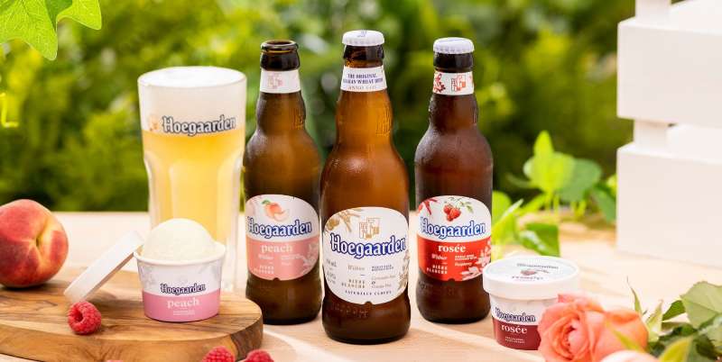
Most light beers use blue and silver. Miller Lite’s white can with its vintage crest stands apart from competitors like Bud Light and Dos Equis. The heraldic style shares more DNA with European brands like Hoegaarden than with typical American light beer packaging.
Conclusion
The Miller Lite logo has survived eight redesigns, a decade-long branding misstep, and the entire craft beer boom. It came out stronger each time.
What makes it work is honesty. The hops emblem, the pilsner badge, the blackletter type. None of it is faking anything.
The 2014 retro revival proved that good logo design principles don’t expire. Sometimes looking backward is the smartest move forward.
For anyone studying brand recognition or beer label design, this logo is the case study. Fifty years in, and it still holds up on every shelf, tap handle, and billboard it touches.

Renowned for his expertise in logo design and visual branding, Bogdan has developed a multitude of logos for various clients.
His skills extend to creating posters, vector illustrations, business cards, and brochures. Additionally, Bogdan's UI kits were featured on marketplaces like Visual Hierarchy and UI8.
He also wrote in the past years on sites like Design Your Way, WebDesignerDepot, WPDean, Designmodo, Speckyboy, Slider Revolution, and more.
- Best Visual Regression Testing Tools for Web and App Design in 2026 - 13 October 2026
- Jujutsu Kaisen Font Generator - 12 October 2026
- The Windsurf Logo History, Colors, Font, And Meaning - 10 October 2026

Bogdan Sandu is a seasoned designer who has been designing websites since 2008. Renowned for his expertise in logo design and visual branding, Bogdan has developed a multitude of logos for various clients. His skills extend to creating posters, vector illustrations, business cards, and brochures. Additionally, Bogdan's UI kits were featured on marketplaces like Visual Hierarchy and UI8. He also wrote in the past years on sites like Design Your Way, WebDesignerDepot, WPDean, Designmodo, Speckyboy, Slider Revolution, and more.
You Might Also Like