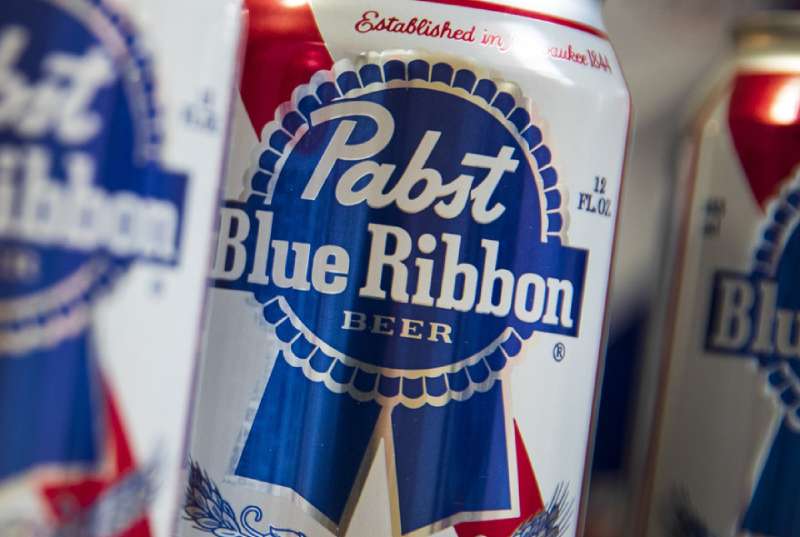
The Pabst Blue Ribbon logo is one of the most recognized marks in American beer history. It’s a combination mark built around a stylized blue medal and ribbon, and it’s been tied to the brand since the late 1800s. What started as actual silk ribbons hand-tied to beer bottles eventually became the central graphic element of the entire brand identity.
Within the broader landscape of beer logos, PBR’s mark sits in a category of its own. It pulls from award imagery, Americana, and vintage label design in a way that most competing brands never attempted. The current version was refined by the New York agency Jones Knowles Ritchie (JKR), though the core visual language goes back well over a century. The brand itself was founded in 1844 by Jacob Best in Milwaukee, Wisconsin. The logo has gone through several iterations since the 1880s, but the blue ribbon medal has been the anchor through every single one.
What Is the Pabst Blue Ribbon Logo?
The Pabst Blue Ribbon logo is a combination mark featuring a stylized blue medal with flowing ribbon tails, overlaid with the word “Pabst” in cursive script and “Blue Ribbon” in bold slab serif lettering. It was most recently refined by Jones Knowles Ritchie (JKR) and traces its origins to 1882. The medal symbolizes quality, tradition, and the brand’s history of winning awards at American fairs.
- Design Type: Combination mark (emblem with wordmark)
- Primary Elements: Stylized blue medal/rosette with scalloped edges, two flowing ribbon tails, cursive “Pabst” wordmark, bold “Blue Ribbon” text on a rectangular insert, and the word “BEER” in small capitals beneath
- Official Introduction Date: The ribbon concept originated in 1882. The name “Pabst Blue Ribbon” became official in 1898. The most recent logo refresh was led by JKR
- Designer/Agency: Jones Knowles Ritchie (JKR), New York. Historical typography contributions by Frederic W. Goudy
- Trademark Status: Registered and renewed with the USPTO. Registration Number 0542096 (filed 1950, registered 1951). The mark consists of a circular ribbon containing “PABST BLUE RIBBON” across two lines of text. Owned by Pabst Brewing Company LLC, San Antonio, Texas
- Color Palette: Navy Blue (#212C64), Red (#CE1F2D), Silver/Gray (#D8D9DA), White (#FFFFFF)
- Usage Context: Beer cans, bottles, tap handles, bar signage, merchandise, digital platforms, PBR Art Can contest materials, and promotional campaigns
How Has the Pabst Blue Ribbon Logo Evolved Over Time?
The PBR logo has gone through a slow, steady evolution since the 1880s. It moved from physical silk ribbons on bottles to printed labels in the early 1900s, then adapted for cans in the 1950s, and received its most recent overhaul from JKR. Through all of it, the blue ribbon medal stayed central.
The Original Silk Ribbon Era (1882–1890s)
Years Active: 1882 to roughly the late 1890s.
There was no printed logo yet. Frederick Pabst, the brand’s driving force, began tying actual blue silk ribbons around the neck of every bottle of Best Select beer. The company was purchasing nearly one million feet of silk ribbon per year by 1892.
This was a branding move before branding was even a word anyone used. Customers started asking bartenders for “the blue-ribbon beer.”
The colors were simply the blue of the silk ribbon against the brown glass bottle. No formal design existed. But the concept of associating the beer with award-winning quality was already locked in.
The brewery had won awards at multiple fairs, and Frederick Pabst wanted everyone to know it. This was marketing at its rawest. The 1893 World’s Columbian Exposition in Chicago is often cited as a turning point, though whether PBR actually won a blue ribbon there is debated.
The First Printed Label Logo (1898–1930s)
Years Active: 1898 to the 1930s.
In 1898, the beer was officially renamed Pabst Blue Ribbon. The ribbon transitioned from a physical accessory to a printed element on the label. Early labels featured ornate Victorian-style designs. Lots of decorative borders, detailed engravings, and dense text.
The red, white, and blue palette showed up early. It mirrored the American flag, and that was intentional. This was an era when beer brands leaned hard into patriotism and regional pride.
During Prohibition (1920–1933), the brewery pivoted to producing cheese under the “Pabstett” brand. The beer label went dormant. When brewing resumed in 1933, the label came back with its core elements intact.
The Can-Era Logo (1950s–1990s)
Years Active: 1950s through the 1990s.
The shift from bottles to cans changed everything. The company stopped using physical ribbons entirely in the 1950s and designed its now-famous printed logo specifically for can labels.
The blue ribbon medal took its recognizable rosette shape during this period. The “Pabst” script and “Blue Ribbon” slab serif text became fixed elements. Red and blue dominated the color palette, with silver accents around the medal border.
The design stayed remarkably consistent through decades of ownership changes and declining sales. By the time PBR hit rock bottom in the early 2000s, that visual consistency actually became an asset. The logo looked unchanged, untouched by corporate meddling. That resonated with a younger crowd.
The JKR Refresh (Modern Era)
Years Active: Current.
Jones Knowles Ritchie cleaned things up without gutting the identity. The medal got smoother edges, replacing the jagged scallops with wave-like ornamental borders. The ribbon tails grew longer. The outlines became thinner and sharper.
The cursive “Pabst” was redrawn with smoother strokes. “Blue Ribbon” kept its heavy slab serif weight but was made more compact. The word “BEER” was added in small geometric sans-serif capitals beneath the main text.
The blue shifted to a deeper, darker ultramarine tone. Silver outlines became cooler and less textured. The whole thing was built to work across cans, digital screens, merchandise, and social media. That’s the tricky part with heritage brands. You have to modernize without losing what made the thing work in the first place.
What Do the Design Elements of the Pabst Blue Ribbon Logo Mean?
Every piece of this mark carries a specific reference. The medal shape points directly to the brand’s award-winning history. The ribbon tails recall the actual silk ribbons once tied to bottles. And the combination of script and slab serif fonts creates a push and pull between handmade warmth and industrial strength.
What Does the Blue Ribbon Medal Symbolize?
The rosette-shaped medal is a direct reference to competition awards. Blue ribbons have meant “first place” in American culture since the 19th century.
For PBR, it connects to the brand’s claimed victory at the 1893 World’s Columbian Exposition in Chicago. Whether that win actually happened is still debated by historians. But the symbol stuck.
The wavy, scalloped edges give the medal a handmade quality. It doesn’t look corporate or machine-pressed. That loose, informal feel is intentional and supports the brand’s positioning as approachable and unpretentious.
Why Did Pabst Blue Ribbon Choose These Specific Colors?
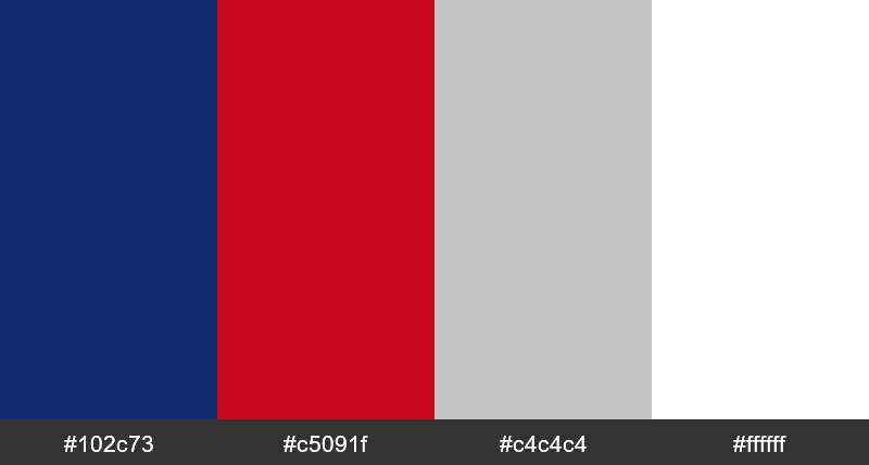
Navy Blue (#212C64, Pantone 2766 C): The dominant color. Blue represents quality, trust, and reliability. It also happens to be in the brand name, so, well, it had to be blue.
Psychologically, deep navy reads as authoritative without being aggressive. It works well across both print and digital applications.
Red (#CE1F2D, Pantone 711 C): Used in the broader brand system and packaging. Red brings energy and pairs with blue and white to form the patriotic American trifecta.
Silver/Gray (#D8D9DA, Pantone Cool Gray 1 C): The medal outline. Silver communicates a sense of prestige, like the border on an actual award certificate or trophy.
White (#FFFFFF): Used for the lettering. Gives maximum readability against the navy background and keeps things clean.
What Typography Style Is Used in the Pabst Blue Ribbon Logo?

Two distinct type styles create the mark’s typographic hierarchy. “Pabst” sits on top in a cursive, hand-lettered style similar to Yellowtail Regular. It feels personal and historic.
“Blue Ribbon” sits below in a heavy slab serif, close to Stymie ExtraBold Condensed or Geared Slab Bold. This part is loud and bold. The contrast between the two styles is what makes the type work.
The brand also uses custom typefaces for extended materials. LTC Pabst Oldstyle, created originally by Frederic W. Goudy, handles body copy and supporting text. The foundry Schriftguss AG contributed additional styles including Ohio-Schrift and Ohio-Kursiv.
What Are the Hidden Meanings in the Pabst Blue Ribbon Logo?
The medal shape doesn’t just look like an award. It’s shaped like a rosette, which in 19th-century America was specifically associated with first-place winners at state fairs and expositions.
The ribbon tails extending downward mimic how actual prize ribbons hang from medals. It’s a visual callback that most people pick up on subconsciously without ever thinking about it.
One thing worth noting: the overall composition has an almost deliberate looseness. The edges aren’t perfectly geometric. The curves aren’t mathematically precise. That’s on purpose. It gives the logo an anti-corporate feel, which fits perfectly with PBR’s positioning as the working-class, no-frills beer.
How Does the Pabst Blue Ribbon Logo Compare to Competitor Logos?
Most American lager brands go one of two directions. They either strip everything down to a clean, modern wordmark, or they lean into crests and coats of arms. PBR’s medal sits somewhere in the middle, and that’s what makes it unusual.
The Budweiser logo uses a bowtie shape with heavy red branding. It’s corporate and polished. Miller Lite went minimal with a retro-inspired wordmark revival. Coors Light leans on mountain imagery and cold-activated color gimmicks.
Corona keeps it tropical and clean. Heineken has its red star. Guinness has the Arthur harp. Each one claims a specific visual territory.
PBR’s medal and ribbon combo doesn’t try to be sleek or modern. It owns its old-school, slightly cluttered, award-badge aesthetic. And that honesty is why it connects with the audience it connects with. Most tech company logos move toward simplification over time. PBR kept its complexity, and the complexity became the point.
What Are the Technical Specifications of the Pabst Blue Ribbon Logo?
Official Color Codes
- Navy Blue: Hex #212C64 | RGB (33, 44, 100) | CMYK (100, 94, 31, 21) | Pantone 2766 C
- Red: Hex #CE1F2D | RGB (206, 31, 45) | CMYK (13, 100, 93, 3) | Pantone 711 C
- Silver/Gray: Hex #D8D9DA | RGB (216, 217, 218) | CMYK (14, 10, 10, 0) | Pantone Cool Gray 1 C
- White: Hex #FFFFFF | RGB (255, 255, 255) | CMYK (0, 0, 0, 0)
Dimensions and Proportions
The logo’s overall shape is vertically oriented, taller than it is wide, driven by the ribbon tails extending below the circular medal portion. The medal itself is roughly circular with scalloped or wave-like border details.
For web use, the logo is available as SVG and PNG on official brand resources. The vector format ensures the mark stays crisp at any size, which matters when you’re scaling from a tiny app icon to a massive billboard.
Clear space requirements follow standard brand guideline practices. The medal should have adequate breathing room on all sides, typically equal to the height of the “Pabst” script. Minimum reproduction size ensures the slab serif text stays legible and the medal details don’t collapse into mush.
What Cultural Impact Has the Pabst Blue Ribbon Logo Had?

PBR became a countercultural symbol in the early 2000s without trying. As the brand’s sales cratered, young adults in cities like Portland, Chicago, and New York adopted it as their beer of choice. The retro logo was a big part of that appeal.
It showed up in David Lynch’s “Blue Velvet.” It became a fixture in dive bars and art galleries. The PBR Art Can contest turned the logo into a canvas for independent artists. WWE even had a John Cena t-shirt pulled for looking too similar to the PBR can design.
The logo’s staying power comes from its refusal to chase trends. While other beer brands kept redesigning to look contemporary, PBR’s mark stayed planted in its own visual history. That gave it an authenticity that no amount of market research could manufacture.
How Does the Pabst Blue Ribbon Logo Fit Into the Overall Brand Identity?
The logo is the anchor of a broader system that JKR developed to work with or without the full medal. The brand’s style guide includes the custom typefaces (LTC Pabst Oldstyle, Ohio-Schrift, Ohio-Kursiv), a four-color palette split between primary (navy, red) and secondary (gray, white) tones, and a set of graphic elements pulled from the medal’s details.
The identity carries across beer cans, bottles, tap handles, bar mats, neon signs, merchandise, and digital channels. PBR’s grassroots marketing approach (sponsoring bike messenger races, gallery openings, and local events) means the logo shows up in contexts that feel organic rather than forced.
That’s the thing about this brand. The logo doesn’t just represent the product. It represents a specific attitude toward beer, culture, and authenticity that the company has (sometimes accidentally) built over 180 years.
How Should the Pabst Blue Ribbon Logo Be Used?
Pabst Brewing Company owns all rights to the logo and associated trademarks. Commercial use without written permission is trademark infringement. Period.
If you’re a bar owner wanting PBR signage, a merchandise creator, or an artist using the mark in your work, you need approval from Pabst Brewing Company, currently headquartered in San Antonio, Texas. The brand has actively pursued unauthorized uses, including the WWE/John Cena incident.
For fan art or personal use, standard fair use principles apply, but anything commercial requires licensing. Official logo files in PNG and SVG formats can be sourced through brand asset repositories and Pabst’s official channels.
Don’t alter the colors, distort the proportions, or separate the text from the medal. Don’t place it on busy backgrounds where the silver outlines disappear. And don’t use outdated versions of the mark in materials meant to represent the current brand. These are standard rules, but you’d be surprised how often they get broken.
FAQ on The Pabst Blue Ribbon Logo
What Does the Pabst Blue Ribbon Logo Look Like?
The PBR logo features a stylized blue medal with scalloped edges and two flowing ribbon tails. “Pabst” appears in cursive script across the top, with “Blue Ribbon” in bold slab serif lettering on a rectangular insert below it.
When Was the Pabst Blue Ribbon Logo First Created?
The logo traces back to 1882 when Frederick Pabst started tying blue silk ribbons to bottles of Best Select beer. The printed version came later.
The name Pabst Blue Ribbon became official in 1898, and the ribbon shifted from a physical object to a printed emblem on labels.
Who Designed the Current Pabst Blue Ribbon Logo?
The New York design agency Jones Knowles Ritchie (JKR) handled the most recent refresh. They modernized the medal shape and refined the custom typefaces while keeping the classic beer packaging look intact.
Frederic W. Goudy contributed historical letterforms used in the brand’s extended type system.
What Do the Colors in the PBR Logo Mean?
Navy blue (#212C64) represents quality and trust. Red (#CE1F2D) adds energy and ties into the American lager branding tradition. Silver outlines the medal to suggest prestige.
White text keeps everything readable. The palette mirrors the American flag, which was always the point.
Has the Pabst Blue Ribbon Logo Changed Over the Years?
Yes, but carefully. The core blue ribbon medal has survived every revision since the 1880s. Changes have been subtle: smoother edges, longer ribbon tails, deeper blue tones, and tighter type spacing.
The retro beer branding feel was never abandoned. That consistency turned out to be the brand’s greatest asset.
What Font Is Used in the PBR Logo?
“Pabst” uses a cursive style similar to Yellowtail Regular. “Blue Ribbon” uses a heavy slab serif close to Stymie ExtraBold Condensed.
The brand also relies on LTC Pabst Oldstyle for extended materials. Multiple type styles create a strong visual contrast within the mark.
Is the Pabst Blue Ribbon Logo Trademarked?
Absolutely. The Pabst Brewing Company holds multiple USPTO registrations. The primary mark (Registration #0542096) has been registered and renewed since 1951.
Commercial use without written permission from Pabst is infringement. They’ve enforced this aggressively, including a case involving WWE.
Why Does the PBR Logo Feature a Ribbon?
It goes back to the 1893 World’s Columbian Exposition in Chicago. Pabst claimed their beer won “America’s Best” there, and blue ribbons were already being tied to bottles as a mark of quality since 1882.
Whether they actually won is debated. But the ribbon stuck.
What Makes the PBR Logo Different From Other Beer Logos?
Most beer brands either go minimal or lean into crests. PBR’s medal-and-ribbon combo occupies a middle ground that feels genuinely vintage.
It never chased trends. That brand identity stubbornness gave it authenticity that resonated with younger drinkers in the 2000s when hipster beer culture took off.
Can I Use the Pabst Blue Ribbon Logo for My Project?
Not commercially. The logo, related marks, and all PBR brand designs are intellectual property of Pabst Brewing Company, based in San Antonio, Texas.
Personal, non-commercial use follows standard fair use rules. Anything beyond that requires licensing approval directly from Pabst.
Conclusion
The Pabst Blue Ribbon logo has done something most iconic brands struggle with. It stayed visually consistent for over a century while remaining culturally relevant to each new generation.
From actual silk ribbons in Milwaukee to the JKR-refined medal on today’s cans, the design tells the full story of American brewing heritage without saying a word.
The mark works because it never pretended to be something it wasn’t. No flashy redesigns. No chasing what’s trending.
That kind of visual storytelling is harder to pull off than it looks. PBR’s logo proves that sometimes the best branding strategy is just refusing to abandon what already works.
Renowned for his expertise in logo design and visual branding, Bogdan has developed a multitude of logos for various clients.
His skills extend to creating posters, vector illustrations, business cards, and brochures. Additionally, Bogdan's UI kits were featured on marketplaces like Visual Hierarchy and UI8.
He also wrote in the past years on sites like Design Your Way, WebDesignerDepot, WPDean, Designmodo, Speckyboy, Slider Revolution, and more.
- The Airtable Logo History, Colors, Font, And Meaning - 12 July 2026
- How to Blur Background in Canva: A Quick Tutorial - 11 July 2026
- Typography Trends - 10 July 2026
Bogdan Sandu is a seasoned designer who has been designing websites since 2008. Renowned for his expertise in logo design and visual branding, Bogdan has developed a multitude of logos for various clients. His skills extend to creating posters, vector illustrations, business cards, and brochures. Additionally, Bogdan's UI kits were featured on marketplaces like Visual Hierarchy and UI8. He also wrote in the past years on sites like Design Your Way, WebDesignerDepot, WPDean, Designmodo, Speckyboy, Slider Revolution, and more.
You Might Also Like