Autumn color palettes do more than capture falling leaves and pumpkin patches. They set moods, drive conversions, and separate memorable designs from forgettable ones. The…

Blue shows up everywhere because it works. From corporate logos to social media interfaces, designers reach for blue when trust matters. But not all blues…
Wrong colors on a choropleth map don’t just look bad, they actively lie to your audience. Map color palettes determine whether someone reads your data…
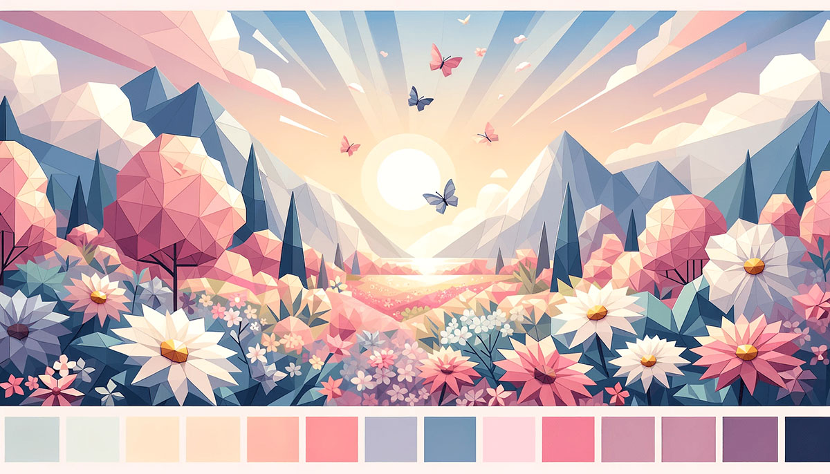
Soft hues transform brutal design into something people actually want to look at. Pastel color palettes strip away the aggression of saturated colors while maintaining…
Most designs fail not because of bad typography or weak layout, but because the colors don’t work together. A well-built four color palette gives you…
Cyan is one of those colors that works harder than it looks. Sitting between blue and green on the color wheel, it shows up in…
Color at full intensity stops people. That’s just how human vision works. Saturated color palettes push every hue to its purest chromatic state, no gray,…
Magenta sits between red and purple on the color theory wheel, refusing to play it safe. It’s bold, electric, impossible to ignore. Magenta color palettes…
Nature gets color right every time, and forests are proof of that. From deep moss green and olive green to bark brown and dappled canopy…
Your brand disappears in a sea of beige and gray, no matter how good your product actually is. Vivid color palettes fix this problem by…
Your game’s color scheme makes players feel something before they read a single word or click a button. Gaming color palettes determine whether players expect…
Your brand’s color palette makes the first impression before anyone reads a single word. Modern color palettes balance contemporary aesthetics with psychological impact. They signal…
Your portfolio gets 50 milliseconds to make an impression. The colors you choose determine whether potential clients see professional expertise or amateur hour. Portfolio color…
Most designers play it safe with neutrals and muted tones. Then they wonder why their work gets scrolled past in three seconds. Fun color palettes…
Your Instagram feed tells a story before anyone reads a single caption. Instagram color palettes create instant brand recognition. They’re the difference between a scroll-past…
Your brand feels warm when it should feel calm. That’s the temperature problem most designers face when building cool color palettes. Blues, greens, purples, and…
Muted color palettes are having a moment, and it’s not hard to see why. These desaturated hues bring sophistication without the noise, perfect for brands…
Greige has overtaken gray as the most searched paint color for three years running, but most people still can’t tell you what makes a neutral…
Most design problems aren’t color problems – they’re too-many-colors problems. Three is the number that works. A single dominant tone, one supporting hue, and a…
Every decade leaves behind a visual fingerprint, and retro color palettes capture those moments perfectly. From the pastel optimism of 1950s diners to the neon…
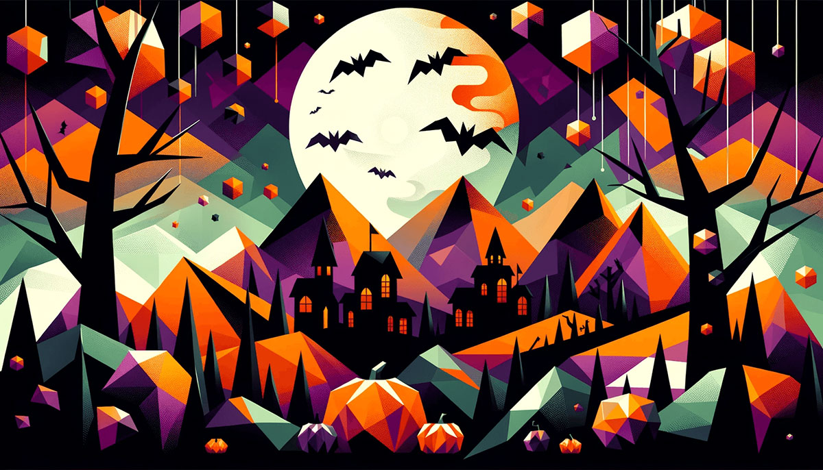
Orange and black might be the obvious choice, but Halloween color palettes stretch far beyond jack-o’-lantern basics. From neon nightmares to pastel spooks, the right…
Teal sits perfectly between blue and green on the color wheel, offering designers a versatile foundation that feels both calming and energizing. Teal color palettes…
Winter transforms your design palette the same way frost transforms a window. Sharp, deliberate, unmistakable. Winter color palettes deliver what other seasonal schemes can’t: the…
Turquoise sits between blue and green on the color wheel, pulling the calm of ocean depths and the energy of tropical shallows into one shade.…
Color sets the mood before a single ornament goes up. The right Christmas color palette pulls a design together instantly, whether you’re decorating a home,…
White isn’t just one color. It’s dozens of shades hiding behind the same name, each one changing how a room feels or how a brand…
Gray sits quietly between black and white, but it’s anything but boring. Gray color palettes deliver sophistication without shouting, making them the backbone of modern…
Beige is one of those colors that does more work than it gets credit for. The right beige color palette can ground a brand identity,…
Bright color palettes turn whispers into shouts. Whether you’re building a brand identity, designing a website, or creating marketing materials, saturated hues and vivid tones…
Yellow transforms designs from forgettable to magnetic in seconds. It’s the color of sunshine, energy, and instant attention, but choosing the wrong shade can wreck…