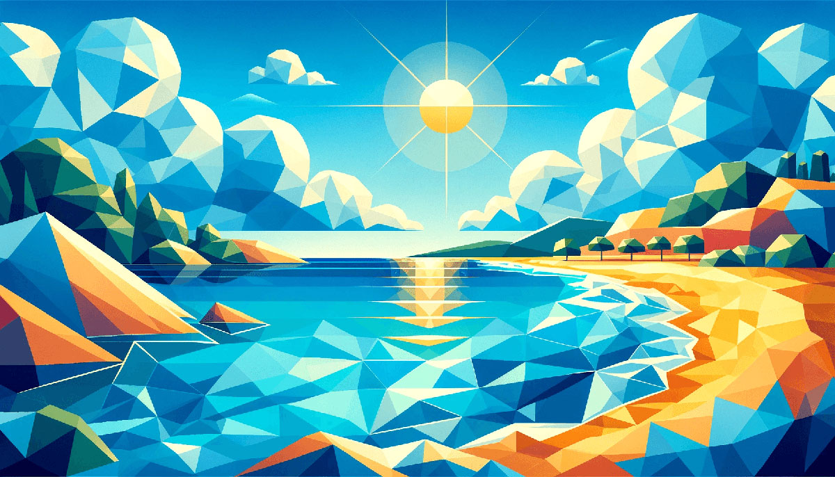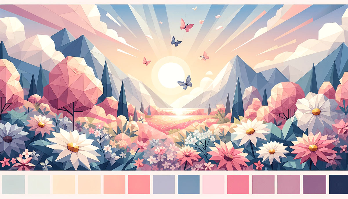
Bright color palettes turn whispers into shouts.
Whether you’re building a brand identity, designing a website, or creating marketing materials, saturated hues and vivid tones grab attention faster than any muted scheme ever could. The challenge isn’t finding bright colors but combining them without creating visual chaos.
This guide breaks down 15 tested bright color palettes with hex codes, usage contexts, and pairing strategies. You’ll learn which combinations work for tech brands versus retail, how to anchor high-saturation colors with neutrals, and when brightness helps or hurts readability.
Each palette includes specific color theory applications so you can adapt these schemes to your projects immediately.
Bright Color Palettes
Electric Energy
| #0CE161 | #F84499 | #FAF715 | #0EE2F5 | #8255DF |
What It Is
Vivid green, hot pink, bright yellow, cyan, and purple combine for maximum chromatic intensity.
Visual Character
High saturation across all hues creates immediate visual impact. Neon-adjacent tones demand attention without crossing into fluorescent territory.
Best Used For
Tech startups, gaming color palettes, youth-focused campaigns, music festivals, social media graphics. Works for brands that reject subtlety.
Pairing Tips
Anchor with charcoal (#2b2b2b) or pure white backgrounds. Use the vivid green as your primary action color, hot pink for secondary CTAs. Limit to three colors per screen to avoid visual chaos.
Tropical Burst
| #FC5C0D | #FDDA17 | #0EC188 | #3BE3EE | #1D67C2 |
What It Is
Orange, golden yellow, island green, teal, and cobalt blue capture warm color palettes meeting cool tones.
Visual Character
Balanced temperature distribution prevents the palette from skewing too warm or cool. Creates vacation-ready energy with professional undertones.
Best Used For
Travel agencies, outdoor brands, summer campaigns, packaging design for beverages, wellness apps. Strong choice for brands emphasizing adventure.
Pairing Tips
Use island green (#0ec188) as your focal point, orange for headers. Teal and cobalt establish hierarchy without adding more hues. Sand or cream (#f5e6d3) works better than white for this palette.
Rainbow Pop
| #F7093B | #F5CF1D | #2CD27E | #3AE5E7 | #9C1AE7 |
What It Is
Classic rainbow progression using red, yellow, green, aqua, and purple at peak brightness.
Visual Character
Full spectrum coverage creates variety while maintaining unity through consistent saturation levels. Childhood nostalgia meets modern color palettes.
Best Used For
Kids color palettes for toys, educational apps, diversity campaigns, pride month content, playful SaaS dashboards. Avoid for corporate or luxury contexts.
Pairing Tips
Needs strong white space between color blocks. Use one color per section with generous padding. Off-white (#fafafa) backgrounds prevent optical vibration better than pure white.
Neon Dreams
| #570BB7 | #D042F8 | #2EDBEF | #3AEFB6 | #F10983 |
What It Is
Royal purple, violet, aqua, teal, and magenta push into neon color palettes territory without full fluorescence.
Visual Character
Cool-dominated scheme with strategic magenta warmth. Cyberpunk aesthetic without the darkness, similar to vivid color palettes but more restrained.
Best Used For
Nightlife brands, music streaming apps, motion graphics, crypto projects, Gen Z marketing. Strong for dark mode interfaces.
Pairing Tips
Works on dark navy (#0a0e27) or true black. Add 20% opacity overlays to prevent pure color blocks from overwhelming. Reserve magenta for micro-interactions and hover states only.
Citrus Splash
| #E71919 | #FB8637 | #FDEF0A | #57E9F6 | #1683E8 |
What It Is
Red, orange, bright yellow, aqua, and royal blue mimic citrus fruit intensity.
Visual Character
Temperature gradient from hot to cool creates natural visual hierarchy. Higher luminosity than typical bright palettes makes colors appear backlit.
Best Used For
Food color palettes for restaurants, energy drinks, fitness apps, summer color palettes campaigns, children’s hospitals. Energizing without aggression.
Pairing Tips
Use yellow (#fdef0a) sparingly as accent only. Red and orange can share space but need white space separation. Pair with soft cream (#fff8e7) instead of stark white to reduce eye strain.
Sunset Glow
| #FF5400 | #FF006E | #FFBD00 | #8338EC |
What It Is
Orange, hot pink, gold, and purple capture golden hour transitions.
Visual Character
Gradient color palettes foundation with smooth transitions between adjacent hues. Works as actual gradient or isolated color blocks.
Best Used For
Event tickets, concert posters, sunset color palettes photography, nightlife marketing, creative portfolios. Popular in poster design for music venues.
Pairing Tips
Create smooth orange-to-pink gradient for backgrounds, reserve purple for text or icons. Gold works as metallic accent at 30% opacity. Use on dark charcoal (#1a1a1a) for dramatic contrast.
Bold Primary
| #FA2A0F | #FC8817 | #FAE604 | #A9DA15 | #338FED |
What It Is
Red, orange, yellow, lime, and royal blue enhance traditional primaries with extended range.
Visual Character
Playground-ready brightness rooted in color theory basics. Educational clarity with modern saturation levels.
Best Used For
Educational platforms, kids color palettes for toys, sports leagues, fun color palettes for events, infographics. Perfect for content targeting families.
Pairing Tips
Lime (#a9da15) provides fresh alternative to traditional green. Use as tertiary accent behind red and blue primaries. Requires generous spacing, works best with grid systems at 24px+ gutters.
Candy Shop
| #FC59A3 | #87C830 | #FFD400 | #FE7E0F | #8E3CCB |
What It Is
Hot pink, lime green, yellow, orange, and purple create confectionery-inspired energy.
Visual Character
Artificial sweetener aesthetic with no muted tones. Each color competes for attention equally, requiring careful balance in layouts.
Best Used For
Candy brands, Instagram color palettes for influencers, party supplies, retro color palettes projects, pop art styles. Avoid professional services entirely.
Pairing Tips
Use hot pink as dominant, lime as secondary, others as accents. Purple adds depth when surrounding colors feel too sweet. White borders between color blocks prevent optical mixing and maintain clarity.
Summer Vibes
| #66FF00 | #1974D2 | #08E8DE | #FFF000 | #FF007F |
What It Is
Bright green, blue, turquoise, yellow, and bright pink capture peak summer intensity.
Visual Character
Maximum chromatic range with no temperature bias. Each hue sits at its brightest possible value, creating saturated color palettes energy.
Best Used For
Beach resorts, summer color palettes campaigns, water parks, tropical brands, festival merchandise. Works for happy color palettes targeting vacation mindsets.
Pairing Tips
Turquoise (#08e8de) bridges warm and cool zones effectively. Use bright green sparingly as it dominates at full saturation. Pair with sand beige (#f4e4c1) to ground the palette without dulling brightness.
Digital Pop
| #0078FF | #BD00FF | #FF9A00 | #01FF1F | #E3FF00 |
What It Is
Blue, purple, orange, green, and yellow at digital RGB peak values.
Visual Character
Screen-optimized brightness that appears backlit even in print design. Feels artificial and futuristic by design.
Best Used For
Tech companies, gaming color palettes, VR experiences, digital agencies, app interfaces. Strong choice for web design targeting developers.
Pairing Tips
Blue (#0078ff) serves as primary brand color with purple for premium features. Green works for success states, orange for warnings. Use on dark backgrounds (#0d0d0d) exclusively to prevent eye strain from high luminosity.
Fiesta
| #E71919 | #FB8637 | #FDEF0A | #57E9F6 | #1683E8 |
What It Is
Red, orange, yellow, aqua, and blue create celebration-ready warmth transitioning to cool.
Visual Character
Temperature gradient provides natural flow from hot to cold. Similar to Citrus Splash but with slightly different blue values for varied applications.
Best Used For
Mexican restaurants, party planning, cultural festivals, summer promotions, popular color palettes for events. Works across print and digital equally well.
Pairing Tips
Red and orange dominate warm sections, aqua and blue cool areas. Yellow bridges both zones as transitional element. Works on white or light color palettes backgrounds better than dark.
Vibrant Meadow
| #FF4D6D | #2DE2E6 | #FFBD00 | #7CFF6B |
What It Is
Coral, cyan, gold, and lime create organic brightness.
Visual Character
Nature color palettes pushed to artificial intensity. Feels like spring on full brightness, balancing analogous colors with sharp contrast.
Best Used For
Health apps, organic brands, wellness centers, spring color palettes marketing, juice bars. Good for portfolio color palettes showing range.
Pairing Tips
Cyan provides cooling contrast against warm coral and gold. Lime adds fresh energy without competing with primary hues. Use coral as primary, cyan for interactive elements, gold and lime as accents only.
Purple Passion
| #580C82 | #8F30A1 | #FE4773 | #F6D68D | #46B3A5 |
What It Is
Romantic purple, young purple, fiery rose, tender gold, and soft teal blend jewel tones with brightness.
Visual Character
Monochrome colors in purple family supported by contrasting warm and cool accents. More sophisticated than typical bright palettes while maintaining energy.
Best Used For
Beauty brands, creative agencies, wedding color palettes, interior design studios, fashion boutiques. Works for purple color palettes seeking modern edge.
Pairing Tips
Two purple values create depth without dilution. Fiery rose (#fe4773) provides unexpected warmth, teal cools the composition. Gold works as metallic accent or full background depending on emphasis needs.
Retro Neon
| #00ECFF | #FF0000 | #FF00E7 | #00FF11 | #8900FF |
What It Is
Cyan, red, magenta, green, and purple at pure neon values.
Visual Character
s arcade aesthetic with modern clarity. Each color hits maximum saturation in pure CMYK or RGB values creating intense optical presence.
Best Used For
Retro color palettes projects, arcade bars, synthwave music, vaporwave art, nostalgic campaigns. Perfect for Brutalist design applications.
Pairing Tips
Use on pure black (#000000) backgrounds only. Add slight glow effects to enhance neon illusion. Limit simultaneous colors to two per composition to prevent visual chaos and maintain readability.
Playful Mix
| #FA2A0F | #FC8817 | #FAE604 | #A9DA15 | #338FED |
What It Is
Red, orange, yellow, lime, and blue create accessible brightness across full spectrum.
Visual Character
Childhood simplicity with professional saturation levels. Works as three color palettes (red, yellow, blue) or full five-color system.
Best Used For
Educational platforms, kids color palettes content, community centers, family restaurants, daycare branding. Strong for accessible design requiring clear visual signals.
Pairing Tips
Blue and red provide strong contrast for primary actions. Yellow and orange work together without conflict. Lime bridges warm and cool zones while adding contemporary freshness to traditional primaries.
FAQ on Bright Color Palettes
What are bright color palettes?
Bright color palettes use high saturation and luminosity values to create vivid, eye-catching combinations. These schemes typically feature RGB values above 200 or HSL saturation levels exceeding 80%, producing colors that appear vibrant on both screen and print.
When should I use bright colors in design?
Use bright palettes for youth brands, tech startups, entertainment venues, fitness apps, and summer campaigns. Avoid them for luxury brands, legal services, healthcare (except pediatrics), or finance where trust and stability matter more than energy.
How many bright colors should I use together?
Limit active bright colors to three maximum per layout. Use one as primary, one as secondary, and one as accent. Additional colors create visual chaos and reduce visual hierarchy effectiveness, making designs harder to scan.
What’s the difference between bright and neon colors?
Neon color palettes hit maximum RGB saturation (255 values) and often appear fluorescent. Bright palettes maintain high saturation (200-240 range) but include more luminosity variation, making them energetic without causing eye strain or accessibility issues.
How do I make bright colors work on white backgrounds?
Add subtle drop shadows or 1-2px borders to prevent optical vibration. Use off-white (#fafafa) instead of pure white to reduce harsh contrast. Ensure sufficient white space between bright elements so colors don’t compete visually.
Can bright palettes work for professional brands?
Yes, when anchored with neutral tones like charcoal, navy, or warm gray. Use bright colors as accents (15-20% of design) while neutrals handle typography and backgrounds. Tech companies and creative agencies successfully balance professionalism with vibrant accents.
What are the best color combinations for bright palettes?
Complementary color schemes (blue/orange, purple/yellow) create maximum contrast. Analogous combinations (blue/cyan/teal) offer harmony with energy. Triadic schemes (red/yellow/blue) work for playful brands but require careful balance to prevent overwhelming viewers.
How do bright colors affect readability?
Bright backgrounds reduce readability significantly. Always place dark text (contrast ratio 7:1+) on bright backgrounds or reverse it. Yellow, lime, and cyan backgrounds need especially dark text. Use bright colors for accents and CTAs, not body text.
Do bright palettes work in print design?
Yes, but convert RGB to CMYK carefully as saturation often drops 15-25%. Request printed proofs since screen brightness differs from ink on paper. Pantone spot colors maintain brightness better than four-color process for critical brand elements.
How can I test if my bright palette works?
Check contrast ratios using WebAIM tools for accessibility. View designs in grayscale to verify hierarchy still works. Test on multiple devices since screen calibration affects brightness perception. Ask colorblind users to review, as high saturation can create issues.
Conclusion
Bright color palettes deliver immediate visual impact when applied strategically. The fifteen combinations above prove that high saturation works across industries when you understand color theory fundamentals and pairing principles.
Success comes from balancing vibrant hues with neutrals, limiting simultaneous colors to three, and testing contrast ratios for accessibility. Whether you’re designing for digital screens or print materials, these palettes provide tested starting points.
Remember that RGB values translate differently in CMYK, so always request proofs for printed work. Use tools like WebAIM to verify readability before launch.
Start with one palette that matches your brand personality, adapt the hex codes to your specific needs, and build from there. Color psychology matters, but so does testing with real users across devices.

Renowned for his expertise in logo design and visual branding, Bogdan has developed a multitude of logos for various clients.
His skills extend to creating posters, vector illustrations, business cards, and brochures. Additionally, Bogdan's UI kits were featured on marketplaces like Visual Hierarchy and UI8.
He also wrote in the past years on sites like Design Your Way, WebDesignerDepot, WPDean, Designmodo, Speckyboy, Slider Revolution, and more.
- The Windsurf Logo History, Colors, Font, And Meaning - 10 October 2026
- How to Remove Background From Product Photos (No Photoshop) - 10 October 2026
- How Designers can Build a Stronger Online Creative Identity - 9 October 2026

Bogdan Sandu is a seasoned designer who has been designing websites since 2008. Renowned for his expertise in logo design and visual branding, Bogdan has developed a multitude of logos for various clients. His skills extend to creating posters, vector illustrations, business cards, and brochures. Additionally, Bogdan's UI kits were featured on marketplaces like Visual Hierarchy and UI8. He also wrote in the past years on sites like Design Your Way, WebDesignerDepot, WPDean, Designmodo, Speckyboy, Slider Revolution, and more.
You Might Also Like