


Every color transition you see on a screen, from a button’s subtle glow to Instagram’s iconic logo, starts with one technique. So what is gradient in graphic design, and why does it show up in practically every modern layout?
A gradient is a smooth blend between two or more colors. Simple concept, but the way designers use it changes everything about how a composition feels, from flat and static to deep and alive.
This article breaks down how gradients work across tools like Adobe Photoshop, Figma, and CSS. You’ll learn the main gradient types, how to pick color combinations that actually look good, where gradients fit in branding and UI design, and the common mistakes that make them fall apart.
What Is a Gradient in Graphic Design

A gradient is a gradual blend between two or more colors. That’s the short version. The longer version is that gradients create smooth transitions where one hue melts into the next, producing depth and visual interest that flat fills just can’t match.
Think of it like this. You pick a starting color and an ending color. The software (or CSS, or your own hands with an airbrush) fills the space between them with a continuous tonal shift. No hard edges. No sudden jumps.
Every gradient has a few basic parts:
- Color stops: the specific colors placed along the gradient’s path
- Direction: the angle or shape of the transition (left to right, top to bottom, circular)
- Midpoint: where the blend hits its halfway mark between two stops
According to NMSC, the global graphic design market reached $52.32 billion in 2024 and is projected to hit $70.53 billion by 2030. A big chunk of that work involves color blending techniques like gradients, which show up in everything from app interfaces to product packaging.
Gradients aren’t new, either. They’ve been around since the early days of print and airbrush illustration. But the digital tools we have now, from Adobe Photoshop to Figma and CSS3, made them wildly accessible. Anyone can drop a gradient onto a background in under ten seconds.
The reason they work so well comes down to how our eyes process color. A smooth color transition feels natural. We see gradients every day in sunsets, in the way light falls across a wall, in water reflections. Our brains are already wired to read them as depth cues.
Types of Gradients
Not all gradients do the same thing. The type you pick changes the mood, the direction of focus, and even how modern or classic your design feels.
| Gradient Type | How It Works | Best Used For |
|---|---|---|
| Linear | Blends along a straight line | Backgrounds, buttons, banners |
| Radial | Spreads outward from a center point | Spotlights, product highlights |
| Angular / Conic | Sweeps color around a focal point | Gauges, pie-style visuals |
| Mesh / Freeform | Irregular multi-point blending | Artistic compositions, branding |
| Diamond | Transitions from center in a diamond shape | Decorative fills, textures |
Linear vs. Radial Gradients
Linear gradients are the workhorse. Color moves in a straight line, and you control the angle. Set it to 0 degrees for vertical, 90 degrees for horizontal, or anything in between for a diagonal sweep.
Radial gradients radiate outward from a single point, like ripples in water. They naturally draw the eye toward the center, which makes them a solid pick for creating a focal point in your layout.
A 2025 Adobe survey found that 1 in 2 consumers have chosen one brand over another based on color alone. The way you transition between those colors matters just as much as the colors themselves.
Mesh and Freeform Gradients
Mesh gradients break every rule of the linear/radial model. Instead of a single direction, they use multiple anchor points scattered across the shape. Each point holds its own color, and the blending between them creates an organic, almost painterly effect.
Figma, Adobe Illustrator, and Sketch all support some version of mesh or freeform gradients. With over 10 million Figma users as of 2025 (Xrilion), mesh gradient tools have become a go-to feature for designers building brand visuals, hero sections, and social media assets.
Took me a while to get comfortable with mesh gradients, honestly. They’re tricky to control because there’s no single “direction” to anchor your thinking. But once you get the hang of placing color points, the results feel way more natural than any linear or radial option.
How Gradients Work in Design Software
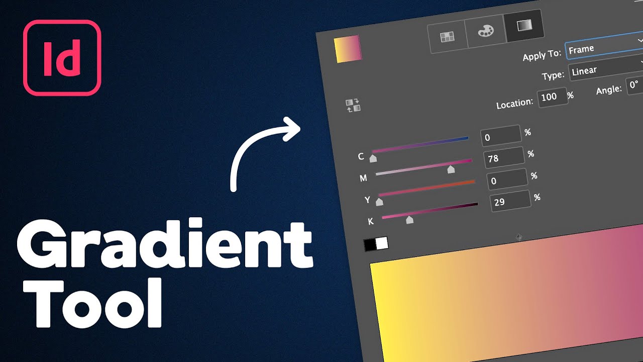
Knowing what a gradient is and actually building one are two different things. The good news is that every major design tool makes gradients pretty straightforward. The tricky part is learning the subtle controls that separate a clean gradient from a muddy one.
Gradients in Figma and Adobe Illustrator
In Figma, you select a shape, open the fill options, and switch from solid to gradient. From there, you drag color stops along a bar, pick your colors, and adjust the angle.
Adobe Illustrator works similarly but with more control. You get the Gradient panel, the Gradient tool (G shortcut), and for freeform gradients, a dedicated mode that lets you place color points anywhere on the object. Illustrator also handles gradient meshes natively, which Figma still doesn’t fully replicate.
Figma holds a 40.65% market share in design tools (Cropink, 2025). That’s a huge install base, and its gradient tools keep improving with each update. For quick UI work, Figma is usually faster. For detailed illustration-level gradients, Illustrator still wins.
CSS Gradients for Web Design
CSS linear-gradient() and radial-gradient() functions let you build gradients directly in code. No image files needed.
A basic example:
background: linear-gradient(135deg, #667eea, #764ba2);background: radial-gradient(circle, #ff9a9e, #fecfef);
CSS also supports conic gradients with conic-gradient(), and you can stack multiple gradients on a single element. Tools like WebGradients and Grabient generate the code for you, which saves a lot of time when you’re building web design layouts.
SVG gradient definitions offer another route for scalable graphics. They’re particularly useful inside vector graphics that need to scale without losing quality, something bitmap formats can’t handle as well.
What Gradients Communicate Visually
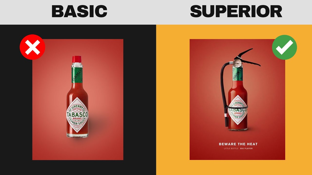
A flat blue rectangle says “blue.” A gradient that shifts from deep navy to bright cyan says depth, light source, atmosphere. That’s the difference.
Gradients carry visual meaning beyond the colors themselves. They suggest dimension on a 2D surface, which is why buttons with subtle gradients look “clickable” while flat ones can feel inert. Your brain reads the tonal shift as a physical surface catching light.
Research from Zippia shows that color increases brand recognition by up to 80%. Gradients multiply this effect because they combine multiple hues into a single, distinctive blend. Instagram’s pink-to-purple-to-orange gradient is a perfect case study. It’s instantly recognizable even without the camera icon.
Warm-to-cool transitions (orange into blue, for example) create tension and energy. Monochrome shifts within a single color family feel calmer and more refined. Dark-to-light gradients simulate overhead lighting. Light-to-dark ones feel like shadows closing in.
Understanding color psychology matters here. A gradient from red to yellow triggers different emotional responses than one moving from teal to lavender. The transition itself adds a layer of movement that static colors simply don’t have.
Gradients also play a direct role in visual hierarchy. A bright gradient behind a headline pulls attention before the reader even processes the text. That’s not a guess, that’s how the eye works. Brighter, warmer areas get scanned first.
Common Uses of Gradients in Graphic Design

Gradients show up in practically every corner of design work. But some applications are more effective than others, and knowing where gradients actually improve a layout versus where they just add noise is half the skill.
Gradients in Logo and Brand Identity
Instagram’s 2016 rebrand is the textbook example. The shift from a skeuomorphic camera icon to a simplified glyph with a vivid gradient was polarizing at first, but it worked. Creative Bloq notes the gradient has become so foundational to the brand that Gen Z users don’t even remember the old logo.
Firefox, Tinder, and Adobe Creative Cloud all use gradient logos too. According to Logome.ai, brands using bright multi-color logos see a 33% increase in memorability compared to flat designs.
But gradient logos come with a catch. They can fall apart at small sizes or when printed in single-color formats. Your brand guidelines need to include fallback versions for those situations.
Gradients in UI and Web Design
Hero sections are probably the most common spot for web gradients. A smooth color transition behind a headline and call-to-action button creates a clean, modern feel without needing a background image.
Other common uses:
- Button hover states that shift between gradient stops
- Card backgrounds in dashboard interfaces
- Progress bars and loading indicators
- Overlay effects on photography
Figma’s 2025 design statistics report shows that 79.1% of home pages contain low-contrast text (WebAIM), which is a direct reminder that gradient backgrounds need proper contrast testing before going live. A gorgeous gradient means nothing if nobody can read the text sitting on top of it.
Stripe is a great example of gradients done right in web design. Their hero sections use gradients to create depth and movement without cluttering the layout. The gradient guides the eye toward the product, not away from it.
Gradient Color Theory and Combination Principles

Picking two random colors and blending them together usually looks terrible. The “muddy middle” problem is real. When you blend complementary colors (like blue and orange), the midpoint can turn into a dull, grayish brown that kills the whole effect.
How to Choose Colors That Actually Work
Analogous colors are the safest bet for gradients. These sit next to each other on the color wheel (think blue to teal, or orange to red), and they blend without producing unwanted muddy tones in between.
Monochrome color gradients, where you shift between light and dark versions of a single hue, are another reliable option. They’re clean, professional, and almost impossible to mess up.
The Adobe 2025 survey of 1,000 US consumers found that 16% say color scheme is the first thing they notice about a brand. Getting your gradient palette wrong means making a bad first impression before anyone reads a word.
Tools and Techniques for Gradient Palettes
Gradient palette generators:
- Coolors: generates full color palettes with export options for multiple formats
- WebGradients: 180 pre-built linear gradients with CSS code ready to copy
- Grabient: lets you customize angles, add stops, and export CSS instantly
- Adobe Color: builds palettes from color theory rules, including analogous, complementary, and triadic schemes
One thing people overlook: saturation shifts matter as much as hue shifts. A gradient that only changes hue but keeps saturation constant can look flat. Dropping saturation slightly in the middle of the blend and boosting it at the edges adds a sense of depth that feels more natural.
If you’re working within a brand style guide, make sure your gradient colors fall within the approved RGB or CMYK values. Gradients that look perfect on screen can shift dramatically in print design, especially when converting between color models.
Gradient Trends in Modern Design

Gradients never fully disappeared. But the version of gradients we’re seeing now looks nothing like the glossy Web 2.0 buttons from 2008.
The current wave started around 2018, when flat design began losing its grip and designers started reintroducing color depth into interfaces and branding. Kittl’s 2025 design trends report confirms this: gradient design (often called “aurora”) continues to grow, with grainy textures and blurred effects added on top of traditional color blending.
From Flat Design Back to Gradients
The flat design era killed gradients for a while. Monochrome interfaces, solid backgrounds, thin icons. That was the look from roughly 2013 to 2017.
Then Instagram dropped its gradient logo in 2016 and something shifted. Suddenly, color transitions felt modern again instead of dated. By 2018, gradient backgrounds were showing up in hero sections, app UIs, and brand identities across the board.
Figma’s design statistics report (2025) notes the global graphic design market is projected to pass $56 billion by end of 2025 (NMSC). A big part of that growth involves digital-first visuals where gradients play a central role.
Aurora, Holographic, and Duotone Effects
Aurora gradients mimic the look of the northern lights, blending soft pastels in flowing, multi-directional patterns. They’re all over SaaS landing pages and fintech apps right now.
Holographic gradients push further with iridescent, metallic color shifts. Think packaging for beauty brands and tech product launches.
Duotone overlays map two contrasting gradient colors onto photography, stripping away detail and replacing it with mood. Spotify popularized this approach for playlist covers around 2016, and it’s still effective.
Glassmorphism and Grain Textures
Glassmorphism layers translucent, frosted-glass cards over gradient backgrounds. Apple used it heavily in macOS Big Sur, then doubled down with the Vision Pro in 2024. Apple announced its “Liquid Glass” design language at WWDC 2025, signaling that gradient-backed translucent UIs are the direction for the next several years.
Grain and noise textures layered on top of gradients add a tactile, almost analog quality. It breaks the “too perfect” digital feel and gives compositions a handmade edge. Your mileage may vary on how much grain to add, but even 1-3% noise can make a huge difference in visual depth (SVGator).
Mistakes Designers Make with Gradients
Gradients look effortless when done right. When done wrong, they look like someone spilled paint on a screen.
The WebAIM Million 2025 report found that 94.8% of the top 1 million home pages had detectable WCAG accessibility failures. Low-contrast text alone appeared on 79.1% of home pages. Gradient backgrounds are a major contributor to this problem when text readability isn’t tested.
| Mistake | Why It Happens | How to Fix It |
|---|---|---|
| Muddy midpoint | Blending opposing hues | Use colors closer on the color wheel |
| Color banding | Low bit depth or compression | Work in 16-bit, add slight noise |
| Poor text contrast | Gradient shifts under text | Test with WebAIM Contrast Checker |
| Too many color stops | Trying to be “creative” | Limit to 2–3 stops per gradient |
The Muddy Middle Problem
Blend blue and orange in a linear gradient and watch what happens at the midpoint. It turns brownish-gray. That’s the muddy middle, and it’s the single most common gradient mistake.
Fix: stick to color harmony principles. Colors that sit next to each other on the color wheel blend cleanly. Colors on opposite sides don’t, unless you add an intermediate stop to bridge the gap.
Color Banding and Bit Depth
Color banding shows up as visible “steps” in what should be a smooth gradient. It happens when there aren’t enough tonal values between two colors to create a seamless transition.
The main culprits, according to SVGator’s research:
- Working in 8-bit color depth (only 256 shades per channel)
- Heavy compression during export (especially GIF and low-quality JPEG)
- Display limitations on low-end monitors
Switch to 16-bit per channel in Photoshop or Affinity Photo, and add 1-3% noise to break up the banding. It’s a small step that fixes most cases.
Ignoring Accessibility and Contrast
WebAIM’s 2025 data shows low-contrast text averaged 29.6 instances per home page. Gradients make this worse because the background color shifts underneath the text, so what passes contrast checks at one point in the gradient might fail at another.
Test your text against the lightest AND darkest points of the gradient, not just the middle. WCAG requires a minimum 4.5:1 contrast ratio for normal text and 3:1 for large text. If your gradient can’t meet that consistently, add a semi-transparent overlay behind the text block.
Gradient vs. Solid Color, Pattern, and Texture
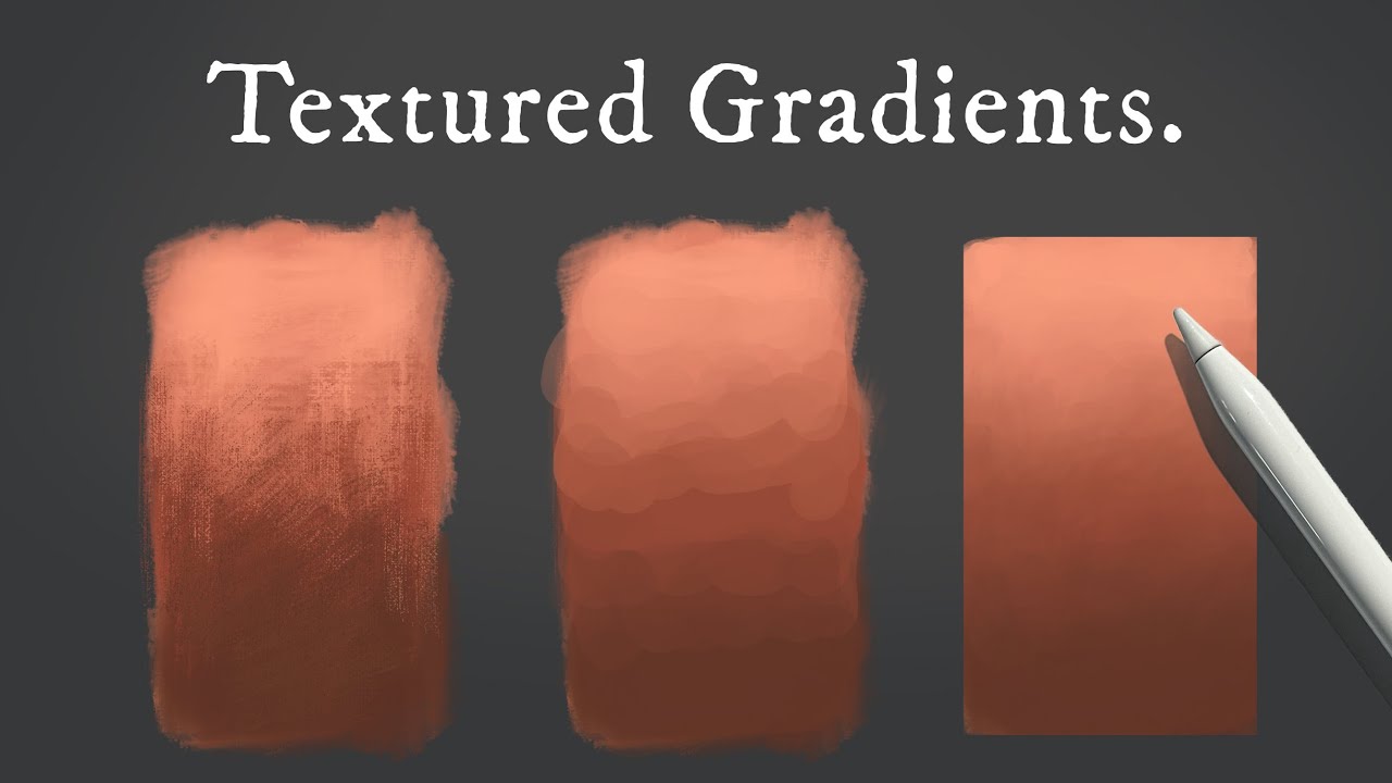
Gradients aren’t always the right call. Sometimes a solid fill does the job better. Sometimes a pattern or texture is more appropriate. Knowing when to use which is what separates thoughtful design from decoration for its own sake.
When Gradients Outperform Flat Fills
Gradients earn their place when you need to suggest depth, light, or rhythm on a flat surface. A solid blue background is fine. A gradient from deep navy to sky blue implies an atmosphere, a light source, something happening beyond the pixel grid.
They also work well for:
- Hero sections where you want energy without a photo
- Call-to-action buttons that need to feel “pressable”
- Brand identities trying to communicate progress or transformation
Logome.ai data shows gradient logos see a 33% boost in memorability versus flat logos. When distinctiveness matters, gradients win.
When Solid Color Works Better
Clean, fast, universal. That’s what flat color gives you.
Solid fills load faster, reproduce perfectly across devices, and never have contrast issues. For packaging design that will be printed in limited colors or signage viewed from a distance, flat color is almost always the safer choice.
Minimalist design also favors solid fills. When you’re working with white space and restrained typography as your primary tools, adding a gradient can undercut the simplicity that makes the layout work.
Combining Gradients with Textures and Patterns
You don’t have to choose just one. Layering a subtle noise texture over a gradient kills the “too digital” feel and adds some variety to the surface.
Geometric patterns behind a semi-transparent gradient can create striking compositions, especially in poster design and social media design.
One thing to watch: performance. On the web, stacking multiple CSS gradients, textures, and backdrop filters can slow down rendering, particularly on mobile. Figma’s design statistics note that 51.7% of website traffic now comes from mobile devices (Statcounter, 2025). Test your gradient-heavy designs on real phones, not just desktop monitors.
FAQ on What Is Gradient In Graphic Design
What is a gradient in simple terms?
A gradient is a gradual color transition between two or more colors. Instead of a hard edge, the colors blend into each other. You see this effect in backgrounds, buttons, logos, and practically every modern design tool.
What are the main types of gradients?
The four main types are linear, radial, angular (conic), and mesh gradients. Linear blends along a straight line. Radial spreads from a center point. Angular sweeps around a focal point. Mesh uses multiple anchor points for freeform blending.
How do you create a gradient in Figma?
Select a shape, open the fill panel, and switch from solid to gradient. Drag color stops along the bar to set your colors. Adjust the angle and opacity for each stop. Figma supports linear, radial, angular, and diamond gradients.
What is a CSS gradient?
A CSS gradient uses functions like linear-gradient() and radial-gradient() to create color transitions directly in code. No image files needed. Modern browsers fully support them, making gradient backgrounds lightweight and scalable for any screen size.
Why do some gradients look muddy?
Blending colors on opposite sides of the color wheel creates a dull, grayish midpoint. This is called the “muddy middle” problem. Stick to colors that sit closer together, or add an intermediate color stop to bridge the gap cleanly.
What is color banding in a gradient?
Color banding produces visible steps instead of a smooth blend. It happens when there aren’t enough tonal values between two colors, usually due to 8-bit color depth or heavy compression. Adding slight noise and working in 16-bit fixes most cases.
Which brands use gradient logos?
Instagram, Firefox, Tinder, and Adobe Creative Cloud all use gradient logos. These multi-color blends add depth and energy that flat fills can’t match. Instagram’s pink-to-purple-to-orange shift is one of the most recognized gradients in branding today.
Are gradients good for accessibility?
They can be, but only with proper contrast testing. Text placed over gradients often fails WCAG contrast requirements because the background color shifts underneath. Always test readability at the lightest and darkest points of the gradient, not just the center.
What tools generate gradient color palettes?
WebGradients, Grabient, Coolors, and Adobe Color are the most popular. They let you preview blends, adjust color stops and angles, and copy CSS code directly. Most are free and work in the browser without any installation.
When should you use a solid color instead of a gradient?
Use solid fills when you need fast loading, simple reproduction across devices, or a clean minimalist look. Gradients add depth but can introduce contrast problems and file size issues. If the design works with flat color, don’t add complexity for its own sake.
Conclusion
Understanding what is gradient in graphic design goes beyond knowing how to blend two colors. It’s about controlling depth, directing attention, and making design compositions feel dimensional on a flat surface.
Whether you’re building a linear gradient for a website hero section or experimenting with mesh gradients in Adobe Illustrator, the fundamentals stay the same. Pick colors that sit well together. Test your contrast ratios. Don’t overdo the color stops.
The tools keep getting better. Figma, CSS3, and palette generators like Coolors make gradient creation faster than ever. But the design thinking behind a good gradient hasn’t changed.
Match your gradient choices to the brand identity you’re building. Keep accessibility in focus. And when a solid fill does the job, let it.
Good gradients don’t shout. They guide.

Renowned for his expertise in logo design and visual branding, Bogdan has developed a multitude of logos for various clients.
His skills extend to creating posters, vector illustrations, business cards, and brochures. Additionally, Bogdan's UI kits were featured on marketplaces like Visual Hierarchy and UI8.
He also wrote in the past years on sites like Design Your Way, WebDesignerDepot, WPDean, Designmodo, Speckyboy, Slider Revolution, and more.
- The Cursor Logo History, Colors, Font, And Meaning - 24 September 2026
- Top 7 Web Design Subscription Services That Replace Full-Time Hires - 24 September 2026
- Canva vs PowerPoint: Which Is Better for Presentations? - 22 September 2026

Bogdan Sandu is a seasoned designer who has been designing websites since 2008. Renowned for his expertise in logo design and visual branding, Bogdan has developed a multitude of logos for various clients. His skills extend to creating posters, vector illustrations, business cards, and brochures. Additionally, Bogdan's UI kits were featured on marketplaces like Visual Hierarchy and UI8. He also wrote in the past years on sites like Design Your Way, WebDesignerDepot, WPDean, Designmodo, Speckyboy, Slider Revolution, and more.
You Might Also Like


