Every layout you’ve ever loved had a pulse. Something that pulled your eye from one element to the next without you thinking about it. That’s rhythm.
So what is rhythm in design, exactly? It’s the deliberate arrangement of repeated visual elements (shapes, colors, spacing, textures) to create a sense of organized movement across a composition. It works in graphic design, web layouts, architecture, interior spaces, and everything in between.
This guide breaks down how visual rhythm functions, the five types designers actually use, how it connects to principles like balance and contrast, and practical methods for building it into your own work. Real examples from Mondrian to Spotify included.
What Is Rhythm in Design
Rhythm in design is the repeated arrangement of visual elements to produce a sense of organized movement across a composition. Think of it like the beat in a song, except instead of sound, you’re working with shapes, colors, spacing, and textures.
Your eye doesn’t randomly bounce around a page. It follows paths. Rhythm is what creates those paths.
The concept applies across every design discipline. Graphic designers use it in poster layouts. Architects build it into facades. Web designers depend on it for scroll-based experiences. Interior designers repeat materials and colors across a room to hold things together visually.
According to the Design Management Institute, design-driven companies outperformed the S&P 500 by 228% over a ten-year period. That kind of gap doesn’t come from aesthetics alone. It comes from solid application of foundational graphic design principles, and rhythm is one of the most misunderstood among them.
At its core, rhythm does three things simultaneously:
- Guides the viewer’s eye through a layout in a controlled sequence
- Creates predictability so the brain can process visual information faster
- Builds visual unity across a composition without making everything identical
Most people confuse rhythm with simple repetition. They’re related, but they’re not the same thing. Repetition is a tool. Rhythm is the result you get when that tool is used well, with intention and variation built in.
How Rhythm Works as a Visual Principle

The Brain’s Pattern-Recognition System
The Gestalt principles of visual perception explain most of what happens when your brain encounters rhythm. Proximity, similarity, and continuity are the big three here.
When elements share visual traits (same color, same size, same spacing), your brain groups them automatically. It doesn’t ask permission. Research from Wertheimer’s foundational work on perceptual grouping, now over a century old and still cited in neuroscience, confirms that humans perceive wholes before parts.
Maze’s 2026 UX research compilation reports that users form an opinion about a website in roughly 50 milliseconds. That’s before anyone reads a word. The brain is scanning for visual patterns, and rhythm is one of the first things it picks up on (or notices the absence of).
Spacing, Intervals, and Pacing
Intervals are everything. The distance between repeated elements is what actually produces rhythm. Two identical circles placed randomly on a page don’t create rhythm. Those same circles spaced at equal distances suddenly do.
This is where white space becomes a structural tool, not decoration. The gaps between elements carry as much visual weight as the elements themselves.
A Blue Acorn A/B test with 25,000 visitors showed that consistent card sizing in product grids produced a 17.1% increase in revenue per visitor. Consistent spacing and sizing are rhythm at work in a commercial context.
Rhythm vs. Repetition
| Concept | What It Does | Example |
|---|---|---|
| Repetition | Reuses the same element multiple times | A row of identical icons |
| Rhythm | Organizes repeated elements into a pattern with flow | Icons with varied spacing that guide the eye left to right |
| Pattern | A specific repeating unit, often tileable | A wallpaper motif |
Repetition without variation creates monotony. Rhythm uses repetition as raw material, then adds variation in spacing, scale, or color to produce visual movement.
Types of Rhythm in Design

Regular and Alternating Rhythm
Regular rhythm is the most straightforward type. Equal elements, equal intervals, predictable sequence. Think of a row of columns in a Greek temple or the evenly spaced tiles on a bathroom floor.
It works well when you want stability. But it gets boring fast if you don’t break it somewhere.
Alternating rhythm adds a second (or third) element into the rotation. Instead of A-A-A-A, you get A-B-A-B or A-B-C-A-B-C. This is what you see in checkerboard patterns, striped fabrics, and navigation bars that alternate between icon and text label.
Forrester Research found that well-designed interfaces can raise conversion rates by up to 400%. Alternating rhythm in UI layouts specifically helps users distinguish between different content types without adding cognitive friction.
Flowing and Progressive Rhythm
Flowing rhythm follows organic, curved, or natural movement paths. No hard edges, no rigid intervals. Waves, vines, rivers, sand dunes.
In web design, flowing rhythm shows up in curved section dividers, organic blob shapes, and layouts that guide the eye along a serpentine path instead of straight down.
Progressive rhythm is different. Here, elements change gradually across a sequence. A row of circles that grow from small to large. A color gradient that shifts from blue to green. Type that scales up as you scroll down. Each step in the sequence is slightly different from the last, creating a sense of direction.
- Flowing rhythm feels natural, loose, almost accidental
- Progressive rhythm feels intentional, directional, like it’s leading you somewhere
Random Rhythm
This one trips people up. How can randomness produce rhythm?
It works when there’s enough repetition of shared traits (color, texture, shape family) to hold the composition together, even though the placement is unpredictable. Jackson Pollock’s paint splatters have random rhythm. A scattered confetti pattern on product packaging has random rhythm.
The key is that it still reads as a unified composition, not chaos. If a viewer’s eye can move through the piece without getting lost, you’ve achieved random rhythm. If they feel anxious looking at it, you’ve just got mess.
Rhythm in Graphic Design
Grid Systems as Rhythm Generators
Josef Müller-Brockmann basically wrote the manual on this. His work in Swiss design showed how a strict grid system could produce compositions that felt both orderly and alive.
The grid itself is rhythm infrastructure. Columns, rows, gutters, margins. Every element placed on the grid automatically participates in the layout’s visual beat.
McKinsey’s 2018 design research tracked 300 publicly listed companies and found that top-quartile design performers saw 32% higher revenue growth and 56% higher shareholder returns over five years. That kind of performance correlates directly with systematic, grid-based design approaches in product and brand work.
Typography and Rhythm
Type is where rhythm gets subtle. The spacing between lines, the size relationships in a typographic hierarchy, the cadence created by alternating headings and body copy. All rhythm.
Baseline grids are the hidden rhythm tool in typographic design. When all text across a spread aligns to the same horizontal grid, readers feel it even if they can’t name it. Everything looks “right.”
A Stanford study found that 75% of consumers judge a company’s credibility based on website design. Typographic details like consistent line heights and proper text rhythm are a big part of what makes or breaks that perception.
Pattern Design and Poster Layouts

Surface pattern design is pure rhythm, nothing else. A repeating tile, rotated and mirrored, creates a visual beat that can extend infinitely. Islamic geometric art mastered this centuries ago.
In print work, poster compositions often use progressive rhythm to pull your eye from a headline at the top to a call-to-action at the bottom. The basic design elements (line, shape, color, texture) repeat and evolve across the layout to keep you moving through the content.
Rhythm in Web and UI Design
Rhythm Through Spacing and Layout Grids
Card layouts are probably the most obvious example of rhythm in UI. Pinterest, Spotify, Airbnb. Rows and columns of similarly structured cards, each one a beat in the visual pattern.
The spacing between those cards matters more than most people realize. CSS Grid and Flexbox give developers precise control over gap values, and those gaps create the intervals that define the rhythm.
Hostinger’s 2026 web design analysis reports that 38% of users will stop engaging with a site if the content or layout is unattractive. Inconsistent spacing is one of the fastest ways to trigger that reaction.
A 4-point or 8-point spacing system creates consistent alignment across components. When every margin, padding value, and gap follows the same mathematical scale, the entire interface develops a rhythmic quality that users feel without consciously identifying it.
Rhythm in Motion and Interaction Design
Temporal rhythm is the piece most static design discussions miss.
Animation timing, easing curves, and transition durations all follow rhythmic patterns. A button hover that takes 200ms, a page transition at 400ms, a loading skeleton that pulses every 1.5 seconds. These are beats.
When motion design shares consistent timing relationships across an interface, the whole product feels cohesive. When every animation uses random durations, the experience feels janky and unpolished.
InVision research found that 88% of users are more likely to return to a website after a positive experience. Consistent interaction rhythms directly contribute to how “polished” that experience feels.
Rhythm in Architecture and Interior Design
Architectural Rhythm Through Repeated Structural Elements

Walk past a row of arches in a Gothic cathedral. That’s regular rhythm at architectural scale. The Colosseum in Rome layers three different column orders (Doric, Ionic, Corinthian) across its facade. That’s alternating rhythm.
Le Corbusier formalized this with the Modulor system, a proportional scale based on human body measurements and the golden ratio. The idea was to build rhythm into architecture at every scale, from room proportions down to window placement.
Zaha Hadid took the opposite approach. Her buildings use flowing rhythm, organic curves that move through space without repeating exact modules. Both approaches work because they’re committed to a rhythmic logic, just different ones.
Interior Design Rhythm
Material repetition is how interior designers build rhythm across a room. The same wood species on the floor, the stair treads, and the kitchen island. A specific hue that shows up in the sofa fabric, the throw pillows, and a piece of wall art.
Furniture placement follows rhythmic patterns too. Evenly spaced dining chairs around a table. A progression of pendant lights above a kitchen bar, each slightly lower than the last.
The difference between a room that “works” and one that doesn’t often comes down to whether there’s enough visual repetition to create rhythm, with enough variety to keep it from feeling like a showroom.
How Rhythm Connects to Other Design Principles
Rhythm doesn’t work in isolation. It overlaps with almost every other principle, and understanding those connections is what separates someone who arranges elements from someone who actually composes.
Rhythm and Balance
A composition can have rhythm and still feel lopsided. That’s a balance problem, not a rhythm problem.
Symmetrical rhythm distributes identical elements equally on both sides of a central axis. Symmetrical layouts naturally feel stable, but they also risk looking rigid.
Asymmetrical rhythm places unequal elements at different intervals, then uses visual weight to keep things from tipping. This is harder to pull off. But when it works, the result feels more dynamic than any mirror-image layout could.
Rhythm and Contrast
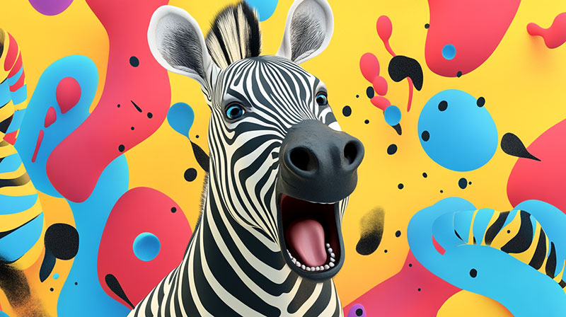
Here’s where it gets interesting. Contrast is how you break rhythm on purpose.
Establish a pattern, then disrupt it with a single element that’s a different size, color, or shape. That disruption becomes a focal point. The viewer’s eye locks onto it because the brain notices the break in the expected pattern.
| Principle | Relationship to Rhythm | Effect |
|---|---|---|
| Balance | Distributes rhythm evenly or unevenly | Stability or dynamic tension |
| Contrast | Breaks rhythm to create focal points | Attention and emphasis |
| Proximity | Controls grouping within rhythm | Perceived relationships between elements |
| Visual hierarchy | Uses rhythm to order information | Clear reading paths |
Apple’s product pages are a textbook case. Repeated section layouts (hero image, specs, comparison grid) create strong rhythm. Then a single oversized image breaks that rhythm and becomes the page’s most memorable moment.
How to Create Rhythm in a Design Composition

Knowing what rhythm is and actually building it into your work are two different things. Took me a while to figure out that rhythm isn’t something you add at the end. You plan for it at the start.
Building Rhythm with Color and Shape
Color echoing is one of the simplest rhythm techniques. Pick a color palette with three to five colors, then repeat those colors at intervals throughout the composition.
The shapes you choose matter too. Rounded elements repeated across a layout create a different feel than angular ones. Mix both and you lose rhythm unless there’s a clear system governing when each appears.
Spotify uses green accent dots, rounded card corners, and consistent icon shapes across every screen. That’s color and shape rhythm working together at product scale.
Building Rhythm with Typography
Marketing LTB research shows 67% of users prefer scanning content over reading full paragraphs. Typographic rhythm is what makes scanning feel effortless.
- Type scale: Use a consistent ratio (like 1.25 or 1.333) between heading sizes
- Line height: Keep body text at 1.5 to 1.6x the font size
- Letter spacing: Tighter for large headings, looser for small caps and labels
A baseline grid ties everything together. When all text across a layout sits on the same invisible horizontal lines, the rhythm becomes almost musical. You feel it even if you can’t explain why.
Tools That Help Maintain Rhythm
| Tool | Rhythm Feature | Best For |
|---|---|---|
| Figma | Auto-layout, spacing variables | UI and product design |
| Adobe InDesign | Baseline grid, master pages | Print and editorial work |
| CSS custom properties | Spacing scale tokens | Web development |
| Tailwind CSS | Utility spacing classes | Rapid prototyping |
The 8-point grid system is probably the most popular spacing framework in UI work right now. Every margin, padding, and gap value follows multiples of 8px, which automatically creates consistent intervals across the entire interface.
Common Mistakes That Break Visual Rhythm
Most rhythm failures aren’t dramatic. They’re subtle. The kind of thing where a layout just feels “off” and nobody can explain why.
Inconsistent Spacing
This is the number one offender. A 24px gap between cards in one section, a 32px gap in another, and a 16px gap somewhere else. The eye picks up on those inconsistencies even when the brain can’t name them.
PWC data shows 32% of consumers will leave a brand after just one inconsistent experience. That principle applies directly to visual layouts where spacing doesn’t follow a coherent system.
Competing Patterns
Two or three rhythmic patterns running simultaneously can cancel each other out. A striped background, a grid of icons, and alternating colored sections all happening on the same page. The eye doesn’t know which pattern to follow.
Pick one dominant rhythm. Let everything else support it or stay out of its way.
Monotonous Repetition
Regular rhythm without any variation is just… boring. A long page of identically sized cards with identical spacing and identical layouts. Your eye glazes over after the third row.
Loopex Digital’s 2026 analysis reports bounce rates still averaging 41% to 55% across most industries. Monotonous layouts that fail to hold visual interest contribute directly to that number.
Ignoring Responsive Breakpoints
A layout with beautiful rhythm at 1440px wide can fall apart completely at 375px. Columns collapse, spacing ratios change, and the visual beat disappears.
Hostinger reports that 73.1% of web designers say non-responsive design is the top reason visitors leave. If your rhythm doesn’t survive the transition from desktop to mobile, it’s not really rhythm. It’s just decoration that only works in one context.
Examples of Rhythm in Well-Known Designs
Theory matters, but seeing rhythm in real work is what actually makes it click. These aren’t obscure references. You’ve probably encountered all of them.
Piet Mondrian’s Grid Compositions
Mondrian stripped painting down to rectangles, primary colors, and black lines. That’s alternating rhythm at its most reduced. Red, blue, yellow, white. Thick line, thin line. Large block, small block.
The compositions still influence graphic design movements and fashion nearly a century later. Yves Saint Laurent’s 1965 Mondrian dress proved that design rhythm translates directly across mediums.
Apple’s Product Pages
Progressive rhythm, executed with precision.
Each Apple product page follows the same scroll pattern: hero image, key feature section, technical deep-dive, comparison table. The rhythm repeats across every product, creating familiarity. Then within each page, elements get progressively more detailed as you scroll down.
DesignRush’s analysis notes that Apple uses repeated structural elements (navigation bar, sliding hero images, grid layouts) organized in consistent patterns across all product pages.
Islamic Geometric Patterns
These are regular rhythm perfected over centuries. A single geometric unit, rotated and reflected, generating infinite complex surfaces from simple mathematical rules.
The Alhambra in Granada, Spain contains 17 distinct symmetry groups across its tilework (the full set of possible planar symmetries). That’s not decoration. That’s rhythm as mathematics.
Spotify’s Interface
Card grid rhythm meets progressive disclosure. Albums, playlists, and podcasts appear as uniform cards in horizontal rows. Scroll down and the rows repeat. Scroll right and more cards appear within each row.
The rhythm is regular enough that you never feel lost. But color variation in album artwork provides just enough random rhythm to keep the grid from feeling like a spreadsheet.
Zaha Hadid’s Architecture
Flowing rhythm at building scale. No straight lines, no repeated modules. Instead, continuous curves that move through space like frozen water.
The Heydar Aliyev Center in Baku, Azerbaijan has no sharp edges at all. Walls become roofs, floors become walls. The entire building is one flowing rhythmic surface, and it works because the curves follow consistent proportional logic even as they never repeat exactly.
FAQ on What Is Rhythm In Design
What is rhythm in design?
Rhythm in design is the repeated use of visual elements like shapes, colors, and spacing to create organized movement across a composition. It guides the viewer’s eye through a layout in a predictable, controlled way.
What are the five types of rhythm in design?
The five types are regular, alternating, flowing, progressive, and random rhythm. Each creates a different visual tempo. Regular uses equal intervals, while flowing follows organic curves and progressive changes elements gradually.
What is the difference between rhythm and repetition?
Repetition is reusing the same element multiple times. Rhythm is the result when those repeated elements are arranged with intentional spacing, variation, and pacing. Repetition is the tool. Rhythm is the effect.
Why is rhythm important in graphic design?
Rhythm creates visual flow, holds a composition together, and helps viewers process information faster. Without it, layouts feel disorganized. With it, the eye moves naturally through content, which improves both readability and engagement.
How do you create rhythm in a design?
Start with a grid system. Choose elements to repeat (color, shape, texture). Set consistent intervals between them. Then decide where to break the pattern for emphasis. Test by squinting at the composition.
What is an example of rhythm in design?
Spotify’s card-based interface is a clear example. Rows of uniform album cards repeat at consistent intervals, creating regular rhythm. The varied album artwork adds random rhythm within the grid structure.
How does rhythm relate to visual hierarchy?
Rhythm establishes the reading path. Visual hierarchy determines what gets seen first. Together, they control both the order and pace at which viewers absorb information across a composition.
Can rhythm exist in web design?
Yes. Card layouts, consistent spacing systems, scroll-based content blocks, and animation timing all produce rhythm in web and UI design. CSS Grid and Flexbox give developers precise control over these intervals.
What breaks rhythm in a design?
Inconsistent spacing, competing patterns, and monotonous repetition without variation. Ignoring responsive breakpoints also destroys rhythm, since layouts that work on desktop often collapse on mobile screens.
How is rhythm used in architecture?
Repeated columns, arches, and window patterns create architectural rhythm. The Colosseum uses alternating rhythm with three column orders. Zaha Hadid’s buildings use flowing rhythm through continuous organic curves.
Conclusion
Understanding what is rhythm in design comes down to one thing: controlling how the eye moves through a composition. Whether you’re working with grid systems in Figma or placing furniture in a living room, the underlying logic is the same.
Regular, alternating, flowing, progressive, and random. Five types, each with a distinct visual tempo. Pick the one that matches your project’s intent.
Rhythm ties directly into how users perceive visual hierarchy, spacing, and compositional flow. Get it right and everything feels connected. Miss it and even polished designs feel scattered.
Start with consistent intervals. Build in variation. Break the pattern where you want attention. Then test it at every screen size. That’s the whole process.

Renowned for his expertise in logo design and visual branding, Bogdan has developed a multitude of logos for various clients.
His skills extend to creating posters, vector illustrations, business cards, and brochures. Additionally, Bogdan's UI kits were featured on marketplaces like Visual Hierarchy and UI8.
He also wrote in the past years on sites like Design Your Way, WebDesignerDepot, WPDean, Designmodo, Speckyboy, Slider Revolution, and more.
- The Substack Logo History, Colors, Font, And Meaning - 2 October 2026
- How UX Design Impacts SaaS User Retention and Churn - 1 October 2026
- How to Embed Fonts in PDF for Reliable Printing - 30 September 2026

Bogdan Sandu is a seasoned designer who has been designing websites since 2008. Renowned for his expertise in logo design and visual branding, Bogdan has developed a multitude of logos for various clients. His skills extend to creating posters, vector illustrations, business cards, and brochures. Additionally, Bogdan's UI kits were featured on marketplaces like Visual Hierarchy and UI8. He also wrote in the past years on sites like Design Your Way, WebDesignerDepot, WPDean, Designmodo, Speckyboy, Slider Revolution, and more.
You Might Also Like