


Every consistent design you’ve ever trusted, from a brand’s packaging to a website’s layout, relies on one principle working quietly in the background. Repetition in graphic design is the deliberate reuse of visual elements like colors, fonts, shapes, and spacing to create cohesion across a composition.
It’s one of the core design principles, and it’s the reason a 50-page brand guide feels like one document instead of fifty separate pages.
This article breaks down what repetition is, how it differs from pattern, the types you’ll use most often, and how it connects to branding, UI design, and real-world examples from designers like Massimo Vignelli and Josef Müller-Brockmann.
What Is Repetition in Graphic Design

Repetition is the deliberate reuse of visual elements throughout a design to create consistency and cohesion.
That’s the short version. The longer version is that repetition takes any element you can think of (a color, a shape, a texture, a font, a line weight, a spacing value) and uses it again. And again. On purpose.
It’s one of the core graphic design principles, sitting alongside contrast, alignment, proximity, and balance. But repetition does something the others don’t. It stitches a composition together across space and time.
A single poster uses repetition to tie the headline to the footer. A 200-page annual report uses it to make page 3 feel like it belongs with page 187. A website with 40 screens uses it so nothing feels random.
Robin Williams (the design author, not the comedian) put it plainly in The Non-Designer’s Design Book: repeat some aspect of the design throughout the entire piece. Not randomly. Not decoratively. Structurally.
There’s a difference between repetition and redundancy that trips people up. Repetition is intentional. Redundancy is accidental. If a button shows up in two different shades of blue across your app, that’s not repetition. That’s a missed style token. If every button is the same blue with the same border radius and the same padding, that’s repetition doing its job.
According to Lucidpress research, consistent brand presentation across all platforms can boost revenue by up to 23%. Repetition is the mechanism behind that number. Every reused color, font, and layout pattern compounds into recognition.
Why Repetition Matters in Visual Communication
Repetition creates unity. That’s the obvious answer.
But here’s why that actually matters: the human brain is wired to find patterns. The Gestalt principles of perception, specifically the principle of similarity, show that people naturally group elements that look alike. When you repeat a visual element, you’re working with the viewer’s brain instead of against it.
Visual Unity Across Layouts
Multi-page documents, websites, and app screens need a thread running through them. Repetition provides that thread.
Without it, every spread in a magazine would feel like a different publication. Every screen in an app would feel disconnected. Took me a while to really appreciate this, but once you see it broken in a live project, you never forget it.
Renderforest found that 71% of businesses agree inconsistent brand presentation leads to customer confusion. That confusion is what happens when repetition fails.
Brand Recognition and Recall
It takes 5 to 7 brand interactions for a consumer to remember a brand, according to branding research from Demand Metric.
Repetition is how those interactions feel connected rather than scattered. Coca-Cola’s red, its Spencerian script, the contour bottle shape. Each repeated element reinforces the last. Research shows that consistent use of signature colors can increase brand recognition by up to 80% (Loyola University study). That’s repetition at a macro level.
And it’s not just big brands. A freelance designer who uses the same grid, the same accent color, and the same heading typeface across their portfolio is doing the same thing at a smaller scale.
Reducing Cognitive Load
When visual elements are repeated, viewers spend less energy processing the layout.
They already “know” what the heading style looks like. They already know the button color. Their brain can focus on the content instead of decoding the structure every time they turn a page or scroll a new section. A well-designed UI, according to Maze research, can improve conversion rates by up to 200%, and much of that comes from predictable, repeated interaction patterns.
Types of Repetition in Design
Repetition isn’t one thing. It shows up in at least five distinct forms, and recognizing them changes how you approach a layout.
| Type | What Gets Repeated | Where You See It |
|---|---|---|
| Color | Palette values, accent hues | Brand systems, UI themes |
| Typographic | Font families, weights, sizes | Editorial layouts, websites |
| Shape/Motif | Icons, geometric forms, illustrations | Posters, packaging, logos |
| Spatial | Margins, padding, grid columns | Web layouts, print grids |
| Texture/Pattern | Surface treatments, overlays | Backgrounds, decorative elements |
Color Repetition
This is the one most people notice first. A consistent color palette across all compositions signals cohesion instantly.
Research from Straits Research found that 85% of consumers say color is the primary factor in their product purchasing decisions. Repeating color values faithfully (not “kind of blue” but the exact hex code) is what separates amateur work from professional systems. Understanding color theory helps, but discipline in applying it consistently is what makes repetition actually work.
Typographic Repetition
Same font families. Same weights. Same sizes at the same heading levels.
This sounds boring until you see a document where the designer used four different heading sizes across six pages. Typographic repetition means your H2 always looks like your H2. Your body copy never randomly switches from 16px to 14px. A solid understanding of typography basics, including leading and tracking, makes this kind of consistency achievable.
According to UXCam research, marketers see a 30% increase in engagement when using fonts consistent with their brand.
Shape and Motif Repetition
Recurring icons, geometric forms, and illustrative elements create a visual language unique to the design.
Look at Google’s Material Design system. The rounded rectangles, the specific corner radius, the consistent icon stroke width. All repeated. All on purpose. The psychology of shapes tells us that repeated geometric forms create expectations in the viewer’s mind. Circles feel friendly. Sharp angles feel dynamic. Repeat them and you’re building a mood.
Spatial Repetition
Consistent margins, padding, and grid systems are repetition that most people never consciously notice. But they feel it.
When every section of a website has the same side margins, the same spacing between cards, the same vertical rhythm, the whole layout breathes evenly. Break that pattern without intention and it looks like a mistake. White space applied consistently is just as much repetition as a repeated logo mark.
Exact Repetition vs. Repetition with Variation
Exact repetition: identical elements used without change. A logo that appears at the same size in the same spot on every page. A navigation bar that never shifts.
Repetition with variation: the same element adjusted in size, color, or orientation. A circle motif appearing at different scales. A brand color used at full saturation for headings and at 20% opacity for background fills.
Both have their place. Exact repetition builds rock-solid consistency. Repetition with variation keeps things interesting while maintaining the connection. Most professional work uses a mix. Your mileage may vary, but I lean toward variation whenever the layout can handle it. Exact repetition across 30 pages gets monotonous fast.
Repetition and Pattern: What’s the Difference
People mix these up constantly, and honestly, the line between them is blurry.
But here’s the distinction that matters: pattern is a product of repetition, not a synonym for it.
Repetition can exist without forming a pattern. A brand’s accent color showing up on the header of every page is repetition. But it’s not a pattern in the visual sense. It’s a consistency rule.
Pattern implies a structured, predictable arrangement of repeated elements. Think wallpaper. Think textile design. Think William Morris’s intricate floral prints from the Arts and Crafts movement. Those are patterns built from repeated motifs arranged in a grid or organic flow.
| Concept | Definition | Example |
|---|---|---|
| Repetition | Reusing any visual element deliberately | Same heading font on every page |
| Pattern | Structured arrangement of repeated elements | Tessellated tile design on a floor |
Here’s where it gets practical. In web design, repetition shows up as consistent button styles, card layouts, and navigation structures. Pattern shows up as decorative background textures or repeating SVG fills.
You need both. But they solve different problems. Repetition solves the “does this feel like one project?” problem. Pattern solves the “does this surface look finished and intentional?” problem.
How Repetition Works with Other Design Principles
Repetition doesn’t work alone. It actually gets more powerful when paired with other principles. Think of it less as a standalone tool and more as a connector.
Repetition and Contrast

This is the most common pairing, and honestly the most effective one.
You repeat most elements in a composition to create a baseline. Then you break the pattern strategically with contrast to draw the eye. A page full of gray text with one red pull quote. A grid of identical product cards where one card is twice the size. That’s repetition setting the stage and contrast creating the focal point.
Without repetition, contrast has nothing to push against. Without contrast, repetition becomes monotonous.
Repetition and Alignment
Grid systems are, at their core, structured repetition.
Every column, every gutter, every baseline increment is a repeated measurement. Josef Müller-Brockmann’s grid-based poster work, a pillar of the Swiss design tradition, shows this clearly. His layouts used rigid grids where the repetition of spatial intervals created visual order even when the content varied wildly.
A baseline grid is repetition applied to vertical spacing. Content snaps to the same invisible lines, making multi-column text feel related even when the columns hold different kinds of information.
Repetition and Proximity
Grouping repeated elements creates sections, categories, and hierarchies.
Picture a pricing page. Three cards, each with the same structure: plan name, price, feature list, button. The repetition of the card layout tells the viewer “these are comparable options.” The proximity of each feature to its card tells them what belongs where. One doesn’t work as well without the other.
Repetition and the Gestalt Principle of Similarity
The Gestalt principle of similarity states that elements sharing visual characteristics are perceived as related.
Repetition is how you activate that principle in practice. Same color? Related. Same shape? Related. Same size? Related. Design systems like IBM’s Carbon and Spotify’s Encore rely on this heavily, using repeated component styles so users instinctively understand relationships between interface elements without reading a single label.
Repetition in Branding and Identity Systems

Brand guidelines are, when you strip away the jargon, a set of rules about what to repeat and how.
Renderforest data shows 95% of companies have some form of brand guidelines. But only 25% actually enforce them. That gap is where repetition breaks down and brand inconsistency starts.
How Brand Systems Codify Repetition
Logo usage rules: minimum sizes, clear space requirements, approved color variations. All repetition guidelines.
Color specifications: exact hex values, RGB values, CMYK breakdowns, and Pantone references ensure the same color gets used across print and digital.
Typography specs: approved typefaces, weights for headings vs. body, size scales, line height rules.
Apple’s Human Interface Guidelines, IBM’s Design Language, and Google’s Material Design are all, at their foundation, repetition systems. They define which elements get repeated and the tolerances within which variation is allowed.
Repetition Across Touchpoints
Packaging, web, print, signage, social media. Every touchpoint is a chance for repetition to build brand equity, or for inconsistency to erode it.
Energy and Matter research found that inconsistent brand usage can lead to a 56% decrease in brand recognition. That’s a staggering number. Spotify’s consistent use of the Circular typeface and duotone imagery across its app, marketing, and social media is a good example of cross-touchpoint repetition done right.
Airbnb’s design system, Cereal (named after their custom typeface), applies the same visual language to their app, website, email campaigns, and physical signage. The repetition is systematic. Not left to individual designers’ judgment.
Companies that have prioritized this kind of consistent branding have seen at least a 33% increase in revenue, according to Demand Metric. Repetition, applied at the system level, is directly tied to business outcomes.
Repetition in Web and UI Design
Design systems are repetition turned into infrastructure. Buttons, cards, navigation bars, form fields. All built once, repeated everywhere.
That’s not laziness. That’s the whole point. A McKinsey study (2024) found companies with mature design systems save 20 to 30% in design and development costs annually, mostly because they stopped rebuilding the same components from scratch.
Figma, which holds 40.65% market share in the design tool category as of 2025, built its entire business model around this idea. Component libraries, shared styles, design tokens. All tools for enforcing repetition across teams. Nearly 95% of Fortune 500 companies now use Figma in their workflows, according to SQ Magazine research.
Design Systems as Systematic Repetition
Component libraries are the building blocks: buttons with consistent padding, cards with the same border radius, icons drawn at the same stroke weight.
Design tokens are the values that get repeated: color hex codes, spacing units, font sizes stored as variables in CSS or JSON.
Bootstrap and Tailwind CSS both work this way. They give you a predefined set of repeatable classes. Your spacing, your type scale, your color palette. All locked in. Headspace reported 20 to 30% time savings on routine tasks and up to 50% on complex projects after standardizing their token system, according to Figma research.
Consistent Interaction Patterns
Repetition in UI goes beyond how things look. It includes how things behave.
If clicking a card opens a detail view on one screen, the same interaction should happen on every screen with that card type. Users learn patterns fast. Adobe research found that 68% of users abandon products that feel inconsistent or confusing. That’s what breaks when interaction patterns aren’t repeated faithfully.
Sparkbox research (2024) shows design system adoption speeds up development by 47% for forms alone, with 38% gains for design teams broadly. Those numbers come directly from repeated components removing decision-making overhead.
Repetition in Responsive Layouts
Maintaining visual repetition across breakpoints is tricky. At least in my experience, this is where repetition breaks down most often.
A desktop layout with clean 24px gutters might collapse to 16px on mobile, but if that 16px isn’t applied consistently across every mobile view, the whole thing feels off. Grid systems and modular scales act as repetition frameworks that adapt per breakpoint while keeping the underlying ratios intact.
| Breakpoint | Grid Columns | Gutter Width | Repetition Role |
|---|---|---|---|
| Desktop (1200px+) | 12 | 24px | Full component display |
| Tablet (768px) | 8 | 20px | Stacked with same spacing ratios |
| Mobile (375px) | 4 | 16px | Single column, consistent margins |
The key here is that the ratio stays consistent even when the absolute values change. That’s repetition with variation applied to responsive web design layouts.
Common Mistakes with Repetition
Over-repetition is real. And it kills designs just as effectively as no repetition at all.
Too Much Repetition Creates Monotony
When every element looks the same and nothing stands out, you’ve got a flat composition. No emphasis. No visual hierarchy. Just visual noise that happens to be consistent.
The fix is pairing repetition with variety. Repeat most things. Break the pattern deliberately for the elements that need attention. That’s where rhythm comes from, the interplay between expected and unexpected.
Inconsistent Repetition
This is worse than no repetition.
Switching fonts mid-project. Using three slightly different shades of your brand blue. Having buttons that are 8px rounded on one page and 12px on another. These inconsistencies signal carelessness to the viewer, even if they can’t articulate why something feels wrong.
Renderforest survey data shows that less than 10% of brands maintain a high level of brand consistency across all products and marketing channels. The gap between “having guidelines” and “enforcing guidelines” is where inconsistent repetition thrives.
Confusing Repetition with Laziness
Every repeated element should serve a purpose. Repeating a decorative border that adds nothing to comprehension is clutter, not design.
Good repetition answers the question “why is this here again?” with something like “because it signals navigation” or “because it reinforces the brand color.” If there’s no clear answer, the element probably shouldn’t be repeated. It should probably be cut.
How to Practice Repetition in Your Own Work
Knowing what repetition is and actually applying it are two different things. Here’s where it gets practical.
Start with a Style Tile or Mood Board
Before touching a layout, lock down your repeatable elements. A mood board collects the visual direction. A style tile narrows it down to specifics:
- Two to three typeface selections with assigned roles (heading, body, accent)
- A defined color palette with primary, secondary, and neutral values
- Button styles, border treatments, and icon conventions
Locking these down early means every decision afterward is an act of repetition rather than improvisation. That’s how consistency happens at scale.
Audit Existing Designs for Accidental Inconsistency
Most inconsistency isn’t deliberate. It’s accumulated drift.
Go through an existing project and screenshot every button, heading, color, and spacing value. Lay them side by side. You’ll almost certainly find variations that crept in over time. A project I worked on last year had four different “primary blue” hex values across 12 screens. Nobody noticed until the audit.
Renderforest found that only 25% of companies actively enforce their brand guidelines. Auditing is how you move from having guidelines to actually following them.
Use Tools That Enforce Repetition Automatically
| Tool | Repetition Feature | Best For |
|---|---|---|
| Figma | Components, styles, variables | UI/UX teams, product design |
| Adobe InDesign | Master pages, paragraph styles | Print design, editorial |
| Canva | Brand Kit (colors, fonts, logos) | Small teams, social media |
| CSS Variables | Design tokens in code | Front-end development |
These aren’t suggestions. They’re requirements if you’re working on anything larger than a one-page flyer. Manual repetition breaks down. Automated repetition scales.
Examples of Repetition in Graphic Design
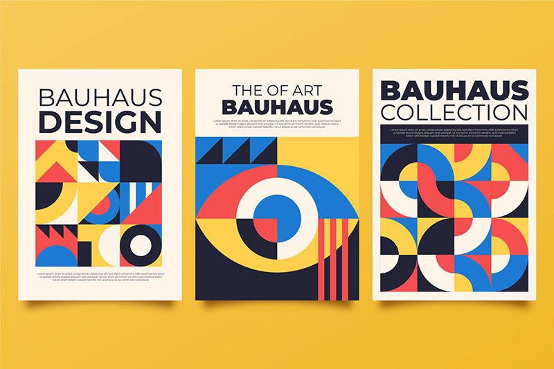
Theory is only useful if you can see it in action. These examples cover a range of eras and applications where repetition carries the design.
Swiss International Typographic Style
Josef Müller-Brockmann’s concert posters for the Zurich Tonhalle are textbook examples. Rigid grid, repeated sans-serif typography, and mathematical spacing.
The Swiss design movement (also called the International Typographic Style) was built entirely on the principle that repeated structural elements create order. Jan Tschichold’s earlier work with the Constructivist tradition influenced this approach heavily. The entire movement treated repetition not as decoration but as logic.
Massimo Vignelli’s NYC Subway Map
One typeface. One line-weight system. Repeated color coding.
Vignelli’s 1972 subway map for New York City used Helvetica exclusively and applied the same visual treatment to every station and line. The repetition made a system with 472 stations feel navigable. Vignelli is among the most influential graphic designers in history, and his commitment to typographic repetition is a big reason why.
Contemporary Digital Examples
Stripe’s website is one of the most referenced examples of repetition in modern web design. Consistent spacing, a limited color palette, repeated card layouts, and the same typographic scale across every page.
Airbnb’s Cereal design system applies the same visual language to their app, email campaigns, and physical signage. The system includes a custom typeface, defined spacing tokens, and standardized component patterns that get repeated across every touchpoint. Baymard Institute found that consistent interfaces can improve conversion by up to 20%, which gives concrete business weight to what Airbnb and Stripe are doing.
Print and Editorial Examples
Kinfolk magazine: known for generous white space, repeated type pairings, and a muted color palette that carries across every issue.
Cereal magazine: uses the same minimal layout grid, the same serif/sans-serif pairing, and the same photographic style issue after issue. Both publications prove that repetition doesn’t have to feel rigid. In print, it can feel meditative. Almost restful.
The Bauhaus design school pioneered this kind of systematic thinking in the early 20th century. Their approach to repeated geometric forms, standardized materials, and functional layouts directly influenced how we think about design systems today. Look at any modern component library and you’ll see Bauhaus DNA in the structure.
FAQ on What Is Repetition In Graphic Design
What is repetition in graphic design?
Repetition is the deliberate reuse of visual elements like colors, fonts, shapes, and spacing throughout a design. It creates consistency and cohesion across layouts, helping viewers recognize related content and navigate compositions without confusion.
Why is repetition important in design?
Repetition builds visual unity across pages, screens, and touchpoints. It reduces cognitive load for viewers and strengthens brand recognition. Without it, multi-page documents and websites feel disconnected, like separate projects stitched together.
What is the difference between repetition and pattern?
Pattern is a product of repetition, not a synonym. Repetition can be a consistent heading font across pages. Pattern is a structured, predictable arrangement of repeated motifs, like a tessellated tile or William Morris textile print.
What are the types of repetition in graphic design?
The main types are color repetition, typographic repetition, shape and motif repetition, spatial repetition (margins and grids), and texture repetition. Each type reinforces design cohesion in a different way across compositions.
How does repetition relate to other design principles?
Repetition works closely with contrast, alignment, proximity, and balance. It sets the visual baseline. Contrast then breaks the pattern to create emphasis. Grid systems are structured repetition. Grouping repeated elements creates hierarchy through proximity.
Can you have too much repetition?
Yes. Over-repetition creates monotony. When every element looks identical and nothing stands out, the design loses its visual hierarchy. The fix is pairing repetition with variety, breaking the pattern intentionally where emphasis is needed.
How is repetition used in branding?
Brand guidelines are codified repetition rules. They define which colors, typefaces, logo placements, and spacing values get reused across every touchpoint. Companies like Spotify and Airbnb apply these rules systematically to build recognition.
What is the difference between exact repetition and repetition with variation?
Exact repetition uses identical elements unchanged, like a logo at the same size on every page. Repetition with variation adjusts size, color, or orientation while keeping the core element recognizable. Most professional work combines both.
How do design systems use repetition?
Design systems like Google’s Material Design and IBM’s Carbon are built on repeated components, tokens, and patterns. Buttons, cards, and navigation bars are created once and reused across products, making interfaces consistent at scale.
What tools help enforce repetition in design?
Figma uses components, styles, and variables. Adobe InDesign offers master pages and paragraph styles. Canva has a Brand Kit feature. CSS variables handle design tokens in code. All automate repetition so it doesn’t rely on manual consistency.
Conclusion
Understanding what is repetition in graphic design comes down to one idea: reuse visual elements with intention, and your work holds together. Skip it, and everything falls apart.
Repetition is the principle that connects a single poster to a full brand identity system. It’s how Müller-Brockmann’s grids made complex information feel orderly, and how Spotify’s interface feels the same whether you’re on mobile or desktop.
The practical side matters just as much as the theory. Lock down your typefaces, your color values, your spacing tokens early. Use tools like Figma or InDesign to automate what shouldn’t be left to memory.
Pair repetition with contrast so nothing becomes monotonous. Audit your work for drift. And remember that every repeated element should earn its place.
Repetition isn’t about doing the same thing over and over. It’s about making deliberate choices that compound into visual coherence across every layout, screen, and touchpoint you design.

Renowned for his expertise in logo design and visual branding, Bogdan has developed a multitude of logos for various clients.
His skills extend to creating posters, vector illustrations, business cards, and brochures. Additionally, Bogdan's UI kits were featured on marketplaces like Visual Hierarchy and UI8.
He also wrote in the past years on sites like Design Your Way, WebDesignerDepot, WPDean, Designmodo, Speckyboy, Slider Revolution, and more.
- The Coda Logo History, Colors, Font, And Meaning - 20 October 2026
- How Can Designers Turn AI Image Prompts Into Polished Visuals? A Practical Workflow - 20 October 2026
- Top Military and Defense UI/UX Design Services Companies: A 2026 Buyer’s Guide - 19 October 2026

Bogdan Sandu is a seasoned designer who has been designing websites since 2008. Renowned for his expertise in logo design and visual branding, Bogdan has developed a multitude of logos for various clients. His skills extend to creating posters, vector illustrations, business cards, and brochures. Additionally, Bogdan's UI kits were featured on marketplaces like Visual Hierarchy and UI8. He also wrote in the past years on sites like Design Your Way, WebDesignerDepot, WPDean, Designmodo, Speckyboy, Slider Revolution, and more.
You Might Also Like


