Place two buttons next to each other and people assume they’re related. Pull them apart and the connection breaks. That’s proximity at work.
So what is proximity in design? It’s the Gestalt principle that says elements placed close together are perceived as a group. No borders needed, no color coding. Just space doing the heavy lifting.
It’s one of the foundational graphic design principles, and getting it wrong quietly ruins layouts that otherwise look fine.
This guide covers how proximity creates visual grouping, how it compares to other Gestalt laws, how to apply it across UI, print, and design systems, and the common spacing mistakes that trip up even experienced designers.
What Is Proximity in Design
Proximity is the practice of placing related visual elements close together and moving unrelated ones further apart. That’s it. The brain does the rest.
It’s one of the four core graphic design principles outlined in Robin Williams’ The Non-Designer’s Design Book, sitting alongside alignment, contrast, and repetition.
The idea comes from Gestalt psychology. Max Wertheimer, Kurt Koffka, and Wolfgang Köhler formulated these perceptual laws in 1920s Germany, trying to explain how people organize what they see into meaningful patterns. The Law of Proximity was one of the first they identified.
When elements sit near each other, you assume they belong together. No boxes needed. No lines, no color coding. Just space.
According to CXL research, users form opinions about a webpage in roughly 50 milliseconds. That snap judgment depends on structure, spacing, and how the layout is organized. Proximity handles a huge chunk of that work before conscious thought even kicks in.
Think about a business card. The person’s name and job title are grouped at the top. Phone number, email, and address sit together at the bottom. Nobody needs a label to tell them which section is which. The spacing does the talking.
And here’s the thing most people get wrong about proximity. It’s not just about pulling related items closer. It’s equally about pushing unrelated items apart. The gap between groups matters just as much as the tightness within them.
How Proximity Creates Visual Grouping
Your brain automatically clusters nearby objects into a single unit. It’s a shortcut, and a fast one.
Research from the Interaction Design Foundation confirms that proximity is actually more powerful than other visual features like color or shape when it comes to perceptual grouping. People will see items as related just because they’re close, even if everything else about them differs.
The Role of White Space
White space is what makes proximity work. It’s the tool that activates grouping.
Tighten the space between a heading and its paragraph, and they read as one unit. Widen the gap before the next section, and a new group forms. The elements of design don’t change. Only the distance between them shifts.
Nielsen Norman Group published research specifically on this topic, showing that effective use of spacing in forms and content layouts significantly reduces user confusion. Labels placed close to their corresponding input fields are understood faster. Labels floating too far away? People start guessing which field belongs to which label.
Reducing Cognitive Load
Proximity lets users process chunks instead of individual items. That’s a direct reduction in mental effort.
A 2025 study published in Frontiers in Psychology provided neural-level evidence for the spatial proximity effect, confirming that placing related information closer together reduces extraneous cognitive load and improves processing efficiency. The researchers used functional near-infrared spectroscopy to measure this at the brain level.
Forrester research shows every $1 invested in UX design returns roughly $100. Proximity is one of the cheapest UX improvements you can make, since it costs nothing beyond rethinking your spacing.
Proximity vs. Other Gestalt Principles
Proximity isn’t the only perceptual grouping principle. But it tends to win when principles compete.
| Principle | Groups By | Overrides Proximity? |
|---|---|---|
| Similarity | Shared color, shape, size | Rarely |
| Common Region | Enclosing boundary (box, background) | Yes, often |
| Continuity | Aligned along a path or line | No |
| Closure | Completing incomplete shapes | No |
Proximity vs. Similarity
Similarity groups design elements by shared visual traits, like color, shape, or size. Proximity groups purely by distance.
When the two conflict (say, a red circle placed next to a blue circle, both far from another red circle), proximity usually wins. People see the two nearby circles as a pair before noticing the matching colors across the layout.
Maze’s 2024 research on Gestalt principles in product design reinforces this. Teams that relied on proximity-based grouping over color-based grouping saw more intuitive navigation patterns in user testing.
When Common Region Takes Over
Common region is the one principle that consistently overrides proximity. If you place elements inside a shared boundary (a card, a colored background, a bordered box) users will see them as grouped even if they’re spaced far apart inside that container.
This is why card-based layouts are so effective. The card itself creates a region, and proximity organizes everything within it.
Understanding these overlaps prevents misapplication. If your layout relies only on proximity and something still feels off, you might need a boundary to reinforce the grouping. Or you might be fighting similarity without realizing it.
Proximity in UI and Web Design

Digital interfaces are where proximity does its heaviest lifting. Every form, dashboard, navigation menu, and content block depends on spatial relationships to make sense.
A Stanford University study found that 75% of consumers judge a business’s credibility based on website design. And a lot of what people call “good design” just comes down to proper spacing between elements.
Form Design and Label Placement
The distance between a label and its input field changes how people interact with forms. This isn’t opinion. It’s backed by repeated usability testing.
Nielsen Norman Group’s research on form design white space shows that labels placed too far from text fields cause users to lose track of which label belongs to which input. Top-aligned labels (directly above the field) provide the closest proximity and enable the fastest form completion.
IBM’s Carbon Design System adopted top-aligned labels as their default specifically because of this proximity advantage. Their documentation references NNG’s research directly.
Card-Based Layouts
Cards are proximity made structural. Each card groups an image, title, description, and action button into one contained unit.
Google’s Material Design system uses cards extensively, and for good reason. The spatial proximity within a card creates an instant visual relationship between all its contents. The gap between cards separates distinct items.
According to Loopex Digital’s 2026 web design statistics, well-executed UI can increase conversion rates by up to 200%, and proximity-driven layouts like card grids are a big part of that.
Spacing Systems and Proximity
Most modern grid systems enforce consistent proximity through fixed spacing scales.
The 4px/8px grid is the standard in tools like Figma and Sketch. Material Design and Apple’s Human Interface Guidelines both build their component spacing around multiples of 4 or 8 pixels. The reason is straightforward: consistent spacing creates predictable proximity relationships throughout an interface.
The State of Design Tokens 2024 report by Supernova found that nearly 70% of designers have started using Figma variables for managing spacing tokens. Another 19% planned to adopt them soon. That’s a massive shift toward systematized proximity control.
CSS properties like gap, margin, and padding are the code-level tools that translate design proximity into actual rendered layouts. The web design process now treats spacing as a first-class concern, not an afterthought.
Proximity in Print and Graphic Design

Proximity wasn’t born on screens. It started on paper.
Poster design, magazine spreads, and packaging all rely on spatial grouping to direct the reader’s eye and establish reading order. The principle works the same way it does digitally, just without hover states.
Posters and Flyers
On a poster, proximity determines what people read first. The headline groups with the date. The venue groups with the address. The sponsors cluster at the bottom.
Break those groupings and people lose the thread. I’ve seen event flyers where the date was closer to the sponsor logos than to the event name. Nobody could figure out when the thing was happening.
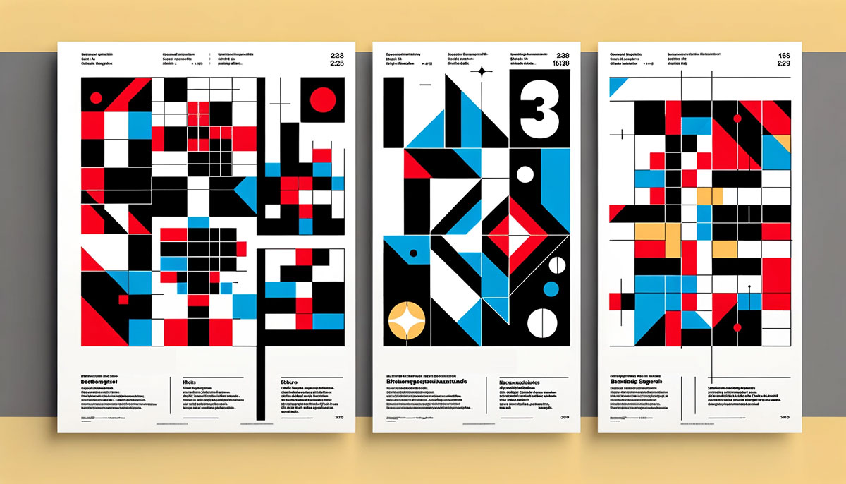
Swiss design from the mid-20th century practically codified the use of spacing and proximity in print design. Josef Müller-Brockmann’s grid-based poster layouts are textbook examples of proximity creating order from complex information.
Packaging and Labels
Packaging design uses proximity under tight constraints. Everything has to fit on a small surface, so grouping becomes even more critical.
The FDA nutrition label is a familiar example. Serving size groups with calories. Nutrients group together. Daily values group in their own column. Proximity separates these sections without needing thick lines or colored backgrounds.
Forbes data indicates that 94% of first impressions are design-related. For physical products sitting on a shelf, the proximity of text elements on the label is often what determines whether someone picks it up or walks past.
Business Cards, Resumes, and Documents
A resume with equal spacing between every line reads like a wall of text. One with clear grouped sections (contact info, experience, education) scans quickly.
The same goes for business cards. Look at one where the name, title, and company are grouped separately from the contact details. Then look at one where everything is evenly distributed. The grouped version communicates faster every single time.
Understanding visual hierarchy and typography choices only gets you partway there. Without proximity handling the spatial relationships, even great type and color choices fall flat.
Common Proximity Mistakes
Most proximity failures aren’t dramatic. They’re subtle, and that’s what makes them tricky. The layout looks “fine” at a glance, but users hesitate, misread, or click the wrong thing.
Equal Spacing Between Everything
This is the single most common proximity mistake. When every element on a page has the same amount of space around it, nothing feels grouped. The brain has no spatial cues to work with.
It’s the design equivalent of reading a paragraph with no punctuation. The words are all there, but good luck parsing them.
MindInventory’s 2026 UX statistics report shows that 88% of users won’t return to a site after a bad experience. Uniform spacing that prevents quick scanning absolutely contributes to that kind of frustration.
Floating Labels
Labels that drift too far from their associated content cause ambiguity. Is this caption for the image above or the one below? Does this heading belong to the paragraph before it or after it?
Nielsen Norman Group’s form usability research calls this out specifically. When form labels sit equidistant between two fields, users have to guess which field the label describes. Top-aligned labels fix this by collapsing the distance to near-zero.
Overcrowding Related Elements
Proximity means close, not smashed together. Packing items too tightly kills individual identity. Buttons lose their tap targets. Text blocks become unreadable.
Proper font spacing, including leading and tracking, still matters inside a grouped unit. Elements need room to breathe even when they’re supposed to be read together.
Relying on Borders Instead of Space
Adding lines and boxes between every section is a crutch. It means the spacing isn’t doing its job.
Well, sometimes borders make sense. But if your layout needs a divider between every single group, your proximity relationships are probably broken. Minimalist design approaches prove that space alone can do almost all the organizational work.
Airbnb redesigned their listing pages years ago with a heavy focus on spatial grouping over visual separators. The result was a cleaner interface that performed better in usability testing, because the content hierarchy was communicated through proximity rather than decoration.
How to Apply Proximity Effectively
Proximity isn’t something you eyeball. At least, not if you want consistent results across a full layout.
Loopex Digital’s 2026 data shows that clear visual hierarchy with guided spatial structure can boost conversions by around 30%. Proximity is the cheapest way to get there.
Start With Content Relationships
Before opening any design tool, list which elements belong together. Headings with their body text. Labels with their inputs. Images with their captions.
Skip this step and you’ll spend hours nudging pixels around without a clear plan. Every proximity decision should trace back to a logical content relationship, not a visual hunch.
The Squint Test
Blur your eyes or step back from the screen. If you can still see distinct groupings, your proximity is working.
If everything blurs into one uniform mass, your spacing is too even. If groups look random, you’ve got elements in the wrong clusters. This takes about three seconds and catches most layout problems before they reach a user.
Establish a Spacing Hierarchy
You need at minimum two distinct spacing values:
- Tight spacing (e.g., 8px) for items within a group
- Wide spacing (e.g., 24px or more) between separate groups
Most production design systems use a full scale. Material Design, for instance, works off multiples of 4px. Shopify’s Polaris system defines explicit spacing tokens at 4, 8, 12, 16, 20, and 24 pixels to keep proximity decisions consistent across every component.
Proximity in Design Tools
| Tool | Proximity Feature | Best For |
|---|---|---|
| Figma | Auto Layout, spacing tokens, variables | UI and component design |
| Adobe InDesign | Grids, baseline grids, paragraph spacing | Print layouts, editorial |
| CSS | gap, margin, padding, flexbox/grid | Code implementation |
Figma’s Auto Layout is probably the single most useful feature for proximity control in digital design right now. It lets you define exact spacing between child elements and padding within a frame, so grouped items stay grouped no matter what.
For print work, InDesign’s baseline grid keeps typographic elements locked into a vertical rhythm. That rhythm is proximity at the micro level, making sure every line of text relates properly to the one above and below it.
Proximity and Visual Hierarchy

Proximity doesn’t create hierarchy on its own. But it reinforces it in ways that other principles can’t fully replace.
A heading next to a paragraph reads as a title for that content. Increase the size of the heading (that’s scale and proportion) and it gets more prominent. But without proximity tying the heading to its content, the size alone doesn’t tell users which content it belongs to.
How Grouping Signals Subordination
Elements grouped tightly under a heading are perceived as subordinate to it. That’s how navigation menus work: the main category sits above, and the subcategories cluster below.
MindInventory’s 2026 UX report notes that 94% of users form their opinion of a website based on its design. A massive part of that snap judgment comes from whether the hierarchy is readable at a glance, and proximity is what makes hierarchy scannable.
Breaking Proximity to Create Emphasis
Isolating an element is one of the strongest emphasis techniques available.
A call-to-action button surrounded by generous negative space draws the eye precisely because it breaks from the surrounding groupings. Apple does this constantly on their product pages. The “Buy” button sits alone, separated from feature descriptions and pricing details.
This works because the brain processes isolated elements differently. They register as distinct, important, separate from the flow.
Reading Patterns and Proximity
Nielsen Norman Group’s eye-tracking research identified two dominant scanning behaviors on the web: the F-pattern (for text-heavy pages) and the Z-pattern (for simpler layouts).
Both patterns depend on proximity to function. In the F-pattern, users scan headings down the left side, then read horizontally when something catches their attention. If your headings aren’t visually grouped with their corresponding content through tight proximity, users lose the thread during these rapid scans.
The Z-pattern works on pages with less text, where the eye moves diagonally from top-left to bottom-right. Strategic proximity of focal points along that path keeps users moving toward the conversion point.
Measuring Proximity in Design Systems
Individual designers can get away with eyeballing spacing. Teams can’t.
When multiple designers and developers work on the same product, proximity decisions need to be documented, tokenized, and enforced. Otherwise, every new page ends up with slightly different spacing, and the whole product starts feeling disconnected.
Spacing Scales
A spacing scale is a predefined set of values that maps to different proximity relationships. Here’s a typical one:
| Token | Value | Proximity Use |
|---|---|---|
| space-xs | 4px | Inline elements, icon-to-label gap |
| space-sm | 8px | Related items within a group |
| space-md | 16px | Between grouped sections |
| space-lg | 24px | Major section breaks |
| space-xl | 48px | Top-level content separation |
The Supernova State of Design Tokens 2024 report found that 70% of designers now use Figma variables for managing these values. Spacing tokens are the second most adopted token type after color.
How Major Design Systems Handle It
IBM Carbon: Uses a 2px mini unit and an 8px base unit. All spacing within and between components is built from these two values. IBM reported that Carbon cut development time by 50% and delivered a 2,600% ROI.
Shopify Polaris: Defines spacing tokens explicitly and ties them to component specs. Shopify reduced design time by 30% after rolling out Polaris across their product teams.
Atlassian: Treats their design system as a product with its own adoption metrics, tracking how consistently spacing tokens are applied across Jira, Confluence, and other tools.
Figma’s 2024 data shows that organisations with established design systems achieve 83% greater brand consistency and ship features 47% faster.
Auditing Proximity Consistency
Headspace reported 20 to 30% time savings on standard tasks after implementing design tokens and variables, with up to 50% savings on complex projects, according to Figma’s design system metrics research.
The tools for catching spacing problems:
- Figma Library Analytics: tracks token usage across files and teams
- Design Lint plugins: flag components that deviate from system spacing
- Redline overlays: visualize exact pixel distances between elements during handoff
If a component’s internal spacing doesn’t match the system’s token for “related items,” that’s a proximity inconsistency. Small on its own. Compounded across hundreds of screens, it erodes the spatial logic users depend on to scan your product quickly.
Your mileage may vary depending on team size and product complexity. But the principle holds: measure it, or it drifts.
FAQ on What Is Proximity In Design
What is the proximity principle in graphic design?
The proximity principle states that elements placed close together are perceived as related. It comes from Gestalt psychology and helps designers create visual grouping without needing borders or color coding. Space alone signals which items belong together.
How does proximity differ from alignment?
Proximity groups related items by closeness. Alignment creates order by placing elements along a shared edge or axis. They work together but solve different problems. Proximity handles relationships. Alignment handles structure.
Why is proximity important in UI design?
Proximity reduces cognitive load by letting users scan grouped chunks instead of individual items. Forms, navigation menus, and card layouts all depend on spatial relationships to feel intuitive. Bad spacing forces users to guess which elements are connected.
What is an example of proximity in everyday design?
A business card. The name and job title sit together at the top. Contact details cluster at the bottom. Nobody needs labels to understand the grouping because the spacing between elements communicates everything.
How does proximity relate to white space?
White space is the tool that activates proximity. Tighter space within a group signals relatedness. Wider space between groups signals separation. Without intentional white space, proximity has nothing to work with.
Can proximity override other Gestalt principles?
In most cases, yes. Research shows proximity is stronger than similarity (grouping by color or shape). The main exception is common region, where enclosing elements in a boundary, like a card, can override closeness.
What are common proximity mistakes in design?
Equal spacing between every element is the biggest one. It kills all sense of grouping. Other mistakes include labels floating too far from their fields, overcrowding related items, and relying on borders instead of space itself.
How do you apply proximity in web design?
Start by identifying which content elements are logically related. Group them with tight spacing. Separate unrelated sections with wider gaps. CSS properties like gap, margin, and padding give you direct control over proximity in code.
What is the connection between proximity and visual hierarchy?
Proximity reinforces hierarchy by tying subordinate elements to their parent. A heading grouped tightly with its paragraph reads as a unit. Breaking proximity by isolating an element, like a CTA button, creates emphasis through separation.
How do design systems standardize proximity?
Through spacing tokens. Systems like Material Design and IBM Carbon define fixed spacing scales (4px, 8px, 16px, 24px) that map to specific proximity relationships. These tokens keep spacing consistent across teams, products, and platforms.
Conclusion
Understanding what is proximity in design comes down to one thing: controlling the space between elements so the brain doesn’t have to work overtime. It’s the quietest principle, but it does the most structural work in any layout.
Whether you’re building a web interface, laying out a poster, or defining spacing tokens in a design system, proximity decisions shape how people read, scan, and interact with your work.
Get the grouping right and everything else falls into place. Typographic hierarchy lands better. Balance feels natural. Users find what they need without friction.
The best proximity work is invisible. Nobody notices good spacing. They just notice when it’s missing.

Renowned for his expertise in logo design and visual branding, Bogdan has developed a multitude of logos for various clients.
His skills extend to creating posters, vector illustrations, business cards, and brochures. Additionally, Bogdan's UI kits were featured on marketplaces like Visual Hierarchy and UI8.
He also wrote in the past years on sites like Design Your Way, WebDesignerDepot, WPDean, Designmodo, Speckyboy, Slider Revolution, and more.
- Best Visual Regression Testing Tools for Web and App Design in 2026 - 13 October 2026
- Jujutsu Kaisen Font Generator - 12 October 2026
- The Windsurf Logo History, Colors, Font, And Meaning - 10 October 2026

Bogdan Sandu is a seasoned designer who has been designing websites since 2008. Renowned for his expertise in logo design and visual branding, Bogdan has developed a multitude of logos for various clients. His skills extend to creating posters, vector illustrations, business cards, and brochures. Additionally, Bogdan's UI kits were featured on marketplaces like Visual Hierarchy and UI8. He also wrote in the past years on sites like Design Your Way, WebDesignerDepot, WPDean, Designmodo, Speckyboy, Slider Revolution, and more.
You Might Also Like