

Scale and proportion get mixed up constantly. Even experienced designers confuse them, and it causes real problems in layouts, architecture, and visual composition.
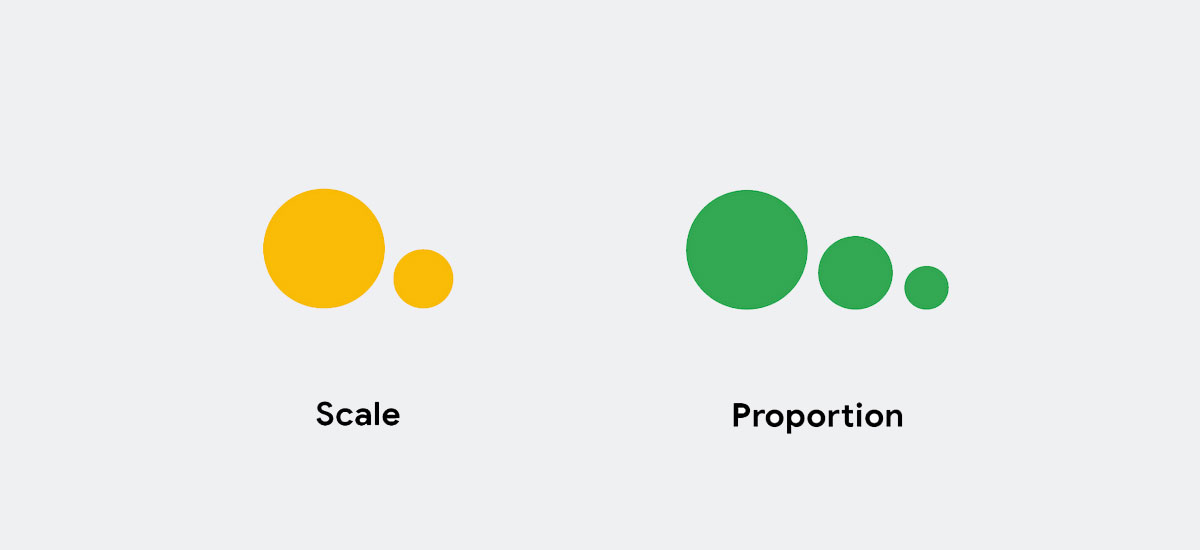
The difference between scale and proportion comes down to one thing: what you’re comparing. Scale measures an object against something external. Proportion looks at how parts relate inside the same object.
That distinction sounds simple, but it changes how you approach everything from responsive breakpoints to building facades. This article breaks down both concepts, shows where they overlap, and covers the common mistakes that happen when you treat them as the same thing.
What Is Scale

Scale is the size of an object compared to something else. That “something else” is always external, always outside the object itself. A blueprint drawn at 1:100 means every centimeter on paper represents 100 centimeters in the real world.
This is a fixed, measurable relationship. Without the reference point, scale doesn’t exist.
Think about it this way. A chair sitting in a room means nothing in terms of scale until you compare it to the doorframe, the ceiling height, or the person sitting in it. The chair’s dimensions haven’t changed, but its perceived size shifts entirely based on context.
How Scale Works Across Different Fields
Scale shows up differently depending on the discipline, but the core idea stays the same: size relative to a known standard.
Architecture: Measured against the human body and building codes. A standard door is roughly 2.1 meters tall because that’s what works for most people.
Cartography: A map at 1:50,000 scale means 1 cm equals 500 meters of real terrain. Get the scale wrong, and entire navigation systems fail.
Graphic design: Elements are scaled relative to the canvas, the screen, or other components in the layout. A headline at 48px only “feels” large because the body text sits at 16px.
3D modeling: Objects require precise scale ratios to render correctly in engines like Unity or Blender. A character model built at the wrong scale against the environment looks immediately off.
Hostinger reports that 94% of first impressions of a website come down to its design, which makes getting the relative size of interface elements right a big deal from the very first screen load.
Units of Measurement Define Scale
Scale always needs a unit. Inches, meters, pixels, points. Without a unit, you can’t establish the relationship between an object and its reference.
This is what separates scale from proportion. Scale is quantifiable. You can put a number on it. A model airplane built at 1:72 scale tells you exactly how the model relates to the real aircraft.
DPI (dots per inch) is another example. A print file at 300 DPI and the same file at 72 DPI contain the same image, but they exist at completely different scales for completely different output contexts.
What Is Proportion

Proportion is the relationship between parts of the same thing. Not compared to an outside reference. Not measured against a fixed standard. It’s internal.
A rectangle where the width is 1.618 times the height follows the golden ratio. That ratio holds whether the rectangle is 10 pixels wide or 10 meters wide. The size changed. The proportion didn’t.
Proportion as Internal Harmony
Your brain processes proportional relationships constantly, even when you’re not aware of it. Something “looks right” or “looks off” before you can explain why. That gut reaction? It’s almost always a proportion issue.
Leonardo da Vinci’s Vitruvian Man is the textbook example. He mapped the ratios between arm span, height, head size, and torso length based on the writings of Roman architect Vitruvius. The drawing isn’t about how big a person is. It’s about how the parts relate to each other.
According to the Preservation Society of Charleston, the golden section ratio (1:1.618) appears repeatedly throughout the relationships of parts in the human body, and these proportions have been applied in architecture for over two thousand years.
Proportion Doesn’t Need Measurement Units
This is the part that trips people up. Proportion can exist without inches or centimeters or pixels.
A square is always a square regardless of its size, because the ratio between its sides is always 1:1. Scale it up, scale it down. The proportion stays locked.
The Fibonacci sequence (0, 1, 1, 2, 3, 5, 8, 13, 21…) generates ratios that approach 1:1.618 as the numbers get larger. Designers, architects, and artists have used these proportional relationships for centuries, not because of the absolute sizes involved, but because the ratios themselves produce something that the human eye finds balanced.
Classical sculpture depended entirely on this. The proportions of the human body in Greek and Roman statues followed strict mathematical ratios. The actual size of the statue could vary wildly, but those internal relationships stayed consistent.
How Scale and Proportion Differ

Scale compares an object to something external. Proportion compares elements within the same object. That’s the core distinction, and everything else flows from it.
| Aspect | Scale | Proportion |
|---|---|---|
| Reference point | External (another object, the viewer, a standard) | Internal (parts of the same whole) |
| Requires units | Yes (px, cm, inches, ratios to real-world size) | No (exists as a ratio at any size) |
| Changes when resized | Yes | Only if resized non-uniformly |
| Primary concern | How big is this compared to that? | Do the parts relate well to each other? |
A building model can be perfectly to scale but still have terrible proportions. The columns might be accurately sized at 1:100, but if they’re too thick for the entablature they support, the building looks heavy and awkward.
And the reverse happens too. A thumbnail sketch and a finished mural can share identical proportions at completely different scales.
Scale Without Proportion
Ever stretched a photo horizontally to fill a space? You changed the scale on one axis only, and instantly broke the proportions. Faces look wide. Text looks squashed. Everyone notices, even people who can’t articulate the problem.
The same thing happens in web design. A button sized correctly for desktop might be too small on mobile, and if the padding, icon, and text inside don’t maintain their proportional relationships during resizing, the whole component falls apart visually.
GoodFirms research shows that 84.6% of designers consider cluttered layouts a major error small businesses make. A lot of that clutter comes from scaling elements without respecting their internal proportions.
Proportion Without Scale
A logo designed at 500px wide and the same logo printed on a billboard share identical proportions. The scale is wildly different. The logo works at both sizes because its internal ratios hold up.
This is exactly why vector graphics exist. SVGs maintain proportional relationships at any scale because they’re defined by mathematical coordinates, not fixed pixel grids.
Typography works this way too. The ratio between heading size and body text should stay proportional across screen sizes in responsive layouts. If your H1 is 3x the body text on desktop, it should stay close to that multiplier on mobile, even though the actual pixel values change.
Scale and Proportion in Art and Design

Painters figured this out centuries ago. If you want something to feel far away, make it smaller than the objects in the foreground. That’s scale doing the work, creating the illusion of depth on a flat surface.
But composition? That’s proportion.
The rule of thirds divides the canvas into a 3×3 grid, placing key elements along the intersections. It’s a proportional framework, and it works regardless of whether the canvas is a postcard or a wall-sized painting.
When Artists Break Scale on Purpose
Claes Oldenburg and Coosje van Bruggen built careers on deliberately breaking scale. Their Spoonbridge and Cherry sculpture at the Walker Art Center in Minneapolis weighs almost 7,000 lbs. It’s a spoon. At building scale.
Here’s the thing though. The internal proportions of the spoon and cherry are accurate. The handle curves correctly. The cherry sits where it should. The psychology of shapes still reads as “spoon” because the proportions are right, even though the scale is absurd.
That’s why it works as art and not just as a big thing. The tension between correct proportion and impossible scale creates the emotional response.
Proportion as the Foundation of Composition
The visual hierarchy of any design depends on proportional relationships between elements. A headline that’s 4x the body copy grabs attention first. A focal point works because surrounding elements are proportionally smaller or less prominent.
UXmatters research confirms that size progression is the most impactful way of creating visual order. People naturally associate significance with size.
Meanwhile, balance in a composition is a proportional relationship between visual weight on different sides of the layout. You can achieve it through symmetry or through asymmetry, but either way, it’s about how parts relate to the whole.
Scale and Proportion in Architecture

This is where the distinction between scale and proportion has the most practical weight. Get either one wrong in a building, and people feel it physically.
Scale in architecture starts with the human body. Standard door openings, stair risers, ceiling heights. These aren’t arbitrary numbers. The ideal residential ceiling height sits between 2.7 and 3.0 meters because that range feels comfortable relative to human dimensions.
Building Codes as Scale Standards
Building codes dictate scale. Minimum ceiling heights, maximum stair riser dimensions, required door widths. These are fixed measurements designed around how human bodies move through space.
Le Corbusier developed the Modulor system in the 1940s specifically to bridge this gap. He created an anthropometric scale of proportions based on the human body, the Fibonacci sequence, and the golden ratio, then applied it to everything from furniture dimensions to entire housing blocks.
The Marseille Housing Unit was his first project where all dimensions were multiples of the Modulor. Took me a while to appreciate what he was doing there. Actually, it depends on whether you think systematizing every dimension down to body ratios is brilliant or suffocating. Probably both.
Classical Orders as Proportion Systems
The Doric, Ionic, and Corinthian orders aren’t about how big a column is. They’re about the ratios between column diameter, column height, capital size, and entablature depth.
A Doric column has a height roughly 6-8 times its base diameter. An Ionic column stretches that to about 9 times. These are proportional systems, not scale prescriptions. You can build a Doric temple at any size, and as long as those ratios hold, it reads correctly.
The Parthenon demonstrates this with optical corrections that are genuinely clever. The columns tilt slightly inward, the stylobate curves upward at the center, and corner columns are slightly thicker. All of these adjustments maintain the appearance of perfect proportion at the building’s actual scale, because at that size, perfectly straight lines would look curved to the human eye.
Modern Architecture and Human Scale
ArchDaily notes that the human visual angle ranges between 50° and 55°, which is why low-rise structures feel more natural and high-rise buildings can feel alienating without ground-level design adjustments.
Skyscrapers solve this by paying attention to human-scale elements at street level. Lobbies, entrances, canopies, and street-facing retail all exist at proportions comfortable for pedestrians, even when the building above towers 60 stories.
The Bauhaus design movement pushed this thinking into both architecture and graphic design. Function drove form, but proportion drove both.
Scale and Proportion in Graphic and Web Design

Responsive design is a proportion problem. Breakpoints are a scale problem. And most layout issues come from confusing the two.
Hostinger data shows that 90% of all websites (around 1.2 billion) have implemented responsive design as of 2025. But responsive done poorly is just scale without proportion. Elements shrink but lose their internal relationships.
Why Responsive Design Depends on Both
A fluid grid system maintains proportional relationships. Columns stay in ratio as the viewport narrows. A sidebar that’s 38% of the content area width stays at 38%, whether the screen is 1440px or 768px wide.
Media queries handle scale. At a specific breakpoint, you might switch from a three-column layout to a single column. That’s a scale decision. But within that single column, the proportional relationships between heading sizes, image aspect ratios, and spacing need to hold.
Responsive designs convert 11% better than non-responsive sites (Business Dasher). And 62% of businesses report increased sales after adopting responsive design. Those gains come from getting both scale and proportion right across devices.
Typographic Scale
A typographic hierarchy is built on proportional ratios. The “major third” scale multiplies by 1.25 at each step. The “perfect fourth” uses 1.333. These aren’t arbitrary. They’re musical intervals translated into font spacing and size.
If your body text is 16px and you’re using a major third scale:
- Body: 16px
- H3: 20px (16 × 1.25)
- H2: 25px (20 × 1.25)
- H1: 31.25px (25 × 1.25)
The actual pixel values are scale. The 1.25 multiplier between them is proportion. Change the base size from 16px to 18px, and everything scales up, but the proportional relationship stays intact.
Over 50 million websites use Google Fonts for their typography (Termageddon, 2024). What matters isn’t which font they pick. It’s whether the size ratios between type levels create a readable, scannable hierarchy.
Icons, Buttons, and Component Proportions
An icon inside a button is a proportion problem. The icon should be roughly 60-70% of the button’s inner height, with balanced padding around it. That ratio stays constant whether the button is 32px tall (mobile) or 48px tall (desktop).
The scale changes. The proportion shouldn’t.
Figma’s auto layout feature handles proportion by maintaining padding ratios and spacing relationships as components resize. Export settings handle scale by rendering at 1x, 2x, or 3x for different screen densities.
Contrast plays into this too. A button with high color contrast against its background works at any scale, but the proportional relationship between text size, padding, and border radius determines whether it looks like a button at every size.
FAQ on Difference Between Scale And Proportion
What is the main difference between scale and proportion?
Scale compares an object’s size to an external reference, like the human body or a fixed measurement. Proportion describes the internal size relationship between parts of the same object. Scale needs a reference point. Proportion doesn’t.
Can something be in proportion but out of scale?
Yes. A thumbnail sketch can have perfect proportional relationships between all its elements while being far smaller than the real subject. The internal ratios stay correct even when the overall size is completely different.
How do scale and proportion work together in design?
Scale sets how large elements appear relative to the viewer or canvas. Proportion controls how those elements relate to each other internally. Strong compositions get both right. Weak ones usually nail one and miss the other.
Why is the golden ratio connected to proportion?
The golden ratio (1:1.618) is a proportional relationship found in nature, art, and architecture. Leonardo da Vinci used it in the Vitruvian Man. It defines how parts relate to a whole, not how big something is.
How does scale affect visual hierarchy in graphic design?
Larger elements grab attention first. A headline scaled bigger than body text signals importance. This size comparison between elements creates a reading order that guides the viewer through the layout naturally.
What happens when you change scale without keeping proportion?
Things break visually. Stretching an image horizontally changes its scale on one axis and destroys its proportions. Faces warp, text distorts, and the composition looks wrong even to untrained eyes.
How do architects use scale and proportion differently?
Architects use scale to size buildings relative to the human body and building codes. They use proportion through systems like the classical orders, where column height relates to diameter at fixed ratios regardless of building size.
Is proportion more important than scale?
Neither outranks the other. A well-proportioned design at the wrong scale fails just as badly as a correctly scaled design with broken proportions. Both need to work together for effective visual communication.
How does responsive web design relate to scale and proportion?
Fluid grids maintain proportional relationships as viewports change. Media queries handle scale shifts at specific breakpoints. Responsive design breaks when developers treat proportion problems as scale problems, or the reverse.
What is hierarchical scale in art?
Hierarchical scale is a technique where the most significant figure in an artwork is depicted largest. Ancient Egyptian art used this. Pharaohs appeared physically bigger than other people to communicate power and status visually.
Conclusion
The difference between scale and proportion isn’t academic. It shows up every time you resize a component, draft a floor plan, or set type sizes across breakpoints.
Scale gives you the size comparison against an external standard. Proportion keeps the internal ratios between parts intact. Mess up one, and the other can’t save you.
From the classical orders of Greek architecture to modern responsive grid layouts, these two concepts have shaped how humans create and perceive visual compositions for thousands of years. The Parthenon’s optical corrections and Figma’s auto layout solve the same fundamental problem.
Check your work at multiple sizes. If it holds up at 50% and 200%, your proportions are solid. If it only looks right at one size, you’ve got a scale dependency worth fixing.
Both concepts earn their place in your process. Learn where each one applies, and your design decisions get sharper across every medium.

Renowned for his expertise in logo design and visual branding, Bogdan has developed a multitude of logos for various clients.
His skills extend to creating posters, vector illustrations, business cards, and brochures. Additionally, Bogdan's UI kits were featured on marketplaces like Visual Hierarchy and UI8.
He also wrote in the past years on sites like Design Your Way, WebDesignerDepot, WPDean, Designmodo, Speckyboy, Slider Revolution, and more.
- Versatile Work Sans Font Pairing for Every Project - 16 September 2026
- How to Set Up a Digital Menu Board: Hardware to Layout - 15 September 2026
- The Arc Browser Logo History, Colors, Font, And Meaning - 14 September 2026

Bogdan Sandu is a seasoned designer who has been designing websites since 2008. Renowned for his expertise in logo design and visual branding, Bogdan has developed a multitude of logos for various clients. His skills extend to creating posters, vector illustrations, business cards, and brochures. Additionally, Bogdan's UI kits were featured on marketplaces like Visual Hierarchy and UI8. He also wrote in the past years on sites like Design Your Way, WebDesignerDepot, WPDean, Designmodo, Speckyboy, Slider Revolution, and more.
You Might Also Like


