


Symmetry feels safe. But the most memorable layouts in graphic design break the mirror on purpose.
So what is asymmetry in graphic design, and why do so many professional designers choose it over perfectly balanced compositions? Asymmetry is a compositional strategy where unlike visual elements are arranged to create balance without mirroring. It shows up in everything from editorial spreads and web layouts to brand identities and packaging.
This article covers how asymmetrical balance actually works, the different types designers use, its historical roots in movements like the Bauhaus and De Stijl, and the common mistakes that turn intentional imbalance into visual chaos. You’ll also find practical methods for building this skill into your own work.
What Is Asymmetry in Graphic Design
Asymmetry in graphic design is a compositional approach where visual elements are arranged without mirroring across an axis, yet still achieve a sense of balance. It’s not randomness. It’s not throwing stuff on a canvas and hoping for the best.
The whole point is intentional imbalance. You place elements of different sizes, colors, and visual weight in positions that feel stable without being identical on both sides.
Think of it this way. A large photograph on the left side of a layout can be balanced by a small block of bold text on the right, as long as both elements carry enough visual weight to hold the composition together. The layout doesn’t mirror itself, but it doesn’t tip over either.
This is one of the core graphic design principles that separates competent work from flat, predictable layouts. And it shows up everywhere, from editorial spreads and poster design to brand identities and product pages.
Research published on ResearchGate found that roughly 94% of first impressions people form about a business are design-related. That snap judgment happens in about 50 milliseconds, according to a Google-backed study. Asymmetry plays directly into that. It creates visual tension, which grabs attention faster than a perfectly centered, mirrored layout ever could.
A quick distinction worth making: asymmetry is not the same as being “off-balance.” An off-balance composition feels broken. Asymmetry feels alive.
Asymmetry vs. Symmetry in Layout Composition

Symmetry mirrors elements along a central axis. Asymmetry distributes unlike elements to create equilibrium through visual weight rather than identical placement.
Both approaches work. But they produce very different results depending on the context.
How Each Approach Affects the Viewer
Symmetrical layouts feel formal, stable, and institutional. They work well for government sites, luxury brands that want to signal tradition, and contexts where calm authority matters. Your mileage may vary, but I’ve found symmetry tends to read as “safe.”
Asymmetrical layouts feel active. They create movement and pull the eye through the composition in a specific sequence. Fashion sites like Gucci have leaned into this for years because it communicates modernity.
According to The Brand Shop, the visual dimension is the number-one factor that influences purchasing decisions for 92.6% of people. That stat alone tells you how much layout composition matters.
When to Use Which
| Approach | Best For | Feels Like | Eye Movement |
|---|---|---|---|
| Symmetry | Corporate, formal, luxury | Calm, authoritative | Predictable, centered |
| Asymmetry | Editorial, creative, tech | Dynamic, modern | Guided, directional |
| Combination | Product pages, portfolios | Structured yet interesting | Varied per section |
The Swiss International Typographic Style used grid-based structures that could produce both symmetrical and asymmetrical results. Josef Müller-Brockmann’s poster work is a good example of how a strict grid actually made controlled asymmetry possible rather than preventing it.
David Carson’s work on Ray Gun magazine sits at the opposite end. His layouts were aggressively asymmetrical, with overlapping typography, off-axis images, and compositions that broke every traditional rule while somehow still communicating.
How Asymmetrical Balance Works
Asymmetrical balance works through visual weight distribution. Every element in a composition carries weight based on its color, size, texture, value, and position relative to the optical center of the page.
The optical center sits slightly above and to the right of the mathematical center. Most people don’t realize this, but your eye naturally lands there first. Took me a while to internalize that when I was starting out.
Visual Weight and How Designers Measure It
There’s no Photoshop plugin that calculates visual weight for you. It’s mostly a feel thing, built through practice. But the underlying mechanics are concrete enough.
Color saturation and value: Darker elements weigh more than lighter ones. A small black square can balance a much larger light gray rectangle. High-saturation colors pull more attention than muted ones.
Size and density: Bigger elements carry more weight, obviously. But a cluster of small elements grouped tightly can match or exceed the visual weight of a single large element.
Isolation vs. grouping: An isolated element surrounded by white space draws more attention than the same element packed into a crowded area. Negative space amplifies visual weight.
Position: Elements farther from the center of a layout carry more visual weight, similar to how leverage works on a seesaw. A small element at the edge can counterbalance a larger element near the center.
The Role of Whitespace
Whitespace is not empty space. It’s a balancing tool.
According to G2 research, 73% of companies rely on design to set themselves apart from competitors. The smart ones know that strategic use of negative space is one of the fastest ways to make a layout feel professional and intentional, rather than cramped.
Apple’s product pages are the obvious example here. Massive amounts of whitespace around a single product image create a visual weight that dominates the page without needing busy graphics or heavy borders.
Types of Asymmetry Used in Graphic Design

Asymmetry isn’t just one thing. It shows up in several forms, and most professional layouts combine two or three of these simultaneously.
Color Asymmetry
Unequal distribution of color across a layout. One side might carry a bold, saturated hue while the other stays neutral or muted.
This technique leans heavily on color theory. A deep red block doesn’t need to be large to command attention, because warm and saturated colors naturally advance toward the viewer. Meanwhile a cool, desaturated area recedes. The imbalance in color creates the balance in composition.
Scale Asymmetry
One large element on one side, a cluster of smaller elements on the other. This is probably the most common type you’ll see in editorial layouts and web design.
Understanding scale and proportion matters here because the size relationship between elements has to feel deliberate. A hero image that takes up 60% of a homepage layout with a text block filling the remaining 40% is asymmetrical, but the proportional relationship keeps it from feeling off.
Textural Asymmetry
Rough against smooth. Detailed against flat. A heavily textured photographic area on one side balanced by clean vector shapes or flat color on the other.
This type is tricky to pull off in digital work because screen rendering doesn’t always do textures justice. But when it works, like in Stripe’s marketing pages where detailed product screenshots sit against clean geometric backgrounds, the contrast creates a natural visual hierarchy without you even thinking about it.
Positional Asymmetry
Off-center focal points, diagonal arrangements, and elements that break out of expected grid positions.
The rule of thirds is the most commonly referenced tool for positional asymmetry. By placing key elements along the one-third lines of a layout, you avoid the static quality of centered compositions while maintaining structure.
Why Designers Choose Asymmetry Over Symmetry
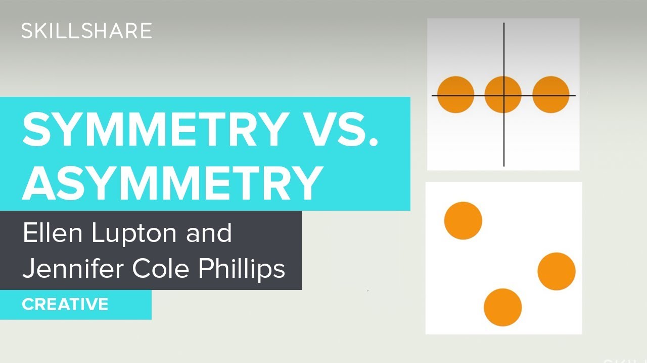
Asymmetry isn’t just a stylistic preference. There are concrete functional reasons behind it.
It Directs the Eye
Asymmetrical compositions create a visual path. Your eye doesn’t land in the center and stay there. It moves.
That movement is visual hierarchy in action. By controlling where elements sit and how much weight they carry, a designer can lead the viewer from headline to supporting image to call-to-action in a specific order. Symmetrical layouts don’t offer that same level of control over reading flow.
It Holds Attention Longer
Visual tension keeps people looking. When a composition doesn’t resolve itself instantly (the way a mirrored layout does), the viewer stays engaged longer while their brain processes the arrangement.
CXL research confirmed that users take 2.6 seconds to find the area of a website that most influences their first impression. Asymmetrical layouts give designers more control over where that landing spot is.
It Feels More Natural
Look around you. Almost nothing in the natural world is symmetrical. Human faces aren’t perfectly mirrored. Trees don’t grow in balanced patterns. Landscapes aren’t evenly distributed.
Asymmetry taps into that organic quality. The Gestalt principles of perception, especially figure-ground and proximity, explain why our brains are comfortable processing asymmetrical arrangements. We do it constantly in everyday life.
It Serves Storytelling
Asymmetry works better for storytelling in design because stories aren’t symmetrical. They have a beginning, middle, and end. They build tension and resolve it.
According to data from The Brand Shop, asymmetrical design is 325% more popular than it was a few years ago, riding the wave of the anti-design movement. That growth isn’t random. Brands are realizing that static, perfectly balanced compositions don’t communicate personality the way asymmetrical ones do.
Asymmetry in Web and Digital Design

Asymmetry on the web has exploded over the past two years. The tools are better, the browsers are more capable, and designers are bolder.
Broken Grid Layouts and CSS Grid
CSS Grid and Flexbox made asymmetrical web layouts practical. Before these tools, building anything outside a standard column-based grid required hacky positioning and absolute values that broke on different screen sizes.
Now you can overlap elements, create uneven column distributions, and let content break out of its container without fighting the technology. WebFX notes that asymmetric layouts will likely keep growing in popularity through 2026, with CSS Grid giving designers print-level layout control in the browser.
The grid system itself hasn’t gone away. It just became more flexible. Most asymmetrical web layouts still use a grid underneath. The asymmetry comes from how content is placed within and across grid cells, not from abandoning structure entirely.
Split-Screen and Hero Section Layouts
Apple’s product pages are the go-to example. Large product images on one side, minimal text on the other. The split isn’t 50/50. It’s weighted, and that weight shift creates visual interest without requiring any decorative elements.
Stripe does something similar with their developer-facing pages. Code blocks on one side, explanatory content on the other, with unequal sizing that naturally draws the eye to whichever element is more relevant.
Responsive Challenges
Here’s the tricky part. An asymmetrical layout that looks great on a 1440px desktop screen can completely fall apart on a 375px mobile viewport.
G2 research from 2024 shows the US graphic design market size hit $16.9 billion, and much of that spend goes into digital. Responsive asymmetry is where a lot of that budget gets burned, because you’re basically designing two or three different compositions for the same content.
The rumahmedia 2025 trend report calls out that the anti-design trend “leans towards breaking traditional rules and embracing asymmetrical layouts,” but warns designers to test across devices. What reads as controlled tension on desktop can become confusion on mobile if you’re not careful.
Most designers solve this by collapsing asymmetrical layouts into a single-column stack on mobile, which works but kills some of the compositional impact. The better approach (and the harder one) is designing the mobile layout as its own distinct asymmetrical composition rather than just reflowing the desktop version.
Asymmetry in Logo and Brand Identity Design

CustomNeon research across the world’s top 250 companies found that 66.8% of logos are asymmetrical. That directly contradicts the old assumption that symmetry is always the safer bet for brand marks.
The reason is psychological. A study published in the Journal of Marketing Research (Luffarelli, Stamatogiannakis, and Yang) found that asymmetrical logos are perceived as more arousing and exciting than symmetrical ones. Consumers associate asymmetrical marks with brands that have a dynamic, forward-looking personality.
Asymmetrical Logos That Work
Nike’s swoosh is the textbook example. It’s a single curved stroke that carries directional movement, suggesting speed and forward motion. Nike paid $35 for the original design in 1971. That mark is now worth billions in brand equity.
Pepsi’s globe (post-2008 redesign) uses an off-center wave that splits the circle into unequal sections. It reads as energetic and contemporary, which fits a brand that markets itself against Coca-Cola’s more traditional identity.
Both logos succeed because the asymmetry is purposeful. It communicates something specific about the brand. It’s not just different for the sake of being different.
When Symmetry Still Makes Sense for Logos
| Brand Type | Logo Approach | Why It Works |
|---|---|---|
| Financial, insurance | Symmetrical | Signals stability and trust |
| Tech startups, sportswear | Asymmetrical | Signals energy and innovation |
| Luxury heritage brands | Symmetrical | Signals tradition and permanence |
| Creative agencies, media | Asymmetrical | Signals personality and boldness |
According to Renderforest data, 60% of consumers avoid brands with unappealing or poorly designed logos. The choice between symmetry and asymmetry in a logo isn’t cosmetic. It carries real business consequences.
Risks at Small Sizes
Asymmetrical logos need to hold up at 16×16 pixels for favicons and app icons. That’s where things get tricky.
A complex asymmetrical mark that looks great on a billboard might turn into a smudge at thumbnail size. The best logo design principles call for testing the mark at every scale before committing to asymmetry as the primary approach.
Historical Roots of Asymmetry in Design
Asymmetry didn’t show up in graphic design by accident. It was a deliberate break from centuries of centered, symmetrical layouts, and it happened in specific places at specific times.
The Bauhaus and the New Typography

Jan Tschichold attended the first Bauhaus exhibition in Weimar in 1923. That visit changed everything about how he approached the printed page.
His 1928 book, Die Neue Typographie, laid out a complete rejection of symmetrical, centered layouts. MoMA describes it as a movement where “modernist designers organized the printed page as a blank field in which blocks of type and illustration could be arranged in strikingly asymmetrical compositions.”
Tschichold wrote that “asymmetry is the rhythmic expression of functional design.” He treated white space as an active element rather than background filler, and insisted on sans-serif type with geometric arrangements. His influence is still visible in every contemporary editorial layout that uses off-center headings and structured white space.
De Stijl, Constructivism, and the Grid
Piet Mondrian’s compositions used horizontal and vertical lines with primary color blocks in deliberately unequal proportions. The De Stijl movement proved that rigid geometric structure didn’t require symmetry.
Russian Constructivists like El Lissitzky applied asymmetrical composition to political posters, using diagonal text and overlapping shapes to create urgency and directional force. These weren’t decorative choices. They served the message.
Japanese Aesthetic Influence
The concept of wabi-sabi, which finds beauty in imperfection and incompleteness, introduced Western designers to a fundamentally different relationship with balance.
Japanese concepts like ma (the active use of empty space) aligned closely with what minimalist design practitioners were already exploring. The influence runs deeper than most people realize, showing up in everything from mid-century American poster work to current Silicon Valley product pages.
A Quick Timeline
| Period | Movement | Asymmetry Contribution |
|---|---|---|
| 1920s | Bauhaus / New Typography | Rejected centered layouts for functional asymmetry |
| 1920s–30s | De Stijl / Constructivism | Used geometry and diagonals without mirroring |
| 1950s–60s | Swiss International Style | Formalized grid-based asymmetry |
| 1990s | Grunge design / David Carson | Pushed asymmetry into deliberate chaos |
Josef Müller-Brockmann’s work in the 1950s and 60s brought all of this together. His grid systems gave designers a repeatable framework for asymmetrical composition, proving that structured grids and off-center placement weren’t contradictory.
Common Mistakes When Using Asymmetry
Asymmetry done wrong looks worse than symmetry done right. Here’s where most people trip up.
Confusing Randomness with Intention
Throwing elements around a page without considering visual weight isn’t asymmetry. It’s mess.
Every element in an asymmetrical composition needs a reason for being where it is. If you can’t articulate why that text block sits at 30% from the left edge instead of 25%, the placement is probably arbitrary. Asymmetry requires more compositional thinking than symmetry, not less.
Ignoring the Optical Center
The optical center of a page sits slightly above and to the right of the geometric center. Design that ignores this will feel bottom-heavy or lopsided regardless of how carefully you’ve distributed elements.
According to CXL research, users’ eyes land on specific areas of a page within 2.6 seconds, and those areas are clustered near the optical center. If your asymmetrical layout fights against where the eye naturally goes, you’re working against biology.
Forgetting the Grid Underneath
No grid equals no control. Even the most experimental asymmetrical layouts from well-known designers like David Carson had underlying structural logic. The baseline grid doesn’t disappear just because your layout isn’t mirrored.
Figma and Adobe InDesign both offer layout grid overlays that make it straightforward to build asymmetrical compositions on a solid structural foundation.
Not Testing Across Contexts
What looks balanced on a 27-inch monitor might collapse on a phone screen. What reads well in a PDF might fall apart when printed as a brochure.
Hostinger reports that web design shapes 94% of first impressions. A layout that breaks at certain viewport widths doesn’t get a second chance. Test your asymmetrical compositions at every size and in every medium where they’ll appear.
How to Practice Asymmetrical Composition
Asymmetry is a skill that develops through practice, not theory alone. Here’s how to build it.
The Squint Test
Squint at your layout until the details blur and only the shapes remain. If the composition still feels balanced as abstract masses of light and dark, the asymmetry is working.
This sounds basic. It is. But I’ve seen it catch problems that hours of pixel-level adjustments missed. If it doesn’t pass the squint test, it doesn’t work.
Start Symmetrical, Then Break It
A technique taught in most foundation design courses at places like Parsons and RISD:
- Build a perfectly symmetrical layout first
- Move one element off-center
- Adjust a second element to compensate for the shifted weight
- Keep adjusting until the composition feels balanced but no longer mirrors itself
This method teaches you to feel visual weight shifts in real time. It’s way more effective than starting from scratch with a blank canvas.
Study Real Work
Where to look: magazine spreads (Bloomberg Businessweek is great for this), book cover design, and award-winning advertising design. Pay attention to how professional designers distribute visual weight across the page.
Try recreating existing asymmetrical layouts in Figma or Adobe InDesign. Not to copy them, but to understand the decisions behind each element’s placement. You’ll notice patterns quickly, things like how a large headline on the left gets balanced by a dense photo on the lower right.
Tools That Help
Figma’s layout grids let you set up multi-column structures with unequal column widths, which is exactly what you need for controlled asymmetry.
Adobe InDesign’s baseline and column grids give print designers the structural backbone for asymmetrical editorial layouts. Both tools make it possible to be precise about placement while still breaking away from centered, mirrored compositions.
FAQ on What Is Asymmetry In Graphic Design
What is asymmetry in graphic design?
Asymmetry is a compositional approach where visual elements are arranged without mirroring across an axis, yet still achieve visual balance. It relies on distributing unlike elements based on their visual weight rather than identical placement.
What is the difference between asymmetry and symmetry in design?
Symmetry mirrors elements equally along a central axis. Asymmetry uses elements of different sizes, colors, and positions to create balance through visual weight distribution instead of identical repetition on both sides.
Why do designers use asymmetry instead of symmetry?
Asymmetry creates movement, directs the viewer’s eye through a specific path, and holds attention longer. It feels more natural and dynamic than symmetrical layouts, which tend to read as static and formal.
How does asymmetrical balance work?
Every element carries visual weight based on its color, size, texture, and position. A small dark element can balance a large light one. Strategic placement around the optical center keeps the composition stable.
Can asymmetry be used in logo design?
Yes. Research shows that 66.8% of the world’s top 250 company logos are asymmetrical. Brands like Nike and Pepsi use asymmetrical marks to communicate energy and excitement through their visual identity.
What are the types of asymmetry in graphic design?
The main types include color asymmetry, scale asymmetry, textural asymmetry, and positional asymmetry. Most professional layouts combine two or three of these to create compositional balance without mirroring.
Is asymmetry harder to execute than symmetry?
Yes. Asymmetry requires a stronger understanding of visual weight, spatial arrangement, and hierarchy. Symmetry gives you automatic balance through mirroring. Asymmetry demands that you build that balance manually through deliberate decisions.
What role does whitespace play in asymmetrical layouts?
Whitespace acts as an active balancing element, not empty filler. An isolated element surrounded by generous negative space carries more visual weight than the same element packed into a crowded area of the layout.
Which design movements popularized asymmetry?
The Bauhaus, De Stijl, and Russian Constructivism all pushed asymmetry into mainstream design during the 1920s. Jan Tschichold’s The New Typography in 1928 formally rejected centered, symmetrical layouts for functional asymmetry.
How can beginners practice asymmetrical composition?
Start with a symmetrical layout, then deliberately shift one element off-center. Adjust other elements to rebalance the composition. Use the squint test to check if abstract shapes still feel balanced when details blur.
Conclusion
Understanding what is asymmetry in graphic design comes down to one thing: learning to create visual balance without relying on mirrored layouts. It’s a compositional skill, not a trend.
From Jan Tschichold’s New Typography to modern CSS Grid layouts, asymmetry has proven itself across nearly a century of design practice. The mechanics stay the same. Visual weight, negative space, color value, and element positioning all work together to hold an off-center composition in place.
The data backs it up too. Most top brand logos use asymmetrical marks. Web designers are increasingly breaking conventional grids. And the anti-design movement has pushed asymmetrical layouts further into mainstream creative work.
Start with a symmetrical layout, break it deliberately, and test the result at every scale. That’s the whole process. The rest is practice and repetition until reading visual weight becomes second nature.

Renowned for his expertise in logo design and visual branding, Bogdan has developed a multitude of logos for various clients.
His skills extend to creating posters, vector illustrations, business cards, and brochures. Additionally, Bogdan's UI kits were featured on marketplaces like Visual Hierarchy and UI8.
He also wrote in the past years on sites like Design Your Way, WebDesignerDepot, WPDean, Designmodo, Speckyboy, Slider Revolution, and more.
- Canva vs PowerPoint: Which Is Better for Presentations? - 22 September 2026
- How to Install Fonts on Mac (Step-by-Step Guide) - 20 September 2026
- From Mockup to Code: How AI-Augmented Development Speeds Up the Design Handoff - 19 September 2026

Bogdan Sandu is a seasoned designer who has been designing websites since 2008. Renowned for his expertise in logo design and visual branding, Bogdan has developed a multitude of logos for various clients. His skills extend to creating posters, vector illustrations, business cards, and brochures. Additionally, Bogdan's UI kits were featured on marketplaces like Visual Hierarchy and UI8. He also wrote in the past years on sites like Design Your Way, WebDesignerDepot, WPDean, Designmodo, Speckyboy, Slider Revolution, and more.
You Might Also Like


