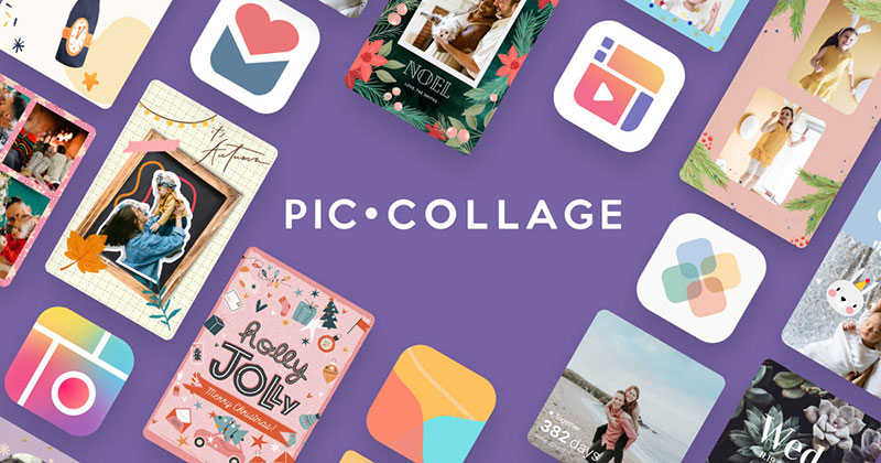
A successful app logo should communicate its purpose before users even open it. PicCollage achieves this through colourful shapes and a playful visual identity that reflects the creative freedom at the heart of its photo-editing experience.
The Meaning Behind the PicCollage Logo
The PicCollage logo takes inspiration from the activity that defines the platform: bringing different visual elements together. Its app icon uses a rounded square divided into colourful sections, creating the impression of a miniature collage.
The arrangement is particularly relevant to the product. Rather than relying on a single photographic image, the design combines distinct colour areas into one recognizable symbol. This reflects the idea that individual pictures, graphics and creative elements can form something more expressive when combined.
A circular white outline within the icon adds another visual reference. It resembles a camera lens, reinforcing the connection with photography and image editing.
The overall composition is simple enough to remain recognizable at small sizes. This is important for an application icon that must compete for attention on crowded smartphone screens.
A Colour Palette That Communicates Playfulness
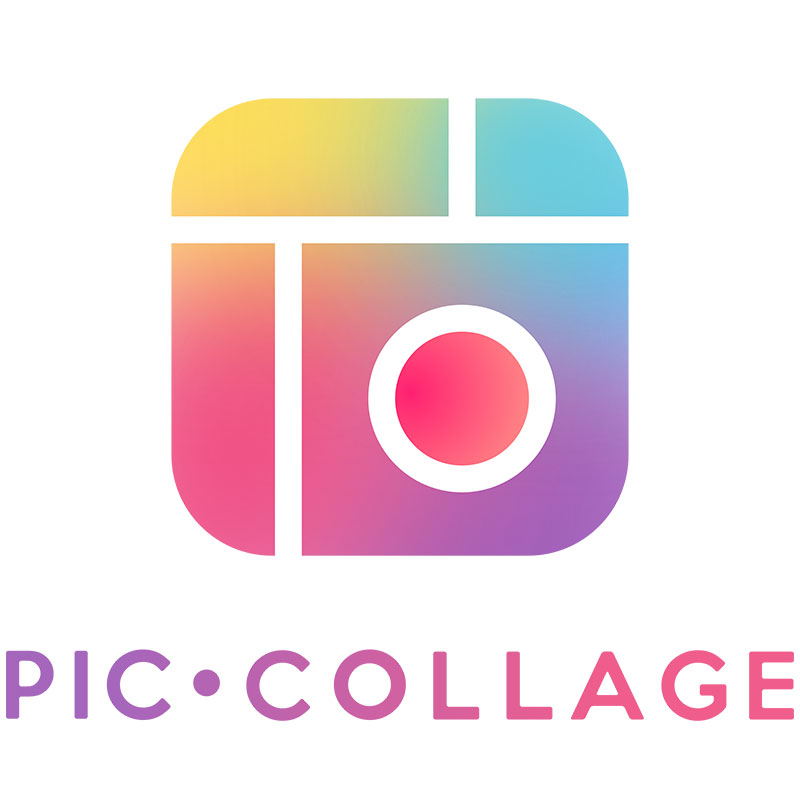
Colour is one of the strongest features of the PicCollage visual identity. The current app icon combines vibrant yellow, green, pink and purple gradients, separated by clean white divisions.
Each colour contributes to an energetic appearance. Yellow suggests optimism, pink introduces warmth, while purple and green add contrast and visual variety.
More importantly, the combination avoids the restrained appearance associated with traditional professional editing software. It presents image creation as an enjoyable activity rather than a complicated technical process.
The rounded corners also soften the overall design. Together, these details create a friendly personality that feels welcoming to casual users, families and younger creative audiences.
Typography and the Importance of Recognition
The PicCollage name is straightforward and descriptive. It combines two familiar words to communicate the application’s central function without requiring an explanation.
Its branding benefits from this simplicity. The name is easy to remember and immediately establishes an association with photographs and collage-making.
The visual symbol can also work independently of the full name. This is particularly useful in mobile environments, where available space is limited.
Rather than relying on elaborate lettering, the identity places considerable emphasis on its colourful icon. This gives the brand a recognizable visual signature across different digital touchpoints.
How the PicCollage Logo Has Evolved
PicCollage launched in 2011 and has been on the market for more than 15 years. Its identity has undergone several changes since its early days. In a 2018 anniversary article, the company itself explained that its logo had changed quite a few times as the product developed.
An archived comparison published by the company shows earlier app icons and interface designs. These provide useful evidence of how its visual presentation has progressed.
The evolution reflects a broader shift in mobile design. Early app identities often relied on more literal illustrations and decorative details. Contemporary icons generally benefit from simpler compositions, stronger colour contrasts and clearer silhouettes.
PicCollage’s current icon follows this more streamlined approach. However, it retains the colourful, segmented appearance that connects the identity to its original creative purpose.
A Visual Identity That Reflects the Product
The strongest aspect of PicCollage’s branding is the relationship between its appearance and functionality.
PicCollage, developed by Cardinal Blue, is one of the best-known photo collage apps worldwide, with nearly 300 million downloads across iOS and Android. Its playful templates, stickers and creative tools allow users to combine photographs, backgrounds and text without requiring advanced design knowledge.
This philosophy extends to its online presence. The PicCollage website presents the brand through colourful examples of birthday cards, digital scrapbooks and photo compositions. Users can also access browser-based creative tools, including the Collage Maker, Editor and Background Remover.
The visual language therefore feels consistent with the experience users encounter inside the product. It communicates experimentation, personal expression and the enjoyment of creating something unique.
Conclusion
The PicCollage logo demonstrates how a relatively simple visual identity can communicate a clear creative purpose. Its colourful panels, rounded geometry and camera-inspired detail make it recognizable while reflecting the application’s accessible personality. Its evolution also illustrates how a brand can modernize its appearance without losing the visual ideas that made it distinctive.
Sources:
https://apps.apple.com/us/app/piccollage-magic-photo-editor/id448639966
https://piccollage.com/blog/happy-birthday-to-us/
https://piccollage.com/
https://picc.co/products
https://piccollage.com/blog/happy-birthday-to-us/ https://apps.apple.com/us/app/piccollage-magic-photo-editor/id448639966

Renowned for his expertise in logo design and visual branding, Bogdan has developed a multitude of logos for various clients.
His skills extend to creating posters, vector illustrations, business cards, and brochures. Additionally, Bogdan's UI kits were featured on marketplaces like Visual Hierarchy and UI8.
He also wrote in the past years on sites like Design Your Way, WebDesignerDepot, WPDean, Designmodo, Speckyboy, Slider Revolution, and more.
- PicCollage Logo: How Colour, Shape and Simplicity Express Creativity - 5 November 2026
- Before You Publish That Image: A Designer’s Checklist for AI-Generated Visuals - 5 November 2026
- How to Unlock Canva Page and Locked Elements - 4 November 2026

Bogdan Sandu is a seasoned designer who has been designing websites since 2008. Renowned for his expertise in logo design and visual branding, Bogdan has developed a multitude of logos for various clients. His skills extend to creating posters, vector illustrations, business cards, and brochures. Additionally, Bogdan's UI kits were featured on marketplaces like Visual Hierarchy and UI8. He also wrote in the past years on sites like Design Your Way, WebDesignerDepot, WPDean, Designmodo, Speckyboy, Slider Revolution, and more.
You Might Also Like