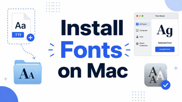
Open Krita’s Text tool for the first time, and the custom typeface you just downloaded is nowhere on the list. That’s the exact moment most…
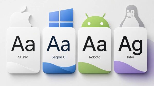
The font already on your device is often better than anything you’d pay to download. The best system fonts are preinstalled, load instantly, and are…
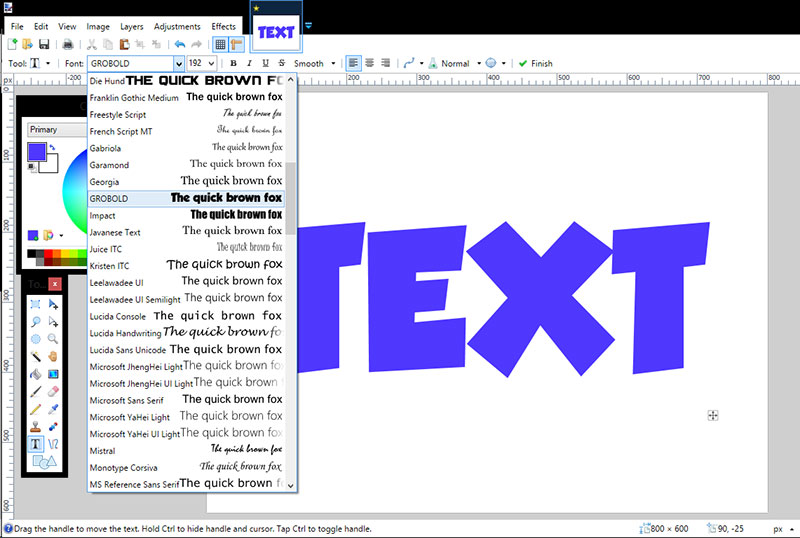
Every Paint.NET user hits the same wall eventually: the font you want just isn’t showing up in the dropdown. Learning how to add fonts to…
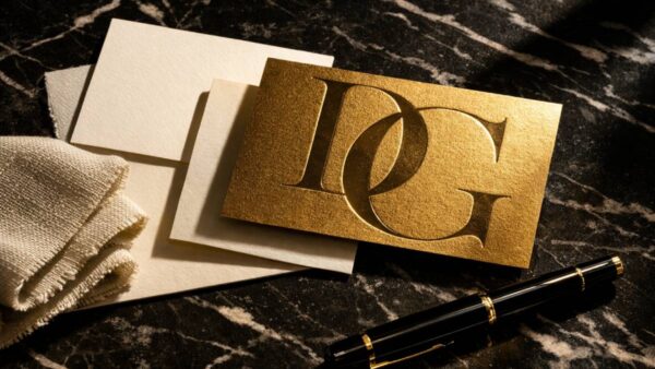
The right typeface can make a brand feel like it belongs in a flagship store on Avenue Montaigne. The wrong one can undo years of…
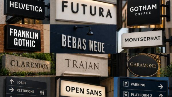
The wrong font can make a sign completely unreadable from 10 feet away. Font legibility at distance is what separates a sign that works from…
The font you pick for your website does more than set a visual tone. It directly affects how long people stay, how much they trust…
Pick the wrong font and half your visitors will never see it the way you intended. The web safe fonts list exists for exactly this…
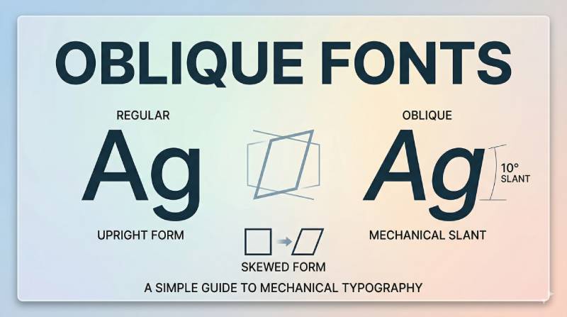
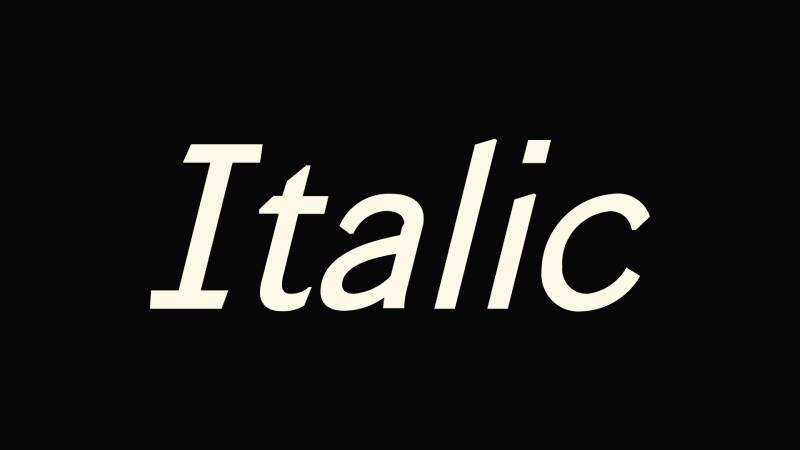
Most people use italic text every day without thinking about it. A quick Ctrl+I in a document, a book title in an essay, a label…
Google Fonts gives you free access to over 1,800 font families, and learning how to use Google Fonts correctly can make or break your site’s typography and loading speed.…
Typography can make or break a website. The wrong typeface kills readability. The right one builds trust before a single word is read. The best…
Your font choice can make or break a logo before anyone reads a single word. The typeface you pick shapes how people feel about a…
Your font choice says something about your brand before a single product is seen. For clothing brands, typography is not decoration. It shapes how customers…
The typeface you choose for a poem is not decoration. It is part of the poem. Finding the best fonts for poetry means understanding how…
Every serif typeface you have ever read falls somewhere on a spectrum, and transitional fonts sit right at the center of it. So what is…
Every sans-serif typeface you’ve ever used traces back to a category that people once considered ugly. So, what is a grotesque font, and why does…
Every code editor, terminal window, and screenplay on the planet uses the same type of font. So what is a monospaced font, and why does…
The font you pick for your website does more than set a visual tone. It affects how long people stay, how much they trust you,…
Every time you see a brand logo with perfectly circular letters and clean, uniform strokes, you’re looking at a geometric font in action. But what…
Every typeface you read carries a history. Some were built from circles and rulers. Others were shaped by the human hand, and that difference changes…
Condensed fonts are everywhere, from newspaper headlines to sports jerseys to app interfaces. But most people couldn’t tell you what actually makes a font “condensed”…
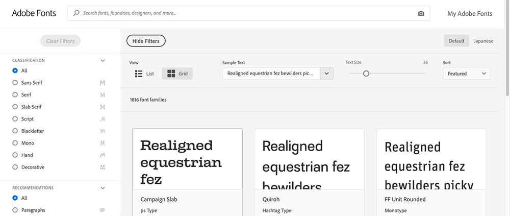
Two font platforms dominate web typography, and they couldn’t be more different. The Google Fonts vs Adobe Fonts decision affects everything from page load speed…
Most of the fonts you pick for a website aren’t actually installed on your visitor’s device. And when that happens, the browser just picks something…
You’ve seen blackletter fonts everywhere, from The New York Times masthead to tattoo parlors to heavy metal album covers. But what is a blackletter font,…
What Are Font Combinations A font combination is the deliberate pairing of two or more typefaces used together in a single design to create hierarchy, contrast, and…
The font on your screen is doing more than displaying words. It’s shaping how you feel about them before you’ve finished reading the first sentence.…
Bad spacing between letters can turn a perfectly good headline into an embarrassment. If you’ve ever wondered what is kerning in typography, it’s the precise…
A single slider can make text feel polished or completely unreadable. That’s the power of tracking in typography, the uniform adjustment of space between all…
Most text looks “off” not because of the font choice, but because of the space between lines. That space has a name: leading. Understanding what…
Every word you read is shaped by a decision someone made about type. Typography is the practice of arranging text to make it readable, legible,…
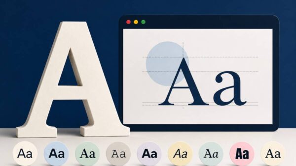
Two fonts set at identical sizes can look completely different. That’s x-height at work. X-height is the measurement that defines how tall a typeface’s lowercase…