The Takeda logo is one of the most recognized symbols in the global pharmaceutical industry. It carries more than 240 years of Japanese heritage packed into a clean, modern mark that shows up on everything from drug packaging to clinical research papers.
Takeda Pharmaceutical Company Limited was founded in 1781 by Chobei Takeda I in Osaka, Japan. The company’s visual identity has gone through at least four major iterations since then, starting with the original Dakiyama-Hon family crest. The current version of the logo, the modernized Dakiyama symbol with the “Takeda” wordmark, was officially adopted as the global corporate brand symbol in 2019.
That’s a long time for a brand to keep evolving while staying rooted in the same visual DNA. And honestly, not many pharmaceutical logos can claim that kind of continuity.
What Is the Takeda Logo?
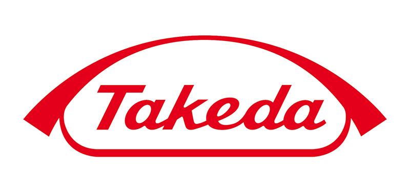
The Takeda logo is a combination mark featuring the Dakiyama (“Embracing Mountains”) symbol paired with the company name in a custom sans-serif typeface. Created in 1961 for the company’s 180th anniversary, the current global version was adopted in 2019. The design represents two mountains, symbolizing Takeda’s origins in both Omi and Osaka.
- Design Type: Combination mark (symbol + wordmark)
- Primary Elements: The Dakiyama symbol, which depicts two stylized mountain shapes “embracing” each other, placed above the “Takeda” wordmark in English
- Official Introduction Date: The Dakiyama was first created in 1961. The current global version was adopted in 2019
- Designer/Agency: Internal Takeda design team. The original Dakiyama-Hon was based on the Omiya family crest, modified over generations
- Trademark Status: Registered trademark of Takeda Pharmaceutical Company Limited, actively protected worldwide
- Color Palette: Primary red (HEX #E1242A), used alongside white. Previously appeared in black before switching to red to match the Uroko mark
- Usage Context: Pharmaceutical products, corporate communications, clinical trial materials, digital platforms, investor relations, and global marketing materials across all Takeda business divisions
How Has the Takeda Logo Evolved Over Time?

Takeda’s logo has moved through four distinct phases over more than two centuries. Each version reflected where the company was at that point, from a family-owned medicine shop to a global pharmaceutical leader.
The shifts were never random. They tracked real changes in the business, from domestic expansion to international growth to the massive Shire acquisition in 2019 that reshaped Takeda’s global footprint.
The Dakiyama-Hon (1781-1898)
- Years Active: 1781 to late 1800s
- Design Description: Based on the “Embracing Mountains” (Dakiyama) crest from the Omiya brand, with the Japanese character “hon” added. Two mountain shapes sitting together, representing one mountain from Omi (the clan’s hometown) and one from Osaka (where the store was set up)
- Color Scheme: Black ink on white, typical of the period’s Japanese merchant marks
- Context: Chobei Takeda I started selling traditional Japanese and Chinese herbal medicines in Doshomachi, Osaka. The mark identified the main family branch of the Omiya clan
- Cultural Significance: This was a family crest more than a corporate logo. It told customers and other merchants exactly which lineage they were dealing with
The Uroko Mark (1898-1961)
- Years Active: Registered in 1898, became the official company mark in 1943
- Design Description: A triangular symbol representing a fish scale (uroko in Japanese). Simple geometric form. Clean and easy to remember
- Color Scheme: Originally black, later changed to red
- Context: Registered for products meeting Japan Pharmaceutical Standards. When the company renamed itself Takeda Pharmaceutical Industries, Ltd. in 1943, the Uroko became the official mark because of its simplicity
- Key Changes from Previous: Complete departure from the mountain imagery. Geometric instead of symbolic. Much more streamlined
- Cultural Significance: Fish scales are a symbol of good luck in Japanese culture. They represent age and growth over time, similar to tree rings. The Uroko is still used as Takeda’s logo mark in Japan to this day
The Heron Mark (Early 1900s)
- Years Active: Used alongside other marks, primarily for premium products
- Design Description: A white heron (bird) symbol, more illustrative than the geometric Uroko
- Color Scheme: White and black
- Context: Developed specifically for products that exceeded Japan Pharmaceutical Standards. It was a quality mark, not the corporate identity itself
- Cultural Significance: The pure white heron represented the high quality of Takeda’s products and the company’s commitment to serving society with integrity
The Modern Dakiyama (1961-Present)
- Years Active: 1961 to present (adopted globally in 2019)
- Design Description: A refined version of the original Dakiyama-Hon with softened corners and the “Takeda” name added in English underneath. Smoother, more approachable than the original sharp-cornered family crest
- Color Scheme: Originally black, now red (matching the Uroko’s color)
- Context: Created to celebrate Takeda’s 180th anniversary. The company was expanding internationally and needed a mark that would work across cultures and languages. In 2019, after the Shire acquisition, the Dakiyama was officially adopted as the single global brand symbol
- Key Changes from Previous: Softened corners gave it a friendlier look. The English wordmark made it readable for international audiences. The switch from black to red unified it visually with the Japanese Uroko mark
- Cultural Significance: The two mountains still reference the company’s dual origins. But the modern treatment makes it feel less like a family crest and more like a global corporate mark
What Do the Design Elements of the Takeda Logo Mean?
Every part of the Takeda logo carries meaning rooted in Japanese culture and the company’s history. The Dakiyama symbol itself represents two mountains, one from Omi and one from Osaka, standing together.
This is not decorative. It tells a story about where the company came from and how two places shaped its identity over centuries.
What Does the Dakiyama Symbol Represent?
The Dakiyama, meaning “Embracing Mountains,” goes back to the Omiya family crest. The two mountain shapes represent unity between the clan’s hometown of Omi and their business base in Osaka.
After 1961, the softened curves made it feel less traditional and more global. But the core meaning stayed the same. It’s about roots and reach, both at the same time.
The psychology of shapes matters here. Mountain forms suggest stability, permanence, and aspiration. For a pharmaceutical company, that’s exactly the right signal to send.
Why Did Takeda Choose These Specific Colors?
Takeda’s primary brand color is red.
- Color Name: Takeda Red
- Hex Code: #E1242A
- RGB: (225, 36, 42)
- CMYK: (0, 84, 81, 12)
- Pantone: PMS 1795 C (approximate)
Red is a big deal in Japanese culture. It signals energy, good fortune, and vitality. In pharmaceutical branding, red also communicates urgency and commitment to health.
The logo originally appeared in black. The switch to red happened to align the global Dakiyama mark with the Uroko symbol used in Japan. That color consistency across both marks was a deliberate branding decision.
Understanding color psychology helps explain why red works so well. It grabs attention, it triggers emotional responses, and it stands out on packaging and digital screens. Compared to other red logos in different industries, Takeda’s particular shade sits on the warmer, bolder end.
What Typography Style Is Used in the Takeda Logo?

The “Takeda” wordmark uses a custom sans-serif font. It’s clean, with even letter spacing and moderate stroke width. No decorative elements at all.
The letterforms are quite neutral. They don’t shout. They sit underneath the Dakiyama symbol and let the visual mark do the heavy lifting.
Good typography in pharmaceutical branding has to work at very small sizes on pill bottles and at very large sizes on conference banners. The tracking in the Takeda wordmark is generous enough to stay readable across all those contexts.
What Are the Hidden Meanings in the Takeda Logo?
Honestly, “hidden” might be the wrong word. But there are layers most people miss.
The two mountain shapes don’t just represent geography. They also suggest partnership and mutual support, which tracks with Takeda’s founding philosophy of “Sanpo Yoshi” (benefit for buyer, seller, and society).
The softening of the mountain shapes in 1961 wasn’t just aesthetic. It was a signal that the company was opening up, moving beyond Japan. The rounded edges carry warmth and accessibility, quite different from the angular original.
How Does the Takeda Logo Compare to Competitor Logos?

Most pharmaceutical logos lean on blue. Think about the Pfizer logo or the Novartis logo. They go for trust and clinical cleanliness. Takeda goes red.
That’s a meaningful difference. It puts Takeda in a separate visual category from its Western competitors immediately.
The Roche logo uses blue. The AstraZeneca logo uses a combination of blue, gold, and purple. The Sanofi logo went with purple. Eli Lilly’s logo is red too, but their design approach is completely different, using script-style lettering.
Where most pharma brands use abstract geometric shapes or wordmarks alone, Takeda keeps a pictorial element (the Dakiyama) that directly references its history. The Bayer logo does something similar with its cross formation, tying back to the company’s heritage. But Takeda’s mountains feel more narrative. They tell a specific story rather than just serving as a recognizable pattern.
The Merck logo is a straightforward wordmark. The AbbVie logo uses stylized letterforms. By comparison, Takeda’s combination of symbol and text gives it more visual range and flexibility.
What Are the Technical Specifications of the Takeda Logo?
Official Color Codes
Primary Color: Takeda Red
Secondary Color: White
- Hex: #FFFFFF
- RGB: (255, 255, 255)
- CMYK: (0, 0, 0, 0)
Tertiary Color: Black (for specific applications)
- Hex: #000000
- RGB: (0, 0, 0)
- CMYK: (0, 0, 0, 100)
Dimensions and Proportions
The logo uses a vertical lockup with the Dakiyama symbol positioned above the “Takeda” wordmark. The proportional relationship between the symbol and the text is fixed in Takeda’s brand guidelines.
Clear space around the logo is defined by the height of the “T” in the wordmark, applied on all four sides. This protects the mark from being crowded by other visual elements.
The logo is available in vector graphics formats (SVG, EPS, AI) for scalable use, and in raster formats (pixel-based PNG, JPEG) for web and digital applications. The SVG file for the logo is approximately 5 KB, keeping it lightweight for digital use.
Minimum size requirements exist to make sure the Dakiyama symbol remains recognizable and the wordmark stays legible at small scales, particularly on pharmaceutical packaging where DPI requirements are strict.
What Cultural Impact Has the Takeda Logo Had?

Takeda’s logo carries weight beyond branding. In Japan, the Uroko (fish scale) mark is one of those symbols people just know, even if they’re not in healthcare.
Globally, the Dakiyama mark became a signal that a major Asian pharmaceutical company was competing at the highest level. After the 2019 Shire acquisition, seeing the Takeda logo on products previously branded under Shire was a real statement about the company’s reach.
The logo also shows up in cultural contexts. Takeda sponsors research institutions, medical conferences, and patient advocacy programs worldwide. Every time that red Dakiyama appears in those settings, it reinforces the brand’s association with scientific progress and patient care. Its presence in marketing and corporate communications follows the principles of good visual hierarchy, where the mark anchors the brand message across different formats.
How Does the Takeda Logo Fit Into the Overall Brand Identity?

The logo sits at the center of a broader system. Takeda’s corporate identity includes the Dakiyama symbol, the red color palette, the custom typography, and detailed usage rules that govern how everything works together.
In Japan, the Uroko mark still gets used for domestic products. That dual-mark strategy is unusual in global pharma. Most companies pick one symbol and run with it everywhere.
Takeda’s brand style guide covers everything from spacing rules to approved color combinations for co-branded materials. The system is built to stay consistent whether the logo shows up on a clinical trial document in Tokyo or a conference booth in Boston.
The principles of repetition and unity matter a lot here. Every touchpoint uses the same colors, the same spacing, the same mark. That consistency is what builds recognition over decades.
How Should the Takeda Logo Be Used?
Official Usage Guidelines
- Do: Use the logo in its approved color versions (red, black, or white reverse). Maintain the required clear space around the mark. Follow the fixed proportional relationship between the Dakiyama symbol and the wordmark
- Don’t: Alter the logo’s colors outside approved palettes. Stretch, rotate, or distort the mark. Place the logo on busy backgrounds that reduce legibility. Separate the symbol from the wordmark unless specifically allowed in the guidelines
Where to Access Official Logos
Takeda provides brand assets through internal channels for employees and approved partners. Media outlets typically access logo files through Takeda’s press and media relations team. Third-party brand asset platforms also host vector versions, though official files from Takeda directly are always the safest bet for accuracy.
Licensing and Trademark
The Takeda logo is a registered trademark. Unauthorized use, reproduction, or modification is prohibited. The Dakiyama symbol, the “Takeda” wordmark, and the Uroko mark are all protected under intellectual property law in multiple jurisdictions. Any use of Takeda brand assets by external parties requires written authorization from Takeda Pharmaceutical Company Limited.
FAQ on The Takeda Logo
What does the Takeda logo look like?
The Takeda logo features the Dakiyama symbol, two stylized mountain shapes sitting above the “Takeda” wordmark in a clean sans-serif typeface. The mark appears in red on white. It’s a combination mark used across all global operations.
What does the Takeda logo mean?
The Dakiyama means “Embracing Mountains.” The two shapes represent mountains from Omi and Osaka, linking to the Takeda family’s origins. It’s a symbol of unity and heritage for the Japanese pharmaceutical company, dating back to the original Omiya family crest.
When was the current Takeda logo introduced?
The Dakiyama was first created in 1961 for Takeda’s 180th anniversary. It became the official global corporate brand symbol in 2019, replacing the region-specific approach the company had used for decades.
What color is the Takeda logo?
Takeda Red, with a hex code of #E1242A. The logo was originally black but switched to red to match the Uroko mark used in Japan. Red carries strong cultural meaning in Japanese branding, signaling vitality and good fortune.
What font does the Takeda logo use?
The wordmark uses a custom sans-serif typeface. It’s neutral, evenly spaced, and designed for readability at all sizes. The letterforms are professional without being cold, which works well for pharmaceutical branding and corporate identity materials.
What is the Uroko mark used by Takeda?
The Uroko is a triangular fish scale symbol registered in 1898. It became the official company mark in 1943. Still used as Takeda’s logo in Japan today. The fish scale represents good luck, age, and growth in Japanese culture.
Has the Takeda logo changed over time?
Yes. Takeda’s logo evolution includes at least four major versions. The Dakiyama-Hon crest, the Uroko triangle, the Heron quality mark, and the modern Dakiyama. Each shift tracked a real change in the company’s business scope and global reach.
Can I download the Takeda logo?
Official logo files are available through Takeda’s media relations team. Third-party platforms host vector versions, but for accuracy you should always get files directly from Takeda Pharmaceutical Company Limited. Unauthorized use of their trademark is not permitted.
How does the Takeda logo compare to other pharma logos?
Most pharmaceutical company logos use blue. Takeda stands out with red and a pictorial symbol. That makes it visually distinct from competitors like Pfizer, Novartis, and Roche, who lean more on wordmarks or abstract geometric shapes.
What is the Heron mark in Takeda’s branding history?
The Heron mark was a quality symbol used for products exceeding Japan Pharmaceutical Standards. It depicted a white heron and represented Takeda’s commitment to high-quality products. It was never the primary corporate logo, more of a product-level quality seal.
Conclusion
The Takeda logo is a rare example of pharmaceutical branding that actually means something beyond corporate aesthetics. It connects a 240-year-old Japanese heritage to a modern global identity without losing either one.
From the original Dakiyama-Hon crest to the current Takeda brand symbol, every version tracked a real shift in the company’s direction. The red color, the mountain forms, the clean wordmark. None of it is accidental.
For a biopharmaceutical company operating across oncology, rare diseases, neuroscience, and gastroenterology, that kind of visual identity consistency matters. It builds trust with patients, partners, and healthcare professionals worldwide.
Few pharma brands manage to carry their history forward this well.

Renowned for his expertise in logo design and visual branding, Bogdan has developed a multitude of logos for various clients.
His skills extend to creating posters, vector illustrations, business cards, and brochures. Additionally, Bogdan's UI kits were featured on marketplaces like Visual Hierarchy and UI8.
He also wrote in the past years on sites like Design Your Way, WebDesignerDepot, WPDean, Designmodo, Speckyboy, Slider Revolution, and more.
- The Windsurf Logo History, Colors, Font, And Meaning - 10 October 2026
- How to Remove Background From Product Photos (No Photoshop) - 10 October 2026
- How Designers can Build a Stronger Online Creative Identity - 9 October 2026

Bogdan Sandu is a seasoned designer who has been designing websites since 2008. Renowned for his expertise in logo design and visual branding, Bogdan has developed a multitude of logos for various clients. His skills extend to creating posters, vector illustrations, business cards, and brochures. Additionally, Bogdan's UI kits were featured on marketplaces like Visual Hierarchy and UI8. He also wrote in the past years on sites like Design Your Way, WebDesignerDepot, WPDean, Designmodo, Speckyboy, Slider Revolution, and more.
You Might Also Like