


Every printed object you’ve ever touched, from a cereal box to a business card, got its color from four inks. If you’ve ever wondered what is CMYK, it’s the four-color printing process behind nearly all physical color reproduction: cyan, magenta, yellow, and black.
Getting this wrong means washed-out prints, unexpected color shifts, and wasted money. Getting it right means your designs look exactly how you intended on paper.
This guide covers how the subtractive color model works, where CMYK is used, how it compares to RGB, how to read color values, how to set up print-ready files, and what mistakes to avoid before sending anything to a printer.
What is CMYK?

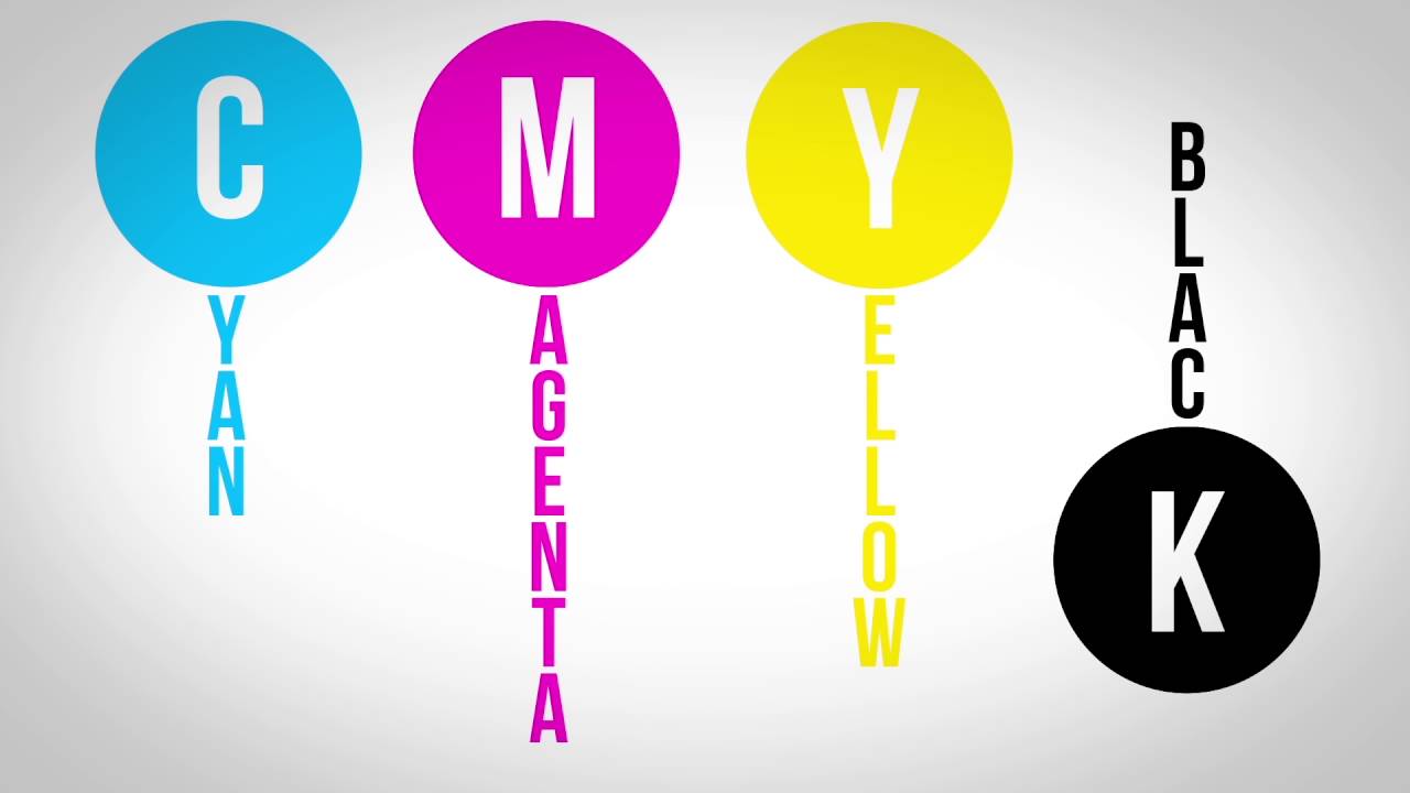
CMYK is a subtractive color model built on four ink components: cyan, magenta, yellow, and black. It’s the standard color system used in commercial and digital printing to reproduce a wide range of colors on paper and other physical surfaces.
The abbreviation breaks down simply. C stands for cyan, M for magenta, Y for yellow, and K for key. That last one trips people up.
Black is called “Key” because it refers to the key plate in traditional offset printing. The key plate carried the most detail and contrast, and the other three color plates were aligned (or “keyed”) to it. Using “K” also avoids confusion with blue in the RGB model, where “B” already stands for blue.
Each channel in CMYK ranges from 0% to 100%. A value of 0% across all four channels leaves the paper white. Crank all four up and you get a deep, saturated black. Every printed brochure, magazine, business card, and cereal box you’ve held used some version of this four-color process to put ink on the page.
Mordor Intelligence data from 2025 shows that offset lithography (the process most associated with CMYK printing) held 38.62% of the global commercial printing market share. So yeah, this color model isn’t going anywhere.
The four-color process also goes by “process color.” You’ll hear print shops use both terms interchangeably, and they mean the same thing. Four inks, layered in precise amounts, creating the illusion of full-color images on a flat surface.
How CMYK Colors Mix on Paper

CMYK operates on subtractive color mixing. That word “subtractive” matters more than most people realize.
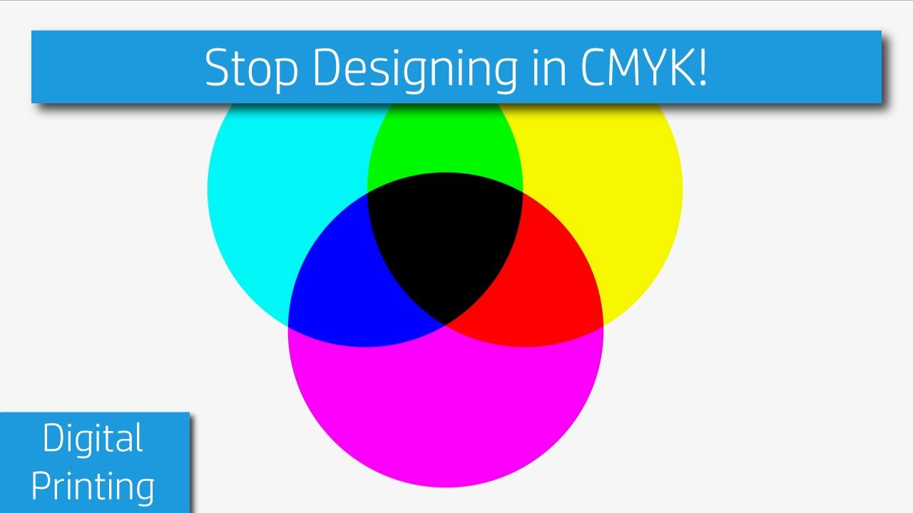
Here’s how it works. White light hits a printed surface. The inks on that surface absorb (subtract) certain wavelengths of light and reflect the rest back to your eyes. What bounces back is the color you perceive.
What Each Ink Absorbs
Cyan absorbs red light and reflects green and blue.
Magenta absorbs green light and reflects red and blue.
Yellow absorbs blue light and reflects red and green.
When you layer cyan and yellow inks together, they absorb both red and blue light. Only green reflects back. That’s how you get green from inks that aren’t green at all. Took me an embarrassingly long time to wrap my head around that one when I first learned color theory.
Why Black Ink Exists Separately
In a perfect world, combining 100% cyan, 100% magenta, and 100% yellow would produce pure black. Real-world ink doesn’t cooperate.
Impurities in pigment manufacturing mean the result is a muddy, brownish mess. Not the crisp black you’d want for text or fine detail. So black ink is added as a fourth component to compensate.
There are practical reasons too. Using three inks to make black wastes ink, increases drying time, and can cause paper to warp from excess moisture. A single black ink gets you cleaner results with less material. According to Wikipedia’s documentation of the CMYK model, black ink is also significantly more cost-effective than combining three colored inks for the same result.
Halftone Dot Patterns
CMYK printing doesn’t lay down solid sheets of color. Instead, it uses tiny dots arranged in patterns called halftones.
Each of the four inks prints at a different screen angle to avoid visual interference (called moiré). When you hold a printed magazine under a magnifying glass, you’ll see these dot clusters. From normal viewing distance, your brain blends the dots into smooth, continuous tones. The technique dates back to the 1890s, when CMYK printing was first used for color newspaper illustrations.
CMYK vs. RGB
These two color models solve completely different problems, and confusing them is one of the most common mistakes in print design.
| Feature | CMYK | RGB |
|---|---|---|
| Type | Subtractive (ink-based) | Additive (light-based) |
| Medium | Paper, packaging, physical surfaces | Screens, monitors, digital displays |
| Primary colors | Cyan, magenta, yellow, black | Red, green, blue |
| Color range | Narrower gamut | Wider gamut |
| White | Absence of ink (paper shows through) | All colors at full intensity |
| Black | All inks combined or K ink | Absence of light |
RGB works by emitting light. Your monitor shoots red, green, and blue light at your eyes in varying intensities. Mix all three at full power and you get white. Turn them all off and you get black. It’s additive because you’re adding light.
CMYK works the opposite way. You start with white (the paper) and subtract light by adding ink. More ink means less light reflecting back, which means darker colors.
The practical takeaway? RGB covers a much larger percentage of the visible spectrum than CMYK does. Bright neon greens, electric blues, vivid oranges. All of those exist comfortably in RGB and look fantastic on your screen. Try printing them and they’ll come out noticeably duller.
Smithers data shows digital printing grew at a 3.4% CAGR to $165.5 billion in 2024, with further growth forecast at 4.8% CAGR through 2029. As digital print volumes increase, color management between RGB screens and CMYK output becomes more critical than ever.
Why Colors Shift Between Screen and Print
Your monitor isn’t calibrated to match printed output. That’s not a bug. It’s just how the technology works.
The colors that shift the most are the ones that sit outside CMYK’s printable gamut. Bright blues, vivid greens, anything neon. These exist in RGB space but physically cannot be reproduced with standard process inks. When your design software converts the file, it maps those out-of-gamut colors to the closest available CMYK equivalent. The result is almost always less vibrant.
Monitor calibration adds another layer of unpredictability. Two monitors showing the same file will display slightly different colors unless both are calibrated to the same standard. Then there’s ambient lighting in your workspace, the age of the display, and whether you’re looking at it from a weird angle.
Soft proofing helps. In Adobe Photoshop or Illustrator, you can simulate how your colors will look in a specific CMYK profile before sending anything to print. It’s not perfect, but it’s closer to reality than trusting your screen blindly. I always do this before sending files to print because the alternative is an expensive surprise.
Where CMYK is Used

Pretty much anything that puts ink on a physical surface uses CMYK or some version of it. The list is longer than most people expect.
Commercial Offset Printing
Magazines, newspapers, catalogs, annual reports. Offset lithography runs CMYK plates at high speed and high volume. It’s been the backbone of commercial printing since the early 20th century, and Mordor Intelligence’s 2025 data confirms it still holds the largest technology share in the market.
Heidelberger Druckmaschinen has dominated the sheetfed offset press market for decades, with a 42% global market share in sheetfed offset machines as recently reported by Scoop Market. That’s one company producing nearly half the world’s offset presses.
Digital Printing
Brochures, flyers, business cards, short-run booklets. Digital presses use CMYK toner or inkjet to produce small quantities without the setup cost of offset plates.
IMARC Group reports the global digital printing market reached $30.5 billion in 2024, growing at a 5.5% CAGR. Digital printing is faster for small jobs and supports variable data, meaning every printed piece can be slightly different.
Packaging and Labels
Food packaging, cosmetic boxes, product labels. Mordor Intelligence data shows packaging accounted for 45.74% of the commercial printing market in 2025. It’s the single largest application segment. Every box on a grocery shelf used CMYK process color (sometimes with additional spot colors for brand accuracy).
Home and Office Printers
Your inkjet printer at home? It uses CMYK cartridges. Some high-end photo printers add extra ink channels (light cyan, light magenta) for smoother gradients, but the base system is still cyan, magenta, yellow, and black. The DPI setting on your printer controls how many ink dots per inch get laid down, directly affecting print quality and sharpness.
Large-Format Printing
Banners, trade show displays, vehicle wraps, posters. Large-format printers use CMYK inkjet systems scaled up to handle materials several feet wide. The ink chemistry changes (solvent, UV-curable, or latex) depending on whether the output needs to survive outdoors.
CMYK Color Values and How to Read Them
CMYK values are expressed as four percentages, one for each ink channel. They range from 0% (no ink) to 100% (maximum ink). Understanding what these numbers mean is practical knowledge, not just theory.
Reading CMYK Values
A CMYK value like (0, 100, 100, 0) means zero cyan, full magenta, full yellow, and no black. The result is red. Change that to (100, 0, 100, 0), with full cyan, no magenta, full yellow, and no black, and you get green.
Pure yellow is (0, 0, 100, 0). Pure cyan is (100, 0, 0, 0). Standard black text prints at (0, 0, 0, 100), using only the key plate.
The numbers tell the printer how much of each ink to deposit at any given point. Thinking of it as a recipe helps. Each percentage is an ingredient, and the paper is the dish.
Rich Black vs. Standard Black
Standard black (0, 0, 0, 100) works fine for body text and thin lines. But for large black areas, like a full-page background or a bold headline, it can look washed out. Almost gray.
Rich black fixes this by adding other ink channels behind the black. A common formula is (60, 40, 40, 100). The cyan, magenta, and yellow create depth underneath the black ink, producing a darker and more saturated result.
But watch the math. Adding all those percentages gives you a total ink coverage of 240%. Most print shops set a maximum total ink limit (often around 300% for coated paper, 260% for uncoated). Go above and you risk ink that won’t dry, smearing, and paper that buckles or tears.
Where to Input CMYK Values
In Adobe Illustrator, the color picker lets you type CMYK percentages directly. Same with InDesign and Photoshop (when the document is set to CMYK mode).
Canva defaults to RGB and hex values for its browser-based workflow. If you’re designing for print in Canva, you’ll want to export in CMYK-compatible PDF format when available, or convert later in a desktop application. For precise CMYK control, professional tools like Illustrator or InDesign still have the edge.
How to Set Up a Design File for CMYK Printing
Getting colors right at the end starts with getting the file setup right at the beginning. And if I’m being honest, this is where most print disasters originate.
Start in CMYK Mode
Set your document’s color mode to CMYK from the very first step. In Adobe Illustrator, this happens at File > New > Color Mode. In Photoshop, it’s Image > Mode > CMYK Color.
Converting an RGB file to CMYK after you’ve finished designing is possible but messy. Colors shift, and you end up spending time fixing things that didn’t need fixing if you’d just started in the right color space. Your mileage may vary, but I’ve learned this the hard way more than once.
Bleed, Trim, and Safe Zones
Bleed: The area beyond the trim line where ink extends. Standard is 3mm (0.125 inches) on each side. It prevents white edges if the cut is slightly off.
Trim: Where the paper actually gets cut. This is the final size of your piece.
Safe zone: The inner margin where all your text and critical graphics should live. Usually 3-5mm inside the trim line. Anything outside this area risks being cut off or looking awkwardly close to the edge. Good alignment and clear margins make the difference between a polished piece and a sloppy one.
Color Profiles and PDF Export
Embedding an ICC color profile tells the printer exactly how to interpret your colors. The two most common profiles are FOGRA39 (standard for European coated paper) and GRACoL (used in North America).
When exporting, use the PDF/X standard. PDF/X-1a is the safest choice for most commercial printers. It flattens transparency, embeds fonts, and ensures the file is print-ready without surprises. Before exporting, outline all fonts so the printer doesn’t need to have them installed.
The eco-friendly inks market was valued at $4.71 billion in 2024 according to StickerYou’s compilation of industry data. As sustainable inks gain ground, understanding proper color profiles matters even more, because these newer ink formulations can behave differently under various ICC profiles compared to traditional petroleum-based inks.
Converting RGB to CMYK Without Ruining Your Colors
If you’re stuck with an RGB file (it happens), here’s how to handle the conversion.
In Photoshop, go to Image > Mode > CMYK Color. The software converts using your working color profile. Before you do this, turn on the gamut warning (View > Gamut Warning) to see which colors will shift. Anything highlighted falls outside what CMYK can reproduce.
In Illustrator, go to File > Document Color Mode > CMYK. Same principle. Any out-of-gamut colors get pulled to their nearest printable equivalent. Bright hues take the biggest hit. If your design leans heavily on vivid blues, neon greens, or deep purples, expect those to look different after conversion.
The only real fix for out-of-gamut colors is adjusting them manually. Bump up magenta or yellow to compensate for lost vibrancy in specific areas. Or just accept that some screen colors don’t translate to paper and pick a color palette that works within CMYK’s limits from the start.
CMYK Color Gamut Limitations
CMYK can’t reproduce every color the human eye can see. Not even close. And this isn’t a flaw in the technology. It’s just how ink on paper works.
The color gamut of CMYK is significantly smaller than what RGB displays on a screen. Colors that look perfectly fine in a digital mockup may fall completely outside the printable range. Bright blues, vivid purples, neon greens. These are the usual suspects.
What Falls Outside the CMYK Gamut
INX International data shows that traditional CMYK inks can only reproduce about 40% of Pantone standards. That means more than half the spot colors brands rely on can’t be matched with four-color process printing alone.
- Fluorescent and neon colors require specialty inks
- Metallic finishes (gold, silver, copper) need separate foil or metallic ink passes
- Deep, saturated purples and bright oranges lose intensity in CMYK
If your design leans heavily on any of these, standard process color won’t cut it.
Extended Gamut Printing as an Alternative
Extended color gamut (ECG) printing adds orange, green, and violet inks to the standard CMYK set, creating a CMYKOGV configuration. FESPA reports this can increase the printable color gamut by up to 25% and reproduce up to 90% of Pantone Solid Coated colors.
The ECG printing for packaging market alone reached $2.71 billion in 2024, according to Dataintelo, growing at a 10.4% CAGR. Packaging brands are driving this shift because shelf appeal depends on color accuracy, and CMYK alone often can’t deliver it.
PRINTING United Alliance released a standardized ECG dataset in late 2024 to bring consistency to this technology across different presses and substrates. Think of it as what GRACoL did for CMYK, but for seven-color workflows.
Pantone vs. CMYK

This comparison comes up constantly in print production, and the confusion is understandable. Both systems put color on paper. But the way they get there is completely different.
| Aspect | CMYK (Process Color) | Pantone (Spot Color) |
|---|---|---|
| How it works | Four inks layered as dots | Pre-mixed single ink |
| Color range | ~40% of Pantone library | 2,161+ standardized colors |
| Cost per ink | Included in standard press run | Additional plate per spot color |
| Best for | Full-color images, photographs | Brand-specific color matching |
| Consistency | Varies with press calibration | Highly consistent across runs |
When Pantone is Worth the Extra Cost
Brand identity is the main reason. Coca-Cola red, Tiffany blue, Target red. These companies don’t trust CMYK process builds to hit their exact brand color every time. A dedicated Pantone ink guarantees it.
Pantone’s library now includes over 15,000 shades, according to Artnet’s 2024 reporting on the Pantone Color Insider launch. Wikipedia notes that as of 2019, the core Pantone Matching System contained 2,161 colors, with about 30% of those unable to be simulated with CMYK at all.
Packaging for consumer goods almost always uses at least one spot color alongside CMYK. The brand’s primary color gets a Pantone ink for accuracy, while the rest of the packaging artwork prints in four-color process.
Pantone-to-CMYK Conversion
Every Pantone swatch book shows the closest CMYK equivalent next to each spot color. But “closest” doesn’t mean “identical.”
The conversion is always an approximation. Some Pantone colors translate well enough. Others (particularly bright oranges, deep blues, and vivid greens) shift noticeably. If your client’s brand guidelines specify Pantone values, converting to CMYK without telling them is a fast way to lose trust.
Pantone Connect, the company’s digital platform, charges $299 per year and lets designers match colors from photos directly to Pantone reference numbers. It replaced the free Pantone integration that Adobe previously offered in Illustrator, InDesign, and Photoshop. A lot of designers are still frustrated about that change, honestly.
Common CMYK Mistakes in Print Design
Print shops see the same errors over and over. Most of them are preventable if you know what to look for before sending files.
Designing in RGB and Converting at the Last Minute
This is the single most common mistake. VistaPrint’s design guidance confirms it: when you print an RGB file, the printer converts those colors to the closest CMYK equivalent. The result is almost always duller than expected.
Neon and highly saturated colors take the biggest hit. That electric blue logo that looked perfect on screen? It prints as a muted, flatter version of itself. Starting your document in CMYK mode from the beginning avoids this problem entirely.
Exceeding Total Ink Coverage
Total ink coverage (also called TAC, total area coverage) is the sum of all four CMYK percentages at any given point. A rich black of (60, 40, 40, 100) has a TAC of 240%.
Most commercial printers cap this at 300% for coated stock and around 260% for uncoated paper. Go above and you’ll get:
- Ink that won’t dry properly, causing smearing
- Paper buckling or tearing from excess moisture
- Colors bleeding into each other
A TAC of 400% (all four channels at 100%) is technically possible in your design file but physically impossible to print cleanly.
Ignoring Paper Stock Effects
Paper isn’t neutral. Uncoated stock absorbs more ink and shifts colors warmer. Coated stock reflects more light, producing sharper, more vibrant results.
Cream or off-white papers push every color slightly yellow. Recycled stock with visible fibers affects contrast and fine detail. If you’re designing a piece where color accuracy matters (and when doesn’t it?), request a printed proof on the actual paper stock before approving the full run.
Forgetting Bleed and Safe Zones
No bleed = white edges. If any color or image extends to the trim line, you need at least 3mm of bleed on every side. Without it, even a tiny shift during cutting leaves a visible white strip along the edge of your finished piece.
The safe zone matters just as much. Text or critical graphics placed too close to the trim line risk getting clipped. Keep everything important at least 3-5mm inside the cut line. Print shops won’t reject your file over this, but the finished product will look amateur if you skip it.
Assuming Screen Colors Will Match Print
Your monitor is not a proof. Two monitors sitting side by side will display the same file differently unless both are calibrated to the same ICC profile.
According to FESPA’s reporting, even calibrated monitors can only simulate CMYK output. They can’t fully replicate how ink sits on a specific paper stock under specific lighting. The only reliable way to check color accuracy before a full print run is a physical press proof or, at minimum, a calibrated digital proof from the actual print shop that will produce the job.
Jukebox Print’s 2026 design guide puts it simply: if you use only 100% black ink for large areas, the result looks more like charcoal gray than true black. This specific issue surprises people who’ve never worked in print production before, because on screen, (0, 0, 0, 100) looks perfectly black.
FAQ on What Is CMYK
What does CMYK stand for?
CMYK stands for cyan, magenta, yellow, and key (black). These are the four ink colors used in the standard printing process. “Key” refers to the key plate that carried detail and contrast in traditional offset printing.
Why is black called “key” in CMYK?
In traditional printing, the black plate was the “key” plate. The other three color plates were aligned to it. Using “K” also avoids confusion with “B” for blue in the RGB color model.
What is the difference between CMYK and RGB?
CMYK is a subtractive color model for printing. RGB is an additive model for screens. CMYK uses ink to absorb light, while RGB emits light. They produce different color ranges, which is why screen colors often look different when printed.
When should I use CMYK instead of RGB?
Use CMYK for anything that will be physically printed. Business cards, brochures, packaging, posters. If ink touches paper or any other surface, your file should be set to the CMYK color mode from the start.
Can you convert RGB to CMYK without losing color?
Not completely. RGB has a wider color gamut than CMYK. Some bright and saturated colors fall outside the printable range. Converting will shift those colors to the nearest CMYK equivalent, which usually looks less vivid.
What is rich black in CMYK?
Rich black adds cyan, magenta, and yellow behind the black ink for deeper, darker results. A common formula is (60, 40, 40, 100). Standard black at (0, 0, 0, 100) can appear grayish in large printed areas.
What is total ink coverage in CMYK printing?
Total ink coverage is the sum of all four CMYK percentages at one point. Most printers cap this around 300% for coated paper. Exceeding it causes smearing, slow drying, and paper damage.
Why do my printed colors look different from my screen?
Monitors display colors using light (RGB), while printers use ink (CMYK). The two systems have different color ranges. Monitor calibration, ambient lighting, and paper stock all affect how the final print compares to your screen.
What is the difference between CMYK and Pantone?
CMYK uses four process inks mixed during printing. Pantone uses pre-mixed spot color inks for exact color matching. Pantone is more accurate for brand colors but costs more because each spot color requires a separate printing plate.
What file format should I use for CMYK printing?
Export your files as PDF/X for commercial printing. This format embeds color profiles, flattens transparency, and ensures the file is print-ready. Set the document to CMYK mode and embed the correct ICC profile before exporting.
Conclusion
Understanding what is CMYK comes down to knowing how four inks, cyan, magenta, yellow, and black, work together to produce color on printed surfaces. It’s the foundation of every commercial printing workflow.
The gap between screen colors and printed output catches people off guard. But once you understand color space conversion, gamut limitations, and how ink coverage affects the final piece, the results get predictable.
Set your files to the right color mode before you start designing. Use proper ICC color profiles when exporting. Check total ink limits. Request a proof on the actual paper stock.
Whether you’re preparing files for offset lithography, digital printing, or large-format output, these basics don’t change. Four inks. One process. Get the setup right and the print takes care of itself.

Renowned for his expertise in logo design and visual branding, Bogdan has developed a multitude of logos for various clients.
His skills extend to creating posters, vector illustrations, business cards, and brochures. Additionally, Bogdan's UI kits were featured on marketplaces like Visual Hierarchy and UI8.
He also wrote in the past years on sites like Design Your Way, WebDesignerDepot, WPDean, Designmodo, Speckyboy, Slider Revolution, and more.
- Canva vs Midjourney: AI Design Tools Compared - 28 September 2026
- A Brand Identity Is Only Finished When Someone Else Can Use It - 28 September 2026
- Friendly Karla Font Pairing Ideas for Modern Brands - 26 September 2026

Bogdan Sandu is a seasoned designer who has been designing websites since 2008. Renowned for his expertise in logo design and visual branding, Bogdan has developed a multitude of logos for various clients. His skills extend to creating posters, vector illustrations, business cards, and brochures. Additionally, Bogdan's UI kits were featured on marketplaces like Visual Hierarchy and UI8. He also wrote in the past years on sites like Design Your Way, WebDesignerDepot, WPDean, Designmodo, Speckyboy, Slider Revolution, and more.
You Might Also Like


