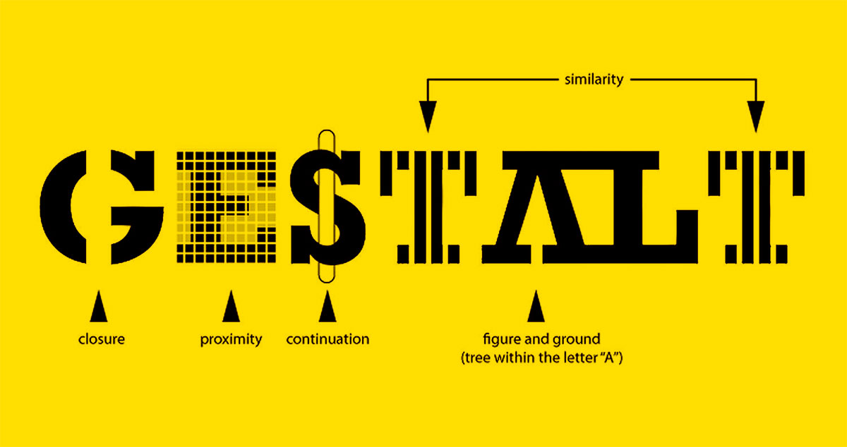
If you’ve ever squinted at light gray text on a white background, you already know what poor color contrast feels like. You just might not have had the technical language for it.
So, what is color contrast? It’s the measurable difference in luminance between two colors placed next to each other, most often text against its background. It affects readability, usability, and whether roughly 350 million people with color vision deficiency can actually use your site.
WebAIM’s 2025 analysis found low contrast on 79.1% of the top one million homepages. It’s the most common accessibility failure on the web, and it’s one of the simplest to fix.
This guide covers how contrast ratios work, what WCAG requires, the types of contrast that matter for screens, and how to test and fix problems before they become legal ones.
What Is Color Contrast

Color contrast is the measurable difference in luminance or color between two visual elements placed next to each other. It’s how your eye separates a line of text from the background behind it, or how a button stands apart from the rest of a page.
Without enough brightness difference between foreground and background, content becomes difficult or impossible to read. And this isn’t some edge case. According to the WebAIM Million 2025 report, low contrast text was found on 79.1% of the top one million homepages, making it the single most common accessibility failure on the web.
The concept sits at the intersection of physics, biology, and design. Light reflects off surfaces, enters your eye, and the retina interprets differences in relative luminance. When those differences are too small, perception breaks down.
Your brain relies on tonal variation (light versus dark) more than it relies on differences in hue. A bright red on a bright green might look wildly different in terms of color, but if both carry similar luminance values, they’ll blur together for someone with low vision. That’s the tricky part. Two colors can look “different” and still fail a contrast check.
Color contrast applies to everything on a screen: body copy, headings, icons, input borders, placeholder text, focus indicators. If a user needs to perceive it, contrast matters.
Luminance vs. Chromatic Contrast
Luminance contrast refers to the light-dark relationship between two colors. It’s the primary driver of text readability and the metric that WCAG measures.
Chromatic contrast refers to the difference in hue or saturation between two colors, independent of brightness. A vivid orange next to a muted teal produces chromatic contrast even if both have similar lightness.
For accessibility, luminance is what counts. Chromatic contrast alone doesn’t make text readable for people with color vision deficiency.
Simultaneous Contrast and Perception
Colors shift depending on what surrounds them. A medium gray square looks darker on a white background and lighter on a black one. This optical effect, called simultaneous contrast, means the same color pair can feel different depending on where it appears in your layout.
Josef Albers explored this extensively in Interaction of Color. It’s something most automated tools can’t account for because they check isolated color values, not the full visual context.
So you can pass every ratio check and still have readability problems if surrounding elements shift the perceived brightness. At least in my experience, this bites people on complex dashboards and data-heavy interfaces more than simple marketing pages.
How Color Contrast Ratios Work

Contrast ratios are the standard measurement system used to determine whether two colors provide enough visual separation. The Web Content Accessibility Guidelines (WCAG) define the formula, and nearly every accessibility tool on the market uses it.
The math works like this: take the relative luminance value of the lighter color, add 0.05, divide by the relative luminance of the darker color plus 0.05. The result is a ratio expressed as X:1.
| Color Pair | Contrast Ratio | WCAG AA (Normal Text) |
|---|---|---|
| Black (#000) on White (#FFF) | 21:1 | Pass |
| Gray (#767676) on White (#FFF) | 4.54:1 | Pass |
| Gray (#777) on White (#FFF) | 4.47:1 | Fail |
| Red (#FF0000) on White (#FFF) | 4:1 | Fail |
Look at that #777 gray. It misses by a hair. WebAIM specifically notes you cannot round up to 4.5:1, and this particular shade is one of the most commonly used grays that fails the check.
The scale runs from 1:1 (no contrast, like white on white) to 21:1 (maximum contrast, black on white). Everything else falls somewhere between those two extremes.
Normal Text vs. Large Text Thresholds
WCAG sets different minimum ratios depending on text size. Larger characters are easier to read at lower contrast because their letterforms carry more visual weight.
AA compliance: 4.5:1 for normal text, 3:1 for large text (18pt or 14pt bold).
AAA compliance: 7:1 for normal text, 4.5:1 for large text.
In web design terms, 18pt maps to 24 CSS pixels and 14pt bold maps to roughly 18.67px. Most body copy on the web sits between 14px and 18px, which means it almost always falls under the stricter 4.5:1 requirement.
Took me a while to internalize that large text isn’t just “big headings.” A 19px bold paragraph technically qualifies. And that one threshold difference (3:1 vs 4.5:1) opens up a lot more color options for typographic hierarchy if you’re strategic about it.
Types of Color Contrast

Color contrast isn’t a single thing. It shows up in several distinct forms, each producing different visual effects. Johannes Itten, the Bauhaus-era color theorist, identified seven types of color contrast back in 1961. Not all of them matter equally for screens, but understanding the categories helps when making design decisions.
Lightness Contrast
This is the most important type for readability. It’s the difference between light and dark values, regardless of hue. Black text on a white background is the extreme version. A dark navy on a pale cream achieves the same thing with less harshness.
Every WCAG calculation is fundamentally a lightness contrast measurement. If you’re only going to think about one type, this is the one.
Hue Contrast
Hue contrast comes from placing two different colors next to each other. Red next to blue. Yellow next to green. The wider the distance on the color wheel, the stronger the hue contrast.
Here’s where it gets unreliable for accessibility though. Two fully saturated hues can have identical luminance values. They’ll look wildly colorful together but fail every contrast check. People with color vision deficiency may not even distinguish them.
Saturation Contrast
A vivid, fully saturated blue next to a washed-out grayish blue creates saturation contrast. Same hue family, different intensity.
This type gets used a lot in UI design to show state changes: an active button in a rich brand color, a disabled version of the same button in a muted tone. Your mileage may vary on whether saturation alone is enough to communicate state, since WCAG 2.1 Success Criterion 1.4.11 requires non-text elements to meet a 3:1 contrast ratio regardless.
Warm vs. Cool Contrast
Warm colors (reds, oranges, yellows) paired against cool colors (blues, greens, violets) create temperature contrast. It’s more of a compositional tool than an accessibility concern, and it shows up constantly in poster design and brand work to establish visual hierarchy.
Temperature contrast doesn’t directly improve readability. But pairing a warm color palette foreground against a cool background (or vice versa) often generates enough luminance difference as a side effect.
Complementary Contrast
Colors sitting on opposite sides of the color wheel produce complementary contrast. Think red and green, blue and orange, yellow and purple.
The visual vibration at the boundary of two complements can be intense, sometimes to the point of discomfort. That buzzing effect at the edge is called simultaneous contrast, and it makes text genuinely hard to read if both colors are highly saturated. Desaturating one of the pair fixes it.
Why Color Contrast Matters for Accessibility
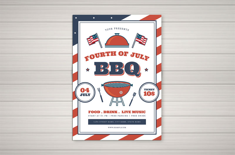
Around 350 million people worldwide have some form of color vision deficiency. Red-green color blindness affects roughly 8% of men and 0.5% of women of Northern European descent, according to research published in the Journal of the Optical Society of America. That’s 1 in 12 men.
And color blindness is just one piece. Low vision, cataracts, aging eyes, even situational factors like sunlight washing out a phone screen. All of these reduce a person’s ability to perceive contrast between foreground and background elements.
The Scale of the Problem
The WebAIM 2024 Million study found that 81% of the top one million homepages had low contrast text below WCAG 2 AA thresholds. Each page averaged 34.5 distinct instances of insufficient contrast.
By 2025, that number dropped slightly to 79.1%, with an average of 29.6 instances per page. Progress? Barely. It’s still the most commonly detected accessibility violation, year after year.
Microsoft’s Inclusive Design team has estimated that situational and temporary impairments affect a far larger population than permanent disabilities alone. Someone holding a phone in direct sunlight has the same functional need for high contrast as someone with a chronic vision condition.
Legal Requirements
This isn’t theoretical. In 2024, over 4,000 ADA-related web accessibility lawsuits were filed in U.S. state and federal courts, according to UsableNet. About 41% of federal filings targeted companies that had already been sued before.
Section 508 requires U.S. federal agencies to make digital content accessible. The ADA extends similar obligations to private businesses. The European Accessibility Act, which took effect in June 2025, applies across the EU.
Poor color contrast is one of the easiest violations to detect with automated tools. Which also makes it one of the easiest for plaintiffs to document in a lawsuit. Fix contrast first. It’s often the lowest-effort, highest-impact accessibility change you can make.
Color Contrast in UI and Web Design
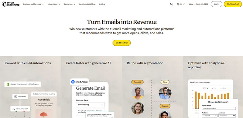
Contrast decisions run through every layer of an interface. It’s not just about body text on a background. Buttons need it. Form inputs need it. Icons, focus states, error messages, placeholder text. If a user needs to perceive it and act on it, contrast is part of that conversation.
Text and Background Relationships
The most common contrast relationship is text sitting on a colored background. Dark text on light backgrounds generally produces better readability than the reverse, because the font strokes have more perceived weight against a bright field.
For dark mode, things shift. Light text on dark backgrounds tends to feel thinner, especially with sans-serif fonts at small sizes. The APCA model (more on that later) accounts for this polarity difference, but under WCAG 2, the ratio stays the same regardless of direction.
Button and Interactive States
A single button has at least four visual states: default, hover, focus, and disabled. Each one needs its own contrast consideration.
Default state: the button label must meet 4.5:1 against its background, and the button itself must meet 3:1 against the page background (WCAG 1.4.11).
Focus indicators: keyboard users rely on visible focus rings to know where they are on the page. WCAG 2.2 added Success Criterion 2.4.11 requiring a minimum contrast of 3:1 for focus indicators.
Disabled state: technically exempt from contrast requirements, but a completely invisible disabled button is a usability failure, not just an accessibility one.
Non-Text Contrast
WCAG 2.1 introduced Success Criterion 1.4.11, requiring graphical objects and user interface components to meet a 3:1 contrast ratio against adjacent colors. This covers things like chart lines, icon boundaries, input field borders, and toggle switches.
I’ve seen entire design systems pass text contrast checks while failing every single form input because the border color was too subtle against a white background. It’s one of the most overlooked requirements.
Common Mistakes That Keep Showing Up
- Light gray text on white backgrounds. The #999 on #FFF combination only hits about 2.8:1. It fails badly, and it’s everywhere.
- Placeholder text that’s nearly invisible. HTML placeholder styling defaults are often too faint, and many designers make them even lighter.
- Using color alone to signal errors. A red border around an invalid field means nothing to someone who can’t distinguish red from the surrounding color. Pair it with an icon or text label.
- Brand palettes built without contrast in mind. If the brand guidelines specify a primary blue that doesn’t hit 4.5:1 on white, you’ve got a systemic problem.
Airbnb’s design team rebuilt their entire color system after discovering that multiple brand colors failed WCAG AA when used as text on their standard backgrounds. They ended up adjusting dozens of color values across the product.
Tools for Checking Color Contrast

You can calculate contrast ratios manually using the relative luminance formula. But nobody does that. There are fast, accurate tools for every stage of the design and development process.
Browser-Based Checkers
WebAIM Contrast Checker is the most widely used free tool. Enter two hex values and it instantly returns the contrast ratio with pass/fail indicators for AA and AAA at both normal and large text sizes. It also provides a simple API for programmatic access.
The Accessible Web Color Contrast Checker and Siege Media’s Contrast Ratio tool are solid alternatives that let you pick colors visually or enter RGB and hex codes.
Built Into Your Dev Tools
Chrome DevTools shows contrast ratios directly in the color picker when inspecting elements. Hover over the ratio and it tells you which WCAG levels are met. It even has an experimental APCA mode buried in the settings, if you want to test the newer algorithm.
Google Lighthouse flags contrast violations automatically during audits. It’s not perfect (automated tools catch about 25-30% of all accessibility issues, according to WebAIM), but it catches the obvious ones.
Design Tool Plugins
Stark is the most popular accessibility plugin for Figma and Sketch. It checks contrast, simulates color blindness types, and integrates directly into design workflows.
For full-page audits after deployment, axe DevTools from Deque Systems and the WAVE browser extension scan entire pages and flag every contrast failure in context.
| Tool | Stage | Best For |
|---|---|---|
| WebAIM Contrast Checker | Design / Quick check | Fast ratio lookups |
| Chrome DevTools | Development | Live element inspection |
| Stark (Figma/Sketch) | Design | In-tool checks, CVD simulation |
| axe DevTools | QA / Audit | Full-page automated scans |
| TPGi Colour Contrast Analyser | Any | Desktop app, eyedropper tool |
The real lesson with contrast tools: check during design, not after launch. Catching a failed color pair in Figma takes ten seconds. Finding it during a QA audit means changing CSS, updating design tokens, possibly rethinking entire color schemes. By then, you’ve wasted time and money that didn’t need to be spent.
APCA and the Future Contrast Model in WCAG 3.0
The current WCAG 2.x contrast formula dates back to 2008. It was built for CRT monitors, core web fonts, and a much simpler web. The formula treats foreground and background colors identically, ignores typography weight, and produces the same ratio whether you’re reading dark text on light or light text on dark.
The Advanced Perceptual Contrast Algorithm (APCA) fixes these problems. It’s the contrast model being considered for WCAG 3.0 (Project Silver), and it represents the biggest shift in how we measure accessible color relationships since the original guidelines were published.
What APCA Changes
Polarity awareness: APCA produces different values depending on whether text is darker than the background or lighter. White text on black is not treated the same as black text on white, because your eye doesn’t perceive them the same way.
Font size and weight as variables: a thin 300-weight sans-serif at 14px needs far more contrast than a bold 700-weight heading at 36px. WCAG 2 only draws one line between “normal” and “large” text. APCA uses a lookup table that maps specific font sizes and weights to required contrast values.
Perceptual uniformity: an APCA value of Lc 60 represents the same perceived readability regardless of how light or dark the colors are. Under WCAG 2, a 4.5:1 ratio with near-black colors can be functionally unreadable, even though it “passes.”
APCA Contrast Levels
| Lc Value | Use Case | Rough WCAG 2 Equivalent |
|---|---|---|
| Lc 90 | Preferred for body text (16px+ normal weight) | Exceeds 7:1 |
| Lc 75 | Minimum for body text (18px+ normal) | Exceeds 4.5:1 |
| Lc 60 | Large or bold text, UI labels | Exceeds 3:1 |
| Lc 30 | Absolute minimum for any text | No direct equivalent |
| Lc 15 | Near-invisible for many users | Below all thresholds |
The sliding scale is the big improvement. Instead of a binary pass/fail, APCA gives designers a range of acceptable values depending on what the text actually does on the page.
Where WCAG 3.0 Stands Right Now
The published WCAG 3.0 draft as of August 2025 does not yet include APCA as a finalized requirement, according to the W3C. The algorithm is still being refined, and multiple reference tables have been proposed for different conformance levels.
Accessibility consultant Eric Eggert has estimated WCAG 3.0 is still 3 to 5 years from any official release. Even after that, WCAG 2.x will remain written into most laws and procurement policies for years.
Chrome DevTools already includes an experimental APCA mode. Tools like Polypane and the Myndex APCA calculator support it natively. Some Figma plugins offer APCA checks alongside standard WCAG ratios.
So what should you do today? Design to meet WCAG 2 AA first (that’s what the law requires). Then run your color pairs through APCA as a secondary check. If something passes WCAG 2 but looks terrible in APCA, trust your eyes. The newer algorithm is almost certainly more accurate about what’s actually readable.
How to Fix Low Color Contrast
Contrast failures are common but they’re also among the easiest accessibility issues to fix. The WebAIM 2025 Million report showed that even though 79.1% of homepages still had low contrast text, the average number of instances per page dropped 14.4% from the previous year. Which means fixes are happening, just slowly.
Start With Lightness Values
The single most effective fix for any contrast failure: adjust the lightness, not the hue. A text color that fails at one lightness level will often pass if you darken it by just a few steps.
Gray text (#999) on white only hits 2.8:1. Shifting to #767676 (a slightly darker gray) gets you to 4.54:1, which passes AA for normal text. Same hue. Same feel. Just darker.
Use Contrast-Safe Palette Generators
Leonardo by Adobe generates entire color scales from target contrast ratios. You pick a brand color, set your required ratios (like 4.5 and 3), and it outputs accessible variations automatically.
Randoma11y takes a different approach. It generates random accessible color pairs that meet WCAG standards, with community voting on which combinations look best. Good for quick inspiration when you’re stuck.
Accessible Palette and Color Easily both let you evaluate full color systems with APCA support, making them useful if you’re building or auditing a brand style guide.
Supplement With Visual Cues
Sometimes a color pair can’t be adjusted enough to pass without ruining the overall design elements you’ve established. In those cases, add supporting visual cues:
- Visible borders or outlines around low-contrast elements
- Underlines for links (instead of relying on color difference alone)
- Icons paired with status colors (a checkmark with green, not just green)
Google’s Material Design team uses this approach throughout their component library. Status indicators always combine color with iconography, so meaning doesn’t depend on contrast alone.
Pushing Back on Brand Colors
Here’s the uncomfortable part. Sometimes the brand’s primary color simply doesn’t work for text or interactive elements at accessible contrast levels.
The logo itself is exempt from WCAG contrast requirements (logotypes get a pass under WCAG 2 SC 1.4.3). But the rest of the interface isn’t. A brand orange that looks great in a logo might only hit 3.5:1 on white, which fails for normal-sized text.
The fix isn’t to abandon the color. It’s to create accessible variants: a darker version for text, a lighter version for large decorative elements, and a compliant version for interactive components. Build it into the brand documentation so every designer on the team knows which shade goes where.
Test Across Environments
A color pair that passes on your calibrated studio monitor might look washed out on a cheap laptop panel or under fluorescent office lighting.
Check on multiple screens. Check in bright ambient light. Check at arm’s length, which is how most people actually use their phones. If it feels borderline on any device, bump the contrast up another notch. The WCAG minimum is a floor, not a target.
Astigmatism (which affects 30 to 60% of people, according to the Accessibility Checker) causes a halation effect in dark mode where light text appears to bleed or glow against dark backgrounds. So if you’re testing dark themes, reduce pure white (#FFF) to a softer off-white (#E0E0E0 or similar) to cut down on that glow without losing sufficient contrast.
FAQ on What Is Color Contrast
What is color contrast in design?
Color contrast is the difference in luminance between two adjacent colors. In design, it determines whether text, icons, and interactive elements are readable against their backgrounds. Higher contrast means better visibility for all users.
Why does color contrast matter for accessibility?
Around 350 million people worldwide have some form of color vision deficiency. Low contrast makes content unreadable for them, and for anyone viewing screens in bright sunlight or with aging eyes. It’s also a legal requirement under the ADA and Section 508.
What is a good contrast ratio?
WCAG 2 requires a minimum of 4.5:1 for normal text and 3:1 for large text at AA level. AAA compliance raises that to 7:1 for normal text. Black on white hits the maximum at 21:1.
How do I check color contrast on my website?
Use the WebAIM Contrast Checker for quick ratio lookups. Chrome DevTools shows ratios directly in the color picker. For full-page scans, axe DevTools or the WAVE browser extension flag every failing element automatically.
What is the difference between AA and AAA contrast levels?
AA is the minimum standard most laws reference: 4.5:1 for normal text. AAA is stricter at 7:1. Most organizations target AA compliance, though AAA is recommended for content that affects health, finances, or safety.
Does color contrast only apply to text?
No. WCAG 2.1 Success Criterion 1.4.11 requires 3:1 contrast for non-text elements too. That covers form input borders, icon boundaries, chart lines, focus indicators, and any graphical object users need to perceive.
What is the APCA contrast method?
APCA (Accessible Perceptual Contrast Algorithm) is the proposed replacement for WCAG 2’s contrast formula. It accounts for font weight, text size, and polarity (dark-on-light vs. light-on-dark), producing more accurate readability predictions.
Can two bright colors have enough contrast?
Rarely. Two saturated colors (like red and green) may look different in hue but carry similar luminance values. Contrast ratios depend on brightness difference, not color difference. Always verify with a contrast checker.
Is dark mode more accessible than light mode?
Not automatically. Dark mode can cause halation (a glowing effect around text) for people with astigmatism, which affects 30 to 60% of the population. Both modes need independent contrast testing against WCAG thresholds.
How do I fix low color contrast?
Start by adjusting lightness values. Darkening text by a few steps often fixes the problem. Tools like Leonardo by Adobe generate entire accessible color scales from target contrast ratios automatically.
Conclusion
Understanding what is color contrast comes down to one thing: making sure every person who visits your site can actually read it. The gap between WCAG compliance and real-world readability is where most teams stumble.
The tools exist. WebAIM, Chrome DevTools, Stark, Leonardo. None of them are expensive or hard to learn.
With the APCA model gaining traction and WCAG 3.0 on the horizon, contrast standards are getting smarter about how human vision actually works. Font weight, text size, and polarity will all factor into future requirements.
Start with your accessible color combinations today. Check every text and background pair against AA thresholds. Fix lightness values where they fall short. Build contrast checks into your design process, not your QA process.
The minimum ratio is a floor. Aim higher.

Renowned for his expertise in logo design and visual branding, Bogdan has developed a multitude of logos for various clients.
His skills extend to creating posters, vector illustrations, business cards, and brochures. Additionally, Bogdan's UI kits were featured on marketplaces like Visual Hierarchy and UI8.
He also wrote in the past years on sites like Design Your Way, WebDesignerDepot, WPDean, Designmodo, Speckyboy, Slider Revolution, and more.
- The Windsurf Logo History, Colors, Font, And Meaning - 10 October 2026
- How to Remove Background From Product Photos (No Photoshop) - 10 October 2026
- How Designers can Build a Stronger Online Creative Identity - 9 October 2026

Bogdan Sandu is a seasoned designer who has been designing websites since 2008. Renowned for his expertise in logo design and visual branding, Bogdan has developed a multitude of logos for various clients. His skills extend to creating posters, vector illustrations, business cards, and brochures. Additionally, Bogdan's UI kits were featured on marketplaces like Visual Hierarchy and UI8. He also wrote in the past years on sites like Design Your Way, WebDesignerDepot, WPDean, Designmodo, Speckyboy, Slider Revolution, and more.
You Might Also Like