


People form judgments about a product within 90 seconds of seeing it, and up to 90% of that assessment comes down to color. That’s not marketing fluff. It’s from Satyendra Singh’s research in Management Decision.
So what is color psychology, and why does it matter for anyone working in design, branding, or communication?
This article breaks down the science of how colors affect the brain and body, what individual colors actually mean (backed by research, not infographics), and how businesses apply these principles across marketing, web design, and physical spaces. You’ll also learn where the field gets it wrong and which popular claims don’t hold up under scrutiny.
What Is Color Psychology
Color psychology is the study of how colors affect human perception, emotions, and behavior. It sits at the crossroads of neuroscience, behavioral research, and applied design.
The field traces back to Johann Wolfgang von Goethe’s Theory of Colours (1810), which first proposed that colors carry emotional weight beyond their physical properties. Isaac Newton had already broken white light into its visible spectrum a century earlier, but Goethe pushed the conversation into subjective experience.
And that distinction still matters today.
Scientific color research looks at measurable responses: how the eye processes wavelengths, how the brain’s visual cortex interprets signals from cone cells, and what happens in the limbic system when that information arrives. Applied color psychology, on the other hand, takes those findings and puts them to work in marketing, web design, interior spaces, and branding.
Satyendra Singh’s 2006 study in Management Decision found that people form opinions within 90 seconds of first interacting with a product or person, and 62–90% of that snap judgment is based on color alone.
That single finding reshaped how businesses think about everything from packaging design to storefront layouts.
There’s a catch, though. Color psychology isn’t universal. Cultural context, personal memory, and even lighting conditions change what a color “means” to any given person. Red signals danger in Western countries, but it represents luck and prosperity across much of East Asia.
So the field is real, backed by decades of research from people like Andrew Elliot and Markus Maier. But the popular infographics that claim “blue = trust” or “yellow = happiness” as fixed rules? Those are oversimplifications. The actual science is more layered than that.
How Colors Affect the Brain and Body
Color perception starts in the retina. Three types of cone cells detect different wavelengths of light (short, medium, and long), then send electrical signals through the optic nerve to the brain’s visual cortex. From there, the limbic system processes the emotional component.
Columbia University neuroscientists published findings in Nature Neuroscience (May 2024) identifying, for the first time, brain-cell circuitry that converts raw sensory signals into color perceptions capable of guiding behavior.
That’s the mechanism. But what does it actually do to the body?
Warm Colors and Arousal Response
Red, orange, and yellow activate the sympathetic nervous system. Exposure to red has been linked to increased heart rate and elevated blood pressure in multiple controlled studies.
A 2009 University of British Columbia study by Mehta and Zhu found that red improved performance on detail-oriented tasks requiring accuracy, while also triggering a stronger arousal response compared to cooler tones.
Warm colors show up constantly in fast food branding (McDonald’s, Wendy’s, Chick-fil-A) because they stimulate appetite and create a sense of urgency. That’s not an accident. It’s applied neuroscience.
Cool Colors and Calming Effects
Blue and green engage the parasympathetic nervous system, promoting relaxation.
The same UBC study found blue environments boosted creative output. Participants in blue-walled rooms generated more creative solutions than those surrounded by red. The researchers attributed this to blue’s association with openness and calm.
Hospitals and healthcare facilities lean heavily on blue and green palettes for exactly this reason. These colors lower perceived stress in patients. (Took me a while to notice this pattern, actually, until I started paying attention to waiting rooms.)
| Color Group | Physiological Effect | Common Application |
|---|---|---|
| Red, Orange, Yellow | Increased heart rate, appetite stimulation | Fast food, clearance sales, warnings |
| Blue, Green | Lower blood pressure, creative thinking | Healthcare, finance, tech |
| Black, White, Gray | Neutral arousal, perceived sophistication | Luxury brands, minimalist products |
An MIT study published in Science (2024) found that early visual development shapes how the brain processes color throughout life. Infants who receive limited color input early on learn to recognize objects primarily through luminance rather than hue, and this pattern persists into adulthood.
So when we talk about how colors “make us feel,” there’s a biological foundation. But it’s shaped by development and experience from the very beginning.
What Each Color Means Psychologically
Before getting into specifics: color meaning depends on context. A red button on a website does not carry the same psychological weight as a red wall in a restaurant. Saturation, brightness, surrounding colors, and the viewer’s personal history all play into it.
That said, decades of research point to consistent patterns worth knowing.
Primary Colors

Red triggers urgency and excitement. It raises heart rate and stimulates appetite. Coca-Cola, Netflix, and YouTube all use red as their dominant brand color. In competitive sports, Hill and Barton (2005) found that athletes wearing red won more often in the 2004 Olympics combat events.
Blue communicates trust and stability. It’s the most universally preferred color across genders and cultures. Facebook, PayPal, Samsung, and most major banks rely on blue. According to Straits Research, 33% of the world’s top brands use blue in their primary branding.
Yellow grabs attention fast but can cause anxiety at high color contrast levels. It works best as an accent. Think IKEA’s signage or the golden arches. At lower saturation, it reads as warm and optimistic.
Secondary and Neutral Colors
Green: Nature, health, balance. Whole Foods, Starbucks, and Spotify all lean into green for different reasons. In complementary color pairings, green and red create maximum visual tension.
Orange: Enthusiasm without red’s intensity. Amazon’s smile and Fanta’s branding both use orange to project energy and approachability.
Purple: Historically rare (Tyrian purple was more expensive than gold), so it carries luxury associations. Cadbury and Hallmark use it. Research from Gupta et al. (2025) found female respondents showed significantly stronger preference for purple than male respondents.
Black: Sophistication, authority, power. Chanel, Nike, and Apple’s product lines all leverage black. It’s the go-to for premium positioning across industries. About 28% of top brands use black or grayscale as their primary identity, according to Straits Research.
There’s also the Von Restorff effect (isolation effect) at play here. A single contrasting color in a field of neutral tones draws the eye immediately. This is why creating emphasis through color is one of the most reliable tricks in the entire design toolkit.
Color Psychology in Marketing and Branding
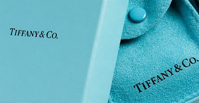
Straits Research reports that 85% of consumers say color is the primary reason they choose one product over another. And colored ads get read 42% more often than identical ads in black and white.
Those numbers explain why brands obsess over their color palette.
How Brands Choose Their Colors
Jennifer Aaker’s brand personality framework maps five dimensions (sincerity, excitement, competence, sophistication, ruggedness) to specific color associations. It’s not about picking a “favorite.” It’s about picking the color that matches what a brand wants to communicate.
A 2006 study in the Journal of Business Research found that the perceived appropriateness of a color for a brand matters more than the color itself. If the color “fits” what’s being sold, consumers respond positively. If it doesn’t, it creates cognitive friction.
Heinz tested this in reverse. When they launched green ketchup (EZ Squirt Blastin’ Green), they sold over 10 million units in the first seven months. The novelty of “wrong” color created curiosity. But it was a short-term play. The product was eventually discontinued.
Color and Purchase Decisions
93% of consumers report that visual appearance is the top factor when evaluating a new product, according to research cited by Digital Information World.
Red drives impulse purchases. Navy blue triggers more deliberate, budget-conscious buying. That behavioral split has been documented in retail environments repeatedly.
And color consistency across touchpoints matters. The University of Loyola, Maryland study found that using consistent signature colors can boost brand recognition by up to 80% compared to monochrome presentation. T-Mobile’s magenta is a perfect case. They’ve trademarked it. It’s instantly recognizable even without the logo present.
Building a coherent visual identity around color is no longer optional for serious brands. It’s a baseline expectation.
Color Psychology in Web and UX Design
HubSpot’s 2011 A/B test found that a red call-to-action button outperformed a green one by 21% in clicks. That stat got repeated everywhere. But here’s what most people missed: the page had a dominant green color scheme. The red button won because it created contrast, not because red is inherently better.
CXL’s analysis of 2,588 A/B tests found blue buttons actually won 31% of the time, versus 22% for green and 16% for red.
Context beats color every time.
The 60-30-10 Rule in Interface Design
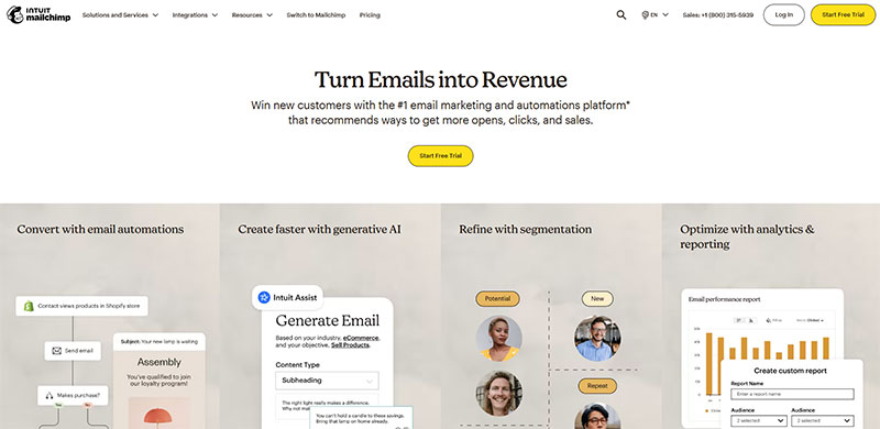
Most UI designers follow a distribution formula. 60% of the interface uses a dominant color (usually a neutral), 30% uses a secondary color, and 10% goes to an accent color that draws the eye to key actions.
That accent color is where color psychology shows up most in UX work. It guides visual hierarchy and tells users where to click, what to read next, and what matters most on the page.
Accessibility and Color Contrast
WCAG (Web Content Accessibility Guidelines) requires a minimum contrast ratio of 4.5:1 for normal text against its background. This isn’t a suggestion. Failing it means portions of your audience literally cannot read your content.
Red-green color blindness affects roughly 8% of men and 0.5% of women. So relying only on red vs. green to communicate error states and success states (a shockingly common pattern) locks out a significant user group.
Good UX color choices work on two levels: they guide behavior through psychological association AND they remain functional for people with vision differences. The RGB color model used in screens makes this tricky, since the same hex value can render differently across monitor calibrations.
Conversion-Focused Color Patterns
Red for errors, green for success, yellow for warnings. These conventions are so deeply embedded in software interfaces that breaking them creates confusion.
Dashboard and SaaS products stick to these patterns because user testing consistently shows faster task completion when color coding matches expectations. But the specific shade matters. A muted red (#CC3333) reads as “important” while a bright saturated red (#FF0000) reads as “danger.”
One survey of 500 consumers found that 39% said color is the single most impactful visual element on a business website. Not images. Not typography. Color.
Cultural Differences in Color Perception
White means purity at Western weddings and mourning at Eastern funerals. That single example breaks most “universal color meaning” charts in half.
Red is another one. In China, red envelopes carry gift money during New Year celebrations. Red wedding dresses are traditional. In South Africa, red is associated with mourning. Same color. Completely opposite emotional contexts.
Regional Brand Adaptation
Global brands adjust. IKEA modifies its catalog imagery (and sometimes color emphasis) by region. Pepsi has historically emphasized different parts of its color palette depending on Southeast Asian or Latin American markets.
Joe Hallock’s 2003 color survey remains one of the most referenced datasets on demographic color preferences. It revealed gender-based differences (purple ranked much higher among women) and age-related shifts in preference. But these findings were collected primarily from English-speaking Western respondents.
Research from Gupta et al. (2025) confirmed that cultural background significantly influences color associations, particularly for white, red, and black, across participants from North America, Europe, and Asia.
Why Universal Color Rules Fail
Green makes Americans think of nature and money. In parts of Malaysia, it can suggest poison. In Islamic cultures, green holds sacred significance.
Applying Western color psychology frameworks to global audiences without adjustment is a common and expensive mistake. The principles of color theory might be universal (warm vs. cool, analogous color harmonies, split-complementary schemes), but the emotional and cultural associations attached to specific colors are not.
For any brand operating across borders, color testing with local audiences isn’t a nice-to-have. It’s a requirement.
Common Myths About Color Psychology
Most color psychology content online is wrong. Not slightly off. Fundamentally misleading.
The field has real science behind it, but the pop psychology versions (those infographics claiming “blue = trust” as a fixed rule) strip away all nuance. Andrew Elliot, one of the leading researchers in color and psychological functioning, has stated that the field is still at a nascent stage and urged caution about sweeping conclusions.
Here are the biggest offenders.
The Baker-Miller Pink Myth
In 1979, Alexander Schauss convinced the U.S. Naval Correctional Center in Seattle to paint holding cells a specific shade of pink. For 156 days, the facility reported zero incidents of inmate violence.
The story spread fast. Jails across the country started painting cells pink.
But psychologist Oliver Genschow’s 2014 replication study at a Swiss prison found no measurable reduction in aggression from Baker-Miller pink. Even Schauss’s own follow-up attempts failed to reproduce the original results.
“Blue Rooms Make People More Creative”
Mehta and Zhu’s 2009 UBC study did show blue environments outperformed red ones on creative tasks. That finding is real. The problem is how it gets repeated.
What people say: “Paint your office blue and you’ll be more creative.”
What the study actually showed: Blue performed better on tasks requiring divergent thinking, while red improved detail-focused accuracy. The effect depended on the type of task, not some universal creativity boost.
Infographics vs. Peer-Reviewed Research
Elliot and Maier’s review of color psychology literature found that much pre-21st century research failed to control for basic variables like hue versus brightness, ambient lighting, or background colors.
The same color at different monochrome values produces completely different emotional responses. A deep navy and a baby blue are both “blue,” but their psychological effects have almost nothing in common. Context, personal history, and color harmony with the surrounding environment all shape the outcome.
Color Psychology in Interior and Environmental Design
Nancy Kwallek at the University of Texas spent decades studying how office wall colors affect worker productivity and mood. Her most cited finding: white offices produced the most errors across all worker types.
“White doesn’t help us be productive,” Kwallek told FastCompany.
That single insight contradicts the default assumption most commercial landlords and office designers still operate on.
Offices and Workspaces
Kwallek’s research compared red, blue-green, and white office environments over four consecutive workdays with 90 participants.
| Office Color | Effect on Workers |
|---|---|
| White | Most typing errors, feelings of sterility |
| Red | More reported anxiety, some higher output |
| Blue-green | Preferred by majority, fewer mood disruptions |
The findings also revealed that individual sensitivity matters. “High screeners” (people who naturally filter out environmental stimulation) performed similarly across all colors. “Low screeners” were far more affected by their surroundings.
Healthcare and Retail Spaces
Hospitals lean on blue and green palettes to reduce perceived stress. Research by Edgerton, Ritchie, and McKechnie (2010) showed that changing corridor colors in a psychiatric hospital to nature-inspired tones resulted in a measurable increase in positive patient behaviors.
Fast food chains use warm reds and yellows to speed up turnover. The warm color stimulates appetite and subconsciously rushes diners. Fine dining does the opposite: muted tones, low color saturation, and dim lighting encourage longer stays.
Retail stores use color to control dwell time. Bright, warm interiors in discount stores push shoppers to move quickly. Cool, muted palettes in boutique environments signal “take your time.”
How to Apply Color Psychology Effectively
Color psychology works. But not the way most people try to use it.
The common approach is to google “what does blue mean,” pick a color that matches a vague emotional goal, and call it done. That skips every variable that actually determines whether a color choice succeeds or fails.
Testing and Iteration
HubSpot’s famous red vs. green button test showed a 21% lift for red. But the real lesson was about contrast, not color. Red stood out because the page was already green.
A/B testing is the only reliable way to know what works for your specific audience on your specific platform. General color psychology gives you a hypothesis. Testing gives you data.
- Test one variable at a time (button color, background, accent)
- Run tests long enough to reach statistical significance
- Account for audience demographics and cultural background
Tools for Color Selection
Adobe Color: Generates palettes using color wheel rules (triadic, tetradic, and other schemes).
Coolors: Fast palette generation with export options for CMYK and hex values.
Pantone Color Institute: Industry standard for physical color matching, especially in print design and product manufacturing.
Pick tools that match your medium. Screen-based work needs RGB values. Print work needs CMYK or Pantone spot colors. Getting this wrong means the color you chose isn’t the color your audience sees.
The Science Behind Color Preference
Why do you prefer certain colors? The answer is less about personality and more about what you’ve eaten, seen, and experienced over the course of your life.
Palmer and Schloss at UC Berkeley proposed the Ecological Valence Theory in 2010, now the most well-supported explanation for human color preference. Their model accounted for 80% of the variance in color preference across participants.
Ecological Valence Theory
The core idea: people prefer colors strongly associated with objects they like and dislike colors associated with objects they find unpleasant.
- Blues score highest because of clear skies and clean water
- Browns and olive tones score lowest because of associations with decay and waste
This isn’t about symbolism. It’s about accumulated sensory experience. And it means color preference is fundamentally personal, shaped by individual ecological encounters rather than universal rules.
Gender, Age, and Individual Variation
Hurlbert and Ling’s 2007 Newcastle University study found that women showed a stronger preference for reddish-purple tones, while men leaned toward blue-green. But the effect was small, and cultural factors likely play a role.
Gupta et al. (2025) confirmed significant gender-based differences. Female respondents rated purple at a mean of 5.8 (on a 7-point scale) versus 4.2 for males.
Age matters too. Younger consumers (18-25) show greater acceptance of unconventional color choices for traditionally conservative product categories. Joe Hallock’s survey data backs this up, showing color preference shifting across age groups.
But here’s the thing. “Favorite color” surveys are terrible predictors of actual purchasing behavior. Someone who says their favorite color is green will still buy a black phone, a blue car, and a red jacket if the context is right. Color preference is real. Color preference as a stable personality trait? Not so much.
What does work is understanding your audience’s associations, testing against real behavior, and treating color as one part of a broader set of design principles rather than a magic shortcut.
FAQ on What Is Color Psychology
What is color psychology in simple terms?
Color psychology is the study of how colors influence human emotions, perceptions, and behavior. It examines why certain hues trigger specific responses, from calming effects of blue to the urgency associated with red. The field spans neuroscience, marketing, and design.
How do colors affect mood and emotions?
Colors trigger responses in the brain’s limbic system, which processes emotion. Warm colors like red and orange increase arousal and heart rate. Cool colors like blue and green activate the parasympathetic nervous system, promoting calm.
Is color psychology scientifically proven?
Parts of it are. Researchers like Andrew Elliot and Markus Maier have published peer-reviewed findings on color and psychological functioning. But Elliot himself cautions that the field is still developing. Many popular claims lack proper scientific backing.
What does each color mean psychologically?
Red signals urgency and excitement. Blue communicates trust. Yellow grabs attention. Green suggests health and nature. Black conveys sophistication. But these associations shift based on cultural context, personal experience, and saturation level.
How is color psychology used in marketing?
Brands pick colors to match their personality and influence consumer decisions. Satyendra Singh’s research found that 62–90% of snap product judgments are based on color alone. Companies like Coca-Cola and Facebook built entire identities around strategic color choices.
Do colors affect purchasing decisions?
Yes. About 85% of consumers cite color as the primary reason they choose one product over another. Red drives impulse purchases while navy blue encourages more deliberate, budget-conscious buying behavior in retail environments.
Does color psychology differ across cultures?
Significantly. White represents purity in Western cultures but mourning in parts of East Asia. Red means luck in China and danger in Western contexts. Global brands adapt their color strategies by region to avoid costly misalignment.
What colors increase conversions on websites?
No single color wins universally. HubSpot’s A/B test showed red outperformed green by 21%, but only because red created stronger visual contrast on a green-dominant page. Contrast and context matter more than any specific hue.
What is the most universally liked color?
Blue. Palmer and Schloss’s Ecological Valence Theory explains this through associations with clear skies and clean water. Joe Hallock’s color survey data confirmed blue as the top preference across genders and most age groups.
Can color psychology improve interior design?
Nancy Kwallek’s research at the University of Texas found that white offices produced the most worker errors. Blue-green environments were preferred by the majority. Warm tones work for restaurants while cool palettes suit healthcare and focused workspaces.
Conclusion
Understanding what is color psychology gives you a concrete advantage in any field that touches visual communication. From brand identity to interior spaces, color choices shape perception before a single word gets read.
But the science isn’t as simple as matching hues to emotions on a chart. Cultural differences, individual sensitivity, and context all change the outcome.
The researchers who built this field (Palmer and Schloss, Kwallek, Elliot) agree on one thing: test before you commit. General color associations give you a starting point. A/B testing and audience research give you actual answers.
Treat color as a design decision backed by data, not a gut feeling. Start with your audience’s cognitive and emotional triggers, account for cultural variation, and validate every choice against real user behavior. That’s how color psychology moves from theory to results.

Renowned for his expertise in logo design and visual branding, Bogdan has developed a multitude of logos for various clients.
His skills extend to creating posters, vector illustrations, business cards, and brochures. Additionally, Bogdan's UI kits were featured on marketplaces like Visual Hierarchy and UI8.
He also wrote in the past years on sites like Design Your Way, WebDesignerDepot, WPDean, Designmodo, Speckyboy, Slider Revolution, and more.
- How to Install Fonts on Mac (Step-by-Step Guide) - 20 September 2026
- From Mockup to Code: How AI-Augmented Development Speeds Up the Design Handoff - 19 September 2026
- The Beehiiv Logo History, Colors, Font, And Meaning - 18 September 2026

Bogdan Sandu is a seasoned designer who has been designing websites since 2008. Renowned for his expertise in logo design and visual branding, Bogdan has developed a multitude of logos for various clients. His skills extend to creating posters, vector illustrations, business cards, and brochures. Additionally, Bogdan's UI kits were featured on marketplaces like Visual Hierarchy and UI8. He also wrote in the past years on sites like Design Your Way, WebDesignerDepot, WPDean, Designmodo, Speckyboy, Slider Revolution, and more.
You Might Also Like


