Every color you see on a product label, a brand logo, or a fabric swatch got there through a decision. And more often than not, that decision involved a Pantone number.
So what is Pantone, exactly? It’s the color standardization system that lets a designer in Berlin and a manufacturer in Shenzhen look at the same numbered code and produce the same precise color. No guessing. No “close enough.”
This article breaks down how the Pantone Matching System works, what separates spot color from process color, where PMS codes show up across industries from printing to fashion, and why the recent subscription changes have frustrated designers worldwide.
What is Pantone

Pantone is a color standardization company that provides a universal language for identifying, matching, and communicating color across industries. Founded in 1963 by Lawrence Herbert, it started as a solution to a very specific problem: printers and designers couldn’t agree on what a color actually looked like.
The core product is the Pantone Matching System (PMS). Each color gets a unique numbered code, like Pantone 186 C, and a precise ink formula that any printer in the world can mix to get the exact same result.
Pantone LLC is headquartered in Carlstadt, New Jersey, and currently operates as a subsidiary of X-Rite under the Veralto corporation (spun off from Danaher in September 2023). Its library now includes over 15,000 colors across multiple systems covering print, fashion, textiles, and plastics.
So when someone says “Pantone,” they might mean the company, the matching system, or a specific color reference. All three are connected. The system gives designers and manufacturers a shared reference point so that a color specified in New York looks identical when printed in Tokyo or sewn into fabric in Milan.
A Reboot study found that using a consistent signature color can boost brand recognition by up to 80%. That’s the whole reason Pantone exists. Without a standardized system, “dark blue” could mean fifty different things to fifty different people.
How Lawrence Herbert Created the Color Standard
Herbert was a chemistry graduate from Hofstra University who joined the company (then called M & J Levine Advertising) as a part-time employee in 1956. He noticed that communicating color between designers, agencies, and printers was chaotic. Everyone was guessing.
By 1962, he was running the ink division at a profit while the advertising side was $50,000 in debt. He bought the company’s technical assets for that same amount and renamed it Pantone.
His first Pantone color guide in 1963 assigned numbered codes to colors, each with an exact ink formula. By 1968, it had become the industry standard across the United States. He later secured buy-in from ink manufacturers in Europe and Asia, and Pantone became the go-to system globally.
How the Pantone Matching System Works

The Pantone Matching System uses pre-mixed inks rather than building colors from four standard inks layered on top of each other. That’s the key difference between a PMS spot color and a CMYK process color.
Every Pantone color has a numbered code. The suffix tells you the paper stock:
- C = coated (glossy, smooth paper)
- U = uncoated (rough, porous paper)
- M = matte (discontinued in recent guides, but still referenced)
Pantone provides about 15 “base” inks from which all ~2,700 solid PMS colors are formulated. A printer follows the exact recipe from the Pantone Formula Guide to mix that specific ink. No guessing, no variation.
The physical swatch books are the actual reference tools. What you see on your monitor is an approximation. Screens display color in RGB, which is a completely different color model. The printed swatch is the truth.
According to Pantone, a seven-color extended gamut process (CMYKOGV) can match roughly 90% of PMS spot colors. But that remaining 10%? Metallics, fluorescents, and very specific brand colors that only a pre-mixed spot ink can reproduce accurately.
Coated vs. Uncoated vs. Matte
This trips up a lot of people the first time they work with PMS codes.
The same Pantone number looks different depending on the paper it’s printed on. Pantone 186 C on coated stock appears brighter and more saturated than Pantone 186 U on uncoated paper. The ink absorbs differently into each surface.
Coated paper has a smooth, sealed surface. Ink sits on top, so colors look vivid and sharp. Uncoated stock is porous. Ink soaks in, making the same formula appear muted and slightly warmer.
That’s why brand guidelines typically specify both versions. A company might list Pantone 2935 C for glossy marketing materials and Pantone 2935 U for letterheads or kraft packaging. If you only specify one and your printer uses the other stock, the color won’t match expectations.
Pantone Color Libraries Beyond Print
Pantone isn’t just for paper and ink anymore. The system expanded into textiles, plastics, interior design, and even skin tones over the past few decades.
Each industry needs a different physical substrate because ink on paper behaves nothing like dye on cotton or pigment embedded in plastic.
| System | Industry | Substrate | Approximate Colors |
|---|---|---|---|
| Solid Coated / Uncoated | Graphic design, printing | Paper | ~2,700 |
| TPG (Textile Paper Green) | Fashion, home, interiors | Lacquer-coated paper | ~2,600 |
| TCX (Textile Cotton eXtended) | Fashion, textiles | Cotton swatches | ~2,600 |
| Plastics Standard Chips | Product manufacturing | Plastic chips | 200+ |
| SkinTone Guide | Beauty, medical, entertainment | Paper | 110 |
The Fashion, Home + Interiors (FHI) system uses a six-digit numbering code that works differently from the graphic arts codes. The first two digits indicate lightness, the middle two specify hue, and the last two describe chroma level.
Why does this matter? Because telling a fabric mill “use Pantone 186 C” is meaningless. That’s a paper-based reference. Fabric needs TCX or TPG codes that account for how dye interacts with fiber.
Pantone vs. CMYK, RGB, and HEX

Here’s where most of the confusion lives. Pantone, CMYK, RGB, and HEX are all ways to define color, but they work in fundamentally different ways and serve different purposes.
Pantone (PMS): A spot color system. The ink is pre-mixed to an exact formula before it ever touches the printing press. One ink, one color, dead-on accurate every time.
CMYK: A process color system. Four inks (cyan, magenta, yellow, black) are printed as tiny overlapping dots. Your eye blends them together. Great for photographs and complex images, but it approximates colors rather than matching them precisely.
RGB/HEX: Screen-based color models. RGB uses red, green, and blue light. HEX is just a shorthand notation for RGB values used in web and web design. Both are device-dependent, meaning the same HEX code can look different on two monitors.
When You Need Pantone vs. When CMYK Works Fine
If you’re printing a full-color brochure with photographs, CMYK handles that. Nobody specifies spot colors for a photo spread.
But if your logo needs to look identical on a business card, a trade show banner, and a product box printed at three different facilities, that’s a Pantone job. Consistency across print runs is literally what the system was built for.
There’s another catch. Some Pantone colors simply cannot be reproduced in CMYK. Metallics, fluorescents, and certain deep blues or bright oranges fall outside the CMYK color gamut. Took me a while to fully appreciate this early on, but once you see a Pantone metallic next to a CMYK “gold,” the difference is pretty obvious.
Research from Loyola University Maryland found that color can increase brand recognition by up to 80%. That’s why brands like Coca-Cola, Tiffany & Co., and T-Mobile don’t leave their signature colors up to a CMYK build. They specify Pantone numbers.
Conversion Limitations
You can convert a Pantone color to CMYK, RGB, or HEX. But conversions are approximations, not exact matches.
The most accurate conversion path goes through Lab values (a device-independent color space based on human perception). Pantone defines each swatch by its Lab coordinates, and converting from there to CMYK or RGB gets you closer than guessing.
But “closer” still isn’t the same. If exact color reproduction across physical materials matters to the project, a printed proof against the physical Pantone swatch is the only way to know for sure.
Where Pantone Colors Are Used

Pantone shows up in more places than most people realize. It goes well beyond printing brochures and business cards.
Brand Identity and Corporate Colors
The most visible use. Major brands trademark specific Pantone colors as part of their visual identity.
- Tiffany Blue (Pantone 1837, named after the company’s founding year)
- Coca-Cola Red (Pantone 484)
- T-Mobile Magenta (Pantone Rhodamine Red U)
- Target Red
According to a Demand Metric study, consistently presented brands are 3.5 times more visible to customers. Pantone makes that consistency possible across every printed touchpoint.
Product Manufacturing and Packaging
In packaging design, spot colors dominate. It’s not unusual for a product package to consist entirely of Pantone spot colors rather than CMYK builds.
Plastics manufacturers use Pantone Plastics Standard Chips to match the exact color of a phone case, a toy, or a shampoo bottle cap. Textile producers reference TCX and TPG codes so a t-shirt dyed in one factory matches fabric sourced from another.
Research shows that 85% of consumers say color is the primary reason they choose a product (Kissmetrics). When your packaging color shifts between production runs, you lose shelf recognition. Pantone prevents that.
Government, Safety, and Institutional Use
National flags, military insignia, safety signage, and even sports team uniforms get specified using Pantone codes. The goal is the same: make sure the color is identical no matter who produces the material, and no matter where.
Some countries officially define their flag colors using PMS numbers in legislation or official standards documents.
Pantone Color of the Year

Every December since 2000, the Pantone Color Institute announces its Color of the Year. It’s the company’s most publicly visible initiative and probably the reason most non-designers have heard the Pantone name.
Recent selections include:
- 2025: Mocha Mousse (Pantone 17-1230)
- 2024: Peach Fuzz (Pantone 13-1023)
- 2023: Viva Magenta (Pantone 18-1750)
- 2022: Very Peri (Pantone 17-3938)
The selection isn’t random. Pantone’s team analyzes color trends across fashion, industrial design, consumer products, and social media throughout the year. Laurie Pressman, vice president of the Pantone Color Institute, has described the process as taking the temperature of what’s happening in the world and translating it into the language of color.
Actual Industry Impact
Once the Color of the Year drops, brands jump in fast. Lowe’s creates interior paint lines around it. Sephora releases makeup products in the shade. FedEx produces branded materials featuring the color. Adobe has released photography assets in its own Pantone Color of the Year category.
This isn’t just a PR stunt. These partnerships generate revenue for Pantone through licensing, formulation books, and color palette guides sold to designers who want to stay on trend.
Criticism and Skepticism
Not everyone buys it. Some critics argue the Color of the Year is less of a forecast and more of a self-fulfilling prophecy. Brands adopt the color because Pantone declared it, and then Pantone points to the adoption as proof they were right.
As Mikel Cirkus from fragrance company Firmenich told Slate, the proliferation of the chosen color across products after its announcement is less about forecasting and more about dictating trends. Fair point.
Still, the program gives Pantone consistent media coverage every year and keeps the brand name in front of an audience far beyond the design world. Understanding principles of color psychology helps explain why the program gets so much public attention. People respond emotionally to color, and Pantone has built a yearly event around that response.
How Designers Work with Pantone Colors

Specifying a Pantone color in a design file is straightforward. Using it correctly through the entire production chain is where things get tricky.
In Adobe Illustrator or InDesign, you select a Pantone swatch from the color library, assign it to your design elements, and mark it as a spot color. The printer then knows to mix that exact ink formula rather than building the color from CMYK.
But here’s the part that catches people off guard: the color you see on your monitor is not what will print. Screens use pixels and light to display color. Printed Pantone swatches use ink on paper. The only reliable color reference is the physical Pantone Formula Guide, which lists 2,390 spot colors across coated and uncoated stocks.
A Pantone Formula Guide set (coated + uncoated) costs around $217 at retail. Pantone recommends replacing it annually because inks yellow over time, which means the color you’re referencing from a three-year-old book might not be accurate anymore.
The Pantone Connect Subscription Shift
This is where the frustration hit hardest.
In late 2022, Pantone and Adobe ended a licensing arrangement that had existed since the 1990s. The result: most Pantone color libraries were removed from Photoshop, Illustrator, and InDesign. Files containing Pantone references opened with black fills instead of the specified colors.
Pantone Connect became the only way to access full digital color libraries inside Adobe apps. Current pricing sits at $89.99/year or $29.99/month for individual users.
The backlash was intense. Designers called it a cash grab. The Pantone Connect plugin page on Adobe Exchange was flooded with one-star reviews citing poor usability, crashes, and buggy performance. Many felt they were now paying three times over: once for Adobe Creative Cloud, once for physical swatch books, and once more for digital access to the same colors.
| Access Method | Cost | What You Get |
|---|---|---|
| Physical Formula Guide (C+U) | ~$217/year | 2,390 spot colors printed on paper |
| Pantone Connect (individual) | $89.99/year | 15,000+ digital colors + Adobe plugin |
| Pantone Connect (monthly) | $29.99/month | Same features as annual, no long-term commitment |
| Free in Adobe (post-2022) | $0 | Limited libraries (CMYK C/U + Metallics) |
Some designers backed up old .ACB library files from pre-2022 Adobe versions. Others switched to alternatives like Affinity Designer or free tools like Freetone. Publisher Macmillan reportedly froze its Adobe Creative Cloud deployment at version 23.3 specifically to retain native Pantone library access.
Pantone for Digital and Web Design

Here’s the honest answer: Pantone has limited direct use in screen-based design. Your monitor doesn’t mix ink. It projects light through pixels. There’s no physical substrate, no spot color, no ink formula being mixed.
Digital designers work in RGB and HEX. Those are the color models that browsers and operating systems understand.
So why does Pantone still show up in digital workflows? Cross-media consistency.
When Digital Designers Still Reference Pantone
Brand guidelines bridge the gap. A company’s brand style guide typically specifies Pantone values alongside RGB and HEX equivalents. The Pantone number is the master reference. The digital values are derived from it.
When Target’s design team builds a web banner, they’re using HEX values that trace back to Target’s trademarked Pantone red. The chain matters because consistency across print and screen is what holds a brand’s visual system together.
Reboot research found that a signature color boosts brand recognition by up to 80%. That recognition breaks down fast if the red on a website doesn’t match the red on the product box sitting next to it.
Converting Pantone to HEX and RGB
Every Pantone color has suggested HEX and RGB equivalents. But these are approximations.
The conversion runs through Lab* color space (a device-independent model based on how humans perceive color). From there, the values get translated into screen-friendly formats. The result is close, but not identical, because the saturation and brightness of a printed ink swatch can’t be perfectly replicated by backlit screen pixels.
For most digital use cases, the difference is negligible. You’ll only notice it when holding a printed piece next to a screen showing the “same” color.
Limitations and Criticism of the Pantone System
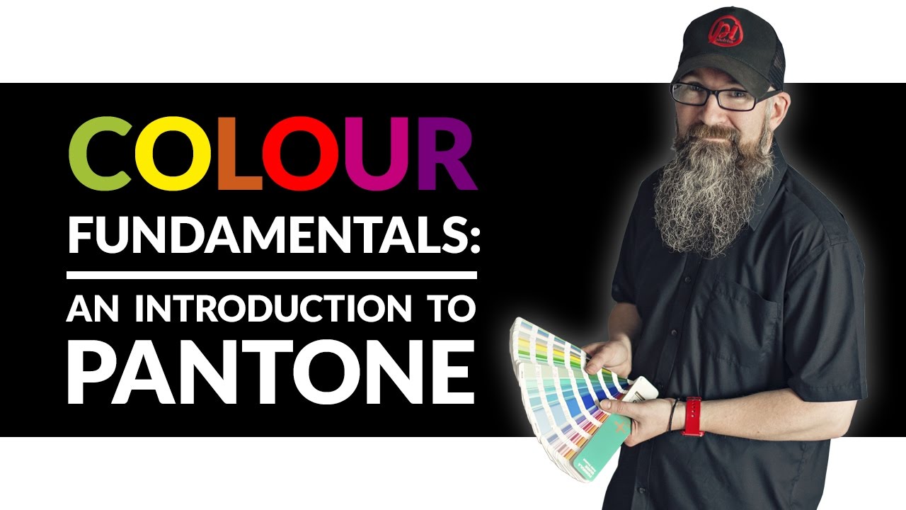
Pantone isn’t without problems. And the criticism has gotten louder in recent years.
Cost Barriers for Freelancers and Small Studios
A Pantone Formula Guide costs roughly $217. The Pantone Color Specifier & Guide Set runs up to $805. Cotton swatch libraries for textile work cost even more.
These books need annual replacement. Pantone recommends buying new guides every 12 to 18 months because printed inks degrade. For a freelance print designer or a small studio, that’s a significant recurring expense on top of software subscriptions and other tools.
Add the $89.99/year Pantone Connect fee for digital access, and the total annual cost of staying current with the Pantone system can easily exceed $300.
The Subscription Problem
The 2022 Adobe licensing split remains the biggest point of frustration in the design community. Designers who had used Pantone libraries inside Adobe apps for decades suddenly lost access unless they paid separately.
Printweek reported that Pantone increased Connect pricing by 150% between August and November 2022. The plugin itself received overwhelmingly negative reviews, with users describing it as buggy and poorly designed.
Adobe’s chief product officer Scott Belsky stated publicly that Pantone required the removal, placing the blame squarely on Pantone’s decision to charge customers directly.
Alternative Color Systems Gaining Ground
Pantone isn’t the only standardized color system. Several alternatives serve specific industries and regions.
| System | Origin | Primary Use | Scale |
|---|---|---|---|
| RAL Classic | Germany, 1927 | Paints, powder coatings, plastics | ~210 colors |
| NCS (Natural Color System) | Sweden, 1950 | Architecture, interior design | ~1,950 colors |
| Munsell | USA, 1905 | Soil science, art, research | Continuous scale |
| HKS | Germany | Print (coated/uncoated paper) | 120 spot colors + 3,250 tones |
| DIC Color Guide | Japan | Print, packaging | 600+ colors |
RAL dominates in European manufacturing, especially for paints and industrial coatings. NCS is preferred by architects and interior designers in Scandinavian countries because it’s based on how humans visually perceive color rather than ink formulations.
None of these systems have the global reach that Pantone holds in the graphic design and packaging industries. But the frustration over Pantone’s pricing model has pushed some designers and studios to look more seriously at open-source color tools and direct spectrophotometer measurements.
Environmental Concerns
Replacing physical swatch books every year generates waste. Each Pantone Formula Guide contains hundreds of printed color chips on cardboard stock. Multiply that across every design studio and print house worldwide, and the volume adds up.
Pantone hasn’t publicly addressed this with a recycling program or sustainable alternative. The 2025 edition introduced five new eco-friendly base mixing inks, but the core issue of disposable physical references remains.
For designers who care about environmental impact alongside color theory precision, it’s a legitimate concern. Digital-first tools like Pantone Connect could reduce physical waste, but only if the software actually worked well enough to replace the books entirely. Based on user reviews, it’s not there yet.
FAQ on What Is Pantone
What is Pantone used for?
Pantone is used to standardize color across printing, fashion, product manufacturing, and packaging. It gives designers and manufacturers a shared reference number so the same color reproduces accurately regardless of location or equipment.
What is the Pantone Matching System?
The Pantone Matching System (PMS) is a proprietary color numbering system. Each color has a unique code and ink formula. Printers mix that exact formula to produce a consistent spot color every time.
How many Pantone colors exist?
Pantone’s library includes over 15,000 colors across all systems. The graphic arts Formula Guide alone covers 2,390 spot colors. Additional libraries serve textiles, plastics, and interior design.
What is the difference between Pantone and CMYK?
Pantone uses pre-mixed spot ink for exact color matches. CMYK builds colors from four process inks (cyan, magenta, yellow, black) printed as overlapping dots. Pantone is more accurate but costs more per print run.
Why are Pantone colors no longer free in Adobe?
Pantone ended its licensing agreement with Adobe in 2022. Accessing full Pantone libraries in Illustrator, Photoshop, or InDesign now requires a paid Pantone Connect subscription at $89.99 per year.
What does the C or U mean after a Pantone number?
The suffix indicates paper stock. C means coated (glossy) paper, U means uncoated (matte, porous) paper. The same Pantone number looks different on each surface because ink absorbs differently.
Can Pantone colors be used in web design?
Not directly. Screens display color using RGB light, not ink. Designers convert Pantone values to HEX or RGB equivalents for digital use. These conversions are approximations, not exact matches.
How much does a Pantone swatch book cost?
A Pantone Formula Guide (coated and uncoated set) costs around $217. Pantone recommends annual replacement since printed inks degrade over time. Larger sets like the Color Specifier run up to $805.
Who created Pantone?
Lawrence Herbert created the Pantone Matching System in 1963. He was a chemistry graduate who recognized that designers and printers had no reliable way to communicate specific colors. The system became the industry standard by 1968.
What is the Pantone Color of the Year?
An annual color selection announced by the Pantone Color Institute since 2000. It reflects global trends in fashion, design, and culture. The 2025 pick was Mocha Mousse (Pantone 17-1230).
Conclusion
Understanding what is Pantone comes down to one thing: it’s the system that removed guesswork from color communication. Lawrence Herbert built it in 1963, and six decades later, it still defines how industries talk about color.
The Pantone Matching System covers everything from poster design to textile manufacturing to plastic production. Each PMS code carries a specific ink formula that any printer or factory can reproduce.
Yes, the costs have gone up. The Pantone Connect subscription and annual swatch book replacements add real expenses. Alternative systems like RAL and NCS are getting more attention because of it.
But no competing system has matched Pantone’s global adoption across graphic design, fashion, and product manufacturing. Whether you’re specifying colors for a brand identity or approving a production sample, PMS remains the common language.
The tools around it keep changing. The core purpose hasn’t.

Renowned for his expertise in logo design and visual branding, Bogdan has developed a multitude of logos for various clients.
His skills extend to creating posters, vector illustrations, business cards, and brochures. Additionally, Bogdan's UI kits were featured on marketplaces like Visual Hierarchy and UI8.
He also wrote in the past years on sites like Design Your Way, WebDesignerDepot, WPDean, Designmodo, Speckyboy, Slider Revolution, and more.
- Canva vs Photoshop: When Does Each Make Sense? - 12 September 2026
- Briefing 3D Game Animation: Rigs, Clip Lists and Engine Handoffs - 11 September 2026
- The Webflow Logo History, Colors, Font, And Meaning - 10 September 2026

Bogdan Sandu is a seasoned designer who has been designing websites since 2008. Renowned for his expertise in logo design and visual branding, Bogdan has developed a multitude of logos for various clients. His skills extend to creating posters, vector illustrations, business cards, and brochures. Additionally, Bogdan's UI kits were featured on marketplaces like Visual Hierarchy and UI8. He also wrote in the past years on sites like Design Your Way, WebDesignerDepot, WPDean, Designmodo, Speckyboy, Slider Revolution, and more.
You Might Also Like