


Most businesses get this wrong from the start. They hire someone to draw a logo, pick two colors, and call it done. That’s not brand identity design.
Brand identity design is the process of building a complete visual and verbal system that controls how people perceive a business across every touchpoint. Logo, color palette, typography, imagery, voice. All of it, working as one coordinated system.
This article breaks down what brand identity design actually involves, how the process works from research through final guidelines, the tools professionals use, and how to tell the difference between a strong identity and one that’s just surface-level decoration.
What Is Brand Identity Design
Brand identity design is the process of building a complete visual and verbal system that shapes how people see, remember, and feel about a brand. It goes well beyond picking a nice logo or choosing a few brand colors.
Think of it this way. Your logo is one piece. Brand identity design is the whole puzzle.
It covers the color palette, the typographic system, the photography style, the illustration direction, the voice, and the tone a brand uses across every touchpoint. All of these pieces work together as a coordinated system, not a loose collection of design decisions made on different days by different people.
There’s a distinction here that trips people up constantly. Brand identity is the system you create. Brand image is how the public actually perceives you. And branding is the ongoing effort of shaping that perception over time.
So brand identity design sits at the start of the chain. It’s the strategic and creative work that produces the toolkit everyone else uses.
According to Lucidpress research, consistent brand presentation can boost revenue by up to 23%. That number jumps to 33% in some studies. The output of brand identity design, the guidelines, the asset library, the rules about what goes where, is what makes that consistency possible in the first place.
The final deliverable is usually a brand guidelines document. Sometimes called a brand book or identity manual. It gives internal teams, agencies, and freelancers the instructions they need to keep everything looking and sounding like it belongs to the same brand.
Without it, you get what most startups deal with: a logo that looks great on Instagram but falls apart on a business card, paired with a website that uses five different fonts because nobody wrote down the rules.
Core Elements of a Brand Identity System
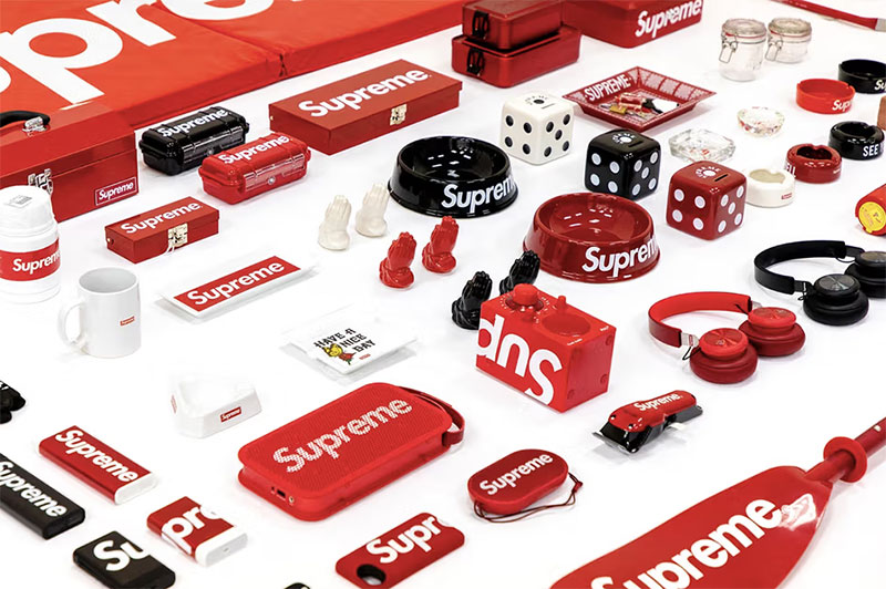
A brand identity system is made up of visual and verbal components that need to work as a single unit. Skip one, and the whole thing starts to feel incomplete. Took me years to stop thinking of these as separate projects instead of connected parts of one system.
Visual Elements
Logo and its variations: A primary logo, a simplified icon version, a wordmark, and sometimes a monogram. The best brand identities include lockups for horizontal, vertical, and square formats. According to Stanford research, 75% of consumers judge a brand’s credibility based on its logo design alone.
Color system: Not just “pick three colors you like.” A proper brand color palette includes primary colors, secondary colors, and accent colors with defined usage ratios. Color can increase brand recognition by up to 80% compared to monochrome presentations, based on the University of Loyola Maryland study.
This is where understanding color theory actually matters. You’ll need to decide on color relationships, whether that’s complementary color pairings, analogous color groupings, or something like a triadic color scheme depending on how bold the brand needs to feel.
Each color also needs specs in RGB for screens, CMYK for print materials, and Pantone for spot color printing. Skipping any of these is how you end up with a brand that looks different on every surface.
Typography: Most brand identity systems include at least two typefaces. A primary one for headlines and a secondary one for body copy. Serif fonts tend to read as traditional or authoritative, while sans-serif options lean modern and clean. Pairing them well is half science, half instinct.
The system also defines typographic hierarchy, which controls how headings, subheadings, and body text relate to each other in size, weight, and spacing. Details like kerning, leading, and tracking get locked down here too.
Imagery and graphics direction: Rules about photography style, illustration approach, icon sets, and whether the brand uses things like gradient overlays or texture treatments. Some brands go flat and minimal. Others go heavy on editorial photography. The identity system specifies which lane the brand lives in.
Verbal and Tonal Elements
This is the part that gets skipped most often, and it shouldn’t be.
Brand voice: How the brand sounds in writing. Is it casual or formal? Witty or serious? A brand voice document gives writers guardrails so the homepage, the customer support emails, and the Instagram captions all sound like they came from the same company.
Messaging framework: This includes the tagline, the value proposition, key brand messages for different audiences, and sometimes a brand narrative that ties everything together with storytelling. Wisernotify data shows 81% of consumers need to trust a brand before they’ll consider buying. Voice and messaging are the primary tools for building that trust over time.
How Brand Identity Design Differs from Logo Design
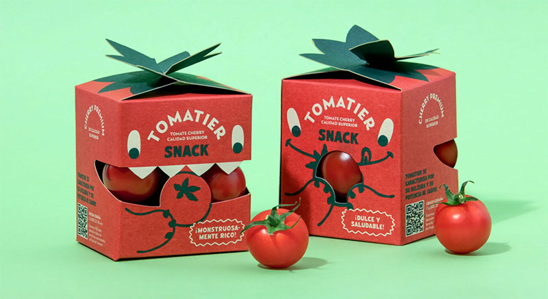
A logo is one component inside a much bigger system. People conflate these two things all the time, and it creates real problems on both sides of the table.
When someone says “I need a brand identity” but actually means “I need a logo,” they usually end up underspending and getting a mark that has no system around it. When a designer quotes for a full identity project and the client expected a logo, there’s sticker shock.
| Scope | Logo Design | Brand Identity Design |
|---|---|---|
| Deliverables | Logo mark, basic file formats | Logo system, colors, type, imagery, voice, guidelines |
| Timeline | 2-4 weeks | 2-6 months |
| Research involved | Minimal competitor scan | Full discovery, audience research, positioning |
| Budget range (SMB) | $2,500 – $10,000 | $15,000 – $100,000+ |
Apple is probably the clearest example of why identity is bigger than a logo. The half-eaten apple icon is recognizable, sure. But Apple’s brand identity extends into product packaging, retail store architecture, website design, advertising photography, even the way the product itself feels in your hand. Every one of those touchpoints was designed as part of one system.
Crowdspring research found that 60% of consumers avoid companies with unappealing logo designs, even when those companies have good reviews. But the logo alone doesn’t create brand loyalty. That takes an entire identity system working together across every point of contact.
According to solid logo design principles, the mark itself should be simple, scalable, and memorable. But it’s the identity system that tells everyone how to use it, where to place it, what space to leave around it, and how it behaves in different contexts.
The Brand Identity Design Process
There’s a sequence to this work that matters. Jump straight into designing the logo without doing research first, and you’ll almost certainly end up redesigning it later. Took me way too many early projects to learn that the hard way.
Research and Discovery
This phase eats up about 20-30% of the total project time, and it should.
The work here includes competitor audits, target audience interviews, stakeholder workshops, and a review of whatever brand assets already exist. If the company has been operating for a while, there’s usually a gap between how the leadership team describes the brand and how customers actually perceive it.
A brand audit is essentially cataloging every touchpoint where the brand currently shows up, then evaluating how consistent (or inconsistent) the presentation is. Capital One Shopping research found that only about 30% of companies have brand guidelines that are widely used across the organization. Which means most companies have guidelines collecting dust somewhere, or none at all.
Creating a mood board is also standard at this stage. It pulls together visual references, textures, colors, and type samples to establish the aesthetic direction before anyone opens Illustrator.
Strategy and Positioning

Here’s where the brand’s positioning gets defined. What does the brand stand for? Who is it for? How is it different from competitors in the same space?
This is not a creative exercise. It’s a strategic one.
Brand attributes, personality traits, and a positioning statement come out of this phase. Everything designed after this point has to support whatever’s written here. If the strategy says “approachable and playful,” the visual identity can’t look like a law firm.
According to WebFX, 73% of companies use design specifically to differentiate from competitors. That differentiation starts with positioning, not with colors or fonts.
Design Development and Refinement
This is the phase people picture when they hear “brand identity design.” Concept development, multiple design directions, iterative feedback rounds, and eventually a final system.
Usually starts with logo exploration. The designer presents 2-4 different directions, each reflecting the strategy in different ways. After the logo direction is selected, the rest of the identity system gets built around it. Colors, type, graphic elements, imagery rules.
The principles of visual hierarchy, contrast, and balance get applied throughout. The Gestalt principles show up here whether anyone names them or not, because they govern how humans perceive grouped visual elements.
Grid systems provide the structural backbone. They keep layouts consistent across business cards, websites, signage, and social media templates without everything looking identical.
Every piece gets tested at scale. Does the logo read at 16 pixels? Does it work in a single color for fax or engraving? Do the brand colors hold up across different screen calibrations? Companies like Slack and Spotify both went through public rebrands where every element had to perform across hundreds of different applications.
Brand Guidelines and How They Hold an Identity Together
The guidelines document is the actual product of a brand identity project. Not the logo file. Not the Figma mockups. The guidelines.
It codifies every decision made during the design process into a reference that anyone can follow. And when it’s well made, it prevents the slow erosion of brand consistency that happens when different teams start making their own creative calls.
What goes into a typical brand guidelines document:
- Logo usage rules, clear space requirements, minimum sizes, and what not to do with the logo
- Primary and secondary color specifications with hex, RGB, CMYK, and Pantone values
- Typography specifications including spacing rules, size hierarchies, and approved font files
- Photography and illustration style direction
- Voice and tone guidelines with examples of do’s and don’ts
- Templates for common applications like business cards, presentations, and social media
Renderforest data from 2024 shows that while 95% of organizations have brand guidelines, only 25-30% actively use them. That’s a staggering gap. Having guidelines means nothing if nobody opens the document.
NASA published its original Graphics Standards Manual in 1976. Designed by Danne & Blackburn, it became one of the most referenced identity manuals in design history. It specified everything from the exact proportions of the “worm” logotype to the precise placement on spacecraft. Spotify and Slack have both made their brand guidelines publicly available, giving the design community a look at how modern tech companies handle identity systems.
Digital delivery has changed things. A brand style guide used to be a printed PDF that nobody updated. Now, platforms like Frontify and Brandfolder host living guidelines that get updated in real time and integrate directly with design tools.
Brand Identity Design for Small Businesses vs. Enterprise
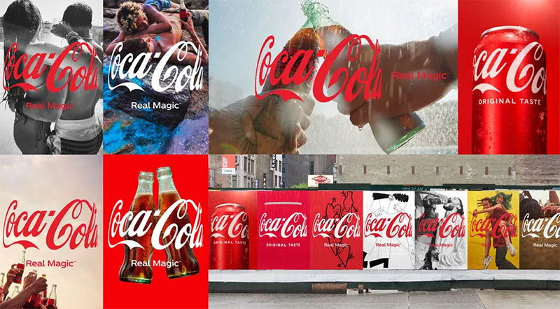
The process scales, but the fundamentals don’t change. A startup with five employees and a Fortune 500 company with 50,000 both need a coordinated visual system. The scope, budget, and level of documentation are just drastically different.
What Small Businesses Actually Need
A small business typically needs what some designers call a “brand identity kit.” Logo, color palette, one or two typefaces, basic usage rules, and maybe a set of social media templates.
Budget reality: small businesses spend somewhere between $5,000 and $20,000 on initial branding, according to Loud Bird Marketing’s 2025 price guide. The most popular deliverable is a logo paired with a basic set of brand guidelines.
DIY tools like Canva and Looka have made it possible for founders to get something out the door fast. The tradeoff is obvious, though. You get speed and low cost, but you lose strategic depth and originality. Your brand might end up looking like 200 other businesses using the same template.
For growing B2B companies and tech founders looking to avoid generic templates, partnering with a specialized B2B brand design agency ensures your visual identity carries the strategic depth and custom execution needed to scale.
What Enterprise Brands Require
Large companies need multi-layered identity systems that account for sub-brands, regional variations, different product lines, and dozens of application types from poster design to motion graphics.
A full corporate rebrand at the enterprise level can cost $250,000 to over $1 million, according to Ignyte Brands, and typically takes 6-12 months. Crowdspring data also shows that 74% of S&P 100 companies have rebranded within their first seven years. So this isn’t a one-and-done project for most companies.
The average B2B business spends about 5% of revenue on marketing, with rebranding eating up 10-20% of that marketing budget. For a company pulling in $15 million annually, that means somewhere around $75,000 to $150,000 earmarked for the rebrand itself.
When a Rebrand Becomes Necessary
A few common triggers:
- The brand has outgrown its original identity (fast growth, new product lines)
- There’s a merger or acquisition that requires unified branding
- Customer perception has shifted negatively, or the market has changed
- The visual system is outdated and inconsistent across channels
HBO is a case study in frequent rebranding. The network shifted from HBO to HBO Max to just Max, each time overhauling its visual identity and confusing a chunk of its audience in the process. Not every rebrand lands well. A thorough rebranding checklist helps prevent the kind of disjointed rollout that turns a rebrand into a public failure.
Tools and Software Used in Brand Identity Design
The tools have changed a lot over the last decade. What used to be an Adobe Illustrator-only workflow has fractured into a mix of cloud platforms, specialized apps, and AI-assisted generators.
Figma holds roughly 40% market share in the design tool category, according to 6sense and Cropink data. It went from 10% in 2017 to dominating the industry in about five years, mostly because of real-time collaboration that just works.
Design and Layout Tools
Adobe Illustrator: Still the standard for vector graphics work. Logos, icons, and scalable brand marks are built here. Most brand identity designers keep it in their stack even if they’ve moved other work into Figma.
Figma: The go-to for collaborative identity work. Teams can design, comment, and iterate in one file without emailing PNGs back and forth. Over 4 million users as of 2024, and companies like Microsoft, Spotify, and Airbnb run their design systems through it.
Sketch: Lost significant ground to Figma but still used in some agencies, particularly for Mac-only workflows. Its market share dropped from roughly 35% in 2018 to single digits by 2023.
Color and Typography Tools
| Tool | Purpose | Best For |
|---|---|---|
| Coolors | Palette generation | Quick color exploration |
| Adobe Color | Color harmony rules | Applying color harmony relationships |
| Google Fonts | Free typeface library | Web-safe font selection |
| Fontpair | Typeface pairing suggestions | Finding complementary type combos |
| Type foundries (Klim, Grilli) | Premium typographic options | Distinctive brand type systems |
Getting the hue and saturation right matters more than people think. Coolors generates palettes fast, but understanding why certain color combinations work (and others just clash) is the part that takes experience.
Brand Asset Management Platforms
Frontify and Brandfolder handle what happens after the identity is designed. They host living guidelines, manage asset libraries, and make sure every team member pulls the correct logo file.
The brand management software market was valued at $6.23 billion in 2024, according to Wise Guy Reports. It’s growing at about 9% annually, driven by the headache of keeping brand assets consistent across dozens of channels and teams.
Mordor Intelligence data shows logo and brand identity accounted for $17.27 billion (31.35% share) of the broader graphic design market in 2025. That’s the largest single segment.
What Makes a Strong Brand Identity
Strong doesn’t mean flashy. It means the identity does its job without anyone having to explain it.
Consistency Across Every Touchpoint
Lucidpress data shows consistent brand presentation can increase revenue by up to 33%. And brands presented uniformly are 3.5 times more visible to customers, per Demand Metric.
That means the same colors, the same typographic personality, the same visual language on a billboard, on a mobile app, on a brochure, and in an email footer. Nike does this at a level most brands can’t match. Their swoosh reads at 16 pixels and on a 50-foot banner with equal clarity.
Distinctiveness Within the Category
Key question: Can someone spot your brand in a lineup of competitors without reading the name?
If every fintech company uses blue and a clean sans-serif, then using blue and a clean sans-serif makes you invisible. The identity needs to stand apart. Mailchimp pulled this off by leaning into illustration and personality when every competitor defaulted to corporate minimalism.
According to WebFX research, 73% of companies actively use design to differentiate from competitors. But differentiation only works when it connects back to the brand’s positioning and audience, not when it’s weird for the sake of being weird.
Flexibility Across Formats
A logo that looks great on a website header but breaks down on a book cover or a piece of signage isn’t flexible enough.
The best identity systems include responsive logo variations (full lockup, icon only, wordmark only), color versions for light and dark backgrounds, and single-color options for engraving or embroidery. The identity has to perform everywhere the brand shows up, from a favicon to a trade show booth.
Memorability and Simplicity Working Together
Crowdspring data shows 95% of the top 100 brands only use one or two colors in their logos. Simplicity isn’t a limitation. It’s a strategy.
Your brain processes visuals 60,000 times faster than text, according to Website Planet research. A simple mark with clear alignment and strong focal point beats a complex illustration every time when you’re competing for attention.
Common Mistakes in Brand Identity Design
I’ve watched projects go sideways for reasons that were completely avoidable. Most of the time, it’s not bad taste. It’s bad process.
Skipping Strategy and Jumping Into Visuals
This is the number one mistake. Someone gets excited about picking colors and fonts before they’ve answered the basic questions: Who is this for? What does the brand need to communicate? How is it different?
Design without strategy is decoration. And decoration doesn’t hold up when the brand needs to extend into new product lines or markets. You end up with pretty assets that don’t mean anything.
Designing Based on Personal Taste
The trap: A founder picks their favorite color or a font they saw on another brand they admire, without considering whether it fits the target audience.
Harvard Business Review research shows 64% of consumers form brand loyalty based on shared values. If the visual system reflects the CEO’s personal style instead of the audience’s expectations, the identity creates a disconnect from day one.
Overcomplicating the Visual System
Jason Moyer, Creative Director at Create Element, puts it well: the most common branding mistake startups make is overcomplicating their identity. Too many colors, too many typefaces, too many graphic treatments. The result is a system nobody can use consistently.
Mint’s identity is a good counterexample. Clean, simple, focused. Its minimalist design approach made financial management feel approachable instead of intimidating.
Ignoring Small-Format Performance
A detailed logo with fine lines and small type might look stunning on a poster. At 32 pixels (favicon size), it turns into a blob.
Cropink data shows 75% of consumers recognize a brand primarily by its logo. If that logo can’t function at small sizes or in single-color applications, it fails at the exact moment recognition matters most.
Treating Brand Identity as a One-Time Project
Most companies consider rebranding once every 7 to 10 years, with smaller refreshes in between (Crowdspring). But brand identity isn’t something you build once and forget. Markets shift. Products change. Audiences grow.
Jaguar’s 2024 rebrand is a cautionary tale. They deleted their entire social media history and launched a new identity that didn’t feature a single car. The backlash was massive, and it showed what happens when a brand abandons its heritage without bringing its audience along.
How to Evaluate Brand Identity Design Work

Whether you’re reviewing your own identity system or evaluating work from an agency, there are clear criteria that separate strong identity design from mediocre output.
Does It Communicate Without Explanation?
Show the brand identity to someone who knows nothing about the company. Can they tell (roughly) what kind of business this is? Does it feel premium, playful, technical, approachable?
If the identity needs a paragraph of context before it “makes sense,” something’s off. The visual system should carry meaning on its own through symbolism, color, and shape psychology.
Internal Consistency Check
| Element | What to Check |
|---|---|
| Logo system | Works at all sizes, in color and mono |
| Color palette | Consistent specs (hex, RGB, CMYK, Pantone) |
| Typography | Hierarchy is clear, pairings are defined |
| Imagery | Photography/illustration direction is documented |
| Voice | Tone guidelines exist with real examples |
Capital One Shopping research found that 46% of consumers feel brands don’t deliver a consistent experience. A proper evaluation catches these gaps before customers do.
Scalability Test
Ask these questions:
- Can the identity extend into new product lines without breaking?
- Does it work across advertising, infographic design, and editorial layouts?
- Can a junior designer follow the guidelines without hand-holding?
If the system only looks good in the original designer’s mockups but falls apart the moment someone else tries to use it, the guidelines aren’t detailed enough. That’s the test.
Competitive Comparison
Pull up five direct competitors. Place your brand identity next to theirs. Does it stand out or blend in?
Gap learned this lesson the hard way in 2010 when they replaced their iconic blue box logo with a generic Helvetica wordmark. Backlash was so intense they reversed the change within six days. The new design didn’t just fail aesthetically. It stripped away what made Gap visually distinct in a sea of retail brands.
Real-World Testing Methods
Audience surveys: Show identity concepts to target customers and measure perception against intended brand attributes.
A/B testing: Run two versions of brand assets (social headers, ad creative, landing pages) and measure engagement differences. Small-scale tests before a full rollout can prevent the kind of disaster Jaguar faced.
According to Edelman’s 2025 Brand Trust report, 80% of people trust the brands they regularly use, and trust carries as much weight in purchasing decisions as quality or price. An identity that doesn’t support that trust, through clear visuals, professional execution, and consistent presence, is working against itself.
FAQ on What Is Brand Identity Design
What is brand identity design?
Brand identity design is the process of creating a coordinated system of visual and verbal elements that represent a brand. This includes the logo, color palette, typography, imagery style, and voice guidelines that work together across all touchpoints.
What is the difference between brand identity and brand image?
Brand identity is what you create and control. Brand image is how the public actually perceives you. The identity is the input (design system, messaging). The image is the output (customer perception, reputation).
What are the core elements of a brand identity?
The core elements include a logo system, color palette, typeface selections, photography and illustration direction, iconography, and a voice and tone framework. Together, these form a cohesive design language documented in brand guidelines.
How much does brand identity design cost?
Small businesses typically spend $5,000 to $20,000. Mid-sized companies invest $50,000 to $150,000. Enterprise-level identity projects can exceed $250,000. Cost depends on scope, research depth, number of deliverables, and whether you hire a freelancer or agency.
How long does the brand identity design process take?
A basic identity project takes 4 to 8 weeks. A full brand identity system with research, strategy, and comprehensive guidelines takes 3 to 6 months. Enterprise rebrands can stretch to 12 months or longer.
Why is brand identity design important for businesses?
Consistent brand presentation can increase revenue by up to 23%, according to Lucidpress research. A strong identity builds recognition, earns trust, and separates you from competitors. Without it, every marketing effort lacks a unified foundation.
What tools do designers use for brand identity work?
Adobe Illustrator remains standard for vector logo work. Figma dominates collaborative design with over 40% market share. Coolors handles palette generation. Frontify and Brandfolder manage brand asset distribution and living guidelines.
What is the role of color in brand identity?
Color drives recognition. Research shows it can boost brand recall by up to 80% compared to monochrome. A defined color system with primary, secondary, and accent colors, specified in hex, RGB, CMYK, and Pantone, keeps the brand consistent across print and digital.
Can a small business create a brand identity without an agency?
Yes, using tools like Canva or Looka. But there’s a tradeoff. DIY tools offer speed and low cost at the expense of strategic depth and originality. For businesses in competitive markets, working with a professional designer produces stronger differentiation.
When should a company rebrand its identity?
Common triggers include rapid growth, mergers, shifting customer perception, or an outdated visual system. Most companies consider a rebrand every 7 to 10 years. Smaller refreshes between major overhauls keep the identity current without losing brand equity.
Conclusion
Understanding what is brand identity design comes down to one thing: it’s the system that makes a brand recognizable, trustworthy, and consistent everywhere it shows up.
The logo mark, the brand color system, the typeface pairings, the photography direction, the messaging framework. None of these work in isolation. They work as a connected design language that shapes how people experience a brand at every touchpoint.
Skip the strategy phase, and the visuals won’t hold up. Ignore the brand guidelines document, and consistency falls apart within months.
Whether you’re building a brand identity from scratch or evaluating an existing one, the process stays the same. Research first. Position clearly. Design with intention. Document everything.
Get the system right, and every piece of brand communication that follows becomes easier to create, easier to manage, and harder for competitors to replicate.

Renowned for his expertise in logo design and visual branding, Bogdan has developed a multitude of logos for various clients.
His skills extend to creating posters, vector illustrations, business cards, and brochures. Additionally, Bogdan's UI kits were featured on marketplaces like Visual Hierarchy and UI8.
He also wrote in the past years on sites like Design Your Way, WebDesignerDepot, WPDean, Designmodo, Speckyboy, Slider Revolution, and more.
- How to Install Fonts on Mac (Step-by-Step Guide) - 20 September 2026
- From Mockup to Code: How AI-Augmented Development Speeds Up the Design Handoff - 19 September 2026
- The Beehiiv Logo History, Colors, Font, And Meaning - 18 September 2026

Bogdan Sandu is a seasoned designer who has been designing websites since 2008. Renowned for his expertise in logo design and visual branding, Bogdan has developed a multitude of logos for various clients. His skills extend to creating posters, vector illustrations, business cards, and brochures. Additionally, Bogdan's UI kits were featured on marketplaces like Visual Hierarchy and UI8. He also wrote in the past years on sites like Design Your Way, WebDesignerDepot, WPDean, Designmodo, Speckyboy, Slider Revolution, and more.
You Might Also Like


