


The font on your screen is doing more than displaying words. It’s shaping how you feel about them before you’ve finished reading the first sentence.
Font psychology studies how typeface characteristics affect human emotion, perception, and decision-making. Research going back to 1923 confirms that people respond to different letterforms with surprising consistency, assigning personality traits to fonts the way they would to people.
This isn’t a small thing. Typeface choices influence brand trust, reading behavior, purchase intent, and even memory retention.
This guide covers the cognitive science behind font perception, the personality traits tied to major typeface categories, how cultural context shifts everything, and practical methods for testing whether your font choices actually work. Real studies, real data, no guesswork.
What Is Font Psychology

Font psychology is the study of how typeface characteristics affect human emotions, perceptions, and decisions. It sits at the crossroads of cognitive science and design practice, asking a pretty simple question: why do certain letterforms make us feel a certain way?
The field has roots going back over a century. Poffenberger and Franken published what many consider the first formal study on typeface perception in 1923, asking participants to rank fonts based on their appropriateness for advertising specific products. They found that people responded almost uniformly to typeface and product combinations, using similar adjectives to describe what they felt about different fonts.
That was a hundred years ago. And honestly, the core finding still holds up.
The difference between font psychology and typography as a broader discipline is worth clarifying. Typography covers the full craft of arranging type: spacing, layout, size, hierarchy, all the structural decisions. Font psychology zooms in specifically on the emotional and cognitive responses that different typeface designs trigger in readers.
Monotype’s 2024 Font Use and Forecasting Survey found that 83% of designers recognize typography as playing a critical role in branding and communication. That’s not a surprise if you’ve spent any time watching how people respond to the same message set in different fonts.
The font someone chooses for a logo, a product label, or a website headline carries weight beyond aesthetics. It shapes first impressions, builds or erodes trust, and affects whether someone keeps reading or clicks away. These reactions happen fast, often before the reader processes the actual words.
How Fonts Influence Emotion and Perception

The brain processes visual information before it consciously reads text. Letterform shape, weight, and stroke contrast all trigger emotional associations within milliseconds of exposure.
Research from Monotype and Neurons, a neuroscience company, tested three contrasting typefaces across 400 participants. Their findings confirmed that softer, more recognizable font types produce more positive emotional responses. Sharper, more angular fonts tend to trigger negative emotions. The CEO of Neurons, Thomas Ramsøy, noted that the emotional response to fonts happens in the temporal lobe, the same brain region involved in processing emotional meaning.
Visual fluency plays a big part in this. Fonts that are easier to process feel more familiar, and familiarity breeds trust. Oppenheimer and Frank (2008) demonstrated that perceptual fluency directly affects how people categorize and judge information. A rose described in a clean, readable font literally “smells sweeter” to the reader than the same text in a hard-to-read typeface.
But here’s where it gets tricky.
Diemand-Yauman, Oppenheimer, and Vaughan (2010) flipped that idea on its head. Their research showed that harder-to-read fonts can actually improve memory retention. Participants who studied material in disfluent fonts like Comic Sans Italic or Bodoni Italic remembered 14% more than those reading in standard Arial. The theory: difficulty forces deeper cognitive processing.
Later studies have produced mixed results on disfluency, so it’s not a universal rule. Your mileage may vary. But the point stands that font choice affects cognition in ways most people never think about.
Serif vs. Sans-Serif Perception
Serif fonts like Times New Roman and Garamond carry associations with tradition, credibility, and authority. Law firms, newspapers, and academic institutions lean on them for exactly this reason.
Sans-serif fonts like Helvetica, Arial, and Roboto read as modern, clean, and approachable. Tech companies and startups gravitate toward them because they signal forward-thinking and simplicity.
A 2024 study published in Cureus (AIIMS, Jodhpur) found that serif fonts produced heightened attention in letter cancellation tasks compared to sans-serif and script fonts. The time taken to complete the task was shortest for serif, suggesting that those small decorative strokes genuinely help the brain lock onto text.
| Perception | Serif Fonts | Sans-Serif Fonts |
|---|---|---|
| Trust level | High (tradition, stability) | Moderate (clarity, openness) |
| Best industries | Law, finance, luxury, academia | Tech, startups, media, retail |
| Reading context | Long-form print | Digital screens, UI elements |
| Emotional tone | Formal, authoritative | Friendly, contemporary |
Three-quarters of Fortune 500 companies choose sans-serif fonts for their logos (Website Planet). Only about 18% use serif exclusively. That gap keeps widening as more companies rebrand for digital-first experiences.
Script and Display Typefaces
A script font creates a sense of elegance, personal touch, and femininity. Wedding invitations, beauty brands, and boutique businesses use script to signal exclusivity and warmth.
Display typefaces serve a different function entirely. They’re built for impact at large sizes, designed to grab attention on headlines, posters, and packaging.
The tradeoff with both categories is readability. A script typeface that looks stunning on a business card becomes illegible at 10px on a mobile screen. Display fonts that dominate a billboard fall apart in body text. Knowing when to push distinctiveness and when to pull back toward legibility is the actual skill here.
Font Psychology in Branding and Marketing
Typeface choice isn’t decoration. It’s a branding decision that directly affects how consumers perceive product quality, trustworthiness, and value.
Doyle and Bottomley’s research (2004, 2006) on font-brand congruence demonstrated that when a typeface personality matches the brand personality, consumers respond more favorably. Mismatch the two and you create cognitive friction. People can’t articulate why something feels “off” about a brand, but the font is often the culprit.
Look at luxury fashion. Dior and Gucci both use classic serif fonts in their brand typography because those letterforms carry connotations of heritage and sophistication. Meanwhile, Google switched to Product Sans and Airbnb developed Cereal, both geometric sans-serifs that communicate accessibility and modernity.
Monotype’s 2024 survey reports that 76% of designers prioritize readability and accessibility when selecting fonts, which tells you a lot about where the industry is headed.
How Font-Brand Fit Affects Purchase Intent
Congruent pairings work. A 2013 study by French et al. found that fonts harder to read (like Monotype Corsiva) actually boosted comprehension scores by 12.8% compared to easier fonts like Arial. But that finding applies to learning contexts, not commerce.
In retail and advertising, the rules flip. The font needs to match the product category. A playful rounded sans-serif works for a children’s app like Duolingo. It would look absurd on a bank’s homepage.
The Jaguar rebrand is a cautionary tale. When they shifted to a highly stylized, almost illegible new typeface in their 2024 rebrand, public reaction was immediate and negative. The font signaled something completely disconnected from what people expected a luxury automotive brand to feel like.
Typeface Personality Traits and Classification
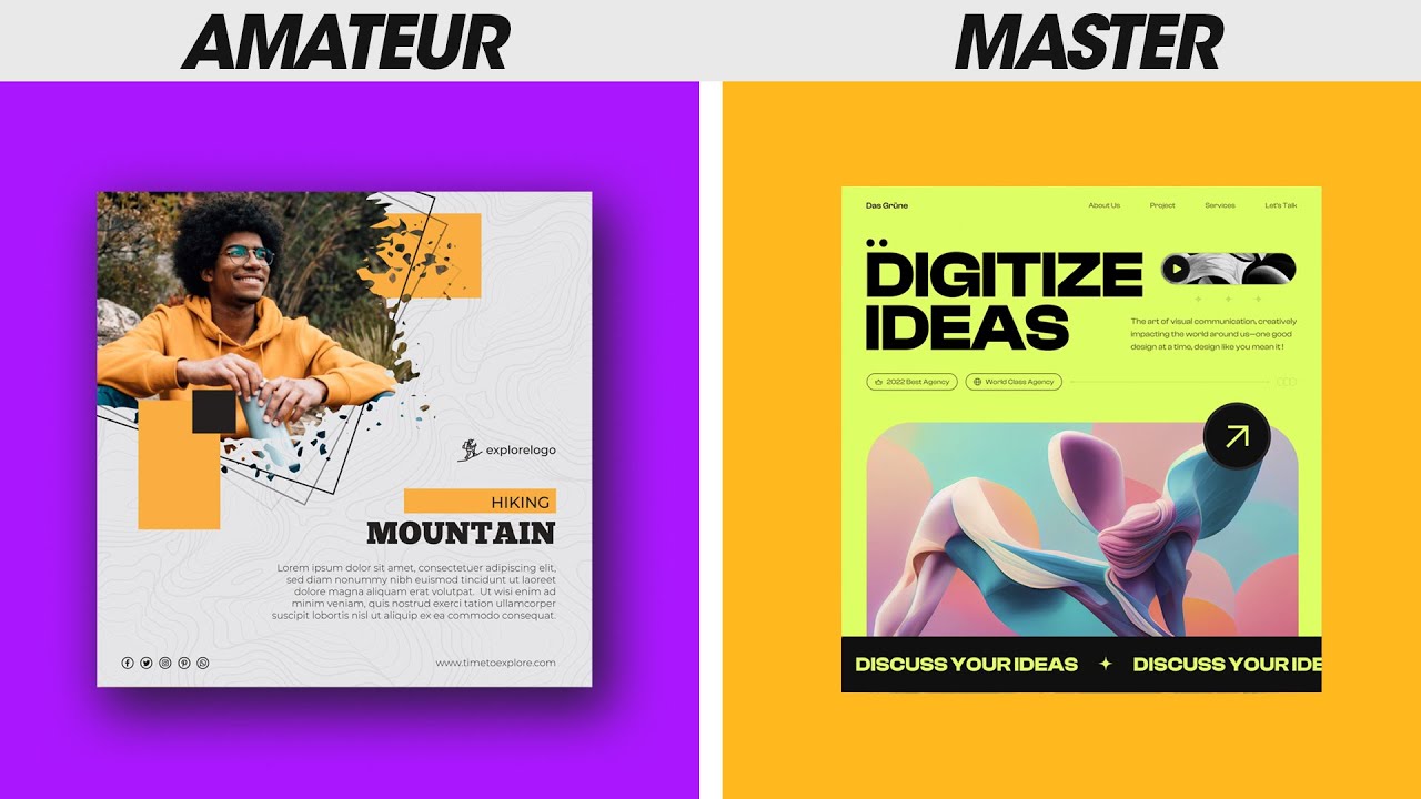
Researchers have been categorizing fonts by personality for decades, and the frameworks are surprisingly consistent across studies.
Henderson, Giese, and Cote (2004) identified four personality dimensions for typefaces: pleasant, engaging, reassuring, and prominent. Not every font scores high on all four. Most cluster around one or two, which is why pairing decisions matter so much.
Geometric Sans-Serifs
Fonts like Futura and Century Gothic are built on circles, squares, and consistent stroke widths. They project precision, objectivity, and design purity.
Paul Renner designed Futura in 1927 at the height of Bauhaus design influence. Almost a century later, it’s still everywhere. That’s not an accident. Geometric sans-serifs age well because their personality is rooted in mathematical proportion rather than cultural trend.
Humanist Sans-Serifs
Warmer and more organic than their geometric counterparts. Gill Sans, Frutiger, and the SF Pro family (used across Apple devices) all fall into this category.
Monotype’s neuroscience research with Neurons found that humanist sans-serif typefaces performed best for conveying trust in seven out of eight countries tested. The slight variation in stroke width and open letterforms feels more human and approachable than rigid geometry.
Slab Serifs and Monospaced Fonts
A slab serif like Rockwell or Courier communicates strength, boldness, and confidence. These fonts show up in editorial headlines, startup branding, and anywhere a brand wants to feel sturdy without going full-traditional.
Monospaced fonts (where every character occupies the same width) carry strong technical credibility. Developers recognize them instantly. Brands in the coding and data space use monospaced type to signal precision and competence.
| Typeface Category | Personality Traits | Common Use Cases |
|---|---|---|
| Geometric Sans | Precise, objective, modern | Tech branding, architecture |
| Humanist Sans | Warm, trustworthy, readable | Healthcare, education, UX |
| Slab Serif | Bold, confident, grounded | Startups, editorial, retail |
| Monospaced | Technical, credible, precise | Developer tools, data platforms |
Font Psychology and Readability

Readability and legibility are two different things, and the distinction matters more than most people realize.
Legibility is whether individual characters can be distinguished from one another. Can you tell the difference between a lowercase “l” and the number “1” in that font? That’s legibility.
Readability is whether someone actually wants to keep reading. A font can be perfectly legible but still feel exhausting in long blocks of text. Readability depends on letter spacing, line height, x-height, and the overall rhythm of the type.
A Wichita State University study found that Arial was rated slightly more readable than Times New Roman on computer screens, with Times New Roman scoring 0.4 points lower on a 7-point readability scale. Small difference, but across millions of readers, it adds up.
Screen vs. Print
The same typeface can trigger completely different psychological responses depending on whether it appears on a screen or on paper. DPI and rendering engines affect how letterforms display, which changes their perceived personality.
Serif fonts that look refined in print can appear cluttered on low-resolution screens. That’s partly why 85% of websites prefer sans-serif fonts, according to a survey of 1,000 websites (Toner Buzz).
System fonts like Roboto (Android), SF Pro (Apple), and Segoe UI (Microsoft) were designed specifically around screen rendering and usability research. They’re optimized for variable display contexts, which is why they feel natural across devices even if they’re not particularly distinctive.
The Disfluency Debate
The Diemand-Yauman et al. (2010) study on disfluency created a lot of excitement. But subsequent replications have been inconsistent. Some showed even larger effects (a 26% difference in one replication), while others found no significant memory benefit from harder-to-read fonts.
Yue, Castel, and Bjork (2013) established that the disfluency effect has boundary conditions. When presentation time is long or the test format is recognition rather than recall, the benefit disappears. So using a weird font to “help people remember” isn’t a reliable strategy. At least not yet.
How Font Size and Weight Shape Authority

Font psychology doesn’t stop at typeface selection. Size, weight, and spacing all carry their own psychological signals.
Size and Perceived Importance
Larger fonts signal importance. This isn’t news to anyone who’s designed a typographic hierarchy, but there’s cognitive science backing it up.
Rhodes and Castel (2008) found that participants rated words presented in 48-point font as significantly more memorable than the same words in 18-point, even though actual recall didn’t differ. The brain conflates visual size with significance, a bias that designers can use (or abuse).
This is why headlines work. It’s also why overusing large text dilutes its effect.
Weight, Spacing, and Tone
Bold weight draws attention and signals urgency, dominance, and confidence. It’s the typographic equivalent of raising your voice.
Light and thin weights suggest elegance, fragility, and restraint. Luxury brands like Cartier and Chanel lean into thin typefaces because they project exclusivity over accessibility.
Tracking (the space between characters) and leading (the space between lines) are subtler levers. Tight tracking creates density and tension. Loose tracking feels airy and calm. The spacing between characters alone can shift the mood of a page from corporate to editorial, from aggressive to meditative.
Research by The British Psychological Society (1989) found consistent correlations between typographic attributes and perceived qualities like “heavy,” “light,” “fast,” and “slow.” Bold fonts in the study were associated with strength and dominance, while lighter weights were linked to speed and delicacy.
Cultural and Contextual Variables in Font Psychology
A typeface that communicates trust in New York might fall flat in Tokyo. Font perception is culturally loaded, and ignoring this is one of the fastest ways to miscommunicate with a global audience.
Monotype and Neurons ran a cross-cultural study across eight countries (including Australia, France, Germany, Japan, the UK, and the US) with 1,957 participants. The results showed that emotional associations with fonts vary significantly depending on where people live and the history of their writing systems.
A few standout findings from that 2023 research:
- Sans-serif FS Jack scored highest for trust in seven out of eight countries tested
- Germany was the exception, where the serif Cotford outperformed for trust
- France, Portugal, and Spain showed strong preference for classic serif styles, tied to their rich printing history
- In Japan, low-contrast humanistic typefaces worked best for conveying innovation
McDonald’s adjusts its font styling by region. The Japanese versions use softer, rounder letterforms to feel more approachable compared to the US version. It’s a small change, but it signals cultural awareness.
Industry Context Changes Everything
The same rounded sans-serif that feels warm on a children’s education app reads as unprofessional on a financial services website. Context isn’t just about culture. It’s about category expectations.
Expectation violation cuts both ways. An unexpected typeface can grab attention and differentiate a brand. Or it can confuse and alienate the audience. The luxury “blanding” trend of the 2010s, where brands like Burberry and Saint Laurent all moved to similar clean sans-serifs, is a good example. Marie Boulanger at Monotype noted that when everyone in your category does the same thing typographically, differentiation through type becomes the smarter play.
Age and Generational Preferences
Cognition Today’s research review found something counterintuitive: younger people prefer serif fonts, while older readers lean toward sans-serif. That flips the common assumption.
The likely reason is that perception is partially culture-dependent and shaped by what each generation grew up reading. Younger audiences associate serif with editorial credibility and “retro” aesthetics. Older audiences value the clarity of sans-serif on screens they spend more time adjusting to.
Applying Font Psychology to Digital Design

Knowing the theory is one thing. Putting it to work inside actual web design projects is where most people get stuck.
The starting point is always the same: match the typeface’s personality to the brand’s values and the audience’s expectations. Everything else, weight, size, spacing, pairing, flows from that initial alignment.
Google Fonts is used on nearly 12 million websites across more than 8.3 million unique domains (Toner Buzz). It’s the default starting point for most web projects because it’s free, fast, and has broad language support. Adobe Fonts fills a similar role for teams already in the Creative Cloud ecosystem. Between the two, most digital font needs are covered.
Font Pairing Psychology
Contrast creates clarity. The standard approach to pairing fonts is to combine a distinctive heading typeface with a neutral body font. The heading grabs attention, the body keeps the reader comfortable.
Typical pairings that work:
- Serif heading + sans-serif body (editorial feel)
- Geometric sans heading + humanist sans body (modern but warm)
- Display heading + clean sans body (bold statements with readable follow-through)
Using two fonts from the same category but with different weights can also work, though it requires more skill to avoid visual monotony. The psychological goal is contrast without collision.
Font Psychology in UI and UX
System fonts like Roboto, SF Pro, and Segoe UI weren’t chosen randomly. Each was designed based on usability research and psychological testing for screen readability.
| System Font | Platform | Design Approach |
|---|---|---|
| Roboto | Android / Google | Geometric with open curves for screen clarity |
| SF Pro | Apple iOS / macOS | Humanist sans optimized for Retina displays |
| Segoe UI | Microsoft Windows | Warm, open letterforms for extended reading |
Micro-typography decisions in buttons, form fields, and navigation affect user confidence. A submit button in a thin, decorative font feels uncertain. The same button in a medium-weight sans-serif with generous kerning feels deliberate and trustworthy.
Spotify’s custom typeface for their annual Wrapped campaign uses playful, retro-inspired letterforms that feel completely different from their standard product UI in Circular. That’s intentional: the Wrapped experience is meant to feel celebratory, not functional.
Common Mistakes
Choosing fonts based on personal taste instead of audience psychology. This is the single most common mistake. What looks good to the designer or founder is irrelevant if it doesn’t match what the target audience expects to see.
Other frequent errors:
- Using more than two or three typefaces on a single page
- Ignoring how a font renders on mobile screens vs. desktop
- Picking trendy fonts that will feel dated in 18 months
WhatFontIs reports that 30% of brands now commission custom bespoke fonts. That’s a significant jump, but for the vast majority of projects, selecting the right font from existing libraries and applying it with psychological intention matters more than spending six figures on custom type.
Measuring the Impact of Font Choices

Gut feeling isn’t enough. If you’re making typeface decisions that affect how users experience a brand, you need data.
Testing Methods
Semantic differential scales: ask participants to rate a typeface on opposing pairs (modern/traditional, warm/cold, trustworthy/untrustworthy). This is the method Poffenberger and Franken used in 1923, and it still works well for getting baseline personality data on fonts.
A/B testing: swap the font on a landing page and measure the difference in bounce rate, time on page, or conversions. Rank Executives reported higher time on site and lower bounce rates after adjusting typography on client projects (CXL).
Eye-tracking: shows exactly where users look first and how they scan a page. Useful for testing visual hierarchy and whether font size and weight guide attention the way you intended.
Metrics That Reflect Font Impact
A font change might not show up as a direct conversion lift. It often shows up in softer engagement signals that compound over time.
Watch for:
- Time on page (longer reading sessions suggest better readability)
- Scroll depth changes after a font swap
- Bounce rate shifts, especially on content-heavy pages
One case study from CXL showed a client improving conversions simply by increasing font size from 10px to 13px. Nothing else changed. The text just became easier to read.
Stated vs. Revealed Preference
People often say they prefer one font but behave differently when actually reading or shopping. Rhodes and Castel (2008) demonstrated this gap: participants rated large-font words as more memorable, but actual recall was identical regardless of size.
This disconnect matters. Mood board surveys and preference polls can tell you what people think they like. Behavioral data from real sessions tells you what actually works. Use both, but trust the behavioral data when they conflict.
FAQ on Font Psychology
What is font psychology?
Font psychology is the study of how different typefaces influence human emotions, perceptions, and behavior. It examines why certain letterform characteristics trigger specific responses, from trust and authority to playfulness and warmth.
How do fonts affect emotions?
Fonts trigger emotional responses through visual fluency and learned associations. Rounded letterforms tend to produce positive feelings. Angular, sharp fonts often provoke tension or urgency. These reactions happen in the brain’s temporal lobe before conscious reading begins.
What font builds the most trust?
Humanist sans-serif typefaces like Frutiger and SF Pro scored highest for trust across seven of eight countries in Monotype’s neuroscience research. Serif fonts like Garamond also perform well for trust in formal or financial contexts.
Does font choice affect readability?
Yes. Readability depends on x-height, letter spacing, line height, and stroke contrast, not just the typeface itself. A poorly spaced font will exhaust readers regardless of how attractive it looks in isolation.
What is the difference between serif and sans-serif psychology?
Serif fonts signal tradition, authority, and credibility. Sans-serif fonts communicate modernity, simplicity, and approachability. About 75% of Fortune 500 companies use sans-serif in their logos, reflecting a broad shift toward digital-first branding.
Can fonts influence buying decisions?
Research confirms that typeface-brand congruence affects purchase intent. When a font’s personality matches the product category, consumers respond more favorably. A mismatch creates cognitive friction that quietly undermines the message.
What fonts do luxury brands use?
Luxury brands like Dior and Gucci favor high-contrast serif fonts such as Didot and Bodoni. These typefaces carry connotations of heritage, sophistication, and exclusivity through their thin hairlines and dramatic stroke variation.
How do cultural differences change font perception?
Font associations shift by region. Serif typefaces feel classic in France and Spain but can seem outdated in Japan, where low-contrast sans-serifs signal innovation. Global brands often adjust typography by market to stay culturally relevant.
What is the best font for a website?
There’s no single best font. System fonts like Roboto and SF Pro are safe choices for UI. For brand differentiation, pick a typeface whose personality aligns with your audience’s expectations and test it across devices.
How do you test font psychology in practice?
Use A/B testing to compare fonts on live pages, measuring bounce rate, time on page, and conversions. Semantic differential surveys capture perceived personality traits. Eye-tracking reveals how font size and weight guide user attention.
Conclusion
Font psychology is not a soft skill. It’s a measurable design variable that directly affects how people process information, perceive brands, and make decisions.
Every typographic choice carries cognitive weight. The difference between a geometric sans-serif and a humanist one, between tight letter spacing and generous breathing room, between a bold headline and a light subhead. These details shape emotional response in ways that research from Monotype, Neurons, and decades of academic study consistently confirm.
The practical takeaway is straightforward. Start with your audience, not your preferences. Test with real behavioral data, not opinion surveys. And treat your typeface selection with the same strategic rigor you’d apply to color psychology or logo design.
Good typography doesn’t just look right. It works right.

Renowned for his expertise in logo design and visual branding, Bogdan has developed a multitude of logos for various clients.
His skills extend to creating posters, vector illustrations, business cards, and brochures. Additionally, Bogdan's UI kits were featured on marketplaces like Visual Hierarchy and UI8.
He also wrote in the past years on sites like Design Your Way, WebDesignerDepot, WPDean, Designmodo, Speckyboy, Slider Revolution, and more.
- The Windsurf Logo History, Colors, Font, And Meaning - 10 October 2026
- How to Remove Background From Product Photos (No Photoshop) - 10 October 2026
- How Designers can Build a Stronger Online Creative Identity - 9 October 2026

Bogdan Sandu is a seasoned designer who has been designing websites since 2008. Renowned for his expertise in logo design and visual branding, Bogdan has developed a multitude of logos for various clients. His skills extend to creating posters, vector illustrations, business cards, and brochures. Additionally, Bogdan's UI kits were featured on marketplaces like Visual Hierarchy and UI8. He also wrote in the past years on sites like Design Your Way, WebDesignerDepot, WPDean, Designmodo, Speckyboy, Slider Revolution, and more.
You Might Also Like


