Those thick, block-like strokes at the ends of letters? That’s a slab serif font. You’ve seen them on Volvo logos, US National Park signs, and half the headlines on your favorite news sites.
But slab serifs aren’t just one thing. The category includes Clarendon-style bracketed designs, geometric slabs like Rockwell, and monospaced typewriter fonts like Courier. Each carries a different tone.
This guide covers what defines a slab serif typeface, how it differs from traditional serifs and sans-serifs, where it came from historically, and how to pick the right one for your project. Whether you’re choosing a brand typeface or building a font stack for a website, the details here will help.
What Is a Slab Serif Font
A slab serif font is a typeface with thick, block-like serifs that sit at the ends of each letterform’s strokes. Those serifs are usually the same weight as the main vertical stems, which gives the entire character a sturdy, grounded look.
Compare that to a traditional serif font, where the serifs taper, bracket, or thin out as they extend from the stroke. Slab serifs don’t do that. They stay flat. Uniform. Almost mechanical.
The category goes by a few other names. You’ll hear “Egyptian,” “square serif,” or “mechanistic” depending on who’s talking and which classification system they follow. The Vox-ATypI type classification system groups them under “mechanistic,” which is probably the most accurate label if you’re being technical about it.
Took me a while to appreciate how different these feel from standard serifs. At first glance, slab serifs can look like sans-serif fonts with blocks stuck on the ends. That’s actually how some type designers describe geometric slabs like Rockwell or Memphis.
How Slab Serifs Differ from Other Serif Types
Stroke contrast is where you see the biggest difference. Traditional serifs (think Garamond, Baskerville) have noticeable variation between thick and thin strokes. Slab serifs flatten that out.
The serifs themselves tell the whole story:
- Traditional serif: tapered or hairline serifs that thin toward the edges
- Slab serif: heavy, rectangular serifs with consistent thickness
- Sans-serif: no serifs at all
Monotype’s 2024 Font Use & Forecasting Survey found that 76% of designers prioritize readability and accessibility when selecting fonts. Slab serifs score well on both counts, especially at larger display sizes.
Common Names for Slab Serif Typefaces
Egyptian is the name that stuck longest, even though it has zero connection to actual Egyptian writing. Napoleon’s campaign in Egypt during the early 1800s triggered a cultural obsession with all things Egyptian. Typefounders just ran with it.
Some slab serif families still carry Egyptian-themed names to this day. Memphis, Cairo, Karnak. It’s a naming convention rooted in early 19th-century marketing, nothing more.
Other terms you’ll encounter: “Antique” (the original name Vincent Figgins used), “block serif,” and “mechanistic” (the Vox-ATypI classification label).
Origins and History of Slab Serif Typography
The first known slab serif letterform appeared on a woodblock lottery advertisement in London, dated 1810. Within a few years, London typefounder Vincent Figgins released the first slab serif typeface under the name “Antique,” in a specimen dated 1815 (though it was likely issued closer to 1817, based on watermark analysis).
Robert Thorne followed shortly after with his own version, calling it “Egyptian.” And that name stuck for the next two centuries.
Why did slab serifs appear when they did? The Industrial Revolution was in full swing. Advertising was exploding. Printers needed bolder, heavier typefaces that could grab attention on posters and playbills. Existing book types were too light and refined for that job.
Slab serifs solved the problem perfectly. Their thick, uniform strokes created maximum impact even at a distance.
The printer Thomas Curson Hansard wrote in 1825 that these new display types were “the outrageous kind of face only adapted for placards, posting-bills, invitations to the wheel of Fortune.” He wasn’t exactly a fan. But the market didn’t care.
A few key milestones shaped the category after that initial burst:
| Period | Development | Impact |
|---|---|---|
| 1845 | Robert Besley creates Clarendon | First bracketed slab serif, bridging display and text use |
| 1920s | Geometric influence enters slab design | Monoline slabs like Memphis emerge |
| 1955 | Howard Kettler designs Courier for IBM | Slab serif becomes the standard typewriter font |
| 2010s | Google Fonts adds Roboto Slab, Bitter, Arvo | Free slab serifs go mainstream in web design |
Brands like Volvo, Sony, and Honda adopted slab serifs in their logos to project solidity and confidence. The Guardian newspaper commissioned its own custom Egyptian typeface specifically because the heavy serifs held up well in print on thin newsprint paper.
Slab Serif Subcategories and Classification

Not all slab serifs look or behave the same. The differences between subcategories are significant enough that picking the wrong one for your project can throw off the entire tone.
Three main groups define the slab serif family.
Clarendon and Bracketed Slabs
Clarendon-style slabs have serifs that curve slightly where they meet the main stroke. That curve is called “bracketing,” and it softens the overall feel compared to geometric slabs.
Think of Clarendon, Sentinel, or the National Park Service signage you’ve probably seen on trails across the US. These fonts carry warmth. They work in editorial settings and body text because the bracketing reduces visual harshness at smaller sizes.
Key trait: moderate stroke contrast with bracketed serif junctions.
Geometric and Unbracketed Slabs
Geometric slabs are the ones most people picture when they hear “slab serif.” Rockwell. Memphis. Museo Slab. Roboto Slab.
The serifs connect to the main strokes at sharp right angles with no bracketing at all. Stroke width stays nearly uniform throughout the letterform. Some type designers describe these as “sans-serif fonts with serifs added,” which is honestly a pretty accurate way to think about them.
According to Toner Buzz’s 2024 font statistics analysis, 85% of websites use sans-serif fonts as their primary choice. But geometric slabs like Roboto Slab are steadily gaining ground in headlines and display text where brands want more personality than a pure sans-serif delivers.
Typewriter Slab Serifs
Courier is the obvious one here. Howard Kettler designed it for IBM in 1955, and IBM never trademarked the name, so it spread everywhere.
These are monospaced slab serifs. Every character occupies the same horizontal width, which was a mechanical requirement for typewriter carriages. That fixed-width characteristic carried directly into programming environments, and Courier variants are still the default in many code editors today.
American Typewriter and Prestige Elite are other well-known examples. The whole subcategory carries a nostalgic, technical quality that’s hard to replicate with proportional fonts.
Visual Characteristics That Define Slab Serifs
You can spot a slab serif in about two seconds once you know what to look for. The visual cues are that distinct.
Heavy, rectangular serifs. This is the defining feature. The serifs are thick, squared off, and typically match the weight of the vertical stems. No tapering. No delicate hairlines.
Low stroke contrast. The difference between thick and thin parts of each letter is minimal. Some geometric slabs are completely monolinear, meaning every stroke has identical weight.
The x-height on most slab serif families tends to run large. That means the lowercase letters sit taller relative to the cap height, which directly helps with legibility at small sizes on screen. A study referenced by the Canadian Journal of Ophthalmology found that participants with age-related macular degeneration could read the smallest text in Courier (a slab serif) more easily than in sans-serif options like Arial.
Slab serifs also tend to be wider than traditional serifs. The letter spacing, or font spacing, runs a bit more open. All of this adds up to letterforms that feel solid and readable, if sometimes a bit heavy for long passages of body text.
Understanding typography elements like stroke weight, terminal shape, and serif structure is what separates someone who can “feel” the difference between font categories from someone who actually knows why they feel different.
Popular Slab Serif Fonts and Where They’re Used
Knowing the theory is one thing. Seeing these fonts in practice is where it clicks.
Rockwell

Released by Monotype in 1934. Geometric, bold, no bracketing. Rockwell has a large x-height and simple character shapes that make it readable even in short text blocks on screen and in print.
It’s one of those fonts that shows up constantly in headlines, branding, and packaging design. The simple shapes and heavy serifs give it a no-nonsense attitude that works across contexts.
Clarendon

Designed by Robert Besley in 1845. This is the original bracketed slab, and it’s still everywhere. The US National Park Service uses it on trail signage. Sony has used Clarendon-influenced lettering in its branding.
Clarendon is probably the most versatile slab serif ever made. It bridges the gap between display impact and text readability better than almost any other font in the category.
Courier
Howard Kettler’s 1955 design for IBM became the typewriter standard and eventually the default monospaced font for programming, screenwriting, and legal documents. The Courier name and design concept are public domain because IBM never secured exclusive rights.
Kettler was once quoted on the naming: the font was almost called “Messenger,” but he decided that “a letter can be the courier, which radiates dignity, prestige, and stability.”
Modern Digital Slab Serifs
Google Fonts changed the game for slab serif accessibility. Roboto Slab is used on over 3 million websites, according to web usage data. Bitter, designed by Huerta Tipográfica specifically for screen reading, powers more than 500,000 sites.
Arvo, a geometric slab by Anton Koovit, shows up on over 700,000 websites and is particularly popular with tech startups.
| Font | Style | Best Use |
|---|---|---|
| Roboto Slab | Geometric, open source | Headlines paired with Roboto sans |
| Bitter | Screen-optimized slab | Blog body text, editorial |
| Arvo | Geometric, monolinear | Tech branding, SaaS sites |
| Zilla Slab | Contemporary slab | Display headlines, bold statements |
The Typewolf font database, tracking usage across more than 3,000 curated sites since 2013, lists Archer, Sentinel, and Museo Slab among the most popular slab serifs in professional design projects. Your mileage may vary on which specific slabs are trending right now.
When to Use a Slab Serif Font

Slab serifs aren’t a universal solution. They do specific things really well and fall apart in other contexts. Knowing when to reach for one (and when not to) saves you from those “something feels off” moments in a design.
Slab Serifs in Print vs. Digital
Print: slab serifs were literally born for this. Headlines, posters, magazine covers, book covers. The heavy serifs hold ink well and maintain clarity even on rough paper stock. The Guardian’s custom Egyptian typeface was built specifically to stay legible on thin newsprint.
Digital: Clarendon-style slabs and screen-optimized options like Bitter work well for body text. Geometric slabs like Rockwell are better limited to headlines and short text blocks on screen. The thick, uniform strokes that look bold on a poster can feel dense and tiring in long paragraphs on a 14px body setting.
Toner Buzz’s analysis of 1,000 websites found that the 15% not using sans-serif as their primary font often lean on slab serifs and traditional serifs for brand differentiation. Slab serifs give these sites a heavier, more authoritative feel than a typical sans-serif layout.
Pairing Slab Serifs with Other Typefaces
The classic move is pairing a slab serif headline with a sans-serif body font. Roboto Slab with Roboto. Bitter with Open Sans. These combinations create typographic hierarchy without clashing.
Knowing how to pair fonts properly means matching the underlying structure. Geometric slabs pair best with geometric sans-serifs. Clarendon-style slabs have enough warmth to pair with humanist sans-serifs.
Avoid pairing two slab serifs together. Also avoid pairing a slab serif with a heavy display font. Both compete for the same visual attention, and you end up with a layout that feels crowded no matter how much white space you add.
According to Monotype’s survey, 83% of designers say typography plays a critical role in branding and communication. Getting font pairing right isn’t a finishing touch. It’s part of the core structure.
Slab Serif vs. Sans Serif vs. Traditional Serif
These three categories make up the bulk of font selection decisions. The differences aren’t just visual. They carry different tones, perform differently across media, and trigger different psychological responses in readers.
| Feature | Slab Serif | Traditional Serif | Sans Serif |
|---|---|---|---|
| Serifs | Thick, block-like, uniform | Tapered, bracketed, thin | None |
| Stroke contrast | Low to none | Moderate to high | Low to none |
| Tone | Sturdy, industrial, confident | Classical, formal, refined | Clean, modern, neutral |
| Best for | Headlines, branding, signage | Books, editorial, body text | UI, web body text, apps |
A 2024 eye-tracking study published in the International Journal of Human-Computer Interaction found no statistically significant differences in readability between serif and sans-serif fonts on e-commerce sites. The old “sans-serif is better on screens” rule doesn’t hold up the way it used to.
What actually matters more than the serif question? Letter spacing, x-height, and stroke contrast. Type designer Bruno Maag, who developed BBC Reith, put it this way: serif or sans doesn’t generally matter as long as letter spacing is sufficient.
The real decision comes down to tone. Slab serifs project weight and authority. Traditional serifs feel literary and established. Sans serifs feel contemporary and approachable. Pick based on what your project needs to communicate, not based on outdated readability assumptions.
Website Planet research shows that 75% of Fortune 500 companies use sans-serif fonts in their logos, while about 18% use serif fonts (including slabs). The remaining mix serif and sans-serif or use other styles entirely. Brands that want to stand out from that sans-serif majority sometimes turn to slab serifs specifically because they’re distinctive without being decorative.
Slab Serif Fonts in Web and Digital Design

Google Fonts commands 57% of the web font market as of 2024, according to CheckThat.ai’s analysis. That dominance makes its slab serif offerings the most accessible entry point for anyone building on the web.
The free slab serifs available through Google Fonts cover a surprising range of use cases.
Google Fonts Slab Serif Options
Roboto Slab: the most widely deployed, found on over 3 million sites. Pairs naturally with Roboto sans for consistent brand systems.
Bitter: built specifically for comfortable screen reading, with thick serifs and a generous x-height. Over 500,000 websites use it, primarily blogs and news sites.
Arvo: a geometric slab with nearly monolinear strokes. Popular with tech startups for its structured, modern feel.
All of these are open source under the SIL Open Font License, meaning zero licensing cost for any commercial project.
Variable Fonts and Performance
HTTP Archive’s 2024 Web Almanac reports that 33% of websites now use variable fonts, up from 29% in 2023. The 2025 data from Figma’s design statistics pushes that even higher, with 41.3% of mobile websites using variable fonts.
Roboto Slab ships as a variable font. One file covers every weight from Thin to Black, which cuts HTTP requests and reduces total page load compared to loading four or five separate static font files.
For CSS implementation, the font-weight property works on a continuous scale with variable slab serifs. You’re not locked into preset weights anymore. A heading at 650 and body text at 350 is totally doable.
Accessibility and Legibility on Screen
Monotype’s 2024 survey found that 76% of designers put readability and accessibility at the top of their font selection criteria.
Slab serifs score well here for specific reasons:
- Thick serifs create stronger letter differentiation at small sizes
- Low stroke contrast reduces visual fatigue
- Large x-heights improve legibility for users with low vision
The Canadian Journal of Ophthalmology study on macular degeneration showed Courier (a slab serif) outperformed Arial for readers with this condition. The thick, uniform strokes kept letterforms distinct where thinner fonts blurred together.
WebAIM’s 2025 accessibility report found that 79.1% of homepages fail on low-contrast text. Slab serifs, with their heavier stroke weight, naturally maintain better color contrast ratios than lighter font styles at equivalent sizes.
How to Choose the Right Slab Serif for a Project
Picking the right slab serif isn’t about finding the “best” one. It’s about matching the subcategory to your project’s tone, testing it at your target sizes, and making sure the license covers your use case.
Match Subcategory to Tone
Clarendon-style for editorial warmth, long-form reading, and brands that want approachability with substance. Think magazines, editorial layouts, and cultural institutions.
Geometric slabs for modern authority. These work in tech branding, SaaS products, and any context where you want weight without nostalgia.
Typewriter slabs for retro, technical, or literary projects. Screenwriting, coding interfaces, and brochure design with a vintage feel.
Test at Target Sizes
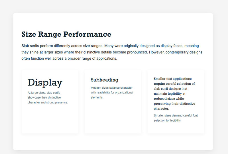
A slab serif that looks commanding at 72px can feel dense and tiring at 14px body text. This is the single most common mistake with slab serif selection.
Quick rule: geometric slabs (Rockwell, Museo Slab) work best above 18px. Clarendon-style slabs and screen-optimized options like Bitter can handle 14-16px body text without problems.
Monotype’s data shows designers lean toward larger font sizes over heavier weights for creating emphasis, with 94% choosing size adjustments as their primary tool. Slab serifs already carry visual weight, so bumping up the size rather than the boldness usually produces better results.
Licensing and Cost Considerations
| Source | Cost | Notable Slab Serifs |
|---|---|---|
| Google Fonts | Free (SIL Open Font License) | Roboto Slab, Bitter, Arvo, Zilla Slab |
| Adobe Fonts | Included with Creative Cloud subscription | Rockwell, Clarendon, Archer |
| Monotype / MyFonts | Per-font or subscription pricing | Sentinel, Museo Slab, Lubalin Graph |
| Custom commission | $30,000+ (Creative Bloq estimate) | Bespoke brand typefaces |
Google Fonts is deployed on over 50 million websites and holds 57% market share for web fonts. For most projects, starting with free slab serif options from Google Fonts makes sense before investing in commercial alternatives.
Spotify commissioned custom retro-inspired typefaces for its Wrapped campaigns in 2023 and 2024, showing how custom type (including slab-influenced designs) can become a core part of visual identity. But that’s a different budget conversation entirely.
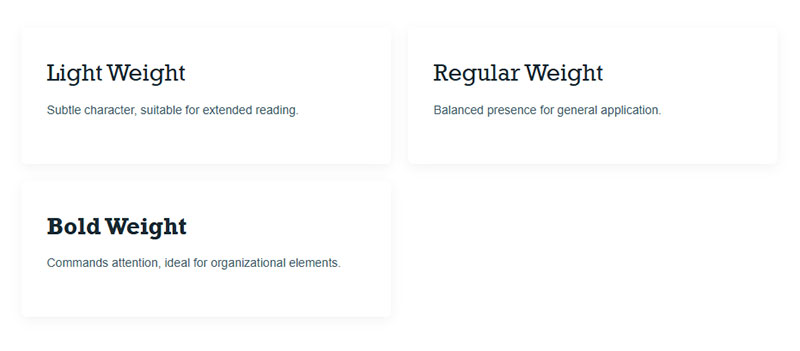
Check what weight range the font family offers before committing. Some slab serif families only ship in Regular and Bold. Others, like Roboto Slab’s variable version, cover the full spectrum from Thin to Black. More weight options give you more flexibility for building visual hierarchy without adding a second font family to your stack.
FAQ on What Is A Slab Serif Font
What makes a slab serif different from a regular serif?
The serifs themselves. Traditional serifs taper or thin out at the edges. Slab serifs stay thick, block-like, and uniform. The stroke contrast is also much lower, giving the entire letterform a heavier, more mechanical appearance.
Why are slab serifs called Egyptian fonts?
Napoleon’s Egyptian campaign in the early 1800s sparked a cultural craze. Typefounders like Robert Thorne labeled their new block-serif designs “Egyptian” to ride that trend. There’s no actual connection to Egyptian writing systems. The name just stuck.
Are slab serif fonts good for body text?
Depends on the subcategory. Clarendon-style slabs like Sentinel handle body text well. Geometric slabs like Rockwell work better as headline or display fonts. Screen-optimized options like Bitter were built specifically for long-form reading.
What are the best free slab serif fonts?
Google Fonts offers several strong options at zero cost. Roboto Slab, Bitter, Arvo, and Zilla Slab are the most widely used. All are open source under the SIL Open Font License and work for both web and print projects.
Is Courier a slab serif font?
Yes. Courier is a monospaced slab serif designed by Howard Kettler for IBM in 1955. Its fixed-width characters were a mechanical requirement for typewriter carriages. That same monospaced structure makes it popular in programming and screenwriting today.
When should I use a slab serif instead of a sans serif?
When you need visual weight and authority without going decorative. Slab serifs work well for headlines, signage, branding, and contexts where you want to stand apart from the dominant sans-serif look most websites use.
How do I pair a slab serif with other fonts?
Match the underlying geometry. Pair geometric slabs with geometric sans-serifs (Roboto Slab with Roboto). Pair Clarendon-style slabs with humanist sans-serifs. Avoid combining two slab serifs or pairing a slab with a heavy script font.
What brands use slab serif fonts in their logos?
Sony, Honda, and Volvo all use slab serif-influenced lettering. The Guardian newspaper uses a custom Egyptian typeface. The US National Park Service uses Clarendon on its trail signage. These brands choose slabs for their sturdy, confident tone.
Do slab serifs work for web design?
Absolutely. Google Fonts slab options like Roboto Slab and Bitter are deployed on millions of sites. Variable font versions reduce load times. Slab serifs perform especially well for headlines and short text blocks where you need strong visual contrast.
What are the main types of slab serif fonts?
Three main subcategories. Clarendon (bracketed serifs, moderate contrast). Geometric or unbracketed slabs (uniform strokes, sharp right-angle serif junctions). Typewriter slabs (monospaced, fixed-width characters). Each carries a distinct visual tone and serves different design purposes.
Conclusion
A slab serif font is more than a bold alternative to standard serifs. It’s a full type classification with distinct subcategories, each built for different contexts and communication goals.
From Vincent Figgins’ first “Antique” specimen in 1815 to Roboto Slab powering millions of modern websites, the category has adapted across centuries. Those thick, uniform serifs still do what they were designed to do: grab attention.
The practical takeaway is straightforward. Match the subcategory to your project’s tone. Test at actual target sizes. Check the weight range before committing.
Whether you’re setting headlines for a brand style guide, choosing a typeface that brings psychological weight to your social media layouts, or picking type for infographic projects, slab serifs deserve a closer look.

Renowned for his expertise in logo design and visual branding, Bogdan has developed a multitude of logos for various clients.
His skills extend to creating posters, vector illustrations, business cards, and brochures. Additionally, Bogdan's UI kits were featured on marketplaces like Visual Hierarchy and UI8.
He also wrote in the past years on sites like Design Your Way, WebDesignerDepot, WPDean, Designmodo, Speckyboy, Slider Revolution, and more.
- The Substack Logo History, Colors, Font, And Meaning - 2 October 2026
- How UX Design Impacts SaaS User Retention and Churn - 1 October 2026
- How to Embed Fonts in PDF for Reliable Printing - 30 September 2026

Bogdan Sandu is a seasoned designer who has been designing websites since 2008. Renowned for his expertise in logo design and visual branding, Bogdan has developed a multitude of logos for various clients. His skills extend to creating posters, vector illustrations, business cards, and brochures. Additionally, Bogdan's UI kits were featured on marketplaces like Visual Hierarchy and UI8. He also wrote in the past years on sites like Design Your Way, WebDesignerDepot, WPDean, Designmodo, Speckyboy, Slider Revolution, and more.
You Might Also Like