Most font combinations look fine. A few actually work.
Roboto is one of the most widely used sans-serif fonts on the web, built by Christian Robertson for Google and shipped as the default typeface for Android and Material Design. It shows up everywhere. But finding the right Roboto font pairing is where most designers either get it right or quietly settle.
The wrong companion font flattens your typographic hierarchy. The right one makes your layout feel intentional and your content easier to read.
This guide covers the 10 best combinations, from classic serif pairings to bold display contrasts, with specific use cases, recommended weights, and honest drawbacks for each.
Roboto Font Pairing Examples
| Pairing | Best For | Heading / Body Roles | Key Watch-Out |
|---|---|---|---|
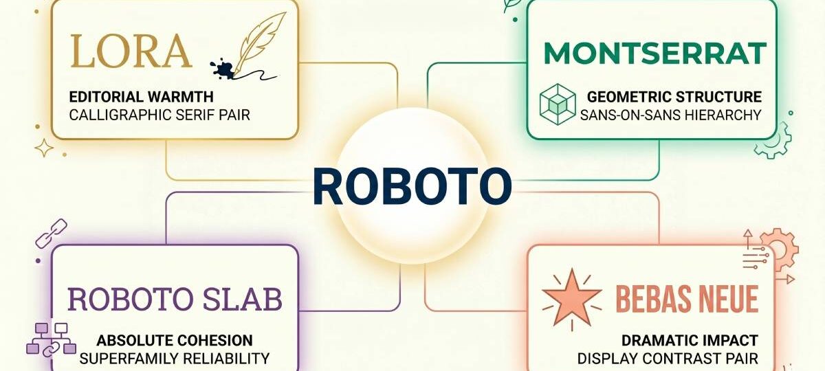
| Roboto + Lora Geometric sans + Calligraphic serif |
Editorial sites, lifestyle blogs, content marketing, law firm and healthcare websites | H1-H2 Roboto Bold 700 / Medium 500 Body Lora Regular 400, 18-21px, lh 1.6-1.8 |
Too editorial for tech or product-focused UI. Use a sans-serif body instead. |
| Roboto + Playfair Display Geometric sans + High-contrast serif |
Fashion editorials, luxury branding, upscale restaurants, portfolio sites, high-end landing pages | H1-H2 Playfair Display, 32px+ only Body Roboto Regular 400, 16-18px |
Hairlines lose clarity below 32px. Out of place in technical or functional UI. |
| Roboto + Merriweather Geometric sans + Screen-optimized serif |
News and media sites, professional blogs, content-heavy product pages, documentation | H1-H2 Merriweather Bold / Black Body Roboto Regular 400, min 16px |
Safe to a fault. Reliable but no visual personality. Weak for brand-forward projects. |
| Roboto + Roboto Slab Geometric sans + Superfamily slab serif |
Material Design implementations, Android app interfaces, Google product design, technical documentation | H1-H2 Roboto Slab Bold / Medium Body Roboto Regular 400 |
Low visual tension. Too uniform for projects that need strong typographic contrast. |
| Roboto + Montserrat Geometric sans + Wide geometric sans |
Startup websites, SaaS landing pages, marketing materials, modern brand identities | H1-H2 Montserrat ExtraBold / Black Body Roboto Regular 400 |
Regular-weight Montserrat kills all distinction. Heavy weights only for headings. |
| Roboto + Raleway Geometric sans + Wide elegant sans |
Creative agency sites, portfolio and personal branding, modern e-commerce | H1-H2 Raleway Thin / Light at display size; Bold for smaller headings Body Roboto Regular 400 |
Thin weights drop below contrast thresholds on mobile. Always test on low-DPI screens. |
| Roboto + Open Sans Geometric sans + Humanist sans |
Government and institutional sites, accessibility-focused platforms, long-form documentation, healthcare and education | H1-H2 Open Sans Bold / SemiBold Body Roboto Regular 400 |
Zero personality. Function over brand. Without strong weight contrast, both fonts look identical. |
| Roboto + DM Serif Display Geometric sans + High-contrast display serif |
Editorial blogs, lifestyle and fashion brands, agency and studio websites | H1-H2 DM Serif Display Regular (one weight only) Body Roboto Regular 400 / Medium 500 for subheads |
No Bold weight available. Size alone drives all heading hierarchy. Limits complex page structures. |
| Roboto + Bebas Neue Geometric sans + All-caps condensed display |
Sports and fitness sites, event landing pages, YouTube thumbnails, high-impact brand campaigns | H1-H2 Bebas Neue at large display sizes only (one weight) Body Roboto Regular 400 / Light, generous letter-spacing |
All-caps only. Unusable for mixed-case or long heading runs. One weight, no flexibility. |
| Roboto + Archivo Geometric sans + Variable grotesque sans |
Tech and SaaS products, app interfaces, modern print materials, scalable brand systems | H1-H2 Archivo Bold / ExtraBold; Black for hero text Body Roboto Regular 400 |
Both are workhorses with limited personality. Not the right choice when brand differentiation matters. |
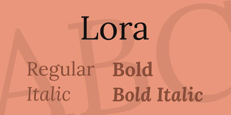
Roboto + Lora
What This Pairing Looks Like
Roboto takes the heading role here, typically in Bold (700) or Medium (500). Lora handles body text in Regular or Italic. The contrast between Roboto’s geometric neo-grotesque structure and Lora’s calligraphic serif warmth is what makes this combination work so well.
Why It Works
Both fonts share a tall x-height, so they align naturally at the same body size. Lora’s brushed curves add warmth that directly offsets Roboto’s precision. The visual hierarchy feels balanced without extra effort.
Best Use Cases
- Editorial websites and lifestyle blogs
- Content marketing platforms
- Digital magazines
- Law firm or healthcare websites (serious tone)
How to Use It
Use Roboto Bold (700) for H1/H2, Medium (500) for H3. Lora Regular (400) at 18-21px for body. Leading around 1.6-1.8 works well. Lora’s italics are particularly strong for pull quotes.
Potential Drawbacks
Lora can feel too editorial for tech-heavy or product-focused interfaces. In those contexts, a sans-serif companion fits better.
Roboto + Playfair Display

What This Pairing Looks Like
Playfair Display takes headlines, Roboto handles body text. High-contrast serif letterforms against clean, neutral sans-serif. The weight difference is immediately visible. This is the most visually dramatic pairing in the Roboto family.
Why It Works
Playfair’s classical structure and strong serifs create sharp contrast against Roboto’s modern geometry. The combination reads as both sophisticated and accessible. Good example of style contrast done right.
Best Use Cases
- Fashion editorials and luxury branding
- Upscale restaurant websites
- Portfolio sites
- High-end product landing pages
How to Use It
Use Playfair Display at 32px and above only. Below that, the high-contrast hairlines lose clarity on screens. Roboto Regular (400) at 16-18px for body. Avoid Playfair at small sizes entirely.
Potential Drawbacks
This pairing feels out of place in technical or functional UI contexts. It skews heavily editorial, which limits its range.
Roboto + Merriweather
What This Pairing Looks Like
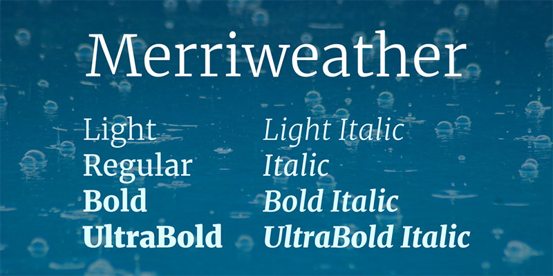
Merriweather as heading, Roboto as body text. Merriweather’s strong serifs and large x-height give it authority at display sizes. Roboto underneath stays clean and completely readable. The typographic hierarchy is clear and reliable.
Why It Works
Merriweather was designed specifically for screen legibility, same as Roboto. Both are screen-first fonts, so they render well together at any size. The serif-to-sans contrast is present without being jarring.
Best Use Cases
- News and media websites
- Professional blogs
- Content-heavy product pages
- Documentation sites
How to Use It
Merriweather Bold or Black for headings. Roboto Regular (400) for body at 16px minimum. Tracking on Merriweather headlines can be tightened slightly for a more editorial feel.
Potential Drawbacks
This combination is safe, almost to a fault. It works well but does not stand out visually. Not ideal when you need a strong brand personality.
Roboto + Roboto Slab
What This Pairing Looks Like
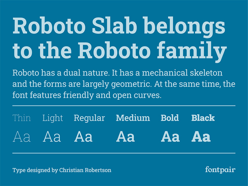
Both fonts come from the same family. Roboto Slab takes headings with its slab serif construction. Roboto handles body text. The structural DNA is shared, so the two feel like parts of one system rather than two separate choices.
Why It Works
Superfamily pairing is one of the safest approaches in typography. Because both fonts share the same skeleton and proportions, the only contrast comes from the serif treatment. Clean, intentional, consistent.
Best Use Cases
- Material Design implementations
- Android app interfaces
- Google product-adjacent design
- Technical documentation
How to Use It
Roboto Slab Bold or Medium for headings. Roboto Regular for body. Both share identical font spacing conventions, so no adjustments needed. Works great with a baseline grid.
Potential Drawbacks
Low visual tension. For projects that need strong typographic contrast, this pairing feels too uniform.
Roboto + Montserrat

What This Pairing Looks Like
Two sans-serif fonts working together. Montserrat in bold for headings, Roboto for body. Montserrat’s wider geometric structure creates visible contrast against Roboto’s more condensed letterforms. Both are clean, but they do not look identical.
Why It Works
Montserrat brings a geometric confidence to headings that Roboto’s neutral character supports well in body text. The width difference between the two creates enough separation to read as a deliberate choice rather than a mistake.
Best Use Cases
- Startup websites and SaaS landing pages
- Marketing and advertising materials
- Modern brand identities
How to Use It
Montserrat ExtraBold or Black for short headings. Roboto Regular for body. Avoid using Montserrat at body sizes since the two fonts compete too closely at small sizes. Check kerning on Montserrat headlines.
Potential Drawbacks
Two sans-serifs can blur together when weight contrast is not strong enough. If Montserrat is used at a regular weight, the pairing loses all distinction.
Roboto + Raleway
What This Pairing Looks Like
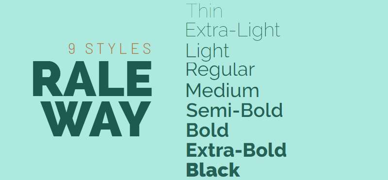
Raleway as headline, Roboto as body text. Raleway is notably wider and has shorter ascenders than Roboto. That width difference makes the heading-to-body transition feel spacious. Raleway’s thin and light weights give headings an elegant, airy quality.
Why It Works
Roboto reads as condensed compared to Raleway’s wider profile. That proportion contrast, combined with Raleway’s rounded forms, creates a modern font combination that reads cleanly on screens of any size.
Best Use Cases
- Creative agency websites
- Portfolio and personal branding
- Modern e-commerce
How to Use It
Raleway Thin or Light for display-size headings. Raleway Bold for smaller headings where light weight loses impact. Roboto Regular for all body text. This combination benefits from generous line spacing.
Potential Drawbacks
Raleway Thin at small sizes can drop below readable contrast thresholds, especially on mobile. Always test on low-DPI screens.
Roboto + Open Sans

What This Pairing Looks Like
Both fonts are neutral sans-serifs designed for screens. Open Sans carries slightly more humanist warmth. Roboto has more geometric discipline. Together they read as a cohesive, professional system with subtle variation between heading and body levels.
Why It Works
Both fonts represent the gold standard for web legibility. Neither demands attention. That makes this combination ideal when content needs to lead and the typography needs to stay out of the way.
Best Use Cases
- Government and institutional websites
- Accessibility-focused platforms
- Long-form documentation
- Healthcare and education sites
How to Use It
Open Sans Bold or SemiBold for headings. Roboto Regular for body. The weight difference is what does the work here. Without it, the two fonts look nearly identical.
Potential Drawbacks
Zero personality. This pairing works for function, not for brand expression. If visual identity matters, look elsewhere.
Roboto + DM Serif Display
What This Pairing Looks Like
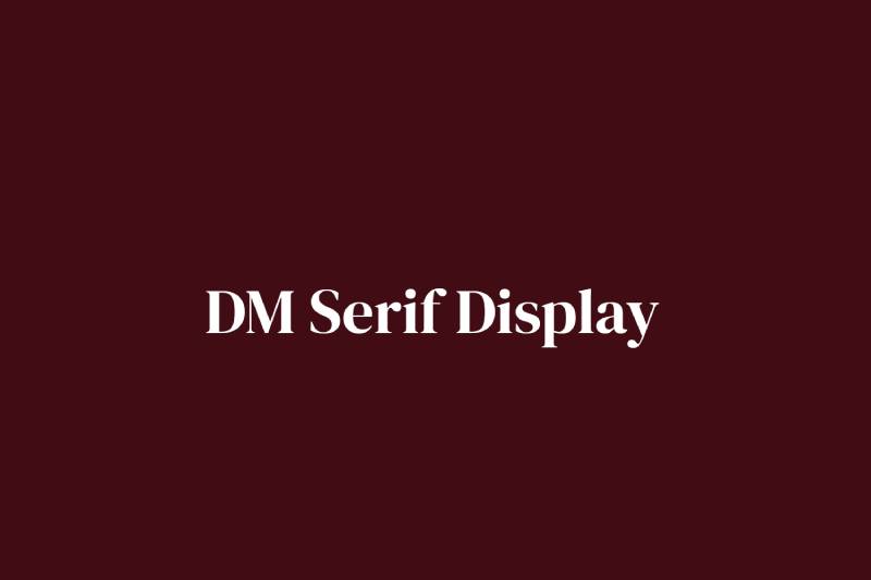
DM Serif Display as heading, Roboto as body text. DM Serif Display is a high-contrast display font with thick-to-thin transitions built in. Against Roboto’s mono-weight structure, the visual tension is immediate and intentional.
Why It Works
The geometric sharp edges of DM Serif Display directly juxtapose Roboto’s smooth, rounded letterforms. That structural contrast creates strong contrast at every heading level. A good choice when the design needs some edge.
Best Use Cases
- Editorial blogs and online publications
- Lifestyle and fashion brands
- Agency and studio websites
How to Use It
DM Serif Display Regular only. It has no additional weights, so font size does all the heavy lifting for hierarchy. Use Roboto Medium (500) for subheadings where DM Serif would be too decorative.
Potential Drawbacks
DM Serif Display has no Bold weight, which limits heading hierarchy options. In complex page structures with many heading levels, this becomes a real constraint.
Roboto + Bebas Neue
What This Pairing Looks Like
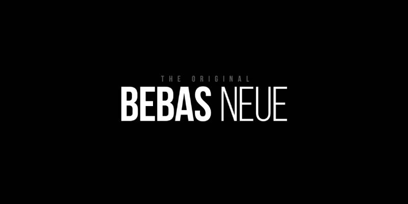
Bebas Neue is all-caps, condensed, and heavy. Roboto handles everything else. The contrast is blunt and deliberate. Bebas Neue commands the heading space fully. Roboto keeps body text neutral and readable underneath. This is not a subtle pairing.
Why It Works
The condensed spacing of Bebas Neue shares structural similarities with Roboto’s slightly condensed proportions. That shared tightness creates visual unity despite the obvious weight contrast. Works especially well in layout-heavy designs.
Best Use Cases
- Sports and fitness websites
- Event posters and landing pages
- YouTube thumbnails
- Brand campaigns with high visual impact
How to Use It
Bebas Neue at large display sizes only. It only comes in one weight, so size variation drives all hierarchy. Roboto Regular or Light for body text. Generous letter-spacing on Roboto body text balances the tight condensed heading.
Potential Drawbacks
All-caps headings only. This limits Bebas Neue to short, punchy phrases. Any heading that requires mixed case or longer runs of text simply does not work with this font.
Roboto + Archivo
What This Pairing Looks Like
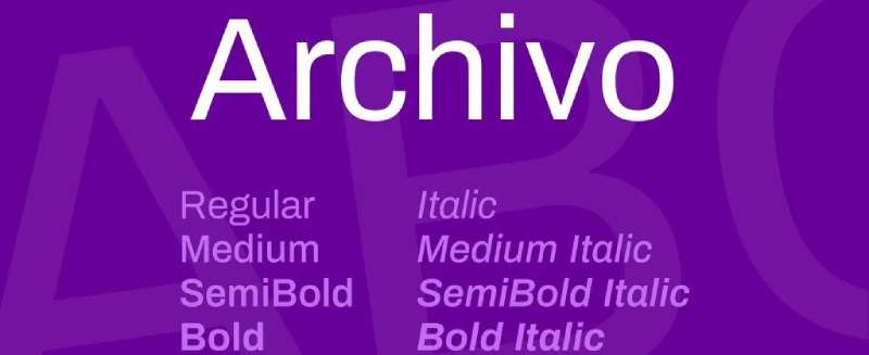
Archivo as heading, Roboto as body text. Archivo is a grotesque sans-serif with strong performance in digital and print contexts. The two fonts share a similar structural category but Archivo’s slightly wider proportions and stronger stroke character create visible separation.
Why It Works
Archivo was designed with variable font support, giving it a wide range of weights and widths. That flexibility makes it easy to build clear heading hierarchy above Roboto’s consistent body text weight. Both fonts feel modern and technically capable.
Best Use Cases
- Tech and SaaS products
- App interfaces
- Modern print materials
- Brand systems that need flexibility
How to Use It
Archivo Bold or ExtraBold for headings. Roboto Regular for body. Archivo Black works well for large hero text. The two fonts pair naturally in font pairing systems that need to scale across multiple screen sizes and contexts.
Potential Drawbacks
Less distinct personality than some other pairings. Archivo and Roboto are both workhorses. If brand differentiation matters, more expressive combinations serve better.
FAQ on Roboto Font Pairing
What is the best font to pair with Roboto?
Lora is the strongest overall choice. Its calligraphic serif warmth directly offsets Roboto’s geometric structure, and both fonts share a similar x-height, making them visually balanced at the same body size.
Can you pair Roboto with another sans-serif font?
Yes, but weight contrast is critical. Pairing Roboto with Montserrat or Raleway works because of their wider proportions. Without strong weight difference between heading and body, two sans-serifs will look like a mistake, not a choice.
Is Roboto good for body text or headings?
Both. Roboto’s clean structure and open curves make it highly readable at small sizes, so it works well as body text. At larger sizes with heavier weights like Bold (700) or Black (900), it holds up as a heading font too.
What serif fonts pair well with Roboto?
Lora, Merriweather, and Playfair Display are the top three. Roboto Slab from the same superfamily is also a reliable option. Each brings a different tone, from editorial warmth to classical elegance.
Does Roboto pair well with display fonts?
Yes. Roboto’s neutral character makes it an ideal body companion for bold display typefaces like Bebas Neue or DM Serif Display. The contrast is strong and intentional when Roboto handles all body text.
What font weight should I use when pairing Roboto?
For body text, Regular (400) is standard. When Roboto serves as a heading font, Bold (700) or Medium (500) creates the clearest visual hierarchy. Always test weight combinations at actual screen sizes before committing.
Is Roboto a good font for web design?
It is one of the most widely used fonts in web design for good reason. Roboto renders crisply across all screen sizes and loads efficiently via Google Fonts. Its extensive weight range also reduces the need for multiple typefaces.
What is the difference between Roboto and Roboto Slab?
Roboto is a neo-grotesque sans-serif. Roboto Slab adds bracketed slab serifs to the same structural skeleton. Both share identical proportions and spacing, making them a natural superfamily pairing with built-in visual consistency.
Can Roboto be used for print design?
Yes, though it was optimized for screens. At print sizes above 10pt it performs well. For body text in printed materials, pairing Roboto with a traditional serif font like Merriweather or Lora improves long-form readability significantly.
How many fonts should I use with Roboto?
One companion font is enough for most projects. Two maximum. Roboto’s wide weight range, from Thin (100) to Black (900), handles most hierarchy needs internally. Adding a second typeface should serve a clear purpose, not just variety.
Conclusion
This conclusion is for an article presenting the most practical Roboto font combinations for web and UI design.
Roboto is a neo-grotesque workhorse. But its real strength shows when paired with the right typeface, whether that is a calligraphic serif like Lora for editorial warmth or a condensed display font like Bebas Neue for high-impact layouts.
The pairing you choose shapes how readers experience your content. Font contrast, weight pairing, and baseline grid consistency all contribute to a type system that feels intentional.
If you want a starting point, go with Roboto and Lora. It covers most use cases and scales across screen sizes without friction.
From there, experiment. Good typography is rarely accidental.

Renowned for his expertise in logo design and visual branding, Bogdan has developed a multitude of logos for various clients.
His skills extend to creating posters, vector illustrations, business cards, and brochures. Additionally, Bogdan's UI kits were featured on marketplaces like Visual Hierarchy and UI8.
He also wrote in the past years on sites like Design Your Way, WebDesignerDepot, WPDean, Designmodo, Speckyboy, Slider Revolution, and more.
- The Windsurf Logo History, Colors, Font, And Meaning - 10 October 2026
- How to Remove Background From Product Photos (No Photoshop) - 10 October 2026
- How Designers can Build a Stronger Online Creative Identity - 9 October 2026

Bogdan Sandu is a seasoned designer who has been designing websites since 2008. Renowned for his expertise in logo design and visual branding, Bogdan has developed a multitude of logos for various clients. His skills extend to creating posters, vector illustrations, business cards, and brochures. Additionally, Bogdan's UI kits were featured on marketplaces like Visual Hierarchy and UI8. He also wrote in the past years on sites like Design Your Way, WebDesignerDepot, WPDean, Designmodo, Speckyboy, Slider Revolution, and more.
You Might Also Like