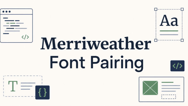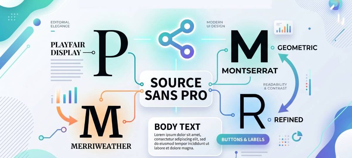
Most font combinations look fine. A few actually work. And when it comes to Merriweather font pairing, the right choice can be the difference between…
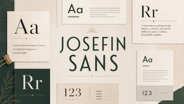
Most geometric sans-serifs play it safe. Josefin Sans does not. Designed by Santiago Orozco and inspired by 1920s typefaces like Futura and Kabel, it carries…
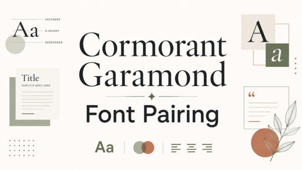
Cormorant Garamond is one of those display serif fonts that looks stunning in a heading and completely falls apart when you pair it with the…
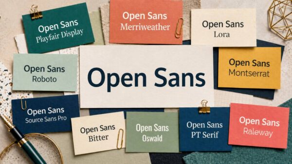
Most fonts fade into the background. Open Sans stays there on purpose. Designed by Steve Matteson and built for screen readability, it has become one…
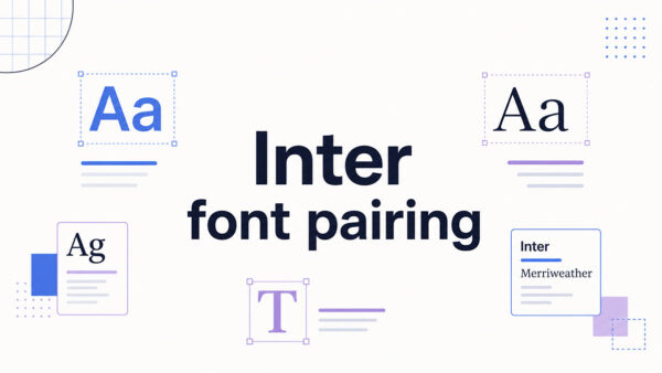
Most designers pick Inter for body text and then spend way too long figuring out what to put next to it. Designed by Rasmus Andersson,…
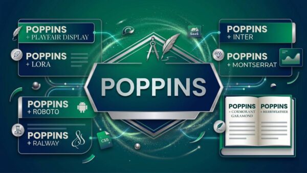
Most font combinations look fine. A few actually work. Poppins is one of the most popular geometric sans-serif typefaces on Google Fonts – clean, versatile,…
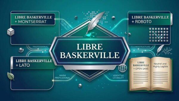
The right Libre Baskerville font pairing can be the difference between a website that reads beautifully and one that just looks like someone grabbed two…
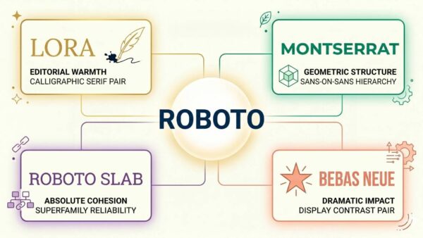
Most font combinations look fine. A few actually work. Roboto is one of the most widely used sans-serif fonts on the web, built by Christian…
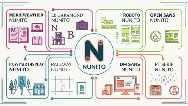
The wrong font pairing can quietly ruin a design. The right one makes everything click. Nunito is a rounded sans-serif typeface built for screens, created…
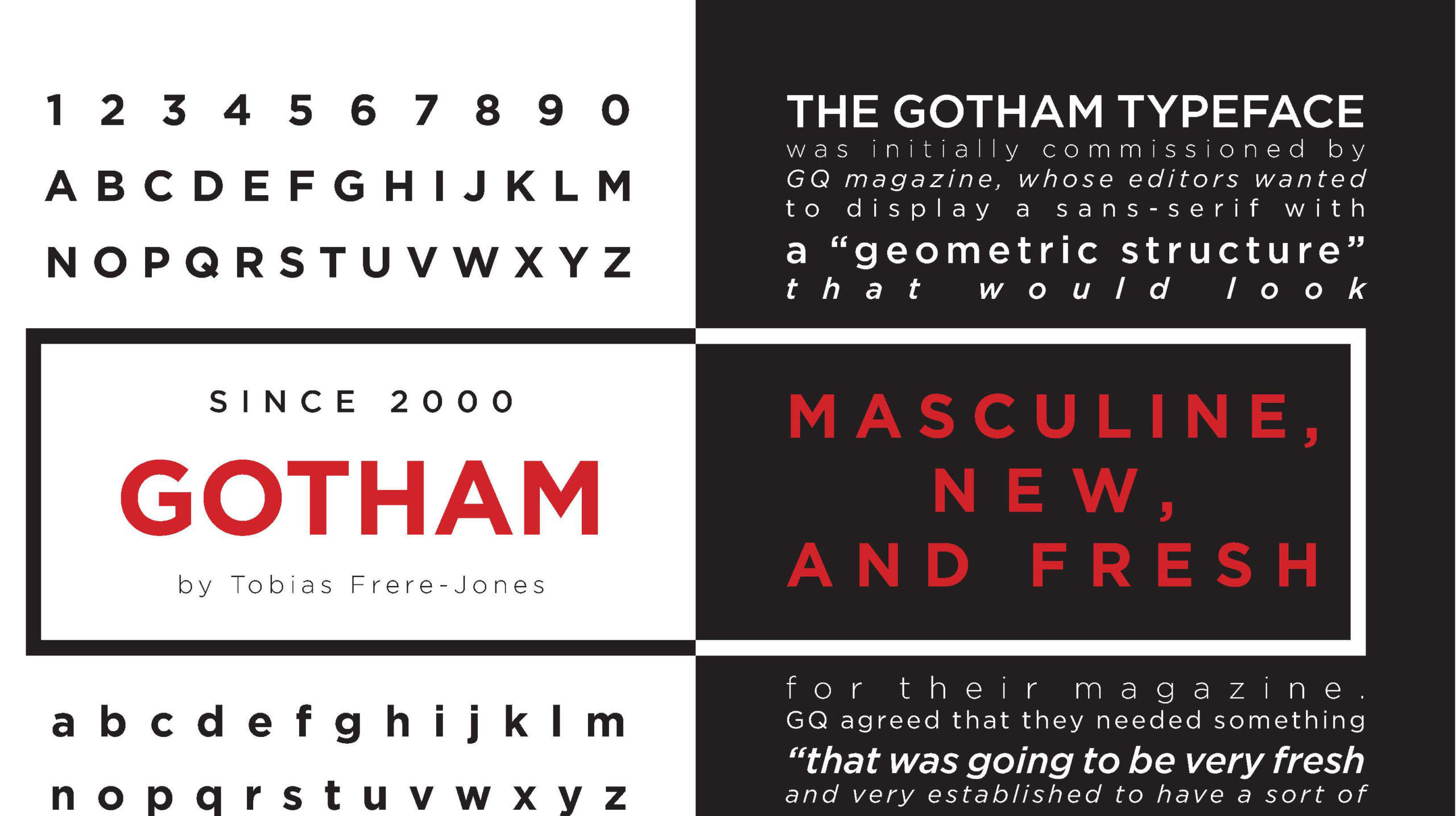
Gotham font pairing trips up even experienced designers. You grab this geometric powerhouse for headlines, then spend twenty minutes scrolling through your font library wondering…
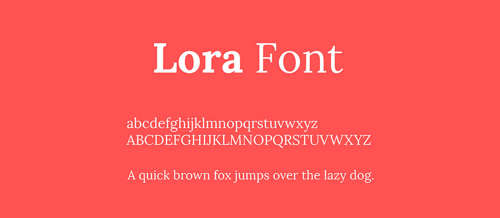
Lora’s calligraphic elegance demands a partner that either complements its curves or provides sharp contrast. Get this wrong, and your design feels off. Get it…
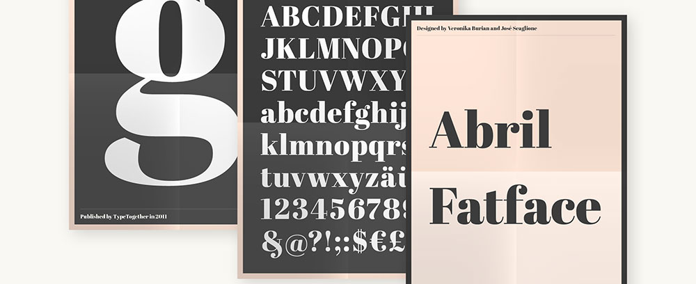
Abril Fatface font pairing separates amateur designs from professional work. This bold display font demands the right partner to shine without overwhelming your layout. Choosing…
Bodoni’s dramatic hairlines and vertical stress command attention, but pairing this elegant serif with the wrong companion destroys the sophistication it promises. Bodoni font pairing requires understanding…
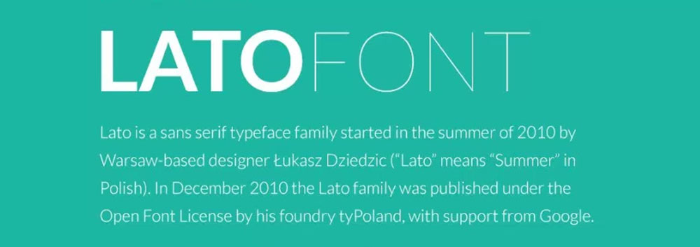
Lato sits in your Google Fonts library waiting to do something interesting, but pairing it wrong turns clean design into visual chaos. This humanist sans-serif…
Futura looks stunning on its own, but pair it wrong and your design falls flat. This geometric sans serif typeface demands thoughtful companions. The clean…
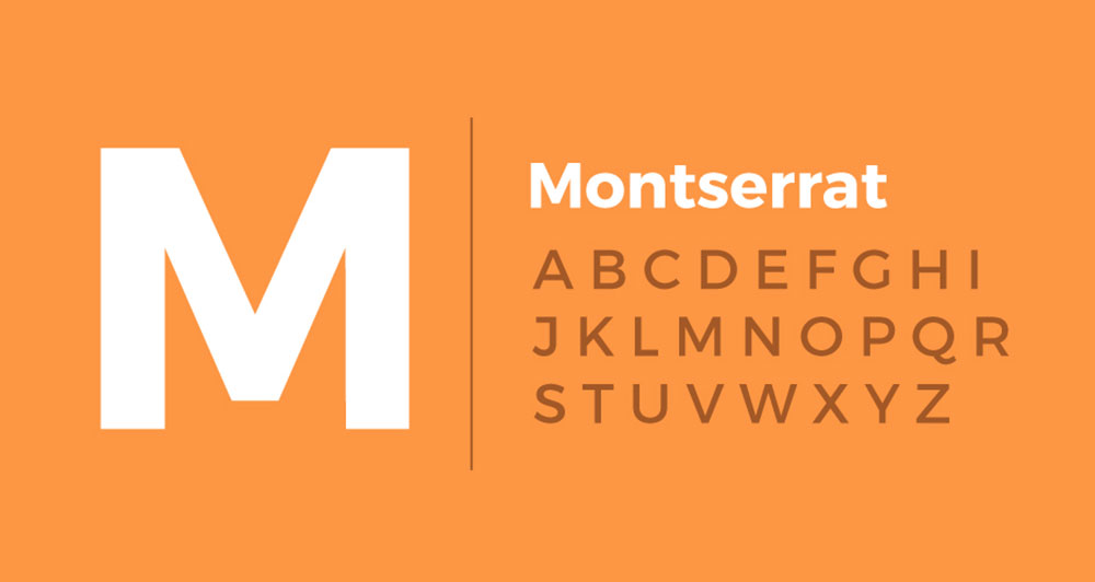
Montserrat’s geometric clarity makes it a workhorse typeface, but choosing the wrong companion font turns that strength into visual chaos. Montserrat font pairing examples reveal…