The font you pick for headings can make or break a design. Not just aesthetically, but functionally.
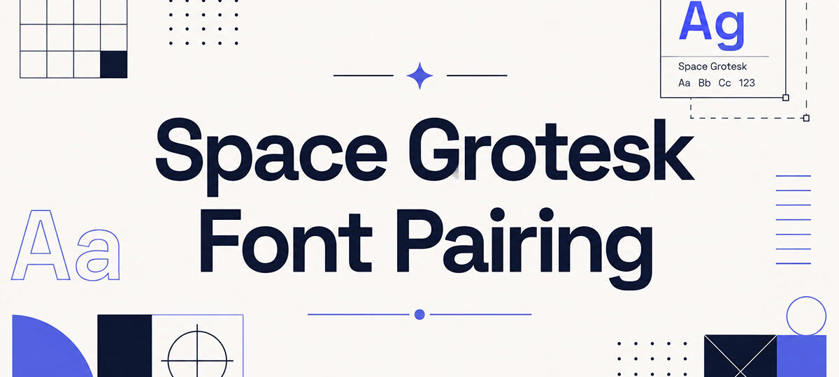
Space Grotesk has become a go-to choice for designers building modern websites, SaaS products, and brand identities. Its geometric structure and distinctive terminals give it personality without sacrificing screen legibility. But the real question is what you pair it with.
A strong Space Grotesk font pairing depends on understanding type contrast, visual hierarchy, and how different typeface classifications interact. Serif or sans-serif body text? High contrast or low? Neutral or expressive?
This guide covers 10 tested combinations, from Space Grotesk with Playfair Display to Space Grotesk with Inter, with specific weight recommendations, use cases, and tone notes for each pairing.
Best Space Grotesk Font Pairings
Space Grotesk + Playfair Display

Why This Pairing Works
This is a classic serif and sans-serif contrast pairing. Space Grotesk brings a geometric, slightly technical edge to headings, while Playfair Display adds high-contrast stroke transitions and refined curves to body copy.
The tension between the two is the point. One feels modern and screen-native, the other feels editorial and print-rooted.
Best Use Cases
- Editorial websites and digital magazines
- Luxury or fashion brand sites
- Portfolio sites with a design-forward tone
- Blog layouts where typographic contrast drives hierarchy
Recommended Roles
- Space Grotesk as: heading, subheadings, UI labels
- Playfair Display as: body text, pull quotes, article introductions
Weight and Size Pairing
Use Space Grotesk Bold (700) at 32px+ for headings. Playfair Display Regular (400) at 17-18px with a line height of 1.7 reads well for long-form body text.
Tone and Mood
Sophisticated. Slightly editorial. Works well for brands that want to feel current without losing a sense of craft or elegance.
Who Should Use This Pairing
Designers working on content-heavy sites, editorial design projects, or brand identities where typographic hierarchy is a primary design tool.
Space Grotesk + Lora
Why This Pairing Works
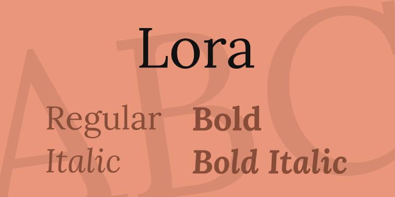
Lora is a contemporary serif font with calligraphic roots, making it warmer and more approachable than high-contrast serifs like Playfair Display. Paired with Space Grotesk, the combination feels modern but readable.
The slightly quirky geometry of Space Grotesk contrasts well with Lora’s brushed curves and driving serifs.
Best Use Cases
- Blog and long-form editorial content
- Creative agency websites
- Brand identities with a warm, human tone
- Mood board-driven design projects
Recommended Roles
- Space Grotesk as: headings, navigation, buttons
- Lora as: body text, captions, article content
Weight and Size Pairing
Space Grotesk SemiBold (600) at 28-36px for headings. Lora Regular (400) at 16-18px with 1.7 line height for body text. The contrast in stroke style creates natural typographic hierarchy without relying on weight alone.
Tone and Mood
Warm, literary, and modern. Sits between formal and casual, which makes it flexible across industries.
Who Should Use This Pairing
Writers, bloggers, and studios building content-first websites where body text readability is the top priority.
Space Grotesk + Merriweather
Why This Pairing Works
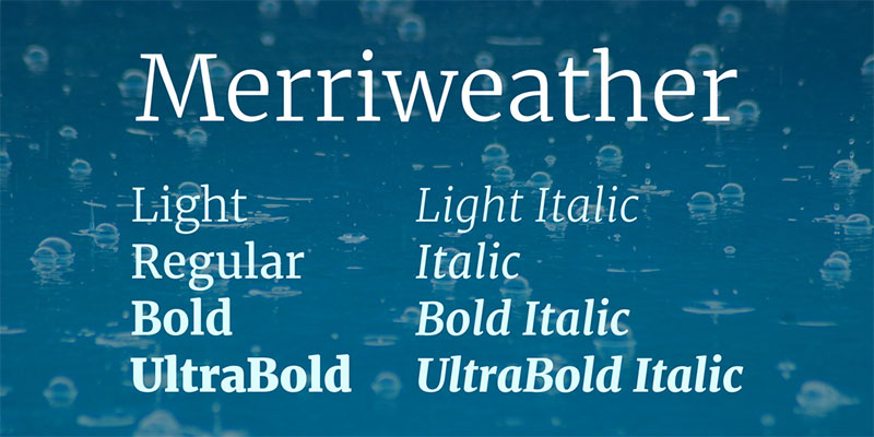
Merriweather was built for screen readability. Its large x-height, open counters, and sturdy serifs make it one of the most reliable body text fonts available on Google Fonts.
Paired with Space Grotesk, the combination is assertive in headings and dependable in body text. No visual noise.
Best Use Cases
- News and media sites
- Documentation and technical writing
- SaaS product blogs
- Corporate web design where trust matters
Recommended Roles
- Space Grotesk as: headings, UI labels, navigation
- Merriweather as: body text, article copy, descriptions
Weight and Size Pairing
Space Grotesk Bold (700) at 30px+ for headings. Merriweather Regular (400) at 16px with a 1.75 line height. Merriweather runs slightly wide, so keep paragraph width between 60-75 characters for best readability.
Tone and Mood
Solid, trustworthy, professional. Slightly heavier than Lora or Source Serif Pro visually, which makes it feel more grounded.
Who Should Use This Pairing
Publishers, SaaS companies, and anyone building content-heavy web products where reading comfort is non-negotiable.
Space Grotesk + DM Serif Display
Why This Pairing Works
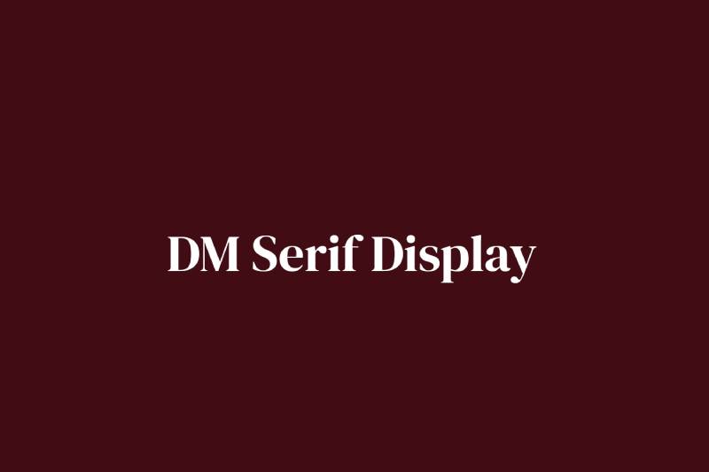
DM Serif Display is a high-contrast transitional serif designed for large sizes. It was not built for body text, which is fine because Space Grotesk handles that role well.
The combination works in reverse of the usual formula: DM Serif Display as a display heading, Space Grotesk as the workhorse below it.
Best Use Cases
- Hero sections and landing pages
- Brand campaigns and marketing sites
- High-impact editorial layouts
Recommended Roles
- DM Serif Display as: H1 hero text, large pull quotes
- Space Grotesk as: subheadings, body text, buttons, labels
Weight and Size Pairing
DM Serif Display Regular at 48-72px for hero headings. Space Grotesk Medium (500) or Regular (400) at 16-18px for body copy. The size gap needs to be dramatic for this pairing to land correctly.
Tone and Mood
Striking. The display font contrast between a high-contrast serif and a geometric sans creates visual interest at first glance. More personality than a standard editorial pairing.
Who Should Use This Pairing
Designers building landing pages, product launches, or brand sites where the hero section needs to stop the scroll.
Space Grotesk + Inter

Why This Pairing Works
This is a dual sans-serif pairing. Space Grotesk takes the heading role with its distinctive character, while Inter acts as the neutral, highly legible body font.
Inter was designed specifically for UI. It reads cleanly at 13px on a dense dashboard. Space Grotesk above it adds just enough personality to prevent the layout from feeling sterile.
Best Use Cases
- SaaS dashboards and web applications
- Tech startup websites
- Design system typography
- Developer tools and documentation
Recommended Roles
- Space Grotesk as: headings, display text, brand elements
- Inter as: body text, UI labels, table data, captions
Weight and Size Pairing
Space Grotesk Bold (700) at 24-36px for headings. Inter Regular (400) at 14-16px for UI text. Inter Light (300) works well for secondary labels and metadata.
Tone and Mood
Clean, modern, product-focused. This is the pairing you see across most well-designed SaaS products in 2024 and 2025.
Who Should Use This Pairing
Product designers, UI/UX teams, and developers building web applications where both personality and usability need to coexist.
Space Grotesk + Source Serif Pro
Why This Pairing Works
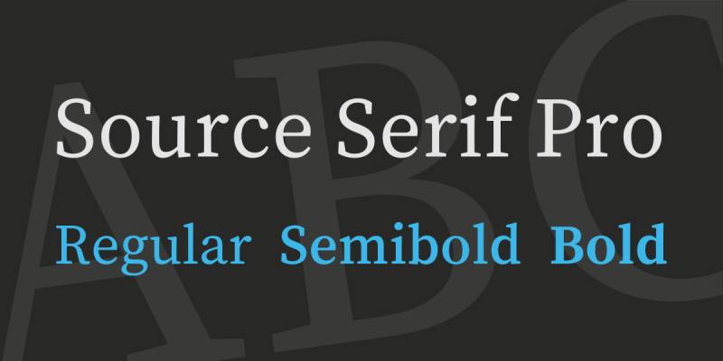
Source Serif Pro is restrained and rational. It is the more neutral option among Google Fonts serifs, which makes it a natural counterpart to Space Grotesk’s distinctive geometric details.
Where Lora is warm and Playfair Display is dramatic, Source Serif Pro is simply reliable. That is sometimes exactly what you need.
Best Use Cases
- Corporate websites and annual reports
- Legal or financial service brands
- Long-form publishing platforms
- Print design and digital-print hybrid layouts
Recommended Roles
- Space Grotesk as: headings, section labels, UI elements
- Source Serif Pro as: body text, article content, captions
Weight and Size Pairing
Space Grotesk SemiBold (600) at 28-32px for headings. Source Serif Pro Regular (400) at 17px. Source Serif Pro has multiple weights and italic styles, giving you more flexibility in body text hierarchy than most serif options.
Tone and Mood
Professional, clean, dependable. Less expressive than other pairings on this list, but more versatile across formal contexts.
Who Should Use This Pairing
Designers working in regulated industries or brand identity design contexts where the typography needs to communicate trust before personality.
Space Grotesk + Fraunces
Why This Pairing Works
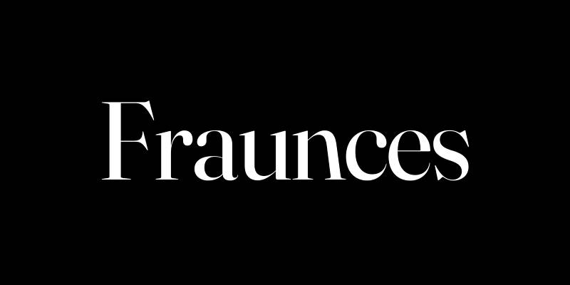
Fraunces is a display-oriented variable serif with a retro, optically-influenced character. It is distinctive in its own right, which means this pairing puts two opinionated fonts in the same layout.
That is a risk. It works because Space Grotesk and Fraunces occupy completely different tonal registers. One reads as technical and forward-looking, the other as editorial and nostalgic.
Best Use Cases
- Food and beverage brand websites
- Editorial design with a retro-modern aesthetic
- Independent publishing and cultural platforms
- Poster design and visual campaigns
Recommended Roles
- Fraunces as: hero headings, pull quotes, display text
- Space Grotesk as: subheadings, body text, UI elements
Weight and Size Pairing
Fraunces Bold or ExtraBold at 40px+ for hero text. Space Grotesk Regular (400) or Medium (500) at 16-18px for body content. As a variable font, Fraunces gives you fine-grained control over weight and optical size.
Tone and Mood
Retro-modern. Expressive. Works for brands that are intentionally unusual and want their web typography to reflect that.
Who Should Use This Pairing
Designers and studios working with independent brands, cultural projects, or any client that specifically wants to avoid looking like everyone else.
Space Grotesk + Space Mono
Why This Pairing Works
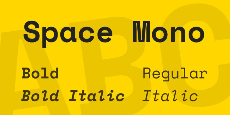
Space Grotesk was designed as a proportional companion to Space Mono. They share the same typographic DNA. This makes them a cohesive system rather than a contrasting pair.
Using them together creates a unified, technical aesthetic that reads clearly as intentional, not just default.
Best Use Cases
- Developer tools and coding platforms
- AI product interfaces and Web3 applications
- Tech startup branding
- Crypto dashboards and data-heavy layouts
Recommended Roles
- Space Grotesk as: headings, body text, navigation
- Space Mono as: code snippets, data values, timestamps, labels
Weight and Size Pairing
Space Grotesk Bold (700) at 24-32px for headings. Space Mono Regular at 13-14px for code and data elements. Space Mono is a monospaced font, so it takes up more horizontal space than proportional fonts at the same size.
Tone and Mood
Technical. Systematic. Geometric sans-serif meets monospace for a look that signals precision and developer credibility.
Who Should Use This Pairing
Product teams building developer-focused products, technical documentation sites, or any interface where monospace type is a functional requirement.
Space Grotesk + Cormorant Garamond
Why This Pairing Works
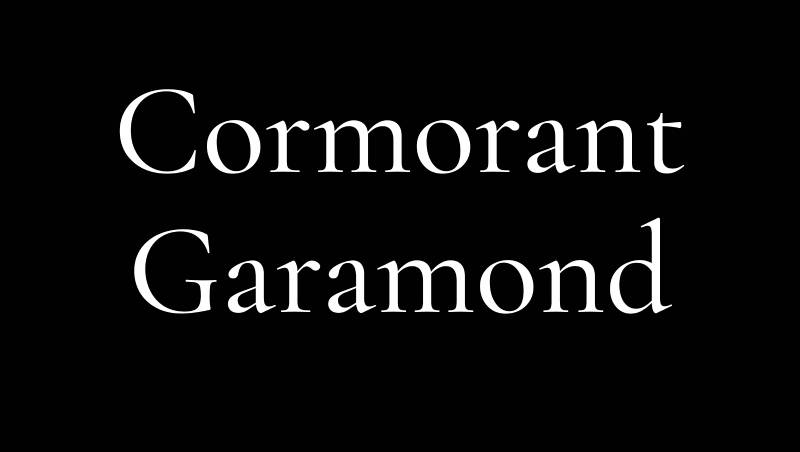
Cormorant Garamond is an extremely high-contrast, display-oriented serif. Its thin strokes and delicate proportions create a dramatic contrast with Space Grotesk’s solid, grounded geometry.
This is one of the more daring pairings on this list. When it works, it works well. When it does not, both fonts fight for attention.
Best Use Cases
- Luxury brand websites and packaging design
- Fashion editorial and lookbooks
- High-end hospitality and lifestyle brands
- Book cover design with a modern editorial direction
Recommended Roles
- Space Grotesk as: subheadings, body text, navigation, labels
- Cormorant Garamond as: large hero headings, pull quotes, brand statements
Weight and Size Pairing
Cormorant Garamond Bold or SemiBold at 48px+ for display headings. Space Grotesk Regular (400) at 16-17px for body text. Do not use Cormorant Garamond at small sizes. Its hairline strokes break down quickly below 20px on screen.
Tone and Mood
Opulent. Editorial. High fashion. This pairing has a strong point of view and needs confident use to land correctly.
Who Should Use This Pairing
Designers working with luxury clients or high-end editorial projects where visual hierarchy and an elevated aesthetic are explicit brand requirements.
Space Grotesk + Libre Baskerville
Why This Pairing Works
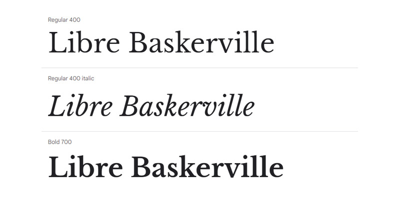
Libre Baskerville is a web-optimized revival of the classic Baskerville typeface. It has strong serifs, high contrast, and excellent screen legibility at medium sizes. It is more grounded than Cormorant Garamond but more characterful than Source Serif Pro.
Space Grotesk next to Libre Baskerville creates a pairing that feels both contemporary and classically informed.
Best Use Cases
- Publishing platforms and content-heavy blogs
- Academic or research-oriented websites
- Professional service brands with heritage positioning
- Brochure design and formal marketing materials
Recommended Roles
- Space Grotesk as: headings, section labels, UI navigation
- Libre Baskerville as: body text, article copy, captions
Weight and Size Pairing
Space Grotesk Bold (700) at 28-36px for headings. Libre Baskerville Regular (400) at 16px with 1.7-1.8 line height. Libre Baskerville is slightly heavier than many serifs, so keep body text at 16px minimum to avoid it feeling dense.
Tone and Mood
Authoritative but approachable. Reliable and well-established. The font weight contrast between the two creates clear hierarchy without requiring large size differences.
Who Should Use This Pairing
Designers building sites for professional services, educational institutions, or publishers that need a well-balanced font pairing that communicates expertise and readability in equal measure.
FAQ on Space Grotesk Font Pairing
What fonts pair well with Space Grotesk?
The best options are Playfair Display, Lora, Merriweather, Inter, and Cormorant Garamond. Serif fonts create strong typographic contrast, while Inter keeps things clean for UI-heavy projects. The right choice depends on tone and use case.
Should Space Grotesk be used for headings or body text?
Primarily headings. Its distinctive geometric details and quirky terminals work best at large sizes. For body text, pair it with a more neutral sans-serif like Inter or a readable serif like Lora for long-form content.
Is Space Grotesk a good font for web design?
Yes. It is available on Google Fonts, loads efficiently as a variable font, and renders well on screen. It suits tech brands, creative agencies, and SaaS products where display font personality matters.
What is the difference between Space Grotesk and Space Mono?
Space Mono is a fixed-width monospaced font. Space Grotesk is its proportional sans-serif companion, designed by Florian Karsten. Both share similar DNA but serve different roles. Space Mono fits code and data; Space Grotesk fits headings and UI text.
Does Space Grotesk work for branding?
It does, especially for tech and creative brands. Its geometric structure and open-source licensing under the SIL Open Font License make it practical. Many startups use it in their brand typography alongside a neutral body font.
What serif font pairs best with Space Grotesk?
Lora is the most versatile option for warm, editorial tones. Playfair Display works for high-contrast, sophisticated layouts. Source Serif Pro suits formal or corporate contexts. All three provide solid visual hierarchy when used alongside Space Grotesk headings.
Can you pair Space Grotesk with another sans-serif?
Yes. Inter is the most common choice. It was built for UI and reads cleanly at small sizes, letting Space Grotesk carry the personality in headings. DM Sans is another option for a softer, lower-contrast combination.
What weight should I use for Space Grotesk headings?
Bold (700) works best for primary headings at 28px or larger. SemiBold (600) is a good option for subheadings. Space Grotesk is available in five weights, from Light (300) to Bold (700), with no italic styles included.
Is Space Grotesk good for editorial design?
It works well as a heading font in editorial layouts, especially paired with Playfair Display or Fraunces for body text. The contrast between its modern geometric sans-serif structure and a high-contrast serif creates a strong reading hierarchy.
Where can I download Space Grotesk for free?
It is available directly on Google Fonts at no cost. You can also access it via the Google Fonts API for web projects. It is released under the SIL Open Font License, so it is free for both personal and commercial use.
“json { "@context": "https://schema.org", "@type": "FAQPage", "mainEntity": [ { "@type": "Question", "name": "What fonts pair well with Space Grotesk?", "acceptedAnswer": { "@type": "Answer", "text": "The best options are Playfair Display, Lora, Merriweather, Inter, and Cormorant Garamond. Serif fonts create strong typographic contrast, while Inter keeps things clean for UI-heavy projects. The right choice depends on tone and use case." } }, { "@type": "Question", "name": "Should Space Grotesk be used for headings or body text?", "acceptedAnswer": { "@type": "Answer", "text": "Primarily headings. Its distinctive geometric details and quirky terminals work best at large sizes. For body text, pair it with a more neutral sans-serif like Inter or a readable serif like Lora for long-form content." } }, { "@type": "Question", "name": "Is Space Grotesk a good font for web design?", "acceptedAnswer": { "@type": "Answer", "text": "Yes. It is available on Google Fonts, loads efficiently as a variable font, and renders well on screen. It suits tech brands, creative agencies, and SaaS products where display font personality matters." } }, { "@type": "Question", "name": "What is the difference between Space Grotesk and Space Mono?", "acceptedAnswer": { "@type": "Answer", "text": "Space Mono is a fixed-width monospaced font. Space Grotesk is its proportional sans-serif companion, designed by Florian Karsten. Both share similar DNA but serve different roles. Space Mono fits code and data; Space Grotesk fits headings and UI text." } }, { "@type": "Question", "name": "Does Space Grotesk work for branding?", "acceptedAnswer": { "@type": "Answer", "text": "It does, especially for tech and creative brands. Its geometric structure and open-source licensing under the SIL Open Font License make it practical. Many startups use it in their brand typography alongside a neutral body font." } }, { "@type": "Question", "name": "What serif font pairs best with Space Grotesk?", "acceptedAnswer": { "@type": "Answer", "text": "Lora is the most versatile option for warm, editorial tones. Playfair Display works for high-contrast, sophisticated layouts. Source Serif Pro suits formal or corporate contexts. All three provide solid visual hierarchy when used alongside Space Grotesk headings." } }, { "@type": "Question", "name": "Can you pair Space Grotesk with another sans-serif?", "acceptedAnswer": { "@type": "Answer", "text": "Yes. Inter is the most common choice. It was built for UI and reads cleanly at small sizes, letting Space Grotesk carry the personality in headings. DM Sans is another option for a softer, lower-contrast combination." } }, { "@type": "Question", "name": "What weight should I use for Space Grotesk headings?", "acceptedAnswer": { "@type": "Answer", "text": "Bold (700) works best for primary headings at 28px or larger. SemiBold (600) is a good option for subheadings. Space Grotesk is available in five weights, from Light (300) to Bold (700), with no italic styles included." } }, { "@type": "Question", "name": "Is Space Grotesk good for editorial design?", "acceptedAnswer": { "@type": "Answer", "text": "It works well as a heading font in editorial layouts, especially paired with Playfair Display or Fraunces for body text. The contrast between its modern geometric sans-serif structure and a high-contrast serif creates a strong reading hierarchy." } }, { "@type": "Question", "name": "Where can I download Space Grotesk for free?", "acceptedAnswer": { "@type": "Answer", "text": "It is available directly on Google Fonts at no cost. You can also access it via the Google Fonts API for web projects. It is released under the SIL Open Font License, so it is free for both personal and commercial use." } } ] } “
Conclusion
This conclusion is for an article presenting the most practical Space Grotesk font pairings available on Google Fonts today.
The right combination comes down to three things: tone, context, and contrast. A serif and sans-serif pairing like Space Grotesk with Lora suits editorial and content-heavy layouts. Inter keeps UI products clean. Cormorant Garamond pushes toward luxury.
No single pairing fits every project. Florian Karsten designed Space Grotesk with strong typographic personality, and that personality needs a counterpart that either balances or amplifies it.
Use the weight recommendations, test at actual screen sizes, and let font weight contrast do the heavy lifting for hierarchy. The combinations in this guide give you a solid starting point for any modern web design project.

Renowned for his expertise in logo design and visual branding, Bogdan has developed a multitude of logos for various clients.
His skills extend to creating posters, vector illustrations, business cards, and brochures. Additionally, Bogdan's UI kits were featured on marketplaces like Visual Hierarchy and UI8.
He also wrote in the past years on sites like Design Your Way, WebDesignerDepot, WPDean, Designmodo, Speckyboy, Slider Revolution, and more.
- The Windsurf Logo History, Colors, Font, And Meaning - 10 October 2026
- How to Remove Background From Product Photos (No Photoshop) - 10 October 2026
- How Designers can Build a Stronger Online Creative Identity - 9 October 2026

Bogdan Sandu is a seasoned designer who has been designing websites since 2008. Renowned for his expertise in logo design and visual branding, Bogdan has developed a multitude of logos for various clients. His skills extend to creating posters, vector illustrations, business cards, and brochures. Additionally, Bogdan's UI kits were featured on marketplaces like Visual Hierarchy and UI8. He also wrote in the past years on sites like Design Your Way, WebDesignerDepot, WPDean, Designmodo, Speckyboy, Slider Revolution, and more.
You Might Also Like