Most fonts fade into the background. Open Sans stays there on purpose.
Designed by Steve Matteson and built for screen readability, it has become one of the most used sans-serif fonts in web and UI design. But its neutral character is also its biggest challenge when it comes to open sans font pairing. The wrong companion makes it disappear. The right one makes the whole layout click.
This guide covers 10 tested combinations, with weight recommendations, hierarchy setups, and real use cases for each one.
Whether you are working on a blog, a SaaS product, or a brand identity, you will leave with a clear pairing you can use today.
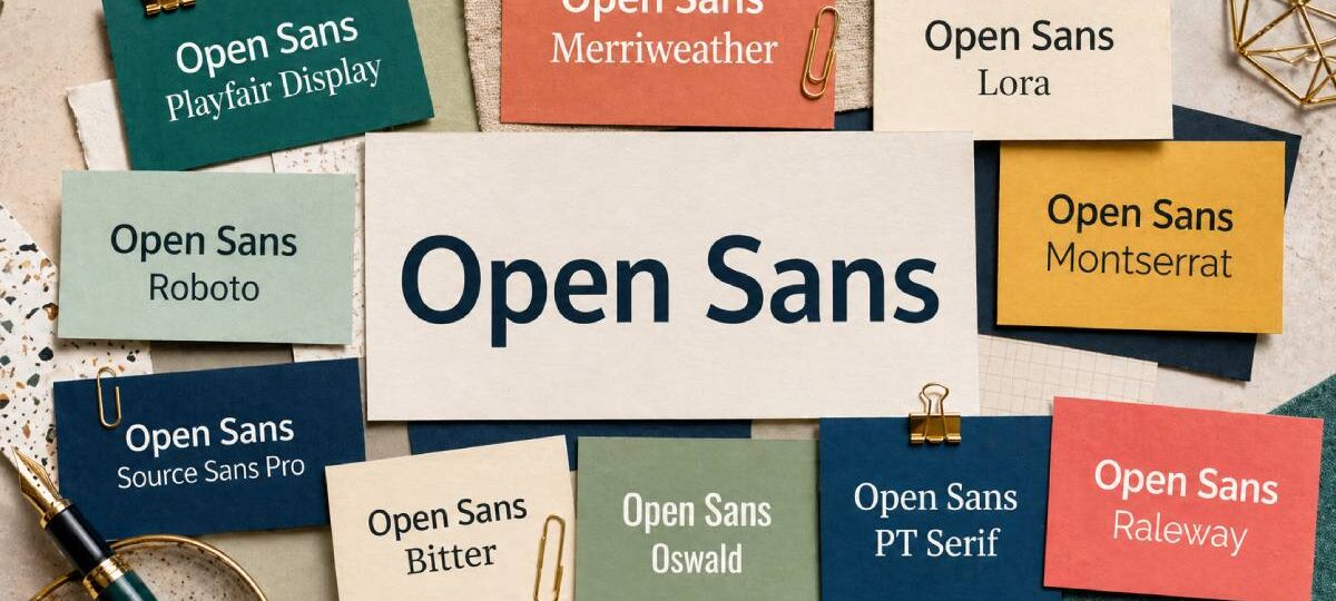
Open Sans Font Pairing Examples
Open Sans is a humanist sans-serif font designed by Steve Matteson and released in 2010. It was built for screen readability across print, web, and mobile, which makes it one of the most widely used typography choices in web design.
Because it is so neutral, it needs a companion that adds personality and contrast. Pair it with another neutral sans-serif and the result feels flat. Pair it with something too decorative and the combination falls apart.
Below are 10 tested combinations, each with weight recommendations and real use cases.
Open Sans + Playfair Display

Why This Pairing Works
Playfair Display is a transitional serif font with high contrast strokes and fine details. It brings drama and elegance that Open Sans on its own never delivers.
The structural contrast is automatic. Open Sans handles body text quietly while Playfair Display commands attention in headings. Together they create strong typographic hierarchy without forcing it.
Best Use Cases
- Editorial websites and online magazines
- Portfolio and interior design sites
- Hotel and hospitality brands
- High-end landing pages
Recommended Weight Combinations
- Playfair Display Bold (700) or Black (900) for headings
- Open Sans Regular (400) for body text
- Open Sans SemiBold (600) for navigation
Hierarchy Setup
Use Playfair Display for H1 and H2 headings. Switch to Open Sans for body copy, labels, and UI elements. The shift between the two creates a clear reading rhythm.
Where to Get It
Both fonts are free on Google Fonts. Load only the weights you need to keep page performance tight.
Open Sans + Merriweather
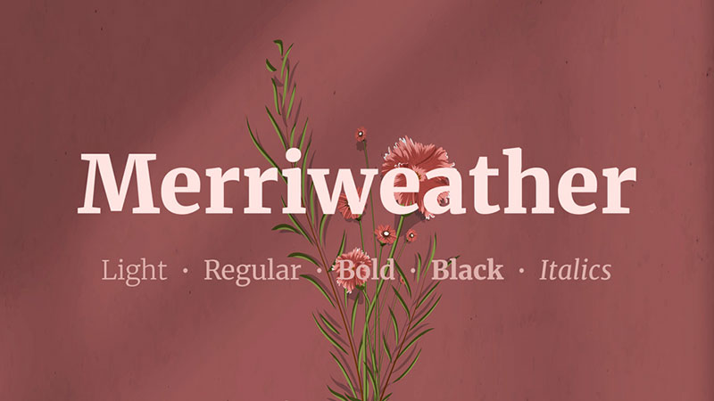
Why This Pairing Works
Merriweather was designed specifically for screen readability, just like Open Sans. Their proportions are closely matched, with large x-heights and open letterforms that align naturally at matching point sizes.
This is probably the most reliable all-purpose combination on this list. It works across blogs, documentation, marketing sites, and editorial layouts without requiring much adjustment.
Best Use Cases
- Content-heavy blogs and news sites
- Corporate and SaaS websites
- Documentation and knowledge bases
- Email newsletters
Recommended Weight Combinations
- Merriweather Bold (700) for headings
- Open Sans Regular (400) for body text
- Open Sans Light (300) for captions and metadata
Hierarchy Setup
Merriweather leads at heading sizes. Open Sans carries body copy and UI text. The serif-to-sans-serif transition feels smooth because both fonts share similar optical sizing.
Where to Get It
Free on Google Fonts. Featured on over 2.9 million websites, making it one of the most proven Google Fonts combinations available.
Open Sans + Lora
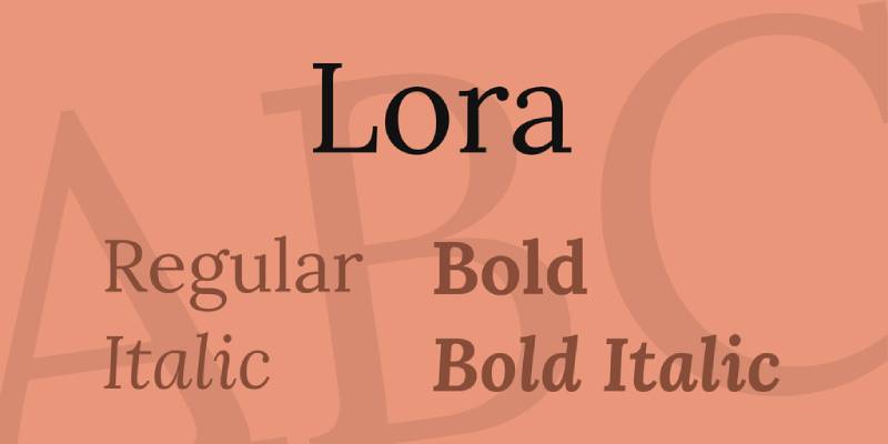
Why This Pairing Works
Lora is a calligraphic serif with brushed curves and moderate stroke contrast. It brings warmth and character that balances Open Sans’s clean, neutral structure.
Their x-heights align well. Transitions between Lora headings and Open Sans body text feel seamless rather than jarring. A widely used combination in editorial and lifestyle design.
Best Use Cases
- Lifestyle and food blogs
- Online publications and long-form articles
- Wedding and event websites
- Personal portfolios
Recommended Weight Combinations
- Lora Bold for H1 and H2 headings
- Lora Regular or Italic for pull quotes and subheadings
- Open Sans Regular (400) for body text at 16px minimum
Hierarchy Setup
Lora works best at display sizes (24px and above). Open Sans takes over for body text, captions, and navigation. Use Lora Italic sparingly for emphasis without adding extra weight.
Where to Get It
Both are free on Google Fonts. Lora also renders well in print design, so this combination works across digital and printed materials.
Open Sans + Montserrat

Why This Pairing Works
Montserrat is a geometric sans-serif inspired by urban signage in Buenos Aires. Its perfectly round bowls and uniform stroke widths create a structural contrast against Open Sans’s humanist forms.
Where Open Sans is warm and organic, Montserrat is crisp and architectural. That difference makes this a strong heading-and-body system for modern digital products.
Best Use Cases
- Startup and tech websites
- Marketing landing pages
- Agency portfolios
- E-commerce product pages
Recommended Weight Combinations
- Montserrat SemiBold (600) or Bold (700) for headings
- Open Sans Regular (400) for body text
- Open Sans Light (300) for large display captions
Hierarchy Setup
Use Montserrat at heading sizes only. It can feel monotonous in long-form body copy. Open Sans absorbs that role naturally, keeping the reading experience comfortable at paragraph level.
Where to Get It
Free on Google Fonts. Both support a wide range of weights, giving you flexibility for full visual hierarchy without loading extra font files.
Open Sans + Roboto
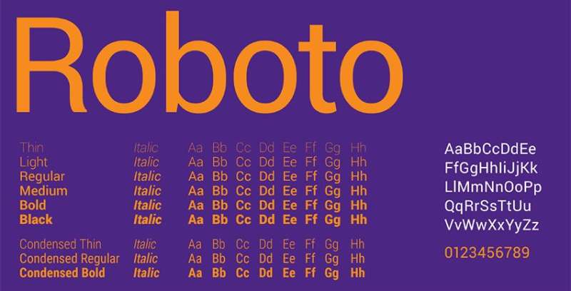
Why This Pairing Works
Roboto was originally developed by Google for Android. It has a mechanical skeleton with geometric forms but also features friendly, open curves, which means it sits comfortably alongside Open Sans without competing.
This is a practical sans-serif pairing rather than a dramatic one. It works well in UI design where clarity matters more than contrast.
Best Use Cases
- Mobile apps and UI design
- Dashboard and SaaS interfaces
- Technical documentation
- Android-first products
Recommended Weight Combinations
- Roboto Medium (500) or Bold (700) for headings and navigation
- Open Sans Regular (400) for body text
- Open Sans Light (300) for secondary labels
Hierarchy Setup
Differentiate the two through weight rather than style. Use Roboto Bold for headings and Open Sans Regular for body copy. The contrast is subtle, so rely on size and leading to reinforce structure.
Where to Get It
Both are free on Google Fonts and available via the standard Google Fonts embed method.
Open Sans + Source Sans Pro
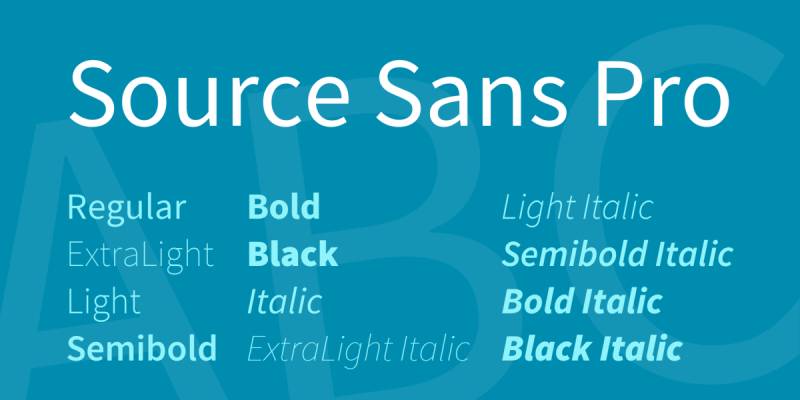
Why This Pairing Works
Source Sans Pro is Adobe’s first open-source typeface, designed by Paul D. Hunt. Like Open Sans, it was built for screen legibility. The two share similar proportions and weight distributions.
Pairing them works best when you rely on weight contrast to create hierarchy. Source Sans Pro ExtraLight or Light as display text against Open Sans Regular in body copy creates a clean, modern look.
Best Use Cases
- Corporate websites and reports
- Professional services and consulting firms
- Technical blogs and developer tools
Recommended Weight Combinations
- Source Sans Pro ExtraBold (900) or Bold (700) for headings
- Open Sans Regular (400) for body text
- Open Sans SemiBold (600) for labels and CTAs
Hierarchy Setup
Since both are humanist sans-serifs, weight and size differences do the heavy lifting here. Push heading weights high and keep body text at regular weight to avoid the pair feeling like a single-font system.
Where to Get It
Both fonts are free. Source Sans Pro is available on Google Fonts and Adobe Fonts.
Open Sans + Bitter
Why This Pairing Works
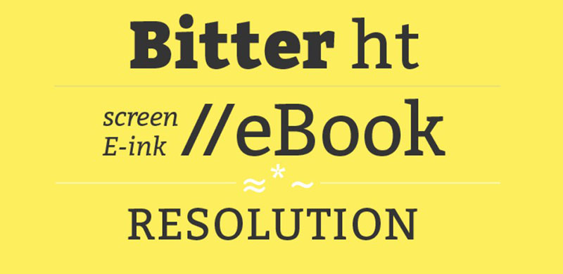
Bitter is a contemporary slab serif font by Huerta Tipografica, designed specifically for body text on screens. Its strong, stubby serifs create a clear visual distinction from Open Sans while keeping readability high.
This combination has a sturdy, editorial feel. It works especially well when you want a no-nonsense, content-first design without going full serif.
Best Use Cases
- News sites and online journalism
- Long-form content platforms
- E-books and digital reading experiences
Recommended Weight Combinations
- Bitter Bold for H1 and H2 headings
- Open Sans Regular (400) for body text
- Open Sans SemiBold (600) for subheadings and callouts
Hierarchy Setup
Let Bitter handle display sizes. Open Sans takes over for body copy and interface text. The slab-to-sans-serif shift is visually clear, so typographic hierarchy builds itself with minimal effort.
Where to Get It
Both are free on Google Fonts. Good pairing for projects where reading comfort is a top priority.
Open Sans + Oswald
Why This Pairing Works
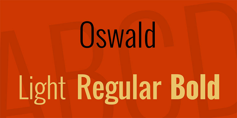
Oswald is a condensed, bold sans-serif that takes up less horizontal space while delivering strong visual impact. That narrow footprint contrasts nicely with Open Sans’s wider, more relaxed letterforms.
The pairing is popular in design, tech, and portfolio contexts. It has a modern, direct personality that suits brands that want to project confidence.
Best Use Cases
- Tech and startup brands
- Sports and fitness websites
- Portfolio and agency sites
- Bold marketing campaigns
Recommended Weight Combinations
- Oswald Bold or SemiBold for headings
- Open Sans Regular (400) for body text
- Open Sans Light (300) for secondary content
Hierarchy Setup
Oswald works best in all-caps or large heading sizes where its condensed structure reads well. Avoid using it for long body copy. Open Sans handles that role much better at paragraph level.
Where to Get It
Free on Google Fonts. Merriweather, Open Sans, and Oswald are among the most popular Google Fonts for websites based on usage data.
Open Sans + PT Serif

Why This Pairing Works
PT Serif was designed by ParaType to harmonize directly with PT Sans, which shares many structural traits with Open Sans. It includes proportions and weights designed for both screen and print use, including Cyrillic support for multilingual projects.
This is a disciplined, clean combination. It does not try to be dramatic. It just works reliably across a wide range of contexts.
Best Use Cases
- Multilingual websites
- Government and institutional sites
- Academic and research platforms
- Professional services firms
Recommended Weight Combinations
- PT Serif Bold for headings
- PT Serif Regular or Italic for subheadings and pull quotes
- Open Sans Regular (400) for body text
Hierarchy Setup
PT Serif and Open Sans share similar optical sizing, so they sit well together without manual kerning adjustments. Use tracking on Open Sans headings if you use it for any display text alongside PT Serif.
Where to Get It
Both are free on Google Fonts. PT Serif is featured on over 1 million websites and has strong cross-browser rendering.
Open Sans + Raleway
Why This Pairing Works
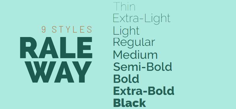
Raleway is an elegant, thin sans-serif developed by Matt McInerney in 2010. Its delicate strokes and distinctive letterforms (especially the “W”) give it a refined personality that Open Sans lacks on its own.
This combination leans sophisticated. The contrast between Raleway’s thin, decorative character and Open Sans’s clean body text creates a refined reading experience without going full serif.
Best Use Cases
- Fashion and lifestyle brands
- Beauty and wellness websites
- Luxury product pages
- Creative agency portfolios
Recommended Weight Combinations
- Raleway ExtraLight (200) or Thin (100) for large display headings
- Raleway SemiBold (600) for subheadings
- Open Sans Regular (400) for body text
Hierarchy Setup
Raleway’s thin weights only read well at large sizes (36px and above). Below that, switch to SemiBold. Open Sans takes over completely for body copy, where Raleway’s delicate strokes would reduce readability at smaller sizes.
Where to Get It
Both are free on Google Fonts. If you want to experiment before committing to a combination, try the font pairing generator to preview these together in real time.
FAQ on Open Sans Font Pairing
What fonts pair best with Open Sans?
The strongest combinations are Playfair Display, Merriweather, Lora, and Montserrat. Serif fonts create natural contrast against Open Sans’s humanist structure. For sans-serif pairings, Montserrat and Oswald work well when differentiated through weight and size.
Should I use Open Sans as a heading or body font?
Open Sans works best as a body font. Its neutral character and high legibility make it ideal for long-form reading. For headings, pair it with a serif or a more distinctive sans-serif that adds personality and visual weight at display sizes.
Does Open Sans pair well with serif fonts?
Yes. Serif fonts produce the strongest Open Sans combinations. The contrast between Open Sans’s smooth humanist forms and the organic stroke variation of a serif font builds clear typographic hierarchy without forcing it.
What is the best Open Sans pairing for websites?
Merriweather and Open Sans is the most reliable web combination. Both were designed for screen readability. Their proportions match naturally, and the pairing works across blogs, corporate sites, documentation, and marketing pages without requiring manual size adjustments.
Can I pair two sans-serif fonts with Open Sans?
You can, but it needs care. Avoid fonts too similar in structure. Montserrat and Oswald work because their geometric or condensed forms contrast clearly with Open Sans’s warmer, wider letterforms. Weight difference alone is not always enough to create visible hierarchy.
What weights should I use when pairing fonts with Open Sans?
Use Open Sans Regular (400) for body text and Light (300) for captions. For heading companions, Bold (700) or SemiBold (600) creates enough contrast. Avoid loading the full font family to keep page load fast.
Is Open Sans good for branding and logo design?
It works in supporting roles within a brand system but rarely as the primary display face. Its neutral character suits UI and body copy in brand guidelines. For a logo, pair it with something more distinctive as the lead font.
What is the best Open Sans pairing for editorial design?
Playfair Display for headings and Open Sans for body text is a go-to editorial combination. The high-contrast strokes of Playfair create visual impact at display sizes while Open Sans keeps long-form content comfortable to read across devices.
Does Open Sans work well in UI and app design?
Yes. It was optimized for screen interfaces from the start. Roboto and Open Sans work well together in UI contexts. Both are clean and legible at small sizes, making them reliable choices for dashboards, mobile apps, and product interfaces.
Where can I find and use Open Sans font pairings for free?
All combinations in this guide are available free on Google Fonts. You can also preview combinations before committing using the font pairing generator. Load only the weights you need to keep performance clean.
Conclusion
This conclusion is for an article presenting the most practical Open Sans font combinations for web and UI design.
Every pairing covered here serves a different need. Merriweather for reliable screen readability. Playfair Display for editorial impact. Montserrat for clean, geometric contrast. Raleway for refined, fashion-forward layouts.
The right choice depends on your project’s tone, your color palette, and the visual hierarchy you are building.
Pay attention to font spacing, weight contrast, and how each combination reads at both heading and body sizes. Good pairing fonts is less about rules and more about balance.
Start with one combination, test it in context, and adjust from there.

Renowned for his expertise in logo design and visual branding, Bogdan has developed a multitude of logos for various clients.
His skills extend to creating posters, vector illustrations, business cards, and brochures. Additionally, Bogdan's UI kits were featured on marketplaces like Visual Hierarchy and UI8.
He also wrote in the past years on sites like Design Your Way, WebDesignerDepot, WPDean, Designmodo, Speckyboy, Slider Revolution, and more.
- The Windsurf Logo History, Colors, Font, And Meaning - 10 October 2026
- How to Remove Background From Product Photos (No Photoshop) - 10 October 2026
- How Designers can Build a Stronger Online Creative Identity - 9 October 2026

Bogdan Sandu is a seasoned designer who has been designing websites since 2008. Renowned for his expertise in logo design and visual branding, Bogdan has developed a multitude of logos for various clients. His skills extend to creating posters, vector illustrations, business cards, and brochures. Additionally, Bogdan's UI kits were featured on marketplaces like Visual Hierarchy and UI8. He also wrote in the past years on sites like Design Your Way, WebDesignerDepot, WPDean, Designmodo, Speckyboy, Slider Revolution, and more.
You Might Also Like