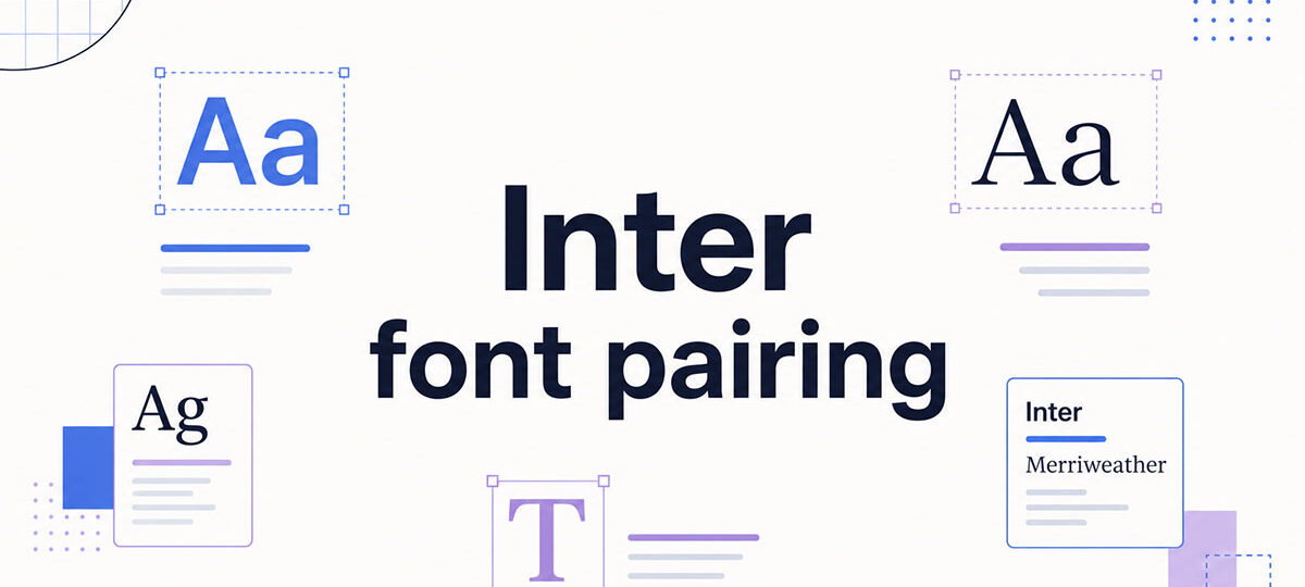
Most designers pick Inter for body text and then spend way too long figuring out what to put next to it.
Designed by Rasmus Andersson, Inter has become the default UI typeface for SaaS products, dashboards, and web apps. It’s neutral, highly legible, and works at almost any size. That neutrality is also its one weakness – without a strong companion font, it can feel flat.
This guide covers the best Inter font pairings across different use cases – from editorial serifs like Playfair Display and Lora to display options like Bebas Neue and Space Grotesk.
You’ll find specific weight recommendations, the typographic reason each pairing works, and exactly where to use each combination. All fonts listed are available free on Google Fonts.
Inter Font Pairing Ideas
Inter + Playfair Display

What This Pairing Looks Like
High contrast. Playfair Display’s dramatic thick-thin strokes sit at the opposite end of the spectrum from Inter’s even, neutral weight. The result is a clear editorial hierarchy – Playfair commands the headline, Inter handles everything below it.
Best Use Cases
- Luxury brand landing pages and hero sections
- Editorial features and creative portfolios
- Marketing pages that need visual drama without losing readability
How to Use It
Use Playfair Display Bold (700) for hero headings, Playfair Regular (400) for subheadings. Inter Regular (400) for body text, Inter Medium (500) for captions and metadata. Set Playfair at 48px or larger – its hairline serifs need space to breathe.
Why It Works with Inter
The two fonts share compatible proportions but occupy completely different tonal registers. Playfair brings 18th-century elegance; Inter brings screen-first precision. The contrast feels intentional, not random.
Free or Paid
Both available free on Google Fonts.
—
Inter + Merriweather
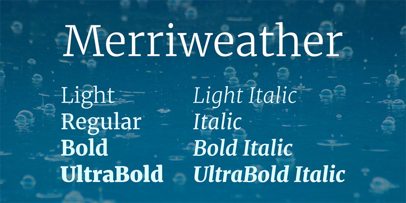
What This Pairing Looks Like
Clean and sturdy. Both fonts were built for screen readability, and it shows. Merriweather’s large x-height and thick serifs anchor headings well, while Inter keeps body text crisp and open.
Best Use Cases
- Documentation sites and content-heavy blogs
- News and editorial platforms
- SaaS marketing pages that need a trustworthy tone
How to Use It
Merriweather Bold (700) for headings, Inter Regular (400) for body text. Both fonts share tall x-heights, so they sit naturally together without size adjustments. Works in either direction – Inter headings with Merriweather body text also holds up well.
Why It Works with Inter
They were both designed with screen readability as the first priority. Similar x-heights and open letterforms create a consistent scanning rhythm. The serif-sans contrast adds typographic hierarchy without any tonal clash.
Free or Paid
Both available free on Google Fonts.
—
Inter + Lora
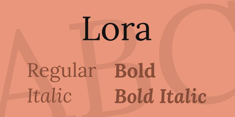
What This Pairing Looks Like
Warm and polished. Lora’s calligraphic curves contrast with Inter’s mechanical precision in a way that feels considered, not forced. The x-heights align closely, so the transition between the two reads naturally.
Best Use Cases
- Blogs and long-form content platforms
- Email newsletters and digital magazines
- Portfolio case studies and brand storytelling
How to Use It
Lora SemiBold (600) or Bold (700) for headings, Inter Regular (400) for body text, Inter Medium (500) for subheadings. Lora can also flip to body text with Inter Bold headings – both directions work.
Why It Works with Inter
Lora’s brushed serif texture offsets Inter’s neutrality without disrupting readability. It is probably the most versatile all-around serif pairing for Inter, covering the widest range of project types.
Free or Paid
Both available free on Google Fonts.
—
Inter + IBM Plex Serif
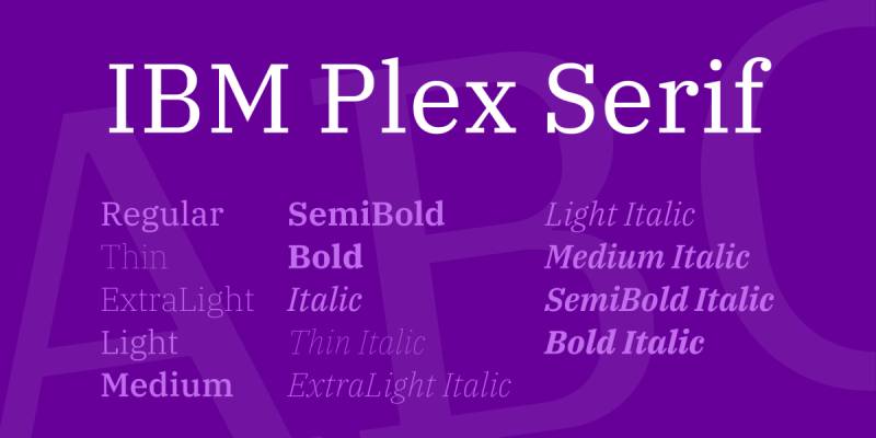
What This Pairing Looks Like
Systematic and authoritative. IBM Plex Serif carries institutional weight without feeling cold. Its subtly angled stress and distinctive lowercase ‘g’ add just enough personality to offset Inter’s uniformity.
Best Use Cases
- B2B product sites and SaaS platforms
- Annual reports and white papers
- Technical documentation with editorial sections
How to Use It
IBM Plex Serif Regular (400) or Bold (700) for headings, Inter Regular (400) for body text. Similar x-heights mean both fonts can serve as body text if needed. The combination works well as a complete design system font stack.
Why It Works with Inter
Both fonts come from systematic design philosophies. They share proportional DNA, making the pairing feel cohesive rather than contrived. IBM Plex Serif adds personality that Inter intentionally avoids.
Free or Paid
Both available free on Google Fonts and IBM’s open-source repository.
—
Inter + Libre Baskerville
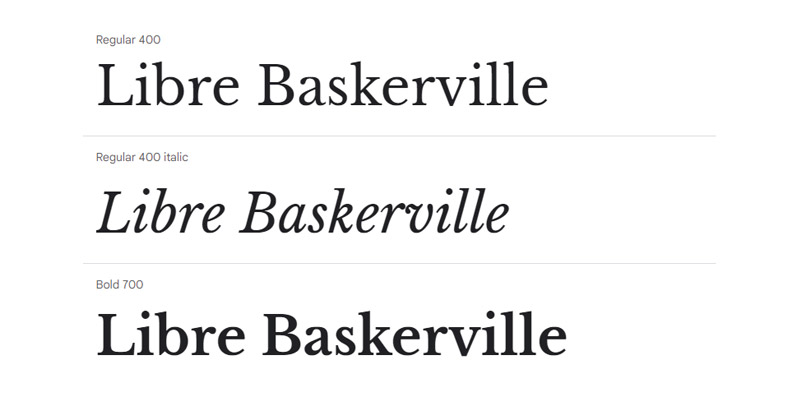
What This Pairing Looks Like
Classic meets modern. Libre Baskerville’s sturdy serifs and old-world character sit in strong contrast to Inter’s screen-first rationalism. The result reads as professional and editorial.
Best Use Cases
- Literary blogs and publishing websites
- Law, finance, and professional services sites
- Academic or research-focused content
How to Use It
Libre Baskerville Bold (700) for headings, Libre Baskerville Regular (400) for pull quotes, Inter Regular (400) for body text. It was optimized for web use, so it holds up well at smaller sizes.
Why It Works with Inter
Libre Baskerville was rebuilt specifically for screen rendering. Its taller x-height and wider counters align well with Inter’s proportions, making the pairing feel balanced rather than mismatched.
Free or Paid
Both available free on Google Fonts.
—
Inter + Cormorant Garamond
What This Pairing Looks Like
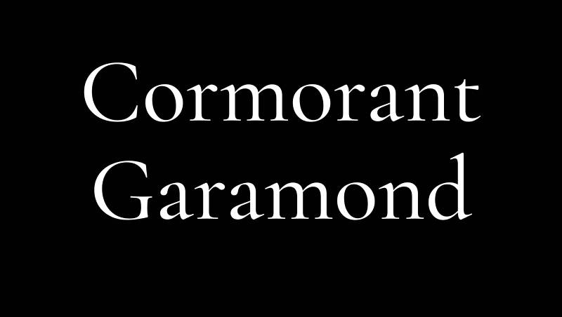
Striking and refined. Cormorant Garamond’s hairline strokes and classical proportions create a dramatic counterpoint to Inter’s utilitarian clarity. This is a high-contrast pairing – not subtle at all.
Best Use Cases
- Fashion editorial and luxury brand sites
- Art gallery and cultural institution pages
- High-end restaurant and hospitality websites
How to Use It
Cormorant Garamond works only at large display sizes – 36px and above. Use it at SemiBold (600) for headings, Inter Regular (400) for body text. Do not use Cormorant Garamond for body text; its hairline strokes break down at smaller sizes.
Why It Works with Inter
Each font is excellent at its own scale. Cormorant brings elegance where Inter would look bland at large sizes; Inter stays legible at body sizes where Cormorant would strain readability. The typographic contrast is functional, not just decorative.
Free or Paid
Both available free on Google Fonts.
—
Inter + Domine
What This Pairing Looks Like
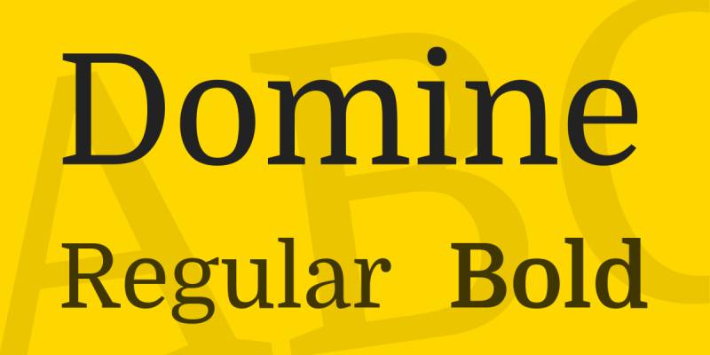
Grounded and readable. Domine was designed specifically for web body text, with performance at 14–16px as a core goal. Paired with Inter, it creates a clean, functional typographic stack with no visual friction.
Best Use Cases
- News sites and online publications
- Professional blogs and documentation
- Any content-first layout that needs reliable readability
How to Use It
Inter Bold (700) or SemiBold (600) for headings, Domine Regular (400) for body text. Works well at even small font sizes. Domine holds up at 11–13px, which makes it a good pick for dense content layouts.
Why It Works with Inter
Domine’s sturdy slab-influenced serifs contrast cleanly with Inter’s open sans-serif forms. Both fonts share a screen-first design philosophy, so they complement each other without competing.
Free or Paid
Both available free on Google Fonts.
—
Inter + Oswald
What This Pairing Looks Like
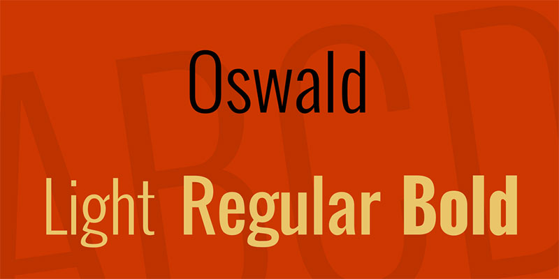
Bold and functional. Oswald’s condensed gothic structure grabs attention in headings, while Inter handles body text and UI elements with neutral clarity. The width contrast between the two is the main visual driver here.
Best Use Cases
- SaaS dashboards and analytics platforms
- Developer tools and data-heavy interfaces
- Tech startup websites and product pages
How to Use It
Oswald Medium (500) or Bold (700) for headings only – it is not a body text font. Inter Regular (400) for body text, Inter Medium (500) for secondary labels and table headers. The condensed-to-normal width contrast creates a clear visual hierarchy without relying on size alone.
Why It Works with Inter
Oswald announces, Inter explains. Their functional contrast is immediate: Oswald’s narrow vertical emphasis cuts through dense content blocks, while Inter’s open proportions keep the supporting text readable.
Free or Paid
Both available free on Google Fonts.
—
Inter + Space Grotesk
What This Pairing Looks Like
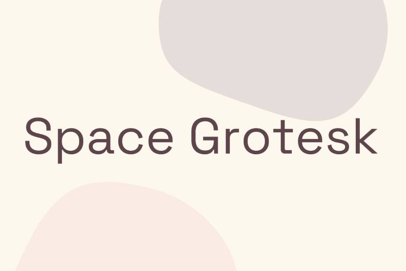
Technical and distinctive. Space Grotesk carries monospace heritage – squared terminals, a single-story ‘a’, and a slightly quirky personality. Against Inter’s polished neutrality, it gives headings a technical edge without overcomplicating the layout.
Best Use Cases
- Developer tools and API documentation
- Open-source project sites and design systems
- Data visualization dashboards and fintech products
How to Use It
Space Grotesk Medium (500) or Bold (700) for headings, Inter Regular (400) for body text, Inter Medium (500) for code comments and metadata. Both are variable fonts, which simplifies the font loading stack considerably.
Why It Works with Inter
Space Grotesk’s monospace roots signal engineering culture while Inter keeps the interface clean and readable. They share geometric DNA but occupy different personality registers – Space Grotesk has character, Inter steps back.
Free or Paid
Both available free on Google Fonts.
—
Inter + Bebas Neue
What This Pairing Looks Like
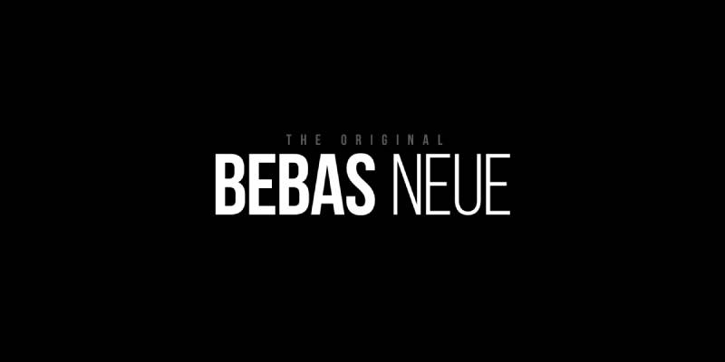
High impact, clean contrast. Bebas Neue is all-caps, condensed, and built for bold headlines. Set against Inter’s neutral body text, the difference in tone is immediate. It is a pairing that works best when one of them completely takes the lead.
Best Use Cases
- Tech product pages and brand refresh campaigns
- Startup pitch decks and landing pages
- Any layout where the headline needs to dominate
How to Use It
Bebas Neue for display headings only – it comes in a single Regular weight, all-caps. Use Inter Regular (400) or Medium (500) for all body text, labels, and UI copy. Keep Bebas Neue at large sizes (48px+) where its compact letterforms work best.
Why It Works with Inter
Bebas Neue’s construction is close to Inter’s in spirit – both are rational, linear, and geometric. Bebas Neue reads almost like a condensed display version of Inter, which is exactly what makes the combination feel cohesive rather than random.
Free or Paid
Both available free on Google Fonts. Bebas Neue Pro (paid) adds lowercase letters and extra weights if needed.
—
FAQ on Inter Font Pairing
What font pairs best with Inter for body text?
Lora is the most reliable choice for body text. Its x-height aligns closely with Inter’s, and its calligraphic warmth adds personality without disrupting readability.
Merriweather is a close second – sturdier, more authoritative, and built from the ground up for screen use. Both are free on Google Fonts.
Can Inter be used as a heading font?
Yes. Inter SemiBold (600) or Bold (700) works well for headings when paired with a serif font in the body – for example, Inter Bold headings with Merriweather or Source Serif Pro body text.
That said, Inter can look generic at large display sizes. If you want headings with more visual character, a display serif like Playfair Display or Cormorant Garamond does more of the heavy lifting.
Is Inter a good font for SaaS and dashboard UI?
It is one of the most used fonts in that space for good reason. Inter was designed specifically for UI – its tabular figures align numbers cleanly in tables and data views, and its open apertures stay legible at small sizes on any screen.
For dashboard-specific font combinations, Oswald or Space Grotesk as heading fonts work well alongside Inter’s body text.
What is the difference between Inter and Inter Display?
Inter Display is an optical size variant introduced in Inter version 4.0. It is optimized for text at 20px and above, with tighter letter spacing, slightly higher stroke contrast, and more refined details.
For standard body text under 20px, use the regular Inter. For large headings and display sizes, Inter Display is the better option – it was made for that context specifically.
Does Inter work well with other sans-serif fonts?
It depends on how much contrast exists between the two. Pairing Inter with a font like Space Grotesk works because Space Grotesk has a distinctive personality – squared terminals, quirky numerals – that Inter lacks.
Pairing Inter with a font like Roboto or Open Sans is tricky. They are too similar to create meaningful contrast, so the hierarchy can feel flat. If you go sans-serif plus sans-serif, the two fonts need clear differences in width, weight, or personality.
How many font weights should I load with Inter?
For most projects, three weights cover everything: Regular (400), Medium (500), and Bold (700) or SemiBold (600).
If you use Inter as a variable font, you load a single file and access the full weight range without the overhead of multiple static font files. It is the better option for performance-sensitive web projects.
Is Inter free to use commercially?
Yes. Inter is open source, released under the SIL Open Font License. You can use it in personal and commercial projects, including products, apps, and client work, with no licensing fees.
What is the best Inter font pairing for a blog?
Lora is the go-to. It handles long-form reading well, adds warmth to Inter’s neutrality, and works across a wide range of visual styles – from minimal to editorial.
If you want something with a bit more authority, Merriweather is the stronger option for content-heavy layouts. Both pair naturally with Inter’s clean UI-first typography.
Can I use Inter for print design?
You can, though Inter was designed primarily for screens. Its large x-height and open counters are optimized for low-resolution rendering, which means it can look slightly heavy in print contexts.
For print, consider pairing Inter with a serif that was designed for both screen and print – Lora or IBM Plex Serif handle the transition better than most.
What fonts are similar to Inter if I want an alternative?
The closest alternatives are DM Sans, Manrope, and Plus Jakarta Sans – all geometric sans-serifs with large x-heights and similar proportions.
Roboto and Open Sans overlap with Inter in function but differ in character: Roboto has slightly rounder curves, Open Sans carries more humanist warmth. If you want something with a bit more personality than Inter, Space Grotesk is worth testing. You can explore a detailed comparison in the fonts similar to Inter guide.
FAQ on Inter Font Pairing
What font pairs best with Inter?
Lora is the most reliable all-around choice. Its calligraphic warmth contrasts well with Inter’s neutral sans-serif structure, and their x-heights align closely. For more visual drama, Playfair Display creates a striking editorial hierarchy in hero sections.
Can Inter be used as a heading font?
Yes – Inter Bold (700) or SemiBold (600) works well for headings. Pair it with a serif body font like Merriweather or Lora for clear typographic contrast. At large display sizes, Inter can look generic, so choose carefully.
Is Inter good for UI and dashboard design?
It’s one of the best options available. Inter was built specifically for screens, with tabular figures that align numbers cleanly in tables and data views. Most SaaS products and dashboards use it as their primary UI typeface.
What is the difference between Inter and Inter Display?
Inter Display is optimized for text at 20px and above. It has tighter letter spacing and slightly higher stroke contrast than standard Inter. Use regular Inter for body text and Inter Display for large headings.
Does Inter work with other sans-serif fonts?
It depends on contrast. Space Grotesk works because its squared terminals and quirky numerals differ clearly from Inter. Pairing Inter with Roboto or Open Sans tends to fall flat – they’re too similar to create meaningful visual hierarchy.
How many Inter font weights should I load?
Three weights cover most projects: Regular (400), Medium (500), and Bold (700). If performance matters, load Inter as a variable font – one file gives you the full weight range without the overhead of multiple static files.
Is Inter free for commercial use?
Yes. Inter is open source under the SIL Open Font License. You can use it in personal and commercial projects – apps, websites, client work – with no licensing fees. It’s available on Google Fonts.
What is the best Inter pairing for a blog?
Lora for a warm, editorial tone. Merriweather if you want something sturdier and more authoritative. Both are screen-optimized serifs with proportions that sit naturally alongside Inter’s clean sans-serif body text.
What fonts are similar to Inter?
DM Sans, Manrope, and Plus Jakarta Sans are the closest alternatives – all geometric sans-serifs with large x-heights and similar proportions. Space Grotesk is worth testing if you want something with more personality than Inter.
Can Inter be used for print design?
You can use it, but Inter was designed for screens. Its large x-height can look heavy in print. For mixed print and web use, pair Inter with Lora or IBM Plex Serif – both handle the transition better than most typefaces.
“json { "@context": "https://schema.org", "@type": "FAQPage", "mainEntity": [ { "@type": "Question", "name": "What font pairs best with Inter?", "acceptedAnswer": { "@type": "Answer", "text": "Lora is the most reliable all-around choice. Its calligraphic warmth contrasts well with Inters neutral sans-serif structure, and their x-heights align closely. For more visual drama, Playfair Display creates a striking editorial hierarchy in hero sections." } }, { "@type": "Question", "name": "Can Inter be used as a heading font?", "acceptedAnswer": { "@type": "Answer", "text": "Yes - Inter Bold (700) or SemiBold (600) works well for headings. Pair it with a serif body font like Merriweather or Lora for clear typographic contrast. At large display sizes, Inter can look generic, so choose carefully." } }, { "@type": "Question", "name": "Is Inter good for UI and dashboard design?", "acceptedAnswer": { "@type": "Answer", "text": "Its one of the best options available. Inter was built specifically for screens, with tabular figures that align numbers cleanly in tables and data views. Most SaaS products and dashboards use it as their primary UI typeface." } }, { "@type": "Question", "name": "What is the difference between Inter and Inter Display?", "acceptedAnswer": { "@type": "Answer", "text": "Inter Display is optimized for text at 20px and above. It has tighter letter spacing and slightly higher stroke contrast than standard Inter. Use regular Inter for body text and Inter Display for large headings." } }, { "@type": "Question", "name": "Does Inter work with other sans-serif fonts?", "acceptedAnswer": { "@type": "Answer", "text": "It depends on contrast. Space Grotesk works because its squared terminals and quirky numerals differ clearly from Inter. Pairing Inter with Roboto or Open Sans tends to fall flat - theyre too similar to create meaningful visual hierarchy." } }, { "@type": "Question", "name": "How many Inter font weights should I load?", "acceptedAnswer": { "@type": "Answer", "text": "Three weights cover most projects: Regular (400), Medium (500), and Bold (700). If performance matters, load Inter as a variable font - one file gives you the full weight range without the overhead of multiple static files." } }, { "@type": "Question", "name": "Is Inter free for commercial use?", "acceptedAnswer": { "@type": "Answer", "text": "Yes. Inter is open source under the SIL Open Font License. You can use it in personal and commercial projects - apps, websites, client work - with no licensing fees. Its available on Google Fonts." } }, { "@type": "Question", "name": "What is the best Inter pairing for a blog?", "acceptedAnswer": { "@type": "Answer", "text": "Lora for a warm, editorial tone. Merriweather if you want something sturdier and more authoritative. Both are screen-optimized serifs with proportions that sit naturally alongside Inters clean sans-serif body text." } }, { "@type": "Question", "name": "What fonts are similar to Inter?", "acceptedAnswer": { "@type": "Answer", "text": "DM Sans, Manrope, and Plus Jakarta Sans are the closest alternatives - all geometric sans-serifs with large x-heights and similar proportions. Space Grotesk is worth testing if you want something with more personality than Inter." } }, { "@type": "Question", "name": "Can Inter be used for print design?", "acceptedAnswer": { "@type": "Answer", "text": "You can use it, but Inter was designed for screens. Its large x-height can look heavy in print. For mixed print and web use, pair Inter with Lora or IBM Plex Serif - both handle the transition better than most typefaces." } } ] } “
Conclusion
This conclusion is for an article presenting the strongest Inter font pairing options across web design, branding, and UI contexts.
The right companion typeface depends entirely on what your project needs to communicate. Cormorant Garamond signals luxury. Merriweather signals authority. Space Grotesk signals technical precision.
Inter handles the functional work in every case – navigation, body copy, labels, data tables. What changes is the heading font and the tone it sets.
Stick to two typefaces, limit your font weight choices to three, and test at actual screen sizes before committing. Most combinations that look refined at 48px in Figma fall apart at 16px on a phone.
Pick one pairing from this list, put it in front of real content, and adjust from there.

Renowned for his expertise in logo design and visual branding, Bogdan has developed a multitude of logos for various clients.
His skills extend to creating posters, vector illustrations, business cards, and brochures. Additionally, Bogdan's UI kits were featured on marketplaces like Visual Hierarchy and UI8.
He also wrote in the past years on sites like Design Your Way, WebDesignerDepot, WPDean, Designmodo, Speckyboy, Slider Revolution, and more.
- The Windsurf Logo History, Colors, Font, And Meaning - 10 October 2026
- How to Remove Background From Product Photos (No Photoshop) - 10 October 2026
- How Designers can Build a Stronger Online Creative Identity - 9 October 2026

Bogdan Sandu is a seasoned designer who has been designing websites since 2008. Renowned for his expertise in logo design and visual branding, Bogdan has developed a multitude of logos for various clients. His skills extend to creating posters, vector illustrations, business cards, and brochures. Additionally, Bogdan's UI kits were featured on marketplaces like Visual Hierarchy and UI8. He also wrote in the past years on sites like Design Your Way, WebDesignerDepot, WPDean, Designmodo, Speckyboy, Slider Revolution, and more.
You Might Also Like