Most font combinations look fine. A few actually work.
Getting DM Sans font pairing right means understanding what makes this geometric sans-serif tick. Designed by Colophon Foundry for Google, DM Sans is clean, neutral, and low-contrast. It doesn’t shout. That’s its strength.
But neutrality has a cost. Pair it with the wrong typeface and the whole type system falls flat. Pair it well and you get a typographic hierarchy that feels effortless.
This guide covers 10 DM Sans combinations that work across web design, branding, and editorial layouts, with specific font roles, weights, and use cases for each.
DM Sans Font Pairing
DM Sans is a low-contrast sans-serif font designed by Colophon Foundry, commissioned by Google in 2019. It’s geometric, neutral, and clean. That neutrality is exactly what makes it such a strong base for pairing.
It doesn’t compete. It supports. And when you put it next to the right serif font, the contrast in style creates a clear typographic hierarchy without any extra effort.
Below are 10 of the best DM Sans font combinations, each with practical details on how to use them.
DM Sans + DM Serif Display
What This Pairing Looks Like
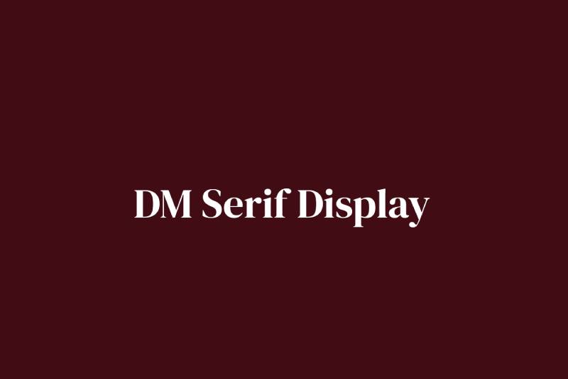
High-contrast transitional serifs meet a clean geometric sans. The calligraphic strokes of DM Serif Display create an immediate visual contrast against DM Sans’s smooth, even letterforms.
Why It Works
Both fonts come from the same type system, commissioned by Google from Colophon Foundry. They share proportions and spacing logic, so they feel designed together. Because they are.
The contrast between thin hairline serifs and the neutral sans creates strong visual visual hierarchy without requiring heavy font weights.
Font Roles
- Heading: DM Serif Display, Regular (400)
- Body: DM Sans, Regular (400) or Light (300)
Weight and Size Recommendations
Use DM Serif Display at 36px and above. Below that size, the fine details get lost. DM Sans body text works well at 16-18px.
Best Use Cases
- SaaS landing pages
- Tech brand websites
- Product documentation
- Startup branding
Mood and Tone
Modern, polished, and trustworthy. This is a go-to for product design and UI typography where you want sophistication without looking like a fashion brand.
Where to Get It
Both fonts are free on Google Fonts.
DM Sans + Playfair Display

What This Pairing Looks Like
Elegant high-contrast serifs paired with a clean, low-contrast sans. Playfair Display is expressive and editorial. DM Sans keeps it grounded.
Why It Works
Playfair Display’s dramatic thick-thin stroke variation creates a strong emphasis in headings. DM Sans balances it with a neutral, readable body text. The result is a pairing with both personality and clarity.
It’s widely used in real-world projects. Webflow has used this combination in their own design work alongside other typefaces.
Font Roles
- Heading: Playfair Display, Bold (700) or Black (900)
- Body: DM Sans, Regular (400)
Weight and Size Recommendations
Playfair Display at Bold or Black for hero headlines. Use DM Sans Medium (500) for subheadings and Regular (400) for body text.
Best Use Cases
- Editorial and magazine layouts
- Luxury brand websites
- Wedding and lifestyle branding
- Portfolio sites
Mood and Tone
Sophisticated and editorial. This pairing has a refined feel without being cold.
Where to Get It
Both free on Google Fonts. Also available via Adobe Fonts.
DM Sans + Lora
What This Pairing Looks Like
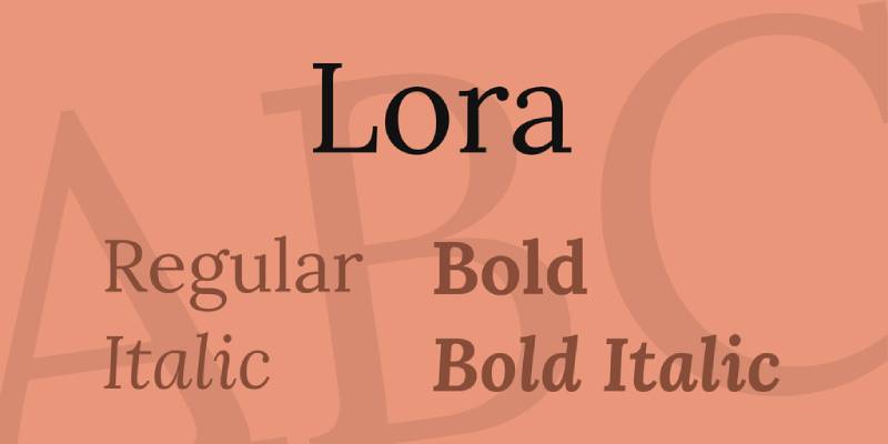
A warm, calligraphic serif paired with a clean geometric sans. Lora has a literary quality that DM Sans doesn’t try to replicate. That difference is the point.
Why It Works
Lora was designed specifically for screen readability at body text sizes. It has a generous x-height and open letter spacing, which makes long-form reading comfortable. DM Sans works well as the heading font here because its clean geometry contrasts Lora’s calligraphic character.
Either font can take the heading role. Both directions work.
Font Roles
- Option A: DM Sans heading + Lora body
- Option B: Lora heading + DM Sans body
Weight and Size Recommendations
Lora Bold (700) for headings. DM Sans Regular (400) for body, or vice versa. Keep leading generous at around 1.6-1.7 for body text.
Best Use Cases
- Blogs and long-form articles
- Health and wellness brands
- Online publications
Mood and Tone
Warm, readable, and approachable. Good for content-heavy sites where readability is the priority.
Where to Get It
Both free on Google Fonts.
DM Sans + Merriweather
What This Pairing Looks Like
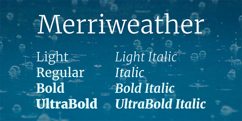
A sturdy, screen-optimized serif paired with a neutral geometric sans. Merriweather reads with authority. DM Sans keeps the UI elements clean.
Why It Works
Merriweather was built for on-screen reading by Eben Sorkin. It has a large x-height, strong serifs, and tight spacing that holds up well at small sizes. DM Sans complements this by handling headings or UI labels without competing for attention.
The font spacing of both fonts aligns well, making the transition between heading and body feel smooth.
Font Roles
- Heading: DM Sans, SemiBold (600) or Bold (700)
- Body: Merriweather, Regular (400)
Weight and Size Recommendations
Merriweather at 16px minimum for body. DM Sans heading size 28-48px depending on context.
Best Use Cases
- News and media sites
- Documentation and technical blogs
- Corporate websites
Mood and Tone
Authoritative and reliable. A no-fuss combination that works across almost any professional context.
Where to Get It
Both free on Google Fonts.
DM Sans + Cormorant Garamond
What This Pairing Looks Like
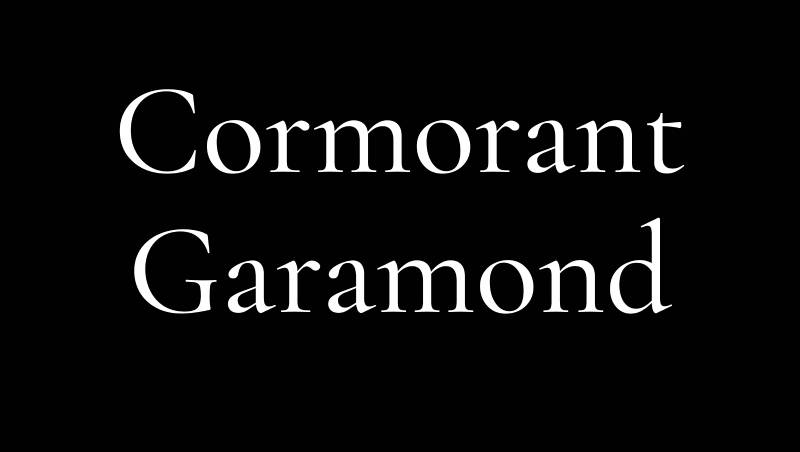
High-drama serifs with razor-thin strokes paired with an ultra-clean sans. Cormorant Garamond is one of the most visually striking display fonts available for free.
Why It Works
Cormorant Garamond is designed by Christian Thalmann, inspired by Claude Garamond’s 16th-century work but redrawn for screen. Its calligraphic roots and high stroke contrast create a pairing with DM Sans that feels both modern and editorial.
The key rule: use Cormorant Garamond only at large sizes (36px+). Its fine details disappear at smaller sizes.
Font Roles
- Heading: Cormorant Garamond, SemiBold (600)
- Body: DM Sans, Regular (400)
Weight and Size Recommendations
Never use Cormorant Garamond below 32px. DM Sans handles subheadings at Medium (500) and body at Regular (400).
Best Use Cases
- Luxury brand identity
- High-end hospitality and restaurants
- Art and photography portfolios
- Wedding stationery and event sites
Mood and Tone
Refined, elegant, high-end. This is not the right pairing for a SaaS product or tech blog. It signals luxury.
Where to Get It
Both free on Google Fonts. Use the font pairing generator to preview combinations.
DM Sans + Libre Baskerville
What This Pairing Looks Like
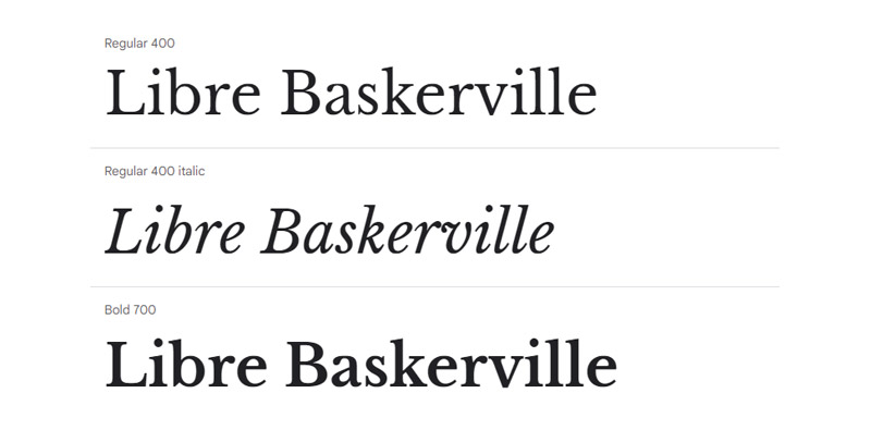
A classic transitional serif paired with a modern geometric sans. Libre Baskerville has the kind of structured, clean serif style that holds up in print and on screen.
Why It Works
Libre Baskerville is an open-source version of the classic Baskerville typeface, optimized for web. Its serifs are clean and its letterforms are familiar, which gives DM Sans a trustworthy partner. The balance between classic and modern works well for brands that want credibility without looking outdated.
Font Roles
- Heading: Libre Baskerville, Bold (700)
- Body: DM Sans, Regular (400)
Weight and Size Recommendations
Libre Baskerville Bold for headings. DM Sans works well at 15-17px for body text. Adjust tracking slightly for headings if they feel tight.
Best Use Cases
- Law firms and professional services
- Finance and banking sites
- Academic and editorial content
Mood and Tone
Professional, structured, and trustworthy. The kind of brand typography that signals competence.
Where to Get It
Both free on Google Fonts.
DM Sans + EB Garamond
What This Pairing Looks Like
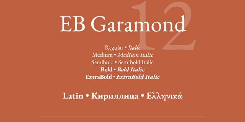
A Renaissance-era serif revival paired with a contemporary geometric sans. EB Garamond is scholarly and warm. DM Sans adds a modern, functional edge.
Why It Works
EB Garamond is Georg Duffner’s open-source revival of Claude Garamond’s original 16th-century designs. It has a warm, humanist quality that contrasts well with DM Sans’s cool geometric structure.
The contrast in style, not just in serif vs. sans, is what gives this pairing its character. EB Garamond brings history. DM Sans brings precision.
Font Roles
- Heading: EB Garamond, Regular (400) or SemiBold (600)
- Body: DM Sans, Regular (400)
Weight and Size Recommendations
EB Garamond works best at larger heading sizes. Use DM Sans for body and UI elements to keep digital readability strong.
Best Use Cases
- Literary and cultural publications
- University and academic sites
- Book publishing and author websites
Mood and Tone
Intellectual, classic, and considered. Good for contexts where knowledge and depth matter.
Where to Get It
Both free on Google Fonts.
DM Sans + Fraunces
What This Pairing Looks Like
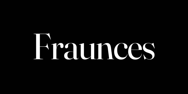
A quirky, optical-size serif with soft, distinctive letterforms paired with a clean, neutral sans. Fraunces has personality. DM Sans lets it breathe.
Why It Works
Fraunces is a variable font with a unique “wonk” axis, giving it a slightly irregular, handcrafted quality. DM Sans is the stable counterpart that keeps the pairing functional and readable.
This is one of those combinations that feels fresh without being trendy. Fraunces has enough originality to give a brand genuine character.
Font Roles
- Heading: Fraunces, Regular or SemiBold with wonk axis enabled
- Body: DM Sans, Regular (400)
Weight and Size Recommendations
Use Fraunces at display sizes (32px+) to get the most out of its character. DM Sans at Regular for body, Light (300) for captions.
Best Use Cases
- Food and beverage brands
- Creative agency sites
- Lifestyle and wellness blogs
- Independent publications
Mood and Tone
Warm, creative, and distinctive. Less formal than Garamond-style pairings but still thoughtful.
Where to Get It
Both free on Google Fonts.
DM Sans + Source Serif 4
What This Pairing Looks Like
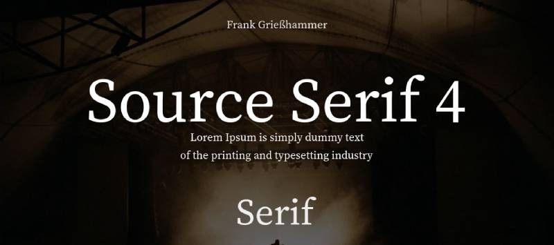
A practical, screen-optimized serif paired with a geometric sans. Both fonts prioritize readability, so this pairing is less about dramatic contrast and more about smooth, reliable reading.
Why It Works
Source Serif 4 was designed by Frank Grießhammer for Adobe and is optimized for text use at screen sizes. It’s not flashy, and that’s the point. DM Sans and Source Serif 4 share similar proportions and spacing logic, so the two fonts sit comfortably next to each other without adjustment.
Interestingly, DM Serif Display was derived from Source Serif, so there’s a family connection to DM Sans here too.
Font Roles
- Heading: DM Sans, Bold (700) or SemiBold (600)
- Body: Source Serif 4, Regular (400)
Weight and Size Recommendations
Source Serif 4 at 16-18px for body. DM Sans at 24-48px for headings. Keep leading at 1.5-1.7 for body text blocks.
Best Use Cases
- Product documentation
- Technical blogs and developer content
- News and information sites
Mood and Tone
Clean, functional, and clear. No drama, just good readability. Solid for any content-heavy digital product.
Where to Get It
Both free on Google Fonts.
DM Sans + Nunito

What This Pairing Looks Like
Two rounded, friendly sans-serif fonts in a same-style pairing. Nunito has softly rounded terminals, giving it a warm, approachable look that contrasts gently with DM Sans’s more precise geometry.
Why It Works
This is a sans-on-sans pairing, which requires contrast through weight and size rather than style. DM Sans handles headings with a crisper, more neutral feel. Nunito handles body text with warmth and softness.
The combination works for educational platforms and community products where you want to feel accessible rather than corporate.
Font Roles
- Heading: DM Sans, Bold (700) or SemiBold (600)
- Body: Nunito, Regular (400)
Weight and Size Recommendations
Use 2-3 weights maximum. DM Sans Bold for headings, Nunito Regular for body, Nunito SemiBold for subheadings or labels.
Best Use Cases
- Educational platforms and e-learning
- Health and wellness apps
- Community and non-profit sites
- Children’s digital products
Mood and Tone
Friendly, warm, and accessible. This is not the pairing for a luxury brand. It’s the pairing for a product that needs to feel easy and welcoming.
Where to Get It
Both free on Google Fonts. Also compatible with how to pair fonts workflows in Figma and Webflow.
FAQ on DM Sans Font Pairing
What fonts pair best with DM Sans?
DM Serif Display, Playfair Display, Lora, Merriweather, and Cormorant Garamond are the strongest options. Each brings serif contrast to DM Sans’s clean geometry. The right choice depends on your project’s tone and whether you need warmth, elegance, or authority.
Is DM Sans good for body text?
Yes. DM Sans is a low-contrast geometric sans-serif with strong screen readability. Its open letterforms and neutral character make it comfortable at 15-18px. It works well as body text when paired with a more expressive serif heading font.
What is the best serif font to pair with DM Sans?
DM Serif Display is the most natural match since both fonts share the same type system. For editorial projects, Playfair Display works well. For long-form reading, Lora or Merriweather are more reliable choices at body text sizes.
Can you pair DM Sans with another sans-serif font?
Yes, but it requires contrast through weight and size. DM Sans paired with Nunito works because Nunito’s rounded terminals differ enough in character. Avoid pairing DM Sans with fonts that are too similar in structure, like Inter or Roboto.
What is DM Sans used for?
DM Sans is widely used in web design, SaaS products, UI design systems, and tech branding. Its neutral, geometric structure suits dashboards, landing pages, and product interfaces where clarity matters more than personality.
What weight should I use for DM Sans headings?
SemiBold (600) or Bold (700) work best for headings. Regular (400) suits body text and UI labels. Avoid using more than 2-3 weights in a single project. Extra weights add page load without adding meaningful visual contrast.
Is DM Sans free to use?
Yes. DM Sans is an open-source font available on Google Fonts under the SIL Open Font License. It is free for personal and commercial use. No font licensing fees apply when loading it via the Google Fonts API.
How does DM Sans compare to Inter?
Both are clean, screen-optimized sans-serif fonts designed for digital use. Inter has a larger weight range and tighter spacing. DM Sans has a slightly warmer feel with more open counters. Inter is more common in developer tools; DM Sans in product branding.
What font size should I use for DM Sans body text?
px is the standard minimum for web body text. DM Sans reads comfortably at 16-18px with a leading of 1.5-1.7. For smaller UI labels or captions, 13-14px works with Light (300) or Regular (400) weight.
Does DM Sans work for print design?
DM Sans was designed primarily for screen use. It works in print design for short text like headlines or captions, but for long-form print body text, a traditional serif like Garamond or Baskerville will perform better at small point sizes.
Conclusion
The right pairing comes down to context. A SaaS product needs something different from a luxury editorial layout.
DM Serif Display keeps things within the same type family. Playfair Display and Cormorant Garamond push toward elegance. Merriweather and Lora prioritize screen readability for long-form content.
Each combination covered here has a specific role, recommended variable font weights, and use cases that actually match real project needs.
Pick based on brand typography goals, not trends. Test at actual screen sizes. And keep your font stack to two typefaces maximum.

Renowned for his expertise in logo design and visual branding, Bogdan has developed a multitude of logos for various clients.
His skills extend to creating posters, vector illustrations, business cards, and brochures. Additionally, Bogdan's UI kits were featured on marketplaces like Visual Hierarchy and UI8.
He also wrote in the past years on sites like Design Your Way, WebDesignerDepot, WPDean, Designmodo, Speckyboy, Slider Revolution, and more.
- The Windsurf Logo History, Colors, Font, And Meaning - 10 October 2026
- How to Remove Background From Product Photos (No Photoshop) - 10 October 2026
- How Designers can Build a Stronger Online Creative Identity - 9 October 2026

Bogdan Sandu is a seasoned designer who has been designing websites since 2008. Renowned for his expertise in logo design and visual branding, Bogdan has developed a multitude of logos for various clients. His skills extend to creating posters, vector illustrations, business cards, and brochures. Additionally, Bogdan's UI kits were featured on marketplaces like Visual Hierarchy and UI8. He also wrote in the past years on sites like Design Your Way, WebDesignerDepot, WPDean, Designmodo, Speckyboy, Slider Revolution, and more.
You Might Also Like