
Google Font Pairings
These Google font pairings put two free fonts together in real layouts: an article, a landing page, pricing cards or a dashboard. Pick a pair, edit the text, switch to dark mode, then copy the code.
- Fonts
- 29 Google Fonts families
- License
- Free, SIL Open Font License or Apache 2.0
- Code
- Google Fonts link, CSS or Tailwind
- Pairings
- 15 tested
Use this pairing
Every Google font pairing side by side
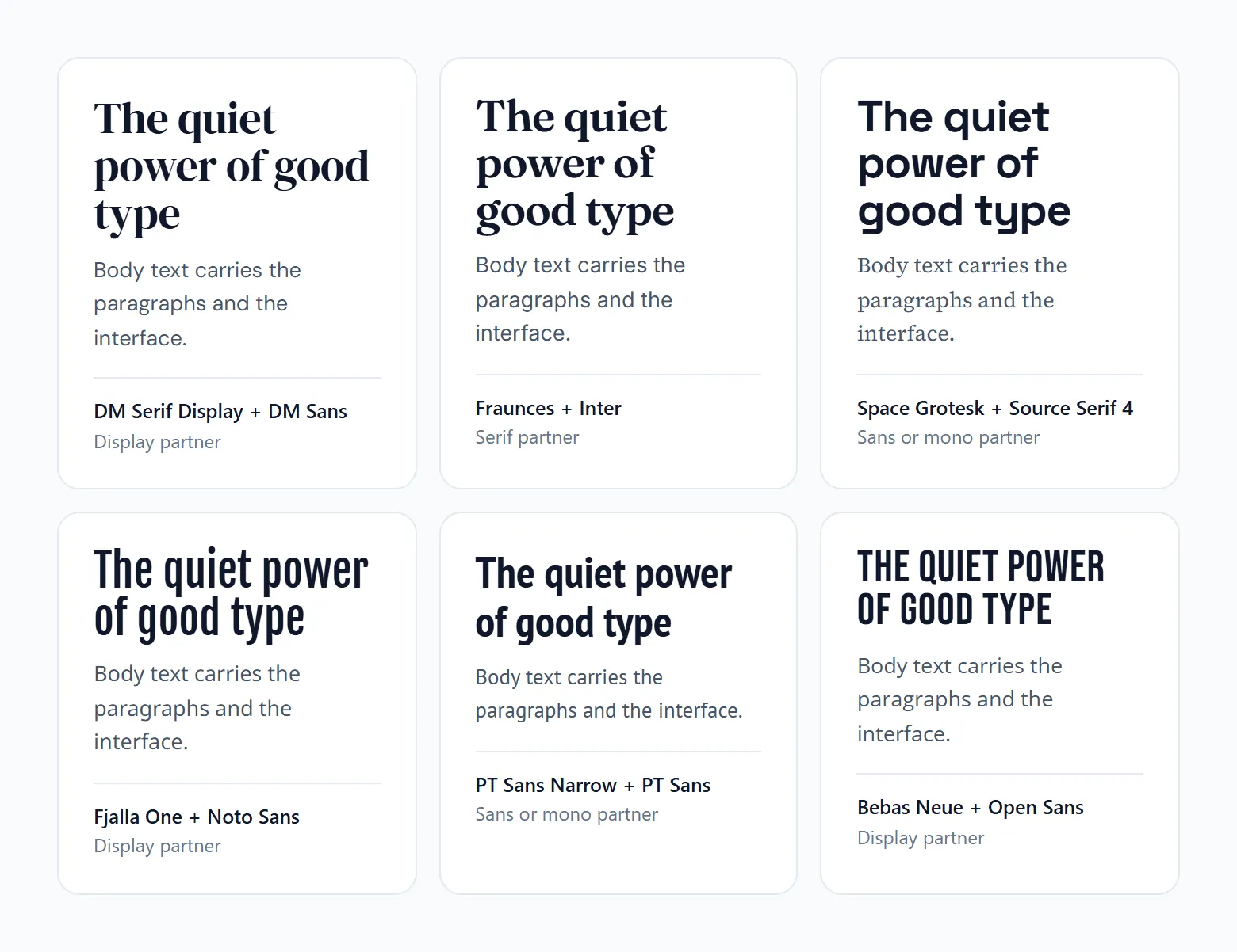
Your heading text in each pair’s heading font, above the body text in its partner.
A good Google Font pairing usually comes down to a heading face with some character sitting over a plain body face that was built for screens. The x-heights should match.
Playfair Display over Source Sans 3 works this way. So does DM Serif Display over DM Sans, and both pairs get by on three font weights total.
Most people shop for these in one place. HTTP Archive's 2025 Web Almanac found Google Fonts on about 54% of desktop sites and 47% of mobile sites, which is a lot of the web leaning on a single library.
There is a speed cost, though. Every static weight a pair requests is one more file the page has to download, and that adds up faster than people expect.
How to use the Google font pairings tool
These Google font pairings combine 29 free font families into 15 heading and body pairs, and the tool shows each one in layouts you actually ship. Every font is on Google Fonts, under the SIL Open Font License or the Apache License 2.0, so you can use them on commercial sites.
- Pick a pairing from the list. Filter by serif, display or sans if you already know the mood you want.
- Switch the layout between Specimen, Article, Landing page, Pricing cards and Dashboard. A pairing that looks great in a hero can feel heavy in a dashboard.
- Type your own heading and body text. Real copy shows problems that sample text hides, like long words in a condensed font.
- Swap roles to put the heading font on the body and the body font on the headings. Display, condensed and script fonts stay on headings, so the button turns off for them.
- Check dark mode and adjust the heading and body sizes.
- Copy the code as a Google Fonts link, plain CSS or a Tailwind v4 theme.
Google font pairings at a glance
| Heading font | Body font | Best for |
|---|---|---|
| Playfair Display | Source Sans 3 | E-commerce, luxury products, editorial and portfolios |
| Montserrat | Merriweather | News sites, publishers, business blogs and long reads |
| Lato | Alegreya | Literary blogs, book sites, education and long articles |
| Oswald | EB Garamond | Law firms, boutiques, magazines and high-end services |
| Raleway | Roboto Slab | Online stores, jewelry, fashion and clean brand sites |
| Roboto Condensed | Roboto | Tech companies, apps, dashboards and news feeds |
| DM Serif Display | DM Sans | Landing pages, portfolios and premium product sites |
| Fraunces | Inter | Food, craft and lifestyle brands, playful editorial |
| Space Grotesk | Source Serif 4 | Startups, tech blogs, newsletters and AI products |
| Fjalla One | Noto Sans | Blogs, international sites and content with many subheads |
| PT Sans Narrow | PT Sans | Software companies, documentation and data-heavy pages |
| Bebas Neue | Open Sans | Hero banners, fitness, music and event promotions |
| Allan | Cardo | Restaurants, festivals, menus and craft brands |
| Amatic SC | Josefin Sans | Art, craft, kids and playful creative sites |
| Dancing Script | Josefin Sans | Weddings, bakeries, beauty and boutique shops |
What Makes Two Google Fonts a Good Pair?
You want the two fonts to differ on one clear axis. Serif against sans-serif, say, or heavy against light. Underneath that difference they should share proportions, x-height most of all.
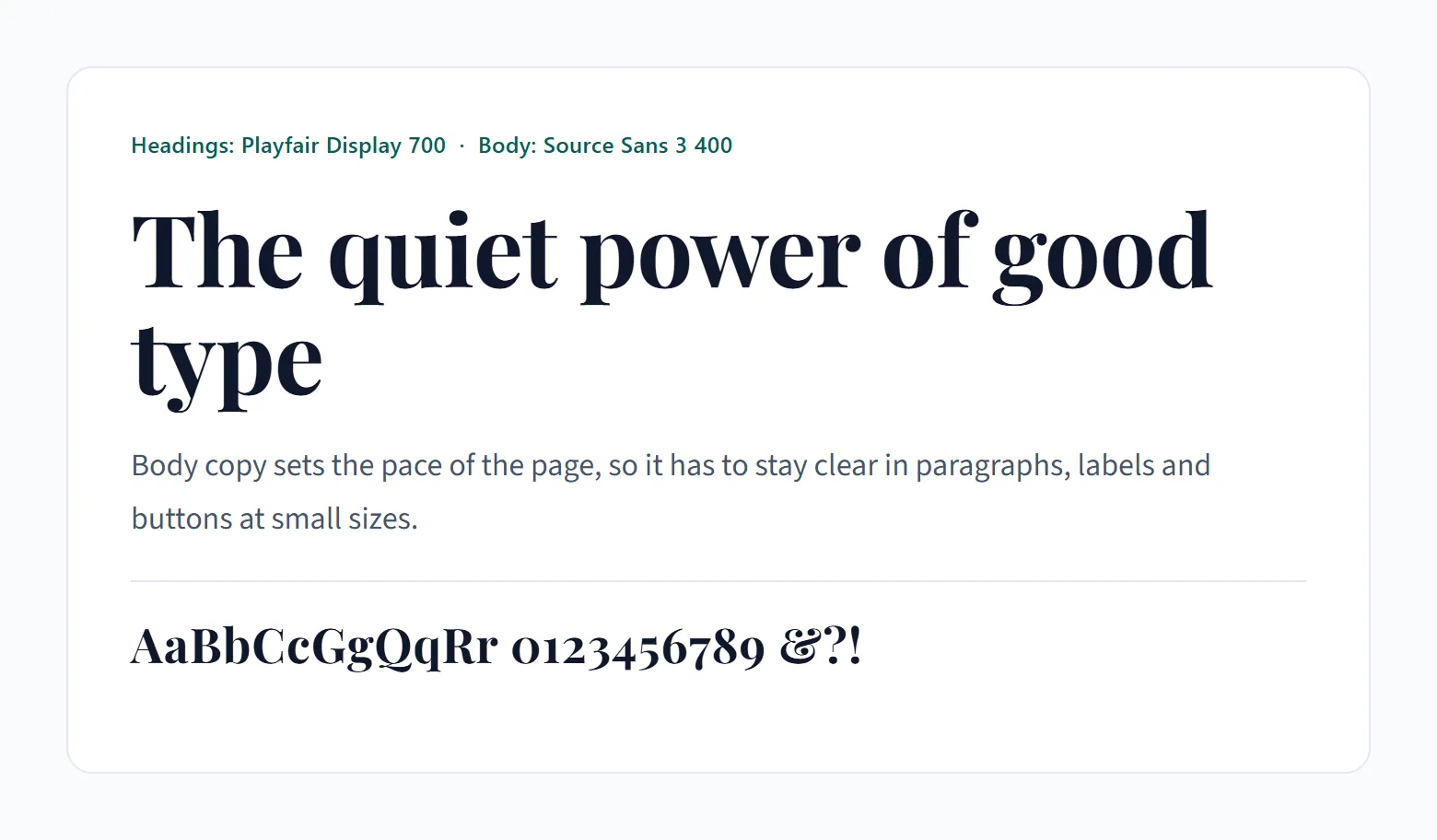
Fonts that differ on every axis fight each other. Fonts that differ on none look like someone forgot to change the font, and honestly that second mistake is the one I see more often.
Contrast Types and When Each Fits
Serif with sans-serif is the default for blogs, magazines and brand sites. The classic serif and sans-serif split still does most of the work, because the structural difference reads at a glance.
Two sans-serifs can work too, but only when width or construction differs. A geometric heading over a humanist body is the usual way to pull it off.
Then there's the display face over a text face. That means a one-weight headline font above something neutral, and it's cheap on file size.
And superfamilies, which take the guesswork out of proportions. IBM Plex is the clearest example: Mike Abbink and Bold Monday drew the Sans, Serif, Mono and Sans Condensed together for IBM's brand material, and Google Fonts hosts them.
The problem with a superfamily is hierarchy. The proportions are so close that headings and body text blur together unless you set a clear weight or size difference.
Metrics That Must Match
The x-height research doesn't fully agree with itself. Cooreman and Beier (2024) ran three experiments with 26, 12 and 12 participants and found that a larger x-height improved letter recognition.
Larson and Carter documented the cost in their 2016 account of designing Sitka, Matthew Carter's typeface for Microsoft. In their legibility tests, a large x-height harmed Greek letters.
So for pairing, don't chase the biggest x-height. Match the x-height of both fonts instead, and compare the x-height of each candidate at the same pixel size before committing.
Width comes next. A wide heading over a condensed body (or the reverse) tends to look accidental. Stroke contrast matters as well, especially with high-contrast serifs like Playfair Display and DM Serif Display, which need a sturdy body face under them.
Check the weight range last. Both fonts need a light enough and a heavy enough weight to separate levels on a phone.
I usually let mood build the shortlist and let proportions pick the winner.
How Many Fonts Should One Page Use, and What Does Each Do?
Two fonts per page is enough for nearly everything, and three is the ceiling.
The heading font carries the personality at 28px and up, and it often needs only one weight. The body font handles paragraphs, lists and captions at 15 to 18px, in regular and bold, plus italic if the copy uses it.
A third font shows up only when buttons, quotes or numerals need a separate voice. Keep it at a single weight.
These roles map onto the typographic hierarchy of the page. The heading font owns the top levels and the body font owns everything beneath them.
Count weights, not families. Every static weight is another file to download, so a body font at four weights costs more than the single-weight display face sitting beside it.
When the weight budget gets tight, the third font goes first. I'd skip it on a first build anyway (most pages never miss it).
Best Google Font Pairings by Use Case
The table is a starting set, not a ranking. I've listed the weights each pair needs, since weight count is what separates a cheap pair from an expensive one.
| Pair | Contrast type | Suggested weights | Watch out |
|---|---|---|---|
| Playfair Display + Source Sans 3 | Serif + sans-serif | Playfair 700; Source Sans 3 400, 600 | Fine hairlines, so headings only |
| DM Serif Display + DM Sans | Display serif + sans-serif, same foundry | DM Serif 400; DM Sans 400, 600 | One weight, so no bold headings |
| Montserrat + Merriweather | Geometric sans + screen serif | Montserrat 700; Merriweather 400, 700 | Wide letters wrap early on phones |
| Roboto Condensed + Roboto | Width contrast, same skeleton | Roboto Condensed 700; Roboto 400, 700 | Close proportions, needs a size or weight gap |
| PT Sans Narrow + PT Sans | Narrow + regular width | PT Sans Narrow 700; PT Sans 400, 700 | PT Sans has only two weights |
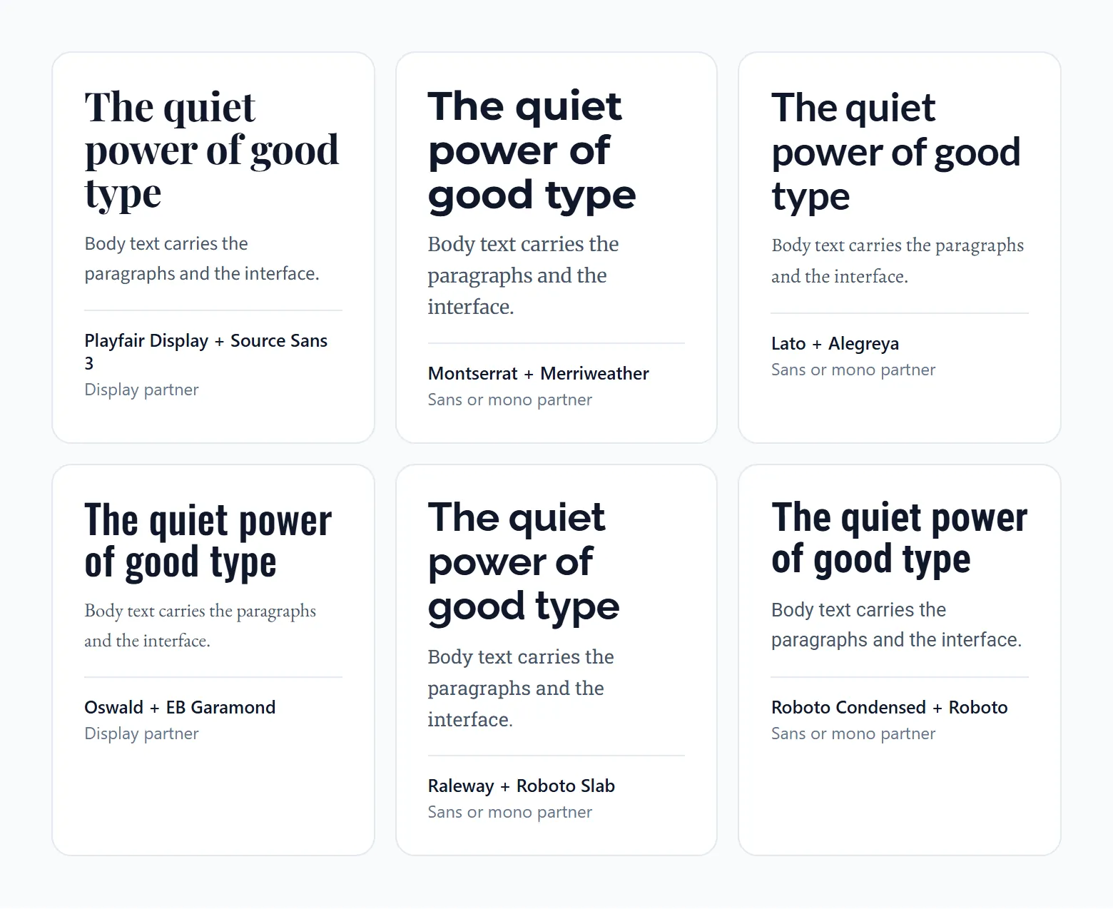
Add the weights up before you commit. All five run on three weights.
Blogs and Editorial Sites
On a text-heavy site the body font matters more than the heading font. Readers spend almost all their time in paragraphs.
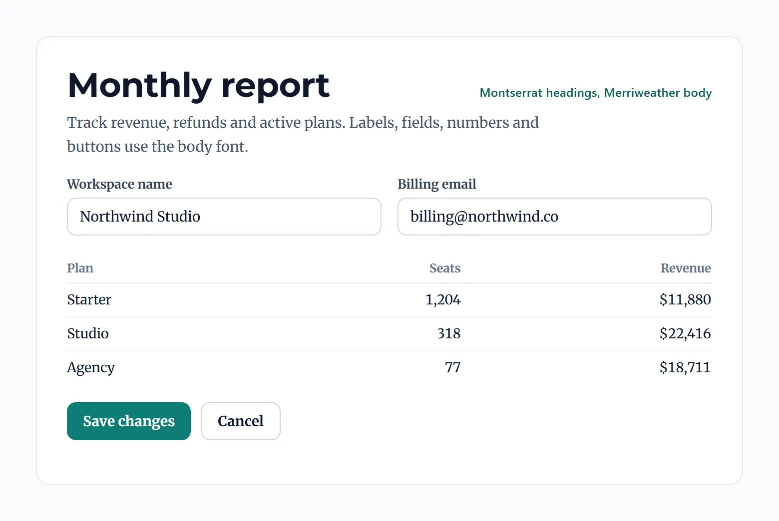
Merriweather was drawn for on-screen reading, with a large x-height and sturdy serifs, according to its Google Fonts description. Montserrat at 700 handles the headings over it.
That flips the usual order (sans heading, serif body) and suits text-heavy pages. Magazine-style blogs can run Playfair Display over Source Sans 3 from the table instead, and a guide to more Playfair Display pairings covers other partners if the first one feels too heavy.
Landing Pages and SaaS
Landing pages reward speed over variety.
DM Serif Display over DM Sans is the lean option, with one heading file and two body weights. Both families come from Colophon Foundry, so they feel related without matching.
For something more corporate, Roboto Condensed over Roboto is the neutral pick. Keep the heading at 700, and let the narrow letters carry longer headlines on a phone.
Google Fonts describes Inter as a variable family drawn for computer screens, with a tall x-height, and a dedicated guide to Inter font combinations covers the wider set.
Portfolios and Brand Sites
For a warm, quiet look, I like Fraunces over Inter. Fraunces is a variable serif with weight, optical size, softness and wonk axes, so one file covers the heading and Inter stays neutral underneath.
Louder brands can try Bebas Neue over Open Sans. Bebas Neue is uppercase only and ships in one weight, which limits it to short titles. Steve Matteson designed Open Sans, and it does the plain work underneath.
Both pairs stay at three weights.
Which Sizes, Line Heights and Contrast Ratios Keep a Pair Readable?
Body text at 16px, a 1.5 line height and a 4.5:1 contrast ratio keeps most Google Font pairs readable. Headings take larger sizes and the lower 3:1 threshold.
That 1.5 isn't arbitrary. Android's Material typography reference sets its body style at 16sp text on a 24sp line, which works out to 1.5.
Test the pair at 15 to 18px for body and 32 to 64px for headings, because a specimen at one size hides problems at the other. I also check 375px. Headings shrink on phones, and a pair with near-equal sizes loses its hierarchy there.
Line height, called leading in print, starts at 1.5 for body copy and tightens as heading size grows. Large headings also tolerate slightly negative letter spacing, around -0.01em, while all-caps labels need it looser.
WCAG 2.2 criterion 1.4.12 requires layouts to survive user overrides: line height at 1.5 times the font size, paragraph spacing at 2 times, letter spacing at 0.12 times and word spacing at 0.16 times (W3C). A pair already set at 1.5 meets the first value. Test the others in a container without a fixed height.
For contrast, W3C's criterion 1.4.3 asks 4.5:1 for normal text and 3:1 for large text, meaning 18pt (about 24px) or 14pt bold (about 18.7px).
The same W3C guidance warns that thin or unusual fonts can pass the ratio and still read poorly. Playfair Display's hairlines and any Light weight deserve a visual check, not only a checker.
Pick one scale ratio for the heading steps and keep it. A type scale generator outputs the sizes for any ratio, and 1.25 suits most pages.
How Much Does a Font Pair Slow Down a Page?
Three static weights at the 2025 Web Almanac median file size (35 to 36 KB, HTTP Archive) add up to about 105 to 108 KB. That's arithmetic on a median, not a measured pair, but it gives you the scale of the weight budget.
File size is the smaller problem, though. Late fonts delay text and shift the layout, which is what LCP and CLS measure. Good LCP is 2.5 seconds or less and good CLS is 0.1 or less, both at the 75th percentile of page loads (web.dev).
Browsers don't handle a missing font gracefully. With a web font missing, Chromium and Firefox hide text for up to 3 seconds and Safari hides it indefinitely (web.dev font guidance, updated October 2022).
Font files also have a long tail. The median sits at 35 to 36 KB, with the 90th percentile at about 115 to 116 KB (Web Almanac 2025, HTTP Archive). One file at that size outweighs a whole three-weight pair, so a single un-subset family can cost more than the pair you are trying to keep light.
Packing weights into variable fonts does not always help. web.dev notes they usually run larger than one static file, so the gain appears only when a page uses several weights or styles.
Google's own CSS API guidance says to request three specific weights as individual styles and to request a range only for a continuous span. For the pairs in this article, list the weights one by one.
Font-Display Values for Headings and Body Text
Roughly half the web picks swap: about 50% of pages use it, against 0.4 to 0.5% for optional (Web Almanac 2025). That shows where habits sit. It doesn't tell you the best setting.
The authoritative sources disagree. web.dev pairs swap for branding elements with optional for body text. Harry Roberts (CSS Wizardry, 2020) advises against optional when the font stylesheet loads asynchronously, because in his tests the short block period only starts mid-load, once the async stylesheet applies. The text flashes invisible and the same fallback comes back, with no new font to show for it.
Slow connections make the gap real. His throttled mobile runs (Galaxy S4, 3G profile) measured a median 1,406 ms to first byte for the Google Fonts CSS file, far beyond optional's 100 ms block period.
In practice I'd set the heading font to swap, so the title renders at once and the real face replaces it. For the body font, optional is fine only when the stylesheet is not loaded asynchronously. Otherwise use swap there too.
Both sources agree on the trade. Optional buys stability and gives up the custom font whenever it arrives late.
Fallback Stacks and Layout Shift
A swap shifts the layout when the fallback and the web font take up different space.
Start the fallback stack with a web-safe font close in width to the pair, such as Georgia behind a serif heading or Arial behind a sans-serif body. Metrics close the rest of the gap.
Build a fallback face from local() Arial or Georgia and add size-adjust, ascent-override, descent-override and line-gap-override to it. Chrome for Developers says these overrides are safe to use without knowing the visitor's operating system for about 90% of Google Fonts families.
Support is the weak spot. MDN lists ascent-override as limited availability (not Baseline), so browsers that ignore them still show the shift.
How to Add a Google Font Pair to a Website
The short version is one CSS2 API URL that requests both families with display=swap, plus preconnect hints for the two Google origins. Each font-family then gets a fallback stack. Self-hosting swaps that URL for WOFF2 files on your own server.
- List the exact weights from the weight budget, for example Playfair Display 700 plus Source Sans 3 at 400 and 600.
- Build one URL with a family= parameter per font and display=swap:
fonts.googleapis.com/css2?family=Playfair+Display:wght@700&family=Source+Sans+3:wght@400;600&display=swap - Place preconnect hints for fonts.googleapis.com and fonts.gstatic.com (the second with crossorigin) above the stylesheet link in the head.
- Declare font-family on headings and body text with a fallback stack behind each font.
- Reload with the network throttled and read the layout shift in Lighthouse or PageSpeed Insights.
Loading From the Google Fonts CDN
Use a link tag, not @import. Google's embed snippet carries preconnect hints, and web.dev says the link element likely delivers the stylesheet faster than @import.
I'd skip async tricks unless you can test them. CSS Wizardry documented the print-media onload trick leaving Vitamix's font stylesheets at the lowest (print stylesheet) priority, which delayed the custom font on a 3G profile.
A walkthrough of how to use Google Fonts covers the font picker and embed screen if you start from fonts.google.com.
The CDN's advantages are mostly about convenience. Unicode-range subsets get served automatically, there's one URL and no files to maintain, and the API returns the compact set of requested styles.
The downsides are less obvious. Visitors open extra connections to two Google origins, and there has been no shared-cache benefit since Chrome 86 (October 2020), per Chrome for Developers. Then there's privacy. The visitor's IP address reaches Google, which matters under GDPR.
Self-Hosting WOFF2 Files
Download the files from the Google Fonts GitHub or the family page, serve WOFF2 only, and write the @font-face rules yourself.
Subset the files. Google's CDN does it by default and local copies lose it (web.dev). Preload only the critical face, with crossorigin, and serve everything from a CDN over HTTP/2.
Sources disagree on speed. CSS Wizardry (2020) calls self-hosting the widely accepted fastest route, while web.dev (October 2022) calls the difference less clear cut and conditional on a CDN and HTTP/2. The Web Almanac 2025 adds that cache partitioning removed some of the CDN's old advantage, and self-hosting keeps rising anyway. Measure both with your own pair.
You get no third-party connection, control over cache headers, and no visitor IP sent to Google. In exchange you own subsetting, WOFF2 conversion, updates and fallback metrics. CJK families are hard to subset well by hand, which is where self-hosting gets annoying.
Which Pairing Mistakes Break Hierarchy or Shift the Layout?
Most of the damage comes from a short list of habits.
Near-twin sans-serifs cause the most confusion. Put Open Sans over Source Sans 3 and the heading looks like a rendering glitch. Swap one of them for a serif or a display face.
Faked bold is next. DM Serif Display and Bebas Neue ship one weight, and Bebas Neue has no italic either. Ask for 700 and the browser smears extra strokes onto the glyphs, so set those headings to 400 and get emphasis from size.
Unused weights are quieter but cost real bytes. Google's CSS API docs warn that requesting unused styles makes users download more font data than they need. Request only the weights the stylesheet uses, and add italic only if the copy has any.
The one almost everybody skips is the loading test. Block the font requests in DevTools and read the page in the fallback. If the heading overflows its box there, it will shift for real visitors on slow connections.
Licensing, Privacy and When Google Fonts Are the Wrong Choice
Google Fonts are free for commercial use under open licenses. The live CDN is a separate matter, mostly a privacy one in the EU, and some sites are better served by a different font source.
Google's FAQ says new families are accepted only under the SIL Open Font License, while some older families carry the Apache License or the Ubuntu Font License. Commercial use, including inside products sold commercially, is allowed under those terms, and the licensing rules for fonts are worth a read before you modify or redistribute files.
The Munich Regional Court (LG München I) ruled on 20 January 2022 (case 3 O 17493/20) that a site operator owed a visitor 100 euros in damages. A dynamically loaded Google Font had sent the visitor's IP address to Google without consent, and the court noted the fonts could be used without a connection to Google.
The ruling set off a wave of demand letters to site operators, so check current law for your own audience. This is general information, not legal advice.
| Situation | Better source | Reason |
|---|---|---|
| EU audience, no consent flow | Self-hosted WOFF2 | No visitor IP sent to Google |
| Brand names a typeface Google lacks | Licensed foundry font | A library gap, not a pairing gap |
| Speed-critical, text-heavy page | System font stack | No download at all |
| Large non-Latin script | Google CDN or system font | CJK subsetting is hard by hand |
When a brand guide mandates a typeface Google Fonts does not carry, a paid library fills the gap. A comparison of Google Fonts and Adobe Fonts lays out the trade-offs.
System fonts skip the download entirely, and web.dev says they work particularly well for body text. If speed matters more than personality, drop the pair and keep one Google Font for headings.
Script coverage is the other limit. Check that both families cover every language the site serves, because a missing script falls back to a system font and splits the pair.
Google Font Pairing FAQ
Which tools preview a Google Font pair before launch?
The type tester on each Google Fonts family page is the obvious place to start. Typewolf shows the fonts used on live sites, which I find the most useful of the lot.
Paste your real headline and a full paragraph into whichever you pick.
Can Google Fonts be used in Word or PowerPoint?
They can, once you download the family and install the files on the computer. Office then lists the font like any other, and the steps for adding fonts to PowerPoint follow the same pattern.
A recipient without the font installed sees a substitute.
Can I pair a Google Font with a font from Adobe Fonts?
Yes. Each font loads from its own host, so the page gains a second connection and the Adobe font needs an active Adobe subscription.
The pairing rules don't change. Match x-height and set a clear weight gap.
Does a pair need italic styles?
Only if the copy sets emphasis, titles or citations in italics. Request it through the ital axis, for example ital,wght@0,400;1,400, and expect a separate italic file.
Check the family first. Bebas Neue has no italic, while DM Serif Display does.
Which pair suits a multilingual or non-Latin site?
Pick families that both list every required language on their Google Fonts pages. Noto Serif over Noto Sans is a safe base, because the Noto project is a font collection meant to support writing in many languages.
Serve CJK families from the Google CDN rather than self-hosting them.
Can a script font serve as the accent font?
For a short word, a signature or a pull quote, sure. Never for paragraphs. Keep it at one weight and pair it with a plain body face.
The Google Fonts text= parameter loads only the letters you use, which can cut the file by up to 90% according to Google's CSS API documentation.
Final Checks Before a Google Font Pair Goes Live
A Google Font pair is ready to ship when the page holds its layout with the web fonts blocked and field CLS stays in the good range.
Block the fonts first and read the fallback layout. After that, compare the weights you're requesting against the weight budget. Both take minutes and need no traffic.
Field CLS and LCP come last, since that data needs real visitors and arrives after launch.
Swap the pair when field CLS stays above the good threshold after fallback metrics are applied, or when a new script enters the site and one family lacks it.
Re-check those targets yearly. web.dev says stable Core Web Vitals metrics change no more than once per year (page last updated 31 October 2024).
A font pairing generator shortlists replacements quickly when a swap comes due.
Other font pairings
Same idea, different starting font. Each guide lists tested partners with notes on where they work.
- Abril Fatface font pairing
- Baskerville font pairing
- Bodoni font pairing
- Cormorant Garamond font pairing
- DM Sans font pairing
- Futura font pairing
- Garamond font pairing
- Georgia font pairing
- Gotham font pairing
- Helvetica font pairing
- Inter font pairing
- Josefin Sans font pairing
- Karla font pairing
- Lato font pairing
- Libre Baskerville font pairing
- Lora font pairing
- Merriweather font pairing
- Montserrat font pairing
- Nunito font pairing
- Open Sans font pairing
- Playfair Display font pairing
- Poppins font pairing
- Raleway font pairing
- Roboto font pairing
- Source Sans Pro font pairing
- Space Grotesk font pairing
- Work Sans font pairing