Bodoni font pairing examples that look great
Imagine the perfect sartorial match. Just as a sharp blazer pairs effortlessly with tailored trousers, Bodoni font pairing is about meshing elegance with function in typography. In the vast universe of typefaces, Bodoni stands out with its sharp contrasts and timeless sophistication.
You’re here because you’ve sensed that simply choosing Bodoni isn’t the end of your design journey—it’s just the beginning.
I’m about to walk you through a gallery of pairings that elevate Bodoni from a solo artist to part of a dream duo. By the close, you’ll have unlocked a treasure trove of combinations that harmonize like coffee with a lazy Sunday morning.
Get ready to discuss:
- Serif and sans-serif companions that complement Bodoni
- Ensuring legibility and enhanced user experience in your designs
- Building visual hierarchy with the right type contrasts
Through the lens of typography and design, let’s spin the color wheel of fonts and find your perfect match.
Bodoni font pairing examples
Montserrat – Similarity in contrast
We can always start exploring the most similar options in design, such as Montserrat, which shares the contrast and elegance of the Bodoni font. Due to its similarity in visibility, it is recommended that we use it in sites with a distinguishable background color.
Futura – From Bauhaus’ house

The Bauhaus movement left many contributions to humanity. One of those was this typography designed in 1927 by Paul Renner. Highlight the geometric shapes and give great importance to the circle. In this case, Futura works like in a Bodoni Font pairing thanks to the bold combination of thin and thick strokes.
DIN Font – Technical Experience
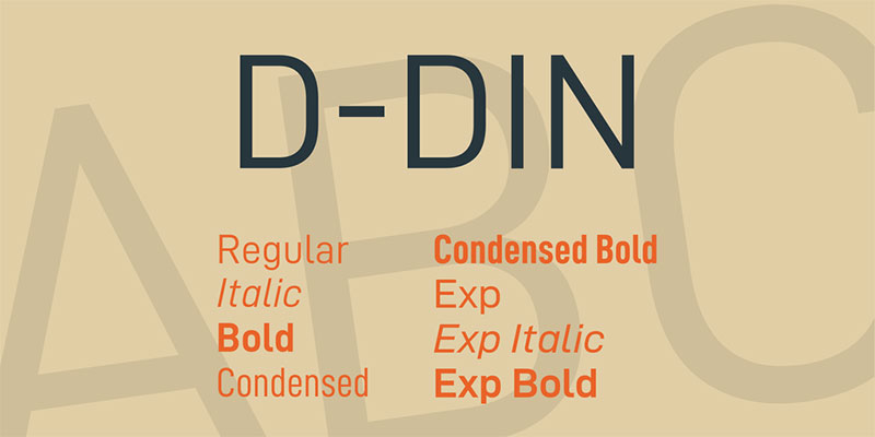
Thanks to the German Institute for Standardization (Deutsches Institut fur Normung, or DIN), we can enjoy this technical letter that works for all types of professional jobs. Its use and classification are within DIN 1451 standards, but in general terms, it is a letter without distracting aesthetic elements.
Its simplicity makes it extremely visible, so it is not only used in industries, but has been extended to posters, signs, and more casual designs.
Source Sans Pro – The interface companion
Specially designed to fit the monitors, Source Sans Pro has an elongated style that makes it readable on vertical screens. Unlike Bodoni, this typeface has no problem using thicker strokes.
PT Sans – Many contemporary styles
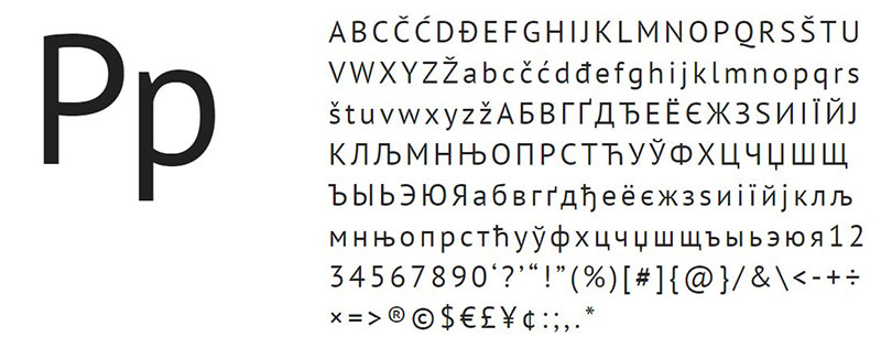
Although not much has happened, the styles of the second half of the twentieth century are very different from what we currently have. As an example, we have this Bodoni pairing that is inspired by a Russian serif letter from a few decades ago. Although it looks slightly modernized, it retains its essence very well. The best thing is that it has eight different styles to choose from.
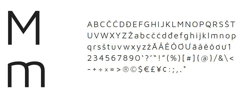
Avenir – Personal style
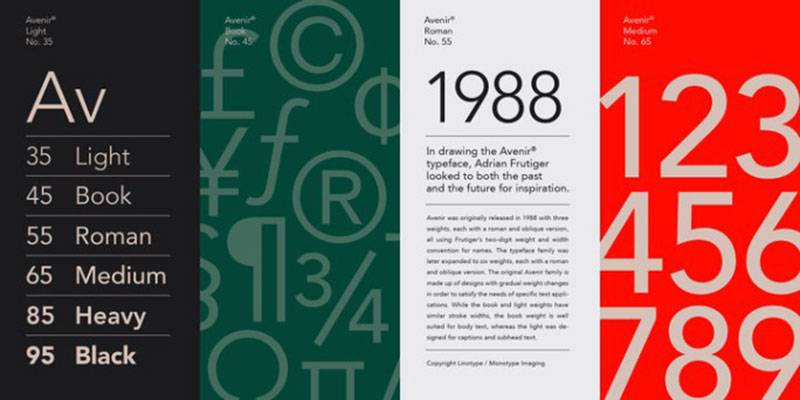
This Bodoni Font pairing was born as a variation of the Futura and Erbar typefaces. It maintains the sans serif style of both but tries to modernize it a bit thanks to the new cultural movements.
Arial – The classic of classics

Working on a computer is knowing about Arial typography. It is a standard for many documents where we do not want any aesthetic detail and a letter of considerable size. It can also be found under the name of Arial MT.
Maven – For any context
Maven’s nature makes it easily adaptable to many types of letters, from classic designs to more contemporary ones. This is because it is not as rigid as other options, instead, it seeks a mix of features to highlight.
Sentinel – Filling a void
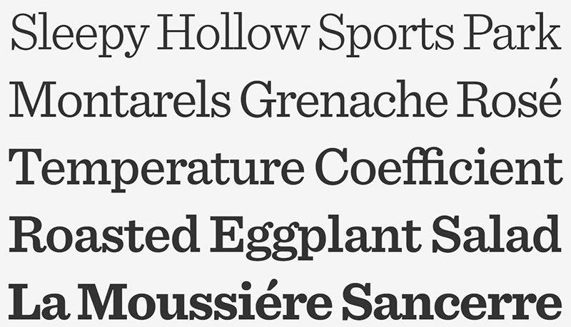
The typeface should adapt to new standards as needs arise. In this case, and based on the existing Clarendon, Sentinel is born, a letter that adds everything that was missing to the original Slab Serif typeface, as are italicized and with wide thicknesses versions.
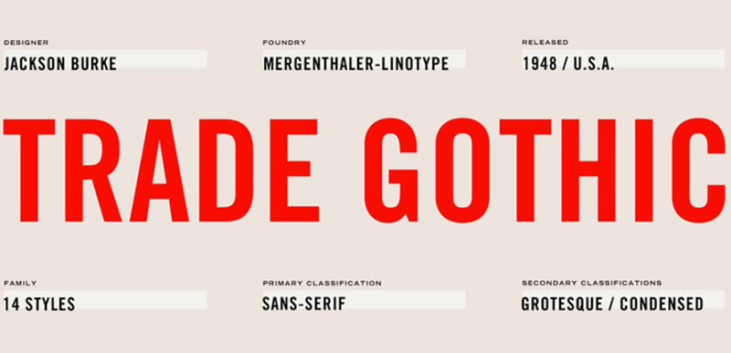
Trade Gothic – Some variety
Trade Gothic offers something different when it comes to Sans Serif. They are extra tall letters, with constant thicknesses in each stroke, and pronounced curves where necessary. This letter is widely used for large headlines in magazines and newspapers, but it can also be easily adapted to a digital medium.
Georgia – Elegance with various styles
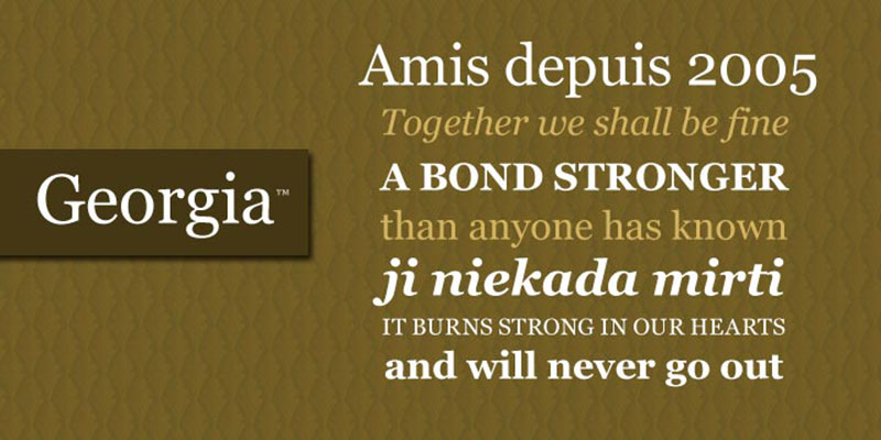
A letter of widespread use is Georgia. It is not specifically created as a Bodoni Font pairing, but generally adapts to almost any context. Georgia is especially useful in subtitles, and since it has a good variety of styles, we will have no problem getting the one we need.
Helvetica – Durable Design
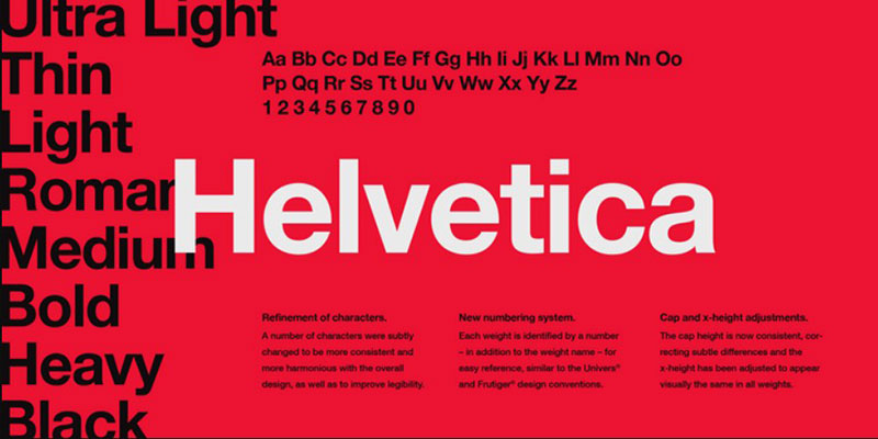
When it comes to advertising, nothing better than the classic Helvetica. Despite having appeared for the first time in 1957, it is still one of the most used for logos, especially because it remains neutral but striking.
Helvetica’s popularity as typography is due to the German and Swiss designers of the 50s and 60s, who used a nineteenth-century font as inspiration.
Neue Haas Grotesk – Recovering history

This is the original version of Helvetica, or at least, an attempt to recover its past. It has undergone some changes over the years, typical of digitalization, as a refinement of the line, but the shapes and locations of the lines have remained.
Iowan Old Style – A simpler time
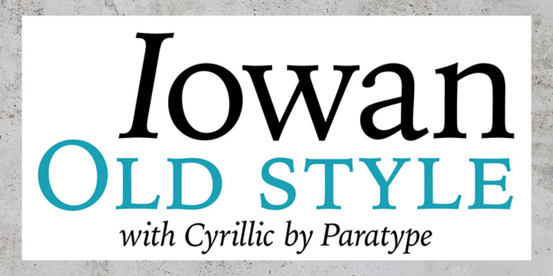
Slight inclinations, many curves, and stylized ends are the main features of this letter designed by John Downer. Additionally, in 2016 a Cyrillic version of the letters was included thanks to the collaboration of Natalia Vasilyeva, so the catalog of possibilities of a letter that has a classic and pleasant appearance was expanded.
Palatino – Professional works

Another recommendation of a Bodoni Font pairing that has considerable time in the world is Palatine. Its original design dates back to the 50s, but recently it was modernized for computers by Professor Zapf, who personally added a good number of additional characters so that it could be used worldwide.
When it comes to professional publications, such as books, pamphlets, catalogs and much more, Palatino is our ideal companion for its elegance.
Sofia – For many languages

We finish this little guide of perfect typefaces to accompany Bodoni with a simple letter, but with many characters. Sofia has a simple geometric pattern, which does not exaggeratedly recharge the lines. We can find it in eight alternatives, including an amazing cursive style.
FAQ about Bodoni font pairing
What makes Bodoni a good choice for font pairing?
Bodoni’s got that timeless vibe, sleek lines, and stark contrasts—making it a go-to for delivering oomph and class. Its structured serifs play well with others, especially offering up a crisp backdrop for more whimsical or modern sans-serif pals. Navigation through a design becomes a breeze, reinforcing that sweet visual hierarchy.
Are there specific fonts that are best to pair with Bodoni?
Absolutely. A classic match? A clean sans-serif like Helvetica or Futura. They’re like yin and yang—balance and harmony in the type world. Bodoni’s assertive presence complements the understated simplicity of these fonts, ensuring typography doesn’t snatch the spotlight, but supports the user experience subtly.
How do I ensure legibility when pairing fonts with Bodoni?
It’s all about contrast and size, friend. Pair Bodoni with something less intricate. Think readability. Go larger for headers, then snag a sans-serif for body text. Less clash, more class. Keep an eye on color contrasts too—it’s key in amplifying that legibility magic we’re chasing.
Can Bodoni be paired with another serif font?
Sure thing, but tread carefully. It’s a dance of finesse where one wrong step could spell jumbled chaos. Opt for serifs that are subtler than Bodoni; think along the lines of Caslon or Garamond. Difference in scale and weight here does wonders, enhancing the font compatibility.
What are some pitfalls to avoid in Bodoni font pairing?
Heavy is the head that wears the crown, right? And Bodoni’s got its crown on tight. Steer clear of overly decorative or complex fonts. They duke it out for attention. Instead, seek out partners that share Bodoni’s vibe—minimalist sans-serifs or a gentle script to soften the edges.
How does Bodoni font pairing impact brand identity?
Fonts whisper secrets about your brand before a single word’s read. Bodoni? Sophistication and strength. Choose its pair wisely; a good combo paints a picture of cohesiveness and forethought. It’s all contributing to that brand identity narrative, enhancing trust and recognition in your target audience’s eyes.
What’s the role of whitespace in Bodoni font pairing?
Whitespace is that silent character in the play which ends up stealing the scene. With Bodoni’s pronounced features, pack in ample breathing room. It lets each letter stretch out and prevents the design from suffocating under its own style. Basically, it’s the unsung hero of a polished visual communication.
Is there a particular context where Bodoni font pairing works best?
Bodoni’s all about making a statement—think high-end fashion mags or luxe product branding. In these realms, Bodoni thrives with partners that underscore its drama without stealing the show. It’s less about the context, though, and more about evoking a specific feel—classy, bold, and unapologetically proud.
How does color influence Bodoni font pairing?
Color’s your secret sauce—it can make or break your font feast. Harmonize Bodoni’s bold strokes with subtle hues or monochromatic schemes for maximum impact. Leave the neon for the ’80s workout videos. Here, we’re channeling an elegant, less-is-more approach, because after all, we’re dialing up the drama with type, not paint.
Can Bodoni font pairing work for digital design and web content?
You bet! While Bodoni’s roots are firmly planted in print, it’s stretching its limbs into digital. On your screen, it demands the same respect—crisp partners like Arial or Lato keep things fresh and functionally fancy. Just watch the loading speeds and rendering, since those serifs can be divas in disguise on low-res screens.
Conclusion
So, we’ve taken a creative dive into the world of Bodoni font pairing examples, right? It’s been a trip – scrolling through all those elegant typeface pairings. Sort of like rummaging in a vintage store and finding that perfect jacket; it’s about discovering a match that makes everything pop.
Now that we’re wrapping up, remember:
- Contrast is your best pal. Picking the sans-serif that vibes with Bodoni’s vibe? Gold.
- Make it readable. Keep that font pair as legible as street signs.
- Branding? You’ve got this. Solid font pairs echo a solid brand voice.
The examples dished out here, they’re more than just pairs; they’re the start of conversations between text and reader. Typography design, it’s an art, and with Bodoni, you’re halfway to a masterpiece. Unlock those creative font trends, and let Bodoni bring the class to your design table.
If you enjoyed reading this article about Bodoni font pairing, you should read these as well:
- The sometimes strange but impressive Gucci ads (Check them out)
- How to create an illustration portfolio that gets you hired in an instant
- The best fonts for print you can pick from this collection
Bogdan Sandu, a seasoned designer with 15 years of diverse experience, has been designing websites since 2008.
Renowned for his expertise in logo design and visual branding, Bogdan has developed a multitude of logos for various clients.
His skills extend to creating posters, vector illustrations, business cards, and brochures. Additionally, Bogdan's UI kits were featured on marketplaces like Visual Hierarchy and UI8.
Latest posts by Bogdan Sandu (see all)