Most people don’t browse anymore. They land on a site, hit the search box, type a handful of words, and judge the whole experience off whatever loads in the next second or two.
That’s not an exaggeration. Site searchers convert at roughly 2 to 3 times the rate of visitors who browse without using search, a number widely documented by Forrester Research and echoed in other conversion studies, with some retailers reporting gains as high as 5 to 6 times.
Which is a little strange, considering how many teams still treat the search box as something you slap onto the header and move on from.
I’ve seen otherwise solid ecommerce sites lose sales over a laggy autocomplete dropdown or a results page nobody bothered testing on a phone. The indexing was fine. The interface got in the way.
Get the input field wrong, or the suggestion panel, or the layout of the results themselves, and a technically flawless search engine still won’t save the sale.
What Is Search UI Design
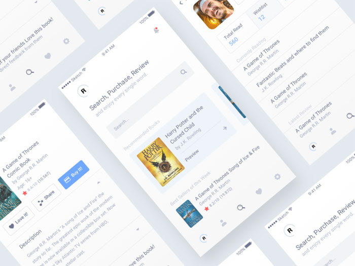
Everything a person touches between typing a query and landing on a result falls under search UI design: the input field, the autocomplete dropdown, the filter panel, the results page itself.
The backend sits outside this scope. Indexing and ranking decide what actually counts as a match, but search UI design only touches what a person sees and clicks.
That distinction matters more than it sounds. A store can run a technically flawless search engine and still lose customers because the input field is hard to find or the suggestion list is cluttered.
Site searchers convert at roughly 2 to 3 times the rate of visitors who browse without using search, per Forrester Research, with some retailers seeing boosts as high as 5 to 6 times. Put design effort into the search box specifically and you’re spending it in one of the highest-value spots on a commerce site or a documentation platform.
Search UI design shows up anywhere a product holds more content than a person can scan by hand. Ecommerce catalogs, SaaS dashboards, internal knowledge bases, marketplaces, media libraries, all of it.
Wherever it shows up, the job stays the same. Get someone from a vague idea to a specific result with as few wrong turns as possible.
What Are the Core Components of a Search Interface
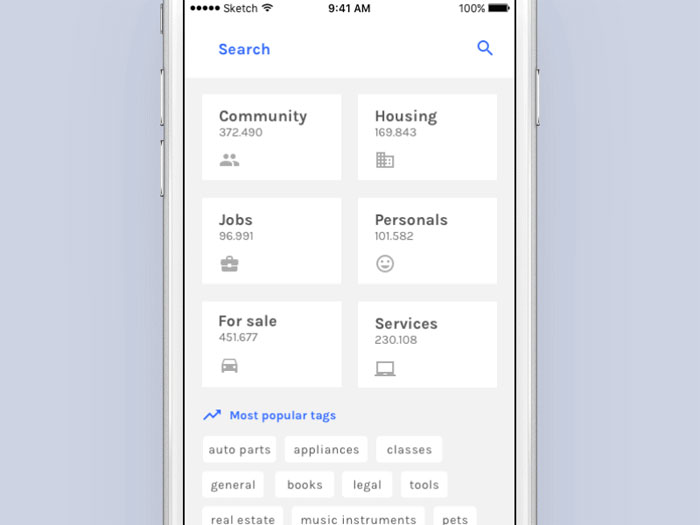
A search interface really comes down to a handful of recurring parts: the input field, the suggestion layer, the filter panel, the results display, and however pagination or infinite scroll gets handled.
Each part behaves differently depending on the device, the size of the catalog, and how much the person already knows about what they’re looking for.
| Component | Function | Common Pattern |
|---|---|---|
| Search input field | Captures the raw query | Persistent bar or expandable icon |
| Autocomplete layer | Predicts intent while typing | Dropdown below the field |
| Filter and facet panel | Narrows results by attribute | Sidebar on desktop, bottom sheet on mobile |
| Results display | Presents matches | Grid or list with sort controls |
The input field carries more weight than any other single element on the page. The icon, the placeholder text, and the field width all signal whether search is a primary tool or an afterthought.
Consistent alignment between the magnifying glass icon and the text field keeps the whole search bar reading as one interactive unit instead of two disconnected controls.
Persistent Search Bar vs Expandable Search Icon
A persistent search bar sits right there in the header the whole time, which is what you’ll find on documentation sites and news sites, anywhere search functions as a real navigation method rather than a nice-to-have.
Marketing-heavy sites tend to go the other way, tucking search behind a magnifying glass icon that only expands into a full input field once someone taps it. Search plays a supporting role there, not the lead.
Nielsen Norman Group’s ecommerce search research (139 design guidelines drawn from usability testing across hundreds of sites) still calls for an identifiable search box with an open text field whenever search carries real weight on the page.
Desktop Layout vs Results Panel Placement
Desktop search interfaces typically place the input field top right or top center, above the fold, which lines up with where eye-tracking research shows people look first.
Suggestion panels render as overlays anchored directly beneath the field rather than a separate page load, keeping the typed query and the matching suggestions in the same visual frame.
- Top right placement, most common on ecommerce and SaaS products
- Top center placement, common on search-first products
- Full-width bar, common on documentation and marketplace sites
How Does Autocomplete and Predictive Search Work
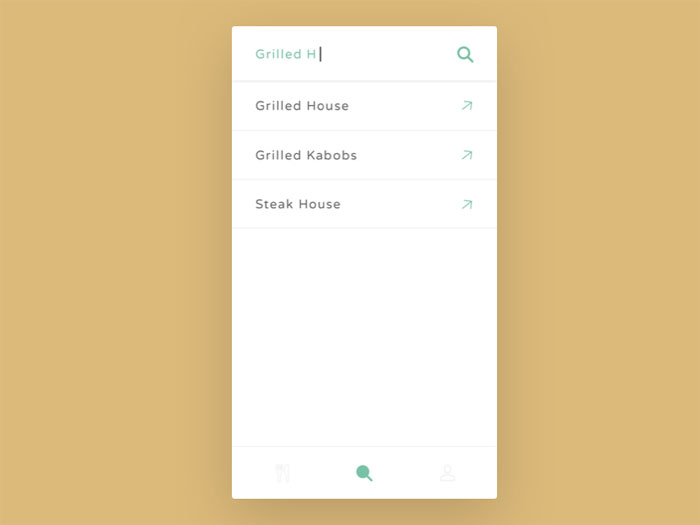
Type the first few letters of a query and autocomplete tries to guess where you’re headed, throwing up query completions, product matches, or category suggestions in a dropdown under the search field before you’ve finished typing.
Search autocomplete has turned into something close to a standard feature over the past decade. Baymard’s ecommerce UX benchmark finds it’s now provided on 80% of ecommerce sites, yet only 19% get every implementation detail right (Baymard Institute).
The mechanics run on a delay. Algolia’s own autocomplete documentation uses a 200 millisecond debounce as a working example, paired with a 500 millisecond stall threshold before a loading state appears (Algolia, 2026).
That delay stops the interface from firing a query on every keystroke. Type fast, and the system waits until typing pauses before it searches.
- Query completions, matching the words already typed
- Product suggestions, matching items in the catalog directly
- Category suggestions, routing to a section instead of a single item
- Recent and trending searches, pulled from history or aggregate demand
Tools like Algolia Autocomplete.js, Elastic App Search, and Typesense InstantSearch handle this layer for teams that don’t want to build it from scratch.
Query Suggestions vs Product Suggestions
Query suggestions finish the sentence for you. Type “running” and the dropdown fills in “running shoes,” “running shorts,” “running watch,” guessing at where you were headed.
Product suggestions skip that step and show the item directly, usually with a thumbnail, a name, and a price sitting right there inside the dropdown.
58% of sites fail to copy the highlighted autocomplete suggestion back into the search field when a person uses arrow keys to select it, which breaks keyboard navigation for that group of users (Baymard Institute, 2024).
Recent and Trending Searches as a Suggestion Type
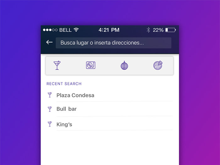
Recent searches just pull from someone’s own history and show up before they’ve typed a single new character.
Trending searches work differently. They pull from aggregate demand across everyone using the search, and they mostly exist to give people something to click when they open an empty search field with no idea yet what they’re looking for.
69% of sites still fail to offer relevant autocomplete suggestions when a query is closely misspelled, a gap that costs matches on some of the most common real-world typing patterns (Baymard Institute, 2026).
How Do Faceted Search and Filtering Systems Work
Check off blue, then in stock, then a price range, and faceted search narrows results across all three without losing the matches already found underneath.
Facets and filters get used interchangeably, but they’re not quite the same thing. Facets are attribute-based, tied to a specific value like “blue” or “under $50.” Filters are often binary toggles, like “in stock only.”
| Type | Example | Typical Use |
|---|---|---|
| Facet | Size, color, brand | Product attribute narrowing |
| Binary filter | In stock, on sale | Yes or no narrowing |
| Range filter | Price, rating | Numeric narrowing |
Amazon uses a sliding price filter that lets a shopper set both a floor and a ceiling in one motion. Yelp uses a star-rating filter to surface only highly reviewed listings, leaning on user trust signals rather than catalog metadata.
Selected facets need clear visual contrast against unselected ones, usually through a filled background or a color change, so a person can tell at a glance what’s actively narrowing their results.
Single-Select vs Multi-Select Filters

With single-select filters, only one value inside a facet group can be active at a time, which is basically how size and fit filters work almost everywhere.
Multi-select is more forgiving. Brand and color filters usually allow it, letting someone check off three or four brands they’d actually consider instead of forcing a single pick that throws away the rest.
15% of ecommerce sites still do not let shoppers combine multiple values within one filter type using OR logic, forcing an all-or-nothing choice that narrows results more than the shopper intended (Baymard Institute).
Range Filters for Price and Numeric Attributes
Anything measured on a scale rather than sorted into a fixed category falls under range filters: price, screen size, weight, star rating.
Dual-handle sliders let a person set a floor and ceiling in one interaction, and they tend to test faster than two separate number fields sitting side by side.
- Price range, the most common range filter across ecommerce
- Star rating, common on marketplaces and review-driven categories
- Distance range, common on local search and travel booking
How Should Search Results Pages Be Structured
A search results page needs a result count sitting up top, a snippet or card design that doesn’t bury the important details, working sort controls, and a scanning pattern the eye can actually follow.
The result count sits top left by convention, stating the total matches so the person knows right away whether the query was too broad or too narrow.
Card and snippet design leans on visual hierarchy to do its job. Thumbnail first, name second, price or key metadata third, in that order, mirrors how the eye actually scans a page of results.
Generous white space between result cards cuts the cognitive load of scanning a dense grid, especially on category pages carrying dozens of items.
Highlighting Matched Terms Within Results
Bold or color-highlight the matched terms inside a title or description and suddenly it’s obvious why an item showed up for that particular query.
The highlight color needs enough separation from the base text to stay legible, easy enough to verify with a color contrast checker before the pattern ships.
Google’s own results pages have bolded matched terms in snippets for years, a convention search UI design across the web has largely inherited.
Sort Controls and Default Ordering
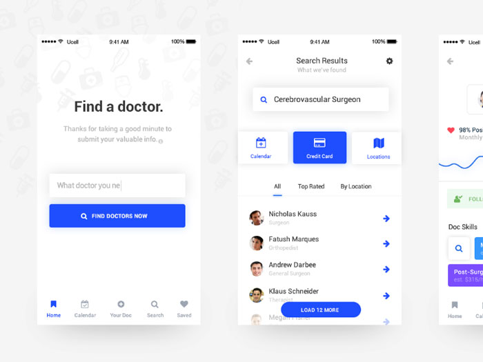
By default, sort should run on relevance, matching the actual query instead of falling back on whatever arbitrary order the catalog happens to sit in.
24% of ecommerce sites default to something other than a diversity-aware relevance sort, which can bury the breadth of a catalog under items that only technically qualify (Baymard Institute).
- Relevance, the default on almost every well-built search interface
- Price, low to high and high to low
- Newest, useful for catalogs that turn over quickly
- Customer rating, useful on review-heavy marketplaces
How Should Search UI Handle Zero-Result Queries
A blank “no results found” message with nothing to do next is worse than no message at all, and it’s still the default on most of the web.
Nearly 50% of ecommerce sites still fail to give shoppers an effective recovery path after a search returns nothing (Baymard Institute, 2025).
The failure mode stays consistent across the sites Baymard tested: a generic “no results found” heading, a short list of spelling tips, and nothing else actionable on the page.
Recovery patterns that test well include automatic spelling correction, related category links, and a fallback list of popular items from the same general area the person was searching.
eBay takes this further on some of its no-results pages, letting a shopper save the exact search and get notified later if a matching listing shows up. It turns a dead end into a standing request instead.
Zero-result rate is worth tracking as its own metric. A high rate usually points to a synonym gap or thin product data rather than a broken search box.
Baymard’s most recent benchmark found 56% of ecommerce sites score “mediocre or worse” on overall search UX, and a poorly handled zero-result page is one of the more visible symptoms of that pattern (Baymard Institute, 2026).
What Are the Differences Between Mobile and Desktop Search UI
Shrink the screen and every search component has to compromise. The input field, the suggestions, the filters, all of it behaves differently once there’s no room left to spare.
| Element | Desktop | Mobile |
|---|---|---|
| Search field | Persistent, top of header | Icon expanding to full-screen overlay |
| Suggestions | Dropdown beneath field | Full-screen list replacing the page |
| Filters | Sidebar, always visible | Bottom sheet or modal, opened on demand |
21% of mobile ecommerce sites still don’t provide a submit button next to the search field, forcing shoppers to rely entirely on the device keyboard’s own search key (Baymard Institute).
That gap matters because plenty of users check the on-screen interface first and never notice the keyboard’s built-in submit option, which creates real friction over what should be a basic action.
Full-Screen Search Overlays on Mobile
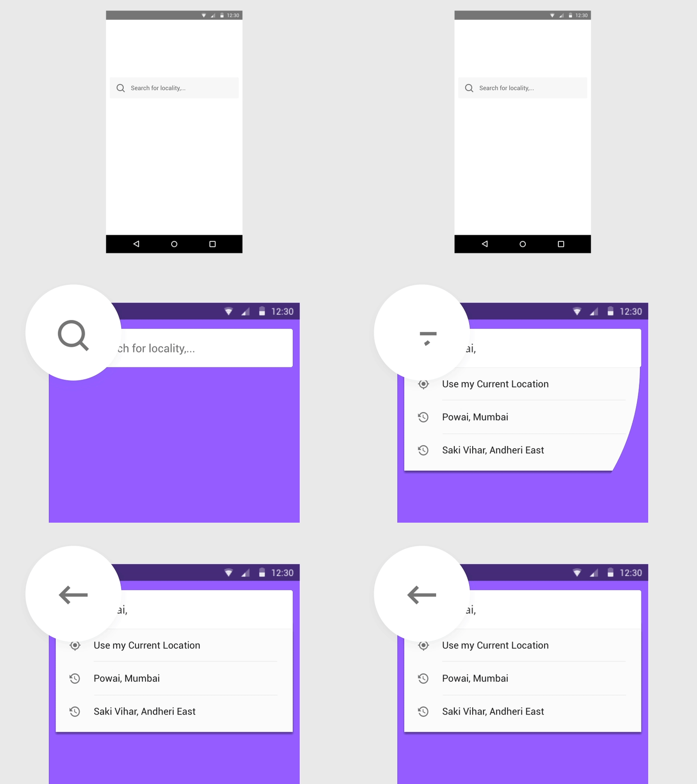
Tap the search icon on mobile and it typically opens a full-screen overlay rather than a small dropdown, since there’s rarely enough screen space for both content and suggestions to share the view.
Airbnb’s mobile app uses this pattern directly, expanding search into its own full screen the moment a person taps in.
The on-screen keyboard eats roughly half the visible screen once it appears, which is why mobile suggestion lists show fewer items than their desktop dropdown counterparts.
Filter Access on Mobile: Bottom Sheets vs Modals
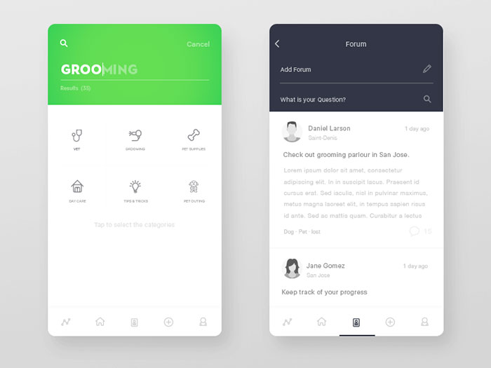
A bottom sheet slides up from the edge of the screen and leaves a sliver of the results grid visible behind it, so there’s at least some sense of continuity.
Modals skip that entirely. They cover the full screen and hide the results grid completely until someone closes them.
57% of sites still fail to make color swatches available inside mobile list items for visually driven categories like apparel, pushing shoppers into an extra tap just to check a color option (Baymard Institute).
Mobile apps carry their own separate problem. Baymard’s 2026 Mobile App UX benchmark found 71% of leading ecommerce apps perform “mediocre or worse” overall, with only 29% reaching a decent standard.
What Accessibility Standards Apply to Search UI Design
Search interfaces fall under the same WCAG 2.2 requirements as the rest of a page, published by the W3C on October 5, 2023, covering keyboard access, focus handling, and screen reader announcements.
Accessible search isn’t some separate discipline from UX design. It’s just what UX design looks like once it accounts for someone who can’t see the screen or use a mouse.
Dynamic result updates need an ARIA live region set to “polite,” so a screen reader announces the new result count without interrupting whatever the person is doing at that moment.
| Requirement | What It Covers | Search UI Application |
|---|---|---|
| Keyboard access (WCAG 2.1.1) | Full functionality without a mouse | Arrow keys and Enter inside autocomplete |
| Live regions | Announcing dynamic content changes | Result count updates after a query |
| Labeled form inputs | Programmatic name for every field | The search box itself |
33.1% of all form inputs across the homepages WebAIM scanned in February 2026 still lack a programmatic label, a category that includes the search box on plenty of sites (WebAIM Million, 2026).
That gap compounds across the wider web. 95.9% of the one million homepages WebAIM tested had at least one detectable WCAG failure, reversing six straight years of gradual improvement (WebAIM Million, 2026).
Ecommerce doesn’t fare any better on its own core functionality. Baymard’s accessibility benchmark found 94% of the top-grossing sites it reviewed carry compliance issues across just 4 basic criteria: images, links, form fields, and keyboard navigation under WCAG 2.1 AA.
Focus indicators on filter checkboxes and a visible focus ring on the search field itself round out the list of checks worth running before a search interface ships.
How Do Voice and Natural Language Interfaces Change Search UI Design
“Waterproof jacket” becomes “which of these jackets actually works in heavy rain” once voice and natural language search enter the picture, and that shift changes how long an input field needs to be and how the results screen gets built.
Short keyword input turns into full conversational questions, shifting the interface away from a list of matches and toward a single synthesized answer.
Google’s own AI Overviews now appear on roughly half of all US search queries, per Google’s official disclosure in early 2026, though independent trackers report figures ranging from about 18% to 60% depending on methodology and query sample.
That spread matters for search UI design specifically. When an answer engine can satisfy a query directly, the interface has to decide whether to show a synthesized response, a results list, or both at once.
Perplexity built its entire interface around that decision, leading with a direct answer and a citation list instead of a traditional results grid.
- Longer input fields, sized for full sentences instead of short keywords
- A microphone icon paired with waveform feedback during active listening
- A transcription line showing what the system heard before it searches
- A direct-answer panel positioned above any list of matching results
The interface implication runs deeper than added input length. Once a natural language query can return a direct answer, the results list becomes a secondary confirmation layer rather than the primary output.
What Are Common Search UI Design Mistakes
Hiding the search field behind an icon on a content-heavy site removes the one navigation method some visitors rely on most, especially on documentation platforms where search functions as the primary way through the content.
Filters that reset the moment a person hits the back button force them to rebuild an entire query from scratch after clicking into a single product. It’s a small thing that costs a surprising amount of trust.
WCAG’s own keyboard success criterion (2.1.1) requires every interactive element, autocomplete dropdowns included, to work without a mouse. Plenty of shipped autocomplete dropdowns never get tested for arrow key navigation before launch anyway.
Baymard’s mass merchant research points to a related pattern: sites carrying huge catalogs often let category clutter and inconsistent filter groupings bury the search box itself under competing navigation elements.
- No indication of what was actually searched, leaving the person unsure if their query registered
- Too many facet categories exposed at once, overwhelming rather than narrowing
- Search fields that submit only on a button click, ignoring the Enter key entirely
- Autocomplete dropdowns with no visible focus state, making keyboard position invisible
Each of these shares a root cause, honestly. The interface got built around what looks clean in a design file, not what a person actually does with their hands and eyes while trying to find something specific.
How Do You Measure Search UI Performance
Search UI performance really comes down to how often a search comes up empty and how often someone clicks a result once it appears. Whether they need to try the search again afterward is worth watching too, though it’s usually a symptom rather than the root problem.
Algolia’s own analytics documentation defines No Results Rate, Click-Through Rate, and No Click Rate as core metrics tracked against search events (Algolia, 2026).
| Metric | What It Measures | Where To Find It |
|---|---|---|
| No Results Rate | Share of searches with zero matches | Algolia Analytics dashboard |
| Click-Through Rate | Searches followed by at least one click | Algolia Analytics dashboard |
| No Click Rate | Searches with results but no click | Algolia Analytics dashboard |
| Conversion Rate | Searches followed by a purchase event | Algolia Analytics dashboard |
Google Analytics 4 tracks site search through a single event, view_search_results, switched on by default under Enhanced Measurement, with the query itself captured in a search_term parameter.
Session recording tools like Hotjar fill the gap analytics dashboards leave open. A dashboard shows that a search failed. A recording shows the exact moment a person gave up and closed the tab.
Search Abandonment Rate vs Zero-Result Rate
Zero-result rate is the percentage of searches where the engine itself came up empty, pointing to a technical problem somewhere in the index or the matching logic.
Search abandonment rate measures something else. Results did show up that time, but the person left anyway without clicking a single one, which usually signals a UI or relevance problem rather than a technical one.
Testing one variable at a time, like moving the filter panel from a sidebar to a horizontal bar above the results, against either metric isolates whether a specific interface change is the reason engagement moved.
Search UI Design Examples
Search Bar Animation

N-calendar app concept
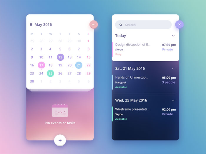
Craiglist Mobile animation
Mail App [Inbox+Search]
![Mail App [Inbox+Search]](https://www.designyourway.net/diverse/6/uisearch/2123631.jpg)
Home & Side Menu Screen
iOS App Filter
iOS Search Experience
DateNight – iOS App WIP
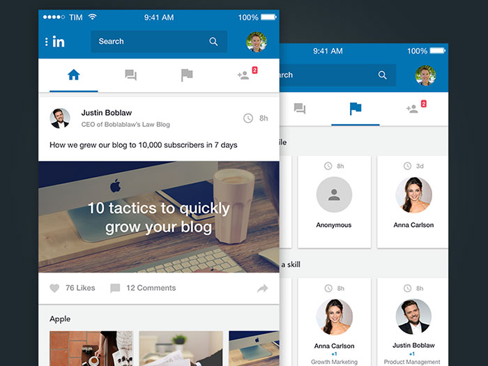
Linkedin Mobile App Redesign
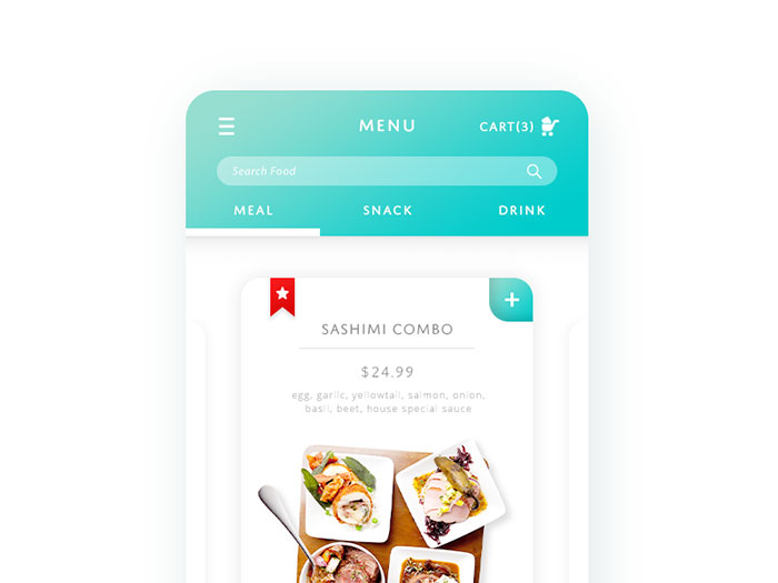
Food & Drink Menu
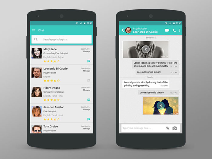
Counsellors – Feed & Chat
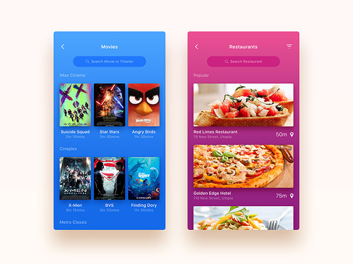
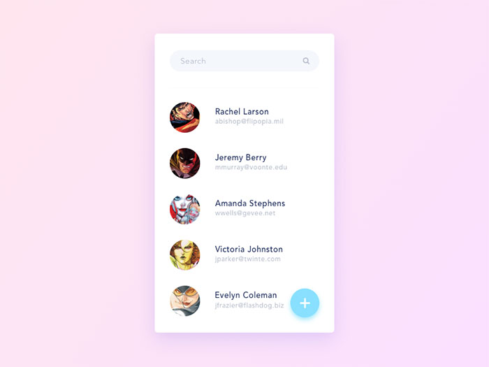
Search
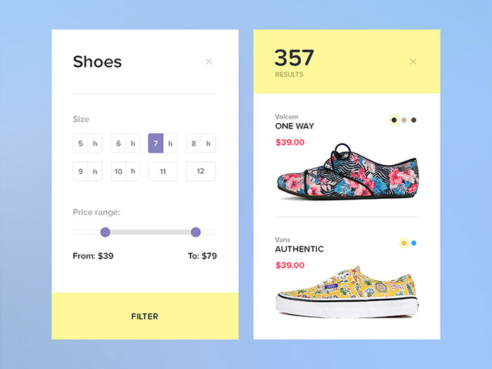
Search Results
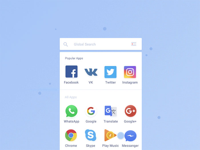
Mobile apps search transition
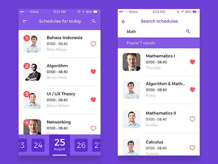
Schedule App #2
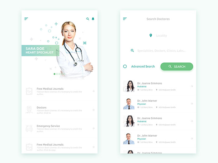
Search Doctor Mobile app design
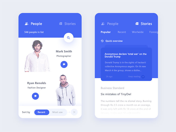
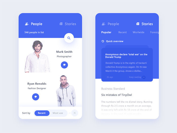
People + story screen
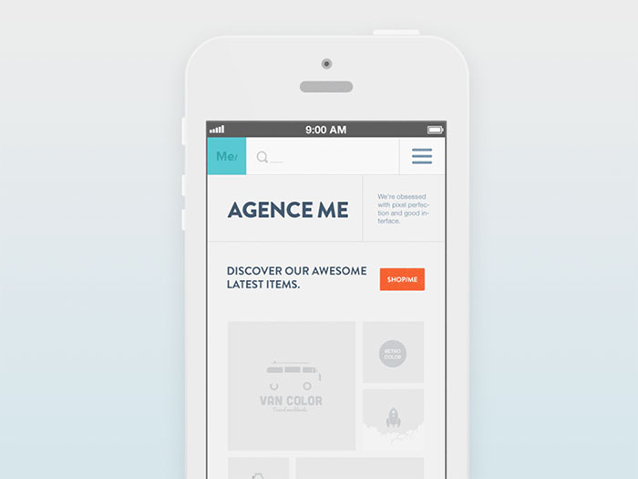
Responsive Search
Fashion Inspiration Android App
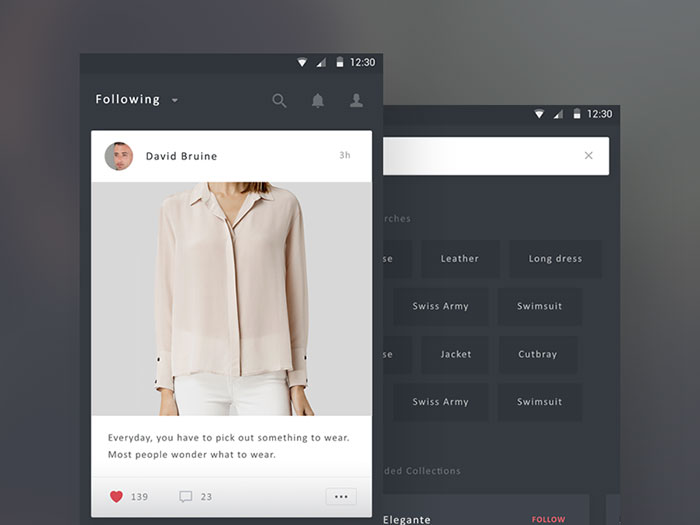
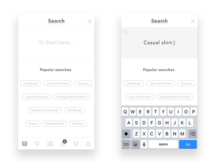
Search – exploring new styles
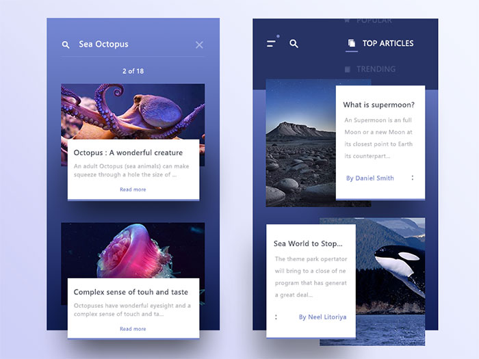
Top+search
FAQ on Search UI Design
What Is the Ideal Search Bar Width
A search field needs enough width to display a typical query without truncating it. Nielsen Norman Group ties input width to the average query length for that specific site, rather than a fixed pixel standard used across every project.
Does Search UI Design Affect SEO
Site search itself is not indexed by Google, but faceted navigation and filter URLs often are. Poorly structured filter parameters create duplicate or thin pages, which is why crawl controls matter alongside the interface design.
How Many Autocomplete Suggestions Should Show At Once
Most implementations cap visible suggestions between 5 and 10 items. Beyond that range, the dropdown competes with the keyboard for screen space and forces scrolling, slowing down exactly the interaction autocomplete is meant to speed up.
What Is Federated Search
Federated search queries multiple separate indexes or data sources at once and merges the results into a single list. It’s common on enterprise intranets and marketplaces, where products, documents, and help articles all live in different systems.
Should Search Results Open In a New Tab
Keep results in the same tab. Opening search in a new tab breaks the back button, strips away applied filters, and forces the person to juggle two browser windows just to compare options.
What Is a Search-As-You-Type Interface
Search-as-you-type updates the results grid live with every keystroke, skipping the separate submit step entirely. It differs from autocomplete, which only suggests queries, because it renders actual matching results as the person types.
How Do You Design Search For a Multilingual Website
Autocomplete and filter labels need full translation, not just the results themselves. Right-to-left languages also flip the search icon and input alignment, and diacritic-insensitive matching stops a missed accent mark from returning zero results.
What Is the Difference Between Site Search and Enterprise Search
Site search covers a single website’s own content or catalog. Enterprise search spans multiple internal systems at once, like email, shared drives, and ticketing tools, and typically needs permission-based results so people only see what they’re allowed to access.
How Do You Usability Test a Search Interface Before Launch
Give test participants specific tasks, not open-ended browsing, then watch where they hesitate or abandon the query. Small moderated sessions of around five users typically surface most major usability problems before a wider rollout.
What Is Faceted Search Used For Outside Ecommerce
Content sites lean on facets to filter articles by topic, date, or format. Real estate platforms do it by bedrooms and price. Job boards go further, layering location, salary, and remote status on top of each other, though it’s the same underlying pattern in every case.
Conclusion
Search UI design rewards sequencing. Fixing every component at once usually means fixing none of them well.
Pull the zero-result rate and the click-through rate before touching a single filter or facet. Those two numbers point to whichever piece is broken, whether that’s autocomplete, faceted navigation, or the results grid itself.
A search bar that looks polished but ships without keyboard support on its suggestion list will still fail a real share of visitors, no matter how good it looks in the mockup.
Treat mobile search UI as its own project, not a scaled-down copy of desktop. Porting one layout straight onto the other usually breaks something once the screen gets smaller.
Fix the box and the suggestions first. Everything downstream, sort order, card design, filter logic, works better once the entry point actually works.

Renowned for his expertise in logo design and visual branding, Bogdan has developed a multitude of logos for various clients.
His skills extend to creating posters, vector illustrations, business cards, and brochures. Additionally, Bogdan's UI kits were featured on marketplaces like Visual Hierarchy and UI8.
He also wrote in the past years on sites like Design Your Way, WebDesignerDepot, WPDean, Designmodo, Speckyboy, Slider Revolution, and more.
- The Windsurf Logo History, Colors, Font, And Meaning - 10 October 2026
- How to Remove Background From Product Photos (No Photoshop) - 10 October 2026
- How Designers can Build a Stronger Online Creative Identity - 9 October 2026

Bogdan Sandu is a seasoned designer who has been designing websites since 2008. Renowned for his expertise in logo design and visual branding, Bogdan has developed a multitude of logos for various clients. His skills extend to creating posters, vector illustrations, business cards, and brochures. Additionally, Bogdan's UI kits were featured on marketplaces like Visual Hierarchy and UI8. He also wrote in the past years on sites like Design Your Way, WebDesignerDepot, WPDean, Designmodo, Speckyboy, Slider Revolution, and more.
You Might Also Like