

Blue lettering spells out “Linked,” and a white “in” sits inside a blue rounded square right after it. That square gets used on its own too, as the [in] logo.
The one-color version running today dates from June 2019, and its blue is commonly cited as #0A66C2.
That value is sampled, since LinkedIn publishes no code for it. The company also hasn’t said what typeface the lettering uses.
What does the LinkedIn logo look like?
Text and symbol read as one name here, which makes it a combination mark. “Linked” is blue. “in” is white, set inside a blue square with softened corners.
- The “i” in the square is a circle for the dot and a rectangle for the stem. According to Adweek in 2019, LinkedIn built its brand shape system on those same two shapes.
- Everything runs along one horizontal line, and the square doubles as a standalone icon. Color-wise it’s one blue, with white for the letters inside the square.
Minimum size gets measured on the square rather than the text, and on screen that means 21 px tall.
Meaning: two words, one square
The design is mostly the name itself, with the second word boxed.
LinkedIn’s public material explains the 2019 refresh, not the original logo. The brand site called the circle and rectangle shapes distinctive to LinkedIn and traced them back to the “i” in the logo (Marketing Interactive, 2019).
Executive creative director Kevin Frank told Adweek the refresh went for a warmer palette and rounder shapes. The new palette sits around the blue instead of centering on it.
This next part is interpretation, and LinkedIn hasn’t documented it. Most writing on the psychology of logo colors reads blue as trust and stability, which suits a professional network. LinkedIn has never given that as its reason for the color.
Colors and HEX codes: which LinkedIn blue is right?
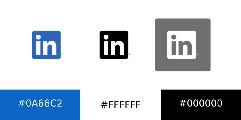
Only one color now, plus white. The older logo used three colors, and the 2019 version dropped to a single blue.
| Color | HEX | RGB | Notes |
|---|---|---|---|
| LinkedIn Blue (current, sampled) | #0A66C2 | 10, 102, 194 | Widely cited for the current blue. Not published on LinkedIn’s logo pages. |
| LinkedIn Blue (earlier value) | #0077B5 | 0, 119, 181 | Still set as the theme color in the code of brand.linkedin.com pages. |
| White | #FFFFFF | 255, 255, 255 | Letters inside the square, preferred background. |
| Black | #000000 | 0, 0, 0 | One-color print version. |
The text of LinkedIn’s logo guidelines pages states no HEX, RGB, Pantone or CMYK codes. Both blues are approximations, and the sources that cite them don’t agree with each other.
When color is not practical, the full logo may be reproduced in solid white or black. The [in] logo only comes in blue, black and white.
Blue is crowded territory for tech brands, as a scroll through other blue logos shows, so the boxed “in” does the identifying work.
Typography: what LinkedIn has and has not disclosed
LinkedIn has not publicly named the typeface behind the logo lettering.
What it did announce in June 2019 was a custom brand typeface called Community. It is proprietary, uses rounded letterforms and borrows elements of handwriting (Search Engine Journal, 2019). The sources reviewed don’t say whether the logo lettering is drawn from it.
The typeface is custom and no public alternative is named, so any font “matched” to the logo online is a guess.
Who designed the LinkedIn logo?
No individual designer of the logo is publicly credited.
The 2019 refresh was led from inside LinkedIn. It was two years of work code-named Project Otis, presented by Frank and VP of brand marketing and corporate communications Melissa Selcher (Adweek, 2019). The brand consultancy Wolff Olins also worked on it. Transform magazine reported in August 2019 that LinkedIn rebranded with the agency’s help, and Wolff Olins’ own write-up says it led LinkedIn through the two-year transformation. Neither source says who drew the logo itself. Launch coverage from Search Engine Journal and Marketing Interactive names no outside agency, and no redesign cost appears in the coverage reviewed.
The paper trail goes back further. USPTO records show LinkedIn filed trademark applications for the “in” square and the LINKED + IN lockup on July 16, 2009.
How the logo changed over time
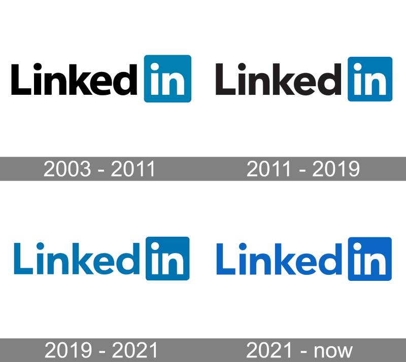
LinkedIn’s own launch material documents one change, from a three-color logo to the one-color logo introduced in June 2019. Logo-history sites such as Waalaxy and 1000logos also list an original 2003-era logo.
The three-color logo, until 2019
Black “Linked,” a white “in” and a blue square made up the logo until 2019. LinkedIn retired that combination when it moved to a single color.
Logo-history sites date this version to 2011, but LinkedIn has not documented that start year, and earlier tweaks to its lettering are not documented by LinkedIn or the design press.
One blue, from June 2019 on
Adweek reported the update on June 13, 2019, the day LinkedIn unveiled it. The black “Linked” text took on the blue of the square, which cut the logo from three colors to one.
LinkedIn framed the change as part of a brand-wide refresh meant to express warmth and community, with a more human feel overall (Search Engine Journal, 2019). Marketing Interactive noted that the single color makes the name read as one word.
The rollout was staged. brand.linkedin.com and the signed-out welcome page went first, and the rest of the platform followed gradually.
The full logo and the [in] square: which version goes where
LinkedIn treats the full logo and the standalone [in] logo as separate assets with separate rules.
The full logo, blue wordmark plus square, is preferred on solid white. LinkedIn allows no one to use it without an existing brand or trademark license.
The square on its own is the [in] logo, available in blue, black or white. Members can use it as a link to a profile, company page or group, on a business card with a profile link or QR code, in an email signature, or in a row of social icons.
Download formats, sizes and clear space
LinkedIn provides transparent PNG files in several sizes and says other formats can be supplied on request.
The official files sit on LinkedIn’s brand downloads page, and downloading them means accepting LinkedIn’s brand and user agreements.
On screen, the minimum height is 21 px, measured on the [in] portion. In print it is 0.25 in (6.35 mm). Clear space around the full logo should equal the height or width of the square, so one [in].
Files may not be enlarged past their native size. For print, LinkedIn requires the high-resolution [in] logo, and picking the right file format for printing a logo follows the same logic: vector artwork stays sharp at any size, while PNG suits screens.
Usage rules from LinkedIn’s brand guidelines
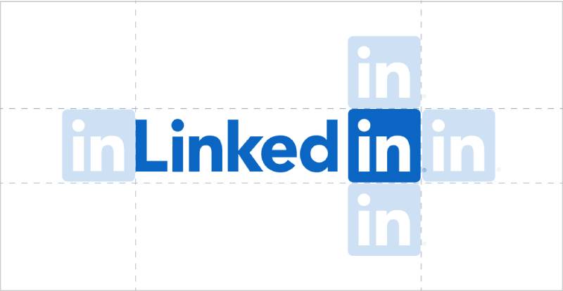
LinkedIn’s guidelines get specific about what is and isn’t allowed.
- Leave clear space around the full logo equal to the height or width of one [in] logo.
- Blue on a solid white background is the default. Solid white or black is for situations where color is impractical.
- The LinkedIn logo stands alone and cannot be combined with another logo.
- Don’t change the shape or color of the [in] logo, and don’t build it into words. LinkedIn’s own examples of what not to do are “[in]vesting” and “Love[in]”.
Registered marks back these rules. USPTO records show the LINKED + IN lockup (Reg. 3971642) registered on May 31, 2011, with color not claimed. The white “in” on a blue square (Reg. 4016687) registered on August 23, 2011, with blue and white claimed as features of the mark.
How that protection works in general is covered in this guide to trademarking a logo.
LinkedIn next to Facebook and Microsoft: a quick comparison
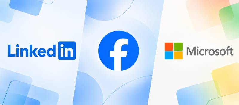
All three use blue, but only LinkedIn puts letters inside a square next to a blue wordmark.
| Logo | Mark | Colors |
|---|---|---|
| “Linked” text plus white “in” in a square | Blue, white | |
| White lowercase “f” on a blue field | Blue, white | |
| Microsoft | Four squares beside a wordmark | Red, green, blue and yellow squares; gray wordmark |
Facebook’s approach is the closest cousin, a single lowercase letter carrying the brand on blue. Facebook’s logo compresses the name into one letter, while LinkedIn keeps the full word and boxes only its last two letters.
Microsoft has owned LinkedIn since it completed the acquisition in December 2016, yet Microsoft’s own logo shares nothing with LinkedIn’s palette. The one-color LinkedIn logo arrived in 2019, about three years after that deal.
Common Questions About the LinkedIn Logo
Can I put the [in] logo on my resume or website?
Within limits, yes. LinkedIn lets members use the [in] logo as a hyperlink to a profile, company page or group, in an email signature, and on a business card next to a profile link or QR code. A resume is not named on the brand page, so an unaltered, hyperlinked square is the closest permitted use.
Can I print the LinkedIn logo on merchandise or a book cover?
No. LinkedIn does not permit its brand on manufactured products such as t-shirts, jackets, mugs, stickers and decals. For books, podcasts and newsletters, neither the full logo nor the [in] logo may appear within the title. The name may be used only as plain text with the ® symbol, never as the first word or dominant part of the title. Covers must not use LinkedIn’s signature blue or a layout resembling the platform, and a mockup of the proposed cover goes to LinkedIn’s trademark team for review and approval. The full logo is licensed only.
Is the LinkedIn logo a registered trademark?
Yes. USPTO records list LinkedIn Corporation as owner of several registrations from 2011, including the white “in” on a blue square and the LINKED + IN lockup. Those records cover the United States only.
Can I use LinkedIn blue in my own branding?
Avoid imitating it. LinkedIn’s branding guidelines tell people not to copy or imitate its website design, typeface, colors, graphics or imagery, and book and podcast covers must not use its signature blue. For anything commercial, treat that guidance as a trade dress warning and check with LinkedIn or a trademark lawyer.
Can I redraw the LinkedIn logo myself in Canva or Photoshop?
No. LinkedIn’s guidelines point people to the supplied artwork, and the color and shape of the [in] logo may not be modified. The [in] logo is also limited to three approved versions, blue, black and white.
Did Microsoft redesign the LinkedIn logo after buying the company?
Not according to the 2019 coverage. Adweek described Project Otis as LinkedIn’s own two-year brand effort, presented by its executive creative director and brand marketing VP, and the only outside agency reported on the project is Wolff Olins. The launch reports reviewed never mention Microsoft, whose acquisition closed in 2016.
Which LinkedIn Logo Version to Use Where
For most people, the [in] logo is the only LinkedIn logo version they can use. LinkedIn licenses the full wordmark lockup to existing partners, while members may use the square in blue, black or white.
That is why LinkedIn builds its rules around the square. Clear space equals one [in], and minimum size is measured on it, so the icon is the unit every other decision starts from.
On a light page or in print, use the blue [in] on solid white. A dark photo or background calls for the white version. In a row of social icons, pick whichever supplied color matches the rest of the row.
As of October 2026, brand.linkedin.com still shows the 2019 one-color logo, so only a new rebrand would change these rules. Anyone weighing the square against other designs can see how other tech company logos pair a symbol with a name.

Renowned for his expertise in logo design and visual branding, Bogdan has developed a multitude of logos for various clients.
His skills extend to creating posters, vector illustrations, business cards, and brochures. Additionally, Bogdan's UI kits were featured on marketplaces like Visual Hierarchy and UI8.
He also wrote in the past years on sites like Design Your Way, WebDesignerDepot, WPDean, Designmodo, Speckyboy, Slider Revolution, and more.
- The LinkedIn Logo History, Colors, Font, and Meaning - 20 November 2026
- Why Quality Assurance is the Backbone of Seamless UI/UX and Web Design - 20 November 2026
- How to Design T-Shirt Art That Actually Prints Well - 19 November 2026

Bogdan Sandu is a seasoned designer who has been designing websites since 2008. Renowned for his expertise in logo design and visual branding, Bogdan has developed a multitude of logos for various clients. His skills extend to creating posters, vector illustrations, business cards, and brochures. Additionally, Bogdan's UI kits were featured on marketplaces like Visual Hierarchy and UI8. He also wrote in the past years on sites like Design Your Way, WebDesignerDepot, WPDean, Designmodo, Speckyboy, Slider Revolution, and more.
You Might Also Like


