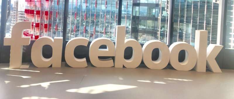
The Facebook Logo is one of the most recognized brand marks on the planet. Over 3 billion people see it every month. That little white “f” sitting inside a blue circle has become shorthand for social media itself.
Facebook launched in 2004 from a Harvard dorm room. Mark Zuckerberg and his co-founders built a platform that changed how humans communicate. And through every update, every controversy, every pivot toward the metaverse, the logo stayed remarkably consistent.
The current version uses a flat, deeper blue with a white lowercase “f” inside a circle. It was last refreshed in September 2023 by Meta’s in-house design team. The mark sits under the Meta corporate umbrella now, but it still carries the weight of two decades of brand recognition. Few tech company logos have managed that kind of staying power.
What Is the Facebook Logo?
The Facebook logo is a combination mark that pairs a lowercase “f” monogram icon with a wordmark. It was originally designed in 2005 by Mike Buzzard of Cuban Council, based on the Klavika typeface by Eric Olson. The blue and white color scheme represents trust, openness, and digital connectivity.
Here’s what defines the Facebook logo today:
- Design Type: Combination mark. The “f” monogram works as a standalone icon, while the full “facebook” wordmark serves corporate and marketing uses.
- Primary Elements: A white lowercase “f” set inside a solid blue circle. The wordmark uses a custom sans-serif font derived from Klavika, later refined into Facebook Sans.
- Official Introduction Date: The original Klavika-based wordmark appeared in 2005. The circular “f” icon took shape around the same period and has been refined multiple times since. The most recent update launched in September 2023.
- Designer/Agency: Mike Buzzard (Cuban Council) led the original design. Eric Olson created the Klavika typeface that served as the foundation. Joe Kral completed the type modifications. The 2023 refresh was handled by Meta’s in-house team under design director Dave Nguyen.
- Trademark Status: The Facebook name and “f” logo are registered trademarks owned by Meta Platforms, Inc. Meta actively enforces its trademark rights globally and restricts unauthorized use on merchandise, domain names, and advertising.
- Color Palette: Facebook Blue (#1877F2) as the primary color. White (#FFFFFF) for the “f” and wordmark text. The 2023 refresh introduced a deeper, more confident blue along with an expanded palette of secondary blues ranging from light blue to dark navy.
- Usage Context: The “f” icon appears on mobile apps (iOS, Android), desktop interfaces, browser tabs, marketing materials, social sharing buttons across third-party websites, and broadcast media. The full wordmark is reserved for corporate use.
How Has the Facebook Logo Evolved Over Time?
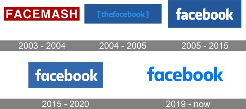
The Facebook logo has gone through about six distinct phases since 2003. Each change was subtle. The brand never did a dramatic overhaul. Instead, small refinements kept the mark fresh while protecting two decades of recognition.
What’s interesting is how little actually changed. The blue-and-white combination has been there from almost the beginning. The lowercase lettering stayed. Even the basic shape of the “f” icon barely shifted. Most people never noticed the updates unless someone pointed them out.
The Facemash Logo (2003)
- Years Active: 2003 (lasted only a few days)
- Design Description: The word “FACEMASH” in white uppercase letters set against a deep red/maroon rectangular background. Simple, bold, and completely different from what came after.
- Color Scheme: White text on a maroon background
- Designer: Created by Mark Zuckerberg himself
- Context: Facemash was a “hot or not” comparison site built by Zuckerberg during his second year at Harvard. The university shut it down within days after he pulled student photos from the school’s security network. The project almost got him expelled.
- Cultural Significance: This short-lived mark set the basic DNA for future versions. White text on a colored rectangle. That structure carried forward, even though everything else changed. It’s a reminder that sometimes your first draft contains seeds of what works, even when the execution is rough.
TheFacebook Logo (2004)
- Years Active: February 2004 – 2005
- Design Description: The word “thefacebook” in lowercase, framed between square brackets. Light blue text on a dark blue background. No spaces between “the” and “facebook.”
- Color Scheme: Light blue text on dark blue background
- Designer: Mark Zuckerberg and early team
- Context: Launched on February 4, 2004, as an online directory for Harvard students. The name came from the physical “facebook” directories given to incoming students at universities.
- Key Changes from Previous: Complete shift from red/maroon to blue. Moved from uppercase to lowercase. Added the bracket framing.
- Cultural Significance: The brackets gave it an academic, almost code-like feel that fit its college audience perfectly. This is where the blue identity began, and there’s a personal reason for it. Zuckerberg has deuteranopia, a form of red-green color blindness. Blue is the color he sees most clearly.
The First Official Facebook Logo (2005-2015)
- Years Active: 2005 – 2015
- Design Description: “The” was dropped. The brackets disappeared. The word “facebook” now appeared in white lowercase letters on a blue rectangle. The typeface was a custom modification of Klavika.
- Color Scheme: White text on a blue rectangle (#3b5998)
- Designer: Mike Buzzard (Cuban Council), with Eric Olson (Klavika typeface creator) and Joe Kral (type modifications)
- Context: Sean Parker, Facebook’s first president and Napster co-founder, is famously credited with pushing to drop “The” from the name. The simpler name reflected the platform’s expansion beyond Harvard to other universities and eventually the general public.
- Key Changes from Previous: Removed “the” and the brackets. Switched to a professional, custom typeface. White lettering replaced the light blue. The overall look became cleaner and more corporate.
- Cultural Significance: This is the version most people grew up with. It carried the brand through its explosive growth from a college network to a global platform with over a billion users. The Klavika-based typography gave it a modern, accessible feel that worked across desktop and early mobile interfaces.
The Refined Facebook Logo (2015-2019)
- Years Active: 2015 – 2019
- Design Description: The typeface was updated to be slimmer and rounder. The most noticeable change was the switch to a single-story “a” instead of the double-story version. Letter shapes were softened with more rounded corners.
- Color Scheme: Same white on blue (#3b5998), though the shade appeared slightly different in various digital contexts
- Designer: Eric Olson worked on refining the typeface, with internal Facebook design team involvement
- Context: This update was designed for a mobile-first world. The previous typeface was described as “dark, condensed, and compact.” The new version needed to read clearly on smaller screens. According to Olson, the goal was to “streamline” the mark.
- Key Changes from Previous: Single-story “a” replaced the double-story “a.” Letterforms became rounder and lighter. The overall feel shifted from corporate to more approachable.
- Cultural Significance: The timing matters here. By 2015, most Facebook usage had moved to mobile. A logo that was designed for desktop monitors needed to work on 5-inch screens. The refinements were small but they made the mark more legible at smaller sizes.
The 2019 Facebook Logo Update
- Years Active: 2019 – 2023
- Design Description: The blue wordmark moved to a neutral background. A new corporate “FACEBOOK” wordmark in all caps was introduced briefly to represent the parent company (before the Meta rebrand). The circular “f” icon got a gradient treatment, shifting from a flat blue to a blue-to-light-blue gradient.
- Color Scheme: The “f” icon updated to #1877F2 with gradient effects. The corporate wordmark used a shifting color to represent different Meta products.
- Key Changes from Previous: Introduction of the gradient on the “f” icon. Separation between the product logo (lowercase “facebook”) and the corporate identity (uppercase “FACEBOOK”).
- Cultural Significance: This was a transitional period. Facebook was dealing with privacy scandals, congressional hearings, and public trust issues. The split between product and corporate branding was a strategic move that foreshadowed the Meta rebrand in 2021.
The Current Facebook Logo (2023-Present)
- Years Active: September 2023 – present
- Design Description: The gradient was removed from the “f” icon, returning to a flat, solid blue. The blue became deeper and more confident. The “f” was made slightly larger within the circle. The wordmark was refined using Facebook Sans, the company’s custom typeface.
- Color Scheme: A deeper, richer blue (evolved from #1877F2) with white. An expanded palette of secondary blues was introduced.
- Designer: Meta’s in-house design team, led by Dave Nguyen (Director of Design) and Tagu Kato (VP Head of Design)
- Context: The refresh focused on accessibility and brand consistency across all touchpoints. The deeper blue provides better contrast for the white “f,” making the icon more legible at small sizes and for users with visual impairments.
- Key Changes from Previous: Removed the gradient. Deepened the blue. Enlarged the “f” relative to the circle. Refined the wordmark’s relationship with Facebook Sans. Rebuilt the entire iconography system.
- Cultural Significance: This update happened alongside a busy year for social media rebrands, with Twitter becoming X and Meta launching Threads. Facebook’s approach was the opposite of dramatic. Instead of tearing everything down, they made careful, measured adjustments. The kind of changes only a designer with a sharp eye would catch.
What Do the Design Elements of the Facebook Logo Mean?
Every part of the Facebook logo carries purpose. The lowercase lettering suggests approachability. The blue conveys trust. The circular shape of the icon works across digital platforms at any size. None of it happened by accident.
The simplicity is the point. A logo that 3 billion people interact with monthly can’t afford to be complicated. It needs to register in milliseconds on a phone screen, a browser tab, or a notification badge.
Why Did Facebook Choose These Specific Colors?
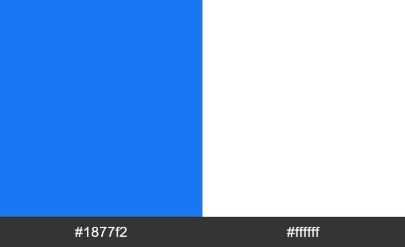
The origin story is well known. Mark Zuckerberg has deuteranopia, a type of red-green color blindness. Blue is the color he perceives most clearly. That personal detail shaped the entire visual identity of one of the biggest companies on Earth.
But there’s more to it than one person’s vision. Blue is the most commonly used color in tech branding for good reason. It signals reliability, calmness, and professionalism. Companies like IBM, Dell, and Intel all lean on it. According to color theory, blue sits on the cool side of the spectrum and produces a calming psychological effect.
Here are the specifics:
- Facebook Blue: Hex #1877F2 | RGB (24, 119, 242) | CMYK (83, 52, 0, 0) | Pantone 2727C. This is the primary brand color. It’s been gradually deepened over the years, with the 2023 refresh making it richer for better accessibility and contrast.
- White: Hex #FFFFFF | RGB (255, 255, 255). Used for the “f” lettermark and the wordmark text. White against blue creates high saturation contrast that reads well at any size.
- Athens Gray: Hex #F0F2F5. Used in the app’s interface as a background color. Not technically part of the logo but present across the product experience.
The pairing of blue and white also does something specific to human perception. It feels clean, youthful, and open. If you look at blue logos across industries, you’ll see this combination come up again and again. Banks use it. Airlines use it. Tech companies use it. It’s not a coincidence.
What Typography Style Is Used in the Facebook Logo?
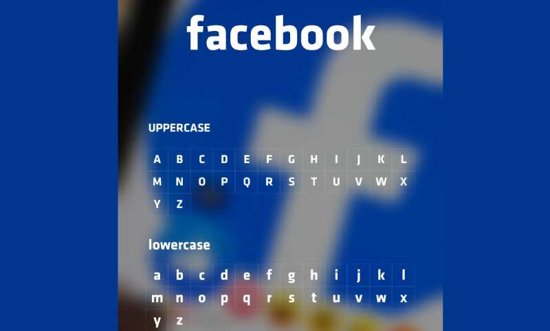
The original wordmark was a custom version of Klavika, a geometric sans-serif font designed by Eric Olson at Process Type Foundry. Joe Kral handled the modifications to make it unique to Facebook.
The current wordmark uses Facebook Sans, a custom typeface built by Meta’s design team. It keeps the spirit of the original Klavika-based design but with refinements that work better across screens.
Key characteristics of the typography: lowercase letters throughout, rounded terminals, a single-story “a” (changed from the double-story version in 2015), open letterforms that stay legible at small sizes, and slightly angled ascenders on letters like “b” and “k” that add subtle forward motion.
The lowercase choice matters. It signals informality. You don’t shout on Facebook. At least, that was the original idea. Compare it to something like the Microsoft Logo or the Oracle Logo, which use more structured, corporate treatments. Facebook’s font psychology aims at something friendlier.
What Are the Hidden Meanings in the Facebook Logo?
There’s no elaborate hidden symbol here. No arrow tucked into a letterform like FedEx. The Facebook logo is direct.
But there are intentional details worth noting. The slightly angled crossbar of the “f” in the icon creates a sense of forward movement. The rounded edges of the circle (replacing the earlier square) feel more human and less corporate. And the minimum of design elements, just one letter and one color, follows principles of minimalist design that keep the focus tight.
One unintentional interpretation that’s gained traction: the “f” looks like a flag when viewed from a certain angle. Some designers have noted it resembles a person’s profile when rotated. These readings weren’t part of the original design intention, but they’ve become part of the logo’s cultural life anyway.
How Does the Facebook Logo Compare to Competitor Logos?
Social media logos have a few things in common. Most use simple shapes. Most work at tiny sizes. Most stick to one or two colors. But within that framework, each platform has made different bets.
The Twitter Logo (now X) went from a friendly bird to a stark letter. Instagram ditched its retro camera for a gradient-filled outline. Hulu keeps things minimal with green. Netflix went with a bold red “N.”
Facebook sits at the conservative end of the spectrum. While other platforms have made dramatic visual shifts, Facebook has kept the same basic identity for nearly 20 years. That consistency has value. Users don’t need to relearn the brand.
The comparison gets more interesting within Meta’s own family. Instagram has a colorful, gradient-heavy identity. WhatsApp uses green. Messenger has its own purple-blue gradient. The Facebook “f” stands out by being the simplest of the group. Just solid blue and white. Among other brands that use blue, Facebook’s shade has become so closely associated with the company that designers sometimes just call it “Facebook Blue.”
What Are the Technical Specifications of the Facebook Logo?
Official Color Codes
- Primary – Facebook Blue:
Hex: #1877F2 | RGB: (24, 119, 242) | CMYK: (83, 52, 0, 0) | Pantone: 2727C
- Secondary – White:
Hex: #FFFFFF | RGB: (255, 255, 255) | CMYK: (0, 0, 0, 0)
- Interface Background – Athens Gray:
Hex: #F0F2F5 | RGB: (240, 242, 245) | CMYK: (2, 1, 0, 4)
Dimensions and Proportions
- Aspect Ratio: The “f” icon uses a 1:1 ratio (circle format). The wordmark scales proportionally based on usage context.
- Minimum Size: 16 pixels or 6mm for digital and print use, respectively. In practice, the logo appears at 30px on the Facebook Brand Page and 40px in the desktop app.
- Clear Space: Defined by dividing the logo width by four. If X represents the logo’s total width, the clear space around it should be at least 1/4 X on all sides.
- File Formats: Available in vector graphics formats (SVG, EPS, AI) and raster formats (PNG, JPEG) through Meta’s Brand Resource Center. For high-quality scaling across DPI settings, the vector versions are recommended.
What Cultural Impact Has the Facebook Logo Had?
That little blue “f” changed how we think about digital identity. It was one of the first social media icons people added to their websites, business cards, and email signatures. The “Find us on Facebook” badge became standard for businesses of all sizes.
The logo’s cultural weight goes beyond branding. It became a symbol of a new era of communication. When people talk about social media’s influence on politics, relationships, or news consumption, the Facebook logo is usually the image that comes to mind.
It also set a template for how social media platforms approach visual identity. Keep it simple. Make it work at any size. Use strong color associations. Instagram, Snapchat, TikTok, and others all followed a similar playbook. The idea that a social platform’s icon needs to be instantly recognizable at 20 pixels, that started with Facebook and a handful of other early platforms.
How Does the Facebook Logo Fit Into the Overall Brand Identity?
The Facebook logo doesn’t exist alone. It’s one piece of a larger system that includes the Meta corporate brand, Instagram, WhatsApp, Messenger, and other products under the Meta umbrella.
After the 2021 rebrand to Meta, the corporate identity separated from the product identity. The Meta logo (an infinity-like “M” shape) represents the parent company. The Facebook “f” represents the social media product specifically.
This matters because the brand guidelines treat them as different things. You can’t use the Facebook wordmark for general marketing. That’s the corporate identity. For promoting your presence on the platform, you use the “f” icon. It’s a distinction that trips up a lot of businesses and content creators.
The overall system follows clear graphic design principles. Consistency across products. Visual hierarchy that puts Meta at the top and individual product brands underneath. A shared commitment to accessibility and legibility. The individual pieces work together because they follow the same underlying rules, even when they look different on the surface.
How Should the Facebook Logo Be Used?
Meta has strict rules about this. Here’s what you need to know.
Do:
- Use the “f” logo to promote your presence on Facebook (your Page, group, or app)
- Download official assets from Meta’s Brand Resource Center only
- Maintain the logo’s original shape, color, and proportions
- Keep enough clear space around the logo so it’s not cluttered
- Capitalize the word “Facebook” when writing it in text (except in web addresses)
- Use the “f” logo alongside other social media icons at equal size
Don’t:
- Modify the logo’s design, color, or proportions in any way
- Use the Facebook wordmark. That’s the corporate identity, not for general use
- Put the logo on merchandise (clothing, mugs, hats, toys) without explicit permission
- Use the logo in a way that suggests partnership or endorsement from Meta
- Combine the Facebook brand with your own name or marks to create a new logo
- Animate, distort, or make physical objects in the shape of the logo
- Use any version of the logo found outside Meta’s official resources
- Abbreviate “Facebook” as “FB” or use it as a verb
Where to access official logos: Meta’s Brand Resource Center at facebook.com/brand. You’ll need to accept the usage guidelines before downloading.
Licensing: The Facebook logo is not available for licensing on merchandise or consumer products. Limited use of the “f” logo on product packaging may be permitted in specific cases, but requires following Meta’s packaging guidelines. For TV, film, or broadcast use, you must submit a permission request through Meta’s official form.
Trademark protection: Meta actively registers and enforces its Facebook trademarks worldwide. You cannot register any mark that’s confusingly similar to Facebook’s trademarks. Nominative fair use is permitted, meaning you can reference “Facebook” when talking about the platform, but you can’t use the stylized logo or wordmark without permission. For questions, Meta accepts trademark inquiries through their official channels.
FAQ on The Facebook Logo
What font does the Facebook logo use?
The original wordmark was built on Klavika, a geometric sans-serif typeface designed by Eric Olson. Joe Kral modified it for the brand.
Today, the logo uses Facebook Sans, a custom typeface created by Meta’s design team. It keeps the same clean, rounded feel but works better across mobile screens and small icon sizes.
What are the official Facebook logo colors?
Facebook Blue is the primary color. The hex code is #1877F2. In RGB values, that’s (24, 119, 242). The CMYK breakdown is (83, 52, 0, 0).
White (#FFFFFF) fills the “f” lettermark. The 2023 refresh deepened the blue for better visual contrast and accessibility. The expanded color palette now includes secondary blues from light to dark navy.
Why is the Facebook logo blue?
Mark Zuckerberg has deuteranopia, a form of red-green color blindness. Blue is the hue he sees most clearly. That personal detail shaped the entire brand identity.
It also just makes sense. Blue signals trust and reliability in color psychology. Most major tech platforms and bank logos lean on blue for the same reasons.
Who designed the Facebook logo?
Mike Buzzard from Cuban Council led the original design project. Eric Olson created the Klavika typeface that served as the foundation. Joe Kral handled the final type modifications and wordmark.
Buzzard was offered equity in Facebook for the work. He turned it down. The 2023 refresh was handled internally by Meta’s team under Dave Nguyen.
Can I use the Facebook logo on my website or marketing materials?
You can use the “f” icon to promote your Facebook Page, group, or app. Only download assets from Meta’s official Brand Resource Center. Never pull logos from random sites.
Don’t modify the shape, color, or proportions. Don’t put it on merchandise. And don’t make it the most prominent feature of your creative, or it looks like an endorsement from Meta.
How has the Facebook logo changed over time?
It started as “FACEMASH” in white caps on maroon in 2003. Then “[thefacebook]” in light blue on dark blue in 2004. The brackets and “the” dropped in 2005.
Since then, changes have been small. A slimmer typeface in 2015. A gradient icon in 2019. A flat, deeper blue in 2023. The core identity barely moved in two decades.
What is the difference between the Facebook logo and the Meta logo?
The Facebook “f” represents the social media app. The Meta logo, an infinity-shaped “M,” represents the parent company that also owns Instagram, WhatsApp, and Messenger.
They split in 2021 when Facebook Inc. rebranded to Meta Platforms. The Facebook product kept its own visual identity. Two separate marks, two separate purposes within the same brand style guide.
What file format should I download the Facebook logo in?
For print work, go with vector formats like SVG or EPS. They scale without losing quality at any DPI.
For web and digital use, PNG with transparent background works well. Avoid bitmap formats for anything that needs to resize. Meta provides all approved formats through their Brand Resource Center.
What does the Facebook “f” icon symbolize?
It’s a lowercase “f” inside a circle. No hidden symbols. No secret messages. The simplicity is the point.
The angled crossbar on the “f” creates a subtle sense of forward motion. The circular shape replaced the earlier rounded square, giving the icon a softer, more human feel. Good logo design principles at work. Nothing extra.
What is the minimum size for displaying the Facebook logo?
Meta sets the minimum at 16 pixels for digital or 6mm for print. Below that, the “f” loses legibility and the mark stops working.
Clear space matters too. Take the logo’s width, divide it by four. That’s your minimum buffer on every side. On Facebook’s own desktop app, the icon displays at 40 pixels.
Conclusion
The Facebook Logo proves that restraint works. Two decades, billions of users, and the core identity barely changed. A white “f” on blue. That’s it.
Every refinement served a purpose. Better legibility on mobile. Stronger emphasis through deeper color. Improved accessibility across screen sizes. The alignment between form and function stayed tight throughout.
Whether you’re studying brand identity for your own project or just curious about why that blue icon looks the way it does, the lesson is clear. Strong logo design doesn’t need to be loud. It needs to be consistent, scalable, and honest about what the brand actually is.

Renowned for his expertise in logo design and visual branding, Bogdan has developed a multitude of logos for various clients.
His skills extend to creating posters, vector illustrations, business cards, and brochures. Additionally, Bogdan's UI kits were featured on marketplaces like Visual Hierarchy and UI8.
He also wrote in the past years on sites like Design Your Way, WebDesignerDepot, WPDean, Designmodo, Speckyboy, Slider Revolution, and more.
- How to Install Fonts on Mac (Step-by-Step Guide) - 20 September 2026
- From Mockup to Code: How AI-Augmented Development Speeds Up the Design Handoff - 19 September 2026
- The Beehiiv Logo History, Colors, Font, And Meaning - 18 September 2026

Bogdan Sandu is a seasoned designer who has been designing websites since 2008. Renowned for his expertise in logo design and visual branding, Bogdan has developed a multitude of logos for various clients. His skills extend to creating posters, vector illustrations, business cards, and brochures. Additionally, Bogdan's UI kits were featured on marketplaces like Visual Hierarchy and UI8. He also wrote in the past years on sites like Design Your Way, WebDesignerDepot, WPDean, Designmodo, Speckyboy, Slider Revolution, and more.
You Might Also Like