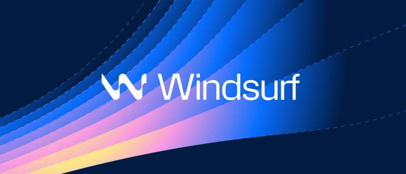
The Windsurf logo is the visual identity of Windsurf, an AI-native code editor developed by Codeium and launched in November 2024. It uses a combination mark built around a turquoise-and-midnight color palette, pairing a minimal geometric symbol with a clean sans-serif wordmark. The brand went through two corporate identities before settling on the Windsurf name, making the logo a relatively recent but fast-recognized mark in the developer tools space.
In the broader history of tech company logos, Windsurf sits squarely in the current wave of AI tool branding: geometric, minimal, and built for dark-mode interfaces from day one. That’s not an accident. Most AI coding tools that launched between 2022 and 2025 followed similar playbooks, chasing the same “precision + energy” aesthetic.
The current Windsurf logo launched in November 2024 alongside the Windsurf Editor itself. The company formally completed its full corporate rebrand from Codeium to Windsurf in April 2025. Codeium was founded in 2021 as Exafunction before rebranding in 2022. The brand has gone through three distinct identities: Exafunction (2021), Codeium (2022), and Windsurf (2024 to present). No public designer or agency has been credited for the Windsurf logo specifically.
What Is the Windsurf Logo?
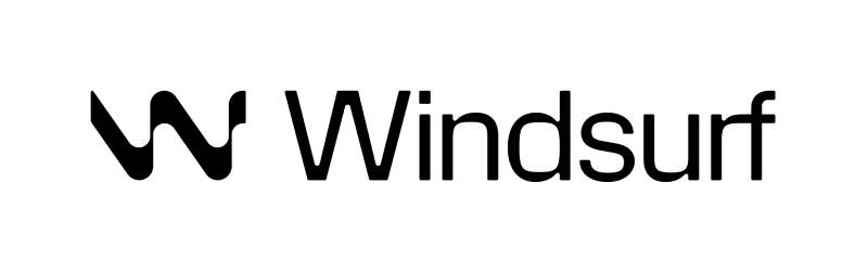
The Windsurf logo is a combination mark featuring a stylized geometric symbol alongside a lowercase wordmark in a geometric sans-serif typeface. It was introduced in November 2024 with the launch of the Windsurf Editor, using turquoise (#34E8BB) as its primary color against a deep midnight navy (#011C42) background.
- Design Type: Combination mark (symbol + wordmark)
- Primary Elements: Geometric wave/flow symbol, lowercase sans-serif wordmark
- Official Introduction Date: November 2024 (editor launch); corporate rebrand finalized April 2025
- Designer/Agency: Not publicly credited; created in-house by Codeium
- Trademark Status: The Windsurf name and logo are proprietary to Codeium/Windsurf (now under Cognition AI ownership). Official brand guidelines are published at windsurf.com/brand
- Color Palette: Turquoise (#34E8BB), Aero Blue (#A8FDE8), Midnight (#011C42), White (#FFFFFF)
- Usage Context: App icon, IDE interface, marketing materials, documentation, press kit, digital platforms, merchandise
How Has the Windsurf Logo Evolved Over Time?
The brand behind Windsurf has cycled through three identities since 2021. Exafunction came first, then Codeium in 2022, and finally Windsurf in late 2024. Each rebrand reflected a genuine strategic pivot, not just a cosmetic refresh.
Original Exafunction Logo (2021-2022)
- Years Active: 2021-2022
- Design Description: Corporate logotype suited to a GPU infrastructure company, with technical and engineering-focused visual cues
- Color Scheme: Not publicly documented
- Designer: Unknown
- Context: Exafunction launched in 2021 focused on optimizing GPU workloads for deep learning. The branding reflected an infrastructure-first identity aimed at enterprise machine learning teams
- Key Changes from Previous: First iteration; no prior version
- Cultural Significance: Represented an era when the company was purely a backend infrastructure provider, before pivoting to developer-facing tools
Codeium Logo (2022-2024)
- Years Active: 2022-2024
- Design Description: Developer-focused brand identity. The Codeium wordmark used a clean, modern sans-serif treatment, with a color system reflecting the AI coding assistant market
- Color Scheme: Turquoise-adjacent palette carrying over into the Windsurf era
- Designer: Unknown
- Context: The rebrand from Exafunction to Codeium in 2022 marked the company’s shift from infrastructure to a direct developer product, competing with GitHub Copilot. The Codeium name and logo were built around accessibility and the free-tier positioning
- Key Changes from Previous: Full name change and identity overhaul from Exafunction. Adopted a developer-friendly aesthetic targeting individual coders, not just enterprise ML teams
- Cultural Significance: The Codeium brand became widely recognized among developers as the best free alternative to GitHub Copilot, reaching over 1 million downloads by February 2024
Windsurf Logo (2024-Present)
- Years Active: November 2024-present
- Design Description: Combination mark with a geometric wave/flow symbol and a lowercase sans-serif wordmark. The symbol abstracts fluid motion, connecting to the “wave” and “flow” metaphors central to the product’s Cascade feature
- Color Scheme: Turquoise (#34E8BB), Aero Blue (#A8FDE8), Midnight Navy (#011C42), White (#FFFFFF)
- Designer: Created in-house by Codeium’s team; no external agency credited
- Context: Launched alongside the Windsurf Editor in November 2024, the first self-described “agentic IDE.” Corporate rebrand from Codeium to Windsurf finalized April 2025. The company was later acquired by Cognition AI in December 2025
- Key Changes from Previous: Complete name and identity change from Codeium. Moved from a purely typographic brand to a combination mark. New color system with deeper midnight navy as the primary background color, positioning the logo for dark-mode environments
- Cultural Significance: The Windsurf brand landed during an extremely competitive period in AI coding tools. Within months of launch, the logo became familiar to over 1 million developers and appeared in major industry coverage covering the AI IDE “wars” with Cursor and GitHub Copilot
What Do the Design Elements of the Windsurf Logo Mean?
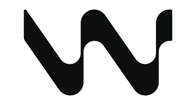
The Windsurf logo draws its meaning from the product’s core philosophy: fluid, uninterrupted developer flow.
The geometric symbol abstracts the motion of a wave or sail moving through water, directly referencing both the literal sport of windsurfing and the software concept of “Cascade flows” built into the product.
The lowercase wordmark reinforces approachability. A lowercase treatment reads less corporate than an all-caps or title-case mark, which fits a developer tool trying to feel accessible rather than institutional.
Why Did Windsurf Choose These Specific Colors?
- Turquoise (#34E8BB)
- Color Name: Turquoise
- Hex/RGB: #34E8BB / RGB (52, 232, 187)
- CMYK: 78, 0, 19, 9
- Symbolic Meaning: Speed, energy, and fluid motion. In the context of a coding tool, turquoise signals activity and intelligence without the aggression of red or orange
- Psychological Impact: High-energy but not overwhelming. Reads as “fast and smart” rather than “urgent.” The saturation level is high enough to pop on dark backgrounds, which matters for an IDE-first brand
- Brand Connection: Turquoise as a primary color is relatively uncommon in developer tools. It differentiates Windsurf visually from Cursor (black/white), GitHub Copilot (purple/dark), and other direct competitors
- Aero Blue (#A8FDE8)
- Color Name: Aero Blue
- Hex/RGB: #A8FDE8 / RGB (168, 253, 232)
- CMYK: 34, 0, 8, 1
- Symbolic Meaning: A lighter tint of turquoise used for gradients and secondary brand moments. Creates the illusion of depth and water-like layering
- Psychological Impact: Softer and more approachable than the primary turquoise. Works well as a highlight color in UI contexts and marketing visuals
- Brand Connection: The pairing of turquoise and aero blue creates an analogous color relationship that feels cohesive. Together, the two tones reinforce the water and wave theme that runs throughout Windsurf’s visual identity
- Midnight Navy (#011C42)
- Color Name: Midnight
- Hex/RGB: #011C42 / RGB (1, 28, 66)
- CMYK: 98, 58, 0, 74
- Symbolic Meaning: Depth, precision, and professionalism. A near-black navy carries the weight of a serious technical product without the harshness of pure black
- Psychological Impact: Midnight navy is increasingly common in AI tool branding because it reads as sophisticated rather than cold. It also creates maximum contrast against the turquoise accent, making the logo readable at any size
- Brand Connection: The midnight-to-turquoise contrast is one of the most distinctive things about the Windsurf color palette in the AI IDE space. Most competitors use either all-black or neutral grey as their base
What Typography Style Is Used in the Windsurf Logo?
The Windsurf wordmark uses a geometric sans-serif typeface rendered in lowercase.
The specific typeface has not been publicly named by Windsurf or Codeium. The letterforms show characteristics of a geometric sans: consistent stroke width, circular bowls on letters like “d” and “u,” and tight but open spacing.
The lowercase treatment is a deliberate choice. It softens the mark and distances it from the more authoritative uppercase treatments you see in enterprise software logos. For a product aimed at individual developers, that approachability matters.
The tracking in the wordmark is slightly open, which improves readability at small sizes, which is useful for a product whose logo appears constantly in app title bars and IDE tabs. The font evolution across the three brand eras (Exafunction, Codeium, Windsurf) has consistently moved toward simpler, more geometric treatments with each iteration.
What Are the Hidden Meanings in the Windsurf Logo?
The most intentional symbolism in the Windsurf logo is the connection between the geometric symbol and the product’s Cascade feature. Cascade is described as a system where the AI flows between action types automatically, and the wave-like symbol mirrors exactly that concept.
The choice of “flow” as the central design metaphor also connects to an explicit goal in the product: keeping developers in “flow state.” The brand page on windsurf.com literally uses the tagline “Built to keep you in flow state.” The symbol reinforces that before you even read a word.
The use of water-related language throughout the brand (waves, surfing, cascade, flow) is systematic rather than accidental. The company’s rebrand announcement referenced “wave by wave” iteration, product launches as making a “splash,” and the broader vision as the next “wave” of AI development. The logo symbol anchors all of that.
There are no widely documented subliminal or unintentional interpretations of the mark beyond the water/flow reading. Unlike some tech logos where hidden shapes or dual meanings have been confirmed by designers, Windsurf has not publicly commented on secondary meanings.
How Does the Windsurf Logo Compare to Competitor Logos?
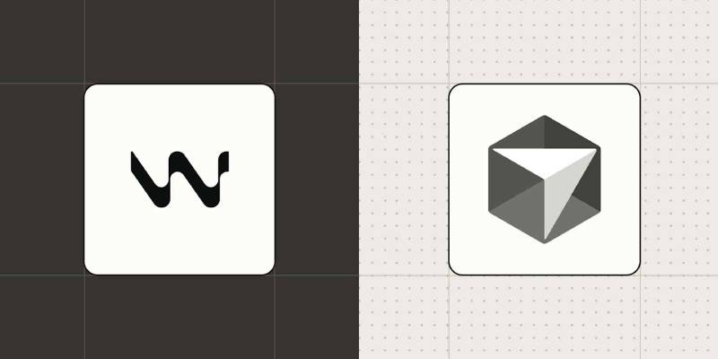
In the AI coding tools space, Windsurf’s turquoise-on-midnight palette stands out immediately next to its main competitors.
Cursor uses a high-contrast black and white identity with occasional accent colors, leaning into a stripped-back, serious-developer aesthetic. GitHub Copilot uses a dark purple and white palette, carrying Microsoft and GitHub’s existing brand equity. Replit uses orange and dark backgrounds, projecting energy and accessibility.
Windsurf’s turquoise is the most distinctive primary color in the group. That’s both a strength and a risk. It’s easy to spot in a comparison grid, but it also carries more personality than some enterprise buyers expect from a development tool. Worth noting that the Cursor logo takes the opposite approach entirely: sharp angles, maximum simplicity.
The lowercase wordmark also separates Windsurf from competitors like Copilot and several others that use capitalized or title-case wordmarks. Lowercase reads as more approachable and less corporate, which fits Windsurf’s positioning as a product that started with a generous free tier before moving upmarket.
Among the broader category of developer tools, the combination mark approach (symbol plus wordmark) is standard. What varies is execution. Windsurf’s symbol has more visual complexity than, say, the simple geometric marks used by tools like Linear or Figma, but it reads cleanly at small sizes, which is the real test for IDE-adjacent branding.
What Are the Technical Specifications of the Windsurf Logo?
Official Color Codes
- Primary Color: Turquoise
- Hex: #34E8BB
- RGB: (52, 232, 187)
- CMYK: (78, 0, 19, 9)
- HSL: (165, 80%, 56%)
- Pantone: No officially documented Pantone equivalent
- Secondary Color: Aero Blue
- Hex: #A8FDE8
- RGB: (168, 253, 232)
- CMYK: (34, 0, 8, 1)
- HSL: (165, 96%, 83%)
- Pantone: No officially documented Pantone equivalent
- Background/Dark Color: Midnight
- Hex: #011C42
- RGB: (1, 28, 66)
- CMYK: (98, 58, 0, 74)
- HSL: (215, 97%, 13%)
- Pantone: No officially documented Pantone equivalent
- White:
- Hex: #FFFFFF
- RGB: (255, 255, 255)
- CMYK: (0, 0, 0, 0)
Note: Windsurf has not published official Pantone equivalents in its public brand materials. The hex codes above are sourced from Brandfetch’s documentation of the windsurf.ai brand profile and from exafunction.com brand data.
Dimensions and Proportions
- Available Formats: SVG (preferred for web and UI use), PNG (for general digital use), JPEG (available for specific contexts)
- Aspect Ratio: Not officially documented in public brand materials
- Minimum Size: Not officially documented; standard practice for combination marks is a minimum of 120px wide in digital contexts and 1 inch wide in print
- Clear Space: Windsurf’s brand guide specifies using the wordmark “in all references to Windsurf as space allows” and the symbol alone for “space-limited layouts or standalone logo grids”
- Official Usage Guidelines: Published at windsurf.com/brand
The DPI requirements follow standard digital branding: 72 DPI minimum for screen use, 300 DPI for any print applications. The vector graphics format (SVG) is the preferred file type for all scalable applications, which ensures the logo retains crispness across any display resolution.
What Cultural Impact Has the Windsurf Logo Had?
For a brand that is barely two years old, Windsurf’s visual identity spread quickly. By April 2025, over 1 million developers had used the product, meaning the logo had meaningful exposure in an extremely tech-literate audience.
The turquoise color specifically became associated with the “new wave” of agentic AI tools. In developer communities on Reddit and Hacker News, the Windsurf brand became shorthand for the category of “Cursor competitors,” and the logo appeared in dozens of comparison articles, YouTube reviews, and social posts throughout 2025.
The brand has gone through significant corporate disruption: Google acquired the founding team in mid-2025, and Cognition AI bought the product in December 2025. Despite these changes, the Windsurf logo and color palette have remained consistent. That continuity has helped the brand survive what could have been an identity crisis. Most developers who follow the space still recognize “Windsurf” and its turquoise palette as a single coherent thing, regardless of who owns the company today.
The water/wave metaphor embedded in the logo also hit well with the developer community, which has largely embraced the “vibe coding” and “flow state” language that Windsurf helped popularize in 2025.
How Does the Windsurf Logo Fit Into the Overall Brand Identity?
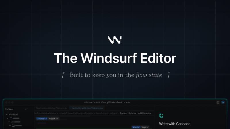
The logo is the most visible node in a brand system that runs consistently through every Windsurf touchpoint, from the IDE interface itself to its press kit, documentation, and social presence.
The midnight navy background in the logo maps directly to the IDE’s default dark theme. The turquoise accent appears as highlight colors in the Cascade interface, in call-to-action buttons on the website, and in feature diagrams. The brand style guide gives separate guidance for symbol-only use (for app icons and space-limited layouts) versus full wordmark use (for documentation and marketing).
The brand system connects closely to the product’s core narrative. Windsurf positions itself around the idea of “flow”: both the software feature (Cascade flows) and the developer psychology (flow state). The logo symbol, the wave metaphor in the name, and the turquoise-water color palette all reinforce that single concept across different contexts. That kind of internal consistency is what separates a deliberate brand from a logo that just happens to look nice.
Compared to other tech company logos in the AI space, Windsurf shows more thematic coherence between its name, its visual identity, and its product features than most. Tools like Copilot or Cursor have strong logos, but the connection between the mark and the product experience is more abstract. With Windsurf, the wave/flow concept runs all the way through.
How Should the Windsurf Logo Be Used?
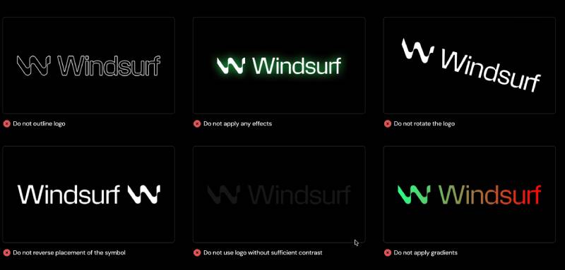
Official Usage Guidelines
- Wordmark vs. Symbol: Use the full wordmark (symbol + text) whenever space allows. Use the symbol alone for app icons, favicons, and space-limited layouts such as logo grids or partnership badges
- Color Versions: The logo is available in turquoise-on-dark and white versions. Use the appropriate version based on background color to maintain contrast and readability
- Do Not Modify: Do not change the logo’s colors, proportions, or add effects. This applies to adding drop shadows, outlines, or placing the logo on backgrounds that reduce contrast
- Clear Space: Maintain adequate clear space around the logo in all applications. The brand guide specifies this but does not publish exact pixel measurements publicly
Where to Access Official Logo Files
- Official Brand Page: windsurf.com/brand (includes downloadable brand assets)
- Press Kit: windsurf.com/press
- Available Formats: SVG and PNG via the official press kit; JPEG versions documented on third-party brand databases including Brandfetch
Licensing and Trademark
- The Windsurf name and logo are proprietary to Cognition AI (current owner as of December 2025)
- Editorial and educational use is generally permitted under standard fair use (reviews, comparisons, news articles)
- Commercial use, advertising, and merchandise require explicit permission. Contact Windsurf directly via windsurf.com for any use not covered in the public brand guidelines
- Do not use the logo in ways that imply official endorsement, partnership, or affiliation without written approval
- The Windsurf brand guidelines specify: “For any use not explicitly covered, please contact us with a visual mockup”
FAQ on The Windsurf Logo
What does the Windsurf logo look like?
It’s a combination mark: a geometric wave-inspired symbol paired with a lowercase wordmark.
The primary color is turquoise (#34E8BB), set against a deep midnight navy (#011C42) background. Clean, minimal, built for dark-mode environments from day one.
What do the Windsurf logo colors mean?
Windsurf CEO Varun Mohan confirmed the logo draws from “waves, vibes, and flow state.” The turquoise reflects speed and fluid motion.
Midnight navy gives the Windsurf brand identity depth and contrast. The color psychology here is deliberate: energetic but not aggressive, technical but approachable.
When was the Windsurf logo introduced?
The original Windsurf logo launched in November 2024 alongside the Windsurf Editor, the first self-described agentic IDE.
A refreshed version of the Windsurf visual identity rolled out in April 2025 when the company formally completed its full rebrand from Codeium to Windsurf.
Who designed the Windsurf logo?
No external agency has been credited. The logo was created in-house by the Codeium team.
This is common among fast-moving AI startups. The Windsurf logo design reflects the product’s core concept: AI and developer working in flow, not two separate entities.
What font is used in the Windsurf logo?
Windsurf has not publicly named the specific typeface in its wordmark.
The letterforms show characteristics of a geometric sans-serif: consistent stroke width, circular letter forms, slightly open font spacing. The lowercase treatment keeps the mark approachable rather than corporate.
Where can I download the official Windsurf logo?
Official Windsurf logo assets in SVG and PNG formats are available at windsurf.com/brand and windsurf.com/press.
Third-party brand databases like Brandfetch also host the Windsurf logo vector files. Always check the official brand guidelines before any use outside editorial or educational contexts.
What are the official Windsurf logo color codes?
The Windsurf brand color palette uses three primary values.
- Turquoise: Hex #34E8BB, RGB (52, 232, 187), CMYK (78, 0, 19, 9)
- Aero Blue: Hex #A8FDE8, RGB (168, 253, 232)
- Midnight: Hex #011C42, RGB (1, 28, 66), CMYK (98, 58, 0, 74)
How does the Windsurf logo compare to the Cursor logo?
Cursor uses a stark black-and-white identity. Windsurf goes the opposite direction with turquoise as its dominant color.
Both are vector-based combination marks designed for high contrast at small sizes. The difference is personality: Cursor reads as serious and precise; Windsurf reads as fast and fluid. Your preference will depend on which matters more to your workflow.
Has the Windsurf logo changed since launch?
Yes. A logo refresh happened in April 2025 alongside the full corporate rebrand from Codeium to Windsurf.
The Windsurf brand mark retained its turquoise-and-midnight palette and wave-inspired symbol, but the wordmark and overall system were refined. The Codeium extensions were also rebranded to Windsurf Plugins at the same time.
Can I use the Windsurf logo on my website or project?
Editorial, review, and educational use is generally acceptable under standard fair use.
Commercial use, advertising, or anything that implies partnership requires explicit written permission from Windsurf (now under Cognition AI). The official brand style guide states: “For any use not explicitly covered, please contact us with a visual mockup.”
Conclusion
The Windsurf logo is one of the sharper brand identity systems to come out of the AI developer tools space in recent years.
Its turquoise-and-midnight color palette, wave-inspired logomark, and clean lowercase wordmark all connect back to a single coherent idea: fluid, uninterrupted flow between developer and machine.
The Windsurf visual identity has stayed consistent through three ownership changes and two corporate rebrands, which says something about how well the original design was built.
For anyone working in Windsurf IDE branding, press usage, or integration directories, the official assets live at windsurf.com/brand.

Renowned for his expertise in logo design and visual branding, Bogdan has developed a multitude of logos for various clients.
His skills extend to creating posters, vector illustrations, business cards, and brochures. Additionally, Bogdan's UI kits were featured on marketplaces like Visual Hierarchy and UI8.
He also wrote in the past years on sites like Design Your Way, WebDesignerDepot, WPDean, Designmodo, Speckyboy, Slider Revolution, and more.
- The Windsurf Logo History, Colors, Font, And Meaning - 10 October 2026
- How Designers can Build a Stronger Online Creative Identity - 9 October 2026
- Minecraft Font Generator - 8 October 2026

Bogdan Sandu is a seasoned designer who has been designing websites since 2008. Renowned for his expertise in logo design and visual branding, Bogdan has developed a multitude of logos for various clients. His skills extend to creating posters, vector illustrations, business cards, and brochures. Additionally, Bogdan's UI kits were featured on marketplaces like Visual Hierarchy and UI8. He also wrote in the past years on sites like Design Your Way, WebDesignerDepot, WPDean, Designmodo, Speckyboy, Slider Revolution, and more.
You Might Also Like