


Every Sunday, millions of fans instantly recognize their favorite teams through powerful visual symbols that transcend the game itself. NFL logos represent far more than simple graphics-they embody decades of tradition, regional pride, and franchise identity that connects generations of supporters.
These iconic emblems tell stories of cities, cultures, and competitive spirit. From the Dallas Cowboys’ lone star to the Green Bay Packers’ classic “G,” each design carries deep meaning and historical significance.
Professional football branding has evolved dramatically since the league’s founding in 1920. Team logos now serve as crucial elements in sports marketing, merchandise sales, and brand recognition across multiple platforms.
This comprehensive guide examines all 32 NFL team logos, exploring their design elements, evolution, and cultural impact. You’ll discover the stories behind each emblem, understand their visual components, and learn how these symbols shape franchise identity in America’s most popular sport.
NFL Logos
| NFL Team Entity | Logo Design Attribute | Symbolic Value | Brand Semantics |
|---|---|---|---|
| Arizona Cardinals | Cardinal bird head profile | Speed, aggression, desert resilience | Avian predator + Southwest identity |
| Atlanta Falcons | Falcon silhouette in flight | Aerial dominance, precision, power | Southern raptor + urban sophistication |
| Baltimore Ravens | Stylized raven head shield | Intelligence, mystery, Edgar Allan Poe | Literary heritage + defensive fortress |
| Buffalo Bills | Charging buffalo silhouette | American frontier, stampede force | Wild West legacy + unstoppable momentum |
| Carolina Panthers | Panther head aggressive stance | Stealth, jungle predator, Carolina pride | Regional feline + sleek modernity |
| Chicago Bears | Stylized ‘C’ letter mark | City initial, simplicity, tradition | Midwest minimalism + historic franchise |
| Cincinnati Bengals | Tiger head with stripes | Jungle cat ferocity, striped pattern | Exotic predator + distinctive markings |
| Cleveland Browns | Orange helmet icon | Industrial simplicity, blue-collar work | Working-class identity + functional design |
| Dallas Cowboys | Five-pointed star emblem | Lone Star State, American excellence | Texas pride + national symbolism |
| Denver Broncos | Bronco horse head profile | Wild horse power, Rocky Mountains | Western frontier + untamed strength |
| Detroit Lions | Lion head roaring stance | King of jungle, Motor City toughness | Regal authority + industrial resilience |
| Green Bay Packers | Oval ‘G’ letter mark | Green Bay initial, community ownership | Small-town America + collective identity |
| Houston Texans | Bull head with Texas outline | Texas bulls, Lone Star geography | State pride + livestock heritage |
| Indianapolis Colts | Horseshoe symbol | Good luck charm, horse racing legacy | Racing tradition + fortune symbolism |
| Jacksonville Jaguars | Jaguar head snarling pose | Jungle stealth, Florida wilderness | Exotic predator + subtropical environment |
| Kansas City Chiefs | Arrowhead with feathers | Native American heritage, precision aim | Indigenous culture + tactical accuracy |
| Las Vegas Raiders | Pirate with eye patch shield | Outlaw spirit, rebellious attitude | Rogue identity + intimidation factor |
| Los Angeles Chargers | Lightning bolt emblem | Electric energy, California power | Dynamic force + coastal energy |
| Los Angeles Rams | Ram head with curved horns | Battering ram force, determination | Relentless power + Hollywood glamour |
| Miami Dolphins | Dolphin jumping through sun | Ocean intelligence, tropical paradise | Marine life + sunshine state lifestyle |
| Minnesota Vikings | Viking horn profile | Norse warrior culture, Scandinavian heritage | Viking ancestry + fierce tradition |
| New England Patriots | Patriot head tricorn hat | Revolutionary War, American founding | Colonial history + national identity |
| New Orleans Saints | Fleur-de-lis symbol | French heritage, religious blessing | Creole culture + spiritual protection |
| New York Giants | Lower case ‘ny’ letters | New York city pride, metropolitan power | Urban sophistication + Big Apple identity |
| New York Jets | Jet airplane wordmark | Aviation speed, modern technology | Aerospace innovation + velocity symbolism |
| Philadelphia Eagles | Eagle head side profile | American symbol, liberty, soaring flight | National bird + freedom representation |
| Pittsburgh Steelers | Three hypocycloids (steelmark) | Steel industry, blue-collar work ethic | Industrial heritage + working-class pride |
| San Francisco 49ers | SF letters oval badge | Gold Rush era 1849, California mining | Historic prospecting + West Coast legacy |
| Seattle Seahawks | Seahawk head fierce expression | Pacific Northwest wildlife, ocean predator | Regional bird + maritime environment |
| Tampa Bay Buccaneers | Pirate flag skull crossbones | Maritime raiders, Gulf Coast history | Seafaring outlaws + coastal adventure |
| Tennessee Titans | T-sword flame emblem | Greek mythology strength, burning spirit | Mythological power + competitive fire |
| Washington Commanders | W crest military shield | Military leadership, capital city authority | Command structure + governmental power |
Arizona Cardinals Logo
The Arizona Cardinals logo features a fierce cardinal head facing right with dark red plumage, black outlines, and a bright yellow beak, serving as the team’s official emblem since 2005.
Design Elements
Core visual components: Cardinal red (#97233F), black (#000000), and bright yellow (#FFB612) create the primary color palette. The aggressive bird head incorporates sharp lines and heavy black outlines. Bold wing feather details add movement and energy.
Typography: Clean, modern sans-serif lettering accompanies the primary mark when needed.
Logo Evolution
Historical progression: Started as interlocking “CC” design in 1920s Chicago. Evolved through cardinal-on-football design (1947-1960), full-body cardinal character (1960-1970), and simplified head design (1970-2005).
Major redesigns: 2005 update made the cardinal “sleeker and meaner” with yellow beak, heavier outlines, and more aggressive appearance. Previous version was criticized as looking like a “parakeet.”
Brand Identity
Team representation: Embodies strength, passion, and resilience. The cardinal’s fierce expression symbolizes determination and fighting spirit.
Regional connection: Though cardinals aren’t native to Arizona, the design connects with the team’s historical roots while representing desert toughness.
Usage Guidelines
Official applications: Primary mark appears on helmets, jerseys, and all team merchandise. Licensed for stadium displays and media usage.
Color specifications: Pantone PMS 194 C for cardinal red, PMS Black C, PMS 1235 C for yellow.
Visual Recognition
Distinctive features: Right-facing orientation, sharp beak angle, and intense eye create instant recognition. The aggressive stance differentiates it from other bird-themed NFL team emblems.
Atlanta Falcons Logo
The Atlanta Falcons logo displays a stylized falcon head in black and red, representing the team’s speed and aerial prowess since its 2003 redesign.
Design Elements
Core visual components: Black (#000000) dominates the falcon silhouette with red (#A71930) accent details. Sharp, angular lines create aerodynamic appearance. Silver highlights add metallic finish.
Symbolic elements: Streamlined design suggests high-speed flight and precision.
Logo Evolution
Historical timeline: Original 1966-2002 design featured more traditional falcon head. 2003 redesign introduced current sleek, aggressive styling with red accents.
Design philosophy: Modern iteration emphasizes speed and movement, reflecting team’s fast-paced playing style.
Brand Identity
Team values: Speed, precision, and aerial dominance. The falcon represents hunting prowess and territorial strength.
Cultural significance: Connects with Atlanta’s identity as a major transportation hub and “city too busy to hate.”
Usage Guidelines
Primary applications: Helmet decals, uniform patches, merchandise, and promotional materials.
Brand standards: Maintains consistent proportions across all media applications.
Visual Recognition
Unique elements: Forward-angled head position and red stripe detail create unmistakable profile among NFL bird logos.
Baltimore Ravens Logo
The Baltimore Ravens logo features a stylized raven head in purple and black, symbolizing intelligence and mystique while honoring Edgar Allan Poe’s literary connection to Baltimore.
Design Elements
Core visual components: Purple (#241773), black (#000000), and metallic gold (#FFB612) form the triadic color scheme. Sharp beak and intense eye details create menacing appearance.
Design motifs: Angular feather patterns and bold outlines emphasize strength and aggression.
Logo Evolution
Franchise history: Introduced in 1996 when team began play. Design remained largely consistent with minor refinements.
2024 updates: Added “Purple Rising” alternate helmet featuring front-facing raven logo with gold talon stripes.
Brand Identity
Literary connection: Honors Edgar Allan Poe’s “The Raven,” linking Baltimore’s cultural heritage with team identity.
Symbolism: Ravens represent intelligence, mystery, and cunning in battle.
Usage Guidelines
Official contexts: Primary logo for helmets and merchandise. Alternate front-facing version for special uniforms.
Color rush applications: Purple helmet pairs with all-purple uniform combinations.
Visual Recognition
Distinctive features: Side-profile orientation and purple color scheme create unique NFL branding. Sharp beak angle and eye intensity separate it from other bird designs.
Buffalo Bills Logo
The Buffalo Bills logo showcases a charging buffalo in red and blue, capturing the team’s power and connection to western New York heritage.
Design Elements
Core visual components: Red (#C60C30) and blue (#00338D) create bold complementary color scheme. Dynamic buffalo silhouette suggests forward momentum.
Typography integration: “Bills” wordmark uses custom serif font with traditional styling.
Logo Evolution
Design progression: Earlier versions featured more static buffalo poses. Current design emphasizes movement and aggression.
Color refinements: Red and blue combination has remained consistent, representing American patriotic themes.
Brand Identity
Regional heritage: Buffalo symbolizes strength of western New York and historical significance of the American frontier.
Team characteristics: Power, determination, and blue-collar work ethic.
Usage Guidelines
Primary usage: Helmet logo and merchandise applications. Consistent sizing maintains visual impact.
Brand guidelines: Specific color ratios preserve brand recognition across all platforms.
Visual Recognition
Unique aspects: Galloping pose and red-blue color combination create instant recognition. Buffalo imagery is unique among NFL animal mascots.
Carolina Panthers Logo
The Carolina Panthers logo presents a snarling panther head in black and silver, embodying the team’s fierce competitive spirit since 1995.
Design Elements
Core visual components: Black (#000000) primary color with silver (#BFC0BF) accents. Sharp teeth, intense eyes, and detailed whiskers create realistic appearance.
Design approach: Photorealistic styling distinguishes it from more stylized NFL animal logos.
Logo Evolution
Consistent design: Logo has remained virtually unchanged since team’s 1995 inception, demonstrating strong initial design.
Minor updates: Subtle refinements to maintain modern appearance while preserving original concept.
Brand Identity
Symbolism: Panthers represent stealth, power, and territorial dominance. Black color suggests mystery and intimidation.
Regional connection: Links to Carolinas’ natural wildlife heritage.
Usage Guidelines
Standard applications: Helmet logo, uniforms, merchandise, and stadium displays.
Licensing requirements: Strict adherence to proportions and color specifications.
Visual Recognition
Distinguishing elements: Realistic rendering style and prominent fangs create unmistakable silhouette. Silver detailing adds metallic sophistication.
Chicago Bears Logo
The Chicago Bears logo displays the classic “C” design in navy blue and orange, representing one of the NFL’s oldest and most storied franchises.
Design Elements
Core visual components: Navy blue (#0B162A) “C” with orange (#C83803) outline creates simple yet powerful mark. Bold, traditional typography reflects heritage.
Geometric precision: Perfect circular shape with consistent stroke width maintains clarity at all sizes.
Logo Evolution
Historical roots: Derived from original Chicago Cardinals interlocking “CC” design. Simplified to single “C” when Cardinals left Chicago.
Timeless design: Minimal changes preserve classic appearance and fan recognition.
Brand Identity
Tradition emphasis: Represents NFL’s founding era and Chicago’s tough, industrial character.
Team values: Strength, reliability, and blue-collar determination.
Usage Guidelines
Primary applications: Helmet logo is the complete identity. No additional elements needed.
Brand consistency: Orange and navy combination appears across all team materials.
Visual Recognition
Iconic status: Simple “C” design creates instant recognition. Orange-on-blue contrast ensures visibility and impact.
Cincinnati Bengals Logo
The Cincinnati Bengals logo features a stylized “B” with tiger stripe pattern in orange and black, reflecting the team’s big-cat identity.
Design Elements
Core visual components: Orange (#FB4F14) and black (#000000) create bold monochrome colors scheme. Tiger stripes integrate naturally with letter form.
Pattern details: Authentic tiger stripe design adds texture and visual interest.
Logo Evolution
Design consistency: “B” concept has remained stable with periodic stripe pattern refinements.
Modern updates: Current version balances readability with tiger-themed aesthetics.
Brand Identity
Animal connection: Tiger stripes directly link letter mark to team’s fierce feline mascot.
Competitive spirit: Orange and black suggest energy, aggression, and warning.
Usage Guidelines
Standard usage: Primary mark for helmets and promotional materials. Stripe pattern must remain consistent.
Color specifications: Exact orange and black values ensure brand integrity.
Visual Recognition
Unique features: Only NFL logo combining letter form with animal pattern. Orange-black combination is distinctive in league.
Cleveland Browns Logo
The Cleveland Browns logo is simply the orange helmet itself, making it the only NFL team whose logo is literally their helmet design.
Design Elements
Core visual components: Orange (#FF3C00) helmet with white facemask. No additional graphic elements or symbols.
Simplicity focus: Clean, unadorned design emphasizes tradition and authenticity.
Logo Evolution
Unique approach: Never featured traditional logo mark. Orange helmet has been constant since 1946.
Alternative marks: Secondary “Dawg Pound” logo and elf mascot exist but aren’t primary identifiers.
Brand Identity
Traditional values: Represents blue-collar Cleveland work ethic and no-nonsense attitude.
Authenticity emphasis: Helmet-as-logo suggests focus on game itself rather than marketing.
Usage Guidelines
Primary representation: Orange helmet serves all logo functions. Alternative marks for specific applications only.
Brand guidelines: DPI and color consistency crucial for helmet reproduction.
Visual Recognition
Distinctive approach: Only NFL team using helmet as primary logo. Orange color creates immediate recognition.
Dallas Cowboys Logo
The Dallas Cowboys logo showcases a blue star with white outline, symbolizing Texas pride and the team’s “America’s Team” identity.
Design Elements
Core visual components: Navy blue (#041E42) five-pointed star with silver (#869397) outline. Perfect geometric proportions create balanced appearance.
Color harmony: Blue and silver combination suggests strength and sophistication.
Logo Evolution
Design refinements: Original 1960 design featured lighter blue. Current darker shade provides better contrast and definition.
Consistent concept: Star symbol has remained unchanged, demonstrating strong original design.
Brand Identity
State symbolism: Lone Star represents Texas heritage and independent spirit.
National appeal: “America’s Team” nickname reflects broad fan base and patriotic associations.
Usage Guidelines
Primary applications: Helmet logo and merchandise. Star appears solo or with wordmark.
Proportional requirements: Exact star dimensions and outline width must be maintained.
Visual Recognition
Iconic status: Blue star is among most recognizable logos in sports. Simple design ensures instant identification.
Denver Broncos Logo
The Denver Broncos logo presents an aggressive horse head in orange and blue, symbolizing the untamed spirit of the American West.
Design Elements
Core visual components: Orange (#FB4F14) and blue (#002244) create dynamic color pairing. Sharp angles and flowing mane suggest speed and power.
Anatomical details: Realistic horse features with stylized interpretation enhance visual impact.
Logo Evolution
Major redesign: 1997 update replaced previous bucking bronco with current head design. Change coincided with consecutive Super Bowl victories.
Modern aesthetics: Angular design reflects contemporary graphic design movements while maintaining western theme.
Brand Identity
Western heritage: Horse symbolizes Colorado’s ranching history and frontier spirit.
Competitive fire: Aggressive expression represents team’s fighting mentality.
Usage Guidelines
Standard applications: Primary helmet logo and brand identifier. Orange and blue must maintain specific ratios.
Brand consistency: Horse head orientation and proportions require exact reproduction.
Visual Recognition
Distinguishing features: Angular mane design and fierce expression create unique profile among NFL animal logos.
Detroit Lions Logo
The Detroit Lions logo features a fierce lion head in Honolulu blue and silver, representing the king of beasts in the Motor City.
Design Elements
Core visual components: Honolulu blue (#0076B6) and silver (#B0B7BC) create distinctive color combination. Detailed mane and intense expression emphasize power.
Anatomical accuracy: Realistic lion features balanced with stylized interpretation for brand consistency.
Logo Evolution
Design stability: Current concept has remained consistent with periodic refinements to maintain modern appearance.
Color heritage: Honolulu blue has been team signature since 1930s, creating unique NFL color identity.
Brand Identity
Regal symbolism: Lion represents courage, strength, and leadership – “King of the Jungle” mentality.
Detroit connection: Fierce pride reflects city’s resilient character and industrial heritage.
Usage Guidelines
Primary usage: Helmet logo and merchandise applications. Blue and silver ratios must be exact.
Brand specifications: Lion head proportions and mane details require consistent reproduction.
Visual Recognition
Unique elements: Honolulu blue color is distinctive in NFL. Regal lion expression creates commanding presence.
Green Bay Packers Logo
The Green Bay Packers logo displays a circular “G” in green and gold, representing the team’s small-town heritage and championship tradition.
Design Elements
Core visual components: Green (#203731) “G” with gold (#FFB612) oval background. Clean, geometric design emphasizes simplicity and tradition.
Proportional balance: Letter sizing and oval dimensions create harmonious visual balance.
Logo Evolution
Historical consistency: Design has remained virtually unchanged since introduction, demonstrating timeless appeal.
Color refinements: Green and gold shades have been standardized for modern reproduction requirements.
Brand Identity
Community ownership: Represents unique fan-owned franchise structure and small-town values.
Championship legacy: Symbol connects to team’s rich history of success and tradition.
Usage Guidelines
Primary applications: Helmet logo and all brand materials. “G” requires specific proportions and color ratios.
Licensing standards: Exact green and gold specifications ensure brand consistency.
Visual Recognition
Classic design: Simple “G” creates instant recognition. Green and gold combination is uniquely Packers.
Houston Texans Logo
The Houston Texans logo features a stylized bull head incorporating Texas state flag elements, symbolizing strength and state pride since 2002.
Design Elements
Core visual components: Deep Steel Blue (#03202F) and Battle Red (#A71930) reflect Texas flag colors. White star serves as bull’s eye, creating clever dual symbolism.
Geometric precision: Angular design elements create modern, aggressive appearance.
Logo Evolution
Consistent design: Logo has remained unchanged since franchise inception, indicating strong initial concept.
Color stability: Deep Steel Blue and Battle Red maintain brand recognition and state connections.
Brand Identity
Texas symbolism: Bull represents state’s ranching heritage. Star design directly references state flag.
Regional pride: Emphasizes Houston’s role as major Texas city and energy capital.
Usage Guidelines
Primary applications: Helmet logo, uniforms, and merchandise. Star element must align properly within bull design.
Brand requirements: Color specifications and proportions require exact reproduction.
Visual Recognition
Distinctive features: Star-as-eye concept creates unique NFL logo. Texas flag colors provide immediate regional identification.
Indianapolis Colts Logo
The Indianapolis Colts logo showcases a blue horseshoe, representing luck, tradition, and the team’s equestrian heritage.
Design Elements
Core visual components: Speed Blue (#002C5F) horseshoe with white outline. Simple, iconic shape creates immediate recognition.
Symbolic meaning: Horseshoe represents good fortune and protection in sports superstition.
Logo Evolution
Design continuity: Horseshoe concept has remained constant through franchise moves from Baltimore to Indianapolis.
Color consistency: Blue and white combination maintains traditional appearance.
Brand Identity
Luck symbolism: Horseshoe represents team’s pursuit of fortune and championship success.
Equestrian connection: Links to horse racing heritage, particularly relevant in Indiana.
Usage Guidelines
Standard usage: Primary helmet logo and brand identifier. Horseshoe orientation must remain consistent.
Brand specifications: Blue shade and outline width require exact measurements.
Visual Recognition
Unique symbol: Only NFL logo using horseshoe design. Simple shape ensures instant identification.
Jacksonville Jaguars Logo
The Jacksonville Jaguars logo presents a snarling jaguar head in teal and gold, embodying the team’s fierce competitive nature.
Design Elements
Core visual components: Teal (#006778) and gold (#D7A22A) create distinctive color psychology combination. Detailed spots and whiskers add authenticity.
Ferocious expression: Open mouth and visible fangs emphasize aggressive team identity.
Logo Evolution
Design updates: 2013 redesign modernized original 1995 concept with cleaner lines and updated proportions.
Color refinements: Teal and gold shades adjusted for better reproduction and brand consistency.
Brand Identity
Predator symbolism: Jaguar represents stealth, speed, and lethal hunting ability.
Regional uniqueness: Teal color creates distinctive NFL brand identity separate from traditional colors.
Usage Guidelines
Primary applications: Helmet logo and merchandise. Jaguar head must maintain fierce expression.
2024 updates: New white alternate helmets feature primary logo with black facemask.
Visual Recognition
Distinctive elements: Teal color and spotted pattern create unique NFL appearance. Snarling expression differentiates from other cat-themed logos.
Kansas City Chiefs Logo
The Kansas City Chiefs logo features an arrowhead design in red and gold, honoring Native American heritage while symbolizing precision and direction.
Design Elements
Core visual components: Red (#E31837) arrowhead with gold (#FFB612) outline. “KC” letters integrated within geometric shape.
Cultural elements: Design respects Native American symbolism while maintaining modern sports aesthetic.
Logo Evolution
Historical development: Arrowhead concept introduced in 1963. Design has remained largely consistent with minor refinements.
Color standards: Red and gold combination maintains brand recognition and cultural significance.
Brand Identity
Native American respect: Arrowhead honors indigenous heritage with dignity and authenticity.
Precision symbolism: Arrow represents accuracy, focus, and hitting targets.
Usage Guidelines
Primary usage: Helmet logo and brand materials. “KC” integration requires proper alignment.
Cultural sensitivity: Logo usage respects Native American heritage and cultural considerations.
Visual Recognition
Unique design: Only NFL logo using arrowhead shape. Red and gold create distinctive color combination.
Las Vegas Raiders Logo
The Las Vegas Raiders logo displays a pirate head with crossed swords, embodying the team’s rebellious “Just Win, Baby” attitude.
Design Elements
Core visual components: Silver (#A5ACAF) and black (#000000) create bold monochrome colors scheme. Eye patch and crossed swords enhance pirate theme.
Fierce expression: Scowling face and detailed helmet create intimidating appearance.
Logo Evolution
Design consistency: Logo has remained virtually unchanged since 1963, demonstrating timeless rebel appeal.
Location independence: Design maintains identity through team moves from Oakland to Los Angeles to Las Vegas.
Brand Identity
Rebel symbolism: Pirate represents independence, toughness, and unconventional approach.
Intimidation factor: Silver and black suggest danger and mystique.
Usage Guidelines
Primary applications: Helmet logo and merchandise. Pirate details require precise reproduction.
Brand consistency: Silver and black ratios must maintain exact specifications.
Visual Recognition
Iconic status: Pirate theme is unique in NFL. Silver and black create instantly recognizable combination.
Los Angeles Chargers Logo
The Los Angeles Chargers logo features a lightning bolt in powder blue and gold, representing speed, power, and electrical energy.
Design Elements
Core visual components: Powder Blue (#0080C6) and gold (#FFC20E) create energetic color combination. Jagged bolt design suggests electrical power.
Dynamic shape: Angular lightning form implies movement and explosive energy.
Logo Evolution
Classic design: Lightning bolt concept has remained constant with periodic color and proportion adjustments.
Color heritage: Powder blue maintains historical team identity and unique NFL color presence.
Brand Identity
Electrical power: Lightning represents explosive offensive capability and energy.
Speed symbolism: Bolt suggests quick strikes and high-tempo gameplay.
Usage Guidelines
Primary usage: Helmet logo and brand identifier. Lightning bolt proportions must maintain dynamic appearance.
Color specifications: Powder blue and gold require exact reproduction for brand integrity.
Visual Recognition
Unique elements: Lightning bolt is distinctive NFL symbol. Powder blue creates singular color identity.
Los Angeles Rams Logo
The Los Angeles Rams logo showcases a curved ram horn in blue and gold, symbolizing strength, determination, and aggressive forward momentum.
Design Elements
Core visual components: Royal Blue (#003594) and gold (#FFA300) create classic color pairing. Curved horn design suggests power and forward motion.
Geometric flow: Smooth curves create elegant movement while maintaining aggressive symbolism.
Logo Evolution
Design evolution: Current curved design replaced previous ram head logo, emphasizing horn symbolism specifically.
Color consistency: Blue and gold maintain historical Los Angeles connection and brand recognition.
Brand Identity
Strength symbolism: Ram horns represent power, determination, and ability to break through obstacles.
Aggressive nature: Curved design suggests charging forward and overwhelming opponents.
Usage Guidelines
Primary applications: Helmet logo and brand materials. Horn curvature must maintain precise proportions.
Brand standards: Blue and gold ratios ensure consistent brand appearance.
Visual Recognition
Distinctive design: Curved horn creates unique NFL logo shape. Blue and gold combination provides strong brand identity.
Miami Dolphins Logo
The Miami Dolphins logo presents a leaping dolphin with sun background, representing intelligence, agility, and South Florida’s tropical atmosphere.
Design Elements
Core visual components: Aqua (#008E97) and orange (#FC4C02) create vibrant tropical color scheme. Sun element adds warmth and regional connection.
Dynamic pose: Leaping dolphin suggests grace, intelligence, and playful competitiveness.
Logo Evolution
Modern updates: 2013 redesign streamlined dolphin shape and enhanced color vibrancy while maintaining core concept.
Tropical consistency: Aqua and orange maintain South Florida identity and beach culture connections.
Brand Identity
Intelligence symbolism: Dolphins represent smart, strategic gameplay and mental toughness.
Regional identity: Tropical colors and sun element connect to Miami’s beach lifestyle.
Usage Guidelines
Primary usage: Helmet logo and merchandise. Dolphin leap must maintain fluid, natural appearance.
Color requirements: Aqua and orange specifications ensure tropical brand consistency.
Visual Recognition
Unique concept: Only NFL logo featuring marine mammal. Aqua color creates distinctive league identity.
Minnesota Vikings Logo
The Minnesota Vikings logo features a fierce Viking head with horned helmet, representing Norse warrior heritage and Scandinavian regional connections.
Design Elements
Core visual components: Purple (#4F2683) and gold (#FFC62F) create regal color combination. Detailed braided hair and horned helmet enhance warrior theme.
Fierce expression: Scowling face and prominent mustache create intimidating Norse appearance.
Logo Evolution
Design refinements: Logo has undergone periodic updates to maintain modern appearance while preserving Viking concept.
Color tradition: Purple and gold maintain unique NFL color identity and royal symbolism.
Brand Identity
Warrior heritage: Vikings represent fierce combat, exploration, and unconquerable spirit.
Scandinavian connection: Honors Minnesota’s significant Nordic immigrant heritage.
Usage Guidelines
Primary applications: Helmet logo and brand materials. Viking details require accurate historical representation.
Brand specifications: Purple and gold must maintain exact color ratios.
Visual Recognition
Distinctive theme: Viking concept is unique in NFL. Purple color creates immediate brand recognition.
New England Patriots Logo

The New England Patriots logo displays “Flying Elvis” – a patriot head in profile with tricorn hat, representing American colonial heritage and regional pride.
Design Elements
Core visual components: Nautical Blue (#002244) and red (#C60C30) reflect American flag colors. Silver accents add modern sophistication.
Colonial details: Tricorn hat and facial features reference Revolutionary War era Patriots.
Logo Evolution
“Flying Elvis” era: 1993 redesign replaced previous “Pat Patriot” design with current streamlined concept.
Modern aesthetics: Current logo balances historical reference with contemporary graphic design principles.
Brand Identity
Patriotic symbolism: Colonial patriot represents American values, revolution, and fighting for independence.
Regional heritage: New England colonial history creates authentic regional connection.
Usage Guidelines
Primary usage: Helmet logo and merchandise. Patriot profile must maintain historical accuracy.
Color standards: Red, white, and blue ratios reflect American flag proportions.
Visual Recognition
“Flying Elvis” nickname: Distinctive profile creates instant recognition. Patriotic colors ensure American identity.
New Orleans Saints Logo
The New Orleans Saints logo showcases the fleur-de-lis in gold and black, honoring French colonial heritage and Louisiana’s unique cultural identity.
Design Elements
Core visual components: Gold (#D3BC8D) fleur-de-lis on black (#101820) background creates elegant contrast. Traditional French royal symbol maintains cultural authenticity.
Cultural significance: Fleur-de-lis represents French heritage, purity, and royal connections.
Logo Evolution
Consistent design: Logo has remained largely unchanged since 1967, demonstrating strong cultural connection.
Color refinements: Gold and black specifications updated for modern reproduction while maintaining traditional appearance.
Brand Identity
Cultural heritage: French colonial symbol honors New Orleans’ unique multicultural history.
Saints connection: Religious symbolism connects to team name and spiritual themes.
Usage Guidelines
Primary applications: Helmet logo and brand materials. Fleur-de-lis proportions must maintain traditional French design.
2024 updates: New white alternate helmets pair with Color Rush uniforms for special games.
Visual Recognition
Unique symbolism: Only NFL logo using fleur-de-lis. Gold and black create distinctive, elegant appearance.
New York Giants Logo
The New York Giants logo features “ny” lowercase letters in blue, representing the team’s connection to New York with understated elegance.
Design Elements
Core visual components: Blue (#0B2265) lowercase letters create simple, clean appearance. Minimalist design emphasizes clarity and tradition.
Typography focus: Clean letterforms prioritize readability and brand consistency.
Logo Evolution
Design simplicity: Logo has maintained consistent concept with periodic font refinements.
2024 centennial: Special 100th anniversary patch celebrates franchise milestone with commemorative design.
Brand Identity
New York pride: Simple “ny” represents connection to America’s largest city.
Understated elegance: Clean design suggests class, tradition, and winning heritage.
Usage Guidelines
Primary usage: Helmet logo and merchandise. Letter proportions and spacing require exact specifications.
Throwback applications: “Century Red” uniforms feature winged helmet design honoring 1930s era.
Visual Recognition
Simple effectiveness: Clean “ny” creates immediate recognition. Blue color provides classic NFL appearance.
New York Jets Logo
The New York Jets logo presents a football-shaped design with “JETS” lettering, representing speed, precision, and New York metropolitan area pride.
Design Elements
Core visual components: Gotham Green (#125740) and white create clean, modern appearance. Football shape integrates team name naturally.
Aerodynamic design: Streamlined form suggests jet aircraft speed and precision.
Logo Evolution
Legacy collection: 2024 update introduced modernized “Sack Exchange” era designs with refined airplane nose.
Color consistency: Green and white maintain traditional Jets identity and New York connections.
Brand Identity
Aviation theme: Jets represent speed, power, and technological advancement.
Metropolitan identity: New York connection emphasizes urban sophistication and competitive edge.
Usage Guidelines
Primary applications: Helmet logo and brand materials. Football integration requires precise proportional balance.
Legacy uniforms: Three-uniform collection honors 1980s “Sack Exchange” era with double-striped shoulders.
Visual Recognition
Unique concept: Football-integrated design is distinctive in NFL. Green color creates immediate team identification.
Philadelphia Eagles Logo
The Philadelphia Eagles logo features a fierce eagle head facing left, representing freedom, power, and the City of Brotherly Love’s fighting spirit.
Design Elements
Core visual components: Midnight Green (#004C54) and silver (#A5A5A5) create bold color combination. Sharp beak and intense eye convey predatory strength.
Feather details: Carefully crafted wing and head feathers add realistic texture and visual interest.
Logo Evolution
Design refinements: Current logo represents evolution of eagle concept with enhanced detail and aggressive expression.
Color updates: Midnight green replaced previous Kelly green, creating more sophisticated appearance.
Brand Identity
American symbolism: Eagle represents freedom, strength, and national bird significance.
Philadelphia pride: Fierce expression mirrors city’s tough, competitive character.
Usage Guidelines
Primary applications: Helmet logo and merchandise. Eagle head must maintain left-facing orientation for brand consistency.
Throwback usage: Kelly green alternate uniforms feature historical eagle design for special games.
Visual Recognition
Distinctive orientation: Left-facing design is rare in NFL. Feather detail creates “E” shape, enhancing brand recognition.
Pittsburgh Steelers Logo

The Pittsburgh Steelers logo displays the Steelmark symbol with three diamonds in yellow, red, and blue, representing the city’s steel industry heritage.
Design Elements
Core visual components: Steelers Gold (#FFB612), red (#C60C30), and blue (#00539B) diamonds within black circle. Each color represents different steel materials.
Industrial symbolism: Steelmark design directly connects to Pittsburgh’s manufacturing heritage.
Logo Evolution
Consistent identity: Logo adopted from U.S. Steel Corporation symbol in 1962, remaining unchanged since.
Cultural significance: Only NFL logo appearing on one side of helmet, maintaining industrial authenticity.
Brand Identity
Industrial pride: Steel industry connection represents Pittsburgh’s working-class values and manufacturing excellence.
Tough character: Black and gold colors suggest strength, durability, and blue-collar determination.
Usage Guidelines
Unique application: Logo appears only on right side of helmet, creating distinctive NFL presentation.
Brand protection: Steelmark proportions and color ratios require exact reproduction.
Visual Recognition
Industrial authenticity: Only NFL logo derived from actual industry symbol. Single-side helmet placement is unique league-wide.
San Francisco 49ers Logo
The San Francisco 49ers logo showcases “SF” letters in red and gold, honoring the 1849 Gold Rush era and northern California heritage.
Design Elements
Core visual components: 49ers Red (#AA0000) and gold (#B3995D) create classic color pairing. Clean, serif letterforms maintain traditional appearance.
Historical connection: Colors and design reference California Gold Rush era and mining heritage.
Logo Evolution
Design stability: “SF” concept has remained consistent with periodic typography refinements.
Color tradition: Red and gold maintain historical California connections and brand recognition.
Brand Identity
Gold Rush heritage: 1849 reference honors California’s founding prosperity and adventurous spirit.
San Francisco pride: Letters represent city identity and northern California regional connection.
Usage Guidelines
Primary usage: Helmet logo and merchandise. Letter proportions must maintain classic serif font appearance.
Brand consistency: Red and gold ratios ensure authentic California color representation.
Visual Recognition
Simple elegance: “SF” letters create immediate city identification. Red and gold provide classic, recognizable combination.
Seattle Seahawks Logo
The Seattle Seahawks logo presents a fierce seahawk head in navy and green, representing the Pacific Northwest’s natural power and predatory strength.
Design Elements
Core visual components: College Navy (#002244) and Action Green (#69BE28) create bold analogous colors scheme. Sharp beak and intense green eye add predatory intensity.
Feather details: Streamlined design emphasizes speed and aerial dominance.
Logo Evolution
Design updates: 2012 redesign modernized original concept with sharper lines and enhanced color vibrancy.
Color refinements: Action green replaced previous blue-green, creating more vibrant Pacific Northwest identity.
Brand Identity
Pacific Northwest connection: Seahawk represents region’s maritime heritage and natural wilderness.
Predatory strength: Fierce expression embodies team’s “12th Man” intensity and defensive prowess.
Usage Guidelines
Primary applications: Helmet logo and merchandise. Seahawk head must maintain right-facing orientation.
50th anniversary: 2024 commemorative logo celebrates franchise milestone with special patch design.
Visual Recognition
Distinctive colors: Navy and green combination is unique in NFL. Fierce eye detail creates immediate impact.
Tampa Bay Buccaneers Logo
The Tampa Bay Buccaneers logo features a pirate skull with crossed swords and football, embodying the team’s swashbuckling spirit and competitive fire.
Design Elements
Core visual components: Pewter (#D50A0A) and red (#FF7900) create bold pirate color scheme. Skull, crossed swords, and football integrate seamlessly.
Pirate authenticity: Detailed skull features and sword designs maintain historical pirate aesthetic.
Logo Evolution
Modern redesign: 2020 update refined original 1997 concept with enhanced detail and updated proportions.
Color consistency: Pewter and red maintain pirate theme while creating distinctive NFL identity.
Brand Identity
Pirate heritage: Skull and swords represent fearless, aggressive approach to competition.
Tampa Bay connection: Maritime theme connects to Florida’s coastal pirate history.
Usage Guidelines
Primary applications: Helmet logo and brand materials. Skull and sword proportions require precise detail.
50th anniversary: 2024 commemorative logos celebrate franchise milestone with throwback design variations.
Visual Recognition
Pirate uniqueness: Only NFL logo featuring skull design. Pewter color creates distinctive metallic appearance.
Tennessee Titans Logo
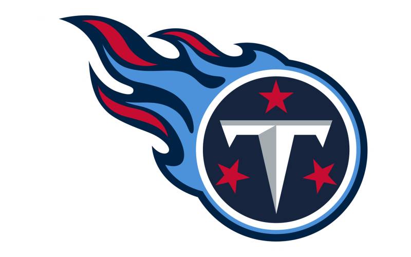
The Tennessee Titans logo displays a flaming “T” with circle design, representing strength, fire, and Tennessee state pride.
Design Elements
Core visual components: Titans Blue (#0C2340) and red (#4B92DB) create patriotic color combination. Flame details add energy and movement.
Geometric precision: Circle and flame integration creates balance between power and motion.
Logo Evolution
Franchise rebrand: 1999 design replaced Houston Oilers identity when team relocated to Nashville.
Design stability: Logo has remained consistent with minor refinements since introduction.
Brand Identity
Mythological power: Titans represent supreme strength, divine authority, and legendary status.
Tennessee pride: Blue and red colors reflect state identity and American patriotic themes.
Usage Guidelines
Primary applications: Helmet logo and merchandise. Flame elements must maintain dynamic appearance.
Alternate designs: Light blue throwback jerseys honor franchise history with updated styling.
Visual Recognition
Flame symbolism: Unique flaming “T” design creates distinctive NFL identity. Blue and red ensure patriotic appeal.
Washington Commanders Logo
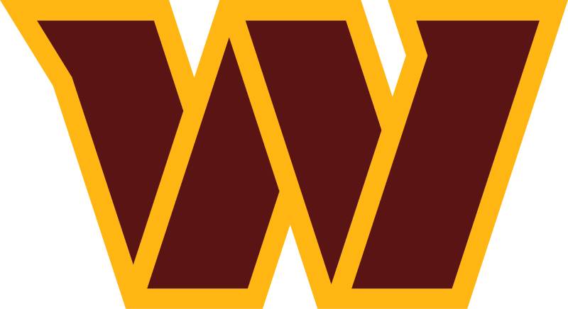
The Washington Commanders logo features a “W” design with burgundy and gold, representing the team’s connection to the nation’s capital.
Design Elements
Core visual components: Burgundy (#773141) and gold (#FFB612) maintain historical team colors. Clean, modern “W” design emphasizes simplicity.
Contemporary styling: Streamlined approach reflects franchise’s modern era and fresh identity.
Logo Evolution
Recent rebrand: 2022 design replaced previous identity with more inclusive, community-focused approach.
Transitional phase: Logo serves as bridge between historical franchise heritage and future direction.
Brand Identity
Military connection: Commanders theme honors Washington D.C.’s military heritage and leadership role.
Capital representation: Design connects to seat of American government and national leadership.
Usage Guidelines
Primary applications: Helmet logo and brand materials. “W” proportions must maintain clean, modern appearance.
Throwback uniforms: 2024 season features 1979-inspired designs honoring franchise’s successful era.
Visual Recognition
Simple approach: Clean “W” design creates immediate recognition. Burgundy and gold maintain historical color connections.
FAQ on NFL Logos
Which NFL team has the oldest logo design?
The Chicago Bears hold the record with their “C” design dating back to 1962. However, the concept traces to the 1920s Chicago Cardinals interlocking letters. Green Bay Packers and Pittsburgh Steelers also maintain designs from the 1960s with minimal changes over decades.
What NFL logo appears only on one side of the helmet?
The Pittsburgh Steelers logo uniquely appears only on the right side of their helmets. This tradition honors the industrial Steelmark symbol and creates the NFL’s most distinctive helmet presentation. All other teams display logos on both sides.
Which teams have changed their logos most frequently?
Tampa Bay Buccaneers lead with five different primary logos since 1976. Washington Commanders and Los Angeles Rams follow closely with multiple redesigns. These franchises updated their visual identity due to relocations, rebranding efforts, and modernization needs.
How many NFL teams use animal-based logos?
Fifteen NFL teams feature animal mascots in their primary logos. Birds dominate with seven teams including Eagles, Cardinals, and Ravens. Mammals like Lions, Bears, and Panthers represent strength, while the Dolphins uniquely showcase marine life.
What colors appear most frequently in NFL logos?
Blue and red dominate NFL team palettes, appearing in over 60% of franchise designs. Blue represents trust and stability, while red suggests energy and passion. Black, white, and gold complete the most popular color psychology combinations across professional football branding.
Which NFL logos incorporate geographical elements?
Several teams reference regional identity through their designs. The 49ers honor California’s Gold Rush era, while Saints showcase Louisiana’s French heritage with the fleur-de-lis. Chiefs use Native American symbolism, and Texans incorporate state flag elements.
How often do NFL teams update their logos?
Most teams update logos every 10-15 years for modernization purposes. Major redesigns occur less frequently, typically coinciding with uniform changes or franchise relocations. Teams balance tradition preservation with contemporary graphic design principles and fan expectations.
What makes an NFL logo successful?
Brand recognition and timeless design create successful NFL logos. Simple shapes, bold colors, and cultural relevance ensure longevity. The best designs work across multiple applications from helmets to merchandise while maintaining visual impact and emotional connection with fans.
Which NFL logo is most commonly copied?
The Philadelphia Eagles logo appears on thousands of high school and amateur teams nationwide. Its fierce expression and detailed feather work create an appealing template. Other frequently imitated designs include Cowboys, Steelers, and Raiders logos.
How are NFL logo colors officially determined?
Teams specify exact Pantone color codes for consistency across all applications. Official brand guidelines include RGB and CMYK values for digital and print reproduction. League approval ensures colors meet broadcasting and merchandise standards.
Conclusion
NFL logos serve as powerful cultural symbols that transcend simple sports branding. These emblems connect millions of fans to their favorite franchises while preserving decades of American football heritage.
Each team’s visual identity reflects unique regional characteristics and historical significance. From industrial Pittsburgh’s Steelmark to Louisiana’s French colonial fleur-de-lis, these designs celebrate local culture and community pride.
The evolution of franchise logos demonstrates how professional sports adapt to changing design trends while maintaining brand recognition. Teams carefully balance tradition with modernization to satisfy longtime supporters and attract new generations.
Modern NFL logos must succeed across multiple platforms, from stadium displays to digital merchandise. Their effectiveness relies on strong visual hierarchy, memorable color theory applications, and emotional connections with fan bases.
These 32 emblems represent more than athletic competition. They embody American sports culture, regional identity, and the unifying power of professional football in communities nationwide.

Renowned for his expertise in logo design and visual branding, Bogdan has developed a multitude of logos for various clients.
His skills extend to creating posters, vector illustrations, business cards, and brochures. Additionally, Bogdan's UI kits were featured on marketplaces like Visual Hierarchy and UI8.
He also wrote in the past years on sites like Design Your Way, WebDesignerDepot, WPDean, Designmodo, Speckyboy, Slider Revolution, and more.
- Canva vs PowerPoint: Which Is Better for Presentations? - 22 September 2026
- How to Install Fonts on Mac (Step-by-Step Guide) - 20 September 2026
- From Mockup to Code: How AI-Augmented Development Speeds Up the Design Handoff - 19 September 2026

Bogdan Sandu is a seasoned designer who has been designing websites since 2008. Renowned for his expertise in logo design and visual branding, Bogdan has developed a multitude of logos for various clients. His skills extend to creating posters, vector illustrations, business cards, and brochures. Additionally, Bogdan's UI kits were featured on marketplaces like Visual Hierarchy and UI8. He also wrote in the past years on sites like Design Your Way, WebDesignerDepot, WPDean, Designmodo, Speckyboy, Slider Revolution, and more.
You Might Also Like


