The Minnesota Vikings logo stands as one of the most recognizable symbols in professional football. It features a fierce Nordic warrior profile, complete with braided hair and a horned helmet, rendered in the team’s signature purple and gold.
Within the landscape of NFL logos, the Vikings mark holds a unique position. It draws from Scandinavian heritage, connecting Minnesota’s large Nordic immigrant population to the football franchise.
The current Norseman logo was introduced in 1966 and has remained largely unchanged since then. That’s nearly six decades of brand consistency. The team itself was founded in 1960, and the logo has seen only minor refinements across four primary iterations.
What is the Minnesota Vikings Logo?
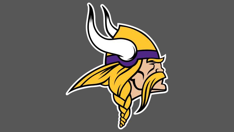
The Minnesota Vikings logo is a stylized profile of a Norse warrior (called “The Norseman”) facing left, featuring a yellow horn, purple and white helmet, blonde braided hair, and a stern expression. It was officially introduced in 1966 and designed by Los Angeles Examiner cartoonist Karl Hubenthal.
Design Type: Mascot-based emblem with combination mark elements
Primary Elements:
- Viking warrior head in profile view
- Curved horn extending from helmet
- Braided blonde hair detail
- Stylized helmet with decorative elements
Official Introduction Date: 1966 (current version)
Designer: Karl Hubenthal, Los Angeles Examiner cartoonist
Trademark Status: Registered trademark owned by the Minnesota Vikings Football, LLC
Color Palette:
- Vikings Purple (primary)
- Vikings Gold/Yellow (secondary)
- White (accent)
- Black (outline details)
Usage Context: Helmets, uniforms, merchandise, stadium signage, digital platforms, broadcast graphics, and all official team communications
How Has the Minnesota Vikings Logo Evolved Over Time?
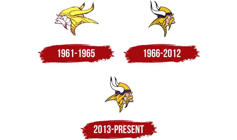
The Vikings logo has gone through four main versions since 1961. Each change refined the Norseman’s appearance while keeping the core identity intact.
The evolution shows a gradual shift toward bolder lines and more aggressive features. But honestly, if you put all four versions side by side, you’d notice the changes are pretty subtle compared to other NFL franchises.
Original Minnesota Vikings Logo (1961-1965)
Years Active: 1961-1965
Design Description: The first Norseman featured a rounder, friendlier face with less aggressive features. The horn was shorter, and the overall style had a cartoonish quality typical of 1960s sports logo work.
Color Scheme: Purple, gold, and white. The purple was slightly different from today’s shade.
Designer: Attributed to the team’s original ownership group
Context: Created when the franchise joined the NFL as an expansion team. Minnesota needed an identity that reflected the region’s Scandinavian roots.
Cultural Significance: Established the Viking warrior concept that would define the franchise for decades.
Second Minnesota Vikings Logo (1966-1996)
Years Active: 1966-1996
Design Description: Karl Hubenthal’s redesign gave the Norseman sharper features and a more menacing expression. The horn grew longer and curved more dramatically. This version became iconic.
Color Scheme: Deeper purple with brighter gold accents
Designer: Karl Hubenthal
Context: Introduced during the team’s rise to prominence. The Vikings would reach four Super Bowls wearing this logo.
Key Changes from Previous: More angular face, extended horn, fiercer expression, refined hair braids
Cultural Significance: This became the logo people picture when they think of the Vikings. It carried the Purple People Eaters era.
Third Minnesota Vikings Logo (1997-2009)
Years Active: 1997-2009
Design Description: Minor refinements to line weights and proportions. The changes were so subtle most fans didn’t notice them.
Color Scheme: Same purple and gold with slight adjustments for modern printing and broadcast
Key Changes from Previous: Cleaner lines for digital reproduction, slightly adjusted proportions
Context: Updated to look better on television and emerging digital platforms
Current Minnesota Vikings Logo (2010-Present)
Years Active: 2010-present
Design Description: The current version features the most aggressive Norseman yet. Sharper angles throughout. The eyebrow is more pronounced, creating an intense stare.
Color Scheme: Updated purple (closer to violet) with refined gold
Key Changes from Previous: More angular features, enhanced detail work, modernized proportions for HD broadcasts and digital applications
Context: Part of a broader brand refresh that coincided with stadium discussions and renewed franchise ambitions
What Do the Design Elements of the Minnesota Vikings Logo Mean?
Every piece of the Norseman carries meaning. The leftward-facing profile suggests forward movement and aggression, while the horn symbolizes the mythologized (though historically inaccurate) Viking warrior helmet.
The braided hair references authentic Norse culture. It adds a human element to what could otherwise be just a generic warrior image.
Why Did Minnesota Vikings Choose These Specific Colors?
Vikings Purple
- Hex: #4F2683
- Pantone: 268 C
- Symbolic meaning: Royalty, nobility, and warrior status
- Psychological impact: Creates sense of prestige and intimidation
- Brand connection: Unique in the NFL, making the team instantly identifiable
The Vikings are one of the few NFL teams with purple logos. It sets them apart immediately.
Vikings Gold
- Hex: #FFC62F
- Pantone: 123 C
- Symbolic meaning: Treasure, victory, and Scandinavian heritage
- Psychological impact: Energy and optimism that balances the darker purple
- Brand connection: References the gold sought by Norse raiders, and the gold in logos has always signified achievement
What Typography Style Is Used in the Minnesota Vikings Logo?
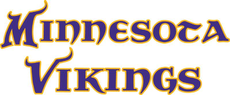
The Vikings wordmark uses a custom sans-serif font with sharp, angular terminals. It feels aggressive without being unreadable.
The letterforms echo the pointed features of the Norseman itself. That consistency matters.
Over the years, the typography has been refined for better legibility at small sizes. The current version works across everything from massive stadium signs to tiny mobile screens.
What Are the Hidden Meanings in the Minnesota Vikings Logo?
The Norseman faces left, which is actually unusual. Most sports logos face right (associated with forward progress in Western reading direction).
Some interpret this as the Vikings “facing their opponents” or representing defensive strength. Others think it was simply an aesthetic choice.
The single horn is another interesting detail. Historical Viking helmets didn’t have horns at all, but the single curved horn has become the team’s most distinctive visual element.
How Does the Minnesota Vikings Logo Compare to Competitor Logos?
Among NFC North rivals, the Vikings logo is the most illustrative. The Chicago Bears logo uses a simple “C” lettermark. The Detroit Lions logo shows a full animal figure. The Green Bay Packers logo relies on an oval “G” mark.
The Vikings Norseman stands out because it shows a human character with personality. You can read emotion in that face.
Compared to other warrior-themed NFL marks like the Las Vegas Raiders logo or Tampa Bay Buccaneers logo, the Vikings version feels more refined. Less cartoonish, more menacing.
What Are the Technical Specifications of the Minnesota Vikings Logo?
Official Color Codes:
Primary Color: Vikings Purple
Secondary Color: Vikings Gold
- Hex: #FFC62F
- RGB: (255, 198, 47)
- CMYK: (0, 22, 82, 0)
- Pantone: 123 C
Accent Color: White
- Hex: #FFFFFF
- RGB: (255, 255, 255)
- CMYK: (0, 0, 0, 0)
Dimensions and Proportions:
- Aspect ratio: Approximately 1:1.15 (width to height)
- Minimum size: 0.5 inches for print, 50 pixels for digital
- Clear space: Minimum of 10% of logo height on all sides
- The logo should never be stretched, skewed, or rotated
What Cultural Impact Has the Minnesota Vikings Logo Had?
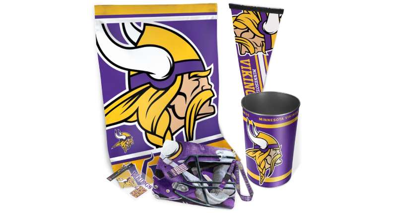
The Norseman has become more than a sports symbol. It represents Minnesota pride and Scandinavian-American identity.
You’ll see it on everything from car bumpers to wedding cakes across the Upper Midwest. That kind of cultural penetration takes decades to build.
The logo also influenced how other sports teams approach heritage-based branding. It proved you could create something fierce while honoring cultural roots.
How Does the Minnesota Vikings Logo Fit Into the Overall Brand Identity?
The Norseman anchors an entire visual system. The same angular aggressiveness appears in the team’s typography, stadium architecture, and uniform details.
U.S. Bank Stadium itself features Viking ship prows in its design, connecting directly to the logo’s Norse themes.
The team’s secondary marks, including the horn symbol and various wordmarks, all share color theory principles and design DNA with the primary logo. Everything feels connected.
How Should the Minnesota Vikings Logo Be Used?
Official Usage Guidelines:
Do:
- Use official logo files from NFL Properties or the Vikings media portal
- Maintain minimum clear space requirements
- Use approved color combinations only
- Scale proportionally
Don’t:
- Alter colors or add effects
- Combine with other logos without approval
- Use on merchandise without licensing
- Distort or crop the logo
Where to Access Official Logos: The Minnesota Vikings media relations department provides approved assets for editorial use. Commercial use requires licensing through NFL Properties.
Licensing Information: All commercial applications require written approval from NFL Properties. The Vikings logo is protected under federal trademark law, and unauthorized use can result in legal action.
Trademark Protection: The Norseman, Vikings wordmark, and associated design elements are registered trademarks. This includes the specific purple and gold color palette when used in sports contexts.
FAQ on The Minnesota Vikings Logo
What Does the Minnesota Vikings Logo Represent?
The Vikings logo represents Scandinavian heritage and warrior strength. The Norseman profile honors Minnesota’s Nordic immigrant history.
It symbolizes aggression, determination, and regional pride. The horned helmet (historically inaccurate but iconic) has become the franchise’s visual identity across all NFL team branding.
Who Designed the Minnesota Vikings Logo?
Karl Hubenthal, a cartoonist for the Los Angeles Examiner, designed the current Norseman in 1966.
His redesign transformed a friendlier original mark into something fiercer. The team’s original 1961 logo came from the founding ownership group. Hubenthal’s version stuck.
When Was the Current Minnesota Vikings Logo Introduced?
The current version launched in 2010. But it’s really just a refinement of Hubenthal’s 1966 design.
The franchise has maintained remarkable brand consistency. Four versions total since 1961. Each update sharpened details without changing the core Viking helmet graphic.
What Are the Official Minnesota Vikings Colors?
Vikings Purple (#4F2683) and Vikings Gold (#FFC62F) are the official team colors. White serves as an accent.
These hues create strong contrast on the field. The purple is unique in professional football, making Minnesota instantly recognizable during broadcasts.
Why Does the Vikings Logo Face Left?
Most sports logos face right, suggesting forward movement. The Norseman faces left.
Some say it represents defensive strength or confronting opponents. Others argue it was simply an aesthetic choice by the designer. The team has never officially explained it.
Has the Minnesota Vikings Logo Changed Over the Years?
Yes. Four versions exist. The 1961 original was rounder and cartoonish.
Hubenthal’s 1966 redesign added aggression. Minor updates came in 1997 and 2010. Each version refined the design elements while preserving the Norseman concept that defines Vikings brand identity.
What Is the Viking Character in the Logo Called?
He’s called “The Norseman.” Not “Ragnar” (that’s the live mascot who rides a motorcycle).
The Norseman represents all Viking warriors, not a specific historical figure. This approach gives the team emblem a timeless, universal quality within NFC North competition.
Why Do the Vikings Use Purple and Gold?
Purple signifies royalty and nobility. Gold represents treasure and victory, connecting to Norse raider mythology.
The combination also stood out in 1961 when most NFL teams used red, blue, or green. Understanding color psychology explains why these choices resonate with fans.
Can I Use the Minnesota Vikings Logo?
Not commercially without licensing. NFL Properties controls all trademark usage.
Editorial and personal use has more flexibility. But selling merchandise, creating advertisements, or using it for business requires written approval. The brand guidelines are strict about unauthorized applications.
Where Can I Download the Official Minnesota Vikings Logo?
The Vikings media portal provides assets for journalists. Fans can find PNG files on official NFL websites.
For commercial work, contact NFL Properties directly. They provide proper vector graphics files with correct specifications for licensed partners and approved vendors.
Conclusion
The Minnesota Vikings logo has earned its place among the most iconic emblems in professional sports. Six decades of consistency built that recognition.
From U.S. Bank Stadium in Minneapolis to Vikings merchandise worldwide, the Norseman serves as the visual anchor for everything this NFL franchise represents.
Karl Hubenthal’s 1966 redesign created something lasting. The purple and gold color scheme, the fierce profile, the distinctive horn. These elements work together through solid logo design principles.
Whether you’re a lifelong fan or just appreciate good sports branding, the Vikings mark delivers. It tells a story of heritage, competition, and regional pride without saying a word.

Renowned for his expertise in logo design and visual branding, Bogdan has developed a multitude of logos for various clients.
His skills extend to creating posters, vector illustrations, business cards, and brochures. Additionally, Bogdan's UI kits were featured on marketplaces like Visual Hierarchy and UI8.
He also wrote in the past years on sites like Design Your Way, WebDesignerDepot, WPDean, Designmodo, Speckyboy, Slider Revolution, and more.
- Canva vs PowerPoint: Which Is Better for Presentations? - 22 September 2026
- How to Install Fonts on Mac (Step-by-Step Guide) - 20 September 2026
- From Mockup to Code: How AI-Augmented Development Speeds Up the Design Handoff - 19 September 2026

Bogdan Sandu is a seasoned designer who has been designing websites since 2008. Renowned for his expertise in logo design and visual branding, Bogdan has developed a multitude of logos for various clients. His skills extend to creating posters, vector illustrations, business cards, and brochures. Additionally, Bogdan's UI kits were featured on marketplaces like Visual Hierarchy and UI8. He also wrote in the past years on sites like Design Your Way, WebDesignerDepot, WPDean, Designmodo, Speckyboy, Slider Revolution, and more.
You Might Also Like