The Oklahoma City Thunder logo represents one of the NBA’s most polarizing franchise identities since its 2008 debut.
Born from the Seattle SuperSonics relocation, the Thunder brought Oklahoma City its first major professional sports franchise. The organization unveiled its brand on September 3, 2008, choosing the name Thunder to reflect both Oklahoma’s location in Tornado Alley and the Thunderbirds division of the U.S. Army stationed in the region.
Team owner Clay Bennett worked with designers to create a logo that incorporated elements from local Oklahoma sports programs, including the Oklahoma Sooners and Oklahoma State Cowboys. The result was a shield-based design featuring the letters “OKC” over a basketball segment with “Thunder” wordmark above.
The franchise has maintained this primary identity while introducing alternate versions in 2017 and 2018 that incorporate tribal-inspired patterns and lightning bolt elements.
What is the Oklahoma City Thunder Logo?
The Oklahoma City Thunder logo is a shield-shaped emblem featuring “OKC” lettering over a partial basketball graphic with “Thunder” wordmark positioned above. Introduced September 3, 2008, the design uses Thunder Blue, Sunset Orange, Navy Blue, and Yellow colors. Created during the team’s relocation from Seattle to Oklahoma City, it serves as the primary identifier for the franchise.
Design Type: Combination mark featuring wordmark, lettering, and graphic elements
Primary Elements:
- Shield-shaped background
- “OKC” letters in white
- Partial basketball graphic
- “Thunder” wordmark set in Industria Bold typeface
- Geometric color blocks
Official Introduction Date: September 3, 2008
Designer/Agency: Created in collaboration with team ownership and local design consultants. Clay Bennett oversaw the design process, incorporating elements from Oklahoma university sports teams.
Trademark Status: Registered with the United States Patent and Trademark Office. Registration number 3788120 filed September 3, 2008, registered May 11, 2010. Owned by The Professional Basketball Club, LLC.
Color Palette:
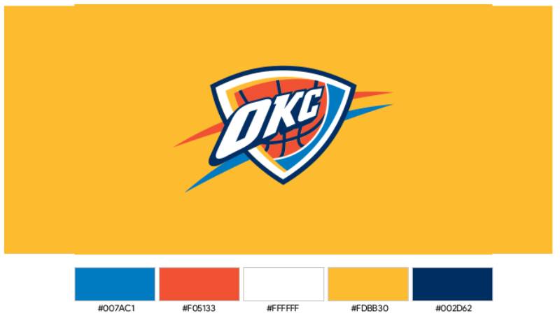
- Thunder Blue: #007AC1 (Pantone PMS 285 C)
- Navy Blue: #002D62 (Pantone PMS 282 C)
- Sunset Orange: #EF3B24 (Pantone PMS WARM RED C)
- Yellow: #FDBB30 (Pantone PMS 1235 C)
Usage Context: Applied across jerseys, court designs, merchandise, digital platforms, arena signage, marketing materials, and official team communications. The logo appears on everything from player uniforms to social media graphics.
How Has the Oklahoma City Thunder Logo Evolved Over Time?
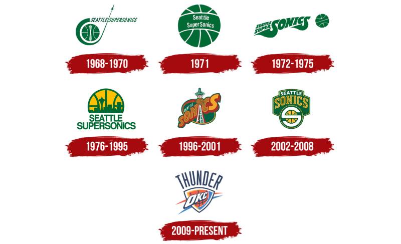
The Thunder logo represents a complete departure from the franchise’s Seattle SuperSonics heritage. When the team relocated in 2008, ownership left all previous branding in Seattle for potential future franchise use.
This created a unique situation where the Thunder started with an entirely new visual identity rather than evolving an existing one.
Original Seattle SuperSonics Logo (1967-1970)
Years Active: 1967-1970
Design Description: Green basketball with stylized orbit and rocket imagery, accompanied by italicized sans-serif lettering
Color Scheme: Green and white
Designer: Created during franchise founding
Context: Reflected Seattle’s aerospace industry and Space Needle landmark. The space-age aesthetic aligned with 1960s futurism.
Key Changes from Previous: First franchise identity
Cultural Significance: Captured Seattle’s identity as a Pacific Northwest aerospace hub during the Space Race era
Second SuperSonics Logo (1970-1971)
Years Active: 1970-1971
Design Description: Simplified green basketball with white wordmark centered on the ball
Color Scheme: Green and white
Designer: Internal team redesign
Context: Moved toward minimalist sports branding trends of the early 1970s
Key Changes from Previous: Removed orbit and rocket elements, simplified to basketball and text only
Cultural Significance: Represented shift toward cleaner, more traditional sports logos
Third SuperSonics Logo (1971-1975)
Years Active: 1971-1975
Design Description: Green basketball with team name written across center
Color Scheme: Green and white
Designer: Internal team design
Context: Further refinement of minimalist approach
Key Changes from Previous: Shuttle and Space Needle imagery completely removed
Cultural Significance: Marked transition away from space-age themes toward pure basketball focus
Fourth SuperSonics Logo (1975-1995)
Years Active: 1975-1995
Design Description: Two-level wordmark beneath basketball showing Seattle skyline silhouette
Color Scheme: Green, yellow, and white
Designer: Unknown
Context: Introduction of yellow added warmth to the palette
Key Changes from Previous: Added yellow color, incorporated Seattle cityscape, reorganized text layout
Cultural Significance: Longest-running SuperSonics identity, spanning two decades including the 1979 championship season
Fifth SuperSonics Logo (1995-2001)
Years Active: 1995-2001
Design Description: Comics-style badge in brown and green with space-themed lettering overlapping oval shape featuring white tower
Color Scheme: Brown, green, and white
Designer: Part of NBA’s 1990s branding evolution
Context: Reflected 1990s trend toward edgier, attitude-driven sports branding
Key Changes from Previous: Complete redesign with new color scheme and illustration style
Cultural Significance: Aligned with grunge and alternative culture movements in Seattle during the 1990s
Sixth SuperSonics Logo (2001-2008)
Years Active: 2001-2008
Design Description: Traditional green crest with yellow basketball at bottom and white-and-yellow inscription above
Color Scheme: Green, yellow, and white
Designer: Part of return to classic sports branding
Context: Final SuperSonics identity before relocation
Key Changes from Previous: Returned to shield/crest format with more traditional styling
Cultural Significance: Last visual identity for Seattle franchise, ended 41-year run in the city
Current Oklahoma City Thunder Logo (2008-Present)
Years Active: 2008-Present
Design Description: Shield featuring “OKC” lettering over basketball segment with “Thunder” wordmark above in Thunder Blue, Sunset Orange, Navy Blue, and Yellow
Color Scheme: Thunder Blue (#007AC1), Navy Blue (#002D62), Sunset Orange (#EF3B24), Yellow (#FDBB30)
Designer: Created under Clay Bennett’s direction with input from Oklahoma university sports design elements
Context: Entirely new franchise identity for Oklahoma City market, designed rapidly during 2008 relocation
Key Changes from Previous: Complete break from SuperSonics heritage. All previous colors, names, and imagery left in Seattle.
Cultural Significance: Represents Oklahoma City’s emergence as major league sports market. Name references both Tornado Alley weather patterns and military presence in the region.
What Do the Design Elements of the Oklahoma City Thunder Logo Mean?
The Thunder logo combines regional symbolism with basketball iconography. The shield shape suggests strength and protection while nodding to university sports traditions in Oklahoma.
The “OKC” letters serve dual purposes as both city abbreviation and visual focal point. The basketball segment reinforces the sport while the Thunder wordmark establishes team identity.
Colors were specifically chosen to connect with Oklahoma. Thunder Blue represents the expansive prairie sky. Sunset Orange captures the vivid Oklahoma sunsets characteristic of the region. Yellow symbolizes sunlight and optimism. Navy Blue provides depth and versatility across applications.
Why Did Oklahoma City Thunder Choose These Specific Colors?
Thunder Blue (#007AC1, Pantone PMS 285 C)
Symbolic meaning: Represents the Oklahoma sky and storm systems that inspired the team name
Psychological impact: Conveys energy, trust, and confidence
Brand connection: Ties to state flag colors and regional identity
Navy Blue (#002D62, Pantone PMS 282 C)
Symbolic meaning: Adds depth and sophistication to the color palette
Psychological impact: Suggests stability and professionalism
Brand connection: Provides versatile base color for various applications
Sunset Orange (#EF3B24, Pantone PMS WARM RED C)
Symbolic meaning: Reflects Oklahoma’s distinctive prairie sunsets
Psychological impact: Creates excitement and intensity
Brand connection: Differentiates Thunder from other blue logos in sports
Yellow (#FDBB30, Pantone PMS 1235 C)
Symbolic meaning: Represents sunlight and Oklahoma’s golden wheat fields
Psychological impact: Conveys optimism and energy
Brand connection: Complements blue and orange while adding brightness
What Typography Style Is Used in the Oklahoma City Thunder Logo?
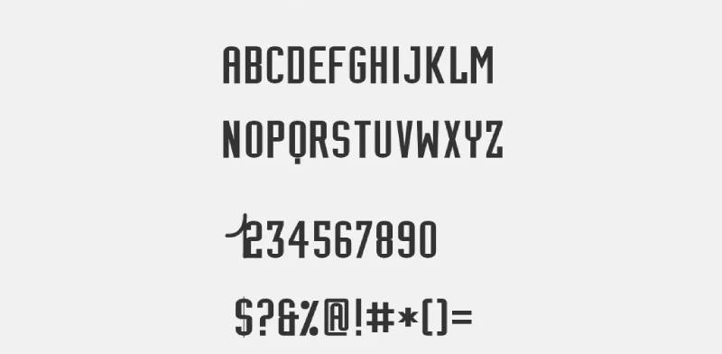
The Thunder wordmark uses Industria Bold, a display sans-serif typeface designed by Neville Brody.
Published by Linotype, this font features geometric construction with strong angular characteristics. The letterforms communicate power and modernity through their bold weight and industrial aesthetic.
The OKC lettering uses a custom design integrated into the shield structure rather than a standard typeface. This creates a unique, proprietary element that can’t be easily replicated.
What Are the Hidden Meanings in the Oklahoma City Thunder Logo?
The shield shape references the Thunderbirds division of the 45th Infantry, U.S. Army, stationed at Fort Sill in Oklahoma.
This military connection honors the significant armed forces presence in the region. The shield also borrows from Oklahoma Sooners and Oklahoma State Cowboys visual traditions, creating continuity with local sports culture.
The basketball segment positioned behind the OKC letters creates a sense of motion and energy. Some fans interpret the overall composition as suggesting a storm cloud formation, though this wasn’t explicitly stated by designers.
How Does the Oklahoma City Thunder Logo Compare to Competitor Logos?
NBA Western Conference competitors use diverse branding approaches. The Denver Nuggets logo features mountain imagery specific to Colorado. The Portland Trail Blazers logo uses pinwheel geometry that’s become iconic.
The Thunder logo sits among more literal, text-heavy NBA designs. It shares characteristics with the Dallas Mavericks logo and Memphis Grizzlies logo in terms of shield-based composition.
Critics often compare the Thunder design unfavorably to the Chicago Bulls logo, widely considered the NBA’s strongest identity. The Bulls use a single powerful image (the bull’s head) while the Thunder combines multiple elements (text, basketball, shield, colors).
Fan communities sometimes nickname the Thunder logo “Team Doritos” due to its triangular color blocks and layered appearance. This criticism reflects ongoing debate about whether the design successfully captures Oklahoma City’s identity.
The Thunder’s orange logos elements set it apart in a league dominated by red and blue color schemes. Teams like the Phoenix Suns logo also utilize orange, creating visual distinction in crowded NBA logos landscape.
What Are the Technical Specifications of the Oklahoma City Thunder Logo?
Official Color Codes:
Primary Color: Thunder Blue
Secondary Color: Navy Blue
- Hex: #002D62
- RGB: (0, 45, 98)
- CMYK: (100, 68, 54, 0)
- Pantone: PMS 282 C
Accent Color: Sunset Orange
- Hex: #EF3B24
- RGB: (239, 59, 36)
- CMYK: (0, 92, 100, 0)
- Pantone: PMS WARM RED C
Accent Color: Yellow
- Hex: #FDBB30
- RGB: (253, 187, 48)
- CMYK: (0, 29, 91, 0)
- Pantone: PMS 1235 C
Dimensions and Proportions:
- Aspect ratio: Approximately 1:1.2 (width to height)
- Minimum size requirements: 0.5 inches width for print applications, 32 pixels for digital use
- Clear space specifications: Minimum clear space equal to height of “T” in Thunder wordmark on all sides
- Official usage guidelines: Maintained by The Professional Basketball Club, LLC with specific rules for placement, color reproduction, and sizing
What Cultural Impact Has the Oklahoma City Thunder Logo Had?
The Thunder logo marked Oklahoma City’s arrival as a major league sports market in 2008.
For a city that previously hosted only minor league teams and temporary relocations, the permanent NBA franchise represented significant cultural elevation. The logo became a unifying symbol across the metro area.
Merchandise sales featuring the logo helped establish the Thunder as a viable small-market franchise. Despite criticism of the design itself, fans embraced the team identity quickly. The logo appears throughout Oklahoma City on buildings, vehicles, and public spaces.
Youth basketball programs across Oklahoma adopted Thunder colors and design elements. The franchise’s success on court, including the 2012 NBA Finals appearance and 2025 championship, elevated the logo’s recognition nationally.
How Does the Oklahoma City Thunder Logo Fit Into the Overall Brand Identity?
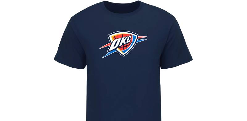
The Thunder visual system extends beyond the primary logo to include alternate marks, court designs, and uniform patterns.
The 2017 alternate logo incorporated tribal-inspired patterns honoring Oklahoma’s Native American heritage. This design variation used warmer color tones while maintaining core brand elements.
The 2018 alternate featured lightning bolts radiating behind a silhouette of Mount Scott, located near downtown Oklahoma City. These alternatives gave merchandise vendors and fans additional options while preserving brand consistency.
Court designs at Paycom Center integrate the logo prominently at center court with Thunder wordmarks along the baseline. City Edition uniforms have explored Oklahoma’s cultural heritage through pattern and color variations that complement the logo system.
How Should the Oklahoma City Thunder Logo Be Used?
Official Usage Guidelines:
- Never alter logo colors or proportions
- Maintain specified clear space around all logo applications
- Do not add effects like shadows, gradients, or outlines
- Use only approved logo files from official sources
- Do not recreate or redraw logo elements
- Respect trademark designations in all uses
Where to Access Official Logos:
Official Thunder logo files are available through NBA Media Central for credentialed media and licensed partners. Fans seeking logos for personal use should visit the official Thunder website or NBA.com.
Licensing Information:
All commercial use of the Thunder logo requires licensing through The Professional Basketball Club, LLC. This includes merchandise production, promotional materials, and business applications. Unauthorized use constitutes trademark infringement.
Trademark Protection Details:
The Oklahoma City Thunder name and logo are registered trademarks protected under U.S. federal law. The Professional Basketball Club, LLC actively enforces trademark rights to prevent unauthorized use and protect brand integrity.
FAQ About the Oklahoma City Thunder Logo
When was the Oklahoma City Thunder logo created?
The Oklahoma City Thunder logo was created and unveiled on September 3, 2008. This occurred shortly after the franchise relocated from Seattle, where it had been known as the SuperSonics since 1967. The rapid timeline reflected the need to establish a complete new identity for the Oklahoma City market before the 2008-09 NBA season began.
Who designed the Oklahoma City Thunder logo?
The Oklahoma City Thunder logo was designed through a collaborative process led by team owner Clay Bennett. Rather than hiring a major sports branding agency, the organization worked with local design consultants and incorporated visual elements from Oklahoma university sports teams, specifically the Oklahoma Sooners and Oklahoma State Cowboys. The specific individual designers have not been publicly credited.
What do the colors in the Oklahoma City Thunder logo mean?
The colors represent Oklahoma’s natural environment and regional identity. Thunder Blue (#007AC1) symbolizes the prairie sky and storm systems. Sunset Orange (#EF3B24) captures the distinctive Oklahoma sunsets. Yellow (#FDBB30) represents sunlight and optimism. Navy Blue (#002D62) adds depth and connects to the Oklahoma state flag. Together, the color psychology creates an energetic, regionally-specific identity.
How many times has the Oklahoma City Thunder logo been redesigned?
The primary Oklahoma City Thunder logo has never been redesigned since its 2008 introduction. However, the franchise has introduced alternate logo variations in 2017 and 2018. The 2017 alternate featured tribal-inspired patterns in warmer color tones. The 2018 alternate incorporated lightning bolts and Mount Scott silhouette. These alternatives supplement rather than replace the original design.
Where can I download the official Oklahoma City Thunder logo?
Official Oklahoma City Thunder logo files are available through NBA Media Central for credentialed media and licensed partners. Fans can find logo images on the official Thunder website (NBA.com/Thunder) and NBA.com. High-resolution files for commercial use require licensing through The Professional Basketball Club, LLC. Unauthorized downloads from third-party sites may provide poor quality or inaccurate versions.
Is the Oklahoma City Thunder logo trademarked?
Yes, the Oklahoma City Thunder logo is a registered trademark owned by The Professional Basketball Club, LLC. Registration number 3788120 was filed September 3, 2008 and registered May 11, 2010 with the United States Patent and Trademark Office. The trademark covers entertainment services, merchandise, clothing, toys, sporting goods, and broadcasting services. All commercial use requires proper licensing.
What font is used in the Oklahoma City Thunder logo?
The Thunder wordmark uses Industria Bold, a display sans-serif font designed by Neville Brody and published by Linotype. This geometric typeface features strong angular characteristics that communicate power and modernity. The OKC lettering uses a custom design integrated into the shield rather than a standard font. This proprietary element ensures the logo cannot be easily replicated.
Why did Oklahoma City Thunder choose a shield for their logo?
Oklahoma City Thunder chose a shield shape for multiple symbolic reasons. The shield references the Thunderbirds division of the 45th Infantry stationed at Fort Sill in Oklahoma, honoring the military presence in the region. It also connects to graphic design principles used by Oklahoma university sports teams, creating visual continuity with local sports culture. The shield conveys strength, protection, and durability.
Conclusion
The Oklahoma City Thunder logo represents a franchise identity created rapidly during the 2008 relocation from Seattle. Built around a shield shape, OKC lettering, basketball element, and Thunder wordmark, it combines regional symbolism with basketball tradition.
Key attributes include the distinctive four-color palette (Thunder Blue, Navy Blue, Sunset Orange, Yellow) that reflects Oklahoma’s natural environment, the Industria Bold typography that conveys modern strength, and the shield composition that honors local military and university sports heritage.
Within the NBA branding landscape, the Thunder logo occupies a middle ground between iconic simplicity and complex layering. While it has faced criticism for being overly generic, it has successfully unified Oklahoma City’s sports community and established recognizable franchise identity since 2008.
As the Thunder continue building competitive success, including their 2025 NBA championship, the logo evolves in cultural significance even as its visual elements remain unchanged.
If you liked this article about the Oklahoma City Thunder logo, you should check out this article about the Portland Trail Blazers logo.
There are also similar articles discussing the San Antonio Spurs logo, the New Orleans Pelicans logo, the Philadelphia 76ers logo, and the Boston Celtics logo.
And let’s not forget about articles on the Indiana Pacers logo, the Los Angeles Clippers logo, the Phoenix Suns logo, and the Charlotte Hornets logo.

Renowned for his expertise in logo design and visual branding, Bogdan has developed a multitude of logos for various clients.
His skills extend to creating posters, vector illustrations, business cards, and brochures. Additionally, Bogdan's UI kits were featured on marketplaces like Visual Hierarchy and UI8.
He also wrote in the past years on sites like Design Your Way, WebDesignerDepot, WPDean, Designmodo, Speckyboy, Slider Revolution, and more.
- The Windsurf Logo History, Colors, Font, And Meaning - 10 October 2026
- How to Remove Background From Product Photos (No Photoshop) - 10 October 2026
- How Designers can Build a Stronger Online Creative Identity - 9 October 2026

Bogdan Sandu is a seasoned designer who has been designing websites since 2008. Renowned for his expertise in logo design and visual branding, Bogdan has developed a multitude of logos for various clients. His skills extend to creating posters, vector illustrations, business cards, and brochures. Additionally, Bogdan's UI kits were featured on marketplaces like Visual Hierarchy and UI8. He also wrote in the past years on sites like Design Your Way, WebDesignerDepot, WPDean, Designmodo, Speckyboy, Slider Revolution, and more.
You Might Also Like