The New Orleans Pelicans logo represents the professional basketball franchise competing in the NBA’s Southwest Division. Introduced in 2013 when the team rebranded from the Hornets, the logo features Louisiana’s state bird holding a basketball in its beak.
The design connects directly to regional identity through the brown pelican, which appears on both Louisiana’s state flag and seal. Owner Tom Benson purchased the franchise in 2012 and initiated the name change to create stronger ties between the team and New Orleans.
The basketball team began as the Charlotte Hornets in 1988 before relocating to Louisiana in 2002. After operating as the New Orleans Hornets for eleven seasons, the franchise adopted its current identity. The Pelicans have used three major logo iterations since arriving in New Orleans.
What is the New Orleans Pelicans Logo?
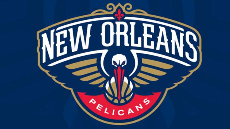
The New Orleans Pelicans logo is a combination mark featuring a front-facing pelican with spread wings holding a gold basketball in its red beak, accompanied by “NEW ORLEANS PELICANS” wordmarks. Officially unveiled January 24, 2013, designer Rodney Richardson created the emblem with navy blue, gold, and red colors representing Louisiana’s regional symbolism.
Design Type: Mascot-based combination mark
Primary Elements: Pelican bird, basketball, fleur-de-lis reference, crescent shape
Official Introduction Date: January 24, 2013 (announced), debuted 2013-14 NBA season
Designer: Rodney Richardson
Trademark Status: Registered trademark of the New Orleans Pelicans franchise
Color Palette:
- Pelicans Navy: #0C2340
- Pelicans Red: #C8102E
- Pelicans Gold: #85714D
- White: #FFFFFF
Usage Context: Team uniforms, Smoothie King Center court design, official merchandise, digital platforms, marketing materials, broadcast graphics
The color palette mirrors the New Orleans city flag. Navy provides stability and professionalism while gold references the city’s rich cultural heritage. Red adds energy and passion to the franchise visual identity.
How Has the New Orleans Pelicans Logo Evolved Over Time?
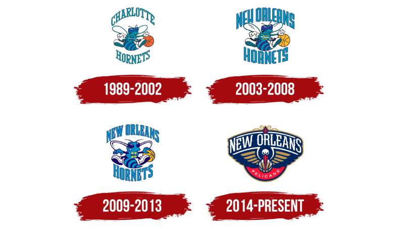
The Pelicans franchise visual identity transformed dramatically through three distinct phases, beginning with the Charlotte Hornets era and culminating in the current pelican-based design that debuted during the 2013-14 season.
Charlotte Hornets Logo (1988-2002)
Years Active: 1988-2002
Design Description: Anthropomorphic hornet character dribbling a basketball with arms and legs visible
Color Scheme: Teal, purple, blue
Designer: Not publicly disclosed
Context: Created when the franchise launched in Charlotte, North Carolina, reflecting the city’s hornets’ nest nickname from the Revolutionary War
Key Changes from Previous: Original franchise logo, no predecessor
Cultural Significance: Became one of the most popular NBA logos of the 1990s, establishing teal and purple as basketball colors
The cartoonish hornet wore white sneakers and held a brown basketball. “CHARLOTTE HORNETS” text surrounded the character in two parts.
New Orleans Hornets Logo (2002-2013)
Years Active: 2002-2013
Design Description: Updated hornet design with “NEW ORLEANS” replacing “CHARLOTTE” in the wordmark
Color Scheme: Sea blue, bright blue (2002-2008), darker navy and teal (2008-2013)
Designer: Not publicly disclosed
Context: Franchise relocated to Louisiana but retained hornets identity despite lack of local connection
Key Changes from Previous: City name change, basketball color changed to gold, font modifications, “NOLA” abbreviation added to hornet’s chest (2009 version)
Cultural Significance: Represented the team during Hurricane Katrina displacement to Oklahoma City (2005-2007)
The 2008 redesign incorporated wrought iron patterns inspired by New Orleans architecture. The hornet became more aggressive-looking with sharper details.
Current New Orleans Pelicans Logo (2013-Present)
Years Active: 2013-present
Design Description: Majestic pelican with spread wings, red beak gripping gold basketball, arched “NEW ORLEANS” text above, “PELICANS” text in red semicircle below
Color Scheme: Navy blue (#0C2340), gold (#85714D), red (#C8102E), white
Designer: Rodney Richardson
Context: Owner Tom Benson wanted regional identity after purchasing team in 2012, brown pelican chosen as Louisiana state bird
Key Changes from Previous: Complete redesign abandoning hornet imagery, new color scheme matching New Orleans city flag, serif typography inspired by French Quarter signage
Cultural Significance: Represents franchise independence from Charlotte history, honors Louisiana wildlife and culture
A 2023 refinement removed wordmarks from icon-only versions for improved digital scalability. The pelican symbol now stands alone on certain applications while maintaining recognition.
What Do the Design Elements of the New Orleans Pelicans Logo Mean?
The pelican symbolizes focus, strength, and resourcefulness, characteristics Richardson sought to capture when the bird dives from air into water for food. These traits mirror the team’s competitive spirit and New Orleans’ resilience after natural disasters.
Why Did New Orleans Pelicans Choose These Specific Colors?
Navy blue conveys loyalty and stability.
The hue matches the New Orleans city flag, creating civic continuity. Rita Benson LeBlanc explained that blue represents loyalty to the community.
Gold references Louisiana’s rich history and championship aspirations.
The metallic tone appears throughout New Orleans architecture and cultural symbols. LeBlanc stated gold represents “the gleam of championships that we hope to bring to our state.”
Red inspires passion and energy.
The vibrant shade adds visual intensity and reflects the city’s passionate fan base and cultural vibrancy.
White provides contrast and clarity.
The neutral tone ensures legibility across all applications and backgrounds.
What Typography Style Is Used in the New Orleans Pelicans Logo?
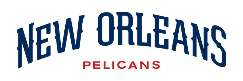
The wordmark features custom serif lettering inspired by French Quarter street signage.
Curved strokes and ornamental flourishes provide historic authenticity matching New Orleans’ architectural vernacular. The rounded elements likely reference the yellow plate on breeding American white pelicans’ bills. Arial Bold serves as the official brand font for supplementary materials, though the logo uses entirely custom type.
What Are the Hidden Meanings in the New Orleans Pelicans Logo?
The crescent shape beneath the pelican references New Orleans’ “Crescent City” nickname.
The Mississippi River bends around the city in a crescent formation. This curved element appears subtly in the logo’s lower section. Richardson intentionally incorporated fleur-de-lis references connecting to the region’s French colonial heritage. Several alternate logos feature explicit fleur-de-lis designs merged with pelican imagery. The “Bird-de-Lis” alternate combines both symbols directly.
How Does the New Orleans Pelicans Logo Compare to Competitor Logos?
The Pelicans logo stands apart from most NBA franchises through its prominent wildlife mascot presentation and regional cultural specificity.
While teams like the Chicago Bulls logo, Miami Heat logo, and Milwaukee Bucks logo use animal symbolism, the Pelicans design emphasizes Louisiana identity more explicitly through color choices and supplementary elements.
The Memphis Grizzlies logo shares a similar wildlife-centric approach with aggressive bear imagery. Both franchises moved from other cities and adopted regional animals. The Toronto Raptors logo also features dynamic dinosaur imagery with comparable energy.
Teams like the Golden State Warriors logo, Los Angeles Lakers logo, and Boston Celtics logo rely more heavily on text and simpler iconography. The Pelicans’ detailed bird illustration contrasts with these minimalist approaches.
The Charlotte Hornets logo maintains the teal and purple scheme the franchise abandoned. This creates clear visual distinction between the two franchises sharing historical roots.
What Are the Technical Specifications of the New Orleans Pelicans Logo?
Official Color Codes:
Primary Color: Pelicans Navy
Secondary Color: Pelicans Red
- Hex: #C8102E
- RGB: (225, 58, 62)
- CMYK: (0, 91, 76, 6)
- Pantone: PMS 186 C
Accent Color: Pelicans Gold
- Hex: #85714D
- RGB: (180, 151, 90)
- CMYK: (40, 48, 76, 16)
- Pantone: PMS 872 C
White
- Hex: #FFFFFF
- RGB: (255, 255, 255)
- CMYK: (0, 0, 0, 0)
Dimensions and Proportions:
The logo maintains consistent aspect ratios across applications. Minimum size requirements prevent detail loss in small-format reproduction.
Clear space specifications require adequate padding around the mark on all sides. Official usage guidelines from the team’s reproduction manual detail exact measurements.
The 2023 icon-only version allows modular deployment across digital platforms without accompanying wordmarks.
What Cultural Impact Has the New Orleans Pelicans Logo Had?
The Pelicans logo helped the franchise establish independent identity separate from Charlotte history after the 2013 rebrand.
The brown pelican gained prominence as a Louisiana symbol following the Deepwater Horizon oil spill in 2010. Oil-soaked pelican images became environmental disaster symbols. Owner Tom Benson specifically referenced the pelican’s representation of resilience and recovery when explaining the name choice. The logo transformed the bird into a symbol of strength rather than victimhood.
Local acceptance grew as fans embraced the Louisiana-centric branding over the disconnected Hornets identity. Merchandise sales increased with the redesign.
Pierre the Pelican mascot, introduced October 30, 2013, initially frightened fans with an unconventional design. The mascot received a redesigned head February 11, 2014, improving reception.
How Does the New Orleans Pelicans Logo Fit Into the Overall Brand Identity?
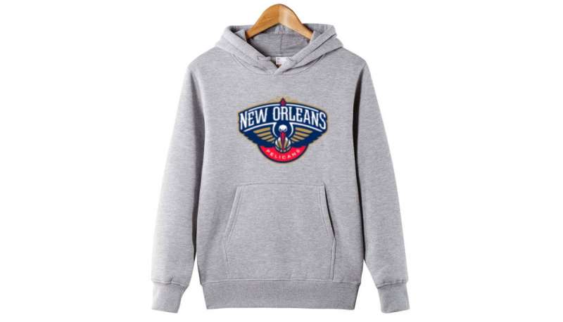
The logo serves as the cornerstone of comprehensive brand guidelines extending across all franchise touchpoints.
Uniforms feature the “NEW ORLEANS” wordmark across jerseys in French Quarter-inspired lettering. The “Bird-de-Lis” secondary logo appears on uniform details. Court design at Smoothie King Center incorporates logo elements in floor graphics and baseline layouts.
Three official alternate logos provide flexibility: the fleur-de-lis pelican head combination, the “Crescent City Basketball” circular mark, and the “NOLA” abbreviation with fleur-de-lis above. These variations maintain color consistency while offering different applications.
The 2024-25 City Edition uniforms introduced the “Skelican” (skeletal pelican) alternate logo appearing on waistbands and inner linings. This design references New Orleans’ cultural relationship with life, death, and rebirth themes visible during local festivals.
How Should the New Orleans Pelicans Logo Be Used?
Official Usage Guidelines:
Do maintain proper color specifications using official Pantone, hex, RGB, or CMYK values. Do preserve clear space around the logo. Do use approved logo versions from official sources. Do maintain proper proportions when scaling.
Don’t alter logo colors. Don’t distort, rotate, or skew the mark. Don’t add effects, shadows, or outlines. Don’t place logo on busy backgrounds reducing legibility. Don’t recreate or redraw logo elements.
Where to Access Official Logos:
The NBA official website provides authorized logo files for media use. Teams release high-resolution versions through official channels for legitimate purposes.
Licensing Information:
The New Orleans Pelicans logo is a registered trademark. Unauthorized commercial use requires licensing agreements. Editorial and news coverage typically falls under fair use provisions.
Trademark Protection Details:
The franchise actively protects logo usage through intellectual property law. Counterfeit merchandise faces legal action. Official licensees must follow strict brand guidelines.
FAQ About the New Orleans Pelicans Logo
When was the New Orleans Pelicans logo created?
The New Orleans Pelicans logo was officially unveiled January 24, 2013, at a press conference announcing the team’s name change from the Hornets. The design debuted for game use during the 2013-14 NBA season after the franchise completed its final season as the New Orleans Hornets.
Who designed the New Orleans Pelicans logo?
Rodney Richardson designed the New Orleans Pelicans logo. Richardson explained his goal was capturing the pelican’s focus, beauty, and strength when diving into water for food, emphasizing the bird’s symbolism of survival, resourcefulness, and new life within the New Orleans community.
What do the colors in the New Orleans Pelicans logo mean?
The navy blue represents loyalty and stability while matching the New Orleans city flag. Gold symbolizes excellence and championship aspirations while reflecting Louisiana’s rich cultural heritage. Red conveys passion and energy embodying the team’s competitive spirit and the city’s vibrant character.
How many times has the New Orleans Pelicans logo been redesigned?
The Pelicans have used one primary logo since 2013 with minor refinements in 2023 for digital optimization. However, the franchise used two Hornets logo versions before rebranding: the original Charlotte Hornets design (1988-2002) and two New Orleans Hornets variations (2002-2008, 2008-2013).
Where can I download the official New Orleans Pelicans logo?
Official New Orleans Pelicans logo files are available through the NBA’s official media resources and the team’s official website press section. High-resolution PNG, SVG, and vector graphics formats exist for authorized media use, though commercial usage requires licensing agreements.
Is the New Orleans Pelicans logo trademarked?
Yes, the New Orleans Pelicans logo is a registered trademark owned by the franchise. The team actively protects its intellectual property rights and requires licensing for commercial applications. Editorial and news coverage typically qualifies as fair use without requiring permission.
What font is used in the New Orleans Pelicans logo?
The wordmark uses custom serif typography inspired by French Quarter street signage rather than a standard commercial font. The lettering features curved strokes and ornamental details reflecting New Orleans’ architectural character. Arial Bold serves as the official supplementary typeface for brand materials.
Why did New Orleans Pelicans choose a pelican for their logo?
The brown pelican is Louisiana’s state bird appearing on both the state flag and seal. Owner Tom Benson wanted regional identity replacing the disconnected Hornets nickname. The pelican symbolizes strength, focus, and resilience, representing New Orleans’ recovery from Hurricane Katrina and the Deepwater Horizon oil spill.
Conclusion
The New Orleans Pelicans logo represents a professional basketball franchise through Louisiana’s state bird rendered in navy blue, gold, and red. Designer Rodney Richardson created the 2013 emblem emphasizing regional identity after owner Tom Benson purchased the team and sought stronger community connections.
The logo features a front-facing pelican with spread wings holding a basketball, accompanied by French Quarter-inspired typography and color schemes matching the New Orleans city flag. Three alternate versions provide branding flexibility across merchandise and digital platforms.
The design successfully separated the franchise from its Charlotte Hornets origins while establishing authentic Louisiana basketball identity. Technical specifications maintain brand consistency through exact Pantone, hex, RGB, and CMYK color codes across all applications.
If you liked this article about the New Orleans Pelicans logo, you should check out this article about the Portland Trail Blazers logo.
There are also similar articles discussing the San Antonio Spurs logo, the Philadelphia 76ers logo, the Boston Celtics logo, and the Indiana Pacers logo.
And let’s not forget about articles on the Los Angeles Clippers logo, the Oklahoma City Thunder logo, the Phoenix Suns logo, and the Charlotte Hornets logo.

Renowned for his expertise in logo design and visual branding, Bogdan has developed a multitude of logos for various clients.
His skills extend to creating posters, vector illustrations, business cards, and brochures. Additionally, Bogdan's UI kits were featured on marketplaces like Visual Hierarchy and UI8.
He also wrote in the past years on sites like Design Your Way, WebDesignerDepot, WPDean, Designmodo, Speckyboy, Slider Revolution, and more.
- The Windsurf Logo History, Colors, Font, And Meaning - 10 October 2026
- How to Remove Background From Product Photos (No Photoshop) - 10 October 2026
- How Designers can Build a Stronger Online Creative Identity - 9 October 2026

Bogdan Sandu is a seasoned designer who has been designing websites since 2008. Renowned for his expertise in logo design and visual branding, Bogdan has developed a multitude of logos for various clients. His skills extend to creating posters, vector illustrations, business cards, and brochures. Additionally, Bogdan's UI kits were featured on marketplaces like Visual Hierarchy and UI8. He also wrote in the past years on sites like Design Your Way, WebDesignerDepot, WPDean, Designmodo, Speckyboy, Slider Revolution, and more.
You Might Also Like