The Phoenix Suns Logo History, Colors, Font, and Meaning

Picture this: the crack of the bat, a roaring crowd, the smell of fresh popcorn, and there, gleaming under the stadium lights, a symbol that unites fans and players alike—the Phoenix Suns logo.
The vibrancy of the purple and orange, a beacon of the Valley of the Sun, isn’t just an emblem; it’s a story of passion, perseverance, and basketball glory, embossed in every stitch of fan gear.
In the swirling dance of sports branding and identity, the logo stands as a testament to the team’s legacy and the city’s spirit.
As we dive into the narrative stitched within the threads of the Suns’ visual symbol, we’ll explore how this NBA insignia transcends beyond mere graphic design, becoming an entity revered by fans worldwide.
You’ll emerge with a newfound appreciation for the careful balance between tradition and modernity—a journey through the annals of franchise history to the frenzy of sports marketing.
Discover the intricate details that shape a professional basketball symbol and how it echoes the thumping pulse of Phoenix basketball.
- The Emblem’s Evolution: Witness the metamorphosis from conception to contemporary chic.
- Branding Brilliance: Uncover the strategic maneuvering behind the team’s identity.
- Cultural Impact: Feel the reverberation of the emblem within the heart of Arizona and beyond.
Engrain the emblem’s essence, embody the ecstasies of fandom, and elevate your understanding—every curve and color has its narrative.
The Meaning Behind the Phoenix Suns Logo
![]()
Dude, when you first gaze upon the Phoenix Suns logo, you can’t help but feel that burning energy. Right? But it’s so much more than a snazzy design.
A Rising Phenomenon
The core idea behind the logo, no surprise here, is the sun. The sun symbolizes a new beginning, a fresh dawn, and a resilient spirit.
For the city of Phoenix, that fiery ball in the sky is more than a daily presence – it’s a metaphorical symbol for their unwavering spirit and passion for the game.
Not Just About Basketball
Yep, the Phoenix Suns is all about b-ball, but their logo? It speaks to the broader community. It’s a nod to the vibrant culture of the city and the warmth of its inhabitants.
You see, it’s not just about slam dunks and alley-oops; it’s about the people who cheer, cry, and celebrate together.
The History of the Phoenix Suns Logo
![]()
Dive into the archives and you’ll see the logo has had its share of makeovers.
Retro Vibes
Back in the day, the logo was super 70s. Think groovy fonts and a sun that looked more disco than desert. But hey, it had character!
Modern Day Magic
Fast forward to today, and the logo’s had a glow-up. Sleek, modern, but with a nostalgic nod to the past. Because you know, respecting the OGs.
The Colors of the Phoenix Suns Logo
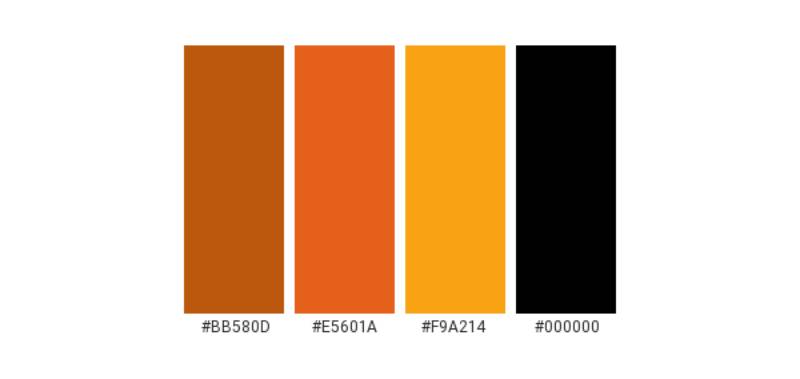
Colors ain’t just for aesthetics, my friend. There’s a whole palette of emotions in those hues.
Fiery Oranges and Reds
This combo screams energy, drive, and ambition. It’s the fiery passion of the team and their relentless pursuit of excellence.
Deep Purple
Oh, that deep purple? That’s the mark of royalty, of grandeur. It’s a nod to the legacy and history of the team.
The Font Used in the Phoenix Suns Logo
Fonts, man, they tell a story too.
Bold and Upright
The Suns’ font stands tall, confident. It’s got this swagger, a subtle hint that says, “We’re here, and we ain’t backing down.”
Curve Appeal
Notice those soft curves? That’s the logo throwing a nod to the fluidity of the game and the grace of those on-the-court moves.
Design Evolution
Every logo has its journey, a transformation story.
From Simple to Sophisticated
Initially, the designs were more straightforward. Over time, the logo embraced intricate details, reflecting the growing complexity and maturity of the franchise.
Iconic Imagery
Did you spot that basketball in the logo? Over the years, it became more prominent, symbolizing the sport’s central role in the Phoenix community.
Fan Influence

Never underestimate the power of fandom!
Tattoos and Tees
Fans have inked this logo on their bodies! And those merch tees? They’re not just wearing a brand. They’re donning an identity.
Feedback Frenzy
Over the years, fan feedback has influenced tweaks and changes. Because at the end of the day, a logo isn’t just for a team – it’s for its people.
FAQ On The Phoenix Suns Logo
What is the symbolism behind the Phoenix Suns logo?
The Phoenix Suns logo captures the essence of the team and its Arizonan roots. The iconic Phoenix bird symbolizes rebirth and strength, reflecting the team’s resilience.
The fiery basketball represents the sport itself, while the bold purple and orange colors mirror Arizona’s vibrant sunsets.
When was the Phoenix Suns logo last updated?
The most recent update to the Phoenix Suns logo debuted in 2013. This redesign subtly refreshed the previous emblem, tweaking shapes and colors to contemporize the brand while maintaining the core elements that reflect the team’s storied history and identity within the NBA.
What does the color scheme of the Phoenix Suns logo represent?
Purple and orange, the hues that define the Phoenix Suns logo, are a nod to Arizona’s picturesque sunsets and the state’s desert landscape. These colors serve not just as branding strategy but also an allegiance to the Phoenix community, illustrating the team’s local pride.
Has the Phoenix Suns logo changed much over the years?
Yes, the Suns logo has undergone several transformations since the franchise’s inception in 1968. Each iteration reflects evolving design trends and team identity, including shifts from a simplistic basketball design to the dynamic imagery of the Phoenix, encapsulating the evolution of sports marketing and graphic design.
Who designed the original Phoenix Suns logo?
The original Phoenix Suns logo, with its classic basketball and western font, was designed by Stan Fabe, who operated a Tucson-based printing and advertising company. His contribution laid the groundwork for a sports logo that’s become emblematic of NBA team branding.
Are there alternative versions of the Phoenix Suns logo for special events?
Special events often spark the creation of variant logos. These encompass the team mascot, alternate colors, or thematic elements, like the “Los Suns” versions for Noche Latina games.
Each special edition maintains the essence of the team’s visual identity while celebrating specific occasions or campaigns.
What is the fan perception of the Phoenix Suns logo?
The logo is generally cherished by fans, encapsulating the team spirit and Arizona’s cultural landscape.
It serves as a rallying symbol for fanbase unity; a graphical anchor that fans young and old don in support of their team—an integral part of the Suns’ visual identity and sports branding.
How does the Phoenix Suns logo compare to other NBA team logos?
Each NBA logo has its unique flair and symbolism. The Suns logo stands out with its incorporation of regional elements, use of vibrant colors, and the iconic Phoenix, distinctively representing the team’s brand identity in a league filled with varied and creative emblem designs.
Has the Phoenix Suns logo been subject to copyright controversies?
While copyright disputes are common in professional sports, the Phoenix Suns have managed to avoid high-profile controversies surrounding their logo.
By securing trademarks and respecting intellectual property rights, they have upheld the integrity of their visual identity within sports marketing and branding realms.
How do the Phoenix Suns use their logo in their marketing strategies?
The Phoenix Suns logo is central to their marketing tactics, with strategic placement on merchandise, advertising campaigns, and digital platforms, fostering brand recognition.
It stands as a cornerstone of their marketing efforts, a symbol around which campaigns are built, thus engaging the fandom and attracting sponsorships.
Conclusion
In the realm where design and sports intertwine, the Phoenix Suns logo stands as an emblem for more than just a basketball team; it’s the heart of a community and a beacon for an entire state. Its evolution—from a simple basketball motif to a fiery phoenix—mirrors the history of a franchise that is constantly rebirthing itself in pursuit of greatness. The logo’s colors don’t just scream ardor; they whisper the story of Arizona’s stunning dusks.
- Endnotes:
- The inception dates back to Stan Fabe’s iconic design.
- Evolution has kept pace with sports branding shifts.
- The fanbase’s embrace, unwavering across generations.
Yet beyond hues and strokes, we discern a narrative of ambition and artistry—a bold declaration of team identity and culture that bleeds beyond the courts into the streets of Phoenix. As the sun sets on this discourse, let the logo linger in your thoughts—not just as a mark, but as a legacy carved into the annals of the NBA and emblazoned in the hearts of its fans.
If you liked this article about the Phoenix Suns logo, you should check out this article about the Portland Trail Blazers logo.
There are also similar articles discussing the San Antonio Spurs logo, the New Orleans Pelicans logo, the Philadelphia 76ers logo, and the Boston Celtics logo.
And let’s not forget about articles on the Indiana Pacers logo, the Los Angeles Clippers logo, the Oklahoma City Thunder logo, and the Charlotte Hornets logo.
Bogdan Sandu, a seasoned designer with 15 years of diverse experience, has been designing websites since 2008.
Renowned for his expertise in logo design and visual branding, Bogdan has developed a multitude of logos for various clients.
His skills extend to creating posters, vector illustrations, business cards, and brochures. Additionally, Bogdan's UI kits were featured on marketplaces like Visual Hierarchy and UI8.
Latest posts by Bogdan Sandu (see all)
- Out of This World: Space Color Palettes for Cosmic Designs - 28 April 2024
- The Bungie Logo History, Colors, Font, And Meaning - 27 April 2024
- After Dark: Night Color Palettes for Mysterious Designs - 27 April 2024