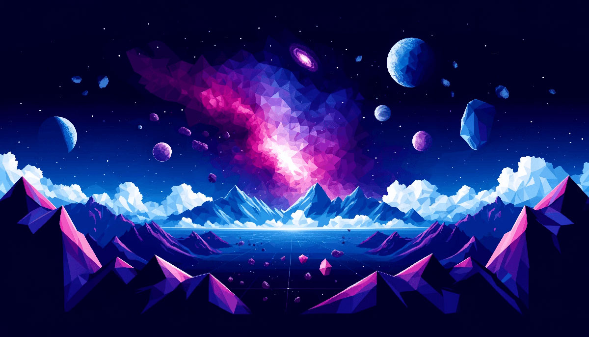
Pull up any telescope image from the James Webb or Hubble archives and you’ll find space color palettes that no designer could invent. Deep purples from ionized gases, electric blues from stellar remnants, and those shocking pinks from nebula clouds all exist in actual photographs of the cosmos.
These aren’t artistic interpretations. They’re real hue combinations captured from distant galaxies and planetary atmospheres.
This guide breaks down 15 cosmic color schemes with exact hex codes, explains when each palette works best, and shows how to apply them without looking like a 1980s arcade game.
You’ll learn which combinations suit corporate brands versus creative projects, how saturation levels affect mood, and why certain space-inspired schemes perform better in digital interfaces than others.
Space Color Palettes
Space-inspired color schemes pull directly from nebula photography, galaxy imagery, and planetary surfaces. Deep blacks anchor these palettes while electric purples, cosmic blues, and stellar pinks create that otherworldly glow.
The hue selections mirror actual astronomical phenomena captured by telescopes. Saturation levels tend to run high in accent colors, mimicking ionized gases and starlight against the void.
Purple Haze Nebula
| #210535 | #430D4B | #7B337D | #C874B2 | #F5D5E0 |
Colors & Hex Codes
Deep eggplant (#210535) transitions through violet midtones (#430d4b, #7b337d) to orchid pink (#c874b2) and blush (#f5d5e0).
When to Use This Palette
Works for beauty brands, creative portfolios, meditation apps. The gradient flow creates calm yet mysterious energy.
Color Composition Breakdown
Based on Orion Nebula imagery. Purple dominance with pink highlights mimics ionized hydrogen clouds.
Best Use Cases
Digital branding, app interfaces, event materials. Pairs well with sans-serif fonts and minimal layouts.
Design Pairing Tips
Use darkest shade for backgrounds, lightest for text or accents. Mid-range purples work for buttons and interactive elements, maintaining strong contrast throughout.
Eclipsed
| #000000 | #051427 | #530F1E | #A44322 | #F8BC04 |
Colors & Hex Codes
Pure black (#000000) through midnight navy (#051427) and burgundy (#530f1e) to burnt sienna (#a44322) and golden yellow (#f8bc04).
When to Use This Palette
Perfect for tech startups, gaming brands, sci-fi projects. High drama with that corona glow effect.
Color Composition Breakdown
Eclipse-inspired warmth against deep space. The gold represents the sun’s corona, reds mimic atmospheric refraction.
Best Use Cases
Landing pages, poster design, video game interfaces. Creates instant visual hierarchy with the bright accent.
Design Pairing Tips
Reserve golden yellow for CTAs and key highlights only. Black provides maximum depth, burgundy works for secondary elements and transitions between extremes.
Deep Space Blue
| #062C43 | #054569 | #5591A9 | #9CCDDC | #CED7E0 |
Colors & Hex Codes
Dark prussian blue (#062c43, #054569) shifting to steel blue (#5591a9), powder blue (#9ccddc), and pale gray-blue (#ced7e0).
When to Use This Palette
Corporate sites, financial dashboards, healthcare platforms. Monochrome approach builds trust and professionalism.
Color Composition Breakdown
Inspired by distant planetary atmospheres. Analogous colors create smooth transitions without jarring shifts.
Best Use Cases
Data visualization, SaaS products, enterprise software. The restrained palette keeps focus on content and functionality.
Design Pairing Tips
Darkest blues for headers and footers, mid-tones for content cards. Lightest shades work for backgrounds and negative space, maintaining clean readability with typography.
Supernova Burst
| #0B1F3A | #76101E | #133769 | #C9374C | #C2DDE4 |
Colors & Hex Codes
Navy depths (#0b1f3a, #133769) with crimson explosion (#76101e, #c9374c) and ice blue (#c2dde4).
When to Use This Palette
Music venues, entertainment brands, bold editorial layouts. The clash between cool and warm creates tension and energy.
Color Composition Breakdown
Supernova event palette. Reds represent stellar matter ejection, blues mirror surrounding space, creating dramatic emphasis points.
Best Use Cases
Album covers, festival branding, motion graphics. High impact for youth-focused or alternative markets.
Design Pairing Tips
Navy anchors the composition, crimson draws attention to key elements. Ice blue softens the intensity and provides breathing room between saturated areas.
Ocean Nebula
| #013026 | #014760 | #107E57 | #A1CE3F | #CBE58E |
Colors & Hex Codes
Dark teal (#013026) and navy (#014760) through forest green (#107e57) to lime (#a1ce3f) and pale chartreuse (#cbe58e).
When to Use This Palette
Environmental organizations, wellness brands, organic products. Green spectrum evokes nature meets cosmos.
Color Composition Breakdown
Mimics nebula with blue-green ionized gases. Unexpected for space palettes but authentic to certain cosmic clouds captured by telescopes.
Best Use Cases
Sustainability reports, eco-tech branding, health apps. Bridges natural and futuristic aesthetics without conflict.
Design Pairing Tips
Deep teals for primary surfaces, lime for accents and interactive states. Pale chartreuse works for highlights and hover effects, creating energetic yet grounded feel.
Cosmic Night
| #020208 | #0C0A20 | #1E1860 | #4848D0 | #7070FF |
Colors & Hex Codes
Near-black (#020208) through deep indigo (#0c0a20, #1e1860) to electric blue (#4848d0) and periwinkle (#7070ff).
When to Use This Palette
Premium tech products, AI platforms, cryptocurrency exchanges. Conveys innovation and forward-thinking without looking dated.
Color Composition Breakdown
Classic space palette structure. Gradual shift from void to starlight using RGB blue channel progression.
Best Use Cases
Web3 interfaces, developer tools, analytics dashboards. Works particularly well for dark mode implementations and night-friendly displays.
Design Pairing Tips
Near-black eliminates eye strain in low-light conditions. Electric blue for primary actions, periwinkle for secondary elements and disabled states, maintaining balance throughout interface.
Nova Pink Glow
| #2C2898 | #FF4488 | #FF88CC | #00DDFF | #88FFEE |
Colors & Hex Codes
Royal purple (#2c2898), hot magenta (#ff4488), bubblegum pink (#ff88cc), cyan (#00ddff), and mint (#88ffee).
When to Use This Palette
Fashion brands, beauty products, creative agencies. Maximum vibrancy for youth markets and energetic messaging.
Color Composition Breakdown
Vaporwave meets cosmic dust. High saturation across all values creates that synthetic, almost neon aesthetic popular in retro futurism.
Best Use Cases
Social media graphics, merchandise design, event promotions. Neon quality demands attention in crowded feeds.
Design Pairing Tips
Purple grounds the composition preventing complete chaos. Alternate between warm pinks and cool cyans to create rhythm and movement across layouts.
Aurora Borealis
| #1D1640 | #3D276F | #001D83 | #39977F | #B4DAC3 |
Colors & Hex Codes
Deep violet (#1d1640, #3d276f), sapphire (#001d83), teal (#39977f), and seafoam (#b4dac3).
When to Use This Palette
Travel brands, outdoor gear, meditation platforms. Captures that ethereal northern lights quality without feeling too mystical or feminine.
Color Composition Breakdown
Inspired by aurora phenomena over dark skies. Combines cool spectrum from purple through blue to green, mimicking atmospheric light displays.
Best Use Cases
Tourism marketing, photography portfolios, nature documentaries. Works for both digital and print applications with strong color palette cohesion.
Design Pairing Tips
Violets anchor darker sections, teal provides mid-range flexibility. Seafoam lifts the composition and creates soft contrast against deeper tones, perfect for white space alternatives.
Northern Lights
| #01213A | #01411F | #005D55 | #08AFA8 | #8AED07 |
Colors & Hex Codes
Midnight navy (#01213a), forest green (#01411f), deep teal (#005d55), turquoise (#08afa8), and electric lime (#8aed07).
When to Use This Palette
Outdoor brands, adventure travel, eco-tourism. The green-blue spectrum feels fresh and invigorating rather than corporate.
Color Composition Breakdown
Captures aurora ribbons across night sky. Progression from cool darks to vivid lime creates natural gradient flow found in actual atmospheric phenomena.
Best Use Cases
App interfaces, web design, outdoor gear branding. Strong enough for digital displays, translates well to fabric and print materials.
Design Pairing Tips
Navy provides solid foundation, teal works for navigation elements. Electric lime demands restraint, use only for CTAs and critical alerts to maintain impact.
Midnight Orbit
| #020617 | #0B1026 | #0EA5E9 | #38BDF8 | #F0F9FF |
Colors & Hex Codes
Deep space black (#020617, #0b1026), sky blue (#0ea5e9), bright cyan (#38bdf8), and ice white (#f0f9ff).
When to Use This Palette
SaaS platforms, fintech apps, analytics tools. Clean and modern without the sterile feeling of pure grayscale.
Color Composition Breakdown
Minimal palette with maximum contrast. Blue accent colors pop against near-black backgrounds, ice white prevents harsh pure white glare.
Best Use Cases
Dashboard interfaces, data visualization, productivity tools. Reduces eye strain during extended use while maintaining visual hierarchy.
Design Pairing Tips
Reserve brightest cyan for primary actions only. Ice white works for body text and cards, creating subtle depth against black rather than stark division.
Galaxy Grape
| #1A0633 | #4B0082 | #6A0DAD | #D946EF | #FDE047 |
Colors & Hex Codes
Dark aubergine (#1a0633), indigo (#4b0082), cosmic purple (#6a0dad), fuchsia (#d946ef), and lemon yellow (#fde047).
When to Use This Palette
Creative studios, music platforms, entertainment apps. High energy with that psychedelic cosmic vibe.
Color Composition Breakdown
Purple dominance with unexpected yellow accent. Creates complementary tension that demands attention without aggressive reds.
Best Use Cases
Merchandise designs, concert posters, streaming service branding. The magenta and yellow combo works particularly well for Gen Z audiences.
Design Pairing Tips
Aubergine grounds the wild energy, purple gradients create depth. Yellow sparingly for icons and small accents, prevents visual overload while maintaining punch.
Stellar Spectrum
| #0A0E27 | #2E0854 | #4169E1 | #8A2BE2 | #B0E0E6 |
Colors & Hex Codes
Charcoal navy (#0a0e27), deep violet (#2e0854), royal blue (#4169e1), blue-violet (#8a2be2), and powder blue (#b0e0e6).
When to Use This Palette
Educational platforms, science communication, astronomy content. Balances authority with accessibility.
Color Composition Breakdown
Reflects stellar light spectrum. Cool tones throughout maintain scientific credibility while purple adds warmth and approachability.
Best Use Cases
Academic websites, museum exhibits, documentary branding. Works across age groups from children’s planetarium shows to graduate research.
Design Pairing Tips
Charcoal for large text blocks, royal blue for headings and navigation. Powder blue creates soft backgrounds and section dividers without harsh contrast jumps.
Nebula Rose
| #210535 | #430D4B | #7B337D | #C874B2 | #F5D5E0 |
Colors & Hex Codes
Identical to Purple Haze Nebula. Deep plum (#210535) through mauve (#7b337d) to rose (#c874b2) and blush (#f5d5e0).
When to Use This Palette
Wellness brands, feminine product lines, luxury cosmetics. Sophisticated alternative to traditional pink schemes.
Color Composition Breakdown
Rose-tinted nebula interpretation. Warmer than typical space palettes while maintaining cosmic connection through purple base.
Best Use Cases
Packaging design, spa branding, romance-focused content. Elevates pink beyond childish associations into premium territory.
Design Pairing Tips
Deep plum for anchoring elements, blush for negative space. Mid-range tones handle transitions smoothly, creating luxe feel with serif typefaces.
Cosmic Citrus
| #0B0D21 | #1E1860 | #6A00FF | #FF6B35 | #FEF9F0 |
Colors & Hex Codes
Ink black (#0b0d21), deep indigo (#1e1860), vivid purple (#6a00ff), coral orange (#ff6b35), and cream (#fef9f0).
When to Use This Palette
Food delivery apps, restaurant branding, culinary content. Unexpected space theme with appetite appeal through orange accent.
Color Composition Breakdown
Purple-orange split creates dynamic energy. Warm citrus against cool space tones breaks typical cosmic palette conventions.
Best Use Cases
Menu designs, food photography backdrops, recipe apps. The orange stimulates appetite while purple adds premium quality signals.
Design Pairing Tips
Ink black for hero sections, purple for brand elements. Coral for food imagery borders and highlights, cream prevents stark white that washes out photography.
Void & Stars
| #000000 | #0D0D0D | #36454F | #4B0082 | #FFFFFF |
Colors & Hex Codes
Pure black (#000000), dark charcoal (#0d0d0d), gunmetal (#36454f), indigo (#4b0082), and pure white (#ffffff).
When to Use This Palette
Minimalist brands, architectural firms, luxury tech. Maximum contrast with minimal color complexity.
Color Composition Breakdown
Stripped-down space palette. Focuses on void and starlight without nebula colors, creating stark dramatic effect.
Best Use Cases
Portfolio sites, photography galleries, high-end product launches. Minimalist approach puts content first without distraction.
Design Pairing Tips
True black for maximum depth, charcoal for subtle layering. Indigo provides single accent option, pure white for typography ensures perfect legibility and alignment clarity.
FAQ on Space Color Palettes
What colors are commonly found in space color palettes?
Deep blacks, midnight blues, and dark purples form the base. Accent colors include electric pinks, cosmic blues, stellar purples, and neon greens pulled from nebula photography and aurora phenomena captured by telescopes.
How do I choose the right space palette for my brand?
Match palette energy to brand personality. Tech and finance work with cool blues and minimal accents. Creative agencies and entertainment brands can handle vibrant purples, pinks, and high saturation combinations.
Can space color palettes work for corporate websites?
Absolutely. Monochromatic blue schemes or restrained navy-to-teal gradients convey professionalism. Avoid neon accents and stick to analogous colors for corporate applications requiring trust and stability.
What’s the difference between galaxy and nebula color schemes?
Galaxy palettes use broader gradients with blues, purples, and blacks in smooth transitions. Nebula schemes pack intense pinks, oranges, and electric blues from ionized gases, creating more dramatic contrast.
Should I use pure black or near-black in space palettes?
Near-black shades like dark navy or charcoal add depth that pure black (#000000) can’t achieve. They prevent flatness and allow subtle layering through gradients while maintaining that deep space feel.
How many accent colors should a space palette include?
Three to five total colors work best. One dark base, two mid-tone colors for structure, and one or two bright accents for highlights. More colors create visual noise and dilute cosmic impact.
Do space color palettes work in print design?
Yes, but verify CMYK conversion before printing. Vibrant screen colors often appear muted in print. Request color proofs for critical projects like packaging design or branded materials.
What typography pairs well with space-inspired palettes?
Modern sans-serif fonts work for tech and futuristic brands. Elegant serifs suit luxury applications. Avoid decorative or script fonts that fight cosmic aesthetics, maintain clean typography throughout.
Can I mix warm and cool tones in space palettes?
Mixing creates dynamic tension when done intentionally. Eclipse and supernova palettes combine warm oranges or reds with cool blues successfully. Balance saturation levels to prevent color clash and maintain unity.
How do space palettes perform in mobile app interfaces?
Excellent for dark mode implementations. They reduce eye strain and battery consumption on OLED screens. Keep bright accents for CTAs only, ensure sufficient contrast meets accessibility standards for visual hierarchy.
Conclusion
These space color palettes pull directly from telescope imagery rather than designer imagination. Each hex code represents actual cosmic phenomena, from nebula dust to planetary atmospheres.
Start with a dark base that matches your brand tone. Corporate work needs restrained blues and controlled saturation, while creative projects can handle vivid purples and neon accents.
Test your chosen scheme across devices before committing. What looks stunning on desktop can wash out on mobile or fail contrast requirements for accessibility.
Apply color theory principles to these cosmic combinations. Analogous colors create smooth transitions, while complementary schemes add drama and tension.
The universe already solved the hardest part of color palette creation. You just need to steal it correctly.

Renowned for his expertise in logo design and visual branding, Bogdan has developed a multitude of logos for various clients.
His skills extend to creating posters, vector illustrations, business cards, and brochures. Additionally, Bogdan's UI kits were featured on marketplaces like Visual Hierarchy and UI8.
He also wrote in the past years on sites like Design Your Way, WebDesignerDepot, WPDean, Designmodo, Speckyboy, Slider Revolution, and more.
- The Windsurf Logo History, Colors, Font, And Meaning - 10 October 2026
- How to Remove Background From Product Photos (No Photoshop) - 10 October 2026
- How Designers can Build a Stronger Online Creative Identity - 9 October 2026

Bogdan Sandu is a seasoned designer who has been designing websites since 2008. Renowned for his expertise in logo design and visual branding, Bogdan has developed a multitude of logos for various clients. His skills extend to creating posters, vector illustrations, business cards, and brochures. Additionally, Bogdan's UI kits were featured on marketplaces like Visual Hierarchy and UI8. He also wrote in the past years on sites like Design Your Way, WebDesignerDepot, WPDean, Designmodo, Speckyboy, Slider Revolution, and more.
You Might Also Like