—
The Bungie logo is one of the most recognized marks in the gaming industry. It belongs to the American video game developer behind franchises like Halo and Destiny, and it’s gone through several redesigns since 1991. But the core idea has stayed surprisingly consistent: clean type, a blue dot, and a sense of forward motion.
Bungie, Inc. was founded in May 1991 by Alex Seropian and Jason Jones in Chicago, Illinois. The studio started out making Macintosh games before Microsoft acquired it in 2000. After splitting from Microsoft in 2007, signing with Activision in 2010, and then going independent again in 2019, Sony Interactive Entertainment completed its acquisition of Bungie in July 2022. Through all of that, the logo evolved four times. The current version dates back to 2009.
What Is the Bungie Logo?
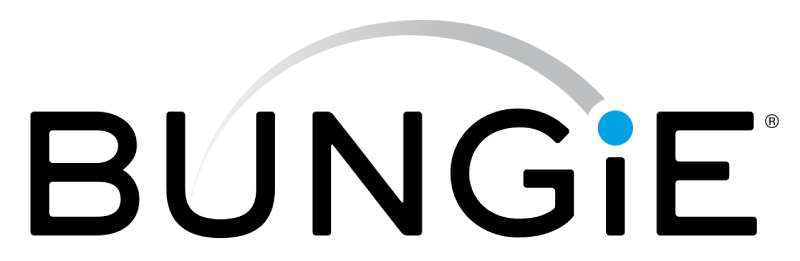
The Bungie logo is a combination mark featuring an uppercase sans-serif wordmark in black with a distinctive lowercase “i” topped by an enlarged blue dot. From the dot, a gray arched orbit extends to the left, crossing over the letter “U.” The current version was introduced in 2009. The design communicates professionalism, modernity, and a subtle nod to the studio’s space-themed game worlds.
Design Type: Combination mark (wordmark with graphic element)
Primary Elements: Uppercase sans-serif typography with a lowercase “i,” an oversized blue dot, and a gray arched orbit line
Official Introduction Date: Current version introduced in 2009; original logo dates to 1992
Designer/Agency: In-house Bungie design team (specific designer not publicly credited)
Trademark Status: Bungie, Inc. holds over 90 registered trademarks with the United States Patent and Trademark Office, including their brand name and associated visual marks
Color Palette: Black (#000000), Gray (#BBBDBF), and Blue (#00A3E3)
Usage Context: Game splash screens, Bungie.net website, Destiny 2 and Marathon game launches, Bungie Store merchandise, marketing materials, press kits, and digital platforms
How Has the Bungie Logo Evolved Over Time?

The Bungie logo has been redesigned three times since the company’s founding. Each version reflected the studio’s growth and shifts in identity, from a small Mac game developer to a globally recognized name in gaming.
The transitions were practical. When the company name shortened, the logo followed. When the brand matured, the typeface got cleaner.
Four distinct versions exist. And honestly, the last two look very similar unless you put them side by side.
Original Bungie Logo (1991–1992)
Years Active: ~1991–1992
This was the very first mark Bungie used, back when the company barely had an office. It was a black-and-white badge with stylized uppercase lettering in an italicized serif font, written with a pixel-like quality.
Two horizontal elements crossed through the wordmark, made up of tiny checker patterns. The whole thing felt scrappy and early-90s, which it was.
There’s no record of a formal designer for this version. Alex Seropian was handling most of the business side while Jason Jones coded, so it was likely put together with minimal outside help.
It served its purpose for the studio’s earliest Macintosh games, but it didn’t last long.
Bungie Software Products Corporation Logo (1992–1994)
Years Active: 1992–1994
When the company became Bungie Software Products Corporation, it got a more structured logo. This version featured a two-level inscription separated by a bold underline.
The main wordmark used bold capital letters in a custom serif font with sharp elements on the bar endings. Below, the full company name sat in a simple uppercase sans-serif.
To the right of the wordmark, three bold parallel horizontal lines with diagonally cut ends formed a small geometric element. Very structured. Very mid-90s corporate.
The color palette stayed black and white. No blue yet.
This version appeared on early releases like Marathon and Pathways into Darkness. It represented Bungie’s growing ambition as a serious Mac developer.
First Modern Bungie Logo (1994–2009)
Years Active: 1994–2009
This is where the Bungie logo people actually recognize started to take shape. When the company shortened its name to just “Bungie,” the logo got a complete overhaul.
The new design introduced an uppercase sans-serif wordmark in black. But here’s the interesting part: the letter “I” was set in lowercase, and the dot above it was enlarged and colored light blue.
From that blue dot, a gray arched orbit extended to the left, its thin sharpened end crossing through the letter “U.” It added movement to what would otherwise be a static wordmark.
This logo carried Bungie through its biggest era. Marathon Infinity, the Myth series, Oni, and the entire original Halo trilogy all launched under this mark. It became tied to the Xbox brand in many players’ minds.
The blue dot and orbit gave it personality. Most game studios at the time were using heavier, more aggressive branding. Bungie’s approach was surprisingly restrained.
Current Bungie Logo (2009–Present)
Years Active: 2009–present
The 2009 redesign didn’t change much, which tells you the 1994 concept was solid. The composition and color scheme stayed the same: black type, blue dot, gray orbit.
But the details shifted. The font moved to a smoother, more modern sans-serif. The blue dot got smaller. The orbit became thinner, shorter, and now uses a gradient that fades from gray to white at its tip.
The closest match to the typeface is Dress Code Medium Round, though Bungie modified several letter contours to make it their own.
This is the version that launched Destiny, Destiny 2, and all their expansions. It’s also the logo that represented the studio through its split from Microsoft, the Activision partnership, and the Sony acquisition.
It feels tighter, more polished. Took me a while to notice the differences when I first compared them. But once you see the thinner orbit and adjusted letterforms, you can’t unsee it.
What Do the Design Elements of the Bungie Logo Mean?
Every piece of the Bungie logo serves a purpose. The blue dot and orbit aren’t decorative filler. They connect directly to the kind of games Bungie makes: expansive, space-focused, and built around exploration.
The uppercase lettering projects authority. The lowercase “i” breaks the pattern on purpose.
And the orbit? It suggests something in motion, something circling outward. That’s pretty on-brand for the studio behind Destiny’s solar system.
Why Did Bungie Choose These Specific Colors?

The Bungie logo uses three colors, and each one pulls its weight.
Black (#000000): The primary text color. It communicates strength and authority without trying too hard. Black is the default choice for wordmarks that need to work on any background, and understanding color psychology shows why. It’s direct. No ambiguity. You’ll find black logos across nearly every industry for this reason.
Gray (#BBBDBF): Used for the orbit element. Gray adds neutrality and balance to the composition. It keeps the orbit from competing with the blue dot for attention. The gradient fade toward white gives it a sense of trailing off into space, which fits.
Blue (#00A3E3): The dot above the “i.” Blue builds trust and signals reliability, which matters when your audience is investing hundreds of hours in your game. It’s also the color most associated with sky and space, tying back to Bungie’s sci-fi focus. This particular hue leans bright and energetic rather than corporate or muted.
What Typography Style Is Used in the Bungie Logo?
The wordmark uses a custom sans-serif typeface with bold, stable letterforms. The closest commercially available match is Dress Code Medium Round, but Bungie modified specific letter contours.
All letters are uppercase except the “i,” which stays lowercase to anchor the blue dot above it. It’s a small break in convention that gives the logo its most recognizable feature.
The kerning is tight but readable. No tight squeezing, no excessive gaps. The letters sit comfortably next to each other, giving the whole wordmark a solid, grounded feel.
What Are the Hidden Meanings in the Bungie Logo?
The enlarged blue dot and arched orbit introduce a celestial feel that most people pick up on subconsciously. It suggests a planet with a ring or an object in orbit, which lines up perfectly with Destiny’s interstellar setting.
The lowercase “i” is interesting. It breaks the uniformity of the uppercase letters, which some interpret as a nod to individuality or the single player within a larger universe.
Bungie’s favorite number has always been seven (they even celebrate Bungie Day on 7/7). While there’s no direct representation of seven in the logo, the orbit’s arc and positioning create a subtle sense of incompleteness, like a story still being told.
How Does the Bungie Logo Compare to Competitor Logos?
Most game studio logos go heavy. Bold lettering, aggressive shapes, dark themes. Look at the Rockstar Games logo with its star-and-R mark, or the Bethesda logo with its stark all-caps treatment. Even the Epic Games logo leans industrial.
Bungie’s logo is softer by comparison. The blue dot and gray orbit give it almost a tech-company feel rather than a pure gaming studio vibe. Which actually works in its favor. It stands out precisely because it doesn’t follow the expected pattern among gaming company logos.
Compare it to the Valve logo, which uses a human head with a valve on it, or the Riot Games logo with its sharp geometric fist. Those are all character-driven or symbol-heavy approaches. Bungie went the other direction: clean type with one small graphic flourish.
The EA logo is probably the closest comparison in terms of simplicity. Both use straightforward wordmarks with minimal graphic embellishment. But EA’s is fully geometric and corporate, while Bungie’s orbit element gives it personality.
Studios like Ubisoft and Square Enix have also moved toward cleaner, more modern logos in recent years. There’s clearly a trend away from the cluttered emblems of the early 2000s. Bungie was ahead of that curve.
What Are the Technical Specifications of the Bungie Logo?
Official Color Codes
Primary Color: Black
Secondary Color: Gray
- Hex: #BBBDBF
- RGB: (187, 189, 191)
- CMYK: (2, 1, 0, 25)
- Pantone: Cool Gray 4 C
Accent Color: Blue
- Hex: #00A3E3
- RGB: (0, 163, 227)
- CMYK: (100, 28, 0, 11)
- Pantone: 299 C
Dimensions and Proportions
The Bungie logo is distributed primarily as an SVG vector file, which means it scales to any size without quality loss. The wordmark itself maintains a roughly 5:1 width-to-height ratio when including the orbit element.
Clear space around the logo should equal at least the height of the letter “B” on all sides. This prevents other elements from crowding the mark and keeps the orbit visually intact.
For digital use, the minimum recommended width is around 120 pixels to keep the blue dot and orbit legible. Below that size, the orbit starts to disappear on screen.
For print applications, the logo works at standard DPI requirements (300 DPI for print, 72 DPI for screen). The SVG format handles both without the bitmap artifacts you’d get from a raster file.
What Cultural Impact Has the Bungie Logo Had?

The Bungie logo became a cultural marker for an entire generation of console gamers. If you played Halo on the original Xbox, that blue dot and orbit were the first thing you saw before the title screen loaded.
It carried weight. When the logo appeared at E3 presentations or game reveals, audiences knew something big was coming. The Destiny reveal trailer in 2013 used it as a statement: this is still Bungie, post-Halo.
The logo also became a community symbol. Bungie Day celebrations on July 7th feature it prominently, and fans have tattooed the mark, printed it on custom merchandise, and recreated it in fan art for decades.
Among video game logos, it ranks alongside the Nintendo logo and the Sega logo in terms of pure recognition within the gaming community. Maybe it doesn’t have the mainstream reach of those brands, but within the FPS and sci-fi gaming audience, it’s instantly identifiable.
How Does the Bungie Logo Fit Into the Overall Brand Identity?
The Bungie logo sits at the center of a larger brand system that includes game-specific logos like the Destiny Tricorn symbol, the Marathon running man, and the classic Halo ring icon. Each game franchise has its own distinct mark, but they all live under the Bungie corporate logo.
It’s a smart brand architecture. The Bungie mark stays clean and corporate while the game logos get to be more expressive and genre-specific. Destiny can be mystical. Marathon can be stark and sci-fi. The parent brand doesn’t have to carry all that tone.
The Bungie Store uses the logo as its primary identifier for merchandise, and Bungie.net features it in the site header. The brand guidelines keep usage consistent across all touchpoints, from social media to press kits to in-game splash screens.
How Should the Bungie Logo Be Used?
Bungie maintains specific rules for how their logo appears in public. If you’re a content creator, journalist, or partner using the logo, here’s what to keep in mind.
Do:
- Use the official logo files from Bungie’s press resources
- Maintain the minimum clear space around the mark
- Display the logo on backgrounds that provide enough contrast for readability
- Use the full-color version whenever possible
Don’t:
- Alter the colors, proportions, or spacing of the logo elements
- Place the logo on busy backgrounds that obscure the orbit element
- Recreate the logo from scratch using approximated fonts
- Use outdated versions of the logo for current Bungie content
The Bungie name and logo are registered trademarks of Bungie, Inc. Use without permission for commercial purposes can result in legal action. Fan art and editorial use generally fall under fair use, but official licensing requires direct authorization from the company.
Official logo assets and press materials can typically be accessed through Bungie’s press portal or by contacting their communications team directly. The Bungie.net intellectual property and trademarks page outlines the full scope of their protected marks.
Conclusion
The Bungie logo has held up remarkably well across three decades of shifts in ownership, game franchises, and industry trends. From its early days as a pixelated serif mark on Macintosh game boxes to the refined sans-serif wordmark with its signature blue dot and orbit, it tells you everything you need to know about the studio without saying a word.
Few tech company logos manage that kind of longevity.
The 2009 redesign proved that sometimes the best move is restraint. A smoother typeface, a thinner orbit, a tighter composition. That’s it. And it still works on Destiny 2 splash screens, the Bungie Store, and every press kit the Bellevue studio puts out.
Whether Sony’s acquisition eventually brings another visual update remains to be seen. But the blue dot above that lowercase “i” has become so tied to the Bungie community that changing it would be a tough sell. Some marks just earn their permanence.

Renowned for his expertise in logo design and visual branding, Bogdan has developed a multitude of logos for various clients.
His skills extend to creating posters, vector illustrations, business cards, and brochures. Additionally, Bogdan's UI kits were featured on marketplaces like Visual Hierarchy and UI8.
He also wrote in the past years on sites like Design Your Way, WebDesignerDepot, WPDean, Designmodo, Speckyboy, Slider Revolution, and more.
- Canva vs PowerPoint: Which Is Better for Presentations? - 22 September 2026
- How to Install Fonts on Mac (Step-by-Step Guide) - 20 September 2026
- From Mockup to Code: How AI-Augmented Development Speeds Up the Design Handoff - 19 September 2026

Bogdan Sandu is a seasoned designer who has been designing websites since 2008. Renowned for his expertise in logo design and visual branding, Bogdan has developed a multitude of logos for various clients. His skills extend to creating posters, vector illustrations, business cards, and brochures. Additionally, Bogdan's UI kits were featured on marketplaces like Visual Hierarchy and UI8. He also wrote in the past years on sites like Design Your Way, WebDesignerDepot, WPDean, Designmodo, Speckyboy, Slider Revolution, and more.
You Might Also Like