A single glance at a controller button can trigger decades of memories. Video game logos serve as visual gateways to entire worlds, from Nintendo’s red oval to PlayStation’s interlocking letters.
These digital emblems represent billions in gaming revenue and shape how millions connect with interactive entertainment. Gaming brand identity has evolved from simple arcade graphics to sophisticated logo design principles that rival any Fortune 500 company.
Understanding gaming iconography reveals how visual design drives player loyalty and market dominance. Console manufacturers and game developers invest heavily in creating symbols that transcend cultural barriers.
This analysis examines 20 iconic gaming brands through their visual evolution, design psychology, and market impact. You’ll discover how color theory influences player emotions and why certain typography choices become instantly recognizable across platforms.
Video Game Logos
| Logo Brand | Design Classification | Visual Elements | Brand Recognition Level |
|---|---|---|---|
| Nintendo | Wordmark Typography | Red oval background, white condensed sans-serif lettering | Global Platform Recognition |
| PlayStation | Abstract Symbol + Wordmark | Multi-colored geometric P and S letters, blue-black typography | Global Platform Recognition |
| Xbox | Abstract Symbol + Wordmark | Green spherical X symbol, contemporary sans-serif | Global Platform Recognition |
| Steam | Iconic Symbol + Wordmark | Mechanical gear with steam valve, industrial typography | PC Gaming Platform Standard |
| Epic Games | Monogram + Wordmark | Stylized E letterform, bold modern sans-serif | Emerging Platform Recognition |
| Super Mario | Character-Based Franchise | Stylized Mario character silhouette, vibrant red and blue | Iconic Game Character |
| The Legend of Zelda | Symbolic Emblem | Triforce golden triangle symbol, elegant serif typography | Fantasy Franchise Recognition |
| Pokémon | Stylized Wordmark | Yellow and blue custom lettering with accent marks | Global Multimedia Franchise |
| Minecraft | Textural Wordmark | Pixelated block-style lettering, earth tone colors | Indie-to-Mainstream Success |
| Fortnite | Dynamic Wordmark | Bold angular lettering, purple and blue gradient | Battle Royale Phenomenon |
| Call of Duty | Military-Style Wordmark | Stencil-inspired typography, tactical color scheme | Annual Franchise Standard |
| Grand Theft Auto | Urban Typography | Graffiti-influenced lettering, high contrast styling | Mature Gaming Franchise |
| FIFA | Corporate Sports Branding | Clean geometric letterforms, official blue coloring | Licensed Sports Simulation |
| Overwatch | Futuristic Symbol + Text | Circular orange emblem, sci-fi inspired typography | Team-Based Shooter Recognition |
| League of Legends | Fantasy Heraldic Design | Blue and gold shield emblem, medieval-inspired elements | MOBA Genre Leader |
| VALORANT | Tactical Wordmark | Angular geometric lettering, red accent coloring | Competitive FPS Innovation |
| Apex Legends | Metallic Symbol Design | Chrome-style triangular emblem, industrial aesthetic | Battle Royale Competitor |
| Cyberpunk 2077 | Neon Dystopian Styling | Yellow cyber-tech typography, futuristic letterforms | AAA Single-Player Experience |
| The Witcher | Medieval Fantasy Emblem | Wolf medallion symbol, dark gothic typography | RPG Franchise Recognition |
| Assassin’s Creed | Historical Symbol Design | Assassin hood emblem, period-appropriate typography variations | Historical Action Franchise |
Nintendo
Nintendo’s visual identity originated from Japanese hanafuda card production, evolving through numerous iterations before settling on its current iconic form.
The company’s logo journey spans over 130 years, transitioning from traditional Japanese typography to the globally recognized red and white “racetrack” design.
Logo Design Elements
The contemporary Nintendo identity features:
- Distinctive oval frame enclosing the wordmark, creating signature “racetrack” shape
- Consistent thickness between frame and letters establishing visual harmony
- Most recognizable element: flattened ‘t’ with square tittle, perfectly suited for pixel era gaming
- Modified version of Helvetica Black Condensed with trademark flattened ‘t’
Brand Context & Heritage
- Evolution: Logo journey reflects transition from playing cards to global gaming dominance
- Simple yet powerful design conveys stability and confidence
- Light and tender feeling through smooth frame maintains Nintendo’s approachable character
- Logo represents innovation without abandoning heritage
Visual Style & Psychology
- Classification: Minimalist modernism with clean, geometric forms
- Emerged from Nintendo’s experimental phase in the 1960s
- Perfect balance between tradition and contemporary aesthetics
- Iconic red represents passion and energy, capturing Nintendo’s dynamic spirit
- Color psychology impact resonates across all gaming demographics
Platform Applications & Recognition
Adaptability features:
- Simple geometry scales effectively from console hardware to mobile applications
- Minimal complexity ensures recognition at any size while maintaining visual impact
- Works across digital and physical merchandise applications
- Serves as visual stalwart unifying experimental products across gaming platforms
Market Impact:
- Whether introducing revolutionary motion controls or portable gaming, consistent branding provides consumer trust
- Immediate recognition supports product launches and brand extensions
PlayStation

PlayStation’s iconic interlocking “PS” logo was created by Japanese designer Manabu Sakamoto in 1994. From 20 design variations presented to management, this three-dimensional optical illusion became one of gaming’s most recognizable symbols.
Logo Design Elements
The distinctive PlayStation identity features:
- Interlocked letters creating 3D optical illusion
- “P” appearing upright while “S” lies horizontally like a shadow
- Original colorful design used red for “P” and gradient of yellow, green, blue for “S”
- Custom typography featuring strict lines with smooth curves
Brand Context & Symbolism
- Unity concept: Logo symbolizes unity among gamers and marks PlayStation’s shift to 3D graphics gaming
- Visual metaphor represents console’s ability to connect players and provide immersive experiences
- Design embodies storytelling through interactive entertainment
- Evolution demonstrates skillful transition from colorful 1990s aesthetics to contemporary minimalism
Visual Style & Psychology
- Original palette: Vibrant colors conveyed excitement and dynamic gaming experiences
- Current approach: Monochromatic schemes represent sophistication and timeless appeal
- Aligns with PlayStation’s mature market positioning
- Emphasizes capital “S” and “P” with distinctive half-cut “t” stroke
Platform Applications & Recognition
Performance metrics:
- Consistent visual identity supported over 500 million console sales globally
- Logo’s scalability enables seamless integration across gaming hardware, lifestyle collaborations, digital platforms
- Maintains 90% global recognition among gamers
- Visual consistency expanded PlayStation into lifestyle brand
Xbox
Microsoft’s Xbox logo emerged from an accidental design choice when co-author Horace Luke used lime green – the only marker color available at the time. This spontaneous decision created one of gaming’s most distinctive brand identities.
Logo Design Elements
The Xbox gaming identity features:
- Stylized “X” enclosed within circular or spherical frame
- Evolution from angular, blocky typography to sophisticated geometric forms
- Distinctive elongated horizontal bar in the “B”
- X360 typeface features sharp edges and geometric precision
Brand Context & Symbolism
- Core meaning: “X” symbolizes crossroads of gaming and entertainment
- Represents power, performance, and modernity in gaming experiences
- Embodies Microsoft’s vision of universal gaming experiences across multiple platforms
- Evolution demonstrates controlled brand maturation from aggressive newcomer to confident industry leader
Visual Style & Psychology
- Color evolution: “Xbox Green” evolved from “toxic waste” to sophisticated, digitally native hue
- Creates instant brand recognition while conveying energy and innovation
- Color selection supports competitive positioning in gaming market
- Design system approach ensures cohesion across Xbox Game Pass, hardware, digital services
Platform Applications & Recognition
System integration:
- Logo functions as anchor point for Xbox’s massive design system
- Works effectively across Xbox Series X/S, Game Pass subscriptions, PC gaming platforms
- Shows how mature brands can step back to create frameworks for content to shine
- Name “Xbox” now carries more weight than visual symbol, indicating successful brand establishment
Steam
Steam’s logo represents locomotive imagery through geometric connecting rods and cranks – the mechanical parts that set steam engines in motion. Created by Valve in 2003, the design emphasizes industrial strength and digital distribution power.
Logo Design Elements
The digital distribution identity features:
- Three circles of different diameters connected by rings and wide stripes
- Represents locomotive cranks and connecting rods in geometric composition
- Creates both abstract appeal and functional symbolism
- Strict sans-serif typography avoids distracting from mechanical emblem
Brand Context & Symbolism
- Locomotive theme: Connects Steam’s name to powerful motion and industrial efficiency
- Visual metaphor represents platform’s ability to deliver gaming content with steam engine-like reliability
- Employs minimalist industrial design with clean geometric forms
- Monochrome palette reflects contemporary digital distribution aesthetics
Visual Style & Psychology
- Current presentation: Red background radiates energy and positivity
- Coral-toned red avoids aggression while maintaining vibrancy
- Represents enjoyable gaming experiences and forward momentum
- Clean letterforms complement geometric logo elements without competing for attention
Platform Applications & Recognition
Technical specifications:
- Maintains minimum sizes of 12.5mm for print and 50 pixels for digital applications
- Scales effectively across Steam’s 28-language platform while preserving mechanical detail recognition
- Serves over 100 million users with nearly 30,000 games
- Industrial symbolism reinforces Steam’s position as gaming’s leading digital distribution platform
Epic Games
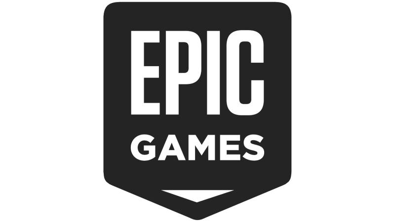
Epic Games represents modern gaming innovation through minimalist design principles. The company’s visual identity reflects its Unreal Engine heritage and Fortnite success.
Logo Design Elements
The game development identity features:
- Bold, condensed typography with subtle geometric adjustments
- Clean letterforms create immediate recognition
- Professional game development aesthetics
- Custom typeface balances readability with character distinction
Brand Context & Values
- Mission connection: Branding connects to breakthrough gaming technology and developer empowerment
- Represents company’s mission to advance interactive entertainment through cutting-edge tools
- Exemplifies contemporary tech company aesthetics with refined typography
- Signals innovation and technical expertise through minimal ornamentation
Visual Style & Psychology
- Color approach: Sophisticated dark themes with accent colors
- Conveys professional development tools while maintaining gaming industry excitement
- Color palette supports both B2B and consumer applications
- Letter spacing and proportion create strong visual hierarchy
Platform Applications & Recognition
Versatility features:
- Scales across game development tools, Epic Games Store, mobile platforms
- Simplified form ensures recognition in various gaming contexts
- Supports position as both game developer and platform provider
- Builds trust among developers and gamers globally through consistent presentation
Super Mario

Nintendo’s Super Mario logo combines playful color theory with instantly recognizable character branding. The design captures the franchise’s joyful gaming experiences.
Logo Design Elements
The character franchise identity features:
- Bold, rounded letterforms with dimensional effects
- Bright primary colors and shadow elements create depth
- Playful energy through three-dimensional typography effects
- Custom bubble-style lettering reinforces franchise’s lighthearted tone
Brand Context & Character Connection
- Personality reflection: Logo reflects Mario’s upbeat personality and family-friendly appeal
- Connects to platforming adventure and Nintendo’s quality gaming standards
- Exemplifies cartoon-influenced gaming graphics appealing to all age demographics
- Font design balances readability with character-driven personality
Visual Style & Psychology
- Color impact: Red and blue color schemes evoke Mario’s iconic outfit
- Creates strong contrast and visual appeal
- Colors generate excitement and nostalgic connection across gaming generations
- Graphic design principles approach appeals to diverse demographics
Platform Applications & Recognition
Franchise support:
- Adapts across console generations, mobile games, merchandise
- Flexible design maintains recognition while supporting diverse product applications
- Leverages decades of gaming history for instant quality communication
- Communicates quality platforming experiences and Nintendo’s commitment to innovative gameplay
Minecraft

Minecraft’s pixelated logo perfectly embodies the game’s block-building aesthetic through intentionally low-resolution pixel graphics.
Logo Design Elements
The sandbox gaming identity features:
- Chunky, three-dimensional letterforms mimicking Minecraft’s signature block aesthetic
- Earth-tone colors and textured effects enhance crafting theme
- Custom pixelated lettering reinforces game’s distinctive visual style
- Chunky letterforms create immediate recognition and tactile appeal
Brand Context & Creative Philosophy
- Core values: Branding reflects creativity, construction, infinite possibility
- Connects to player expression and procedural world generation
- Intentionally embraces low-resolution graphics as artistic choice
- Minimalist design approach became iconic in modern gaming
Visual Style & Psychology
- Material connection: Earth tones suggest natural materials and crafting themes
- Brown and green colors evoke exploration and environmental interaction
- Design maintains pixelated integrity across all platforms
- Scales effectively from mobile screens to console displays while preserving aesthetic
Platform Applications & Recognition
Cross-platform consistency:
- Maintains pixelated integrity across all gaming platforms
- Scales effectively while preserving distinctive visual style
- Instantly communicates creative sandbox gaming experience
- Supports position as one of best-selling games of all time
Call of Duty

Call of Duty’s military-inspired logo reflects the franchise’s tactical combat focus through sophisticated typography and professional aesthetics.
Logo Design Elements
The military gaming identity features:
- Bold, condensed letterforms with metallic effects
- Military color schemes and dimensional treatments
- Custom military-inspired lettering conveying authority and precision
- Letterforms balance strength with clear readability
Brand Context & Military Themes
- Combat focus: Branding emphasizes tactical combat, teamwork, military authenticity
- Connects to competitive multiplayer and campaign experiences
- Draws from military graphics traditions while maintaining contemporary gaming relevance
- Appeals to mature gaming audiences through professional presentation
Visual Style & Psychology
- Color strategy: Dark metallic colors suggest serious military themes
- Colors support franchise’s realistic combat atmosphere
- Typography conveys authority and precision in tactical gaming
- Design approach balances authenticity with gaming industry appeal
Platform Applications & Recognition
Franchise consistency:
- Maintains impact across console generations and esports presentations
- Supports annual franchise releases while preserving core identity
- Instantly communicates tactical combat gaming experience
- Supports franchise’s position as leading first-person shooter series
League of Legends

League of Legends’ sophisticated logo reflects the MOBA genre’s strategic depth through elegant design and fantasy-inspired elements.
Logo Design Elements
The competitive gaming identity features:
- Refined letterforms with subtle magical effects
- Gold and blue accents create premium competitive gaming appeal
- Elegant lettering conveys strategic depth and competitive sophistication
- Letterforms balance fantasy themes with professional presentation
Brand Context & Competitive Focus
- Strategic emphasis: Branding emphasizes strategic gameplay, champion mastery, competitive excellence
- Connects to esports professionalism and fantasy themes
- Balances fantasy aesthetics with competitive gaming professionalism
- Appeals to dedicated esports audiences through sophisticated presentation
Visual Style & Psychology
- Achievement colors: Gold and blue suggest achievement and trust in competitive gaming
- Colors support game’s premium esports positioning
- Design approach emphasizes strategic depth over action-focused excitement
- Professional presentation supports serious competitive gaming environment
Platform Applications & Recognition
Esports integration:
- Scales across PC gaming and international esports events
- Maintains premium competitive recognition across global tournaments
- Instantly communicates strategic competitive gaming experience
- Supports Riot’s position as esports industry leader through consistent branding
FAQ on Video Game Logos
What makes a video game logo iconic?
Gaming brand identity becomes iconic through distinctive visual elements, consistent application across platforms, and emotional player connections. Successful gaming logos combine memorable design elements with strategic color psychology to create instant recognition across console generations and digital platforms.
How do gaming companies choose logo colors?
Interactive entertainment branding relies on color theory to trigger specific emotions and gameplay associations. Red conveys energy and excitement, blue suggests trust and technology, while green represents growth and innovation in gaming culture.
Why do console logos rarely change?
Gaming platform identities maintain visual consistency to preserve brand recognition and consumer trust. Major redesigns risk alienating established gaming communities, so companies like Nintendo and PlayStation evolve their logos subtly while preserving core recognition elements.
What typography works best for video game logos?
Gaming logos favor custom fonts that balance readability with character distinction. Sans-serif fonts dominate modern gaming branding because they scale effectively across digital platforms while maintaining clear visibility at small sizes.
How do gaming logos adapt across different platforms?
Digital gaming graphics must scale from mobile screens to billboards while maintaining recognition. Successful gaming emblems use simple geometric forms and high contrast to ensure visibility across console hardware, merchandise, and streaming platforms.
What symbols are commonly used in gaming logos?
Gaming iconography frequently incorporates geometric shapes, stylized letters, and abstract symbols representing interactive entertainment. Controllers, pixels, and mechanical elements appear across gaming brand symbols to communicate technological innovation and player engagement.
How has gaming logo design evolved over decades?
Early arcade game symbols used simple pixel art due to technical limitations. Modern gaming logos embrace sophisticated vector graphics and complex gradient effects while maintaining essential simplicity for digital distribution.
Do gaming logos influence purchasing decisions?
Gaming brand marks significantly impact consumer purchasing behavior through instant quality recognition. Players associate established gaming emblems with proven gameplay experiences, making logo recognition a critical factor in competitive gaming markets.
What legal protections apply to gaming logos?
Gaming companies protect their brand identity through trademark registration and strict usage guidelines. Unauthorized use of gaming logos violates intellectual property laws, with companies actively enforcing brand protection across global markets.
How do indie games create memorable logos on limited budgets?
Independent developers focus on simple design elements and distinctive typography rather than complex graphics. Successful indie gaming brands prioritize unique concept execution over expensive visual effects to achieve recognition in crowded digital marketplaces.
Conclusion
Video game logos represent far more than simple corporate identification. They function as cultural symbols connecting generations of players through shared interactive experiences and digital memories.
The evolution from arcade symbols to sophisticated brand guidelines demonstrates how gaming companies understand their role in entertainment culture. These gaming emblems transcend traditional marketing to become lifestyle statements and community identifiers.
Success in gaming branding requires balancing innovation with recognition. Companies like Nintendo maintain visual consistency across decades while platforms like Steam adapt industrial symbolism to digital distribution needs.
Gaming logos will continue adapting to emerging technologies and platforms. Virtual reality, mobile gaming, and streaming services demand flexible visual identity systems that preserve core recognition while embracing technological advancement.
Understanding gaming iconography reveals how visual design shapes billion-dollar industries and influences player behavior across global markets through strategic implementation of psychological triggers and cultural resonance.

Renowned for his expertise in logo design and visual branding, Bogdan has developed a multitude of logos for various clients.
His skills extend to creating posters, vector illustrations, business cards, and brochures. Additionally, Bogdan's UI kits were featured on marketplaces like Visual Hierarchy and UI8.
He also wrote in the past years on sites like Design Your Way, WebDesignerDepot, WPDean, Designmodo, Speckyboy, Slider Revolution, and more.
- From Mockup to Code: How AI-Augmented Development Speeds Up the Design Handoff - 19 September 2026
- The Beehiiv Logo History, Colors, Font, And Meaning - 18 September 2026
- Why Small Teams Wait Too Long to Bring On Specialist Engineers - 17 September 2026

Bogdan Sandu is a seasoned designer who has been designing websites since 2008. Renowned for his expertise in logo design and visual branding, Bogdan has developed a multitude of logos for various clients. His skills extend to creating posters, vector illustrations, business cards, and brochures. Additionally, Bogdan's UI kits were featured on marketplaces like Visual Hierarchy and UI8. He also wrote in the past years on sites like Design Your Way, WebDesignerDepot, WPDean, Designmodo, Speckyboy, Slider Revolution, and more.
You Might Also Like