The Overwatch logo is one of the most recognized symbols in modern gaming. Blizzard Entertainment introduced it in 2016 alongside the game’s launch, and it has since become shorthand for the entire hero shooter genre. The design is clean, bold, and built to work at any size, from a tiny app icon to a massive esports arena banner. As gaming company logos go, this one punches well above its weight in terms of recognition and staying power.
Within the broader history of game branding, few logos have achieved this level of immediate recall. It sits comfortably alongside icons from the sports and entertainment world, which is exactly what Blizzard was aiming for when they built Overwatch as an esports-first property from day one.
The current version is the slightly revised Overwatch 2 mark, introduced in 2022. The original was designed in-house by Blizzard’s visual development team and first appeared publicly in 2014 during the game’s announcement at BlizzCon. By the time the game launched in May 2016, the logo had gone through several internal refinements but retained its core shape throughout.
Blizzard Entertainment was founded in 1991 (originally as Silicon & Synapse). The Overwatch brand itself has seen two major logo iterations: the original 2014/2016 mark and the updated Overwatch 2 version from 2022.
What Is the Overwatch Logo?
The Overwatch logo is a combination mark featuring a stylized “O” formed by two intersecting angular shapes that suggest both a visor and crosshairs, paired with the wordmark “OVERWATCH” in a bold, custom geometric typeface. Blizzard officially unveiled it at BlizzCon 2014, with the final version debuting at launch in May 2016. The design was handled internally by Blizzard’s visual development team. The symbol references surveillance, unity, and forward motion, all core themes of the game’s lore.
- Design Type: Combination mark (icon + wordmark)
- Primary Elements: Abstract “O” icon formed by two overlapping angular shapes resembling a visor/lens, paired with bold all-caps wordmark
- Official Introduction Date: November 2014 (announcement); May 2016 (commercial launch)
- Designer/Agency: Blizzard Entertainment in-house visual development team
- Trademark Status: Registered trademark of Blizzard Entertainment / Activision Blizzard
- Color Palette: Primary orange (#F99E1A), white (#FFFFFF), dark navy/black (#1A1A2E for dark backgrounds)
- Usage Context: Game UI, marketing materials, esports broadcasts, merchandise, digital platforms, packaging
How Has the Overwatch Logo Evolved Over Time?
The Overwatch logo has gone through two main public phases: the original 2014-2022 mark and the current Overwatch 2 version. Both share the same core icon, but the transition brought cleaner lines, a refined wordmark, and updated color application.
Original Overwatch Logo (2014-2022)

- Years Active: 2014-2022
- Design Description: Stylized angular “O” icon with two overlapping lens/visor shapes, paired with the “OVERWATCH” wordmark in a wide, geometric sans-serif typeface
- Color Scheme: Orange (#F99E1A) and white on dark backgrounds; dark icon version on light backgrounds
- Designer: Blizzard Entertainment in-house team
- Context: Introduced at BlizzCon 2014 as Blizzard’s first new franchise in nearly two decades. The pressure to create something iconic was real.
- Key Changes from Previous: N/A (first public version)
- Cultural Significance: Became synonymous with the rise of hero shooters and Blizzard’s push into esports. Widely used in fan art, cosplay, and merchandise almost immediately after launch.
Overwatch 2 Logo (2022-Present)
- Years Active: 2022-present
- Design Description: The same core icon, slightly refined with cleaner geometry. The wordmark now reads “OVERWATCH 2” with a “2” rendered in a matching geometric style. Overall feel is slightly more minimal.
- Color Scheme: Same orange and white palette, though digital applications lean more heavily on the orange-on-dark-background combination
- Designer: Blizzard Entertainment in-house team
- Context: Introduced alongside the game’s rebrand as a free-to-play title in October 2022. The logo needed to signal change without abandoning eight years of brand equity.
- Key Changes from Previous: Slightly refined icon geometry, addition of “2” to wordmark, cleaner spacing throughout
- Cultural Significance: The transition was controversial among the fanbase. Many players felt the original game’s identity was being retired. The logo change became part of a larger conversation about the game’s direction.
What Do the Design Elements of the Overwatch Logo Mean?
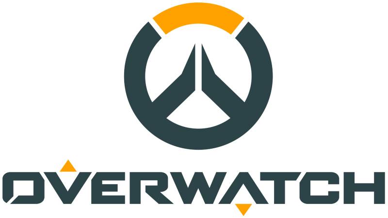
The icon at the center of the logo is a stylized “O” built from two angular, overlapping shapes. It reads simultaneously as a visor, a lens, a target reticle, and the letter O. That’s a lot to pack into one mark, and honestly, it works because none of those readings feel forced.
The sharp angles suggest precision and speed. The overlapping forms suggest unity and teamwork, which ties directly into Overwatch’s core gameplay mechanic: heroes working together.
The overall visual hierarchy of the combined mark puts the icon slightly above the wordmark in terms of visual weight, which is smart. The icon works alone. The wordmark needs the icon.
Why Did Overwatch Choose These Specific Colors?
- Orange (#F99E1A)
- Symbolic meaning: Energy, action, optimism
- Psychological impact: High visibility, excitement, warmth. Orange reads as approachable but dynamic, which matches the game’s tone.
- Brand/industry connection: Orange is relatively uncommon among major game franchise logos, which helps Overwatch stand out. Compare it to the blues and reds that dominate video game logos broadly.
- White (#FFFFFF)
- Symbolic meaning: Clarity, heroism, neutrality
- Psychological impact: Creates clean contrast against dark backgrounds, ensures legibility at small sizes
- Brand/industry connection: White versions of the logo are used extensively in esports contexts where the background color varies
The color psychology here is fairly deliberate. Orange signals action without aggression. It’s warmer than the blues used by competitors like League of Legends and more energetic than the muted tones you see in something like the World of Warcraft logo.
What Typography Style Is Used in the Overwatch Logo?

The wordmark uses a custom geometric sans-serif typeface with wide letterforms and tight spacing.
The letters are all-caps, which adds authority and scale. The characters have slightly flared terminals that echo the angular cuts in the icon, creating visual consistency across the full mark.
Blizzard has not publicly released the typeface for external use. It’s almost certainly a custom design or a heavily modified version of an existing geometric sans-serif font. The wide stance of the letters works well at large sizes but holds up surprisingly well at small scales too.
When Overwatch 2 updated the wordmark, the letterforms stayed nearly identical. The main typographic change was integrating the “2” character in a way that didn’t break the rhythm of the existing mark.
What Are the Hidden Meanings in the Overwatch Logo?
The most discussed “hidden” element is the reticle reading. Look at the icon and you can see crosshairs. Blizzard has never explicitly confirmed this was intentional, but it aligns perfectly with the game’s shooter identity.
The visor reading is more directly connected to the lore. The shape mirrors the visor worn by several heroes in the game, most notably Tracer. This wasn’t accidental.
There’s also the “watch” element built into the name itself. The icon, when read as an eye or lens, literalizes the act of watching, of surveillance, of being the ones who keep watch. That’s the whole premise of the Overwatch organization within the game’s story.
How Does the Overwatch Logo Compare to Competitor Logos?
Among hero shooter and multiplayer game logos, Overwatch’s mark is the most geometrically refined. It prioritizes icon recognition over typographic complexity, which separates it from most competitors.
The Fortnite logo leans heavily on stylized type and color gradients. It’s expressive but less versatile. The Overwatch icon works in single color, at 16×16 pixels, on a black or white background, which gives it a flexibility that Fortnite’s mark doesn’t have.
The Call of Duty logo goes for military realism over graphic abstraction. Completely different approach, different audience signal.
Compared to other Blizzard properties, the Overwatch mark is arguably cleaner than the Diablo logo (which carries heavy gothic ornamentation) and more modern than the World of Warcraft logo. It reflects a deliberate effort by Blizzard to position Overwatch as a more mainstream, accessible brand.
Among orange logos specifically, Overwatch sits in good company. The color choice differentiates it clearly within the gaming space while signaling energy and accessibility.
What Are the Technical Specifications of the Overwatch Logo?
Official Color Codes
- Primary Color: Orange
- Hex: #F99E1A
- RGB: (249, 158, 26)
- CMYK: (0, 37, 90, 2)
- Pantone: PMS 137 C (approximate)
- Secondary Color: White
- Hex: #FFFFFF
- RGB: (255, 255, 255)
- CMYK: (0, 0, 0, 0)
- Pantone: White
- Dark Background Color: Navy/Black
- Hex: #1A1A2E (used in digital contexts; varies by application)
- RGB: (26, 26, 46)
- CMYK: (43, 43, 0, 82)
For print applications, CMYK values should be used. For screen use, RGB or hex codes apply. Blizzard’s brand assets use Pantone references for official merchandise and physical production.
Dimensions and Proportions
- Aspect ratio: Approximately 3:1 (width to height) for the full combination mark
- Minimum size requirements: Icon alone: no smaller than 16x16px for digital; 0.5 inch for print. Full combination mark: no smaller than 120px wide for digital.
- Clear space specifications: Minimum clear space equal to the height of the “O” in the wordmark on all sides
- Official usage guidelines: Available through Blizzard’s press kit and brand asset portal. The icon and wordmark should not be separated, recolored, or distorted outside of approved usage.
If you’re working on fan art or community content, Blizzard’s fan art policy covers what’s permitted. Commercial use without licensing is not allowed. The logo files are available in vector graphics format through official press channels, which means they scale without quality loss at any size. Understanding pixel density matters here too, especially for digital assets where DPI requirements differ between screen and print.
What Cultural Impact Has the Overwatch Logo Had?

Few game logos have crossed into mainstream culture as quickly as this one. Within a year of launch, the Overwatch icon was showing up on clothing, phone cases, fan tattoos, and cosplay props worldwide.
The esports angle accelerated this. Overwatch League launched in 2018 with city-based teams, stadium broadcasts, and professional players. The logo became a fixture on live TV, which is something very few game brands had achieved before.
The icon also became a template of sorts. After Overwatch’s success, several other game studios moved toward cleaner, more abstract icon-based marks for their own franchises. You can see its influence across a wave of post-2016 game branding decisions.
Within gaming culture, the logo functions almost like a badge. Players who wear it are signaling membership in a specific community, which is exactly what strong brand marks do. It works the same way superhero logos function for comics fans or NFL logos work for sports fans.
How Does the Overwatch Logo Fit Into the Overall Brand Identity?

The logo is the anchor of a much larger visual system. Blizzard built an entire brand guidelines framework around it, covering everything from hero-specific color coding to UI design language to merchandise standards.
The orange and dark color palette runs through the game’s interface, loading screens, and marketing materials. The geometric sans-serif typography established by the logo extends into in-game UI text and promotional copy.
Each of Overwatch’s heroes has their own visual identity, but all of them exist within a system that the logo defines at the top level. Tracer’s orange and brown, Reinhardt’s silver and blue, Mercy’s white and gold: they all feel like they belong to the same universe partly because the overall brand color language is so consistently applied.
The brand style guide Blizzard uses internally is not fully public, but enough of it surfaces through official assets and licensed merchandise to see how tightly controlled the system is. That control is part of why the brand has stayed visually coherent across eight-plus years of content, updates, and platform expansions.
Other major game brands manage similar coherence. The Minecraft logo maintains its pixelated identity across every touchpoint. The Final Fantasy logo system uses consistent typographic language across very different game entries. Overwatch fits into this group of brands that have figured out how to stay recognizable while still evolving.
How Should the Overwatch Logo Be Used?
Official usage guidelines from Blizzard:
- Do: Use official logo files from Blizzard’s press kit. Maintain the logo’s proportions. Use approved color versions (full color, white, black). Keep clear space around the mark. Use vector files for print applications.
- Don’t: Recolor the logo outside of approved versions. Stretch, rotate, or distort the mark. Add effects like drop shadows or gradients not present in official files. Place the logo on backgrounds that reduce legibility. Use the logo to imply official affiliation when none exists.
Where to access official logos: Blizzard’s press kit at blizzard.com/en-us/press. Official assets are available in PNG and SVG formats. For esports and media use, Blizzard has a separate media asset portal.
Licensing information: The Overwatch logo is a registered trademark of Blizzard Entertainment. Fan art use falls under Blizzard’s Fan Art & Cosplay Policy. Commercial use requires direct licensing from Blizzard. Merchandise partnerships are handled through Blizzard’s licensing department.
Trademark protection: Blizzard actively enforces its trademark rights. Using the logo on commercial products without authorization, even with a disclaimer, is a trademark violation. This applies to print-on-demand services, streaming overlays used commercially, and third-party app interfaces.
If you’re building fan content, the safest approach is to use Blizzard’s stated fan content guidelines as your reference point and avoid anything that could be read as official affiliation or commercial exploitation.
FAQ on The Overwatch Logo
What Does the Overwatch Logo Represent?
The logo represents unity, vigilance, and precision. The overlapping angular shapes form both a visor and a reticle, referencing the game’s hero roster and shooter identity.
It’s a combination mark: icon plus wordmark, built to work together or separately.
What Font Is Used in the Overwatch Logo?
Blizzard used a custom geometric sans-serif typeface for the wordmark. It’s all-caps, wide, and angular.
The font has never been released publicly. It was designed in-house to match the sharp geometry of the icon.
What Color Is the Overwatch Logo?
The primary Overwatch logo color is orange, hex #F99E1A. White is the secondary color, used for reversed versions on dark backgrounds.
The orange was chosen for energy and visibility. It stands out clearly among other game franchise logos that lean on blues and reds.
When Was the Overwatch Logo First Used?
The logo debuted at BlizzCon in November 2014 during the game’s official announcement. The finalized version launched with the game in May 2016.
Blizzard refined it internally between announcement and launch, though the core icon shape stayed consistent throughout.
Did the Overwatch Logo Change for Overwatch 2?
Yes. The Overwatch 2 logo redesign launched in October 2022 alongside the game’s free-to-play transition.
The changes were subtle: slightly cleaner icon geometry, a “2” added to the wordmark, and tighter overall spacing. The core symbol stayed the same.
Who Designed the Overwatch Logo?
Blizzard Entertainment’s in-house visual development team created it. No single designer has been publicly credited.
The design was part of a broader brand identity project as Blizzard built Overwatch from the ground up as their first new franchise in nearly two decades.
Is the Overwatch Logo a Trademark?
Yes. The logo is a registered trademark of Blizzard Entertainment, now under Activision Blizzard.
Commercial use without authorization is prohibited. Fan art falls under Blizzard’s Fan Art Policy, but selling products bearing the logo requires a direct licensing agreement.
What File Formats Is the Overwatch Logo Available In?
Official files are available through Blizzard’s press kit in PNG and SVG formats. SVG is the preferred format for scalable applications since it’s a vector-based logo that holds quality at any size.
Avoid using fan-uploaded versions for any professional or commercial purpose.
How Does the Overwatch Logo Compare to Other Blizzard Logos?
It’s the most minimal mark Blizzard has produced. Compare it to the ornate gothic styling of the Diablo logo or the fantasy lettering of World of Warcraft.
Overwatch was deliberately positioned as a mainstream, accessible brand, and the logo reflects that direction clearly.
What Makes the Overwatch Logo Effective as a Brand Mark?
It works at any size, in any color version, on any background. The icon reads clearly at 16px.
The logo design principles behind it prioritize scalability and recognition over decoration, which is exactly what an esports-first brand requires.
Conclusion
The Overwatch logo is a case study in doing more with less. One icon, two colors, a custom wordmark, and Blizzard built one of the most recognizable marks in gaming history.
The Overwatch 2 logo evolution kept that foundation intact while signaling a new chapter. Smart move.
From esports broadcasts to merchandise to fan tattoos, the Overwatch emblem has crossed well beyond the screen. That kind of reach doesn’t happen by accident. It comes from deliberate game franchise branding decisions made early and defended consistently.
Whether you’re studying gaming logo design or just curious about the symbol, the answer is the same: this one was built to last.

Renowned for his expertise in logo design and visual branding, Bogdan has developed a multitude of logos for various clients.
His skills extend to creating posters, vector illustrations, business cards, and brochures. Additionally, Bogdan's UI kits were featured on marketplaces like Visual Hierarchy and UI8.
He also wrote in the past years on sites like Design Your Way, WebDesignerDepot, WPDean, Designmodo, Speckyboy, Slider Revolution, and more.
- The Windsurf Logo History, Colors, Font, And Meaning - 10 October 2026
- How to Remove Background From Product Photos (No Photoshop) - 10 October 2026
- How Designers can Build a Stronger Online Creative Identity - 9 October 2026

Bogdan Sandu is a seasoned designer who has been designing websites since 2008. Renowned for his expertise in logo design and visual branding, Bogdan has developed a multitude of logos for various clients. His skills extend to creating posters, vector illustrations, business cards, and brochures. Additionally, Bogdan's UI kits were featured on marketplaces like Visual Hierarchy and UI8. He also wrote in the past years on sites like Design Your Way, WebDesignerDepot, WPDean, Designmodo, Speckyboy, Slider Revolution, and more.
You Might Also Like