The Fortnite logo is one of the most recognized marks in gaming. Bold, tilted letterforms paired with a jagged drop shadow made it instantly distinct from the moment Epic Games launched the title in 2017. It’s a wordmark that does a lot of heavy lifting for a brand now worth billions.
In the broader history of gaming branding, few logos have crossed into mainstream pop culture this fast. It sits alongside the Minecraft logo and the Roblox logo as marks that parents, not just kids, can identify on sight. That’s rare.
The game launched in July 2017. The core logo has remained consistent since then, though seasonal updates and limited-edition chapter variants have introduced visual tweaks over the years. Epic Games handled the design internally, with no publicly credited outside agency.
What Is the Fortnite Logo?
The Fortnite logo is a custom wordmark created by Epic Games, first introduced in 2017. It features bold, italicized lettering with a distinctive jagged drop shadow, using a blue-to-purple color palette that communicates energy and action.
- Design Type: Wordmark (custom lettering)
- Primary Elements: Stylized italic letterforms, angled drop shadow with serrated edges, color gradient fill
- Official Introduction Date: 2017 (Battle Royale mode launch)
- Designer/Agency: Epic Games (in-house, no publicly credited designer)
- Trademark Status: Registered trademark owned by Epic Games, Inc.
- Color Palette: Blue (#1F75CE), Purple (#8A2BE2), Yellow (#F5C518 in some variants), Black drop shadow (#000000)
- Usage Context: Game UI, promotional materials, merchandise, social media, esports broadcasts, in-game branding
How Has the Fortnite Logo Evolved Over Time?

The Fortnite logo has gone through several visual shifts since 2011, moving from a rough early identity to the polished, recognizable wordmark most people know today.
Each chapter brought small adjustments, and the OG era revival in 2023 actually brought back earlier visual cues.
The core structure stayed consistent, but color, shadow depth, and letter weight shifted across seasons.
Original Fortnite Logo (2011–2017)
- Years Active: 2011–2017
- Design Description: Early wordmark with less refined letterforms, rougher texture, and a more muted color palette
- Color Scheme: Orange, brown, and dark tones reflecting the Save the World survival aesthetic
- Designer: Epic Games (in-house)
- Context: Used during the pre-Battle Royale development phase when Fortnite was positioned as a co-op survival builder
- Key Changes from Previous: N/A (original version)
- Cultural Significance: Represents the game’s overlooked origins before it became a cultural phenomenon
Battle Royale Era Logo (2017–2020)
- Years Active: 2017–2020
- Design Description: Bold italic wordmark with the now-iconic jagged drop shadow, heavy letter weight, strong forward lean
- Color Scheme: Blue-purple gradient with black drop shadow
- Designer: Epic Games (in-house)
- Context: Introduced alongside the Battle Royale mode launch in September 2017, which exploded the game’s popularity
- Key Changes from Previous: Complete visual overhaul; brighter, more aggressive color palette, sharper forms
- Cultural Significance: This is the version that became globally iconic, appearing on merchandise, TV broadcasts, and crossover events
Chapter 2 and Beyond Logo (2020–Present)
- Years Active: 2020–present
- Design Description: Refined version of the Battle Royale wordmark with cleaner rendering for high-resolution digital use
- Color Scheme: Consistent blue-purple with occasional season-specific color variants
- Designer: Epic Games (in-house)
- Context: Updated to work across expanding platforms, merchandise lines, and the growing esports scene
- Key Changes from Previous: Cleaner edges, improved digital rendering, more consistent application across formats
- Cultural Significance: Solidified the logo as a long-term brand asset rather than just a game title treatment
What Do the Design Elements of the Fortnite Logo Mean?

Every element in the Fortnite logo was chosen to communicate speed, impact, and excitement. The italic angle creates a sense of forward motion.
The jagged drop shadow is the most distinctive feature. It breaks from the clean geometric shadows used by most gaming brands.
That roughness is intentional. It signals chaos, action, and the unpredictability at the core of a battle royale game.
What Is the Symbolism Behind the Fortnite Wordmark?
The heavy italic letterforms signal urgency and momentum.
The jagged shadow underneath the text echoes destruction and combat, reinforcing the game’s core loop.
The forward lean of the letters visually suggests speed, a player running, pushing forward. It’s one of those design choices that feels obvious once you see it.
What Is the Historical Context of the Logo’s Visual Style?
The logo draws from action genre conventions going back to 1980s arcade game typography.
Bold, tilted letterforms with hard shadows were common in fighting games and action titles. Fortnite’s version modernized that with cleaner execution and a more refined color palette.
It fits within a long tradition of video game logos that use aggressive typography to communicate genre.
What Cultural References Does the Logo Draw From?
The color palette, specifically the blue-purple combination, connects to comic book aesthetics and superhero visual language.
That’s not accidental given Fortnite’s long history of Marvel and DC crossover events.
The overall aesthetic also pulls from street culture and skateboarding graphics, which explains part of its appeal to younger audiences.
Why Did Epic Games Choose These Specific Colors?
- Blue (#1F75CE)
- Symbolic meaning: Action, reliability, digital energy
- Psychological impact: Engages attention without the aggression of red; feels dynamic but approachable
- Brand connection: Widely used in blue logos across gaming and tech for its readability and energy
- Purple (#8A2BE2)
- Symbolic meaning: Fantasy, creativity, rarity (also connects to in-game rarity tiers)
- Psychological impact: Adds a sense of premium value and otherworldliness
- Brand connection: Rare in gaming logos at the time of Fortnite’s launch, giving it immediate distinctiveness. Compare this to purple logos across industries and the choice stands out.
- Black Drop Shadow
- Symbolic meaning: Weight, impact, grounding
- Psychological impact: Makes the wordmark pop against any background, light or dark
- Brand connection: Functional choice that also reinforces the hard-edged, combative tone
What Typography Style Is Used in the Fortnite Logo?

The Fortnite wordmark uses custom lettering, not a retail typeface.
The letters are heavily modified display-style forms, wide and condensed with a strong italic angle. The closest publicly available match is often cited as a modified version of Burbank Big Condensed Black, though Epic has never officially confirmed this.
The display font approach makes sense for a game logo. Readability at a distance matters more than fine detail. The thick strokes and tight letter spacing hold up at small sizes on screen and large sizes on merchandise equally well.
Typography in the logo hasn’t changed dramatically across chapters, which is smart brand discipline. Consistency in the letterforms is what makes the logo recognizable even when color schemes shift for seasonal events.
What Are the Hidden Meanings in the Fortnite Logo?
There’s no officially confirmed hidden symbolism in the Fortnite wordmark.
That said, the jagged drop shadow is widely interpreted as a visual nod to storm walls and building destruction within the game. Whether intentional or not, it works.
Some designers have pointed out that the forward lean of the letters, combined with the shadow direction, creates a subtle sense of a figure in motion. It’s a stretch, but not an unreasonable read.
Epic hasn’t published a detailed design rationale, which leaves room for interpretation.
How Does the Fortnite Logo Compare to Competitor Logos?
Against other battle royale and live-service game logos, Fortnite’s wordmark is more expressive and less corporate. It prioritizes personality over polish.
Most competitor logos lean toward clean, minimal design. Fortnite went the other way.
That contrast is part of what made it memorable in a crowded market.
The Call of Duty logo uses a military-minimal approach: stark, no-nonsense, built for credibility. Fortnite’s logo is essentially the opposite philosophy.
The Overwatch logo uses an emblem-based approach with a strong icon mark alongside the wordmark. Fortnite sticks to typography only, which is a bolder choice because the letters have to do all the work.
The League of Legends logo leans into a prestige, almost heraldic aesthetic that positions it as a serious competitive title. Fortnite’s logo positions itself as fun and accessible. Different audiences, different design decisions, both effective.
Among gaming company logos broadly, Fortnite’s stands out for committing fully to an expressive, genre-specific visual language rather than trying to look like a tech company.
What Are the Technical Specifications of the Fortnite Logo?
Official Color Codes
- Primary Color: Blue
- Hex: #1F75CE
- RGB: (31, 117, 206)
- CMYK: (85, 43, 0, 19)
- Pantone: 285 C (approximate)
- Secondary Color: Purple
- Hex: #8A2BE2
- RGB: (138, 43, 226)
- CMYK: (39, 81, 0, 11)
- Pantone: 2665 C (approximate)
- Drop Shadow: Black
- Hex: #000000
- RGB: (0, 0, 0)
- CMYK: (0, 0, 0, 100)
- Pantone: Black C
Dimensions and Proportions
- Aspect ratio: Approximately 4:1 (width to height) for the standard horizontal wordmark
- Minimum size requirements: Epic recommends no smaller than 100px wide for digital use to maintain legibility of the letterforms
- Clear space specifications: Minimum clear space of the cap height of the “F” on all sides
- Official usage guidelines: Published in Epic’s brand kit, available to licensed partners and press; the logo should not be recolored, rotated, or have its drop shadow removed in official contexts
For digital contexts, the logo is supplied as a vector graphic to maintain sharp rendering at any size. Raster versions are provided for specific pixel-based applications, though at high DPI settings the vector source is always preferred.
What Cultural Impact Has the Fortnite Logo Had?

Few gaming logos have crossed into mainstream culture the way Fortnite’s has. It’s appeared on everything from school bags to stadium signage to celebrity merchandise collaborations.
The logo became a shorthand for a generation of players. Seeing it on a product immediately communicated something about the audience it was aimed at.
That kind of recognition is rare. Most game logos stay within gaming. The Fortnite wordmark escaped that bubble entirely.
It also influenced how other games approached their own visual identity. After Fortnite’s success, more live-service games started leaning into expressive, personality-driven typography rather than safe, corporate wordmarks.
The logo’s presence in esports deserves mention too. On broadcast overlays, arena signage, and player jerseys, it held up well at every scale, which is a real test of a logo’s strength. Most game title treatments weren’t designed with that kind of multi-context use in mind. This one clearly was, even if that wasn’t the original intention.
How Does the Fortnite Logo Fit Into the Overall Brand Identity?
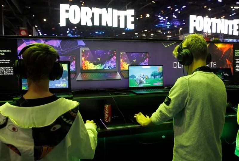
The logo is the anchor for a much larger visual system. Epic Games built an entire design language around the letterform style and color palette that shows up across in-game UI, loading screens, merchandise, and event branding.
The brand guidelines that govern Fortnite’s visual identity extend well beyond the logo itself.
Color, typography, and graphic treatment are all consistent with what the logo establishes.
The logo connects directly to in-game rarity colors (blue for rare, purple for epic), creating a semantic link between the brand mark and the actual game mechanics. That kind of integration between a logo and a product’s internal logic is genuinely clever and not something most game studios think about deliberately.
Seasonal events introduce variant color treatments, but they always maintain the core letterform structure. This keeps the logo recognizable while giving each season its own personality, a smart balance between consistency and freshness that most brand style guides struggle to define clearly.
The logo also functions as the connective tissue between Fortnite’s various modes. Battle Royale, Save the World, and Creative all use the same core wordmark with contextual additions, which keeps the brand unified across what are actually quite different gameplay experiences.
How Should the Fortnite Logo Be Used?
Official Usage Guidelines
- Do: Use the logo at sufficient size to maintain legibility of the letterforms
- Do: Use on dark or light backgrounds where the drop shadow provides contrast
- Do: Download the official version from Epic Games’ press kit for media use
- Don’t: Recolor the logo outside of officially approved seasonal variants
- Don’t: Remove or modify the drop shadow
- Don’t: Stretch, compress, or rotate the wordmark
- Don’t: Place the logo over busy backgrounds that reduce legibility
- Don’t: Use the logo to imply endorsement or official partnership without a license from Epic Games
Where to Access the Official Logo
The official Fortnite logo is available through Epic Games’ press portal at epicgames.com/fortnite/en-US/news. Press and media can download approved assets directly. Licensed merchandise partners receive asset packages through Epic’s official brand partnership program.
Licensing and Trademark Protection
The Fortnite name and logo are registered trademarks of Epic Games, Inc. Using the logo for commercial purposes, including on merchandise, promotional materials, or in advertising, requires a formal licensing agreement with Epic Games. Fan art and non-commercial use generally falls under Epic’s creator guidelines, but any commercial application needs explicit written approval. Epic actively enforces its trademark rights, particularly in the merchandise and apparel space where unauthorized Fortnite branding has been a persistent issue since 2018.
For fan content specifically, Epic’s fan content policy (available at epicgames.com) outlines what’s permitted without a formal license. The boundaries are fairly clear: non-commercial fan work is tolerated; monetized content using official marks is not.
FAQ on The Fortnite Logo
What font does the Fortnite logo use?
The Fortnite wordmark uses custom lettering based on a heavily modified condensed display typeface.
It’s most commonly compared to Burbank Big Condensed Black, though Epic Games has never officially confirmed this. The letters were reworked enough that it functions as a proprietary brand identity asset.
What are the official Fortnite logo colors?
The primary colors are blue (#1F75CE) and purple (#8A2BE2), with a black drop shadow.
These map directly to the game’s in-game rarity system. Blue means rare, purple means epic. That connection between the logo color palette and game mechanics is intentional and consistent across all branding.
Who designed the Fortnite logo?
Epic Games handled the design in-house. No individual designer or outside agency has been publicly credited.
This is fairly common with large studios that maintain internal creative teams. The Fortnite visual identity evolved through multiple iterations without a named external design partner.
Has the Fortnite logo ever changed?
Yes. The original pre-2017 version had a warmer, rougher aesthetic tied to the Save the World survival mode.
The Battle Royale launch in 2017 brought the bold italic wordmark most people recognize today. Seasonal and chapter updates have introduced minor color variants, but the core logo evolution has been gradual rather than dramatic.
Can I use the Fortnite logo for my content?
Non-commercial fan content is generally tolerated under Epic’s creator guidelines. Commercial use is a different matter entirely.
Merchandise, advertising, or any monetized use of the Fortnite branding requires a formal license from Epic Games. They enforce trademark protection actively, especially in apparel and merchandise categories.
What makes the Fortnite logo different from other gaming logos?
Most competing titles use cleaner, more corporate wordmarks. Fortnite went with something deliberately expressive and genre-specific.
The jagged drop shadow and heavy italic lean set it apart from the minimal approach used by titles like God of War or Final Fantasy. It prioritizes personality over polish, which paid off.
Where can I download the official Fortnite logo?
Epic Games makes press assets available through their official press portal at epicgames.com.
The press kit includes the Fortnite logo PNG and vector formats with transparent backgrounds. These are the only versions that should be used in any official or media context.
What does the Fortnite logo symbolize?
The italic angle suggests speed and forward motion. The jagged shadow reads as destruction and combat.
Together they communicate the game’s core loop: fast, chaotic, action-driven. The logo meaning wasn’t spelled out by Epic, but the visual language is clear enough that it doesn’t need explanation.
Is the Fortnite logo a wordmark or does it have a symbol?
It’s a pure wordmark. There’s no standalone icon or emblem separate from the lettering.
This puts it in the same category as the Grand Theft Auto logo and other game titles that rely entirely on custom typography. The letterforms have to carry the full weight of the brand identity on their own.
What file formats is the Fortnite logo available in?
Official assets are distributed as PNG with transparent background and SVG for scalable use.
For print and merchandise applications, high-resolution files are provided to licensed partners. The Fortnite logo vector format is preferred for anything requiring scaling, since raster versions lose quality at large sizes regardless of the original pixel dimensions.
Conclusion
The Fortnite logo is a case study in how gaming branding can cross into mainstream culture without losing its identity.
Bold custom lettering, a distinctive drop shadow, and a blue-purple palette built around the game’s own rarity system. Every choice connects back to the product.
Epic Games created something that works at thumbnail size and stadium scale equally well. That kind of logo design consistency is harder to pull off than it looks.
For anyone studying game logos or broader graphic design principles, the Fortnite wordmark is worth looking at closely.

Renowned for his expertise in logo design and visual branding, Bogdan has developed a multitude of logos for various clients.
His skills extend to creating posters, vector illustrations, business cards, and brochures. Additionally, Bogdan's UI kits were featured on marketplaces like Visual Hierarchy and UI8.
He also wrote in the past years on sites like Design Your Way, WebDesignerDepot, WPDean, Designmodo, Speckyboy, Slider Revolution, and more.
- Canva vs PowerPoint: Which Is Better for Presentations? - 22 September 2026
- How to Install Fonts on Mac (Step-by-Step Guide) - 20 September 2026
- From Mockup to Code: How AI-Augmented Development Speeds Up the Design Handoff - 19 September 2026

Bogdan Sandu is a seasoned designer who has been designing websites since 2008. Renowned for his expertise in logo design and visual branding, Bogdan has developed a multitude of logos for various clients. His skills extend to creating posters, vector illustrations, business cards, and brochures. Additionally, Bogdan's UI kits were featured on marketplaces like Visual Hierarchy and UI8. He also wrote in the past years on sites like Design Your Way, WebDesignerDepot, WPDean, Designmodo, Speckyboy, Slider Revolution, and more.
You Might Also Like