

The Lovable logo is the visual identity mark for Lovable, a Stockholm-based AI platform that lets anyone build full-stack web applications through natural language prompts. It features a gradient heart-shaped icon paired with a clean sans-serif wordmark.
The brand identity was created by Primary Studio in 2024, when the company rebranded from GPT Engineer App to Lovable. It sits squarely within the current wave of AI-first tech branding, where warmth and accessibility matter as much as technical credibility.
What Is the Lovable Logo?
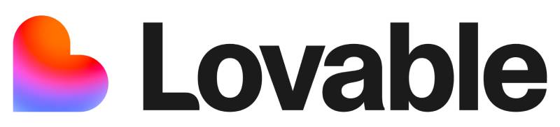
The Lovable logo is a combination mark consisting of a gradient heart icon and a “Lovable” wordmark set in Camera Plain, a contemporary sans-serif typeface. It was introduced in December 2024 when the platform officially rebranded from GPT Engineer App. The identity was designed by Primary Studio and centers on a kinetic, heartbeat-driven concept that positions the brand as energetic, human-first, and accessible. The mark is registered as the official brand identity of Lovable (lovable.dev).
- Design Type: Combination mark (icon + wordmark)
- Primary Elements: Gradient heart-shaped icon (L-shaped mark), “Lovable” wordmark
- Official Introduction Date: December 2024
- Designer/Agency: Primary Studio
- Trademark Status: Registered brand identity; logo assets protected under Lovable’s official brand guidelines
- Color Palette:
- Cream: #FCFBF8
- Orange: #FE7B02
- Blue: #4B73FF
- Pink: #FF66F4
- Red: #FF0105
- Usage Context: Website, product UI, marketing materials, press assets, social media, merchandise
How Has the Lovable Logo Evolved Over Time?
The Lovable logo has only one official version, introduced at the December 2024 rebrand. Before that, the product operated under the GPT Engineer App name with a completely different visual identity focused on developer tooling. The shift to Lovable brought an entirely new brand system, built from scratch by Primary Studio in just two weeks.
GPT Engineer App Logo (2023-2024)
- Years Active: 2023-2024
- Design Description: Developer-focused branding associated with the GPT Engineer App name; utilitarian, technical in tone
- Color Scheme: Not publicly documented; typical of early-stage developer tool aesthetics
- Designer: Not publicly documented
- Context: The product launched as an open-source GitHub project in June 2023 and went viral, hitting 40,000 stars in two months. The commercial version launched under the GPT Engineer App name in early 2024, but two attempts failed to gain meaningful traction. The brand name caused confusion and undersold the product’s actual capabilities.
- Key Changes from Previous: N/A (first commercial identity)
- Cultural Significance: Represented the open-source developer roots of the platform; heavy association with GPT-4 tooling rather than broad accessibility
Lovable Logo (2024-Present)
- Years Active: December 2024-present
- Design Description: Gradient heart icon (often described as an L-shaped mark) with an orange-pink-red-blue gradient, paired with the “Lovable” wordmark in Camera Plain. Available in full-color gradient, black, and white versions.
- Color Scheme: Cream (#FCFBF8), Orange (#FE7B02), Blue (#4B73FF), Pink (#FF66F4), Red (#FF0105)
- Designer: Primary Studio
- Context: Full rebrand to signal the platform’s shift from developer tooling to an accessible, non-technical audience. Primary Studio completed the identity in two weeks, building a “kinetic identity centered on a living heartbeat.”
- Key Changes from Previous: Entirely new visual identity. New name, new icon, new color palette, new typography, new brand positioning.
- Cultural Significance: Anchors Lovable’s identity in the “vibe coding” movement. The heart icon makes a deliberate statement that software creation can be emotional, joyful, and human rather than cold and technical.
What Do the Design Elements of the Lovable Logo Mean?
Every element in the Lovable logo was chosen to communicate accessibility and emotional connection. The heart icon works on two levels at once: it’s an obvious symbol of affection and care, and it also functions as a subtle “L” shape that ties back to the brand name. The gradient running from warm orange-red through pink to cool blue is doing a lot of heavy lifting in terms of brand storytelling.
What Does the Heart Icon Represent?
The heart is a deliberate departure from typical tech iconography.
Most AI and developer tools lean into cold, geometric, or abstract marks. Lovable went the opposite direction.
The heart signals that the platform is designed for people who want to build things they care about, not just engineers writing functional code. It also reinforces the brand name itself, which is a fairly bold move in B2B tech.
According to Primary Studio, the whole identity concept was built around a “living heartbeat,” making the icon the literal embodiment of that idea. The focal point of the mark sits at the top of the heart where the gradient is most intense, drawing the eye immediately.
Why Did Lovable Choose These Specific Colors?
The color story in the Lovable logo is one of the more interesting things about it. Most AI brands go dark-and-minimal or blue-and-trustworthy. Lovable does neither.
- Orange (#FE7B02)
- Color Name: Lovable Orange
- Symbolic Meaning: Energy, creativity, warmth
- Psychological Impact: Signals approachability and enthusiasm; reduces the intimidation factor often associated with technical products
- Brand/Industry Connection: Anchors the warm side of the gradient; used in call-to-action elements across the product UI
- Blue (#4B73FF)
- Color Name: Lovable Blue
- Symbolic Meaning: Trust, logic, technical competence
- Psychological Impact: Balances the warmth of orange; reassures users that the platform produces real, reliable software
- Brand/Industry Connection: The cool end of the gradient; widely used in tech branding for credibility
- Pink (#FF66F4)
- Color Name: Lovable Pink
- Symbolic Meaning: Playfulness, creativity, inclusivity
- Psychological Impact: Softens the brand; adds a sense of fun that’s rare in the AI tool space
- Brand/Industry Connection: Gradient highlight that bridges orange and blue; reinforces the non-technical, maker-culture audience
- Red (#FF0105)
- Color Name: Lovable Red
- Symbolic Meaning: Urgency, passion, vitality
- Psychological Impact: Adds visual punch to the gradient; reinforces the “heartbeat” concept at the core of the brand identity
- Brand/Industry Connection: Inner gradient accent; subtle but adds depth to the icon’s energy
- Cream (#FCFBF8)
- Color Name: Lovable Cream
- Symbolic Meaning: Warmth, approachability, softness
- Psychological Impact: A warmer alternative to pure white; feels human rather than clinical
- Brand/Industry Connection: Primary light background used across the marketing site and app interface
The combination of warm and cool tones across the gradient is intentional. As one brand analysis noted, the palette bridges the “creative/idea” side (warm colors) and the “technical/engineering” side (cool colors). That’s actually a pretty smart way to solve the tension between Lovable’s two core audiences: non-technical founders and experienced developers.
Understanding color theory helps explain why this gradient works: the warm-to-cool shift creates natural visual movement across the icon, making it feel alive even in a static context. Each individual hue in the gradient is carefully chosen so the transitions feel smooth rather than jarring. The overall saturation level stays high throughout, which is what gives the logo its energy and makes it pop against the neutral cream background.
What Typography Style Is Used in the Lovable Logo?
The Lovable wordmark uses Camera Plain, a sans-serif typeface from Darden Studio.
It’s clean, modern, and geometric without being cold. The weight sits in a comfortable middle ground: not so thin that it feels fragile, not so bold that it becomes aggressive.
For a brand targeting non-technical users, the typography choice makes sense. Camera Plain is readable at small sizes, which matters for favicon and mobile app icon usage. It also doesn’t carry the heavy “enterprise software” associations of more traditional typefaces.
The typeface is classified as a sans-serif font, which keeps the overall mark feeling contemporary and approachable. The wordmark appears in both black and white variants to match different background contexts, which is standard practice for modern digital brands.
What Are the Hidden Meanings in the Lovable Logo?
The most notable intentional detail is the “L” shape embedded within the heart icon.
The heart doesn’t just represent emotion. Look closely and the upper-left portion of the heart traces a subtle L shape, tying the symbol directly back to the brand name.
Primary Studio described the full identity as a “kinetic identity centered on a living heartbeat.” That means the icon was designed with motion in mind from the start. In animated versions, the heart pulses, which adds another layer of meaning: the platform is alive, actively generating and building rather than sitting static.
The gradient direction (warm to cool, left to right) could also be read as a transformation: ideas start warm and emotional, then become structured and technical as they turn into actual software. That reading aligns with Lovable’s core value proposition quite neatly, whether intentional or not.
How Does the Lovable Logo Compare to Competitor Logos?
Lovable sits in a crowded space of AI-powered development tools. Most of its competitors went a very different direction with their visual identities. The heart icon and warm gradient palette make Lovable immediately distinguishable in a category that defaults to geometric, abstract, or coolly minimal marks.
Bolt.new uses bold, high-contrast typography with a no-frills wordmark approach. Cursor and Replit both lean into clean, abstract iconography with minimal personality. GitHub Copilot stays squarely in Microsoft’s enterprise design language. None of them use a heart or a warm gradient palette.
The Windsurf logo, another competitor in the vibe coding space, takes a more minimal, technical approach compared to Lovable’s gradient-heavy identity.
Among AI tool brands that have deliberately leaned into warmth and personality, Replit’s logo is worth comparing. Replit uses a simple geometric mark. The Cursor logo goes even more minimal, almost to the point of being forgettable in isolation.
Lovable’s closest visual territory is brands like Duolingo or Notion, which use approachable color and icon choices to lower the perceived barrier to entry. That’s not an accident. The branding is doing targeted positioning work, telling non-technical users “this isn’t scary” before they’ve read a single word of copy.
The gradient used in the icon is similar to what you see across several modern tech brands: Stripe, Figma, and others have all leaned into multi-color gradients in recent years. But Lovable’s version is warmer and more emotionally charged than most. The Figma logo uses a similar multi-color component approach but with flat color blocks rather than a flowing gradient.
What Are the Technical Specifications of the Lovable Logo?
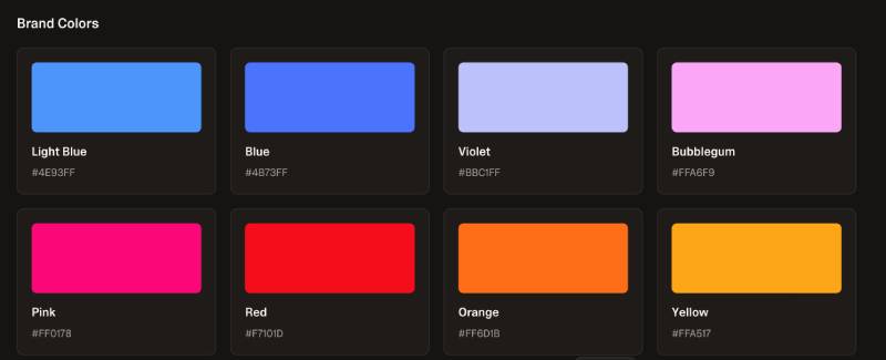
Official Color Codes
Primary Color: Cream
Secondary Color: Orange
- Hex: #FE7B02
- RGB: (254, 123, 2)
- CMYK: (0, 52, 99, 0)
Accent Color: Blue
- Hex: #4B73FF
- RGB: (75, 115, 255)
- CMYK: (71, 55, 0, 0)
Gradient Highlight: Pink
- Hex: #FF66F4
- RGB: (255, 102, 244)
- CMYK: (0, 60, 4, 0)
Gradient Accent: Red
- Hex: #FF0105
- RGB: (255, 1, 5)
- CMYK: (0, 100, 98, 0)
Dimensions and Proportions
- Aspect Ratio: Not officially specified; combination mark uses standard horizontal layout
- Minimum Size Requirements: Not officially published; standard digital practice suggests 16px minimum for icon-only use (favicon)
- Clear Space Specifications: Not officially quantified; brand guidelines note that adequate clear space around the logo must be maintained
- Official Usage Guidelines: Available at lovable.dev/brand; logo assets available for download in PNG and SVG formats
File formats available include PNG (with transparent background) and SVG. The brand offers four main asset variants: primary logo on dark background, monochrome logo on light background, standalone icon on dark background, and standalone icon on light background. For vector graphics use cases, SVG versions are provided directly from the brand page. For digital and web contexts, the files are optimized as standard pixel-based PNGs. For print contexts requiring high DPI, the SVG format is the correct choice.
What Cultural Impact Has the Lovable Logo Had?
Lovable launched its brand identity at exactly the right moment.
The “vibe coding” movement was gaining mainstream attention in late 2024, and Lovable’s visual identity became one of the clearest signals that this category was about inclusion, not just technical innovation.
The heart icon became recognizable fast. Within months of the rebrand, Lovable hit $20M ARR (reportedly the fastest in European startup history) and grew to a $1.8B valuation by mid-2025. The brand’s visual identity was part of that story. User-generated content tagged #BuiltWithLovable spread the logo organically across social platforms, turning the mark into a community badge as much as a company identifier.
There’s something interesting about a tech brand choosing a heart as its primary symbol. It reads as a statement against the cold, utilitarian aesthetic that dominates developer tooling. Whether that resonated because the design was genuinely good or because the timing was right is hard to separate. Probably both.
The color psychology at work here also deserves credit. The warm-to-cool gradient communicates transformation and creative energy in a way that more conservative tech logos simply can’t. It helped Lovable stand out in press coverage, on Product Hunt, and in the kind of screenshot-heavy social media posts that drive early-stage growth for consumer-facing apps.
How Does the Lovable Logo Fit Into the Overall Brand Identity?
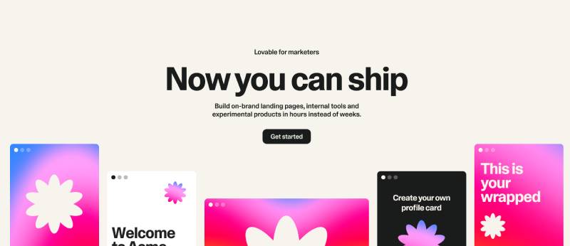
The logo is the centerpiece of a broader visual system that includes dark-mode interfaces, cream-colored marketing pages, and gradient-heavy hero visuals.
The brand guidelines and brand style guide at lovable.dev/brand define the logo’s usage rules and keep the system consistent. The cream background (#FCFBF8) runs across the main marketing site and gives the brand a warm, non-clinical feel that most tech products avoid. The gradient icon appears in product UI, blog headers, social posts, and press materials.
Typography across brand materials uses Camera Plain consistently, which creates a strong sense of coherence between the logo and broader communications. The visual hierarchy in Lovable’s marketing pages puts the gradient icon high and central, then lets the cream background and clean typography carry the rest of the page without competing for attention.
The color palette extends beyond the logo into UI components: the orange shows up in call-to-action buttons, the blue in interactive elements, and the cream as the base surface. That kind of consistent cross-application is what turns a logo into a full brand identity. It means every touchpoint, from a tweet to a product screenshot, feels like it comes from the same place.
Related entities within the brand system include the Supabase integration (a key product partnership), the lovable.dev domain, and the #BuiltWithLovable social tag, all of which contribute to brand recognition in the community. The kinetic, animated version of the heartbeat icon appears in video contexts and motion graphics, adding another dimension to the identity that a static mark alone can’t achieve.
How Should the Lovable Logo Be Used?
Official Usage Do’s
- Use official logo assets downloaded directly from lovable.dev/brand
- Maintain adequate clear space around the logo on all sides
- Use provided color variants (gradient, black, white) on appropriate background colors
- Use the SVG format for print and vector applications
- Use PNG with transparent background for digital applications
Official Usage Don’ts
- Do not modify the logo colors or gradient
- Do not alter the proportions or distort the mark
- Do not place the logo on busy backgrounds that reduce legibility
- Do not use the Lovable name or logo to imply official partnership without permission
- Do not use the mark in ways that suggest Lovable’s endorsement of a product or service
Where to Access Official Logos
Official logo assets are available at lovable.dev/brand. The brand page provides downloadable ZIP files containing PNG and SVG versions of the primary logo, monochrome logo, standalone icon, and wordmark. For press and media use, official logo downloads and press photos are linked from the same page. For questions about specific usage rights, Lovable’s official press contact is press@lovable.dev.
Licensing and Trademark Protection
The Lovable logo, wordmark, and all associated brand assets are the property of Lovable and its affiliates. They are protected under standard trademark and intellectual property law. Third-party use for informational or editorial purposes is generally permitted with proper attribution, but any use that implies sponsorship, partnership, or official affiliation requires explicit permission from Lovable.
The brand guidelines make clear that the logo should not be recreated, redrawn, or modified. For any production work involving the Lovable identity, using the official files from the brand page is necessary, not optional.
FAQ on The Lovable Logo
What does the Lovable logo look like?
It’s a combination mark: a gradient heart icon paired with a clean wordmark.
The heart shifts from warm orange-red through pink to cool blue. The wordmark uses Camera Plain, a contemporary sans-serif font from Darden Studio. Simple, recognizable, and deliberately warm for a tech brand.
Who designed the Lovable logo?
Primary Studio, a brand sprint agency, designed the full identity.
They built the entire brand style guide and visual system in two weeks. The concept centers on a living heartbeat, with motion and color working together to communicate creative energy and platform personality.
When was the Lovable logo introduced?
December 2024, when the platform officially rebranded from GPT Engineer App to Lovable.
The new name and logo marked a deliberate shift in audience targeting, moving away from developer tooling toward a broader, non-technical builder community. It was a full identity replacement, not a refresh.
What are the official Lovable brand colors?
Five colors make up the palette: Cream (#FCFBF8), Orange (#FE7B02), Blue (#4B73FF), Pink (#FF66F4), and Red (#FF0105).
The gradient in the icon blends orange, red, pink, and blue. Cream serves as the primary background across the marketing site. The color palette bridges warmth and technical credibility in one mark.
What font does the Lovable logo use?
The wordmark is set in Camera Plain by Darden Studio.
It’s a geometric sans-serif that reads cleanly at small sizes. The choice fits the brand’s accessible, modern positioning. Kerning and tracking in the wordmark appear standard, keeping the overall mark legible across digital and print contexts.
What does the heart symbol mean in the Lovable logo?
It represents the brand’s core idea: software creation should feel joyful and human, not intimidating.
The heart also contains a subtle L shape, directly referencing the brand name. According to Primary Studio, the full brand identity was built around the concept of a living heartbeat, giving the icon both literal and symbolic meaning.
Where can I download the official Lovable logo?
Official assets are available at lovable.dev/brand.
The page provides PNG and SVG downloads for the primary logo, monochrome version, standalone icon, and wordmark. SVG is the right format for print and vector graphics use. For press inquiries, contact press@lovable.dev.
How does the Lovable logo compare to other AI tool logos?
Most competitors, including Cursor and Bolt, use minimal or abstract marks with cool color palettes.
Lovable stands out with its warm gradient and heart icon. Among tech company logos in the AI builder category, it’s one of the few that prioritizes emotional connection over technical signaling. That’s a real differentiator.
Can I use the Lovable logo in my project or content?
Editorial and informational use is generally permitted with proper attribution.
You cannot modify the logo colors, proportions, or design. Using it to imply an official partnership or endorsement without permission is not allowed. Always pull assets from the official brand page and follow the published brand guidelines.
Has the Lovable logo ever changed?
The current logo is the first official Lovable identity, introduced at the December 2024 rebrand.
Before that, the product used GPT Engineer App branding with a completely different visual identity. There has been no iteration of the current Lovable mark. The logo design launched fully formed and has remained consistent across all brand touchpoints since.
Conclusion
The Lovable logo does something most tech brands avoid: it leads with emotion.
The gradient heart, the warm color palette, the clean Camera Plain wordmark — all of it works together to position the platform as approachable rather than intimidating.
For a product built around the idea that anyone can create software, that kind of emotionally resonant logo design isn’t decorative. It’s functional brand communication.
Primary Studio delivered a memorable logo that holds up across digital platforms, press materials, and community content alike — and it’s only been around since December 2024.

Renowned for his expertise in logo design and visual branding, Bogdan has developed a multitude of logos for various clients.
His skills extend to creating posters, vector illustrations, business cards, and brochures. Additionally, Bogdan's UI kits were featured on marketplaces like Visual Hierarchy and UI8.
He also wrote in the past years on sites like Design Your Way, WebDesignerDepot, WPDean, Designmodo, Speckyboy, Slider Revolution, and more.
- The Lovable Logo History, Colors, Font, And Meaning - 6 November 2026
- Headless WordPress: What Marketing Teams Gain and Lose - 6 November 2026
- PicCollage Logo: How Colour, Shape and Simplicity Express Creativity - 5 November 2026

Bogdan Sandu is a seasoned designer who has been designing websites since 2008. Renowned for his expertise in logo design and visual branding, Bogdan has developed a multitude of logos for various clients. His skills extend to creating posters, vector illustrations, business cards, and brochures. Additionally, Bogdan's UI kits were featured on marketplaces like Visual Hierarchy and UI8. He also wrote in the past years on sites like Design Your Way, WebDesignerDepot, WPDean, Designmodo, Speckyboy, Slider Revolution, and more.
You Might Also Like


