


Bad spacing between letters can turn a perfectly good headline into an embarrassment. If you’ve ever wondered what is kerning in typography, it’s the precise adjustment of space between two specific characters to make text look optically even.
Most people never notice good kerning. But bad kerning? That’s impossible to miss, whether it’s on a billboard, a brand wordmark, or a product label sitting on a shelf.
This guide covers how kerning actually works, why certain letter pairs need manual correction, and how it differs from tracking and leading. You’ll also learn the tools professionals use, the mistakes that trip up even experienced designers, and practical ways to train your eye for better typographic spacing.
What Is Kerning in Typography
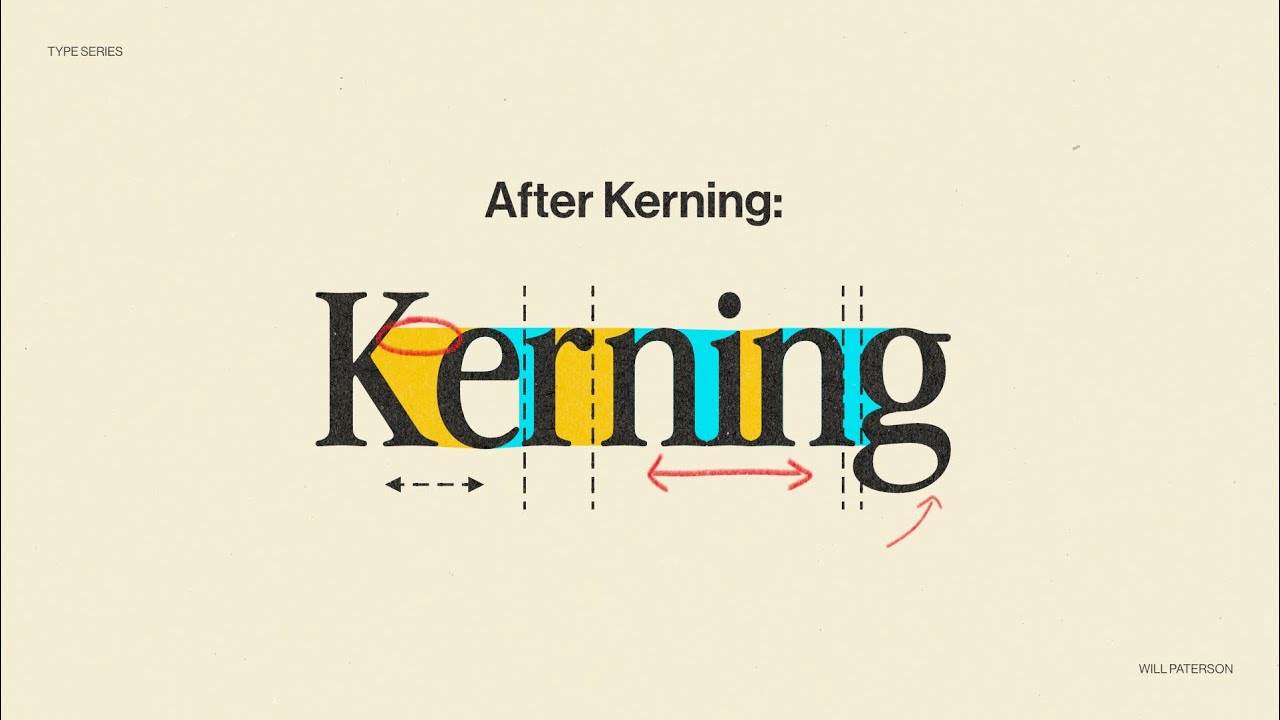
Kerning is the adjustment of space between two specific characters in a typeface. Not all characters. Just two at a time.
It’s one of those things most people never notice until it’s done badly. Then it’s all you can see. The word “CLICK” with poor character spacing can accidentally read as something very different, and that kind of mistake shows up on signs, billboards, and product packaging more often than you’d think.
A professional-quality font ships with hundreds of built-in kern pairs. Some OpenType fonts contain thousands. According to Wikipedia’s documentation on kerning, TrueType fonts typically include several hundred pairs, while more complex OpenType fonts use class-based systems to handle the massive number of possible glyph combinations.
The term itself comes from the French word carne, meaning “projecting angle.” Back during metal typesetting, kerns were the parts of a letter that physically hung over the edge of the type block. Adjusting space between characters in those days meant inserting physical spacers or, in rare cases, filing down the metal itself.
Today, kerning lives inside font files as data. But the principle hasn’t changed. You’re still trying to make the gaps between letters look even to the human eye, not mathematically equal, but optically consistent.
How Kerning Differs from General Letter Spacing
Kerning targets pairs. It corrects the space between “A” and “V” or “T” and “o” without touching anything else in the word.
General font spacing, on the other hand, applies uniformly. If you increase letter spacing across a headline, every character moves the same amount. Kerning is surgical. Spacing is wholesale.
Monotype’s 2024 Global Font Use Survey found that 76% of designers prioritize readability and accessibility when choosing fonts (Monotype/Censuswide). That readability depends heavily on how well a typeface handles the spacing between its character pairs.
Why Certain Letter Pairs Need Kerning

Letters aren’t all shaped the same way. Some are round (O, C, G). Some are diagonal (A, V, W). Some are straight (H, I, L). When you place two different shapes next to each other with equal mathematical spacing, the gaps don’t look equal.
Your brain processes the white space around letters as shapes, not measurements. So a combination like “AV” creates a visible wedge of space at the top that feels wider than the gap between “HI,” even if the actual distance is identical.
The Classic Problem Pairs
Some combinations are notorious. Type designers have been fighting with these for centuries:
- AV, AW, AT – diagonal strokes meeting vertical or diagonal strokes create large visible gaps
- To, Tr, Ta, Te, Ty – the crossbar of T leaves open space above lowercase letters
- WA, We, Wa – similar diagonal gap issues as AV
- LT, LV, LY – the open right side of L next to diagonals or crossbars
Creative Bloq notes that these problem pairs are among the first things experienced typographers check when setting headlines. At large display sizes, the gaps become impossible to ignore.
Why Your Brain Sees Spacing Differently Than a Ruler
Optical spacing and metric spacing are not the same thing. A study of Google Fonts’ kern tables (analyzed on GitHub by André Fuchs) found that 80% of all possible letter pair combinations had some form of kerning applied across the 2,700 fonts sampled. That’s a lot of correction for something most readers never consciously think about.
The reason is straightforward. Our visual system groups shapes by their perceived area, not their pixel distance. Two straight-sided letters like H and I need less adjustment because their sides are parallel. But a round letter like O next to a diagonal like A creates an uneven distribution of negative space that the eye reads as “too far apart.”
Headlines and logos suffer the most from poor kerning because character pairs are large enough for the brain to process individual spacing. At body text sizes (10-12pt), the eye moves too fast to register most kerning errors.
Kerning vs. Tracking vs. Leading

These three terms get mixed up constantly, even by people who’ve been working in typography for years. They all deal with space, but they control completely different things.
| Term | What It Controls | Scope |
|---|---|---|
| Kerning | Space between two specific characters | Individual pairs |
| Tracking | Uniform spacing across all characters | Words, lines, paragraphs |
| Leading | Vertical distance between lines of text | Line-to-line spacing |
Kerning fixes local problems. Tracking sets the overall rhythm. Leading controls how much breathing room exists between lines. You don’t use one to fix the other.
How Tracking and Kerning Work Together
Tracking sets a baseline density for your text. Maybe you want loose, airy uppercase headlines. So you increase tracking across the board.
But after you’ve done that, certain pairs still look off. The “AV” pair might now appear too far apart relative to everything else, or the “LT” combination might still feel cramped. That’s where kerning comes back in to fine-tune individual pairs on top of the global tracking adjustment.
Common mistake: Using tracking to fix what’s actually a kerning problem. If only one or two pairs look wrong, don’t adjust tracking for the entire word. Kern those specific pairs instead.
TypeType’s documentation on spacing in typography points out that the optimal leading setting is generally considered to be about 120% of the font size. But this varies depending on the typeface design and the context it’s used in.
Types of Kerning Methods

Three main approaches exist, and which one you use depends on your software, your font, and how much control you actually need.
Metric Kerning
Uses the font’s built-in kern table. The type designer already defined spacing values for hundreds (sometimes thousands) of character pairs.
This is the default setting in Adobe InDesign and most professional layout tools. It works well when you’re using a quality typeface from a reputable foundry. Butterick’s Practical Typography states that for most users, the built-in kerning is just fine. Manual kerning is a mandatory skill for professional typographers, but the average designer can trust metric kerning for text sizes.
Where it falls apart: cheap or free fonts with poorly built kern tables. If the type designer skipped pairs, metric kerning has nothing to apply.
Optical Kerning
The software analyzes glyph shapes in real time and calculates spacing based on the actual outlines of each character. InDesign and Illustrator both offer this option.
CreativePro’s Ilene Strizver notes that optical kerning is especially useful when you combine different fonts or type sizes in the same line. The algorithm doesn’t care about the font’s internal data. It just looks at the shapes and adjusts accordingly.
The downside? It sometimes overcorrects. If a font already has excellent built-in kerning, optical mode can actually make things worse by ignoring the designer’s careful decisions.
Manual Kerning
You, the designer, adjust individual pairs by hand. In InDesign and Illustrator, that means placing your cursor between two characters and using Alt/Option + arrow keys to nudge the spacing.
This is non-negotiable for logo work, brand wordmarks, and any large display text that will be heavily scrutinized. Took me a while to internalize this, but you really can’t trust auto-kerning on a hero headline at 120px. You have to zoom in and do it yourself.
A research project on GitHub analyzing 2,700 Google Font files found 72,377 unique kerning pairs across the collection. Even with that level of built-in data, manual adjustments are still needed for display applications.
How Font Designers Build Kerning Tables

Kerning tables don’t appear by magic. Someone sat in front of a screen, tested character combinations, and assigned positive or negative values to thousands of pairs. It’s one of the most tedious parts of font development.
What’s Inside a Kern Table
A kerning table is lookup data stored inside the font file itself. In older TrueType fonts, it’s a flat list of pairs and values. Each entry says: “When character X sits next to character Y, move Y this many units closer or further away.”
OpenType fonts use a more efficient system. Instead of listing every single pair individually, they group similar letterforms into classes. The RoboFont documentation explains this approach: letters with similar left-side or right-side shapes (like C, G, O, Q) get grouped together and share the same kerning values.
Class-based kerning is what makes modern fonts manageable. Without it, a font supporting multiple languages would need millions of individual pair entries. With classes, a few hundred group definitions can cover the same ground.
The Tools Behind the Process
Type designers work in specialized software. The three main tools are:
- Glyphs – popular on macOS, widely used by independent foundries
- FontLab – cross-platform, feature-rich, used by both large and small studios
- RoboFont – Python-scriptable, preferred by technical type designers who want full control
The font design software market reached $1.33 billion in 2025, according to Archive Market Research. That growth reflects the increasing demand for custom typefaces across industries.
Thomas Phinney, a veteran type designer, documented his kerning process for the font Cristoforo. He ended up with 101 kerning classes and 632 distinct class adjustments, which took roughly a full week of focused work. And that was for a single weight of one typeface.
Why Free Fonts Often Have Weak Kerning
Building a solid kern table takes time. A lot of it. When a font is released for free, the designer may not have invested the hours needed to test all possible character combinations across multiple languages.
The result: you download a nice-looking display font, set a headline, and immediately notice ugly gaps between certain pairs. The letterforms themselves are fine. The spacing data just isn’t there.
This is one of the clearest differences between professional typefaces and free alternatives. Monotype’s 2024 survey of 4,777 designers found that 83% identify font selection as one of the top three components in their creative process (Monotype/Censuswide). That selection process often comes down to which fonts have reliable spacing and kerning built in.
Kerning in Digital Design Tools

Every major design application handles kerning a bit differently. Knowing where the controls live and what keyboard shortcuts to use can save you serious time.
Adobe InDesign, Illustrator, and Photoshop
Character panel → Kerning field. You’ll find a dropdown that lets you choose between Metrics, Optical, or a manual numeric value.
Keyboard shortcut for manual kerning: place your cursor between two characters, hold Alt (Windows) or Option (Mac), and tap the left or right arrow key. Each tap adjusts by 20/1000 of an em. Add Ctrl/Cmd to jump by 100/1000.
InDesign defaults to Metrics kerning. Illustrator calls the same feature “Auto.” Both pull from the font’s internal kern table. Switch to Optical when mixing fonts or sizes within a single line of text.
Figma
Figma applies auto kerning by default using the font’s built-in data. You can override it in the Design panel → Letter spacing field, but that’s technically tracking, not kerning. Figma doesn’t currently offer per-pair kerning adjustments the way InDesign does.
For most UI work, this is fine. But if you’re designing a logo or brand wordmark in Figma, you’ll likely need to break the text into individual letter layers and position them manually.
Kerning on the Web
CSS gives you two properties that relate to kerning, and they do different things:
font-kerning: auto | normal | none– controls whether the browser uses the font’s built-in kern datafont-feature-settings: "kern"– enables the OpenType kerning feature explicitly
The letter-spacing CSS property is not kerning. It’s tracking. It adds or removes the same amount of space between every character in the selected text. There’s no way to kern specific pairs in CSS without breaking text into individual elements, which is impractical for anything beyond a short headline.
Some variable fonts strip kerning data to reduce file size for web delivery. If you’re using a web font and the spacing looks wrong, check whether the kern table survived the conversion to WOFF or WOFF2 format. The global font and typeface market was valued at $1.14 billion in 2024 (Global Growth Insights), and as more brands invest in custom web typography, kerning quality in web fonts has become a real differentiator.
When Kerning Matters Most

Not everything needs manual kerning. Body text at 12px? The font’s built-in spacing handles it. But there are specific contexts where bad kerning will cost you.
Logos and Brand Wordmarks
This is where kerning matters more than anywhere else. A logo gets reproduced at every size, on every surface, in every context. If the character spacing is off, it follows the brand everywhere.
Renderforest research found that 75% of consumers identify brands primarily through their logos. A confusing logo design can cause a 29% decline in brand recognition, according to Hootsuite data.
MegaFlicks, the former video rental chain, became a cautionary tale. The “l” and “i” in their wordmark sat so close together that the name read as something very different. That’s not a design quirk. That’s a kerning failure with real consequences.
Headlines and Display Text
At large sizes, every gap between characters is visible. A hero banner at 80px or a poster headline at 200pt puts character spacing under a microscope.
All-caps settings are the worst offenders. Uppercase letters tend to have more angular and diagonal shapes, which creates uneven negative space that the eye picks up immediately.
Creative Bloq documents multiple real-world kerning disasters on billboards, where tight “c” and “l” pairs blurred into a “d,” turning insurance ads into something unprintable.
When Kerning Barely Matters
Body text below 14pt rarely needs manual kerning. The eye moves too fast at reading speed to register spacing inconsistencies between individual pairs.
Monospaced fonts used in code editors don’t kern at all. Every character occupies the same width, and that’s by design.
| Context | Kerning Priority | Why |
|---|---|---|
| Logo / wordmark | Critical | Reproduced everywhere, all sizes |
| Headline / hero text | High | Large characters expose gaps |
| All-caps text | High | Angular shapes create uneven space |
| Body text (10–14pt) | Low | Eye moves too fast to notice |
| Monospaced / code | None | Fixed-width by definition |
Common Kerning Mistakes
Even experienced designers get tripped up by these. Some of them seem obvious after the fact, but they keep showing up in production work.
Trusting Auto-Kerning Without Checking
Metric kerning works well with quality typefaces. But “well” doesn’t mean “perfectly.” Auto-kerning can’t account for every combination, especially when you’re mixing font weights, sizes, or pairing different serif and sans-serif families in the same line.
Toner Buzz found that 75% of Fortune 500 companies use sans-serif fonts in their logos. Those logos didn’t get shipped with default kerning. Someone sat down and adjusted every pair by hand.
Over-Kerning
Pushing letters too close is just as bad as leaving them too far apart. When characters touch or overlap in places they shouldn’t, readability drops hard.
The letters “r” and “n” placed too tightly together start reading as “m.” That’s how “kerning” ironically becomes “keming,” a joke so well-known in the design community that it has its own Wikipedia mention.
Ignoring Kerning Across Font Weights
A typeface might kern perfectly in its Regular weight but fall apart in Bold or Light. Each weight has different stroke thicknesses, which change the optical spacing between characters.
If you kern a headline in Bold, don’t assume those same values work for the Italic or Semibold version. Check each weight separately.
Assuming Built-In Kerning Is Always Correct
It’s not. Especially with punctuation, numerals, and special characters. Most kern tables prioritize letter-to-letter pairs and give less attention to combinations like:
- Quotation marks next to capital letters
- Periods following lowercase characters with descenders (g, p, y)
- Numbers next to parentheses or brackets
Fonts.com notes that professional-quality fonts can include kern pairs numbering in the hundreds or thousands, but even these leave some combinations unaddressed, especially in extended character sets.
How to Train Your Eye for Kerning
Kerning is a skill, not a talent. Nobody’s born knowing that the “T” and “o” pair needs tightening. You develop this through practice, and there are specific techniques that help speed up the process.
The Blur and Squint Test
Squint at your text until the individual letters lose their identity and become abstract shapes. What you’re looking for now is the distribution of dark and light areas across the word.
If one gap looks lighter (wider) than its neighbors, that pair needs tightening. If a section looks darker (tighter), those characters are too close. Creative Bloq recommends turning text upside down to remove reading bias entirely. When you can’t read the word, you focus purely on spacing as form.
Play KernType by Method of Action

This free browser-based game is the single best training tool for learning to kern. You drag letters into position, and the game scores your solution against a professional typographer’s spacing.
Anna Boyle, in a game critique published on Medium, noted that KernType makes the barrier to entry quite low and gives people the chance to practice in a low-stakes environment with immediate feedback. It’s used in design education programs, including courses at Parsons School of Design.
Each level uses a different typeface, so you’re not just learning one font’s quirks. You’re building general spacing instincts across multiple type styles.
Print Large and Review on Paper
Screen rendering lies to you. Anti-aliasing, subpixel rendering, and screen resolution all smooth over spacing issues that become obvious in print.
Print your headline or logo at poster size. Pin it to a wall. Step back five feet and look at it. The spacing errors that were invisible at 100% on your monitor will jump out at you from across the room.
Why Professionals Still Kern Every Headline
Monotype’s 2024 survey of 4,777 designers confirmed that 83% consider font selection a top-three component of their creative process (Monotype/Censuswide). That selection process doesn’t end at choosing a typeface. It extends to the micro-level adjustments that make the text look polished.
The reason experienced typographers still kern manually on every display project is simple. Auto-kerning gets you 90% of the way there. The last 10% is where the work actually shows. At large sizes, in brand typography, on book covers, that final adjustment is the difference between “fine” and “finished.”
Butterick’s Practical Typography puts it bluntly: for professional typographers, manual kerning is a mandatory skill. For everyone else, the built-in kerning does the job. But if you’re making something that represents a brand, or something people will look at repeatedly, “good enough” isn’t good enough.
FAQ on What Is Kerning In Typography
What is kerning in typography?
Kerning is the adjustment of space between two specific characters in a typeface. It corrects optical spacing issues so letter pairs like AV or To look visually even, not mathematically equal.
What is the difference between kerning and tracking?
Kerning targets individual character pairs. Tracking applies uniform spacing across an entire word, line, or paragraph. They serve different purposes and are not interchangeable.
Why does kerning matter in logo design?
Logos get reproduced at every size and on every surface. Poor character spacing in a brand wordmark creates awkward gaps or unintended word readings that follow the brand everywhere it appears.
What are kerning pairs?
Kerning pairs are specific two-character combinations that need spacing correction. Classic examples include AV, WA, To, and Ty, where letter shapes create uneven gaps at default spacing.
What is metric kerning vs. optical kerning?
Metric kerning uses the font’s built-in kern table. Optical kerning lets software calculate spacing based on glyph shapes in real time. Metric works best with professional typefaces. Optical helps when mixing fonts.
How do you kern text in Adobe InDesign?
Place your cursor between two characters. Hold Alt (Windows) or Option (Mac) and tap the arrow keys. Each tap adjusts spacing by 20/1000 of an em. Add Ctrl or Cmd for larger jumps.
Can you kern text in CSS?
CSS supports the font-kerning property, which toggles a font’s built-in kern data on or off. The letter-spacing property adjusts uniform spacing (tracking), not individual character pairs.
Do all fonts include kerning data?
No. Professional typefaces from reputable foundries typically include hundreds or thousands of kern pairs. Free or low-budget fonts often ship with incomplete or missing kerning tables.
When should you kern manually?
Manual kerning is needed for headlines, logos, brand wordmarks, and any large display text. At body text sizes (10-14pt), the font’s built-in kerning handles spacing well enough on its own.
How can you practice kerning skills?
KernType by Method of Action is a free browser game that scores your spacing against a professional typographer’s solution. Squinting at text or flipping it upside down also helps train your eye for optical spacing.
Conclusion
Understanding what is kerning in typography comes down to one thing: making the space between character pairs look right to the human eye. Not to a ruler. Not to a pixel grid. To the person reading it.
Whether you’re adjusting kerning pairs in Adobe InDesign, tweaking a brand wordmark in Figma, or enabling the font-kerning CSS property for web fonts, the goal stays the same. Optical consistency across every letter combination.
Good spacing is invisible. Bad spacing gets screenshotted and posted online.
Start with a well-built typeface that has solid kern tables. Learn the difference between metric and optical methods. Practice with tools like KernType. And always, always check your headlines at full size before anything goes live.
The details in typographic spacing separate polished design work from everything else.

Renowned for his expertise in logo design and visual branding, Bogdan has developed a multitude of logos for various clients.
His skills extend to creating posters, vector illustrations, business cards, and brochures. Additionally, Bogdan's UI kits were featured on marketplaces like Visual Hierarchy and UI8.
He also wrote in the past years on sites like Design Your Way, WebDesignerDepot, WPDean, Designmodo, Speckyboy, Slider Revolution, and more.
- The Beehiiv Logo History, Colors, Font, And Meaning - 18 September 2026
- Why Small Teams Wait Too Long to Bring On Specialist Engineers - 17 September 2026
- Versatile Work Sans Font Pairing for Every Project - 16 September 2026

Bogdan Sandu is a seasoned designer who has been designing websites since 2008. Renowned for his expertise in logo design and visual branding, Bogdan has developed a multitude of logos for various clients. His skills extend to creating posters, vector illustrations, business cards, and brochures. Additionally, Bogdan's UI kits were featured on marketplaces like Visual Hierarchy and UI8. He also wrote in the past years on sites like Design Your Way, WebDesignerDepot, WPDean, Designmodo, Speckyboy, Slider Revolution, and more.
You Might Also Like


