


Every letter you read right now was shaped by centuries of typographic decisions. So what is a serif font, and why does it still show up in everything from luxury branding to legal contracts?
Serif fonts are typefaces with small decorative strokes at the ends of their letters. Those tiny lines do more than you’d think. They affect how we read, how we perceive brands, and how designers build visual systems across print and screen.
This guide covers the anatomy of serif letterforms, the four major serif classifications, how they compare to sans-serif alternatives, where they perform best, and how to pick the right one for your next project. Whether you’re choosing a font for a website, a logo, or a 300-page book, the details here will help you make a better call.
What Is a Serif Font

A serif font is a typeface that features small decorative strokes attached to the ends of each letterform. These strokes, called serifs, appear as tiny lines, feet, or tails extending from the main body of characters like T, I, M, and H.
The word “serif” likely comes from the Dutch word schreef, meaning a line or stroke of a pen. Some historians trace it even further back to the Latin scribere, meaning “to write.”
Look at any letter in Times New Roman or Garamond. See those small horizontal or angled marks at the top and bottom of each stroke? Those are serifs.
They show up across uppercase, lowercase, and numerals. Every character in a serif font family carries these finishing strokes, though their size and shape vary dramatically depending on the specific typeface classification.
The physical structure of a serif involves several parts of type anatomy. Each glyph sits on a baseline, and serifs typically appear where a stroke meets that baseline or the cap height. The x-height of a serif font (the height of lowercase letters like “a” or “x”) also affects how readable it feels at different sizes.
Serif fonts have been around since Roman inscriptions. The carved lettering on Trajan’s Column in Rome, dating to 113 AD, shows some of the earliest examples of serif-like strokes. Type designers believe Roman stonecutters added these finishing marks because of how the chisel naturally ended each carved stroke.
Toner Buzz data shows that 19% of Fortune 500 companies use serif fonts exclusively in their logos. That number sounds small until you realize those brands include some of the most trusted names in finance, media, and luxury goods.
How Serif Fonts Differ from Sans Serif Fonts
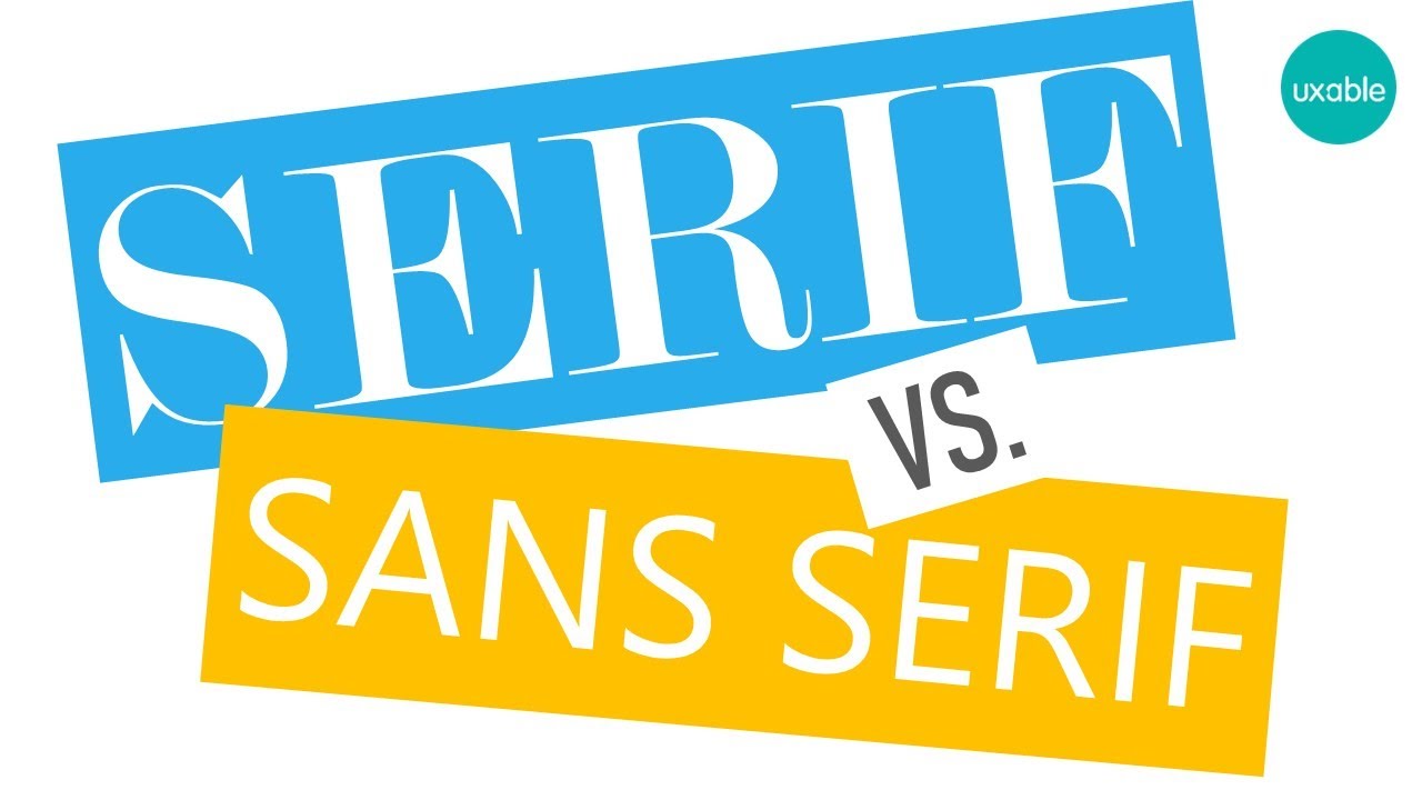
The simplest distinction: serif fonts have decorative terminal strokes on their letters. A sans-serif font doesn’t. The word “sans” is French for “without.”
But the differences run deeper than just the presence or absence of small lines.
Structural Differences
Stroke variation: Serif typefaces tend to have more contrast between thick and thin strokes within a single letter. Bodoni is the extreme example here, with dramatic weight shifts from one part of a character to another. Most sans-serif fonts keep stroke widths more consistent.
Character width: Serif fonts often run slightly wider because the serifs themselves add horizontal space to each letter. This affects spacing between characters and overall line length.
Visual weight: At the same point size, a serif font generally feels “heavier” on the page than its sans-serif counterpart. That has real implications for establishing hierarchy in your type system.
Readability and Perception
The old claim that serifs are always better for reading long text? It’s more complicated than that.
A 2024 study published in the International Journal of Human-Computer Interaction used eye-tracking technology to compare serif and sans-serif typefaces on e-commerce websites. The researchers found no statistically significant differences in readability between the two styles.
Meanwhile, a 2024 study from the All India Institute of Medical Sciences found that Times New Roman (a serif font) produced greater reader attention in letter cancellation tasks compared to sans-serif and script alternatives. So the answer really depends on what you’re measuring, and where.
Wichita State University research found Arial was rated only 0.4 points easier to read on screens than Times New Roman on a 7-point scale. Barely a gap, honestly.
| Feature | Serif Fonts | Sans-Serif Fonts |
|---|---|---|
| Terminal strokes | Present on all characters | Absent |
| Stroke contrast | Usually higher | Usually uniform |
| Traditional use | Print, books, legal docs | Digital interfaces, signage |
| Brand perception | Trust, tradition, authority | Modern, clean, accessible |
| Web usage (HTTP Archive) | 55% of pages reference serif in CSS | 89% of pages reference sans-serif |
Types of Serif Fonts
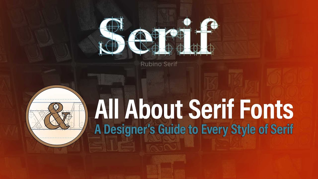
Not all serif fonts look alike. The category breaks down into four major classifications, each with a distinct history and visual character. Understanding these types matters if you’re picking a font for a project, because a slab serif and a Didone serif send completely different signals.
Old-Style Serifs
These are the oldest serif designs still in regular use. Claude Garamond created his namesake typeface in the 1500s, and it remains one of the most popular choices for book typography today.
Old-style serifs borrow heavily from handwritten calligraphy. The stroke contrast is low, the serifs are bracketed (they curve gently into the main stroke), and the stress of rounded letters tilts slightly to the left. Garamond and Jenson are the textbook examples.
These fonts are known for being exceptionally easy on the eyes during extended reading. That calligraphic warmth is exactly why publishers still reach for them centuries later.
Transitional Serifs
Sharper than old-style, softer than modern. That’s the quickest way to understand transitional serifs.
John Baskerville developed his typeface in the 1750s as a deliberate step away from the organic shapes of old-style designs. The contrast between thick and thin strokes increases, the serifs become flatter, and the axis of curved letters shifts to a more upright position.
Georgia, designed by Matthew Carter in 1993, falls into this category. Microsoft specifically commissioned it for screen readability, and it became one of the most widely used serif fonts on the web. Baskerville and Georgia are both go-to choices when you need something that reads well across print and digital formats.
Modern (Didone) Serifs
Giambattista Bodoni and Firmin Didot pushed type design to its logical extreme in the late 1700s.
Their typefaces feature extreme contrast between thick vertical strokes and hairline-thin horizontals. The serifs are completely unbracketed, sitting at sharp right angles to the main stroke. The overall effect is dramatic, almost architectural.
Vogue magazine has used Didot in its masthead for decades. Bodoni shows up across fashion branding from Giorgio Armani to Elizabeth Arden. These fonts look stunning at large display sizes. But set a paragraph of body text in Bodoni at 12px and you’ll quickly see why type designer Bruno Maag specifically warns against high-contrast serif fonts for running text.
Slab Serifs
A slab serif font does exactly what the name suggests. The serifs are thick, blocky, and usually the same weight as the main strokes.
Rockwell and Courier are the classic examples. These typefaces emerged in the early 1800s as attention-grabbing options for advertising and headlines. They carry a mechanical, industrial quality that separates them from every other serif category.
Courier became the default typeface for typewriters and, later, for coding terminals. It’s still everywhere in programming environments today.
| Serif Type | Key Example | Period | Stroke Contrast | Best Used For |
|---|---|---|---|---|
| Old-Style | Garamond | 1500s | Low | Book text, editorial |
| Transitional | Baskerville | 1750s | Medium | Print and web body text |
| Modern/Didone | Bodoni | Late 1700s | Extreme | Fashion, luxury branding |
| Slab | Rockwell | Early 1800s | Low/None | Headlines, advertising |
Where Serif Fonts Are Used

Serif fonts show up in specific contexts where their visual characteristics solve a real problem. Here’s where they still dominate, and a few places where they’re making a comeback.
Print Publishing
Books, newspapers, academic journals. Serif fonts have owned print for centuries.
Linearity research indicates that more than 90% of legal documents still use traditional serif fonts like Times New Roman for their perceived formality and clarity. Research from Turkish universities shows Times New Roman as the top academic font choice, used by 54.77% of 208 institutions surveyed.
Took me a while to understand why publishers are so loyal to serifs in print. The answer is partly tradition, partly the physics of ink on paper. Serifs catch more ink at the letter edges, which can sharpen character definition on physical pages.
Branding and Logo Design
Tiffany & Co., Rolex, Prada, The New York Times. These logos all use serif typefaces, and they all signal something specific: authority, heritage, exclusivity.
Custom Neon data shows that 22.4% of the world’s top 250 companies use serif fonts in their logos, including luxury brands that depend on conveying tradition and trust. The psychology behind font choice in branding is well documented. Serif typefaces trigger associations with reliability, formality, and established credibility.
Fontspring’s 2026 trend report highlights “film-inspired serifs” as a major direction for brand identity work, with wide apertures and soft bracketed serifs showing up in publishing, streaming platforms, and premium content brands.
Web and Editorial Design
The HTTP Archive’s 2022 Web Almanac found that 55% of web pages include serif as a CSS font-family declaration. That’s lower than sans-serif’s 89%, but it’s far from irrelevant.
Long-form editorial sites like Medium and many news outlets pair serif headings with sans-serif body text (or the reverse). This pairing approach creates visual hierarchy without relying on size alone.
The 2025 Web Almanac from HTTP Archive reports that web font usage has reached approximately 88% of all websites, up from 87% in 2024. Serif web fonts from Google Fonts like Merriweather (10 billion+ views), Playfair Display (9 billion+ views), and Lora continue gaining ground as screen resolution improves.
Why Serif Fonts Are Associated with Readability in Print
There’s a popular theory you’ll hear repeated constantly: serifs create a horizontal “guide” along the baseline that helps the eye track across lines of printed text. It sounds logical. It’s also… not entirely proven.
The Guiding Theory
The idea is that the small horizontal strokes at the base of each letter form a subtle visual rail. Your eye follows this rail more smoothly from word to word, especially across long lines of text.
This theory has been around since at least the early 20th century, and type researchers like Miles Tinker explored it extensively. Tinker’s work in the 1960s suggested that serif fonts did support comfortable reading in printed books, though he was careful about overstating the size of the effect.
What Research Actually Shows
The evidence is mixed. Honestly, more mixed than most typography articles will tell you.
A PMC-published study from Lighthouse International tested fonts that varied only in serif size (0%, 5%, and 10% of cap height). Fonts with 5% serifs were slightly more legible than sans-serif versions, but the researchers attributed much of that improvement to the increased inter-letter spacing that serifs naturally create, not the serifs themselves.
A 2005 study by Gasser and colleagues found that serif fonts helped participants remember 9% more information than sans-serif fonts. But multiple follow-up studies across Latin and Cyrillic alphabets have found no significant readability difference between the two styles overall.
University of Central Florida researchers confirmed in 2023 that font readability is highly individual. There’s no single best font for everyone. Some people read faster with serifs, others with sans-serifs, and the gap between a person’s best and worst font can be significant.
Familiarity and Legibility
A big factor that gets overlooked: we read familiar fonts faster. Most people grew up reading books set in serif typefaces. That exposure creates a comfort bias, not a structural advantage.
It’s also worth separating two terms that get confused all the time. Legibility is about how easily you can distinguish individual characters from each other. Readability is about how comfortably you can read blocks of text. A font can be highly legible but still exhausting to read in long passages if the line spacing or letter tracking is off.
Serif Fonts on Screens and Digital Interfaces
For years, the common advice was clear: don’t use serif fonts on screens. That advice made sense in 2005. It’s outdated now.
The Old Rendering Problem
Early computer monitors ran at 72 to 96 DPI. At those resolutions, the thin strokes and fine details of serif fonts turned into a blurry mess. Each pixel was large enough that delicate serif shapes couldn’t render cleanly.
Anti-aliasing helped, but not enough for smaller text sizes. A Wichita State University study from that era found Georgia (a serif designed specifically for screens) performed well, while Times New Roman (designed for print) struggled at body text sizes on monitors.
How High-DPI Displays Changed Everything
Retina displays and their equivalents pack 200+ pixels per inch into every screen. At that density, the fine strokes and bracketed curves of serif typefaces render as cleanly on screen as they do on a printed page.
This shift has been massive for web design. The HTTP Archive’s 2024 Fonts chapter shows web font usage hitting 87% of all websites, with serif options like Noto Serif JP making the top 10 on Google Fonts. The practical barrier that kept serifs off screens for decades is basically gone.
Web-Optimized Serif Fonts
Google Fonts now offers 357 serif font families as of 2025, according to Photutorial. The most popular web-optimized serifs include:
- Merriweather: Designed by Eben Sorkin specifically for comfortable screen reading, with a tall x-height and generous kerning
- Playfair Display: A transitional serif by Claus Eggers Sørensen that works beautifully at headline sizes
- Lora: A well-balanced text font that pairs nicely with popular sans-serif web fonts
In CSS, serif fonts are declared through the font-family property. A typical fallback stack might look like font-family: 'Merriweather', Georgia, 'Times New Roman', serif;. That last generic serif keyword tells the browser to use whatever default serif font is available on the user’s system if none of the preferred options load.
The rise of variable font technology has pushed things even further. Variable serif fonts let designers adjust weight, width, and optical size with a single font file, cutting load times while giving full creative control. The HTTP Archive reports that Google Fonts served 92% of all variable fonts in 2024, down from 97% in 2022 as more sites self-host their typography.
How to Choose a Serif Font for a Project

Picking the right serif typeface takes more than scrolling through Google Fonts and clicking “download.” The wrong serif can make a product package feel cheap or make a website feel stuck in 2003.
A 2024 Monotype study found that 85% of designers consider font choice critical to shaping a brand’s identity. That number makes sense once you start seeing how much the wrong typeface can undermine good work.
Match the Serif Style to the Project’s Tone
Editorial or literary? Old-style serifs like Garamond or Caslon. Their low stroke contrast and organic shapes feel warm and readable.
Corporate or institutional? Transitional serifs like Baskerville or Georgia. Professional without being flashy.
Fashion or luxury? Modern serifs like Bodoni or Didot. High contrast and sharp detail signal exclusivity. Bottega Veneta has kept its bespoke serif logo largely unchanged since 1966, proving this style has staying power in luxury.
Check Glyph Coverage and Weight Options
A typeface that only ships with regular and bold weights will limit you fast. Look for families that include italic variants, light, medium, semibold, and black weights at minimum.
Multilingual projects need extra attention. Not every serif font supports Cyrillic, Greek, or extended Latin characters. Google Fonts lists 357 serif families as of 2025 (Photutorial), and glyph coverage varies wildly between them.
Check the OpenType or TrueType format too. OpenType fonts generally support more advanced features like ligatures and stylistic alternates.
Licensing Considerations
Font licensing trips up even experienced designers. The rules differ depending on how you’re using the typeface.
| License Type | What It Covers | Typical Cost Range |
|---|---|---|
| Desktop | Print, static graphics | $15–$60 per weight |
| Web | Embedded on websites | $50–$300/year (traffic-based) |
| App | Mobile applications | ~$200 one-time |
| Unlimited/Enterprise | All uses, all platforms | Custom quote |
Open-source options from Google Fonts and Font Squirrel are free for commercial use under the SIL Open Font License. Linearity data shows that about 80% of professional designers pay for font licenses, meaning the majority still invest in commercial typefaces from foundries like Monotype and Hoefler & Co.
Understanding how font licensing works before you start a project saves you from nasty surprises down the line.
Common Serif Fonts and What They’re Known For

Some serif typefaces have been around for centuries. Others were born digital. Here are the ones you’ll run into most often, with specific context about why each one matters.
Times New Roman
Stanley Morison designed it in 1929 for The Times of London. It went on to become the default font in Microsoft Word, the standard for academic papers, and the typeface that 54.77% of Turkish universities adopted according to Institute of Science and Technology research.
Its reputation is both a strength and a limitation. Everyone knows it, everyone trusts it. But it also reads as “I didn’t bother choosing a font” in creative contexts. The U.S. State Department banned it in 2023, switching to the sans-serif Calibri for accessibility reasons.
Georgia
Matthew Carter designed Georgia in 1993 specifically for Microsoft, with one goal: make a serif that reads beautifully on low-resolution screens.
It has a taller x-height than most serifs, wider letterforms, and generous spacing between characters. These details kept it readable at sizes where Times New Roman started breaking down. It’s still one of the safest serif choices for web projects where you need a system font fallback.
Garamond
One of the oldest typefaces still in active use. Claude Garamond created it in the 1500s, and typographers have been producing new versions of it ever since. Adobe Garamond Pro (designed by Robert Slimbach) is probably the most popular modern interpretation.
Its reputation for elegance and ink efficiency is well earned. Garamond sets slightly smaller than other fonts at the same point size, which means it uses less paper in long print runs. That’s why you’ll find it in books more than almost any other typeface.
Bodoni
The fashion font. Giambattista Bodoni created it in the late 1700s, and it immediately became associated with luxury and sophistication.
Vogue, Harper’s Bazaar, Giorgio Armani. These brands use Bodoni (or close derivatives) because nothing else delivers the same combination of drama and refinement. The extreme thick-thin stroke contrast makes it gorgeous at display sizes but genuinely difficult to read in body copy.
Palatino
Hermann Zapf designed Palatino in 1949, naming it after the Italian calligrapher Giambattista Palatino. It was built for book typography and reads comfortably across long passages.
Palatino tends to feel slightly warmer and more calligraphic than other transitional serifs. It’s a popular choice in academic publishing and formal documents where Garamond feels too delicate and Times New Roman feels too generic.
Serif Fonts in Logo and Brand Design

Serif typefaces carry specific psychological associations that make them a strategic choice for brand typography. Trust, heritage, authority. These aren’t just design buzzwords here. Research backs it up.
Monotype’s neuroscience research across seven countries found that classic serif styles scored highest for conveying trust in Germany, while regions with deep printing histories (France, Portugal, Spain) showed significant preference for serif typefaces overall.
Why Brands Choose Serifs
Trust signaling: Law firms, financial institutions, and insurance companies lean heavily on serif logos. The associations with tradition and stability align with what these industries want to communicate.
Luxury positioning: Prada, Chanel, Tiffany & Co., and Burberry all use serif typography. Designity reports that heritage-inspired serif fonts are making a strong comeback in 2025, driven partly by brands wanting to signal authenticity in an AI-saturated market.
Editorial credibility: The New York Times, TIME magazine, and The Economist all use serif mastheads. These choices reinforce the perception of journalistic authority.
The Sans-Serif Migration (and the Return)
Between 2017 and 2022, a wave of luxury brands dropped their serif logos for minimalist sans-serif alternatives. Burberry, Saint Laurent, Balmain. The internet called it “blanding.”
Now? The pendulum is swinging back. Form Agency describes serif fonts as “the quiet power move of 2025,” noting that startups and fashion houses alike are choosing serif typefaces to separate themselves from the minimalist crowd. Serif fonts in 2025 are being used with bold color palettes, contrasting weights, and custom ligatures.
Rolex’s custom serif, based on Stempel Schneidler, has stayed virtually unchanged for decades. It didn’t follow the trend, and now it looks prescient.
Building a Serif into Your Brand System
When integrating a serif typeface into a brand’s visual identity, the font needs to function across every touchpoint.
- Test it at small sizes for mobile and social media avatars
- Verify it renders cleanly across Windows, macOS, iOS, and Android
- Pair it with a complementary sans-serif for body text and UI elements
- Document usage rules in your brand guidelines
Monotype data shows that consistent use of a specific font can increase brand recognition by up to 80%. That consistency only works if the typeface performs reliably everywhere your brand appears.
FAQ on What Is A Serif Font
What is a serif font in simple terms?
A serif font is a typeface with small strokes or lines attached to the ends of each letter. These decorative marks appear on characters like T, H, and M. Times New Roman and Garamond are classic examples.
What is the difference between serif and sans-serif fonts?
Serif fonts have small finishing strokes on their letters. Sans-serif fonts don’t. “Sans” means “without” in French. Serif typefaces tend to feel traditional, while sans-serif options look cleaner and more modern on digital screens.
Are serif fonts better for reading?
In print, serif fonts can slightly improve readability for long text. On screens, the difference is minimal. Research shows no significant gap between the two styles. Your familiarity with a font matters more than whether it has serifs.
Why do books use serif fonts?
Books use serif fonts because the small strokes help guide the eye across long lines of printed text. Typefaces like Garamond and Palatino also set efficiently on paper, using less ink and space than many sans-serif alternatives.
What are the four types of serif fonts?
The four main categories are old-style (Garamond), transitional (Baskerville), modern or Didone (Bodoni), and slab serif (Rockwell). Each has different stroke contrast, serif shape, and best-use scenarios ranging from books to advertising headlines.
Can serif fonts be used on websites?
Yes. Modern high-resolution screens render serif fonts cleanly. Web-optimized options like Merriweather, Playfair Display, and Lora from Google Fonts are designed specifically for screen readability. CSS font-family stacks make implementation straightforward.
What serif font is best for logos?
It depends on the brand. Bodoni works for fashion and luxury. Garamond suits publishing and editorial brands. Georgia fits digital-first companies. The best logo serif matches the brand’s personality, whether that’s traditional authority or modern elegance.
Is Times New Roman a serif font?
Yes. Times New Roman is one of the most widely recognized serif fonts. Stanley Morison designed it in 1929 for The Times of London. It became the default typeface in Microsoft Word and remains standard in academic and legal documents.
Are serif fonts outdated?
Not at all. Serif fonts are experiencing a comeback in 2025, especially in luxury branding and editorial design. Designers are using them with bold color palettes and custom ligatures. They feel fresh when applied with intention rather than default.
How do I pair a serif font with other typefaces?
Pair a serif heading font with a sans-serif body font for clear contrast. Merriweather works well with Open Sans. Playfair Display pairs nicely with Lato. The key is matching x-heights and keeping no more than two or three font families per project.
Conclusion
Understanding what is a serif font goes beyond identifying the small strokes at the end of letterforms. It’s about knowing when and why to use one.
From old-style designs like Caslon to high-contrast modern typefaces like Bodoni, each serif classification carries distinct visual weight and cultural associations. The right choice depends on your medium, your audience, and the message you’re trying to land.
Print still favors serifs for long-form readability. Digital screens have caught up thanks to high-DPI rendering and web-optimized families like Merriweather and Lora.
Branding is where things get interesting. Serif typefaces signal trust, heritage, and authority, which explains why 22% of the world’s top 250 companies still use them in their logos.
Whether you’re setting body text for a novel, picking a typeface for a corporate identity, or building a CSS font stack, serif fonts remain one of the most versatile tools in typographic design. Pick the right one, and it works hard without drawing attention to itself. Pick the wrong one, and everything feels off.

Renowned for his expertise in logo design and visual branding, Bogdan has developed a multitude of logos for various clients.
His skills extend to creating posters, vector illustrations, business cards, and brochures. Additionally, Bogdan's UI kits were featured on marketplaces like Visual Hierarchy and UI8.
He also wrote in the past years on sites like Design Your Way, WebDesignerDepot, WPDean, Designmodo, Speckyboy, Slider Revolution, and more.
- Canva vs PowerPoint: Which Is Better for Presentations? - 22 September 2026
- How to Install Fonts on Mac (Step-by-Step Guide) - 20 September 2026
- From Mockup to Code: How AI-Augmented Development Speeds Up the Design Handoff - 19 September 2026

Bogdan Sandu is a seasoned designer who has been designing websites since 2008. Renowned for his expertise in logo design and visual branding, Bogdan has developed a multitude of logos for various clients. His skills extend to creating posters, vector illustrations, business cards, and brochures. Additionally, Bogdan's UI kits were featured on marketplaces like Visual Hierarchy and UI8. He also wrote in the past years on sites like Design Your Way, WebDesignerDepot, WPDean, Designmodo, Speckyboy, Slider Revolution, and more.
You Might Also Like


